Don’t Be the Sad Snack
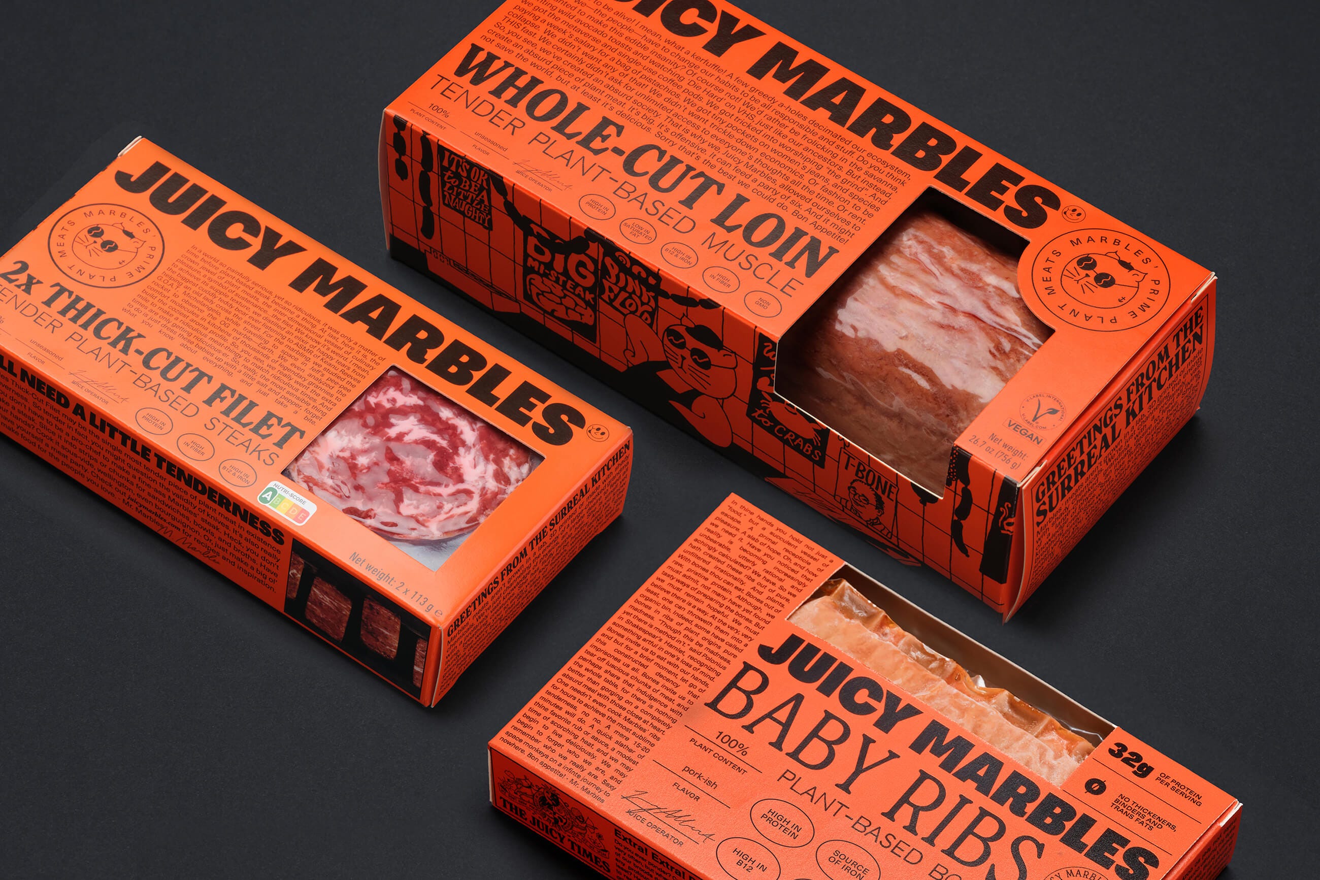
Packaging expert Lisa Cain shares her opinion on the brand identity for vegan meat brand Juicy Marbles designed by Ljudje.

Don't want to miss out on the latest brand identity reviews from the BP&O team? Subscribe and each week we will round-up our latest logo posts and reviews.
Live Last read · last published · next check
Packaging expert Lisa Cain shares her opinion on the brand identity for vegan meat brand Juicy Marbles designed by Ljudje.
This week, logos designed by All Purpose and Buddy Buddy
For those outside of Bristol, it’s all too easy to assume it's merely where Triphop and Dubstep were born; a Mecca for trustafarian ketamine-heads – but this brand proves there's more to it than that.
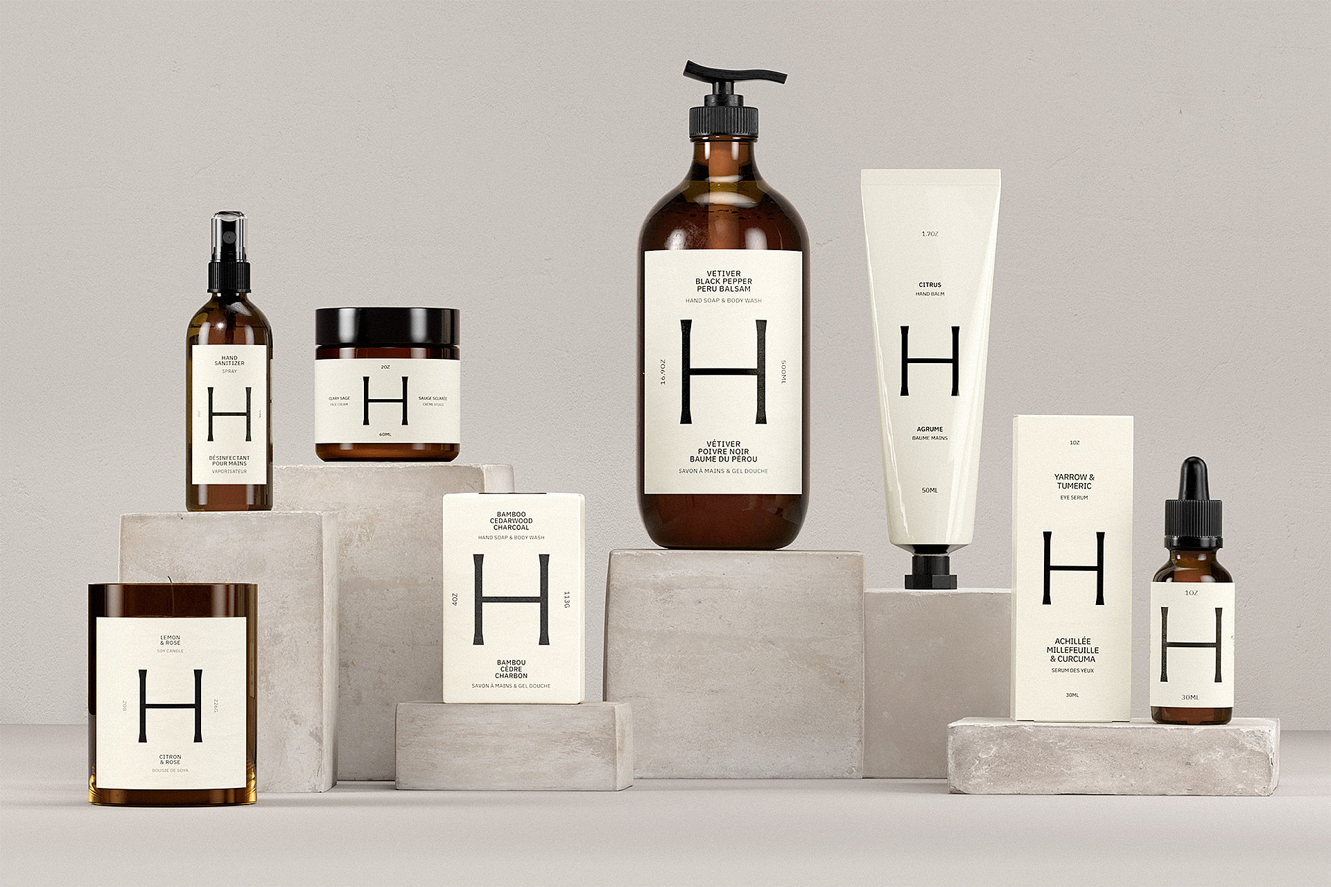
Packaging expert Lisa Cain shares her opinion on LG2's branding and packaging for Health Hut.
This week, logos designed by lg2 and How&How
It’s always a joy to see an international agency lavish the same respect, care, and craft on a relatively unknown, very local brand as they would on a household name – exactly what Base has done here.
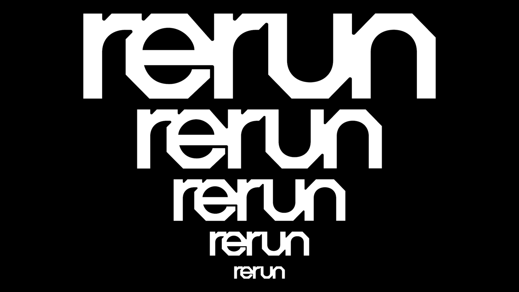
Rerun is an open source platform building the data layer for robots, drones and autonomous vehicles. And it seems it's also a company that's unafraid to take risks when it comes to its brand design.
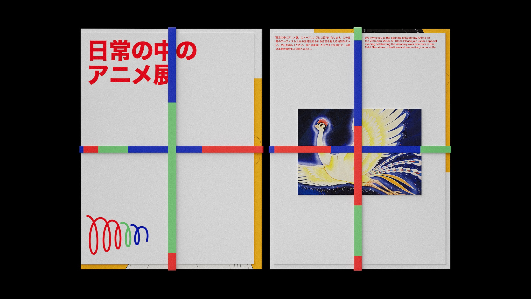
MoN Takanawa is experimental site with an identity in which twists and turns and joy and surprise coalesce in one of my favourite recent museum brands.
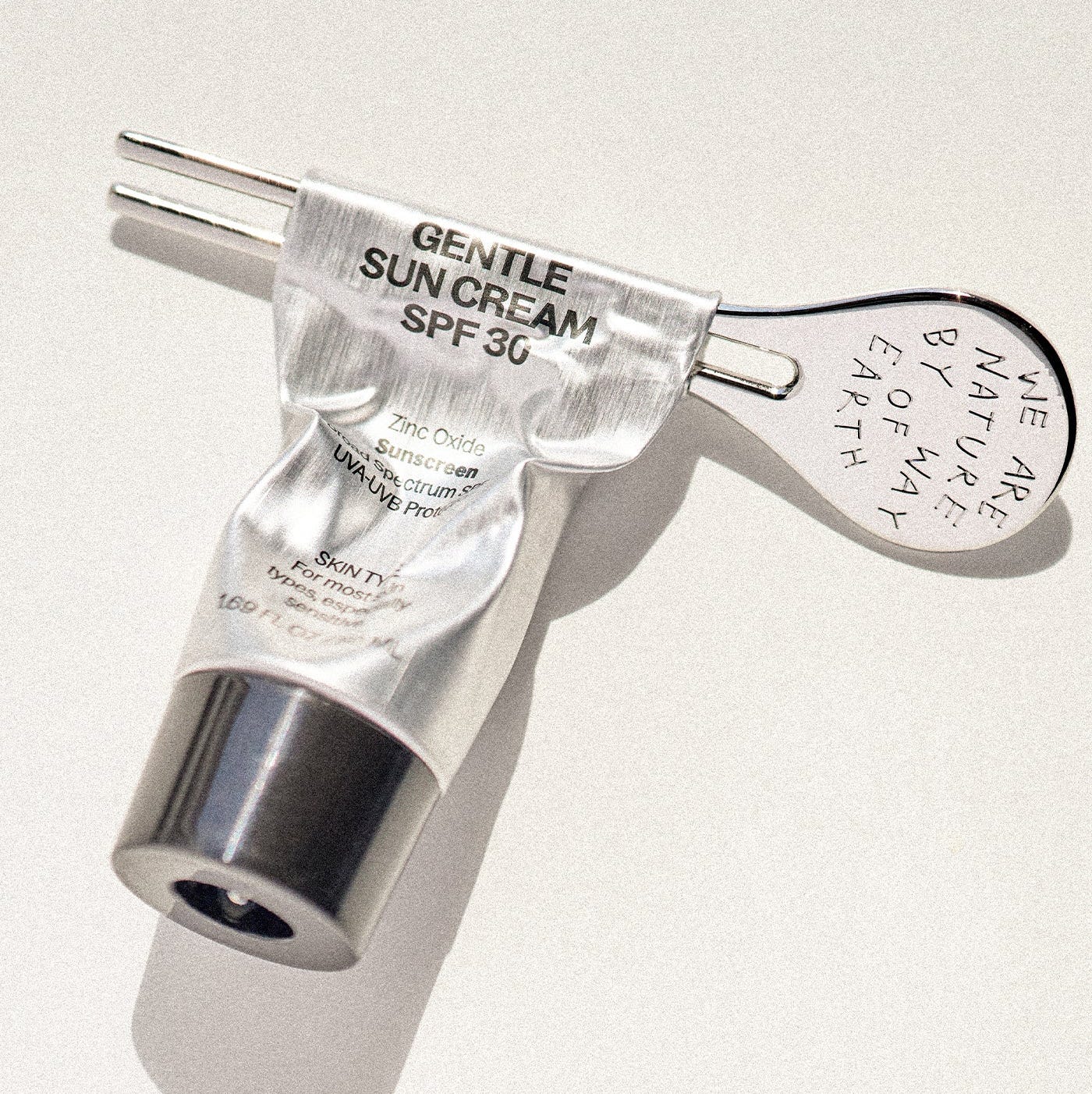
Packaging expert Lisa Cain shares her opinion on tube keys and skincare products.
This week, logos designed by 20(Something) and Redscout
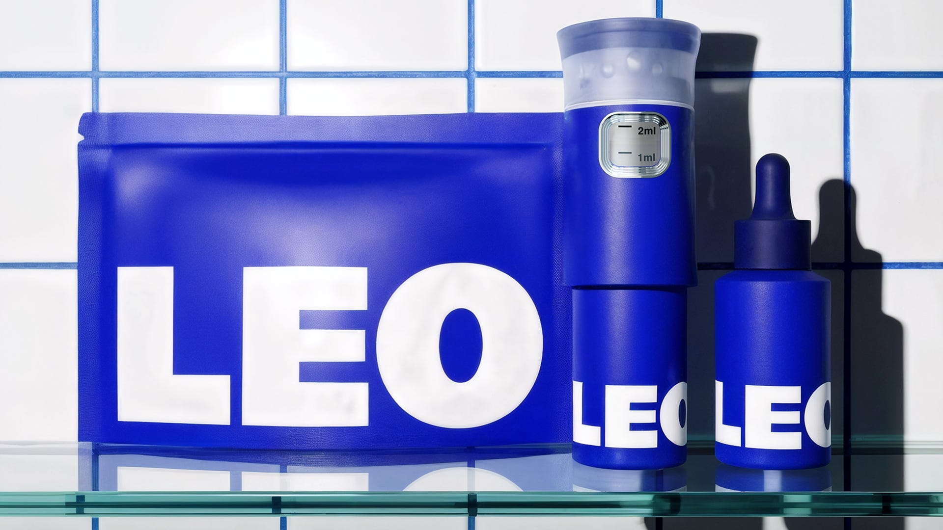
Leo is billed as a “hair rejuvenation brand”, founded by a father and son duo with the broad aim to make hair loss feel “less isolating and less complicated”.
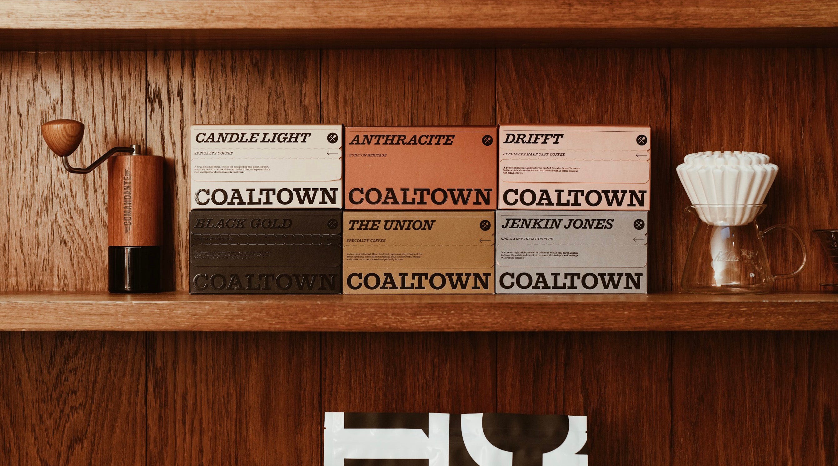
Packaging expert Lisa Cain shares her opinion on Smörgåsbord's branding and packaging for Coaltown Coffee.
This week, logos designed by Red Dot Studio and Further
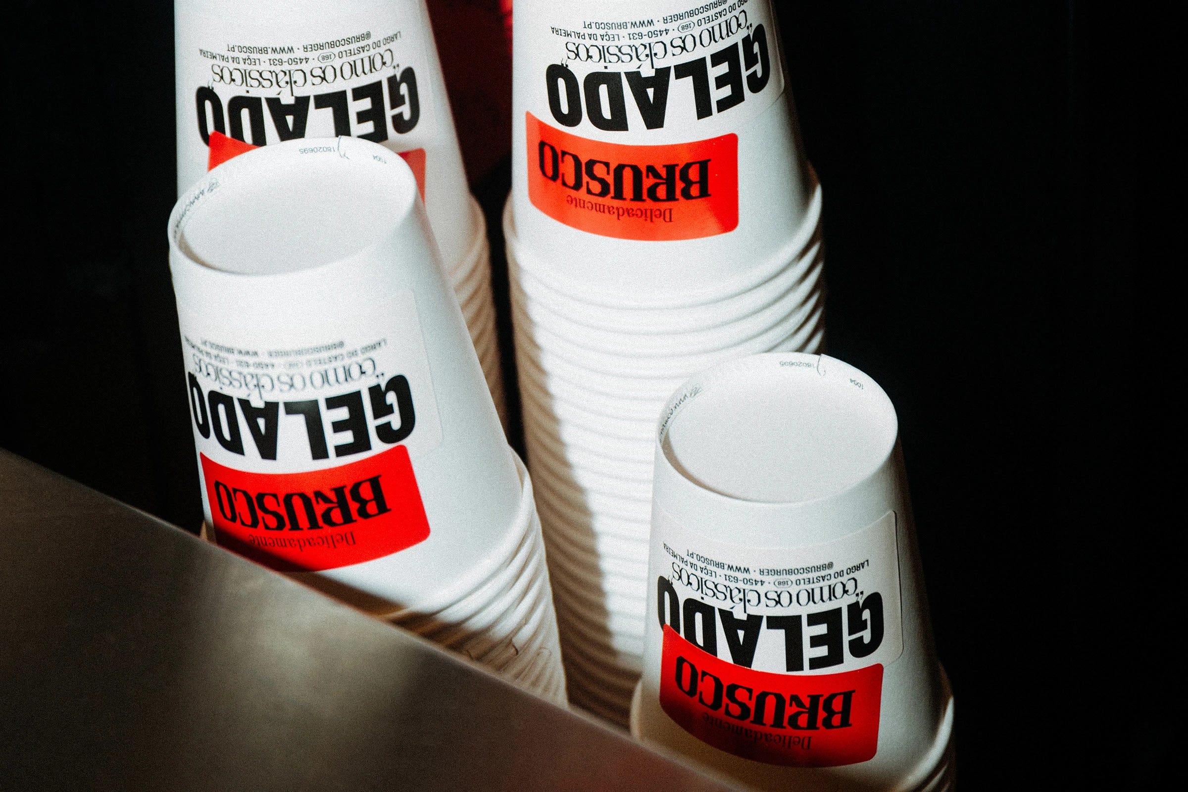
The smash burgers trend shows no signs of going away: one of many think pieces, however, dubbed the meal "a flattening of creativity" – a charge that couldn't possibly be levelled at this superb work.
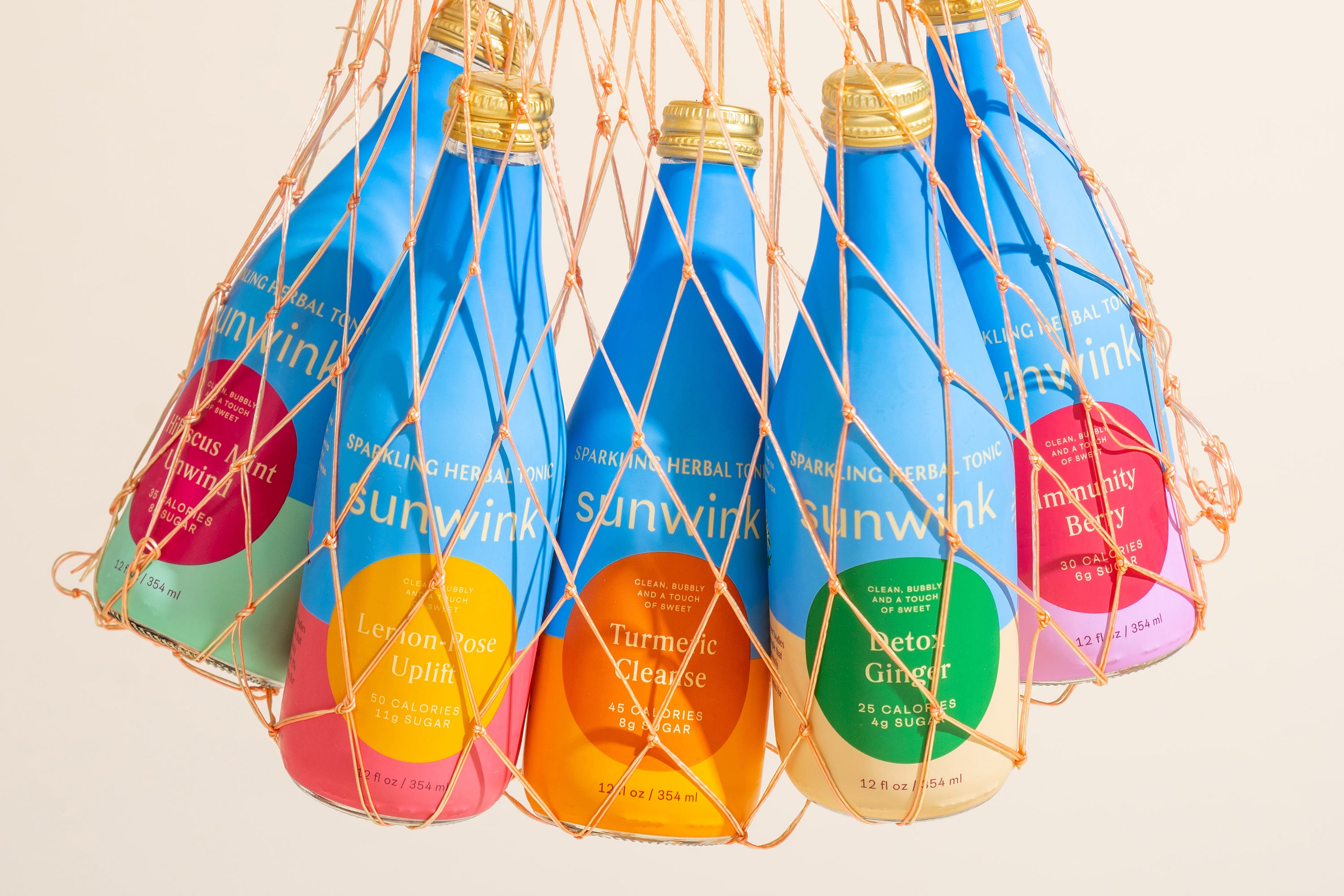
Packaging expert Lisa Cain shares her opinion on ready-to-drink sparkling tonic brand Sunwink.
This week, logos designed by Interbrand and RE-Public
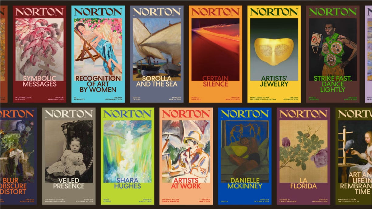
The brand strategy underpinning the entirety of the new identity is beautifully simple, summing up everything The Norton is about in succinct, accessible terms: ‘Where Art Meets Life’.
Packaging expert Lisa Cain shares her opinion on Studio Bland's work for Australian butter brand Bu Deli.
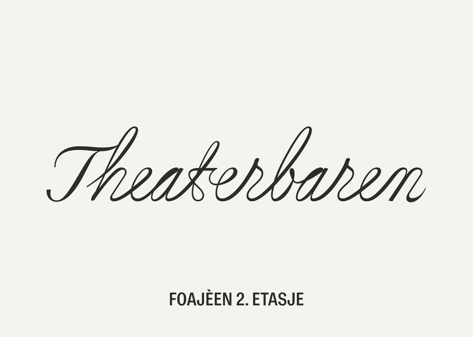
The Oslo-based studio's designs both honour the Nationaltheatret’s architectural and cultural significance and create something modern, social, and playful.
This week, logos designed by For Different and Si Maclennan Studio
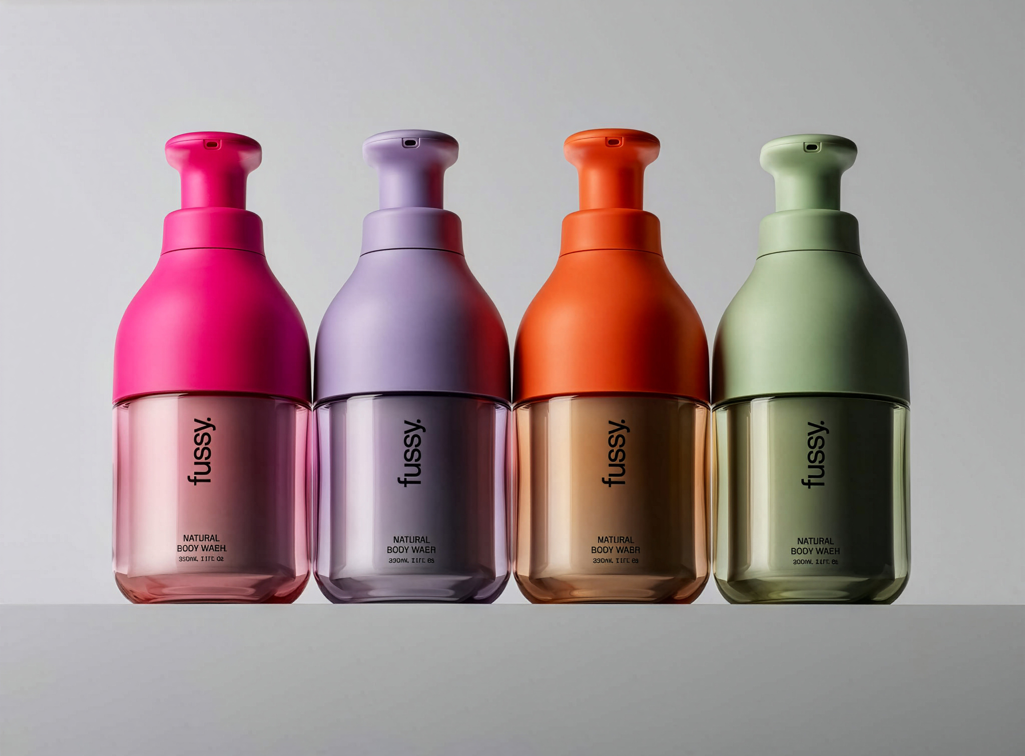
Packaging expert Lisa Cain shares her opinion on Beta Design's work on Fussy's refillable hand soap.
Without ever overtly leaning on the boring old origin story stuff, minimalism to the point of boredom to signify quality and so on, this identity succinctly conveys reputation, ethics, and quality.