

Abitibi-Témiscamingue by lg2
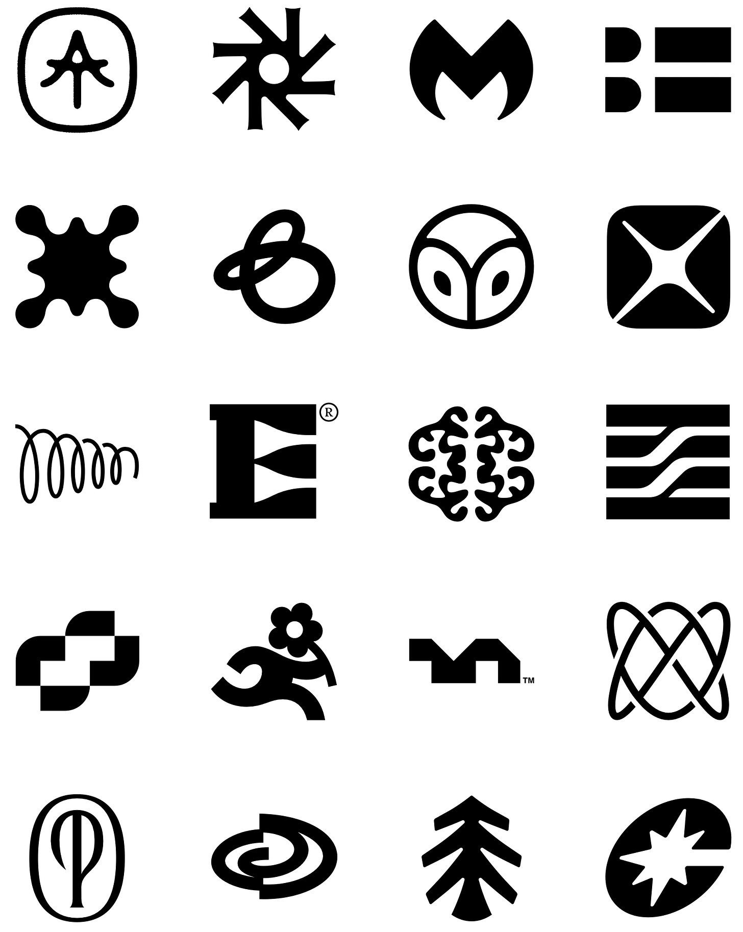
Sometimes, in its simplicity, a logo looks like it designed itself. Other times, the solution was just hidden, waiting to reveal itself. Here, it’s the latter. In the overlapping of an ‘A’ and a ‘T’ you get a neat little coniferous tree, the terminals of the ‘T’ adding a mid-tree flaring that really sells it. Throw in a bit of pseudo-texture and ink bleed it looks like it has existed for decades, a timeless mark, for an ancient region. The container anchors it in the vernacular of trails and parklands, of ranger badges or of scouting achievement. Lovely work by lg2.
→ See more logos


Hometree by How&How
Hometree ‘excels’ in transitioning homes towards more greener heating and energy solutions. Wether it be boilers, home cover and ‘green finance’ Hometree has it covered. Transformation and the green agenda are the foundation for a distinctive new logo, an unusual ‘twist’ on the universal motif of a tree. Familiar yet distinctive and ownable, scaling up and down well. Placed within a system of colour, type and image the twisting path of the tree generates the impression of affordable road to a greener future. Read and see more here.
→ See more logos
Want your logo included in the BP&O Logo Gallery? Like and reply to this newsletter with your latest and best.
Please include a link to your logo submission in use online. We love designing logos for fun, however, the gallery is dedicated to client-only work.

Quick links:
Thank you for subscribing to the BP&O Newsletter. If you enjoy reading this short you may also enjoy these resources from the same team:
Brand Archive – Research tool for brand designers.
LogoArchive Website – Searchable modernist logo archive & research tool.
LogoArchive Shop – Vintage design books & LogoArchive Zines.
Logo Histories – Stories of logos from the past.
Comments
Nothing yet. Say the first thing.
Sign in to join the conversation.