
Radio button
A radio button typically represents a single option in a group of related choices.
Examples
<gl-form-radio name="radio-group" value="option">Option</gl-form-radio>
<gl-form-radio name="radio-group" value="slot-option">
  Slot option
  <template #help>With help text.</template>
</gl-form-radio>
<gl-form-radio name="radio-group" value="checked-option" checked>Checked option</gl-form-radio>
<gl-form-radio name="radio-group" value="disabled-option" disabled>Disabled option</gl-form-radio>
<gl-form-radio name="radio-group" value="checked-disabled-option" checked disabled>Checked disabled option</gl-form-radio>
<gl-form-radio-group
:options="[
{ value: 'pizza', text: 'Pizza' },
{ value: 'tacos', text: 'Tacos' },
{ value: 'burger', text: 'Burger', disabled: true }
]"
name="radio-button-group"
>
<template #first>
<gl-form-radio value="slot-option">
Slot option with help text
<template #help>Help text.</template>
</gl-form-radio>
</template>
<gl-form-radio value="last-option">Last option</gl-form-radio>
</gl-form-radio-group>Structure
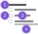
- Legend: A title for a group of radio buttons.
- Radio button: The input element that provides the visual affordance for the control.
- Label: Text indicating the option.
- Help text (optional): Used to further clarify an option.
Guidelines
When to use
- Use a radio button group for a set of options, where only one option can be selected at a time.
When not to use
- If selecting an option would change the state or view of other content and is not within a form, consider using a button group instead.
Appearance
- Radio buttons use high-contrast colors for labels and custom styles (based on Bootstrap) instead of browser defaults for the radio control.
- Radio buttons are vertically stacked, with one radio button per line.
Behavior
- Only one option in a radio button group can be selected at a time.
- A common or recommended option is typically preselected, but no option needs to be selected initially.
- An option is selected by clicking the radio button or its label.
- Unlike a checkbox group, where all options can be unchecked, a radio button group must always have one option selected after a selection has been made.
Content
Label
- Radio button labels are set in regular font weight, positioned to the right of the element, and should be as short as possible.
Legend
- Use a
fieldsetwithlegend(set in bold font weight and positioned above the group of radio buttons) to group a set of radio buttons. Some screen readers will announce the contents of the legend before each nested input to maintain context for a user.
Help text
- Help text can be added below the radio button label or as a paragraph below the group.
Accessibility
- Do not nest or add other elements within a radio button group. Keep the radio button group as a single cohesive unit to ensure the user can properly traverse the controls.
- When using
GlFormGroup, thelabelprop alone does not give the input an accessible name. - The
label-forprop must also be provided to give the input an accessible name.
Single radio button
Single radio with a label
<gl-form-radio v-model="status" value="opened">
  Opened
</gl-form-radio>
Multiple radio buttons
Multiple labeled radio buttons grouped within a fieldset
<gl-form-group label="Issue status">
  <gl-form-radio name="issue-status" value="opened" checked>Opened</gl-form-radio>
  <gl-form-radio name="issue-status" value="closed">Closed</gl-form-radio>
</gl-form-group>
Using GlFormRadioGroup:
<script>
export default {
  data() {
    return {
      options: [
        { value: 'opened', text: 'Opened' },
        { value: 'closed', text: 'Closed' },
      ],
      selected: null,
    };
  },
};
</script>

<template>
  <gl-form-group label="Issue status">
    <gl-form-radio-group v-model="selected" :options="options" />
  </gl-form-group>
</template>
Multiple labeled radio buttons grouped within a fieldset with hidden legend
<gl-form-group label="Issue status" label-sr-only>
  <gl-form-radio name="issue-status" value="opened">Opened</gl-form-radio>
  <gl-form-radio name="issue-status" value="closed">Closed</gl-form-radio>
</gl-form-group>
Using GlFormRadioGroup:
<script>
export default {
  data() {
    return {
      options: [
        { value: 'opened', text: 'Opened' },
        { value: 'closed', text: 'Closed' },
      ],
      selected: null,
    };
  },
};
</script>

<template>
  <gl-form-group label="Issue status" label-sr-only>
    <gl-form-radio-group v-model="selected" :options="options" />
  </gl-form-group>
</template>
Code reference
GlFormRadio components can be used directly, or via a GlFormRadioGroup.
GlFormRadio
<script>
export default {
  data() {
    return {
      selected: 'yes',
    };
  },
};
</script>

<template>
  <div>
    <gl-form-radio v-model="selected" value="yes">Yes</gl-form-radio>
    <gl-form-radio v-model="selected" value="no">No</gl-form-radio>
  </div>
</template>
import { GlFormRadio } from '@gitlab/ui';Props
Name | Description | Default |
|---|---|---|
|
|
|
|
|
|
|
|
|
|
|
|
|
|
|
|
|
|
|
|
|
Slots
Name | Description |
|---|---|
default | Content to use for the label |
help | Content provided here will be shown beneath the radio. Typically used for help or descriptive text. |
Events
Name | Description |
|---|---|
input |
|
change |
|
GlFormRadioGroup
The GlFormRadioGroup component provides an alternative and sometimes more
compact way of setting up a group of GlFormRadio components.
GlFormRadioGroup can be used in a few ways to build a group of GlFormRadio
components: implicitly, explicitly, or a mix of both.
Below is an example which demonstrates all three approaches, written such that all of them produce the same visual result.
Implicit:
<script>
export default {
  data() {
    return {
      selected: 'one',
      options: [
        {
          value: 'one',
          text: 'One',
        },
        {
          value: 'two',
          text: 'Two',
        },
        {
          value: 'three',
          text: 'Three',
        },
      ],
    };
  },
};
</script>

<template>
  <gl-form-radio-group v-model="selected" :options="options" name="implicit" />
</template>
Explicit:
<script>
export default {
  data() {
    return {
      selected: 'one',
      options: [
        {
          value: 'one',
          text: 'One',
        },
        {
          value: 'two',
          text: 'Two',
        },
        {
          value: 'three',
          text: 'Three',
        },
      ],
    };
  },
};
</script>

<template>
  <gl-form-radio-group v-model="selected" name="explicit">
    <gl-form-radio value="one">One</gl-form-radio>
    <gl-form-radio value="two">Two</gl-form-radio>
    <gl-form-radio value="three">Three</gl-form-radio>
  </gl-form-radio-group>
</template>
Mixed:
<script>
export default {
  data() {
    return {
      selected: 'one',
      options: [
        {
          value: 'one',
          text: 'One',
        },
        {
          value: 'two',
          text: 'Two',
        },
        {
          value: 'three',
          text: 'Three',
        },
      ],
    };
  },
};
</script>

<template>
  <gl-form-radio-group v-model="selected" :options="[options[1]]" name="mixed">
    <template #first>
      <gl-form-radio value="one">One</gl-form-radio>
    </template>
    <gl-form-radio value="three">Three</gl-form-radio>
  </gl-form-radio-group>
</template>
import { GlFormRadioGroup } from '@gitlab/ui';Props
Name | Description | Default |
|---|---|---|
|
|
|
|
|
|
|
|
|
|
|
|
|
|
|
|
|
|
|
|
|
|
|
|
Slots
Name | Description |
|---|---|
first | Slot for GlFormRadios that will appear before radios generated from options prop |
default | Slot for GlFormRadios that will appear after radios generated from options prop |
Events
Name | Description |
|---|---|
input |
|
Radio group options array
options can be an array of strings or objects. Available fields:
valueThe selected value which will be set onv-modeldisabledDisables item for selectiontextDisplay text, orhtmlDisplay basic inline html
value can be a string, number, or simple object. Avoid using complex types in values.
If both html and text are provided, html takes precedence. Only basic/native HTML is supported in the html field (components will not work). Note that not all browsers render inline html (i.e. <i>, <strong>, etc.) inside <option> elements of a <select>.
Note: Be cautious of placing user supplied content in the
htmlfield, as it may make you vulnerable to XSS attacks, if you do not first sanitize user supplied string.
const options = ['A', 'B', 'C', { text: 'D', value: { d: 1 }, disabled: true }, 'E', 'F']If an array entry is a string, it will be used for both the generated value and text fields.
You can mix using strings and objects in the array.
Options as an array of objects
const options = [
  { text: 'Item 1', value: 'first' },
  { text: 'Item 2', value: 'second' },
  { html: '<b>Item</b> 3', value: 'third', disabled: true },
  { text: 'Item 4' },
  { text: 'Item 5', value: { foo: 'bar', baz: true } }
]
If value is missing, then text will be used as both the value and text fields. If you use
the html property, you must supply a value property.
Radio values and v-model
<gl-form-radio> components do not have a value by default. You must explicitly supply a value via the value prop on <gl-form-radio>. This value will be sent to the v-model when the radio is checked.
The v-model of both <gl-form-radio> and <gl-form-radio-group> binds to the checked prop. To pre-check a radio, you must set the v-model value to the one of the radio's value (i.e. must match the value specified on one of the radio's value prop). Each radio in a radio group must have a unique value.
Radios support values of many types, such as a string, boolean, number, or a plain object.
Contextual states
<gl-form-radio-group> and <gl-form-radio> includes validation styles for valid and invalid states on most form controls.
Generally speaking, you'll want to use a particular state for specific types of feedback:
false(denotes invalid state) is great for when there's a blocking or required field. A user must fill in this field properly to submit the form.true(denotes valid state) is ideal for situations when you have per-field validation throughout a form and want to encourage a user through the rest of the fields.nullDisplays no validation state (neither valid nor invalid)
To apply one of the contextual state icons on <gl-form-radio>, set the state prop to
false (for invalid), true (for valid), or null (no validation state).
Required constraint
When using individual <gl-form-radio> components (not in a <gl-form-radio-group>), and you want the radio(s) to be required in your form, you must provide a name on each <gl-form-radio> in order for the required constraint to work. All <gl-form-radio> components tied to the same v-model must have the same name.
The name is required in order for Assistive Technologies (such as screen readers, and keyboard only users) to know which radios belong to the same form variable (the name also automatically enables native browser keyboard navigation), hence required will only work if name is set. <gl-form-radio-group> will automatically generate a unique input name if one is not provided on the group.
Related
Last updated at: