
⚠️ Banner
A banner promotes awareness of a new feature or high-priority research initiative.
⚠️ Component on hold
Do not add new usage of this component. It's temporarily restricted as part of our Banner cleanup initiative .
Examples
<gl-banner
  title="Upgrade your plan to activate Service Desk"
  button-text="Upgrade your plan"
  button-link="https://gitlab.com"
  illustration-name="service-desk-sm"
  variant="introduction"
>
  <p>
    GitLab Service Desk is a simple way to allow people to create issues in your GitLab instance
    without needing their own user account. It provides a unique email address for end users to
    create issues in a project, and replies can be sent either through the GitLab interface or by
    email. End users will only see the thread through email.
  </p>
</gl-banner>
<gl-banner
title="Upgrade your plan to activate Service Desk"
button-text="Upgrade your plan"
button-link="https://gitlab.com"
>
<p>
GitLab Service Desk is a simple way to allow people to create issues in your GitLab instance
without needing their own user account. It provides a unique email address for end users to
create issues in a project, and replies can be sent either through the GitLab interface or by
email. End users will only see the thread through email.
</p>
</gl-banner><gl-banner
title="Upgrade your plan to activate Service Desk"
button-text="Upgrade your plan"
button-link="https://gitlab.com"
illustration-name="service-desk-sm"
>
<p>
GitLab Service Desk is a simple way to allow people to create issues in your GitLab instance
without needing their own user account. It provides a unique email address for end users to
create issues in a project, and replies can be sent either through the GitLab interface or by
email. End users will only see the thread through email.
</p>
</gl-banner>Structure
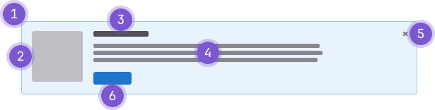
- Container: Wraps the content.
- Illustration (optional): Compliments the content.
- Title: Header for the content.
- Message: Text content indicating the purpose and potential next steps.
- Dismissal: Removes the banner for a user.
- Action: A single button to provide an explicit action the user can take based on the message.
Guidelines
Not sure this is the right pattern? See choosing a messaging pattern to compare the options.
When to use
A banner draws attention away from a user's primary task. Banners are a major source of noise in the product and are easy to overuse, so reach for it only when you can justify that no quieter pattern, such as a badge, inline text, or a popover, would do the job. When a banner is the right call, give it a defined lifespan and only show it to users who can act on it. A banner is appropriate to:
- Announce a new feature a user can try right away, or introduce one that needs setup first, linking to the steps required. Use the Promotion variant and time-box it, such as while the feature is in beta or within a single major version. The exception is the feature's own empty content area, which calls for an empty state rather than a banner.
- Promote a trial, upgrade, or paid capability, or suggest an underused one worth turning on. Target by eligibility, tier, behavior, or configuration state so the message only reaches users who can act on it, and set an expiry; an untargeted suggestion is noise. For first-use or multi-step guidance, use feature discovery patterns instead.
- Solicit user feedback, with a measurable success threshold set before launch and the banner removed once it's met.
When not to use
- Use an alert instead for system status or a system-generated condition, and the tip alert variant for tips and hints about an existing or established feature.
- Route it elsewhere in context: a toast to confirm an action the user just took, or nothing at all if the result is already visible; an empty state for a feature's own empty content area or for next steps after the user completes something; a broadcast message for an instance-level message from an admin to all users.
- Show nothing if a user can't take action, enable the feature, or benefit from the content.
Variants
- Introduction: Provide a basic introduction to help users get started with an existing feature. Illustration optional.
- Promotion: A promotional message to encourage exploring or upgrading to a new feature. Illustration optional.
Behavior
- A banner can always be dismissed.
- It doesn't reappear by default, but in rare circumstances the banner can reappear after 7 days have passed.
- The action should direct a user to one of the following:
- Docs for an installation guide.
- Where they can upgrade their plan to enable a feature.
- A format for contributing or providing feedback.
- When using a banner to solicit feedback, ensure a clear metric of success is set to remove the banner once complete. For example, using a banner to collect survey responses and removing the banner once 100 responses are collected.
Lifecycle
Every banner is temporary. Before adding one, decide how it will be removed.
- Set a defined end condition: an expiry date, a release version, or a measurable threshold for feedback. A promotion should last only through a beta period or a single major version.
- File a cleanup issue when you add the banner, so it doesn't outlive its purpose. Forgotten banners are the main source of banner overload.
- Persist dismissal with the
UserCalloutmodel, never local storage. Local storage causes the banner to reappear on a new browser or device.
Audience and targeting
- Only show a banner to users who can act on its message. Gate by role, plan, or feature state before rendering it. Showing an admin-level message to a user who can't act on it adds noise without value.
- Target by behavior or configuration state, not only by a release flag, wherever it's feasible. The goal is to reach the users for whom the message is relevant, even where this is harder to implement today.
Content
- Title should be concise and indicate the purpose of the banner.
- Tailor the message to the banner's purpose:
- For a feature announcement or promotion, describe the benefit and what the user can do next.
- For a trial or upsell, be explicit about cost and timing: what's free, what's paid, and when that changes.
- For a feedback request, state what you're asking for and roughly how long it takes.
- For a feature that needs setup, lead with the action required before the benefit is available.
- An optional illustration to support the message uses the small illustration size and round container shape.
Placement
- Similar to alert placement, the content within the banner will determine its placement on the page.
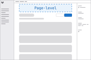
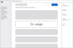
- Generally speaking, an introduction banner should be used at the page-level and relate to all content on the page, whereas a promotion banner can either be used at the page-level or in-page level. If in-page level is used, the banner should be placed directly above the content it relates to.
Accessibility
- When an illustration is used, it should be hidden from screen readers with
aria-hidden="true".
Code reference
Dismiss
Users are able to permanently dismiss banners by default. Banners may also be dismissed temporarily, depending on the use case.
Permanent dismissal
The dismiss action is always represented by the Close icon and anchored
to the top right of the banner.
Banner dismissal should work as follows:
- Banner dismissal must be associated with the user in the system database. Dismissal must persist, even across version upgrades and clients.
- Banners do not reappear by default. In rare circumstances, you may present the banner again to a user after some time has passed.
- Banners should only be shown to users who are logged in.
Implementation Notes:
- The dismissal of the banner is achieved using the
UserCalloutmodel on the backend and thePersistentUserCalloutJS file on the frontend. If both parameters are implemented correctly, the banner will adhere to the dismissal guidelines above.
Temporary dismissal
To introduce temporary dismissal, include a secondary or tertiary button placed alongside the primary action button. Follow the button alignment and order guidelines.
Temporary dismissals should work as follows:
- Banners dismissed temporarily will reappear after 7 days.
- After a banner is dismissed temporarily, use a toast message to let the user know they will see the banner again in 7 days.
GlBanner
import { GlBanner } from '@gitlab/ui';Props
Name | Description | Default |
|---|---|---|
|
| — |
|
|
|
|
| — |
|
|
|
|
|
|
|
|
|
|
|
|
|
|
|
Slots
Name | Description |
|---|---|
default | The banner content to display |
actions | The banner actions to display |
Events
Name | Description |
|---|---|
close |
|
primary |
|
Last updated at: