
Avatar
An avatar represents a unique entity, like a person, group, or project.
Examples
<gl-avatar
  :size="64"
  shape="circle"
  src="https://design.gitlab.com/img/avatar_1.png"
/>
<gl-avatar-labeled
shape="circle"
:size="32"
src="https://design.gitlab.com/img/avatar_1.png"
label="GitLab User"
sub-label="@gitlab-user"
/>Structure
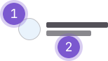
- Image or identicon: A unique image or fallback representing the object.
- Label and sub-label (optional): Text corresponding to the image or identicon.
Guidelines
When to use
- Use an avatar to consistently represent a person, group, or project where the visual or semantic relationship provides context to the content it's in proximity to.
When not to use
- An avatar only represents a user, project, or group. Consider an icon to visually represent interactive elements or other metaphors.
- For multiple user avatars, use the avatar group component instead.
Variants
- Circle: A circle is used for a person.
- Square: A rounded square is used for a group or project.
Sizes
- The size of an avatar varies depending upon its context.
- Available sizes (in pixels): 16, 24, 32, 48, 64, 96.
Content
- An avatar image is added to a profile, group, or project by a user.
- A circle avatar for a user has a Gravatar fallback of either a configured or randomly generated image.
- A square avatar uses a text fallback (identicon) where the text character is an abbreviation of the object it represents.
- A text label identifies the subject of the avatar.
- A text sub-label provides content or metadata for the label.
Accessibility
- A standalone avatar image should use a descriptive
alttag. - If an avatar image is adjacent to descriptive text, like a user or project name, it should use an empty
alttag so it can be ignored by a screen reader. - If an avatar has a tooltip or a popover it must also be focusable via keyboard to ensure the content is available for assistive technology. Tooltip content should match that of the
altattribute. - The single text character in the fallback (identicon) has no semantic meaning and uses
aria-hidden="true"to prevent it from being announced.
Code reference
GlAvatar
import { GlAvatar } from '@gitlab/ui';Props
Name | Description | Default |
|---|---|---|
|
|
|
|
|
|
|
|
|
|
|
|
|
|
|
|
|
|
|
|
|
Events
Name | Description |
|---|---|
load-error |
|
GlAvatarLabeled
Avatars may also be adjacent to a text alternative, such as a user or project name. In these cases,
a null alt text should be used so that they can be ignored by assistive technologies.
Use the avatar-labeled component in those scenarios. It will set a null alt text by default.
It allows to display a label and/or a sub-label next to the avatar image. It accepts the same
properties as the avatar component to modify the avatar’s shape and size.
Using the component
<gl-avatar-labeled :shape="shape" :size="size" :src="src" :label="label" :sub-label="subLabel" />import { GlAvatarLabeled } from '@gitlab/ui';Props
Name | Description | Default |
|---|---|---|
|
| — |
|
|
|
|
|
|
|
|
|
|
|
|
|
|
|
|
|
|
|
|
|
|
|
|
|
|
|
|
|
|
|
|
|
Slots
Name | Description |
|---|---|
meta | Metadata to add to the avatar. Generally used for badges or user status emoji. |
default | Add additional information below the avatar label. |
Events
Name | Description |
|---|---|
label-link-click |
|
GlAvatarLink
<gl-avatar-link> decorates <gl-avatar> with hyperlink functionality. It accepts the same
properties as the <gl-link> component and it works in the same way too. The main purpose of this
component is to apply visual enhancements that makes evident that the user can interact with the
avatar.
Using the component
When wrapping an <gl-avatar> component, <gl-avatar-link> darkens
the border that surrounds the avatar image or fallback text when hovering over it.
<gl-avatar-link href="#">
  <gl-avatar
    :size="32"
    src="https://design.gitlab.com/img/avatar_1.png"
  />
</gl-avatar-link>
When wrapping an <avatar-labeled> component, <avatar-link> underlines
the label and sub-label text when hovering over the avatar. It also applies the
same effects described in the first example.
<gl-avatar-link href="#">
  <gl-avatar-labeled
    :size="32"
    entity-name="GitLab"
    label="GitLab User"
    sub-label="@gitlab"
  />
</gl-avatar-link>
import { GlAvatarLink } from '@gitlab/ui';Slots
Name | Description |
|---|---|
default |
Pajamas::AvatarComponent
Related
Last updated at: