
Token
A token represents a keyword used to add or filter objects.
Examples
<gl-token>Token</gl-token><gl-token view-only>Token</gl-token>Structure
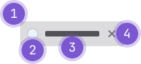
- Container: Wraps the content.
- Avatar (optional): Prefixes the text for a user, project, or group.
- Text: Represents the query.
- Remove button (optional): Permanently removes the token.
Guidelines
When to use
- In a search query where the user is expected to include multiple queries.
- To represent dynamic user input in a filter and verify the input by converting the text into a token.
- Allow a user to manage, filter, and search in a compact area.
When not to use
- If you need to categorize an object, use a label instead.
- To highlight more generic object metadata that is system-generated, use a badge instead.
Variants
- Interactive: Include a
closeicon at the end of the token. When enabled, a user can click the icon to remove the token from the set. - View-only: Can't be removed.
- Avatar: When querying for a user, project, or group, an avatar token should be used. These can be either interactive or view-only.
Placement
- A token can be positioned inline with the text cursor in a field, or in a stacked list.
- A token can wrap to a new row.
Behavior
A token can be used to both add and filter content where:
- An input token adds content in the form of an attribute attached to another object.
- A filter token narrows down content and is attached to a qualifier. The filter inherits a filter token.
Accessibility
The token selector's text input must have an accessible label. There are three ways to provide one:
-
GlFormGroup (preferred): Pass the GlFormGroup
label-forstring to GlFormToken:text-input-attrs: { id: label-for-string }. This is the recommended approach because the label is accessible for all users, and focuses the input on click and touch events.<script> export default { data() { return { dropdownItems: [ { id: 1, name: 'Vue.js', }, { id: 2, name: 'Ruby On Rails', }, ], selectedTokens: [ { id: 1, name: 'Vue.js', }, ], } }, }; </script> <template> <gl-form-group label="Select technologies" label-for="token-selector-input"> <gl-token-selector v-model="selectedTokens" :dropdown-items="dropdownItems" :text-input-attrs="{ id: 'token-selector-input' }" /> </gl-form-group> </template> -
aria-labelledby: Set an ID on the text label element and pass the ID string to GlFormToken
aria-labelledby. This establishes an accessible label, but it will not respond to click or touch events without a custom handler.<script> export default { data() { return { dropdownItems: [ { id: 1, name: 'Vue.js', }, { id: 2, name: 'Ruby On Rails', }, ], selectedTokens: [ { id: 1, name: 'Vue.js', }, ], } }, }; </script> <template> <div class="gl-mb-5"> <div id="token-selector-text-label" style="margin-bottom: 0.5rem;"><b>Select technologies text label</b> <i>(not clickable)</i></div> <gl-token-selector v-model="selectedTokens" :dropdown-items="dropdownItems" aria-labelledby="token-selector-text-label" /> </div> </template> -
aria-label: Provide an accessible label directly to the input when a visible label is not available.<script> export default { data() { return { dropdownItems: [ { id: 1, name: 'Vue.js', }, { id: 2, name: 'Ruby On Rails', }, ], selectedTokens: [ { id: 1, name: 'Vue.js', }, ], } }, }; </script> <template> <div class="gl-mb-5"> <gl-token-selector v-model="selectedTokens" :dropdown-items="dropdownItems" aria-label="Select technologies" /> </div> </template>
Do not provide both aria-label and aria-labelledby on the same input. When both are present, aria-labelledby takes precedence and aria-label is ignored.
Write labels that provide context about what the token selector is for. For example, Select work item assignees is more helpful than token selector.
Code reference
GlToken
import { GlToken } from '@gitlab/ui';Props
Name | Description | Default |
|---|---|---|
|
|
|
|
|
|
|
|
|
Slots
Name | Description |
|---|---|
default | Content to display inside the token |
Events
Name | Description |
|---|---|
close |
|
GlTokenSelector
Choose from a provided list of tokens or add a user defined token.
<script>
export default {
  data() {
    return {
      selectedTokens: [
        {
          id: 1,
          name: 'Vue.js',
        },
      ],
    };
  },
};
</script>

<template>
  <div>
    <gl-token-selector
      v-model="selectedTokens"
      :dropdown-items="[
        {
          id: 1,
          name: 'Vue.js',
        },
        {
          id: 2,
          name: 'Ruby On Rails',
        },
        {
          id: 3,
          name: 'GraphQL',
        },
        {
          id: 4,
          name: 'Redis',
        },
      ]"
    />
    {{ selectedTokens }}
  </div>
</template>
User created tokens
This component allows for users to create their own tokens when configured to do so.
There are two props that support this functionality: allowUserDefinedTokens and showAddNewAlways.
allowUserDefinedTokens is required to enable the functionality
When set to true and a user's search text returns nothing,
they will be presented with an additional dropdown item Add ...
that takes their current search input and emits @input.
The parent component can then handle the event accordingly.
Additionally, there are scenarios where the user may want the ability to add a new token
even if some search results are returned. This functionality can be enabled by additionally
setting showAddNewAlways to true.
This will allow for the Add ... dropdown item to appear at all times
whenever a user has inputted text, regardless if results are found.
<template>
  <div>
    <gl-token-selector
      v-model="selectedTokens"
      :dropdown-items="dropdownItems"
      allow-user-defined-items
      show-add-new-always
      @input="onTokenUpdate"
    />
    {{ selectedTokens }}
  </div>
</template>
import { GlTokenSelector } from '@gitlab/ui';Props
Name | Description | Default |
|---|---|---|
|
|
|
|
|
|
|
|
|
|
|
|
|
|
|
|
|
|
|
|
|
|
|
|
|
|
|
|
|
|
|
|
|
|
|
|
|
|
|
|
| — |
|
|
|
|
|
|
Slots
Name | Description |
|---|---|
empty-placeholder | Optional content to display a placeholder when tokens list is empty |
token-content | Content to pass to the token component slot. Can be used to add an avatar to the token. Default content is "{{ token.name }}". |
loading-content | Content to display when `loading` prop is `true`. Default content is "Searching..." |
user-defined-token-content | Content to display when adding a user defined token. Default content is 'Add "{{ inputText }}"'. |
no-results-content | Content to display when `dropdown-items` is empty and both `allow-user-defined-tokens` and `show-add-new-always` is `false`. Default content is "No matches found". |
dropdown-item-content | Dropdown item content. Default content is "{{ dropdownItem.name }}". |
dropdown-footer | Content to add to the bottom of the dropdown. Can be used in conjunction with `gl-intersection-observer` to load more items as the user scrolls. |
Events
Name | Description |
|---|---|
keydown |
|
text-input |
|
focus |
|
blur |
|
input |
|
token-add |
|
token-remove |
|
Last updated at: