
Filter
Filters allow a user to narrow down content by taking an existing list and removing items based on criteria that matches or doesn’t.
Examples
Structure
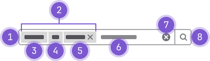
- Input: The input field of the filter.
- Query: Consists of three main token parts: key (3), logical operator (4), and value (5).
- Key: acts as the label of the filter value, for example,
assignee. - Logical operator: the condition that binds the key to the value, for example,
isoris not. - Value: the item that the condition will base results on, for example, a
@username. - Raw text: Additional raw text can be typed into the filter
- Clear button: Clears the entire input field (all queries and raw text).
- Search button: Triggers the search.
Guidelines
When to use
When not to use
Appearance
- Filters utilize the search component with three main token parts that form a query (see Structure).
- Queries are positioned inline with the text cursor in the input field. The input field scrolls horizontally when the queries overflow the width.
- Queries include a
closeicon that removes the whole query from the search box when clicked.
Behavior
- The input field of the filter can be focused by using a keyboard shortcut.
- Clicking on any of the three parts of a query opens a corresponding dropdown for that part of the query. For example, if a user clicks on the value part of the query, the value dropdown appears.
- If the operator is selected, the related dropdown appears and the value part of the query is removed if the operator is changed.
- If the key is selected, the related dropdown appears and the operator and the value of the query are removed if the key is changed.
- The text content of the clicked part (operator or key) becomes editable and the text cursor is immediately placed at the end of that text string so that users can either type or select a suggestion from a dropdown.
- Certain keys are compatible so the operator and value don’t need to be removed in the event of change (for example, changing the key from author to assignee).
- If a user selects a different value from the dropdown when editing a text string, that new value replaces the old one.
- Raw text appears within a token after tabbing or clicking outside of the search box. Setting the
terms-as-tokensprop totruewill enable the correct term rendering and interaction behavior. - If the user clicks anywhere outside the dropdown or the search box, the string is turned back to a token with whatever its value was at the time of the event.
- If a user tries to edit a key with an invalid value, the token is removed and converted to a plain text string.
- If a user tries to edit an operator with an invalid value, the first option is chosen and the invalid text becomes the value text string.
- After a query is successfully added, a dropdown with suggestions for other keys appears immediately.
- If a query is deleted by interaction through the keyboard, the input should remain focused and a new dropdown should appear.
- Clicking the clear button inside the input clears all filters, keeps the input focused, and shows a dropdown.
- Pressing the Esc key on the keyboard hides the dropdown. Pressing the ↓ key or clicking inside the input shows it again. If there's a string already in the input it can be:
- Turned into a token if it's a valid match for a value.
- Turned into raw text on all other occasions.
- The experience of adding a query should be as follows:
- The user clicks into a search box and a dropdown with the keys that can be used appears.
- The user chooses the key of what they want to filter the list by (for example,
assignee). - The user chooses the logical operator (
isoris not) from a dropdown. - The user defines the value part of the query (for example, choosing a @username from a dropdown or typing a text value).
- The user needs to repeat steps 1–4 for each query they want to add.
- Once done, the user needs to confirm the search to trigger it. They do so by clicking on the search button or by using their keyboard.
Content
- Each part is a variant of a token.
- Filters are always used in combination with the “search by confirmation” search box pattern.
- Each filter can consist of only one value and can’t be repeated. For example, a list of issues can only be narrowed down by specifying one assignee.
- While filter results aren't part of the component itself, the Empty States page has additional guidance on what to display if there are no matching filters.
Accessibility
Code reference
GlFilteredSearch
Each filter option (named token) requires a separate Vue component. GlFilteredSearchToken is an
example of such a token.
Prepare array of available token configurations with the following fields:
type: unique identifier of token typetitle: human-readable title of the tokenicon: token icontoken: (optional) the token Vue component to use (for example,AuthorToken)dataType: (optional) identifier of type (for example,user) for this filter. Tokens of the same type could be switched without losing their valuesunique: (optional) indicate this token could appear only once in the filterdisabled: (optional) indicate this token should be hidden from the dropdownoperators: (optional) an array of selectable operators. Each array item is an object that must containvalueanddescription, and optionallydefault(for example,{ value: '=', description: 'is', default: 'true' })multiSelect: (optional) whentrue, the suggestions list becomes multi-select instead of single-select. It is discouraged to use this together withunique, asuniqueis intended for single-select.options: (optional) an array of options which the user can pick after the operator has been selected. The option object can have the following properties defined:value: string,icon: string,title: string,component: Objectanddefault: boolean. Ifcomponentis provided, it is is used to render the option in the suggestions list.segmentTitle: (optional) title to use once the token has been selected (otherwisetitlewill be used)match: (optional) function that determines whether the token should be shownoptionComponent: (optional) A component used to render the token option itself when adding a new token or replacing an existing one- any additional fields required to configure your component
Each token for filtered search is a Vue component with the following props:
value: an object with adataproperty containing the current value, and optionally anoperatorvalue containing the operator valueactive: indicates if the token is currently active. It's the token's responsibility to render proper control for editing (for example input).current-value: current tokens of the filtered search.index: current token position in the filtered search.config: additional configuration, supplied in filtered search config for this token.
The token should emit the following events:
activate: when the token requests activation (for example, when being clicked).deactivate: when token requests deactivation (for example due to losing blur on input).destroy: when token requests self-destruction (for example, clicking theXsign).replace: token requests its replacement with another token.split: token requests adding string values after the current token.complete: token indicates its editing is completed.
Improve space handling
Set the terms-as-tokens prop to true to enable new term rendering and
interaction behavior. This makes it easier to input/edit free text tokens, and
removes the need for quoting values with spaces and other workarounds.
In future, this prop will be enabled by default and eventually removed. Opt in to this earlier rather than later to ease migration.
Grouping tokens
Tokens with a type that starts with "gl-filtered-search-suggestion-group-" are shown as section headers.
Combine a match function with a section header to group tokens together. This match function will show the
"Fruit" section header when any item in the section matches the query the user has typed:
const match = ({query, title, defaultMatcher}) => [title, 'fruit'].some(text => defaultMatcher(text, query));
const availableTokens = [
  { type: 'gl-filtered-search-suggestion-group-example', title: 'Fruit', match },
  { type: 'grouped-token-1', title: 'Apple', token: staticToken, match },
  { type: 'grouped-token-2', title: 'Banana', token: staticToken, match },
];
Examples
Define a list of available tokens:
const availableTokens = [
  { type: 'static', icon: 'label', title: 'static:token', token: staticToken },
  { type: 'dynamic', icon: 'rocket', title: 'dynamic:~token', token: dynamicToken },
];
Pass the list of tokens to the search component. Optionally, you can use v-model to receive
realtime updates:
<gl-filtered-search :available-tokens="tokens" v-model="value" terms-as-tokens />import { GlFilteredSearch } from '@gitlab/ui';Props
Name | Description | Default |
|---|---|---|
|
|
|
|
|
|
|
|
|
|
|
|
|
|
|
|
|
|
|
|
|
|
|
|
|
|
|
|
|
|
|
|
|
|
|
|
|
|
|
Slots
Name | Description |
|---|---|
history-item | Slot to customize history item in history dropdown. Used only if using history items |
Events
Name | Description |
|---|---|
history-item-selected |
|
clear-history |
|
input |
|
token-destroy |
|
token-complete |
|
clear |
|
submit |
|
GlFilteredSearchSuggestion
The filtered search suggestion component is a wrapper around GlDropdownItem, which registers
suggestions in a top-level suggestion list:
<gl-filtered-search-suggestion-list>
  <gl-filtered-search-suggestion value="foo" key="foo-0">Example suggestion</gl-filtered-search-suggestion>
  <gl-filtered-search-suggestion value="bar" key="bar-1">Example suggestion 2</gl-filtered-search-suggestion>
</gl-filtered-search-suggestion-list>
NOTE: Provide a
keyto suggestions of the form${value}-${index}(or similar). While using the index in keys is usually frowned upon for performance reasons, the current implementation relies on all suggestions getting destroyed and recreated to keep rendering order in sync with Up/Down keyboard interaction.
import { GlFilteredSearchSuggestion } from '@gitlab/ui';Props
Name | Description | Default |
|---|---|---|
|
|
|
| The value of the suggestion item. | — |
Slots
Name | Description |
|---|---|
default | The suggestion content. |
Events
Name | Description |
|---|---|
suggestion |
|
GlFilteredSearchSuggestionList
The filtered search suggestion list component is responsible for managing underlying suggestion instances. You obtain the ref for this component and manage suggestion selection via the component public API:
getValue()- Retrieves the current selected suggestion.nextItem()- Selects the next suggestion. If last suggestion was selected, selection is cleared.prevItem()- Selects the previous suggestion. If first suggestion was selected, selection is cleared.
<gl-filtered-search-suggestion-list ref="suggestions">
  <gl-filtered-search-suggestion value="foo">Example suggestion</gl-filtered-search-suggestion>
  <gl-filtered-search-suggestion value="bar">Example suggestion 2</gl-filtered-search-suggestion>
</gl-filtered-search-suggestion-list>
import { GlFilteredSearchSuggestionList } from '@gitlab/ui';Props
Name | Description | Default |
|---|---|---|
|
|
|
Slots
Name | Description |
|---|---|
default | The suggestions (implemented with GlFilteredSearchSuggestion). |
GlFilteredSearchTerm
The filtered search term is a component for managing "free input" in the filtered search component. It is responsible for autocompleting available tokens and "converting" to a relevant component when an autocomplete item is selected.
This component is internal and is not intended to be used by @gitlab/ui users.
import { GlFilteredSearchTerm } from '@gitlab/ui';Props
Name | Description | Default |
|---|---|---|
|
| — |
|
|
|
|
|
|
|
|
|
|
|
|
|
|
|
|
|
|
|
|
|
|
|
|
|
|
|
Events
Name | Description |
|---|---|
activate | Emitted when this term token is clicked. |
deactivate | Emitted when this term token will lose its focus. |
submit | Emitted when the token is submitted. |
split | Emitted when Space is pressed in-between term text. Not emitted when termsAsTokens is true. |
previous |
|
next |
|
input |
|
destroy |
|
complete |
|
replace |
|
GlFilteredSearchToken
Filtered search token is a helper component, intended to simplify the creation of filters tokens which consist of a title, operators and an editable value with autocomplete. This component abstracts token management logic and allows you to focus on implementing autocomplete or view logic.
This component is not intended to be used outside of the GlFilteredSearch component.
Make sure to pass $listeners to gl-filtered-search-token, or route events properly:
<gl-filtered-search-token title="Confidential" :active="active" :value="value" v-on="$listeners">
  <template #suggestions>
    <gl-filtered-search-suggestion value="Yes"
      ><gl-icon name="eye-slash" :size="16" /> Yes</gl-filtered-search-suggestion
    >
    <gl-filtered-search-suggestion value="No"
      ><gl-icon name="eye" :size="16" /> No</gl-filtered-search-suggestion
    >
  </template>
</gl-filtered-search-token>
import { GlFilteredSearchToken } from '@gitlab/ui';Props
Name | Description | Default |
|---|---|---|
|
|
|
|
|
|
|
|
|
|
|
|
|
|
|
|
|
|
|
|
|
|
|
|
|
|
|
Slots
Name | Description |
|---|---|
before-data-segment-input | |
data-segment-input | |
suggestions | The suggestions (implemented with GlFilteredSearchSuggestion). |
view-token | Used to customize how the token is rendered. |
view | Template for token value in inactive state |
Events
Name | Description |
|---|---|
deactivate | Emitted when this term token will lose its focus. |
destroy | Emitted when token is about to be destroyed. |
submit | Emitted when the token is submitted. |
previous |
|
select |
|
split | Emitted when Space is pressed in-between term text. Not emitted when termsAsTokens is true. |
next |
|
input |
|
activate | Emitted when this term token is clicked. |
replace |
|
complete |
|
GlFilteredSearchTokenSegment
The filtered search token segment is a component for managing token input either via free typing or by selecting item through dropdown list
This component is internal and is not intended to be used by @gitlab/ui users.
import { GlFilteredSearchToken } from '@gitlab/ui';Props
Name | Description | Default |
|---|---|---|
|
|
|
|
|
|
|
|
|
|
|
|
|
|
|
|
|
|
|
|
|
|
|
|
|
|
|
Slots
Name | Description |
|---|---|
before-data-segment-input | |
data-segment-input | |
suggestions | The suggestions (implemented with GlFilteredSearchSuggestion). |
view-token | Used to customize how the token is rendered. |
view | Template for token value in inactive state |
Events
Name | Description |
|---|---|
deactivate | Emitted when this term token will lose its focus. |
destroy | Emitted when token is about to be destroyed. |
submit | Emitted when the token is submitted. |
previous |
|
select |
|
split | Emitted when Space is pressed in-between term text. Not emitted when termsAsTokens is true. |
next |
|
input |
|
activate | Emitted when this term token is clicked. |
replace |
|
complete |
|
Last updated at: