
This issue is a case study about one of my latest products: a tv stand for Teto Space. I'll walk you through the main design phases in order, explaining the decisions behind each one.
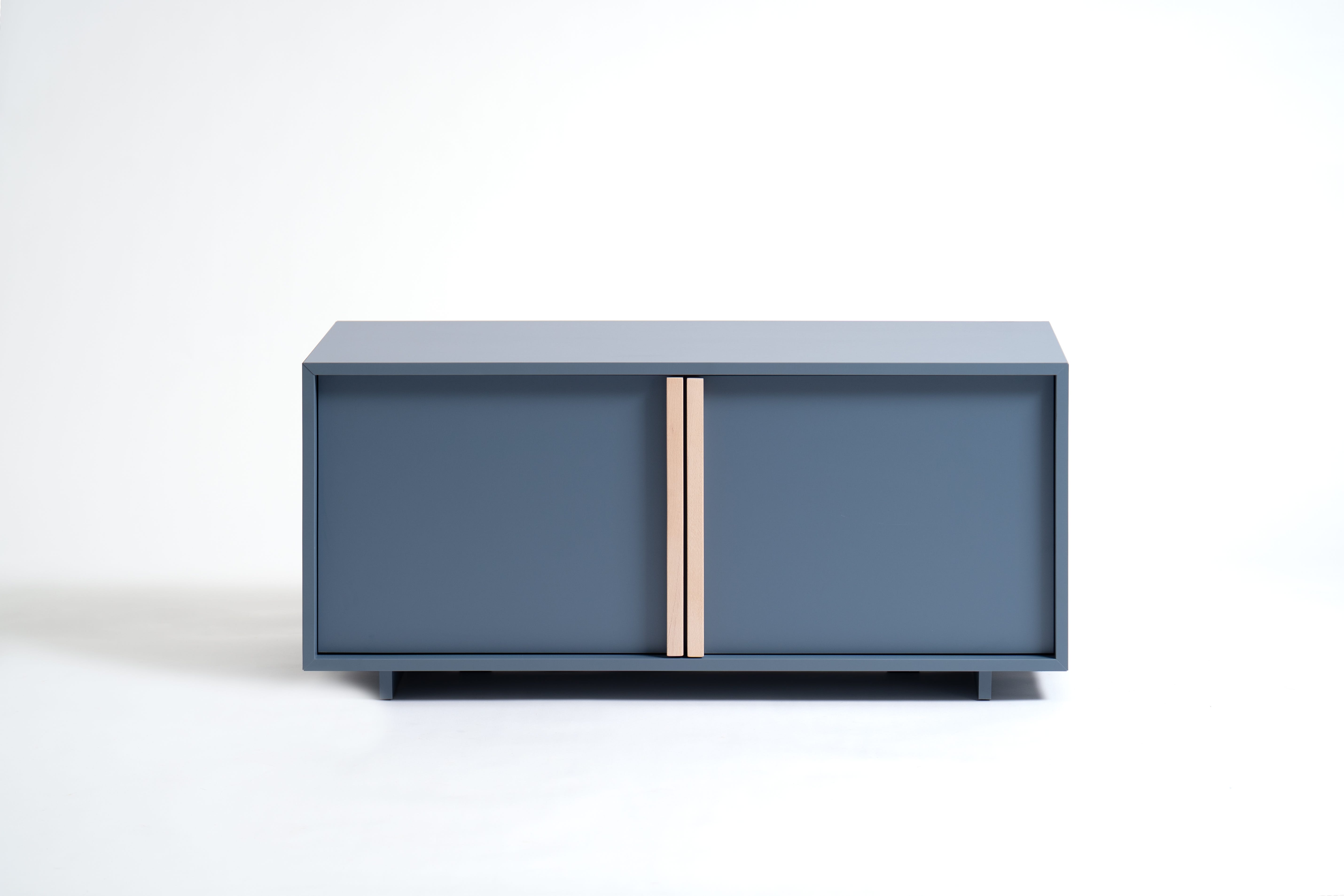
Teto Space is a new furniture brand focused on online sales for the home, particularly the living room. It was born inside a larger group specialised in office furniture, with solid production capacity and a strong focus on melamine surfaces.
They approached me because of my previous experience with successful e-commerce brands. As you know, I think and write a lot about designing physical products for the digital era - so this was the right opportunity to put some updated theory into practice.
The brief was simple and well structured: design a tv stand using melamine surfaces as the main material, within specific measurements to allow easy shipping with their existing logistics partners, and within a defined price range.
The real challenge, then, was to create something at the right price point that still had enough aesthetic confidence to be relevant in online distribution - and to actually be a good product in real life. It sounds standard, but when you put the numbers down, the goal was a genuine balance between construction rationality and design feeling, staying away from trends and aiming for something more durable.
When you design for online distribution, following trends is a very sweet drug. Good design should always aim for something more. I wrote about this in a previous issue - “We risk designing the same things: here’s how I avoid it” - you’ll find the link at the end of this issue.
After a few days of sketching and brainstorming, I had around six solid ideas. After discussing them with the company, we agreed on one direction.
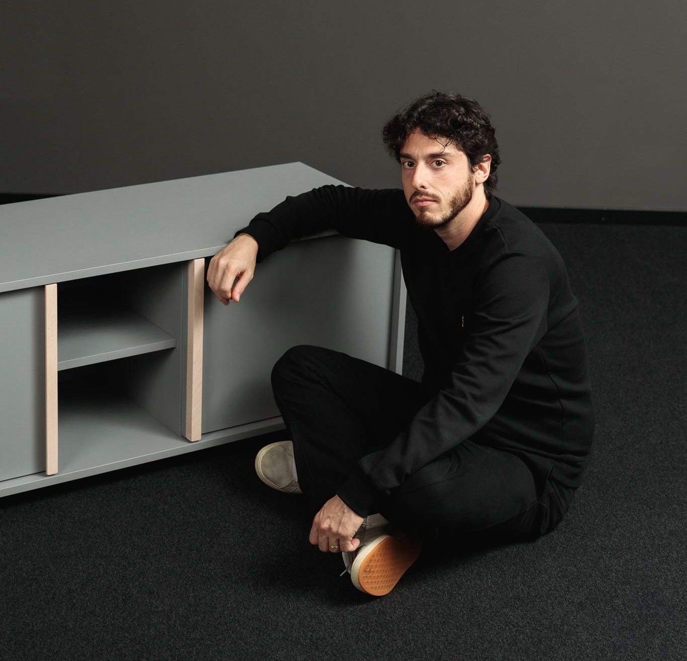
The concept was a simple container with a frame - obtained by stepping back the doors slightly - and a solid wood handle aligned with that frame. The handle would create a visual signature, giving character to what is otherwise a straightforward construction. At the same time, it would give the user a tactile, material experience while using the piece.
A visual thought for the selling phase. A material detail genuinely designed with use in mind. Simple, but relevant. No fakes.
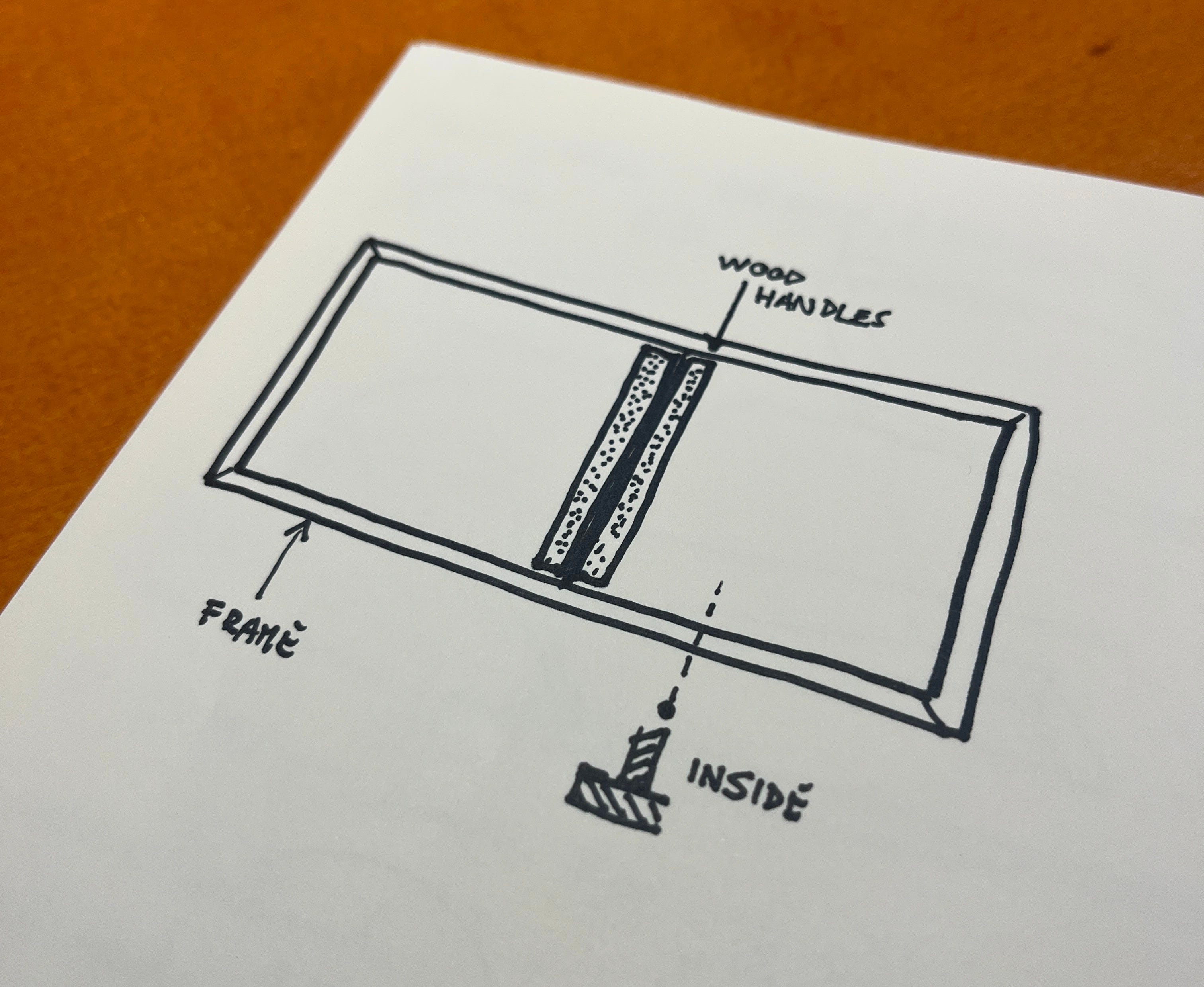
Once the direction was clear, the path was about finding the right production method with R&D and defining the right proportions.
The measurements weren’t complicated - this isn’t a new product category. What generated the most discussion was the handle shape.
I wanted it flat from the front and very simple in profile. I was pushed back: handles need a grip, and in most cases that grip gets overdesigned. I have theories about why we tend to overdesign things, but that’s a topic for another day.
I wanted simplicity. They wanted to follow safer conventions. There was only one way to settle it: make it.
So I built a prototype and proved it worked.
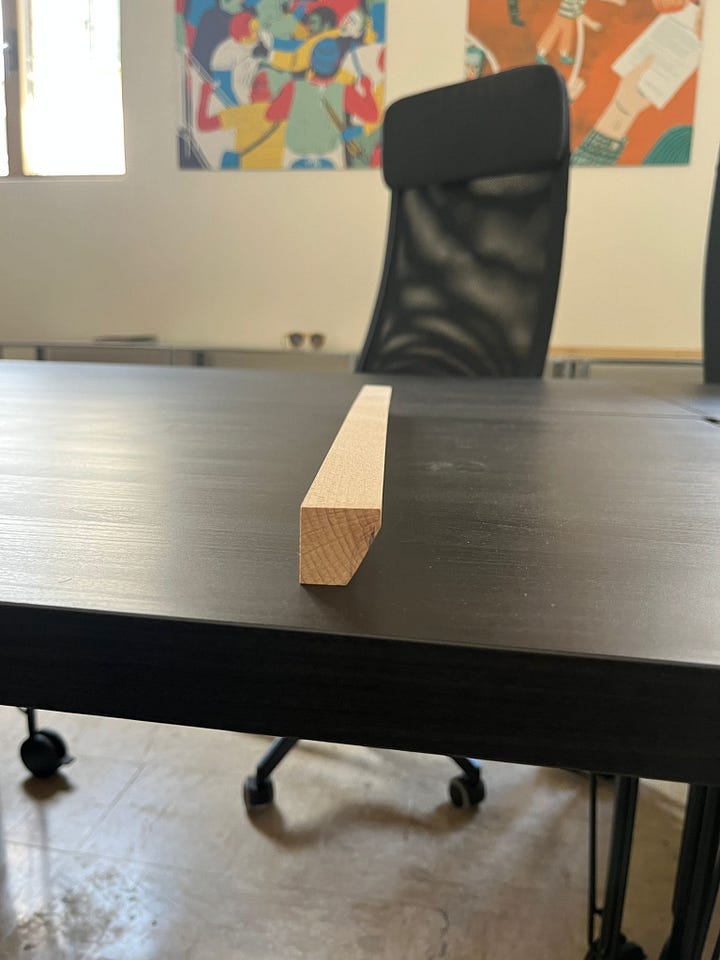
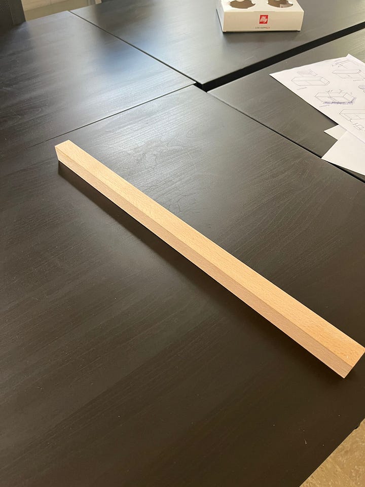
It wasn’t about being attached to my original sketch. I genuinely believed that changing the handle too much would have diluted the whole feeling of the product - and that feeling was exactly what made it right for this context. The prototype confirmed it.
Once the handle was resolved and the right supplier found - solid wood required outsourcing - we moved to a first full prototype.
A few small fixes, mostly on the production side. And given the rational, repeatable construction, we decided to extend the range: small, medium, and large.
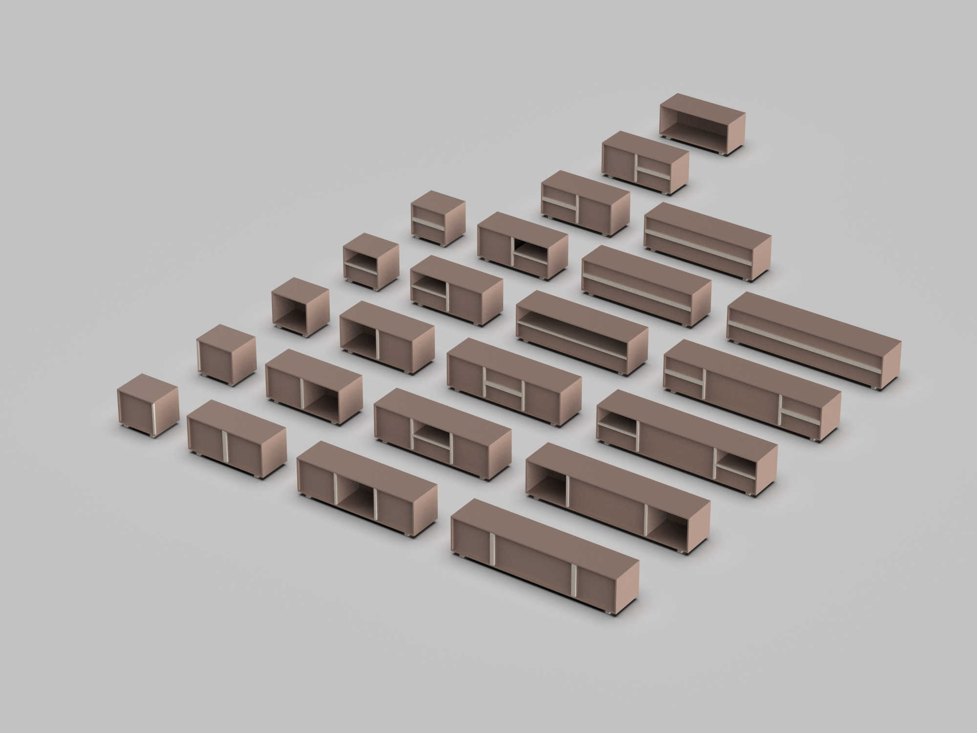
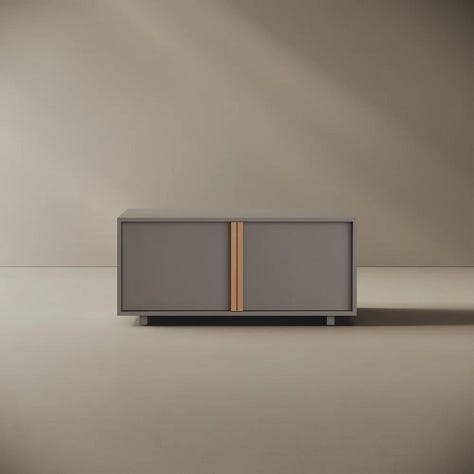
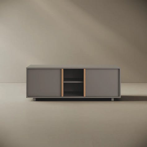
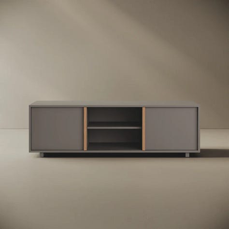
And voilà.
The whole process was smoother than expected. I think this is directly connected to the time I’ve been investing in building a clear theory about how design is shaped by new media and new distribution channels.
When you work with companies, having a defined and tested method is extremely useful. It’s not science - everything is personal, connected to a personal way of working. But that’s the interesting part of this job. It’s what makes every designer different, and why the result changes when you brief different people.
If you found this useful, leave a ❤️ - it's the clearest signal you can send me that this is worth continuing. And if someone comes to mind who'd enjoy reading this, share it with them.
Let me know your case in the comment section.
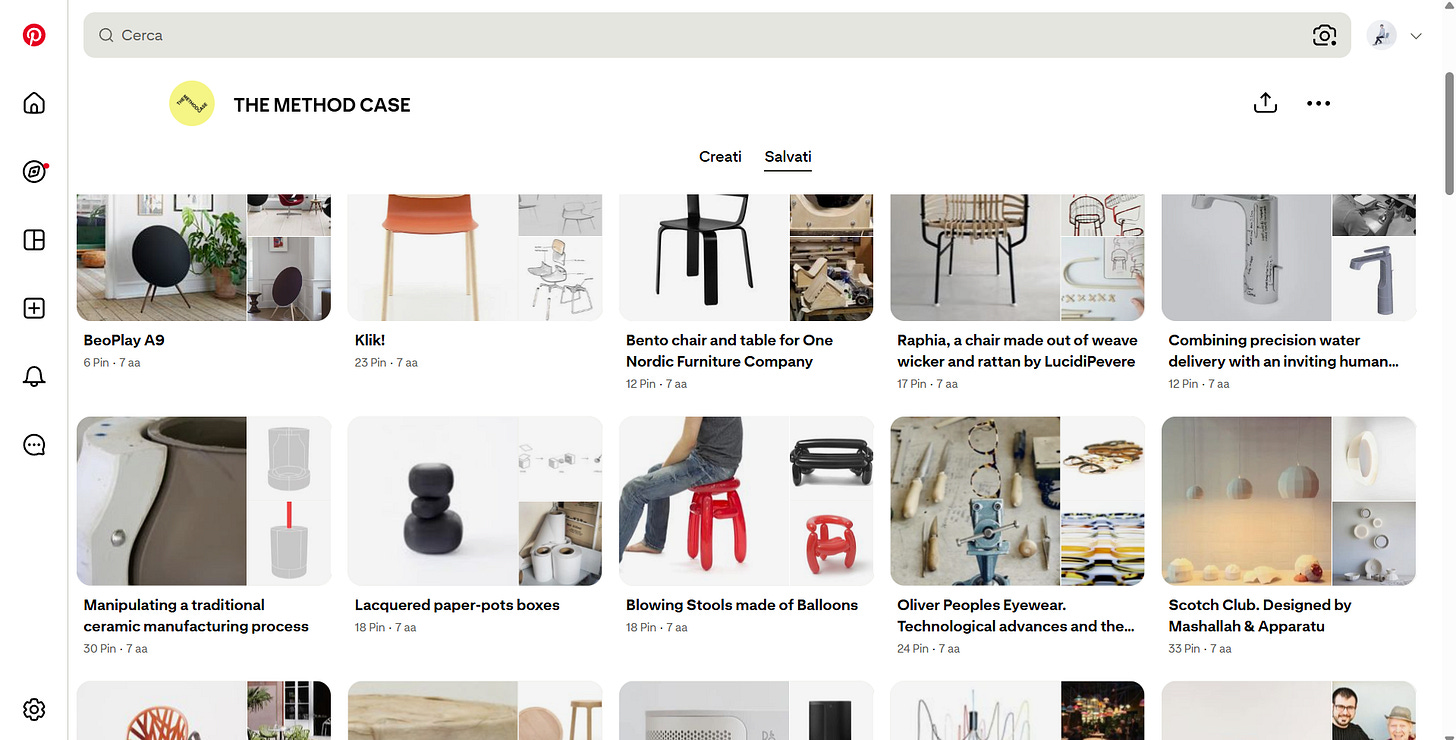
One of the biggest losses for the design community is the closure of The Method Case. It was one of my favourite blogs - genuinely motivational, and it fuelled my desire to design and get my hands dirty with prototypes. This was years before designers started making videos about their process.
The website is gone, but the Pinterest page is still there. Click the image to visit it.
I don’t know who was behind it. If you do, let me know privately - I’d love to get in touch.
To continue this sad series on things that come to an end: this week we put a flower on the grave of Barber & Osgerby. The studio is closing after 30 years.
The duo was one of my biggest inspirations, and if you were in Milan recently you probably saw their exhibition at the Triennale - a clear demonstration of how consistently they controlled the form of everything they made. Remarkable.
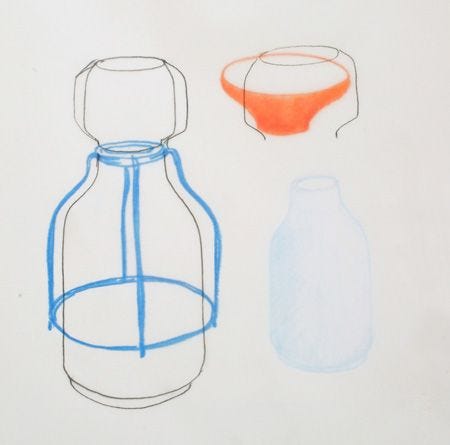
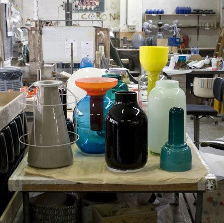
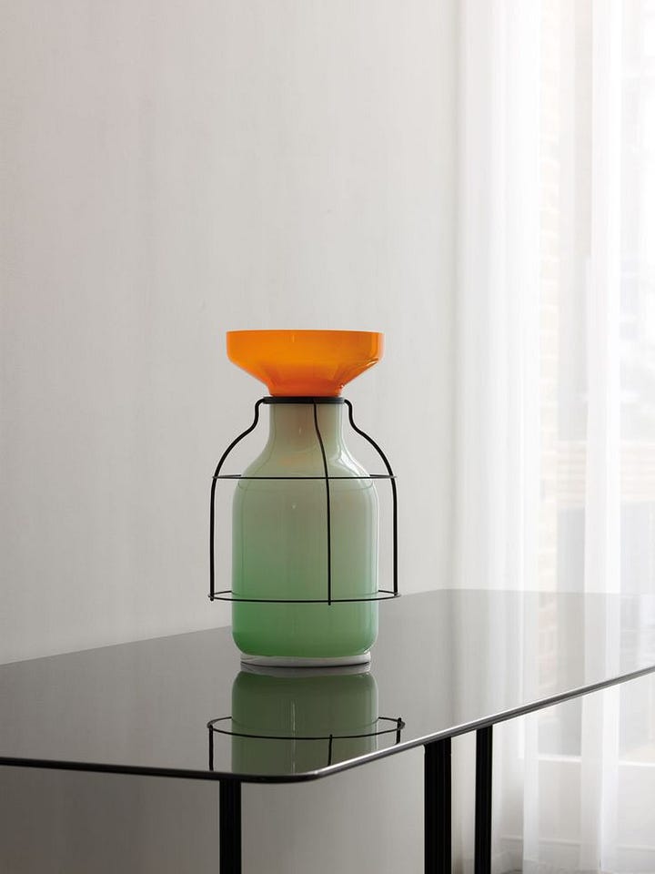
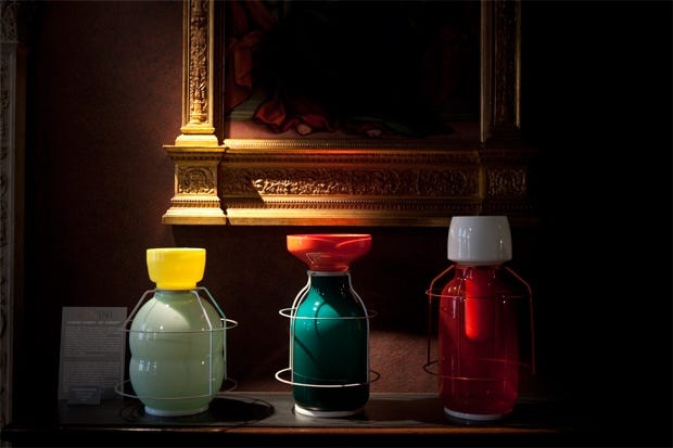
I want to share their vase collection for Venini, Lanterne Marine, made around 2009 - and now very expensive. It was one of the first examples of vases built from a deliberate combination of shapes and materials. After them, dozens of “inspired” products followed.
This newsletter is supported by:

Thanks for reading. Here are three more articles if you want to go deeper:
❤ If you want to: collaborate as a brand - sponsor this newsletter - simply get in touch
Send an email to info@marioalessiani.com or send a message - don’t be shy, I reply to everyone.
More to keep in touch:
Linkedin: where I’m most active
Instagram: a window with my recent design works
Thanks again for being part of this community and in case you want to share this with someone…
If someone forwarded this to you…
With love,
Mario
No posts
Comments
Nothing yet. Say the first thing.
Sign in to join the conversation.