Companies and designers have always invested in product photography. For a long time, the main purpose was catalogues and ads, mostly in print.
Things have shifted online, and while we used to just post print-focused photos on the web, the game is changing. It’s now time to create images specifically for digital purposes.
Fashion, food, and cosmetics made the leap as soon as the internet smelled like business (and money). Design is a bit late to the party, but it’s gaining ground.
What makes the perfect product picture today? Let’s dive into these 5 points.
This realease of Designer From Nowhere is brought to you by:
IED and Accademia di Como are offering 127 Scholarships for Master of Arts and Master's Programs starting in the 2026/2027 academic year across its campuses in Italy and Spain. Click on the image to know more.
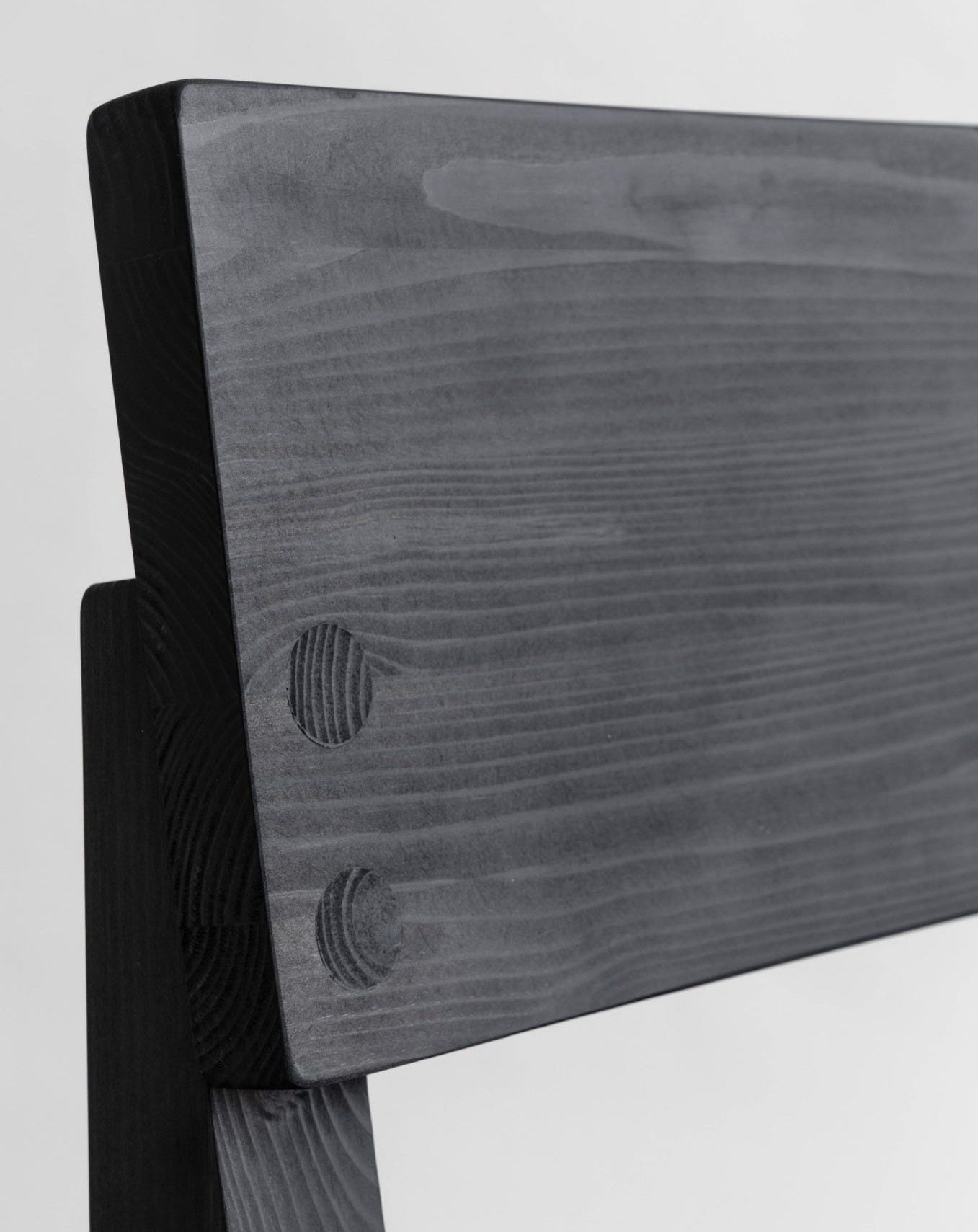
On a screen, acrylic and solid wood can often look identical. Knowing this, finding a way to help people perceive a material’s true nature through an image is essential. As Juhani Pallasmaa writes in The Eyes of the Skin, touch is an extension of sight. Helping people understand what it feels like to touch and feel a material - without ever holding it - is a vital skill in today’s digital world.
Vaarni masters in let you image the feeling of the material, in this case Scots Pine.
Lighting is a narrative tool. In a store, a salesman knows exactly which strings to pull and in what order. In photography, light takes over this role, guiding the eye along a specific path so the viewer knows exactly where to look - without a single word. When combined with the right colors and materials, it’s explosive. Essentially, it’s about controlling the visual hierarchy of the image.
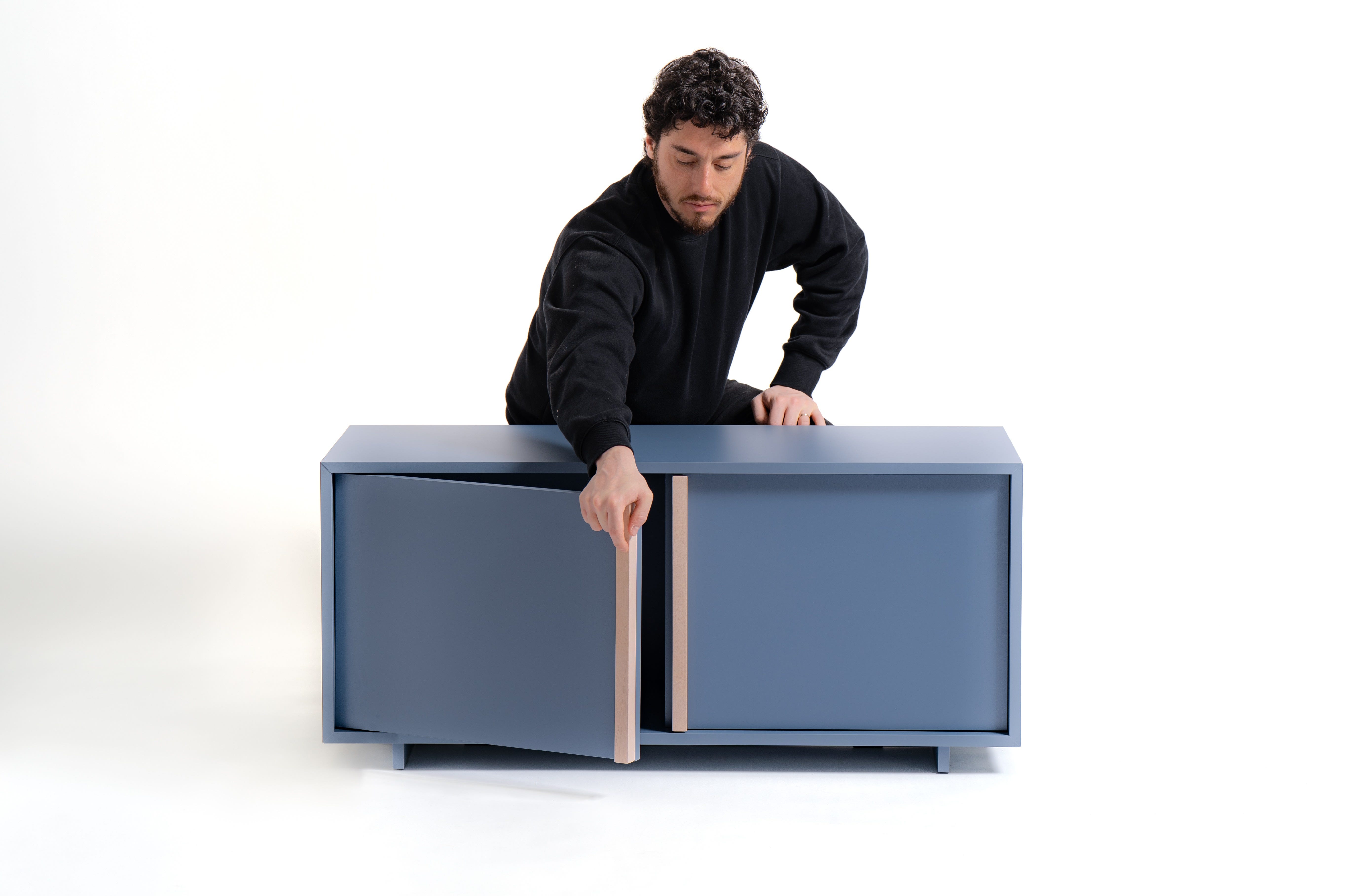
This might sound cliché because design teachers have been preaching it since the Stone Age (Donald Norman, just to mention one), but placing a product in a real environment has never been more critical. I’m not talking about those over-stylized sets you’d find in a 2009 issue of Abitare; I’m talking about the actual spaces the product was meant for when it was first conceptualized. People buy a product when they find a perfect match: “It’s exactly what I need, for the space I have, to do the task I need done.” The closer you get to that reality, the more likely you are to hit the mark.
This cabinet designed by Stefan Scholten for Hay is very well explained in a everyday life scene.
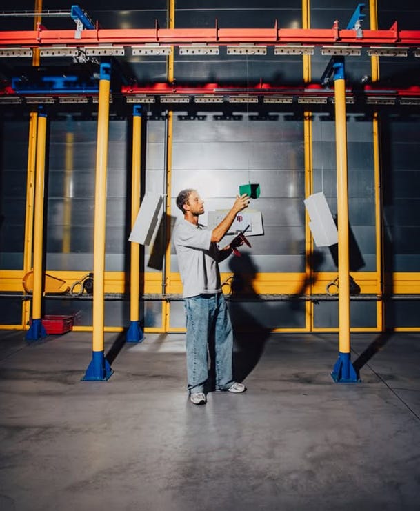
This links back to the first point. Life is so digital right now that it’s almost impossible to distinguish a real photo from something generated by a computer or AI. That’s why it is fundamental to show the product with honesty - not just as a digital representation. You need to provide proof that the product exists in real life, especially if you are a new brand and people don’t yet have a history of your quality to trust. Can Apple use CGI? Yes. Can a new brand? Probably not.
This emerging design brand called Peltia is showing the manufacturing process to demonstrate that the product is there, manufactured in Italy, no scams.
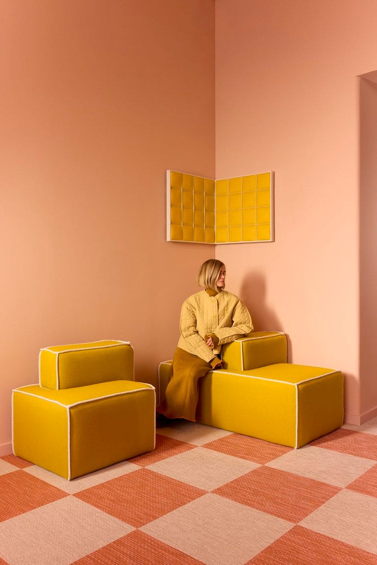
Today, someone is far more likely to see your product on a smartphone than in a book or on a desktop screen. This is something you cannot afford to forget while shooting; otherwise, the visual effect can feel "off." The best part? A vertical-first approach is still perfectly replicable and effective on horizontal screens. It’s not that complicated.
Tekla Evelina Severin is a designer who found the success online. Everything she does is thought with the web in mind.
The irony is that big brands not specialized in furniture -I’m thinking of Zara and the like - have mastered the art of marketing through great imagery. They make their products look premium and expensive, like high-fashion garments, even whenthey can’t actually compete with the quality of design-driven companies in real life.
To make people perceive true quality, we must use imagery and storytelling to bridge the gap. Otherwise, the game is won only by those with the biggest marketing budgets. Authentic design and quality risk becoming exclusive to the few niche channels that can still afford to market only in the physical world.
I’m sure there’s someone out there who needs to read this, so don’t be shy, share it with them.
If you want to share your opinion, I’d love to hear from you in the comments. Let’s start a healthy discussion about what a product picture should look like today.
Last but not least, show your support by hitting the ❤️ like ❤️ button on this post. Your small gesture is the real fuel for this free newsletter and helps me understand that you appreciate and support Designer From Nowhere.
It’s time to release one of my latest products.
This was designed exclusively for e-commerce, and I developed it by applying all the "boring" principles I ramble about here and on LinkedIn. I was wondering if you’d be interested in seeing the full case study, similar to the one I did for the paper roll holder last year. Let me know in the poll below.
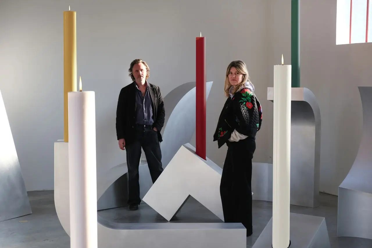
Design Wanted has started publishing my second series of Design Theories - an editorial where I analyze designers and studios, tracing a “common thread” through their practice to understand what makes them special and help define their method. It’s a bit like what you find in design history books, but focused on contemporary, relevant figures. The first installment features Muller Van Severen, who recently celebrated 15 years in the game. Click on the image below to read the article.
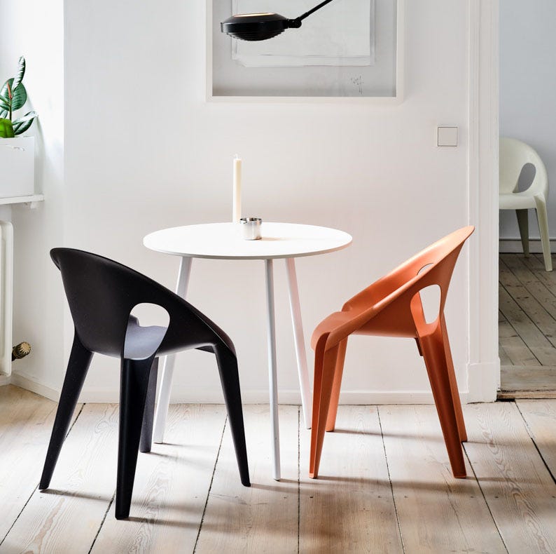
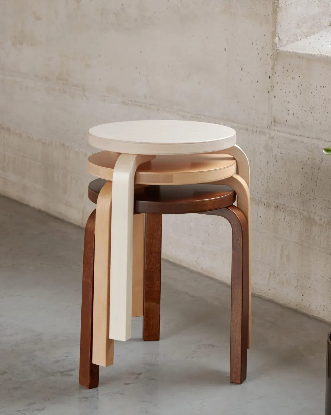
Here is a selection of three products that have been photographed so effectively they utilize 100% of their "charm power."
The MagisBell Chair is one of the few examples of a monoblock that can be used for both residential and HoReCa settings without shame. Aside from being beautiful, the way it’s pictured makes you feel that any place is the right place for it.
Plastiz and Volume Uno did a great job of helping people understand all the visual and tactile characteristics of an uncommon material through a single image.
The Artek Stool 60 is one of the most copied stools of all time (and yes, it’s remarkably similar to the one you’d find at your favorite Swedish giant). To prove its authenticity, look for those visible details in the wood’s texture - tangible proof that Artek deals in the real thing - not just in appearances.





Comments
Nothing yet. Say the first thing.
Sign in to join the conversation.