
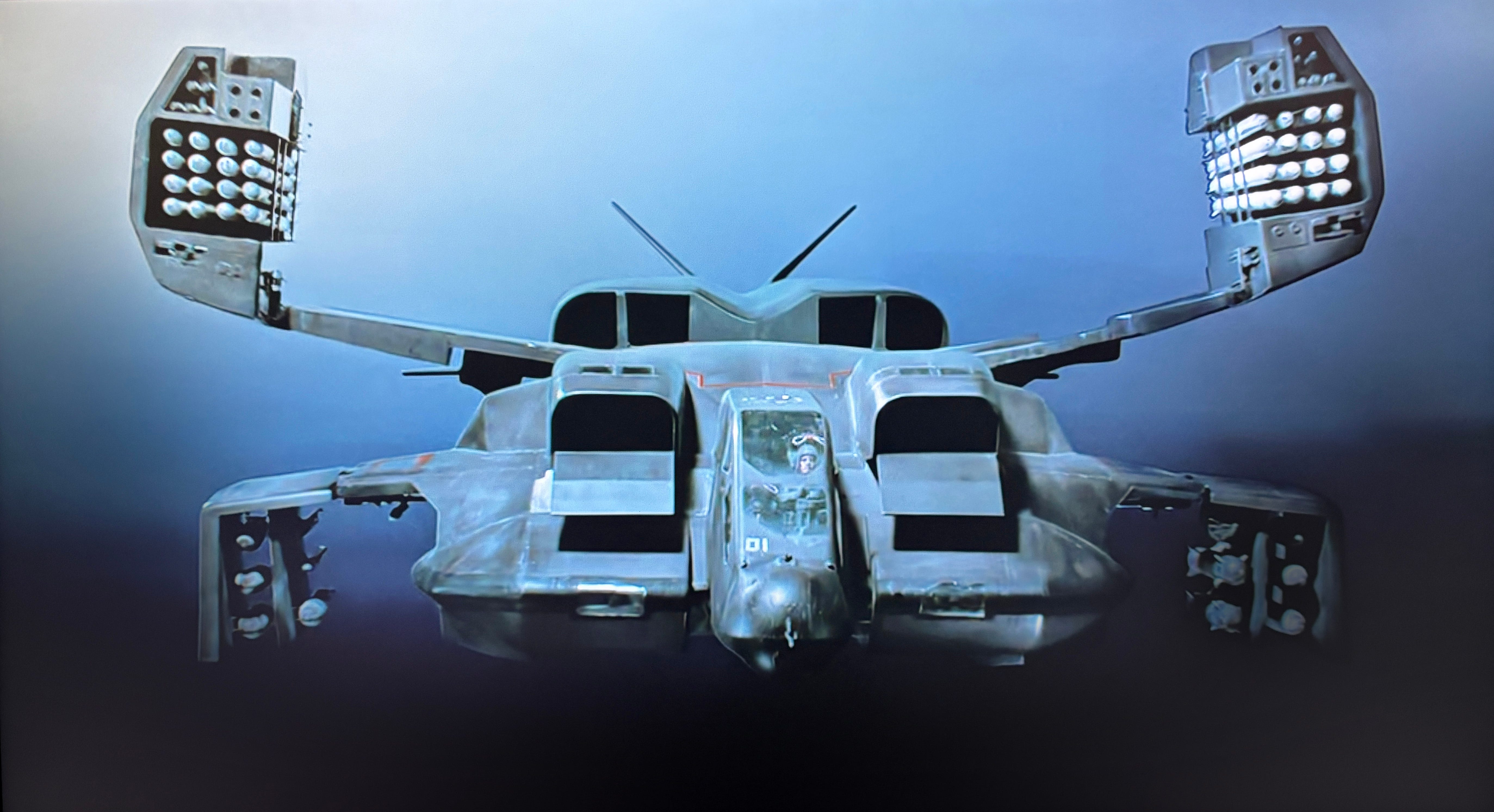
“We're on an express elevator to hell, going down!” The Colonial Marines’ UD-4L dropship: a machine that looks as though it had a job long before the cameras arrived.
Last week, a Xenomorph found respectable work as a gargoyle on Paisley Abbey. This week, I want to look at the vehicle sent to stamp on it.
The Colonial Marines’ dropship in James Cameron’s Aliens is one of those rare science-fiction machines that seems to have existed before the film began. It has folding wings, weapons, stencilled warnings and the general air of something that has seen action. A lot of action.
It also has a cartoon eagle in oversized boots firing a rifle painted on its nose. Above it are the words Bug Stomper. Below it is the rather less diplomatic slogan We Endanger Species.
This is not subtle, but it is brilliant.
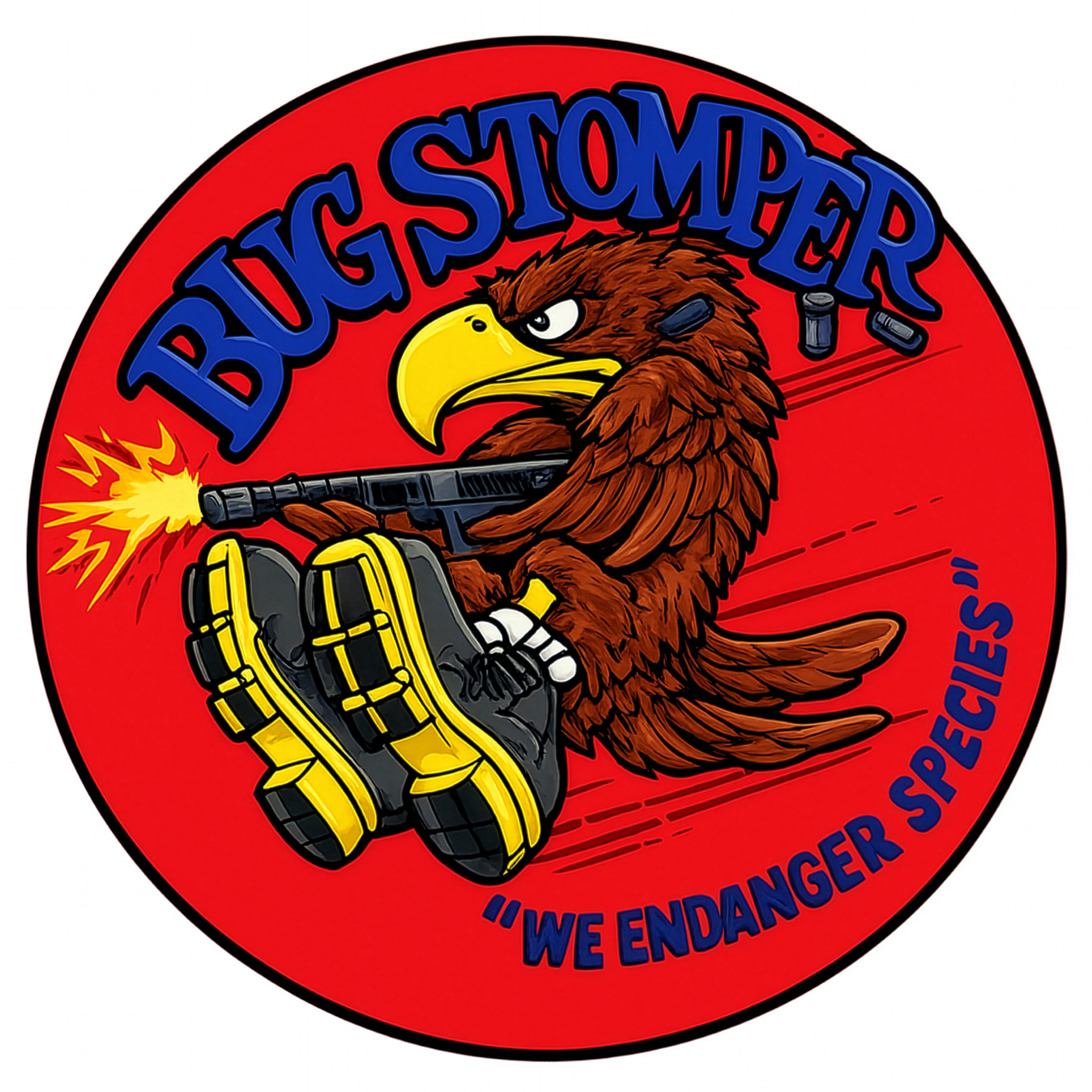
Bug Stomper “We Endanger Species” A name, mascot, threat and bad joke compressed into one piece of nose art.
The emblem was designed by Ron Cobb during Aliens’ preproduction in 1985. His surviving drawing identifies it as a decal intended for the dropship, and the same artwork later appeared on jackets made for members of the production. (I have not found an exact date, or a reliable account of who first coined the name and slogan, but if you have some intel, let me know!)
The image gives the aircraft a name, mascot and attitude in a few square feet of paint. The film does not explain any of this; nobody points at the eagle or explains to Ripley the Bug Stomper’s distinguished operational history. The dropship simply turns up carrying evidence of a life beyond the frame. That is worldbuilding done properly.
Real machines are almost never the work of one mind. The marketing department sets requirements, engineers make it work, regulators require warnings and owners apply liveries. Then the people who use the machine add labels, jokes, and small pieces of personal history.
As an architect, I recognise this immediately. A building may begin with a clear design language, but it rarely keeps one for long. Building codes require signage. Facilities management adds laminated instructions. HR destroys all hope of happiness. Someone tapes a message to the microwave asking people to clean it.
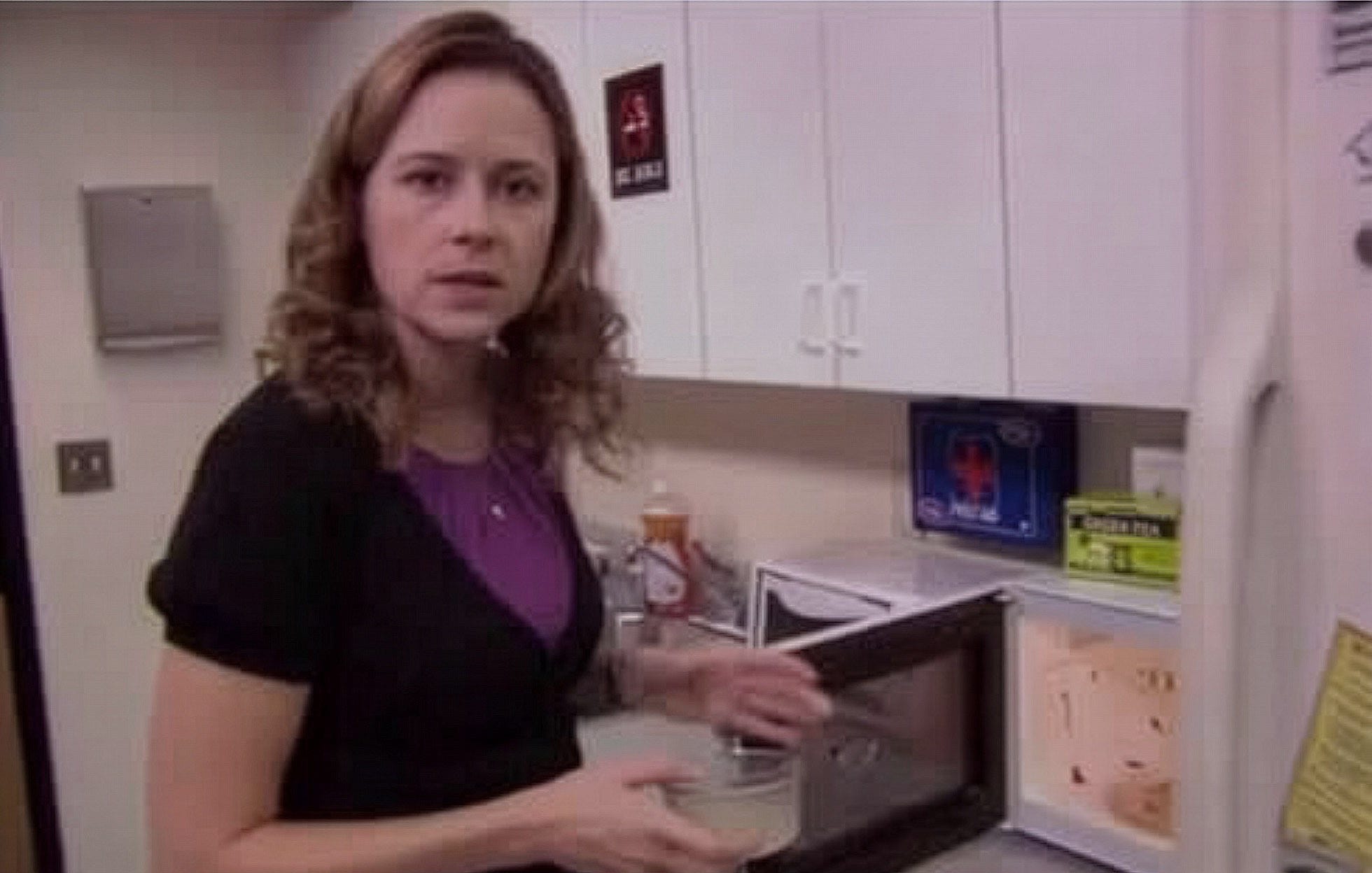
We can all agree that it was Phyllis that made the microwave mess, right?
A lot of science-fiction design misses this. Every panel, uniform, logo and coffee cup appears to have come from the same design department on the same afternoon. The typography matches. The colors coordinate. Even the dirt seems to have been issued with a style guide.
The world looks designed, but not necessarily used.
Aliens avoids that problem because its machinery contains several visual systems at once. Peter Lamont oversaw the production design, with Ron Cobb and Syd Mead contributing major concept work. The dropship was collaborative, shaped by James Cameron, Cobb and the production team. Mead concentrated on the Sulaco; Cobb worked extensively on Colonial Marine and colony hardware.
The emblem also belongs to the Vietnam-era military language that shaped the film. The dropship was meant to recall aircraft such as the F-4 Phantom and the Huey. Cobb had served in the US Army in Vietnam, and his cartoon eagle sits comfortably within the tradition of squadron patches, aircraft nose art and barracks humour.
The eagle reads as American military swagger: the large boots make Stomper literal, the rifle removes any doubt about what the stomping involves, the slogan turns the language of conservation into a boast about extermination.
It is boastful, juvenile and memorable.
It also tells us how the Marines see themselves. When they arrive on LV-426, they expect another “bug hunt.” They assume training, firepower and swagger will carry them through. The eagle is already celebrating victory over an enemy it has not met.
Then, well, things do not go according to plan.
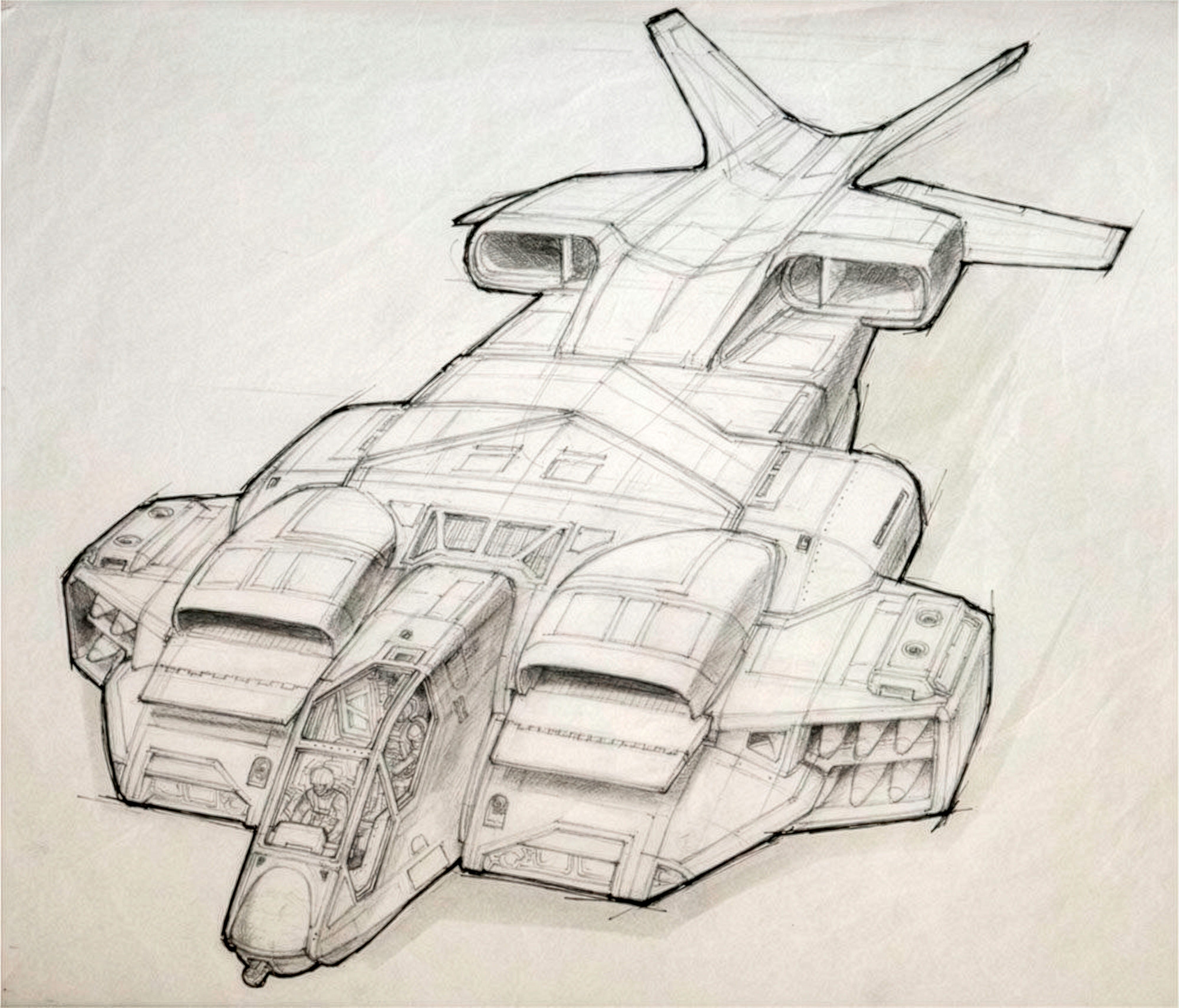
Ron Cobb’s concept work for the dropship. The final vehicle was collaborative, but Cobb’s drawings helped give the Colonial Marine hardware the character of equipment designed around a real job.
The dropship still feels real forty years later because it understands that people mark the things they rely on.
That distinction matters for Fleet Obscura.
A Fleet Seven ship already carries several official identities. Blackwater-Strand owns or operates it. The registry records its fleet, class, shipyard and production history. A shorter hull code is stencilled across service panels and landing bays. Warning symbols explain which openings will vent atmosphere, irradiate maintenance crews or remove limbs.
All of that tells us where the ship sits inside the system, but it does not tell us who it belongs to.
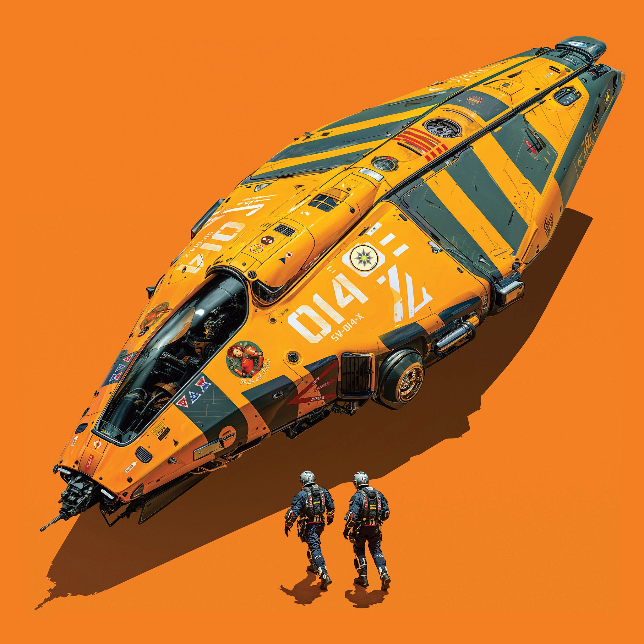
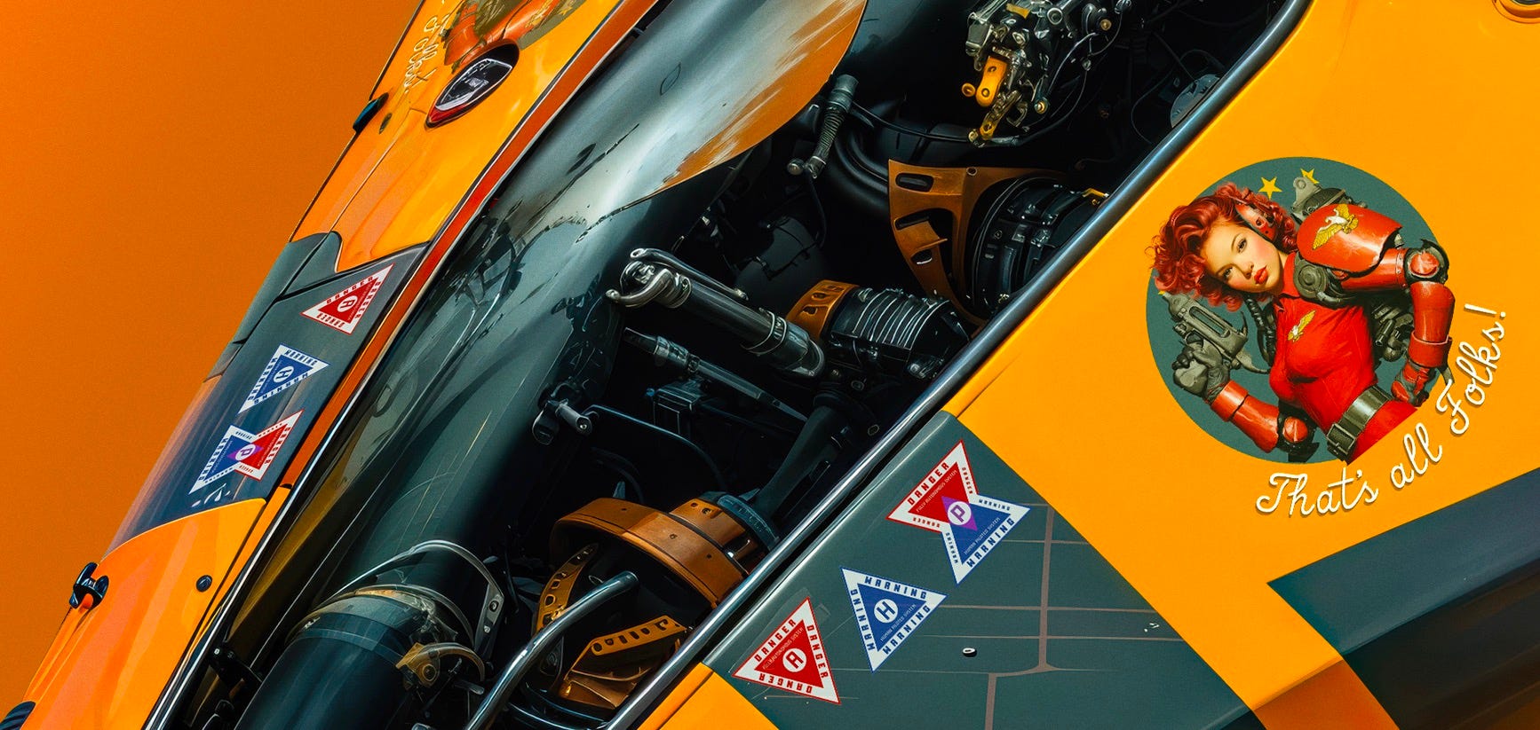
Cockpit detail of the Cartography Department's Stealth Pathfinder ‘I Was never Here.’ showing Fleet Seven’s interpretation of the Foss Mark: part guardian figure, part squadron emblem and part declaration of loyalty.
That is where Captain Mairead Foss enters the picture. Her portrait is not another corporate logo, and it should never look as though Blackwater-Strand’s marketing department approved it. It is the Fleet Seven emblem: part guardain figure, part squadron badge and part declaration of loyalty. Different crews paint the Foss Mark differently, place her in different parts of the ship and alter the image through repairs, campaigns and private jokes.
The official markings identify the vessel; the crew’s loyalty to Foss gives it a face.
And now something a little closer to home …
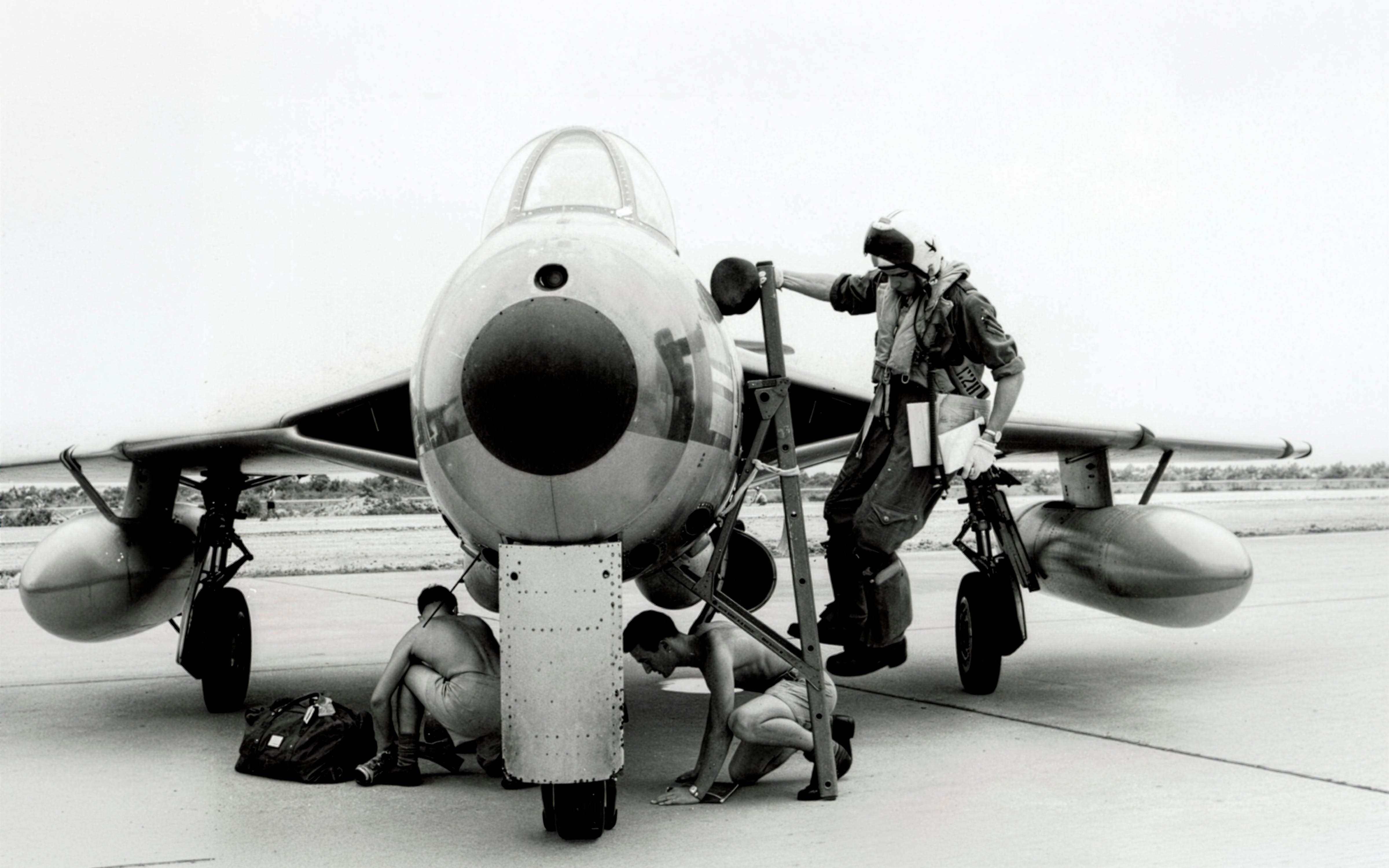
22nd May, 1964. My dad arriving at Udon Airfield, North East Thailand from RAF Tengah, his base in Singapore. “This was right up near the Laos border, when the Vietnam war was on. Long flight from Singapore, and getting low on fuel on arrival … carrying the flight maps in my hand as there was no GPS in those days!” Love you dad!
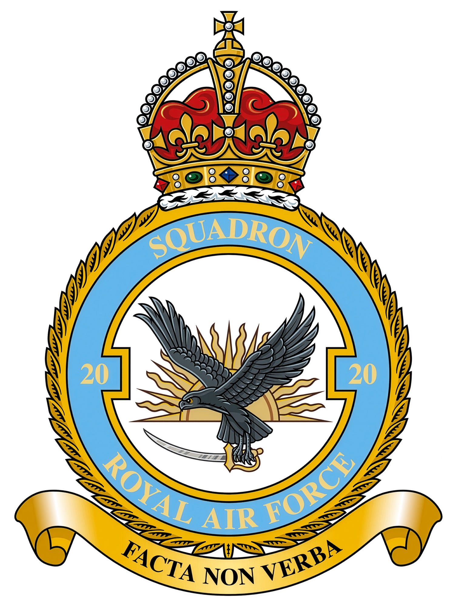
The emblem of No. 20 Squadron RAF. Its motto, Facta non verba, means “Deeds Not Words” which is way cooler than Fleet Seven’s “That’s All Folks!”
Perhaps this is why squadron emblems have always interested me. My father served with No. 20 Squadron, RAF. Its rising sun recalls service in India and the Far East; the black eagle represents endurance and air power; and the Indian talwar records its relationship with soldiers on the ground. Its motto, Facta Non Verba—“Deeds, not words”—gives the emblem its character.
Long before I designed Fleet Seven, I understood that a squadron badge could mean far more to those who carried it than its official description suggested…
The Foss Mark belongs to that same tradition.
Until next week 🚀
Jim.
Comments
Nothing yet. Say the first thing.
Sign in to join the conversation.