
A couple months ago, I went full nerd and did something I’d been wanting to do for years. I used Claude to analyze 900+ PickFu split testing polls (now 1,038+) from 34K (now 38K+) respondents across the 850+ eCommerce brands we’ve worked with. The result was a database that lets me look up trends, spot patterns, and answer almost any question about a client’s creative before we even start designing. This has reframed how my team and I make every creative decision and I’m sharing all of it here in Design Proof. Twice a week: data-backed creative insights to help you convert better on Amazon and eCommerce.
Maybe it’s the cool kids, maybe it’s the smart kids but I’m starting to see this design trend hit every category. It likely started in the beauty space and now I see it spreading to various different categories like supplements and pet.
Call it clinical, or science-driven, or lab-coded. You know it the second you see it. It can be one or multiple of these elements in the design combined to create the effect of a data backed trustworthy product.
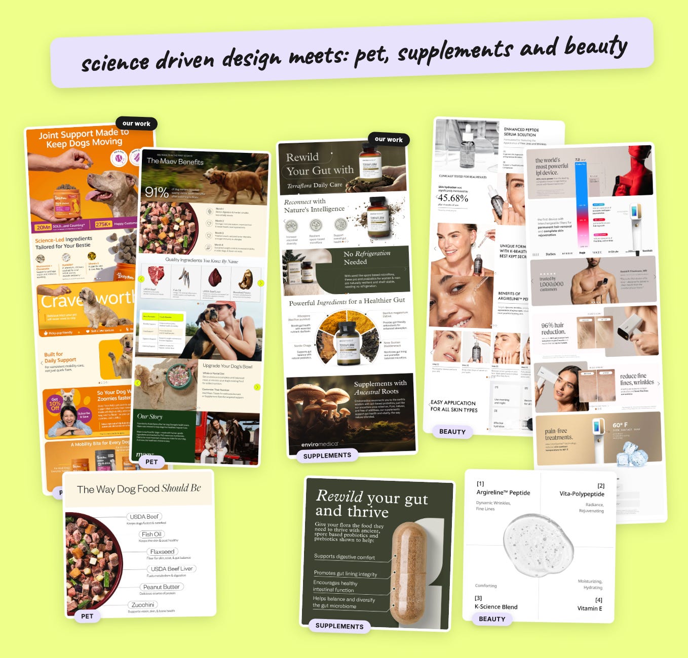
Elements like these:
A big number sitting on its own in the hero.
Precise decimals instead of round figures (45.68% vs 45%).
A footnote citing the exact third party lab used for testing.
Named actives with trademark symbols.
Thin type fonts
Restrained or minimal palette
Lots of white space and breathing room in the design
It started in beauty, and that part makes sense. Beauty has been selling clinical credibility for decades, so they had the vocabulary first.
What I find genuinely interesting is that it isn’t staying there. It’s showing up in supplements. It’s showing up in pet.
And the brands adopting it are not copying beauty page-for-page, they’re adapting the aesthetic to their own category, sometimes in really smart ways.
Here are five product pages I pulled from Amazon, across three categories.
For transparency: Two of these are our designs. We designed the Zesty Paws page and the Enviromedica page, and both are live right now. Depology was a client of ours previously. Nood (a previous client), Maev and the rest are not our recent clients but I’m including them because I’m a fan of their work and it illustrates this trend well.
I also did the next obvious thing and ran the looks through our own testing data.
This post is about conversion, so everything below comes from product image stack tests and A+ content tests only. Nothing from main image tests.
That distinction matters for Amazon conversion :
Your main image has one job, which is stealing the click out from your competitors in the search results. It’s a click-through lever.
Your product image stack and your A+ content are what a shopper actually digests once they’re inside your listing. That’s where the “buy now” happens. That is your conversion lever.
An aesthetic decision is a conversion decision, because the look of the whole design is something a shopper only experiences after the click.
Everything below is a sample of our database, 84 conversion tests:
51 A+ content tests and 33 verified product image stack tests, covering 660 individual stack images we tagged one at a time.
The evidence works. The thin type font does not.
The clearest single example, and the one you should test tomorrow :
Protip: The ingredient breakdown image is the only image format that wins in both places we tested it (Product image stack and A+ content stack).
Things like a picture that shows what's inside the product. A bar sliced open so you can see the layers. A capsule opened up with the powder next to it. The supplement facts panel blown up big. In A+ content it won 50% (vs 30% baseline). In product image stacks, 38% (vs 27%).
Translation: This is a rare finding with enough confidence to advise that most clients just implement immediately. No pre-testing cautiously, just do it.
Every one of the five brands I analyzed has one. Enviromedica’s radial diagram naming four strains. Maev’s ingredient cards with a function line each. Depology’s four-quadrant peptide layout. They arrived at the same module independently, and our tests say they were right.
Protip: name the actual ingredient and what it does.
Don’t just say, “premium ingredients.” Enviromedica writes very specifically, “Nova Scotian Bladderwrack, reinforces gut lining.” That is what clearly explains the benefit to the customer and convinces them of the value.
Test to run: take the image in your stack that says the least and rebuild it as an ingredient or spec breakdown, with one function line per item. PickFu it against your current stack, then validate the winner on your live listing with a Manage your Experiment test.
🔒 Now Let’s Get To The Good Stuff
Upgrading to paid is like getting the version of my brain that isn’t filtered for a general audience. Less than one Starbucks order per month, and you get the strategy I charge clients real money for, broken down so you can use it yourself.
Below the paywall:
The signature clinical module that loses in four separate tests
Why the big number works and the clinical badge next to it doesn’t
What our own Zesty Paws tests show, across seven polls
A prompt to run on your own page today
The Science-Driven Design Scorecard
Comments
Nothing yet. Say the first thing.
Sign in to join the conversation.