
A couple months ago, I went full nerd and did something I’d been wanting to do for years. I used Claude to analyze 900+ PickFu split testing polls (now 1038+) from 34K (now 38K+) respondents across the 850+ eCommerce brands we’ve worked with. The result was a database that lets me look up trends, spot patterns, and answer almost any question about a client’s creative before we even start designing. This has reframed how my team and I make every creative decision and I’m sharing all of it here in Design Proof. Twice a week: data-backed creative insights to help you convert better on Amazon and eCommerce.
Last week, I wrote a guest piece for the Selling From The Beach newsletter about A+ content. The point I made there: your hero headline shouldn’t answer “what is this,” it should answer “why should I keep scrolling.”
That still applies. But that piece was just the teaser, today I’ll go deeper into the hero structure of successful A+ pages.
After reviewing a batch of our 88 verified A+ tests with more than 2,300 shopper responses here’s what the winning and losing hero section types taught us.
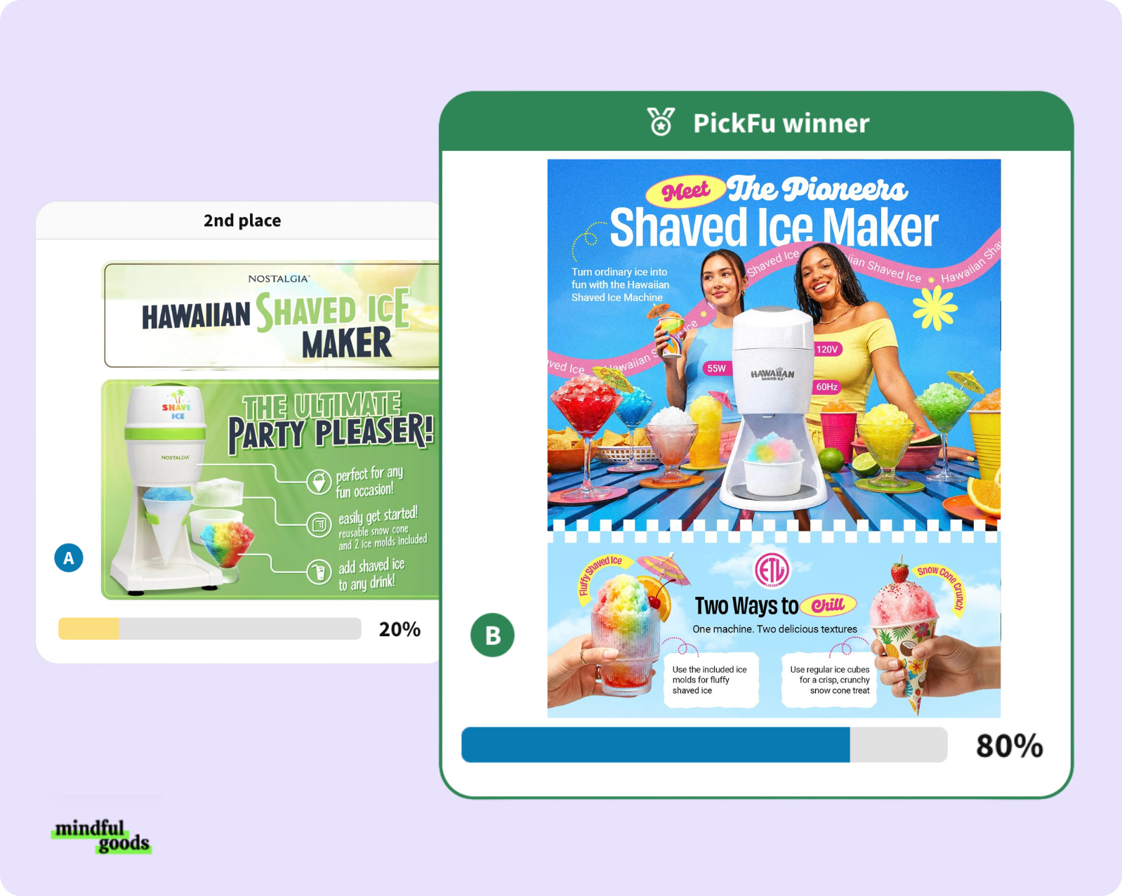
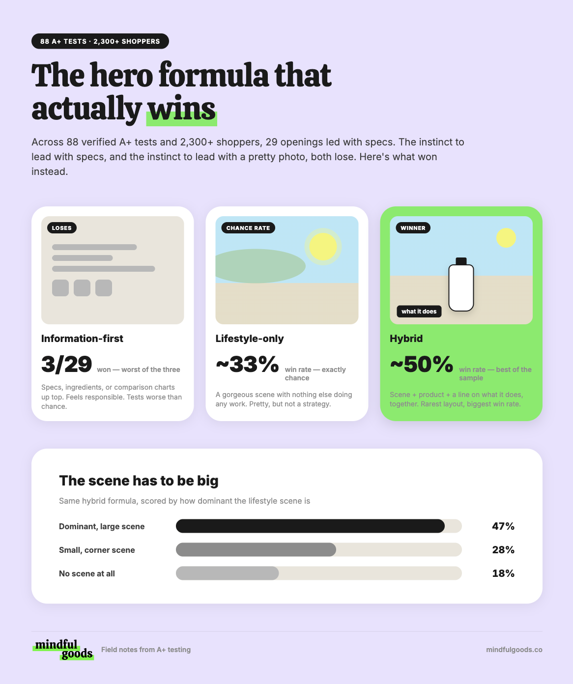
1. The information-first hero is a hard no. A+ pages that opened with specs, ingredients, comparison charts, or a feature rundown won just 3 times out of 29. Chance alone would have predicted a third, so this is the single worst-performing choice. It’s also the most common instinct, sharing the logic first feels like the right move. Tell customers what it is and immediately educate, makes complete sense. Here’s why it’s the wrong move. The data says you’re spending your best real estate on the thing they’ll read last.
2. Here’s the one that makes me cringe: the show stopping hero doesn’t win either. I assumed the lifestyle-led hero would crush the rest. It didn’t. Openings that were purely a lifestyle scene won about a third of the time, again this is exactly what chance predicts. But this part actually makes the most sense, a beautiful photo with nothing else doing any work is not a strategy. It’s just a beautiful photo and a huge missed opportunity to sell.
3. So what actually wins? Hybrid. A hero that combines a large lifestyle scene AND the product AND something that tells you what it does. This is the exact formula that won about half the time against the chance third rate. That combination is the best-performing opening in the entire sample set, and it’s the one I see least often, because most A+ pages commit to being either the pretty hero image or the informative hero.
4. Here’s the kicker: the scene has to be big. This one ties back to our signature design move that we’ve been doing for years. The double module hero. It’s basically two banners combined to make one extra large lifestyle hero. We scored how much this strategy actually won:
A dominant, large scene: won about 47% of the time
A small, supporting scene tucked in a corner: 28%
No scene at all: 18%
Remember, a chance vote sits around 34% for all three. So a small lifestyle image performs much closer to having no scene at all. Half-committing to the double module hero scene gets you almost none of the benefit.
Reflecting back on the findings above, the structure makes a lot of sense. Think of it like a dinner party. You don’t open the door and start sharing the recipe and ingredients you are using. You invite them in, show them the dining room, then you tell them what’s cooking, and the details come up later once they actually want to go deeper.
Test to run: Take your current A+ page, keep every module exactly as designed, and build a second version with only the module order changed: big lifestyle scene first (taking up the top two modules). Run the two against each other on PickFu. That tells you whether your page has a content problem or a sequence problem before you spend a dollar redesigning anything.
Below: the biggest unlock for A+ content messaging with four real examples, and a prompt to run on your A+ content designs today.
🔒 Now Let’s Get To The Good Stuff
Upgrading to paid is like getting the version of my brain that isn’t filtered for a general audience. Less than one Starbucks order per month, and you get the strategy I charge clients real money for, broken down so you can use it yourself.
Below the paywall:
The headline that won nearly two thirds of its tests, and why it’s the opposite of what wins on main images.
Four real client pages, named, with what the winning opening actually did
Why our single best-performing module is the worst thing to put first
Exactly how your A+ should be structured top to bottom
The Claude prompt to run on client A+ pages before you touch the layout
The Above The Fold Scorecard: five things to score your own opening on
Comments
Nothing yet. Say the first thing.
Sign in to join the conversation.