
I opened a client’s storefront last week with one question: do we need to increase dwell time or not?
Increasing dwell time on storefronts has been a focus and best practice for my team for years. The logic is simple: keep people on the page as long as you can, and a percentage of them will convert the longer you hold their attention.
Pair that with strong merchandising and streamlined navigation strategy we’ve usually been able to build a strong storefront. I’ve never really questioned it, and I went in expecting the numbers to tell me how much more of it we needed.
This practice has given us great results like 58% increase in sales from our work with Buffr.
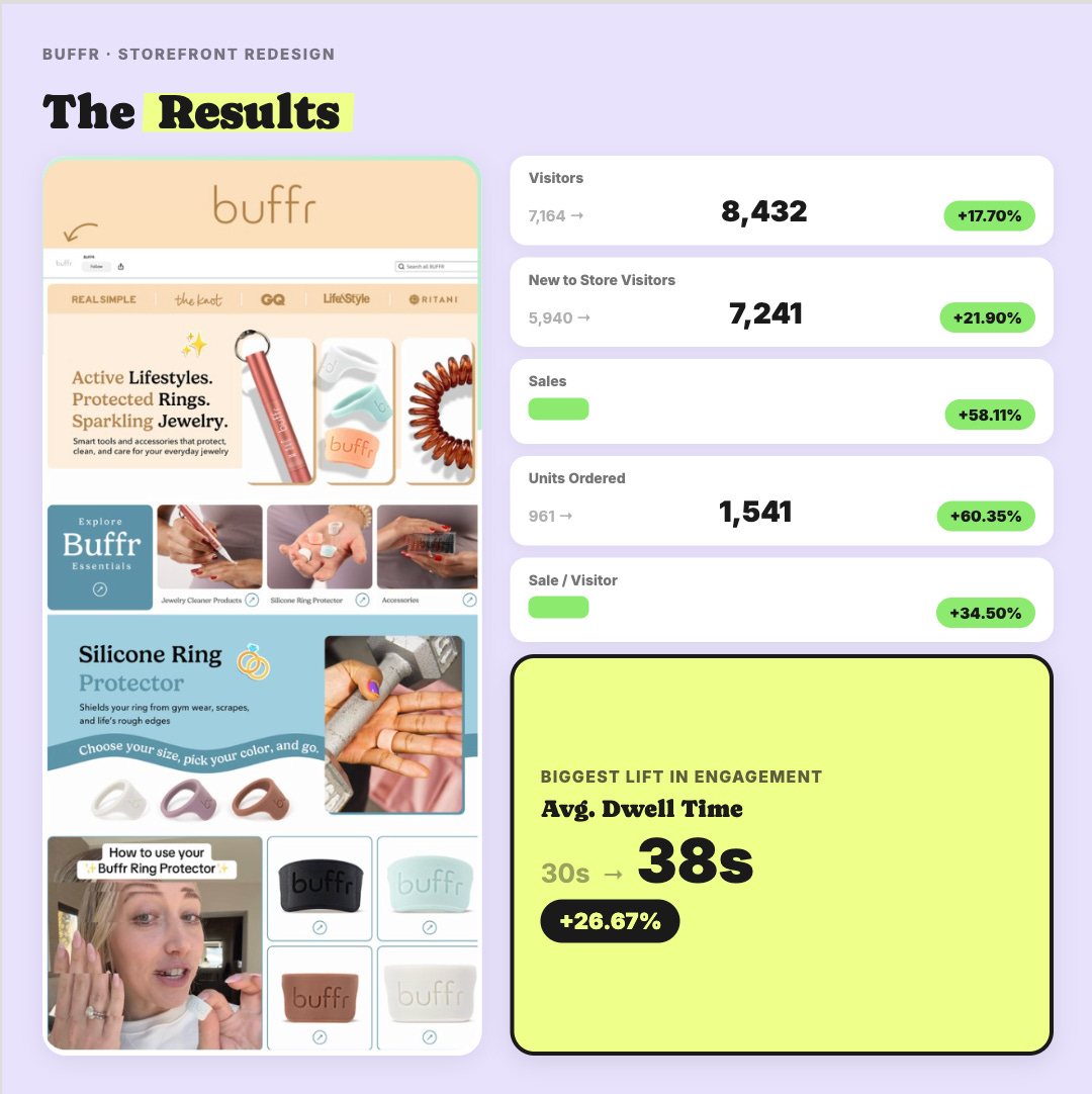
BUT the deeper I dug into Amazon’s new AI storefront tool the more the data revealed and actually made me pump my brakes.
Spoiler alert, dwell time was the wrong focus on a homepage.
Don’t worry, because we’ve developed a new best practice for auditing storefronts.
The important thing to share is that by auditing a handful of client accounts I was able to pinpoint immediate conversion issues with a hit list of fixes we could make immediately, without touching their design at all.
And a conversion killer I almost missed entirely that I wouldn’t have been able to catch without this new process.
Here’s why I think most brands are falling into the design trap, and I’d put us in this bucket too: when a storefront underperforms, it’s easy to treat it as a design problem, because design is the thing you can see.
After this week, I’m certain the better first fix is checking for a routing problem and a module-type problem. Neither of those is visible until you put the store metrics next to your actual design like I did with Claude and Amazon’s AI tool.
I won’t gatekeep this part. To do this yourself there are two steps:
1) Extract as much storefront data as you can.
2) Upload your data and storefront design screenshots to Claude for analysis.
( full step by step breakdown and claude prompt below)
Right now, there are two Amazon tools that will surface your Amazon storefront data. One of them almost nobody has yet.
Last month, I went full nerd and did something I’d been wanting to do for years. I used Claude to analyze 900+ PickFu split testing polls (now 1,000+) from 34K (now 38K) respondents across the 850+ eCommerce brands we’ve worked with. The result was a database that lets me look up trends, spot patterns, and answer almost any question about a client’s creative before we even start designing. This has reframed how my team and I make every creative decision and I’m sharing all of it here in Design Proof. Twice a week: data-backed creative insights to help you convert better on Amazon and eCommerce.
Amazon is testing a feature called Sectional Performance on a small number of accounts. We’ve only seen it on a handful of the ones we have access to.
→ Check your account to see if you have this available to you.
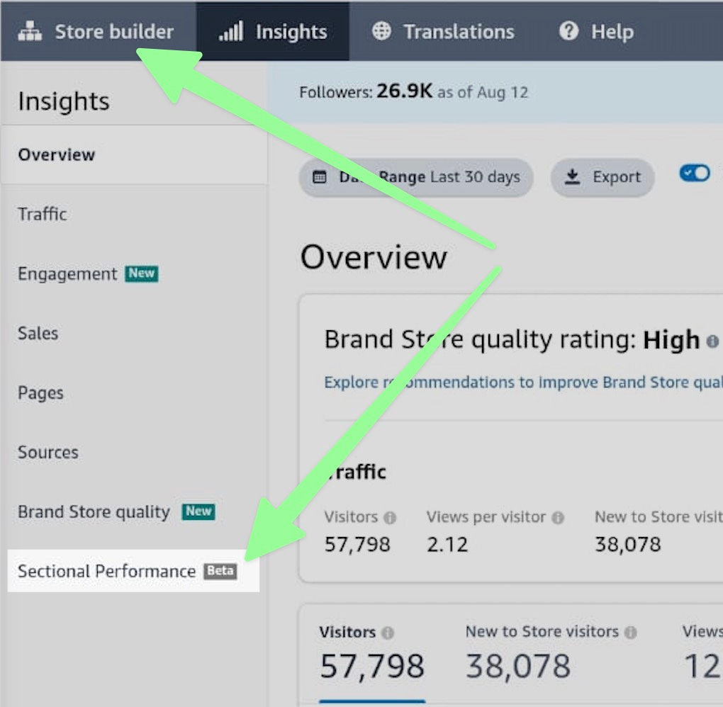
It overlays four numbers on every individual module section of your storefront: renders, views, clicks and click-through rate.
Then it lets you filter by page, by traffic source, by mobile versus desktop, and by store version.
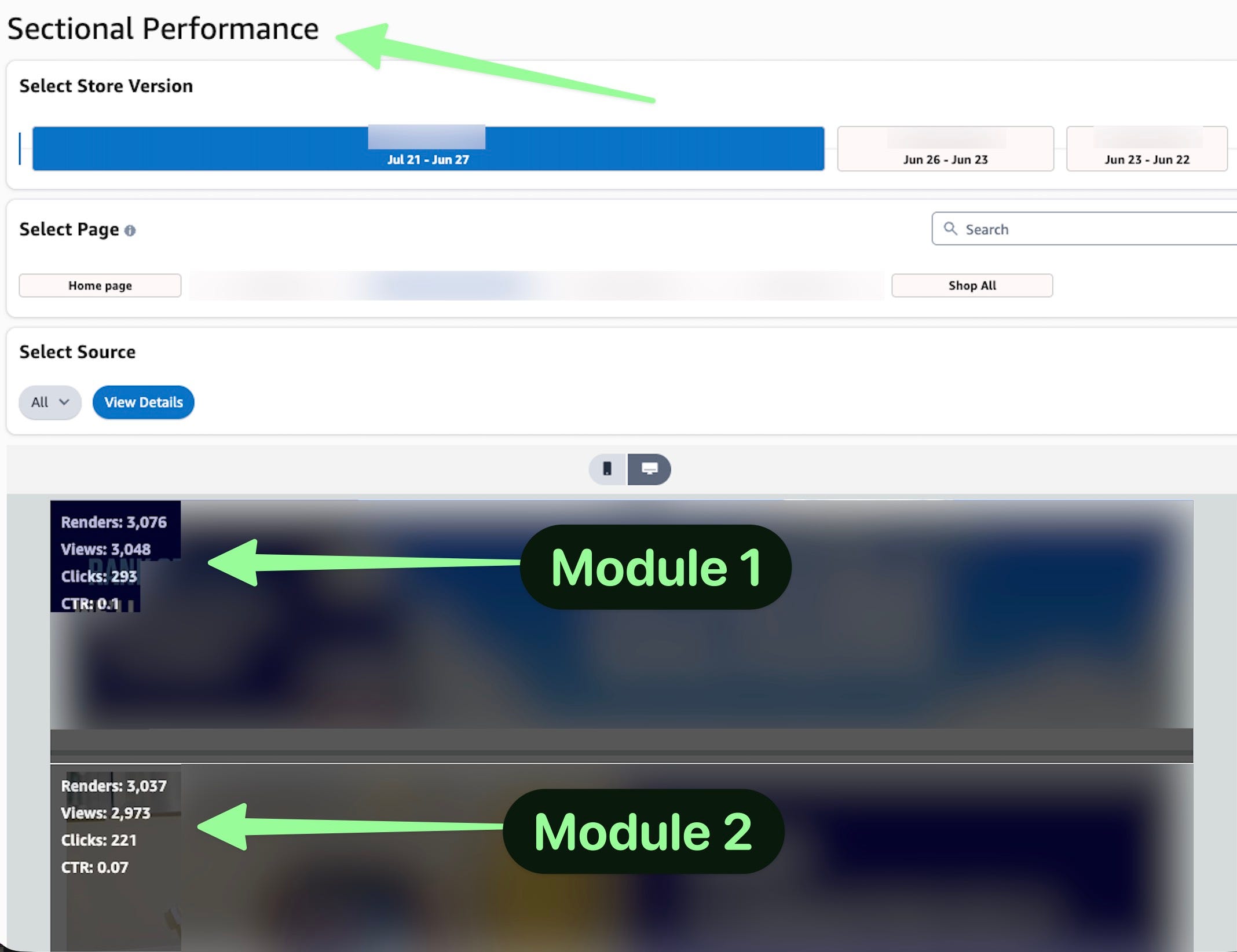
Storefronts to date cannot be tested in Manage Your Experiments. My hope is that Amazon will add that soon.
For now, this tool can help us solve that problem by checking module by module performance on different versions or mobile vs desktop.
A couple of weeks ago I wrote about the new AI chat tool sitting inside Amazon’s storefront builder. I shared my favorite prompts for extracting storefront data.
Find it in Seller Central → Storefront → AI Builder → bottom right corner → Analyze Performance. [Link to my previous post.]
My honest take, the tool could be better but it’s still early days so I’ll celebrate the progress by Amazon and save my heavy criticisms.
What I do love so far, is that it can easily extract data points for you, quickly.
Where it falls flat is when you ask it anything around strategy or anything with deeper context or specificity. You’ll get a dozen excuses, that it can only report on your metrics data and refer you to the Stores Help documentation, which we all know is pretty useless.
My takeaway, this tool is for pulling metrics, not strategy.
That wasn’t good enough for me. So I tapped my chief strategist Ella, aka Claude, and together we built an entirely new approach to auditing storefronts for our clients.
The rest of this post shares the play-by-play of pairing Amazon’s AI with Claude. And sometimes pitting them against each other for funsies.
Each and every learning was paired with a strategic lever and came from a gap that one of them couldn’t see on its own.
The order you ask matters. I asked the questions in the wrong order the first time, and the tools didn’t give me the depth I needed.
Ask these first, in this order:
Give me a traffic source breakdown for the last two weeks (or 6 months), with bounce rate and dwell time. Start here because it tells you who is arriving and whether they behave like buyers. On the store I audited, this is where I found one social channel sending nearly half the traffic and almost none of the sales.
Break down traffic and conversions by source, including orders and sales per visit. Question one gives you engagement. This one gives you money. They rarely agree, and the gap between them is usually the whole story.
What’s my Store Quality Score, and what are the top recommendations by potential impact? Write these down. You’re going to check them against your own page design later, and some of them will not make the cut.
Which of my pages are driving the most engagement and orders? The most valuable question in the whole list. Ask for conversion rate and dwell time per page, not just visits. Every decision later in this post comes from this answer.
Follow up with these, the goal is to extract as much as possible:
Which storefront pages should I create next to improve discoverability and shopping flow?
How well does my storefront align with my Sponsored Brands traffic, and where is the mismatch?
What evidence suggests shoppers are interested but not progressing deeper into the store?
Protip: ask for the day by day numbers, not just the period total. On one store I audited, the two week summary looked stable and the daily view showed traffic falling 76% over two days. Completely different conversation, and it only appeared because I asked for the breakdown.
By going deep with the questions above, the Amazon AI tool identified insights like this across our clients:
Brand-driven organic traffic is the strongest audience. Generating nearly all recorded sales.
Social traffic produces substantial awareness but weak purchasing behavior.
The main problem appears to be traffic routing, not a lack of shopper interest. Several audiences spend meaningful time browsing but cannot easily find the right products or next step.
The homepage is the largest conversion bottleneck. Too many visitors are sent to a general page that does not immediately surface products, categories, or clear shopping paths.
Specialized category pages substantially outperform the homepage. Shoppers who reach focused product category pages are much more likely to purchase.
Paid advertising appears misaligned with its landing experience. Ads drive visits but low sales.
The greatest opportunity is improving how shoppers move from the homepage to products.
Amazon accurately shared plenty of great metrics but fell short on actionable recommendations. I saw things like:
The recommended homepage redesign would prioritize:
A clear hero message with a strong shopping CTA
Prominent links to the strongest categories
Visible bestseller and new-product grids
Product-level calls to action
Solution-oriented shopping paths based on customer needs
Brand story and trust signals near the bottom
New intent-based pages could improve discovery. Suggested concepts include shopping by problem or desired solution, curated bestsellers, bundles, educational guidance, and a stronger brand story.
And called out basic signals worth testing:
A text tile linked to a product page at +34% sales
A text tile linked to a sub-page at +32%
A product grid on the homepage at +33%
A background video at +27%.
(Those are Amazon’s numbers for its peer set, not results we measured.)
Amazon says clearly, that these are a signal worth testing and not a guarantee.
As I looked through multiple storefronts’ data, something became obvious to me:
Amazon’s AI tool is not able to see our designs. The tool is only reading and reporting metrics, it’s not able to strategize against the data to give us a detailed module plan or layout because it’s running blind.
I had more unanswered questions like:
Are the category tiles in the wrong order?
Are the product sections legible on mobile?
Should the brand video live above the fold?
Problem: every recommendation Amazon gave above was generic at best.
“Add a tile, add a grid, add a video.” Not one was about moving, reordering, removing, or redesigning something that already existed.
Solution: pairing with Claude’s vision gave me actionable guidance
When the AI report said add a video, in some cases we already had a video.
What the Claude vision audit found: “The video exists and it sits near the top of the page, but on a phone it reads as a pale gradient with a small logo on it that reads as an empty box to the shopper. It occupies nearly an entire phone screen at the exact moment a shopper is deciding whether to stay, and in that screen there is no product, or visual that entices a tap”.
The fix: add an enticing cover image and move the video below the fold for storytelling placement that does not disrupt high conversion real estate at the top of fold.
And the reorder turned out to be free and probably the biggest single lever across all client storefronts.
Again, the lightbulb moment was realizing, the AI tool was playing dumb because it couldn’t see anything. It has the numbers, not the eyes.
Protip: Before you touch a design, take the tool’s top recommendation and check it against your own page-level numbers. If it tells you to drive more traffic to a category page, look up what that page converts at first. On the store I audited, one of the obvious “send people here” candidates was converting at 2.6%. Sending it more traffic would have wasted the clicks.
Upgrading to paid is like getting the version of my brain that isn’t filtered for a general audience. Less than one Starbucks order per month, and you get the strategy I charge clients real money for, broken down so you can use it yourself.
Below the paywall:
The exact way to run this audit the way we did
Why the mobile view is the only one that matters, and what it exposed for us
5 things we keep finding on storefronts that no analytics tool will ever report
2 traps in Amazon’s own storefront reporting
The one rule that decides every tile on your homepage
The conversion killer I almost missed entirely
The homepage layout map, top to bottom, with what belongs in each position
The new beta report on select accounts that gives you click-through rate on every single module
BONUS: A Claude prompt to run the whole audit on your own store
Comments
Nothing yet. Say the first thing.
Sign in to join the conversation.