
The Climate Engine API lets you bin a dataset and count the number of pixels falling into each bin within your area of interest, making it easy to track how the spatial distribution of values has changed over time.
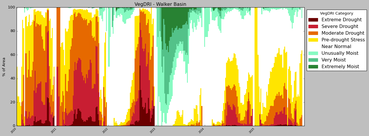
In this example, we walk through a Google Colab notebook that builds stacked bar charts for three drought-relevant datasets:
US Drought Monitor — An impact-based dataset that classifies conditions across six categories: neutral or wet, abnormally dry, moderate drought, severe drought, extreme drought, and exceptional drought.
GRACE Drought Groundwater Storage Indicator — A percentile product (0–100) derived from terrestrial water storage observations collected by the GRACE-FO satellite.
Vegetation Drought Response Index (VegDRI) — A dataset that quantifies drought stress on vegetation.
To use the API, you will need an API key. You can request a quota-limited key following these directions, or connect your earth engine account to Climate Engine to create your own non-quota limited key following these directions.
In this step, install and import the required libraries by running this cell. The one package that isn’t pre-installed in Colab (geopandas) is fetched automatically via pip. The remaining imports cover data manipulation (pandas, numpy), HTTP requests (requests), plotting (matplotlib), date handling (datetime). The final line suppresses SSL warnings from the requests library to keep output clean.
!pip install --quiet geopandas# Import/Install Packages
import datetime
import requests
import matplotlib.patches as mpatches
import pandas as pd
import geopandas as gpd
import matplotlib.pyplot as plt
plt.style.use(’classic’)
%matplotlib inline
import numpy as np
requests.packages.urllib3.disable_warnings(requests.packages.urllib3.exceptions.InsecureRequestWarning)
In this step, you will set your API key as a Colab Secret (see directions here). Retrieve your Climate Engine API key from Colab’s secret manager using userdata.get(’key’), then define the base URL for all API requests and store your key in a headers dictionary. This headers object will be passed with every API call to authenticate your requests.
# Set root URL for API requests# Authorize
from google.colab import userdata
key = userdata.get(’key’)
root_url = ‘https://api.climateengine.org/’
# Authentication info for the API (do not share this widely)
headers = {’Authorization’: key}
In this step, you will load your shapefile files into the runtime files. Note: This example is for a single polygon, with a limited number of vertices. When running for your polygon, complex polygons might need to be passed as POST requests.
Then using geopandas and the .shp path, the data will be read into the notebook as a GeoDataFrame. Then you will verify that its coordinate reference system (CRS) is WGS84 (EPSG:4326), reprojecting it automatically if not. A function then extracts the boundary coordinates from the geometry, handling both Polygon and MultiPolygon shapes by converting them into nested lists of coordinate pairs (a format the /coordinates endpoints require). The values are printed so you can confirm they look correct before passing them to the API.
# Ensure the CRS is WGS84 (EPSG:4326) # Define function to extract coordinates # Extract coordinates from the single geometry print(coords)# Read in the shapefile
shapefile_path = “/content/Walker_HUC8_SHP_simplfied.shp”
gdf = gpd.read_file(shapefile_path)
if gdf.crs != “EPSG:4326”:
gdf = gdf.to_crs(”EPSG:4326”)
def extract_coordinates(geometry):
if geometry is None:
return None
if geometry.geom_type == “Polygon”:
# Add an outer list around the coordinates
return [[list(coord) for coord in geometry.exterior.coords]]
elif geometry.geom_type == “MultiPolygon”:
# Add an outer list around each polygon’s coordinates
return [[[list(coord) for coord in polygon.exterior.coords]] for polygon in geometry.geoms]
else:
return None
coords = extract_coordinates(gdf.iloc[0].geometry)
In this step, you will define the API endpoint for pixel count timeseries and set up your request parameters as a dictionary, which specify the area of interest (your coordinates from Step 3), the dataset (USDM_DROUGHT_MONITOR), the variable, the bins, and the start_ and end_ dates. The bins [-1, 0, 1, 2, 3, 4] correspond to the six US Drought Monitor categories: neutral/wet, abnormally dry, moderate, severe, extreme, and exceptional drought. The date range pulls the five years between 2020 and 2025. The GET request is then sent to the API with your headers from Step 2, and the JSON response is printed so you can inspect the raw data before processing it.
# Set up parameters for API call print(response)# Define Endpoint
endpoint = ‘zonal_stats/pixel_count/timeseries/coordinates’
params = {
“coordinates”: f’{coords}’,
“dataset”: “USDM_DROUGHT_MONITOR”,
“variable”: “usdm”,
“bins”: “[-1,0,1,2,3,4]”,
“start_date”: “2020-01-01”,
“end_date”: “2025-12-31”,
}
# Send request to the API
r = requests.get(root_url + endpoint, params=params, headers=headers, verify=False)
response = r.json()
In this step, loop through each entry in the API response, extracting the date and flattening the nested bin counts, where each bin range (e.g., -1_to_0, 0_to_1) becomes its own column before appending it to a list. That list is then converted into a pandas DataFrame and the Date column is cast from a string to a proper datetime type for accurate time-series plotting in later steps.
# Populate the list with API request values # Convert list to dataframe # Parse date string to datetime value# Create a list to store values in
records = []
for entry in response[’Data’]:
row = {’Date’: entry[’Date’]}
# Flatten each bin range into its own column
for bin_range, count in entry[’usdm’].items():
row[bin_range] = count
records.append(row)
df = pd.DataFrame(records)
df[’Date’] = pd.to_datetime(df[’Date’])
df
In this step, define the desired bin order from most severe to least severe drought, then filter it down to only the bins that actually exist as columns in your DataFrame. A clean copy of the DataFrame is created with just the Date column and the present bins, with any missing values filled with 0. Each bin’s pixel count is then divided by the total pixel count for that row and multiplied by 100, converting raw counts into percentages so that each date’s values sum to 100.
# Only keep bins that exist in the dataframe # Create a copy of the dataframe for plotting # Convert to %s plot_df# Set bin order
bin_order = [’[4, inf)’, ‘[3, 4)’, ‘[2, 3)’, ‘[1, 2)’, ‘[0, 1)’, ‘[-1, 0)’]
present_bins = [b for b in bin_order if b in df.columns]
plot_df = df[[’Date’] + present_bins].fillna(0).copy()
row_totals = plot_df[present_bins].sum(axis=1)
plot_df[present_bins] = plot_df[present_bins].div(row_totals, axis=0) * 100
In this final step, define labels and official USDM colors for each bin. Then build the stacked bar chart by looping through the bins in order (most severe to least severe) and layering each as its own bar segment by using a bottoms array that accumulates height so each new layer stacks on top of the last. The x-axis tick positions are set to the first week of each calendar year rather than every data point, keeping the labels readable across the five-year timeseries. The legend is placed outside the plot area to avoid covering the bars, and plt.tight_layout() adjusts spacing to prevent any labels from being clipped.
# Define colors for bins # Define figure to add data to x = np.arange(len(plot_df)) # Add bars to chart # Update x-axis to label the years based on when year starts # Update y-axis labels + ticks # Add title # Move legend outside the plot so it doesn’t cover bars plt.tight_layout()# Define labels for bins
labels = {
‘[-1, 0)’: ‘No Drought’,
‘[0, 1)’: ‘D0 - Abnormally Dry’,
‘[1, 2)’: ‘D1 - Moderate Drought’,
‘[2, 3)’: ‘D2 - Severe Drought’,
‘[3, 4)’: ‘D3 - Extreme Drought’,
‘[4, inf)’: ‘D4 - Exceptional Drought’,
}
colors = {
‘[-1, 0)’: ‘#FFFFFF’,
‘[0, 1)’: ‘#FFFF00’,
‘[1, 2)’: ‘#FFD37F’,
‘[2, 3)’: ‘#FFAA00’,
‘[3, 4)’: ‘#E60000’,
‘[4, inf)’: ‘#730000’,
}
fig, ax = plt.subplots(figsize=(16, 6))
bar_width = 1.0
bottoms = np.zeros(len(plot_df))
for bin_col in present_bins:
values = plot_df[bin_col].values
ax.bar(x, values, bar_width,
bottom=bottoms,
color=colors[bin_col],
label=labels[bin_col],
edgecolor=’none’,
linewidth=0.3)
bottoms += values
year_starts = plot_df.groupby(plot_df[’Date’].dt.year).head(1).index
tick_positions = x[year_starts]
tick_labels = plot_df[’Date’].dt.strftime(’%Y’).iloc[year_starts]
ax.set_xticks(tick_positions)
ax.set_xticklabels(tick_labels, rotation=45, ha=’right’, fontsize=8)
ax.set_xlim(-0.5, len(plot_df) - 0.5)
ax.set_ylabel(’% of Area’)
ax.set_ylim(0, 100)
ax.set_title(’USDM Drought - Walker Basin’)
ax.legend(handles=[mpatches.Patch(color=colors[b], label=labels[b])
for b in present_bins],
loc=’upper left’, bbox_to_anchor=(1, 1),
title=’USDM Category’, frameon=True)
plt.show()
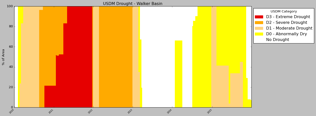
To complete this workflow for the other datasets, continue through the notebooks cells. Bins, labels, etc. will be updated to match the dataset. Note: If you run this workflow for more years, etc. you may need to update the plotting code to make the chart nicely formatted. This chart is specific to this 5-year window for this example AOI.
No posts
Comments
Nothing yet. Say the first thing.
Sign in to join the conversation.