
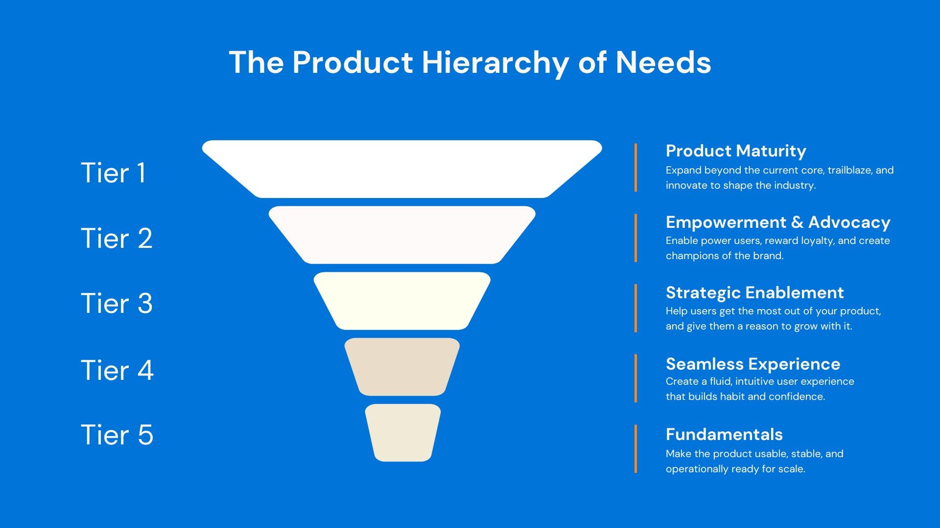
This post explores a core concept from the Product Hierarchy of Needs — a framework that helps product teams assess and evolve their product maturity. You don’t need to have read the full framework to find value here — but if you’d like the full picture, you can start with the overview here.
In this post, we focus on what I call the Seamless Experience Layer — the level where users stop noticing the product, and start noticing their own progress.
Making your product function is one thing.
Making it feel effortless is another.
This layer isn’t about aesthetics — it’s about flow.
It’s where UX psychology, onboarding clarity, and time-to-value start working together to remove friction, build trust, and help users form habits.
This is where good products feel polished. Where they “just work.”
If Tier 5 (the Foundation Layer) is about making things usable and stable…
Then this layer is about making them enjoyable and intuitive — so users actually come back
So, What’s the Problem?
Here’s what happens when this layer is weak:
Users complete onboarding but don’t know what to do next
There’s no clarity on where value is or how to access it
First-time usage feels heavy, scattered, or overly guided
In-app micro-interactions feel disconnected, awkward, or inconsistent
Users start relying on support instead of the product
The product works.
But it doesn’t flow.
One of the most important ideas at this layer is Time-to-Value (TTV) — the time it takes for a user to:
Get onboarded
Understand the product
Experience a small win that validates their decision
The longer your TTV, the greater the risk of churn.
This is where microUX, guidance, empty states, and progressive onboarding come into play.
Here are the elements that separate good products from forgettable ones at this layer:
1. Intentional Onboarding, Not Just Intro Tours
Users don’t need to see everything — they need to see what matters first
Let them achieve something before asking for full setup
Use progressive disclosure: reveal complexity as needed, not all at once
2. Smart Nudges, Not Just Tooltips
Help users reach milestones with nudges that guide, not interrupt
Example: “You haven’t added a goal — most users who do get value 3x faster”
Build confidence, not chaos
3. Empty States That Teach
Don’t leave users staring at a blank screen
Use empty states to educate, inspire, or offer next steps
Examples: starter templates, one-click actions, GIFs of usage
4. Consistency Across Devices
Web and mobile shouldn’t feel like two different products
Small inconsistencies break trust and confuse flow
5. Invisible Design Choices
Helpful animations, clear transitions, loading states that feel responsive
These things seem minor — until they aren’t there
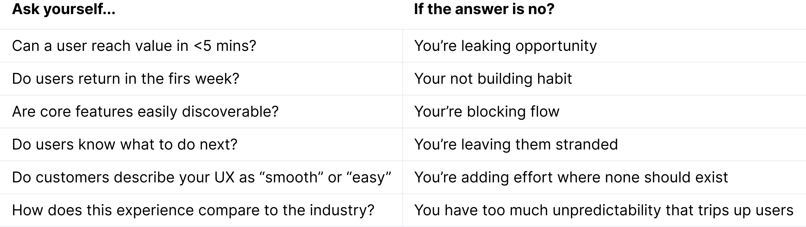
Are You Creating Confidence or Confusion? Here’s a short audit to help assess where your product stands:
You might be shipping weekly.
You might have features your competitors don’t.
But if users don’t feel comfortable, in control, or confident…
They’ll ghost your product without a word.
And here’s The Compounding Cost of a Broken Experience Layer
Struggle with the basics → friction during onboarding
Friction → delayed or failed adoption
Failed adoption → fewer problems solved
Fewer problems solved → no meaningful value
No value → no transformation
No transformation → no long-term retention or advocacy
If you’re stuck in the friction phase — that’s where to focus.
Don’t build the next feature. Fix the path to the first win.
This is the perfect opportunity to introduce or evolve your Customer Health Score (CHS). A simple framework created to help you identifying which users are:
Engaged but confused
Getting stuck in key flows
Dropping off after initial value moments
Use your CHS to guide re-engagement strategies and spot gaps in your seamlessness or at the very least - spark a point of conversion.
Need a CHS framework? Stay tuned for full article on this soon!
Review and improve your onboarding experience
Add subtle but clear guidance to activate habits
Shorten time-to-value at all costs
Improve flow across devices and journeys
Elevate the UX from “it works” to “this is smooth”
Your users don’t want to admire your design system.
They want to get things done.
Make that easy.
This post builds on the Foundation Layer, where we focused on product stability and operational readiness.
Once your product is usable and stable, the next question is:
Does it actually feel good to use?
That’s what the Seamless Experience layer answers.
If you’re constantly answering support tickets, watching users churn after sign-up, or seeing low reactivation — you’re probably here.
This idea builds on a core layer of the Product Hierarchy of Needs — a framework that helps product teams assess where they truly are, and what’s holding them back.
If this is your first time here:
👉 Start with the full PHoN framework
If you missed the last piece:
⬅️ Read: The Foundation Layer – Why Most Growth Problems Are Actually Stability Problems
If you’re ready for what’s next:
Be sure you’re subscribed to get the next drop — Strategic Enablement: Helping Users Grow with You, Not Just Survive You
Comments
Nothing yet. Say the first thing.
Sign in to join the conversation.