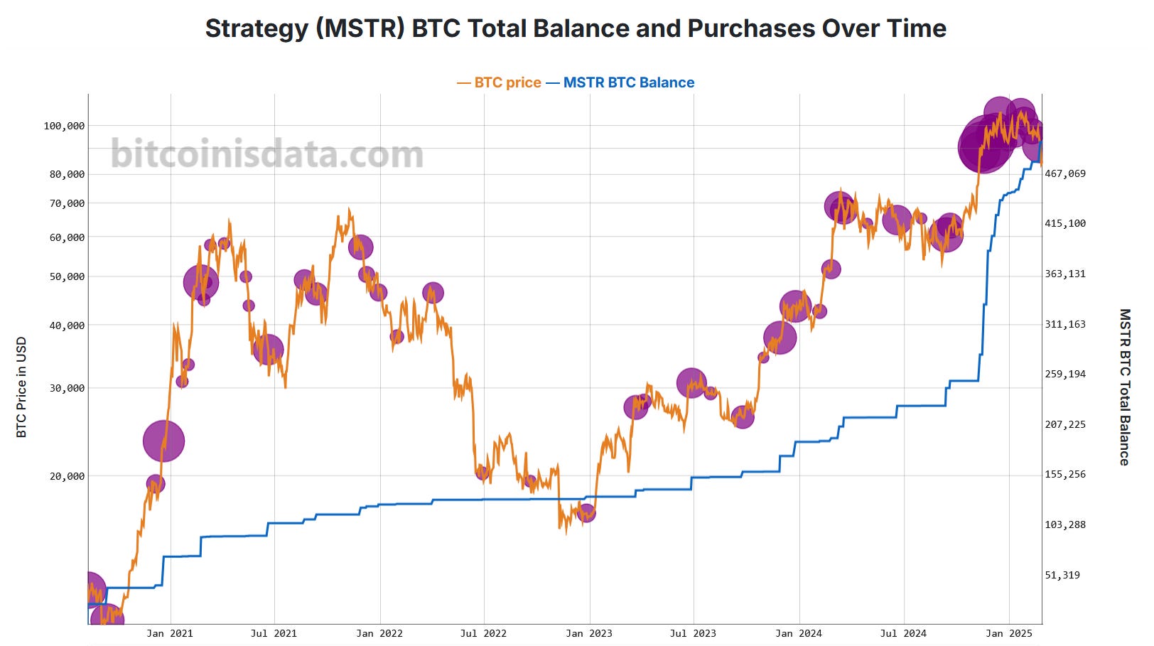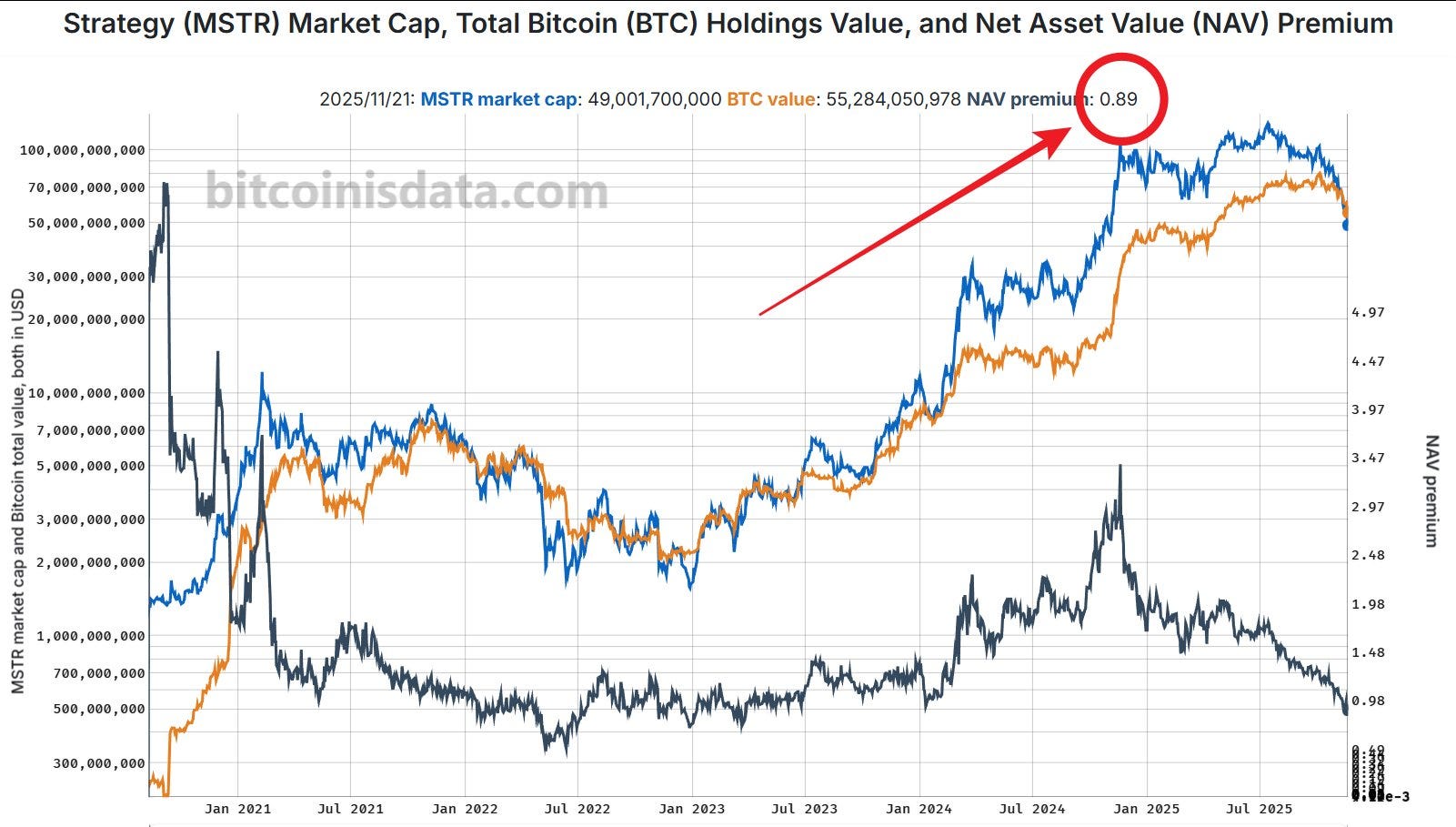
MSTR's mNAV below one
Not a good sign.

Beautiful visualizations of challenging Bitcoin metrics, with raw data available in CSV/XLSX/JSON formats. Updated hourly. https://bitcoinisdata.com/
Subscribe:.rss.atom.json.md.m3u.pls
Live Last read · last published · next check
Not a good sign.
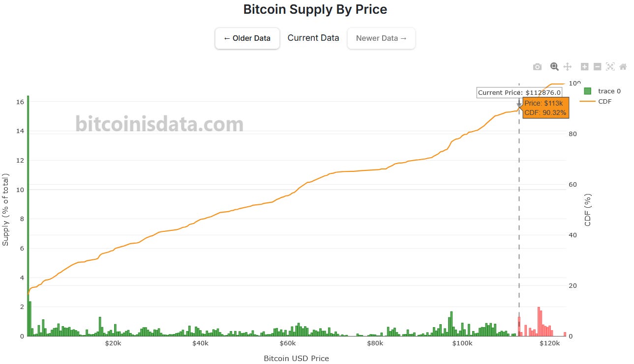
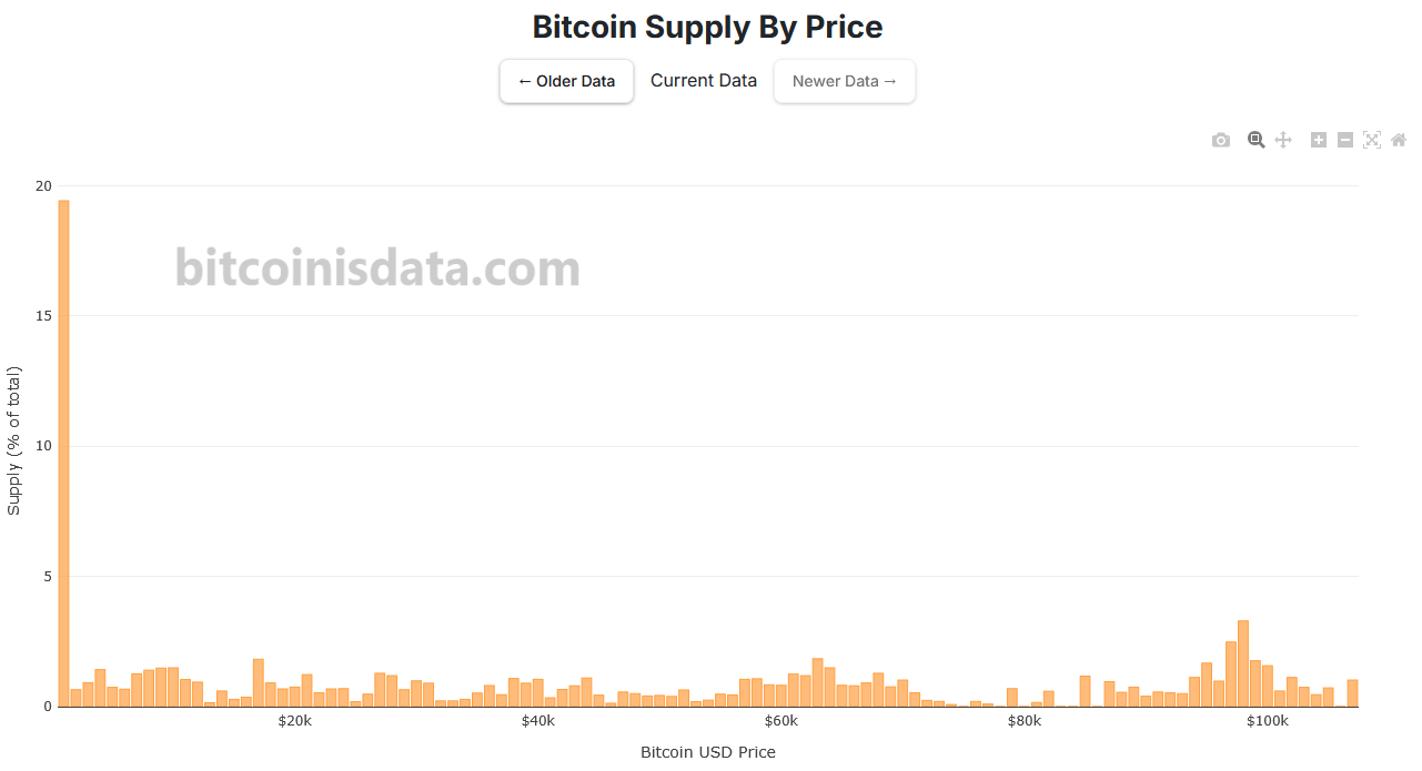
Introducing the cumulative distribution curve to the bitcoin supply histogram
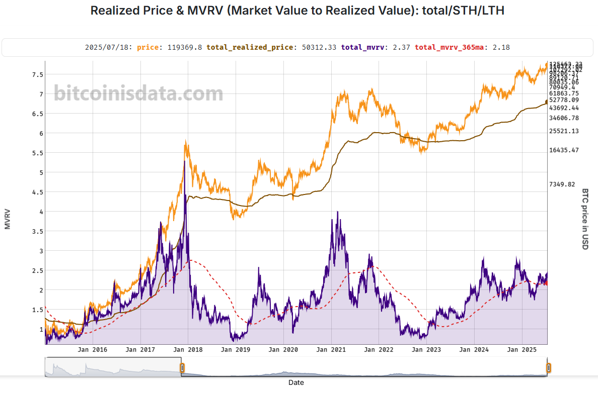
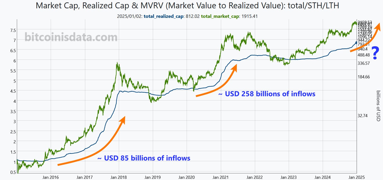
We revamped our MVRV (Market Value to Realized Value) charts to help answer this question.
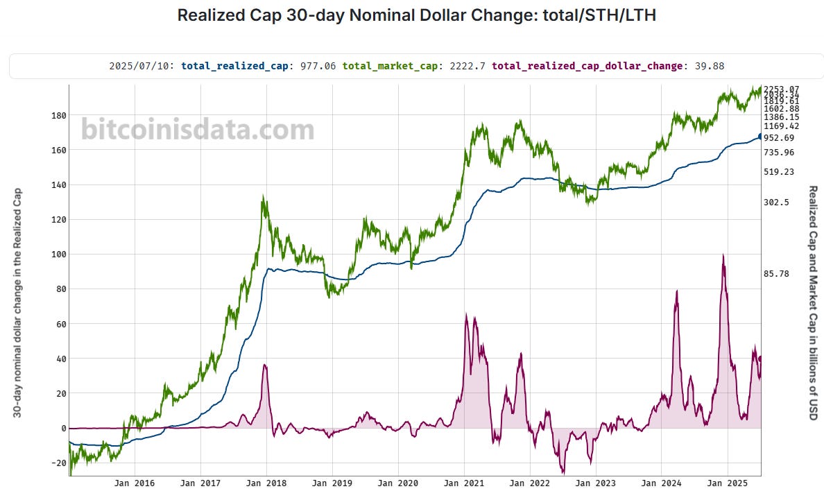
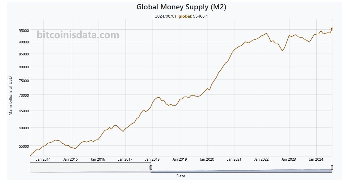
This visualization makes it easy to see how much money is flowing into Bitcoin.
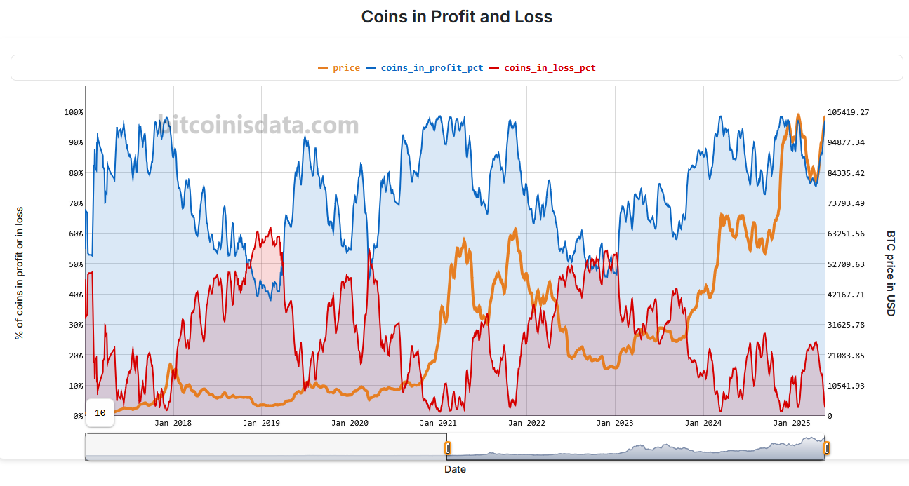
This week we added visualizations to assess whether bitcoin holders are in profit or loss in USD terms — and by what margin.
A Quick Update with Newly Available Data for Download
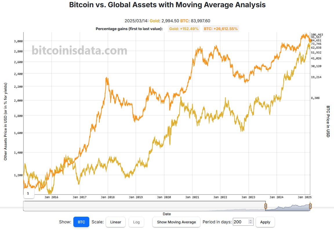
BTC Against Energy, Metals, Treasuries, Indices, Currencies, and Agricultural Assets
Now we can see where the "price gaps" are located.
We now have our version with purple dots!
Bitcoin Is Data 2.0 Is Finally Here
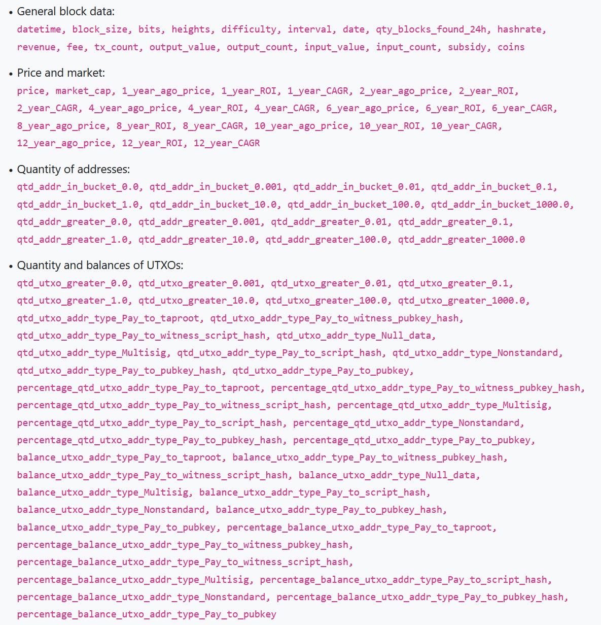
We Offer Over 200 Fields of Bitcoin-Related Data and Metrics for Download
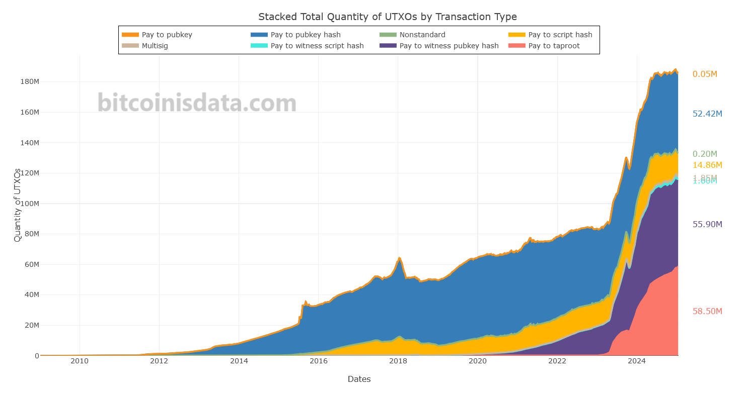
Everything Segmented by Bitcoin Transaction Type
We should have a very good year.
And there's nothing wrong with that.
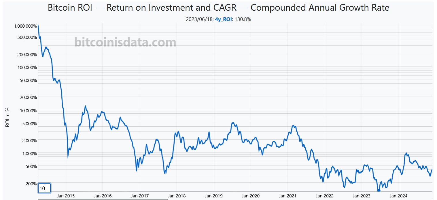
Choose from several time periods to view ROI/CAGR metrics.
I had a conversation with the host, Leta, discussing on-chain analysis and the current Bitcoin cycle.
This metric could offer a hint as to when the top of this cycle is occurring.
This massive update introduces a collection of Bitcoin-related metrics and charts for the Nasdaq-listed firm MicroStrategy (MSTR).
We Knew This Would Happen Sooner or Later
This visualization was inspired by a Twitter post by @TylerDurden