
Today, we introduce a new visualization in Bitcoin Is Data: a chart showing the daily count of new addresses appearing on the Bitcoin network.
Whenever a new (never-before-used) address first appears on the Bitcoin network, regardless of its balance, we record it. Here, we present the time series of daily new addresses on the Bitcoin network.
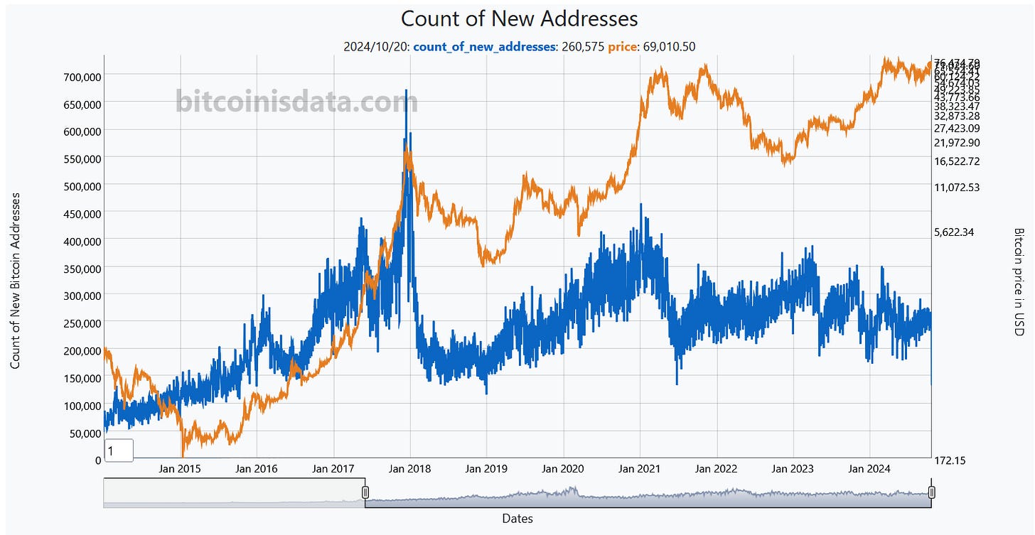
It seems to me that the decline in the blue line preceded the price peaks of the last two cycles (December 2017 and April 2021), so I’ll be keeping an eye on it during the current one.
We'd like to remind you that all the raw data used to generate the charts on Bitcoin Is Data is available for direct download or via our API, in both .CSV and .XLSX (Microsoft Excel) formats.
By the way, if you have any suggestions for improvements, ideas for new data, or new charts, please leave a comment below, contact us at contact@bitcoinisdata.com or via our Twitter and NOSTR handles.
Finally, if you find value in our work, please consider supporting us with a Bitcoin donation to help keep the site running.
That’s all for today—have a great one!
No posts
Comments
Nothing yet. Say the first thing.
Sign in to join the conversation.