
Today, we introduce the Bitcoin Supply by Price chart on Bitcoin Is Data:
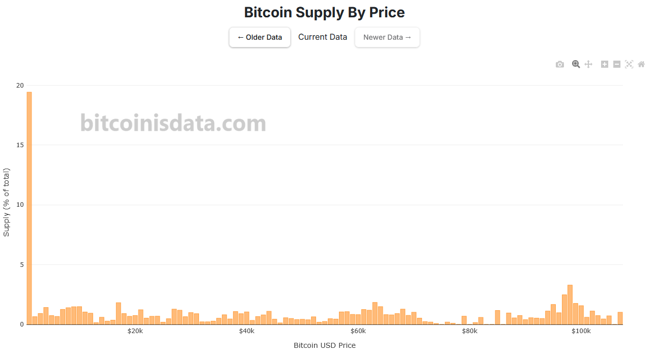
This chart shows where the percentage of Bitcoin’s total supply (currently 19.84M coins) is located relative to price, measured in USD. In other words, it visualizes how many coins were last bought at each price bucket.
Each bar in the chart represents a bucket of $1,000 USD. We can see that the majority of coins were last moved below the first $1,000 mark — meaning they belong to the first bucket.
At the top of the chart, we’ve included buttons that allow users to navigate through time. You can view the Bitcoin supply by price in the present, last week, the last 15 days, or at monthly intervals up to one year in the past.
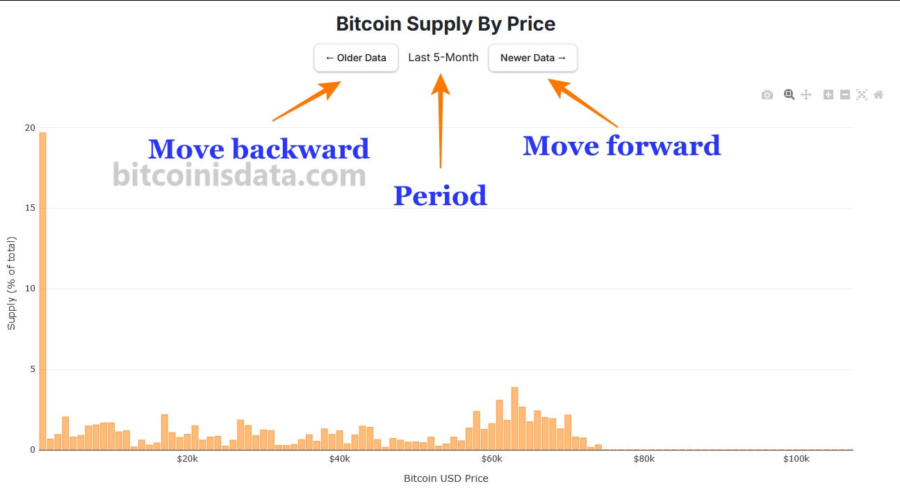
We can also observe the concept of "price gaps", introduced by Bitcoin Strategy (@TheRationalRoot on Twitter/X). These are price zones where relatively few coins changed hands, making them likely to be retested by the price — something that indeed occurred during Bitcoin’s recent dip.
That’s all for today — have a great one!
No posts
Comments
Nothing yet. Say the first thing.
Sign in to join the conversation.