
Dear readers,
In response to a recently expanded workload, I am posting an article from the archives, so that I can cover the extra tasks properly over the next couple of weeks. This one is applicable to some of the projects my current Notan course students are doing. Enjoy!
When we have something to write, we are compelled to organize.
The surface always has limitations, so we have to plan in order to achieve design balance! The writer may or may not have a wide choice of size and material. We adapt and move through the tasks at hand with as much readiness as possible. Today I’ll discuss thoughts on getting letters onto the page: the history, design, alignment, composition, and methods.
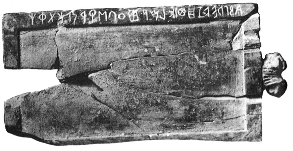
First, the letters need to be taught, so a stylus and tablet come into use around 800 BCE. The Marsiliana tablet had the Etruscan alphabet on top, written from right to left, boustrophedon. The recessed area was filled with wax, and letters written using a stylus. This rectangular area must have been the first “page”, much like a student’s slate from the late 18th - early 19th century.
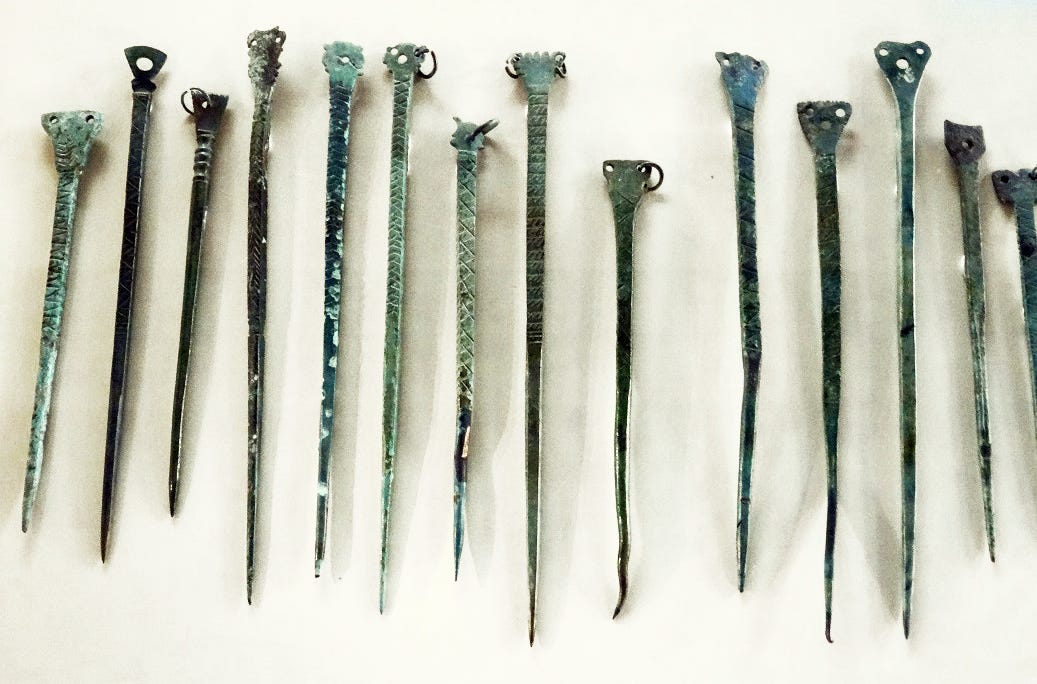
The stylus was usually made of bronze, pointed on one end for writing and often decorated. The opposite end was often flattened to be used as an eraser, smoothing out the wax to change a letter or word.
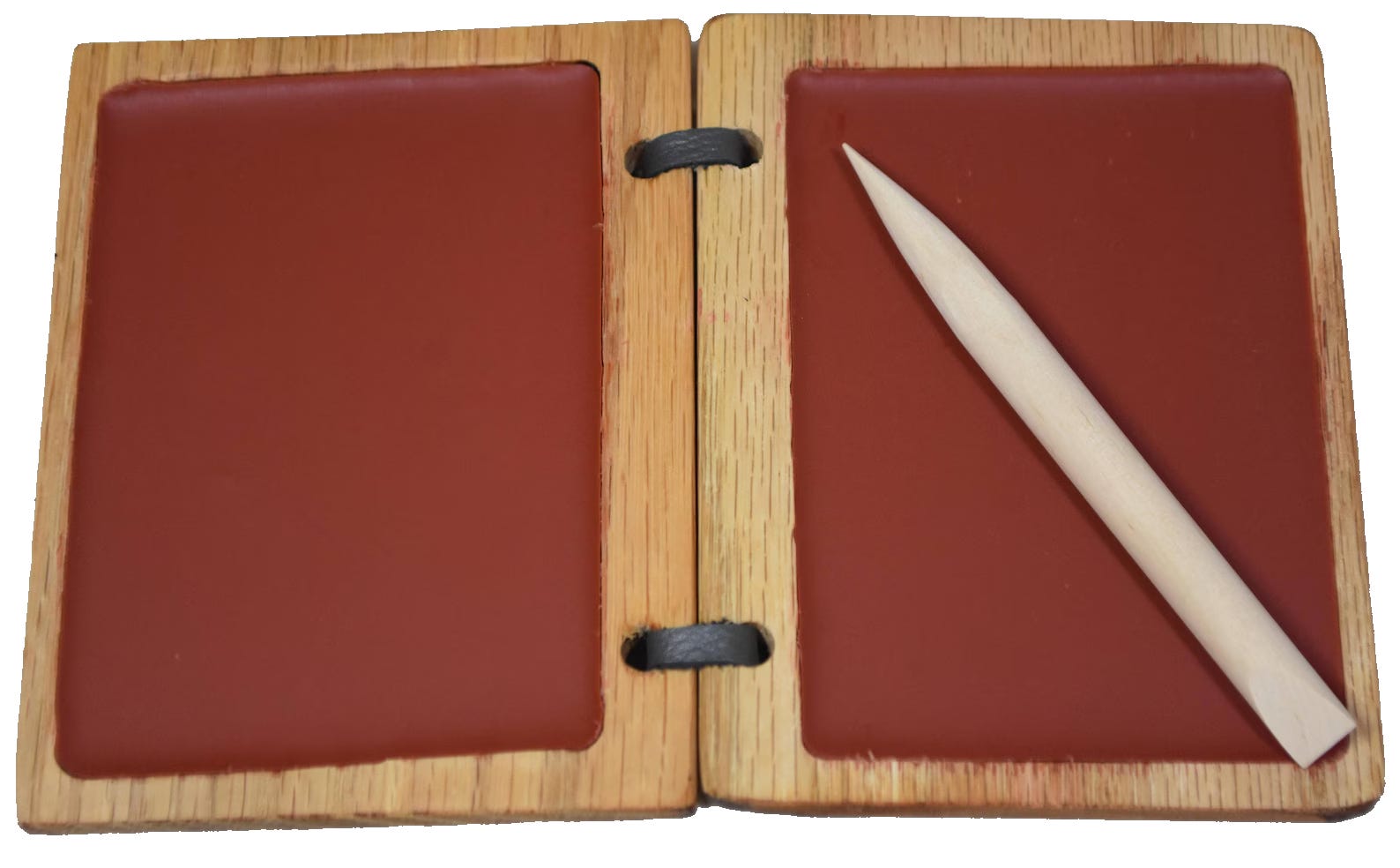
There are companies today, with artisans such as at Scribal Work Shop, who fabricate handsome wax tablets and stylus tools for contemporary use, reenactments, gifts, or simple appreciation of the objects themselves. The old ways are still useful, and have a way of reaching the new generations.

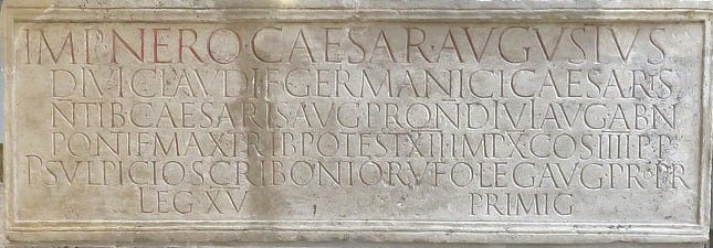
By the time the first century rolled around, the rectangle remained the format for writing. A centering method for inscribed text was not yet perfected (much like many efforts today, student or otherwise). This inscription for Roman Emperor Nero is dated 66 CE. Beautiful letterforms were on their way, architectural and full of impact!
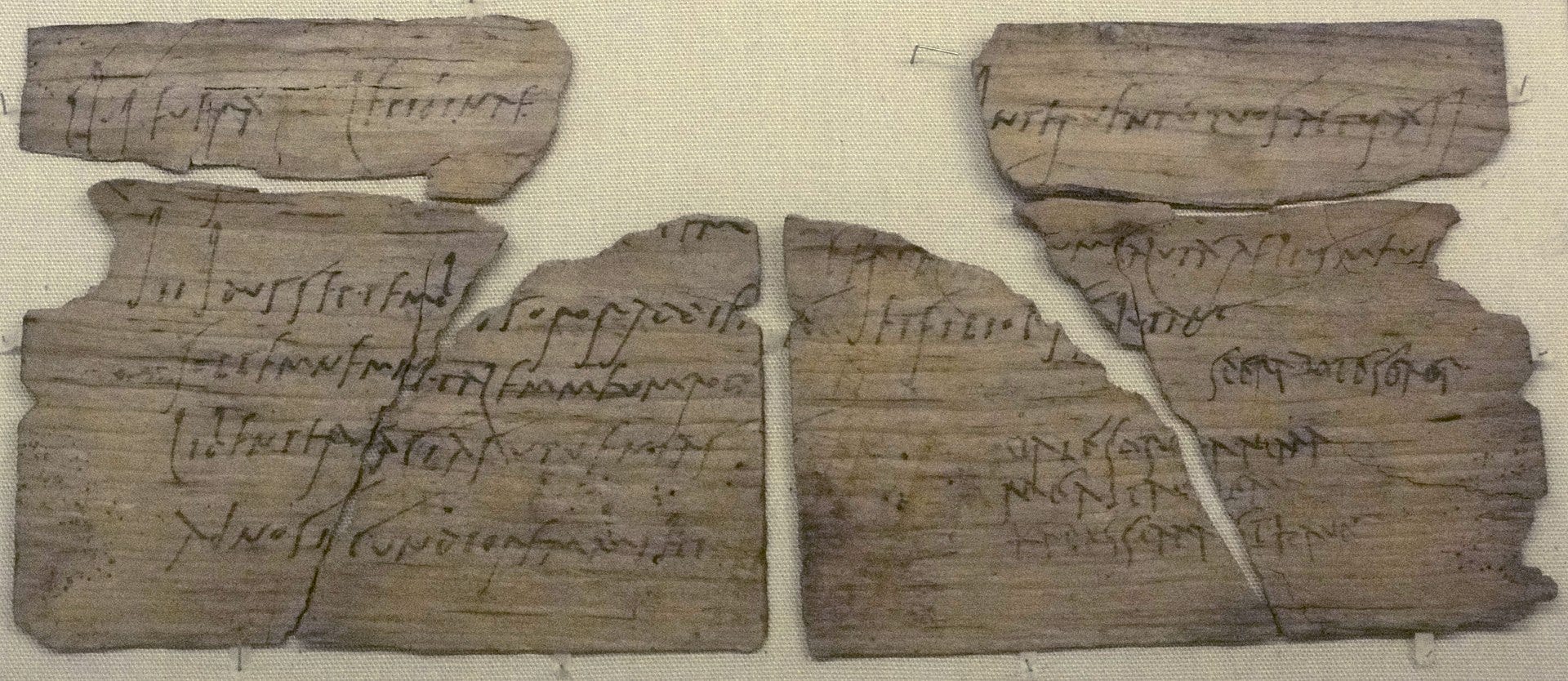
Even in the days of Vindolanda, a 1st century Roman outpost in the UK currently under excavation, Roman cursive script was casually inscribed on thin pieces of wood found in ongoing excavations in an outpost south of Hadrian’s Wall. The striations of the wood formed guidelines for writing. We use what’s there, or we invent!
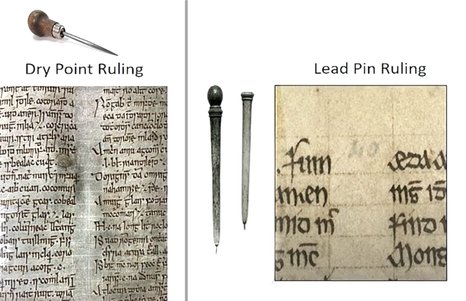
Skipping forward to the Middle Ages, when manuscripts were handwritten on parchment, guidelines were incised or impressed into the skins, leaving a slight mark or groove to guide the scribe’s lettering situated between the two marks or grooves, but rarely were more visible marks applied or drawn onto the surface.
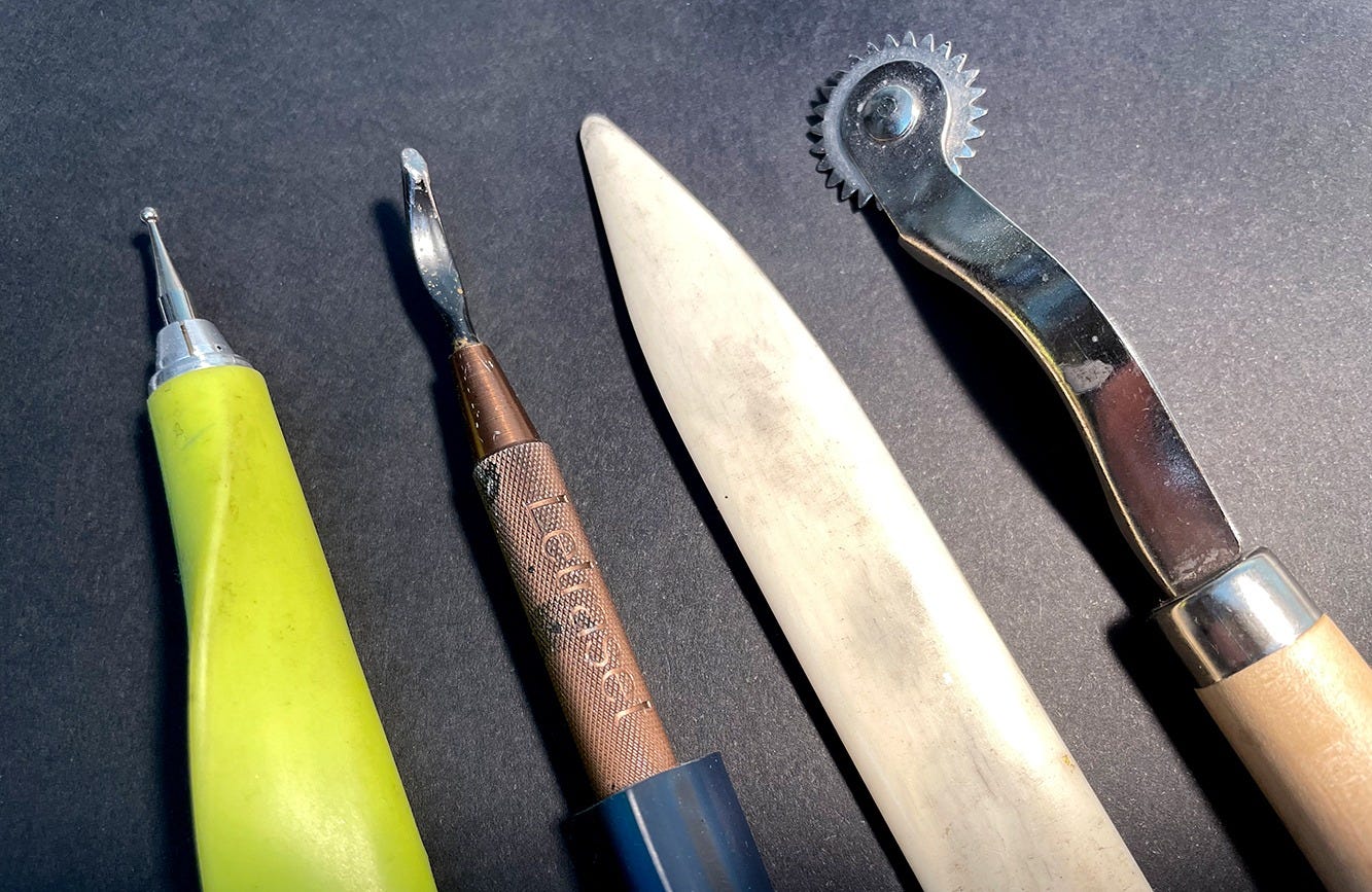
Today we use non-inked and non-pencilled marks, both blind and visible, to guide and complement our writing. Tools such as burnishers, bone folders, scorers, and even seam markers normally used for sewing and stitching guides, are used as a natural constructive element in writing out a page without making a strongly colored mark. The back of a butter knife will make a nice groove that can be seen up close, for the scribe, but is invisible to the eye from a distance.
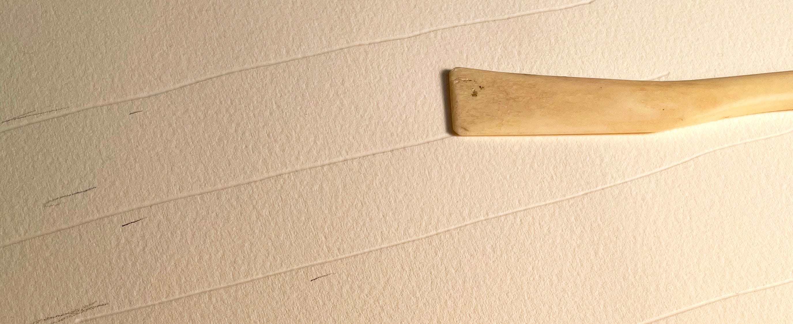
A bone scoring tool that I found at a calligraphy fair a couple of decades ago was made from a chicken drumstick. I’ve used it freehand as shown, as well as against a straightedge. Here, only a few easy-to-remove pencil marks indicate a basic very loose design. These marks were made for instructional purposes, photographed with a raking light for good onscreen contrast. Normally a lighter pressure would be used, just enough for the scribe to see. Alternatively, these deep grooves can be made as part of the overall design and message!
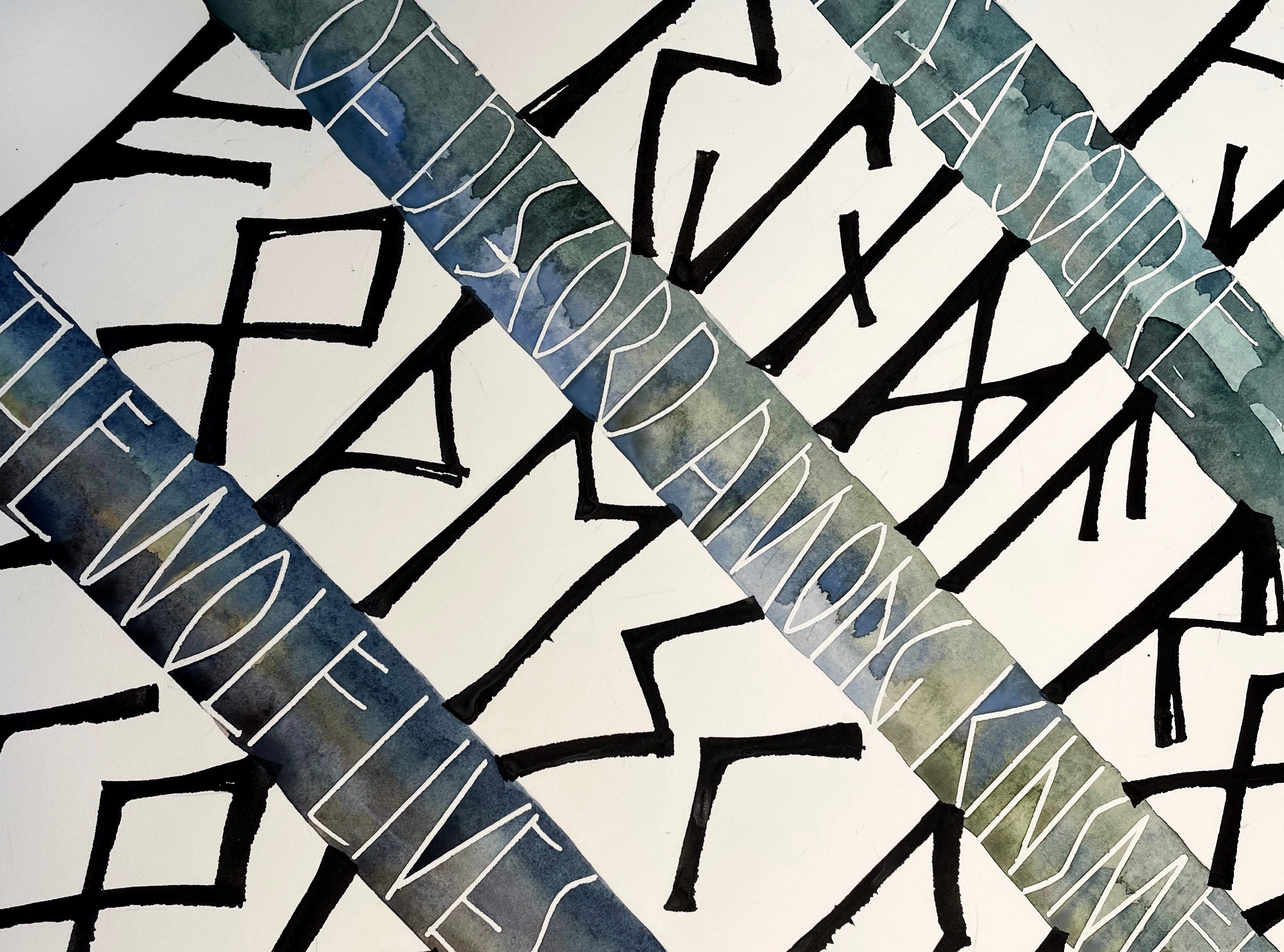
Both scoring and pricking tools were used on the following detail of a runic watercolor passage. The points bite into the paper and both resist and exaggerate the watercolor washes, becoming both an alignment aid and an active part of the artwork.
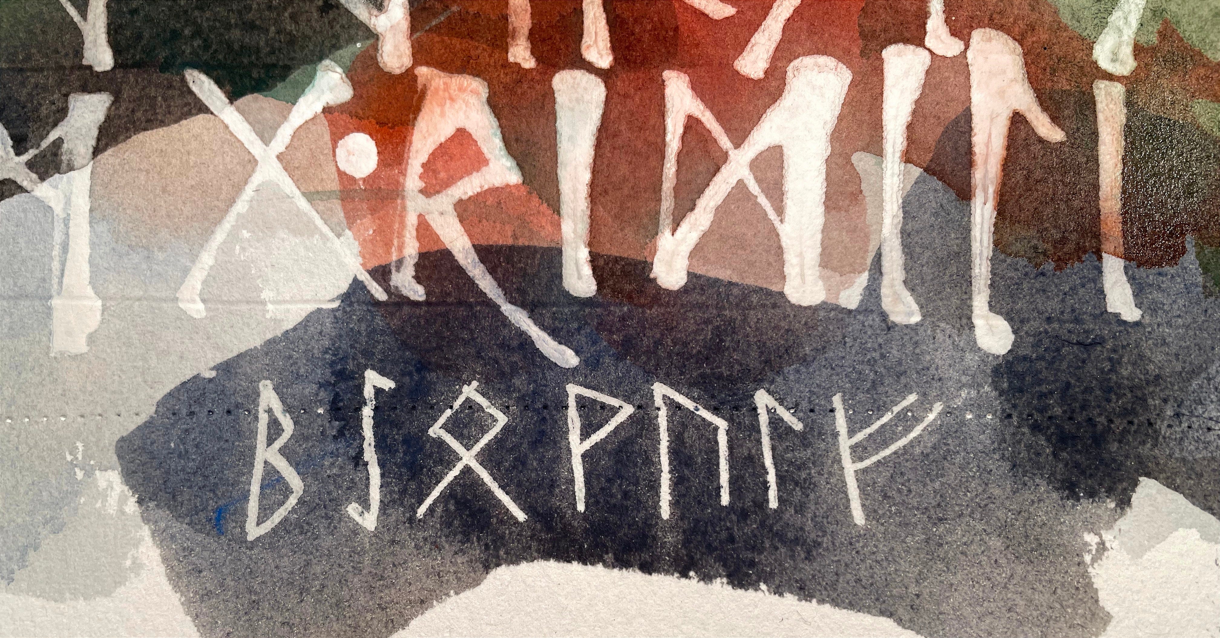
Of course, there are the requisites of learning traditional and precise layout, with all the specs of graphic design in the late 20th century (yesteryear) and the publishing demands of today. There’s no wonder that a medieval journeyman’s education took a couple of decades, unpaid but for room and board. Learning all aspects of a craft requires stasis. You show up and perform the tasks, ask questions, and gain skill; it takes patience and time.
Each script requires a different measurement. The x-height of the minuscule letter body is determined in pen widths. Uncial or Carolingian hand will differ from Blackletter script in x-height. A pen scale is used, determining the correct height for the small letter bodies of each hand, such as a, n, or o. There is a specific line drawn between margins for the location of each letter part; ascender, capital, waistline, baseline, and descender lines cover all of the vertical placements. We rule up before we write! Margins are determined depending upon the size of the page through a system of harmonic geometries (to be discussed in a later post), and the rest falls into place. I’ve found that a buffer zone of one pen width (see # in the image below) will help beginners to avoid colliding descenders and ascenders!
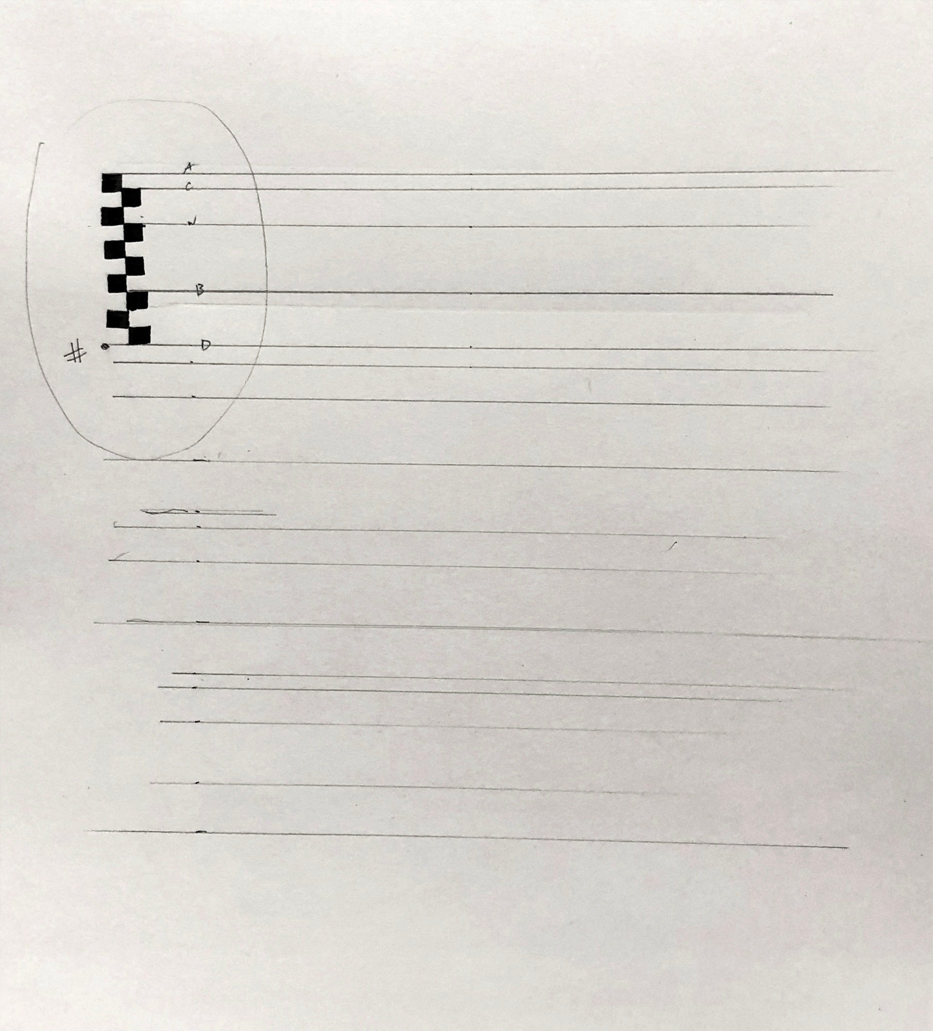
In contemporary calligraphy you might see guidelines left in as part of the design, or erased, but be careful not to disrupt the inked lettering on the manuscript page. Test all materials and processes first. I like Arches 140# Hot Press Watercolor paper and Japanese sumi or even Ziller Soot Black acrylic ink.
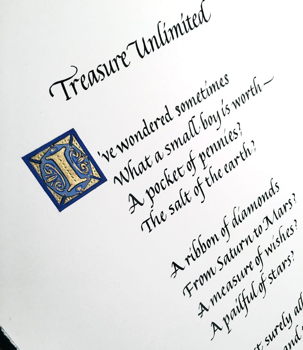
Guidelines on a lightbox are used to align the lettering when writing informally, when there is flexibility of arrangement, bouncing baselines, or modern, irregular letterforms. The light behind the template provides high contrast, enough to letter an original piece without having to put pencil to paper or mar the paper surface in any way.
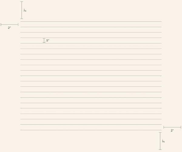
These are a few tips that I hope you’ll find helpful. We always have the grid in mind, simply because we are accustomed to standing tall and knowing where the horizon is! If we take care of the vertical as well as the horizontal, all the connectors can flow between and through this basic sense of orientation. We swing through the monkey bars of the page.
Thank you all for reading and enjoying my posts. It’s great to be here with you.
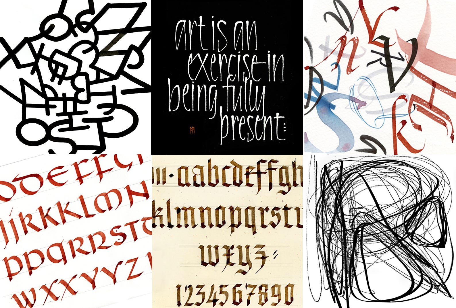
Here’s the summary: Calligraphy is visual music—meditative and seismic—capable of conveying personal meaning through letterform, a blend of structure and movement that stretches back thousands of years. In this course, students will learn to write formal calligraphy scripts with confidence, starting with the basic structures of the Roman alphabet, stroke techniques using pen and ink, and a time-honored grid system for page layout. We’ll explore a contemporary approach to freehand writing with pencil, brush, and marker, focusing on rhythm, spacing, pressure, release, and spontaneous invention. We study four formal scripts: Irish Uncial, an excellent starting hand; the classic upright 15th-century Humanist Minuscule, the foundation of print script; Gothic Blackletter, known for its graphic impact; and Italic, the basis for elegant cursive writing. Assignments will encompass alphabet practice, small projects, and complex designs. Exercises will address correct form, the interplay of positive and negative letterforms, and visual rhythms.
I’ll announce this again when registration opens. A full description and supply list is available now on the Stanford Continuing Studies online catalog page. Join, and we’ll have deep discussions about forms, choices, techniques, rules, and non-rules. Six Wednesdays via Zoom from 6 to 7:50pm Pacific, October 7 to November 11. Full details will be posted soon on my website.
NOTE TO ALL: This blogpost on Substack will always be free. The “paid” area is more interactive, with activities, discussion, and conversation. Your contribution is always appreciated, and helps keep things coming your way.
PAID SUBSCRIBERS: All paid subscriptions are now $75 annually or $7.50 monthly. I am eager to devote time to interactive projects and individual discussions on this basis. For you, it’s an ongoing investment in your graphic skills and performance in the book arts, handwriting, letterformation, and calligraphy.
EDUCATIONAL DISCOUNT: I’m now offering a special 50% discount on the annual paid subscription for art instructors and those in the art education field.
A paid subscription gives you access to ongoing conversations on my chat feed, permanent access to all archives, and access to exercises and how-tos. Let’s continue to talk about art and keep it fed, nourished, and productive. All images copyright Ann Miller unless otherwise noted.
Comments
Nothing yet. Say the first thing.
Sign in to join the conversation.