
While my students and I are wrapping up a productive summer of studying Notan and focusing on the nuances of shape design, the wheels are also turning toward the design of line and letter in the fall.
Let’s get the pen squarely on the paper and see what happens. We study monoline with the Speedball B-0 nib. It steadies the hand. It obliges the eye to watch the white forms and black lines simultaneously. It directs your soul to tidy up those terminals. It urges your brain to grasp the directions, forces, and shapes that populate the page. It makes you self-conscious if you neglect the margins.
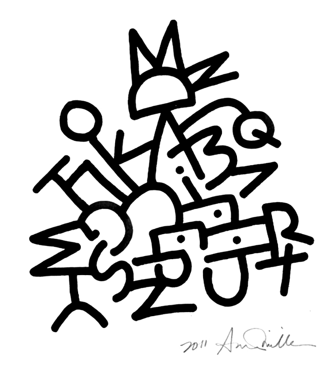
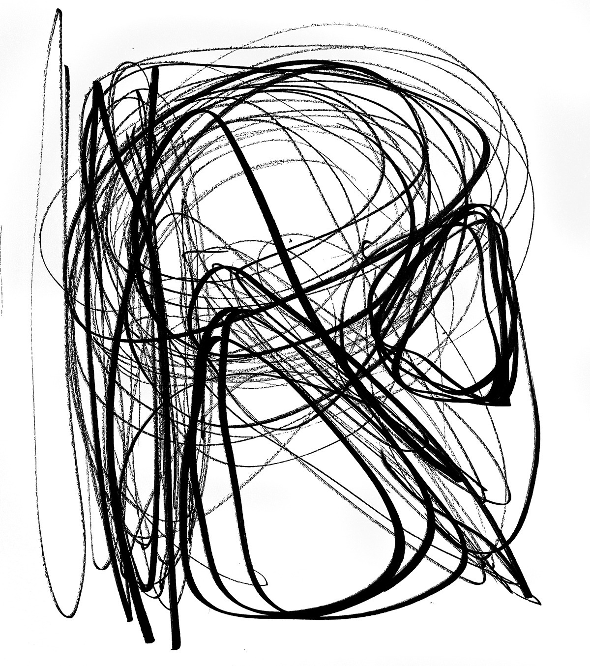
Emboldened by studying the skeleton Romans, we’re ready to go with the flow, the rhythm of ink on the page, the repeated sway of the arm, the pulse of the breath and the heartbeat. We conduct air letters, and the movements end up on the page.
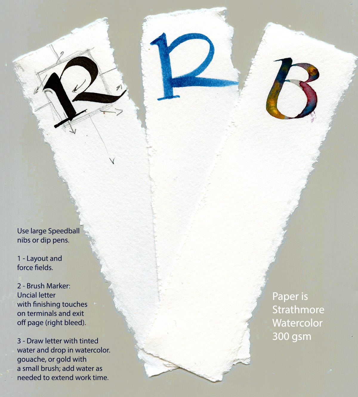
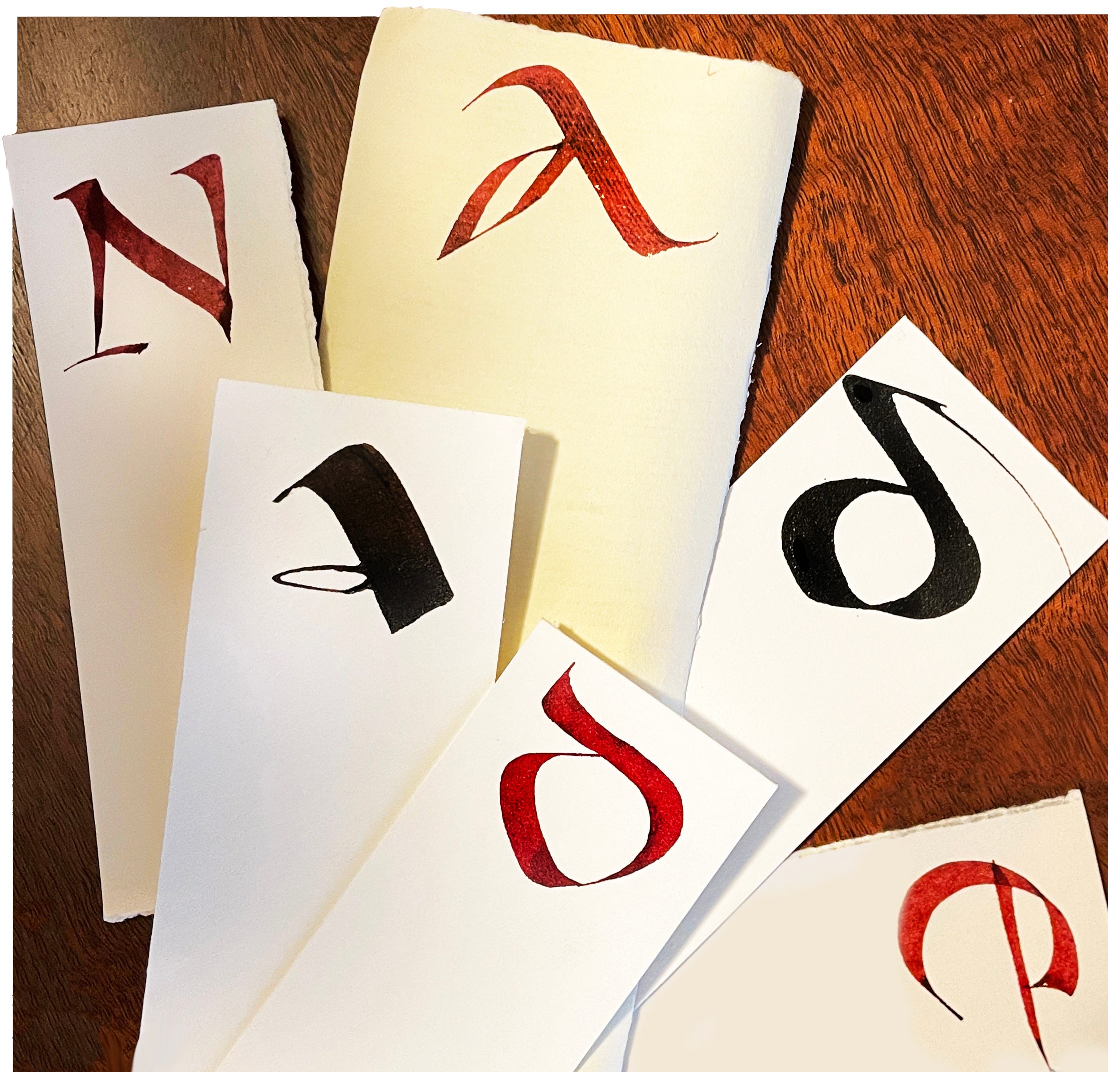
We let our lively movements rest while we tackle our first formal script: Uncial. We study its long history and various forms from Roman uncial, 2nd c. CE to 6th c. Irish Uncial. Absorbing so much history leads us to work with the monogram, exploring the modulations of pen angle to create serifs, curves, shape, and balance using a single letter. It’s a little composition that brings with it some fun features.
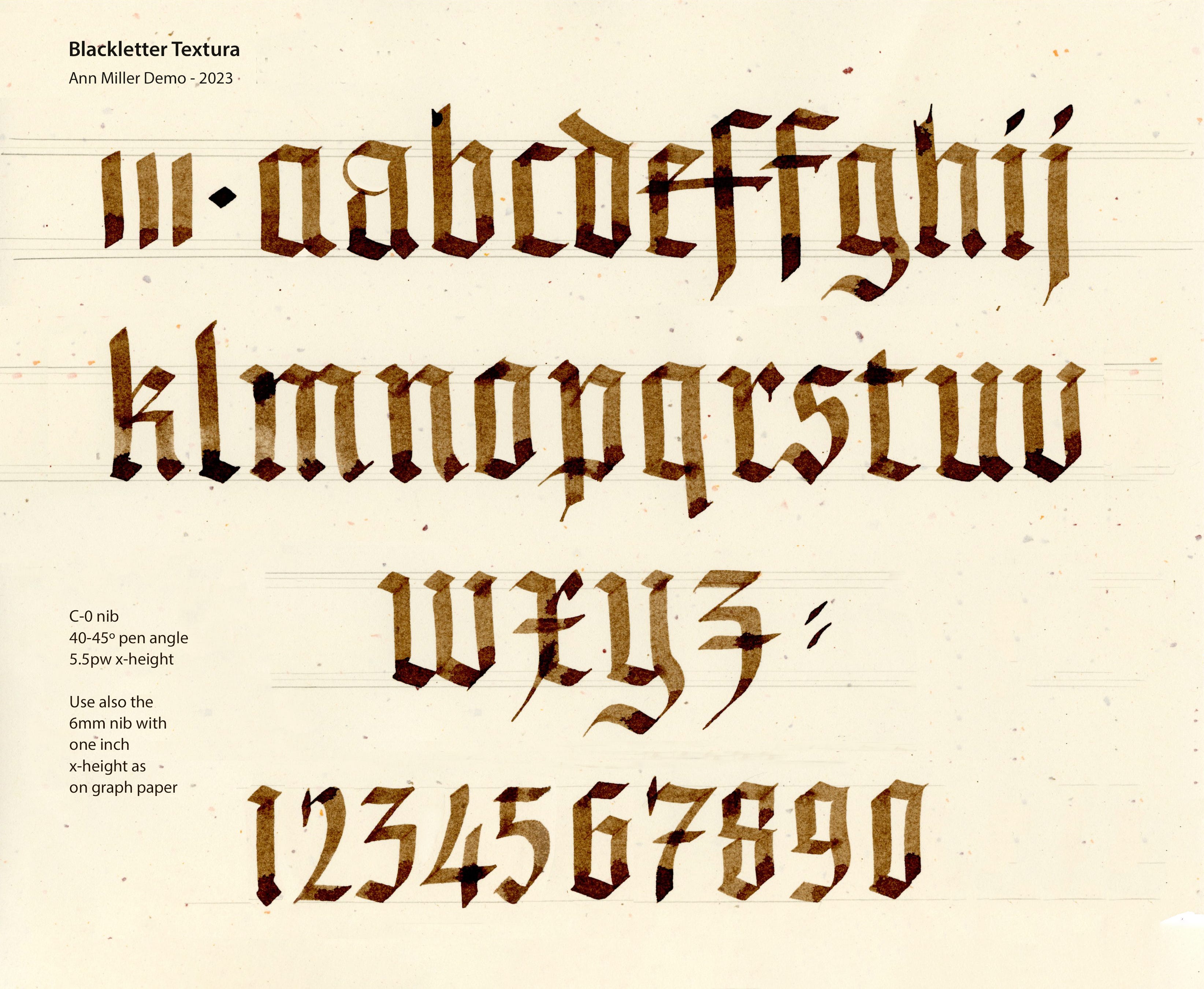
Moving on to more complexity, we work with the variations of Blackletter scripts. Textura is basic, and teaches regular spacing as well as a refined adjustment of pen angle when required. We explore Batarde and Rotunda as well.
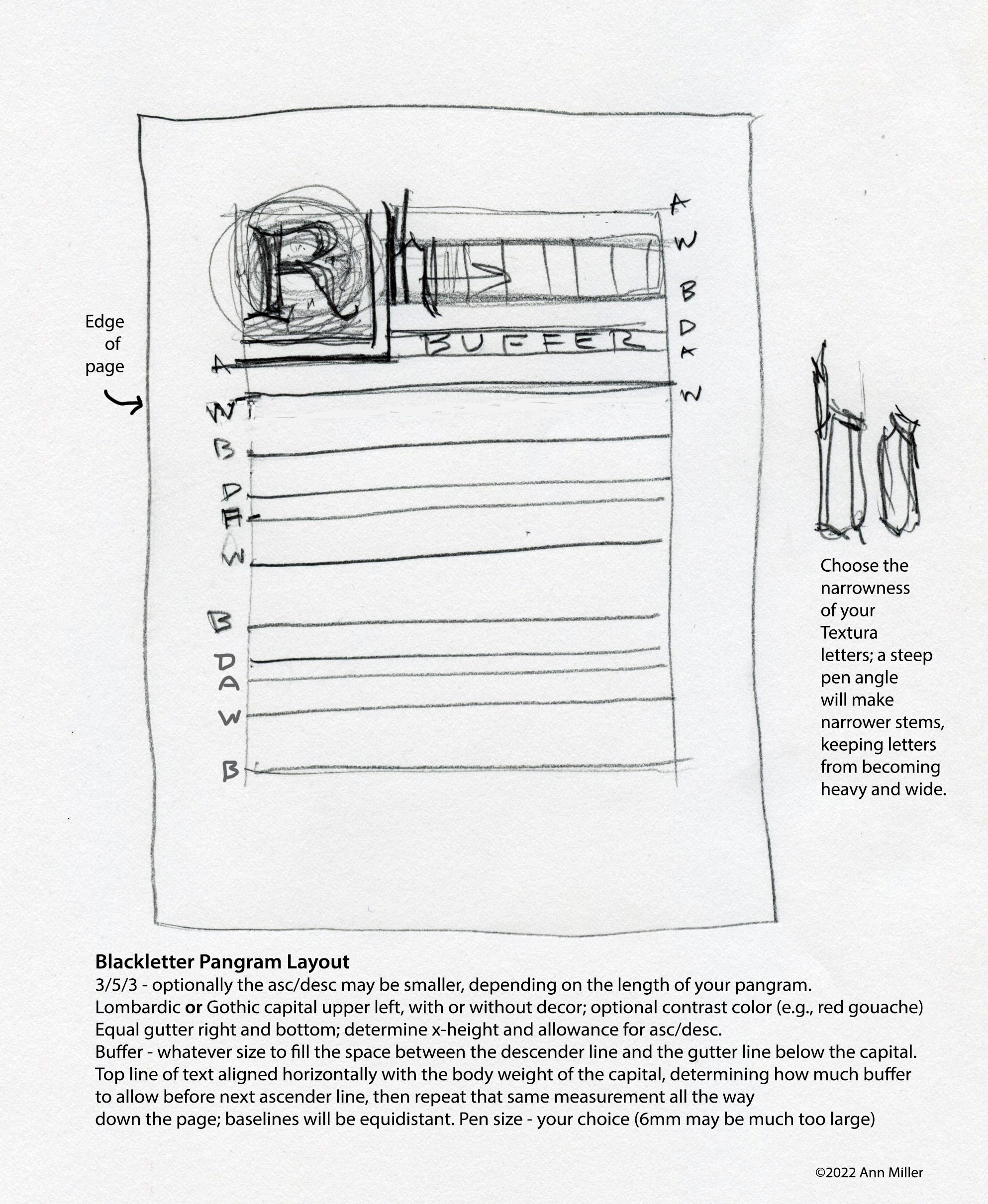
At this point we encounter the pangram layout! You will then be ready for anything the future may bring. I’m from the academics, and I’m here to help!
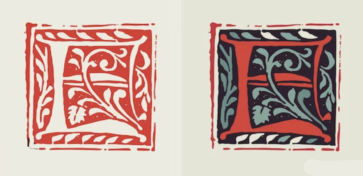
The design for the initial capital introduces Lombardic capital forms and decoration in examples like these.
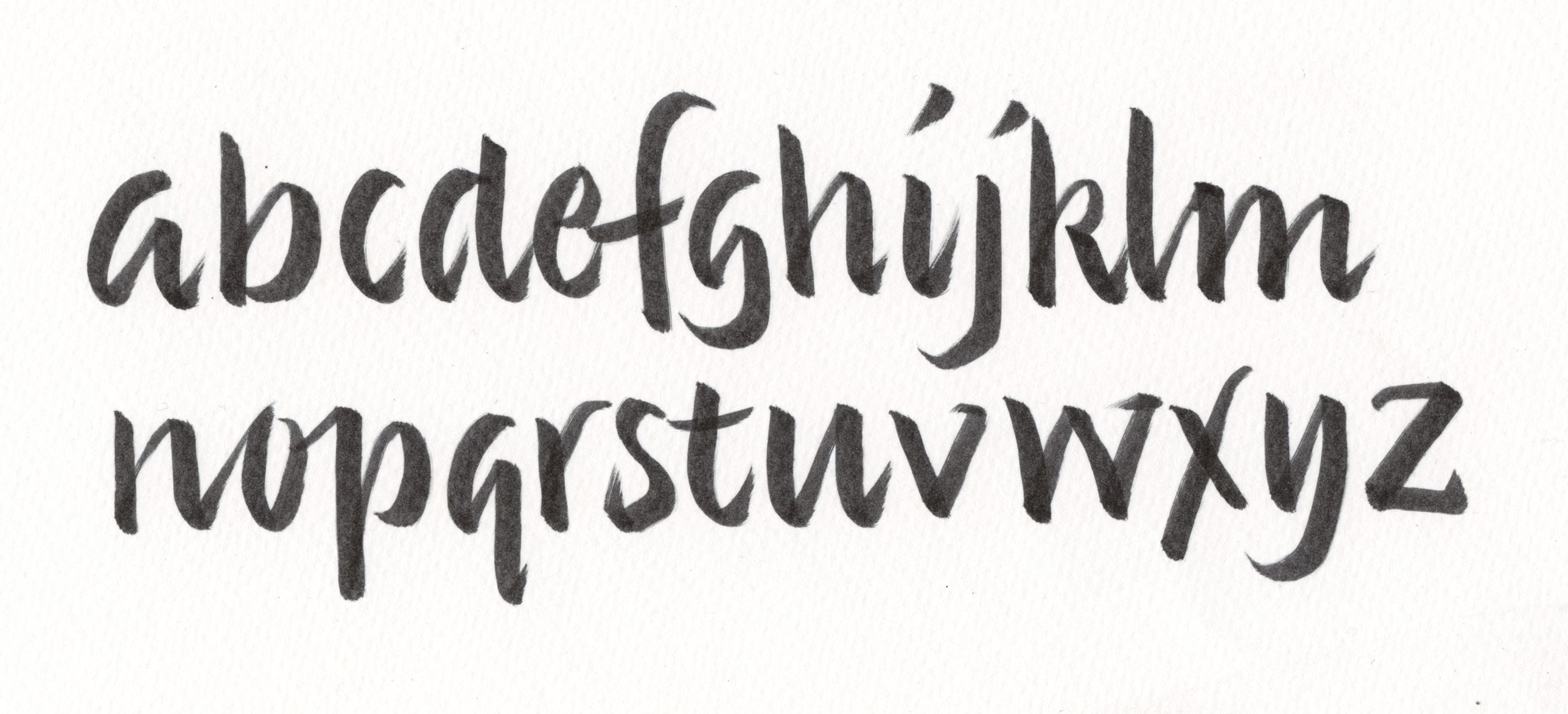
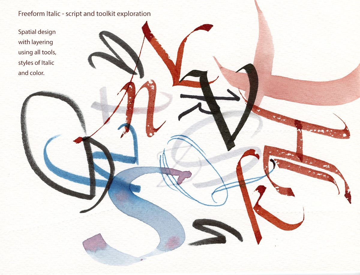
With heads brimming with Gothic visions, we relax into the sensualness of Italic, its curves, rhythms, and fluidity. After studying the proper form, we play with a spatial exploration using overlaps, all tools, and all forms of Italic.
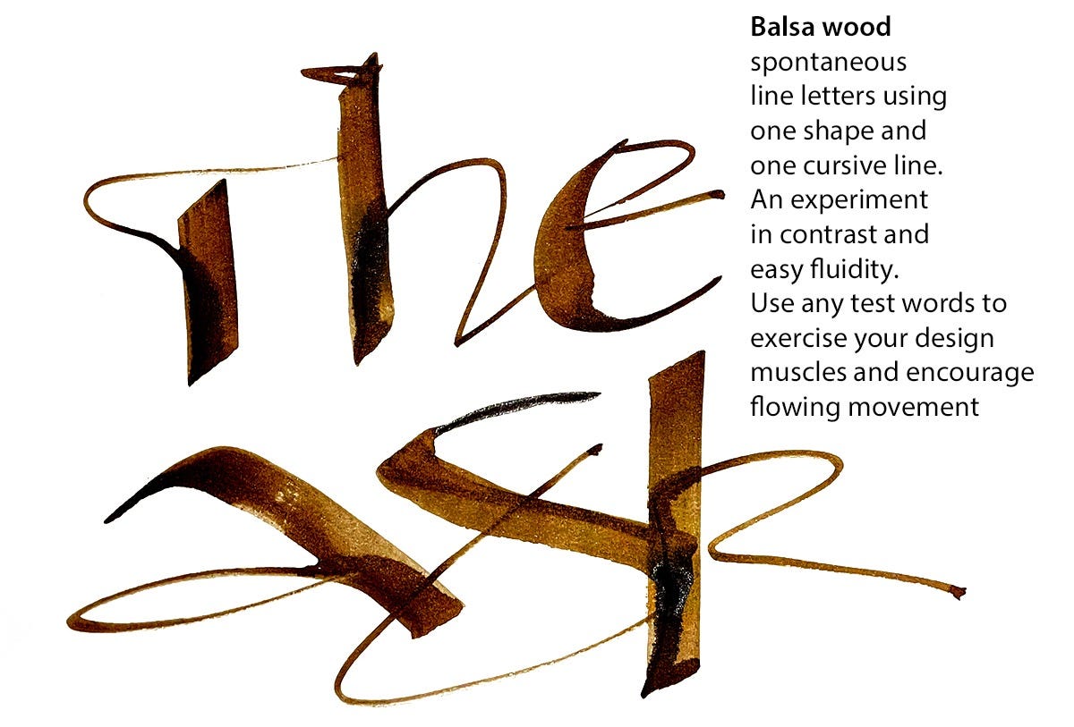
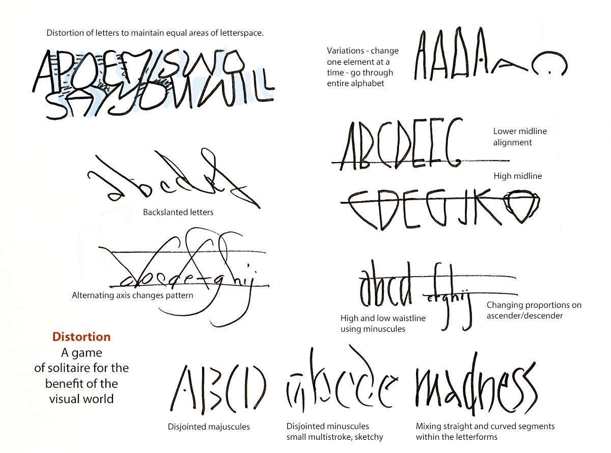
Finally, we step back and explore new tools, texture and distortion. Your work can be confident and bold at any level of mark making.
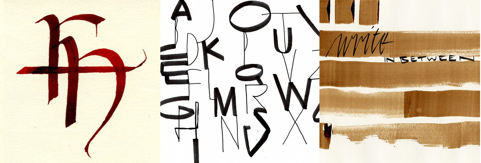
If you have been introduced to calligraphy at any point in your life, it may be that this class is the best way to approach it again. Pick up the pen and have a writing journey. We learn and practice, we discuss and critique, and we find a new understanding of letterforms and a welcome place for them in our day.
Thank you all for reading and enjoying my posts. It’s great to be here with you.
ART 50 - Calligraphy and Letterform: History, Methods, and Practice
It’s at Stanford Continuing Studies, and it begins on Wednesday, October 7, with a zoom session from 6:00-7:50pm. Anyone can register. Canvas opens a week prior to class for orientation, a pre-class assignment, and a general heads-up. This 6-week class covers construction of the basic scripts such as Uncial, Humanist Minuscule, Blackletter, and Italic, freehand writing, and invented letterform as well as page layout, history, and some fun projects. Click the link to check out the full syllabus and supplies list.
Getting Inky will always be available free. If you want more interaction, exercises and activities, discussion, individual one-on-one conversation and critiques, like a mini-class, please send in a contribution of any amount (use tea link) or subscribe!
PAID SUBSCRIBERS: All paid subscriptions are now $75 annually or $7.50 monthly. I am eager to devote time to interactive projects and individual discussions on this basis. Invest in improving your graphic skills, design perception, and performance in the visual arts, handwriting, letterformation, and calligraphy.
EDUCATIONAL DISCOUNT: You receive a 50% discount on the annual paid subscription, available to art instructors and those in the art education field.
Comments
Nothing yet. Say the first thing.
Sign in to join the conversation.