
Today we’ll look at some contemporary artwork to try and get into the artist’s mind as countless decisions are made in pulling an image together. It’s not a mystery. But the parameters of that motivation are hidden from apparent view unless you know.
There are many approaches to dark/light balance in finished work, shown here in the work of many artists you may have seen. An internet search on each one will reveal the true scope of the artists’ visual expression. Here are a few examples to illustrate the essential concepts of figure/ground interaction.
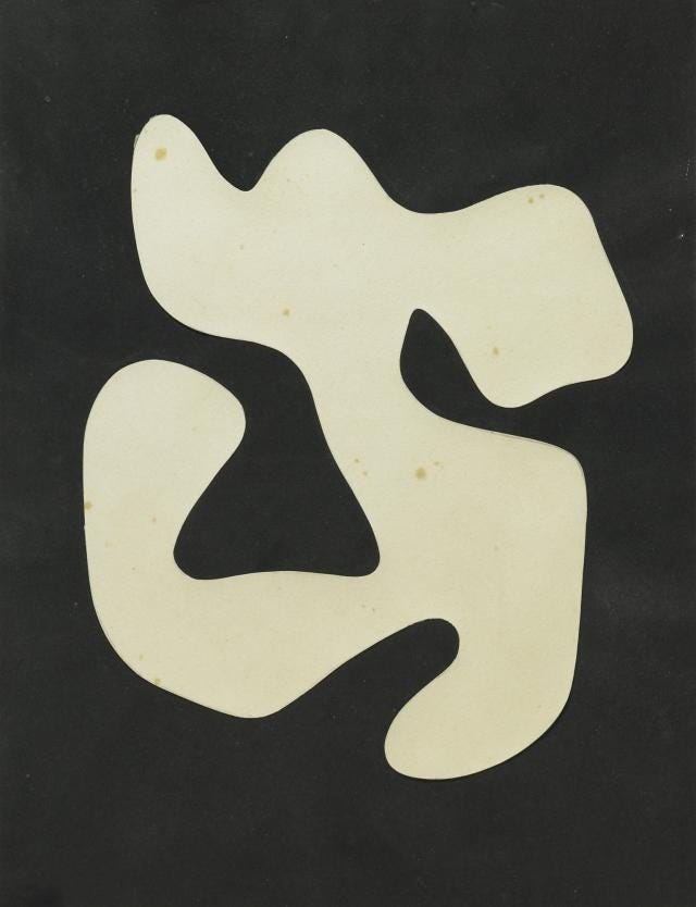
Jean Arp’s simple shapes create powerful Notan reversals. You can see this two ways: looking out from a dark cave at the bright sky OR seeing a fluttering light shape drifting towards you out of the night sky. Note the different character of the black shapes as they push into the white, like fjords and peninsulas. Many of Arp’s shapes are anthropomorphic. He was a member of the Blaue Reiter group and worthy of a web trip to become familiar with his life work.
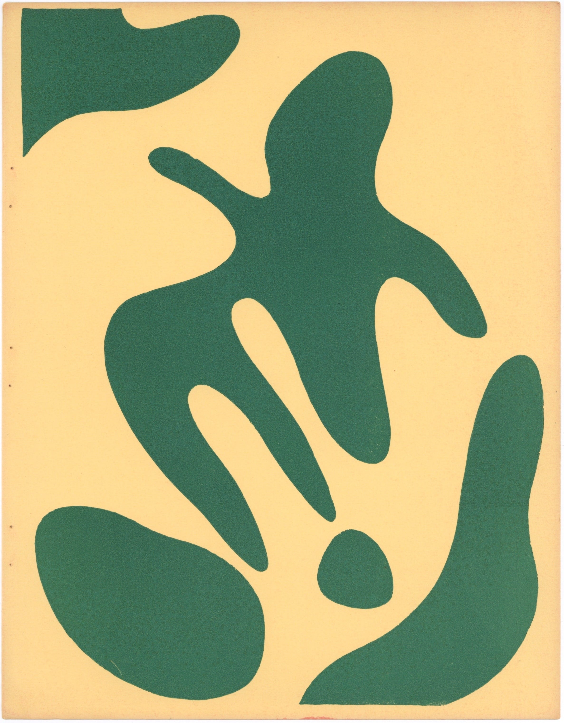
Linocut with simple Notan exchange. Note how the frame is referenced at upper left and lower right using more vertical elements, creating a design counterpoint to the central flow and to provide a stabilizing influence, keeping the movement in the central image area.
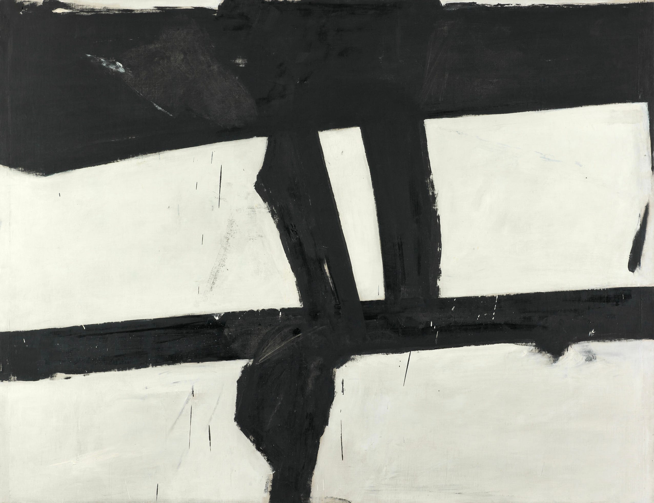
Many of Franz Kline’s paintings are balanced equally between light and dark. Each tone is overlaid white over black, black over white in alternating passes, changing the shapes until the relationships satisfy his sense of both tension and balance. Dark bites into light, light bites onto dark.
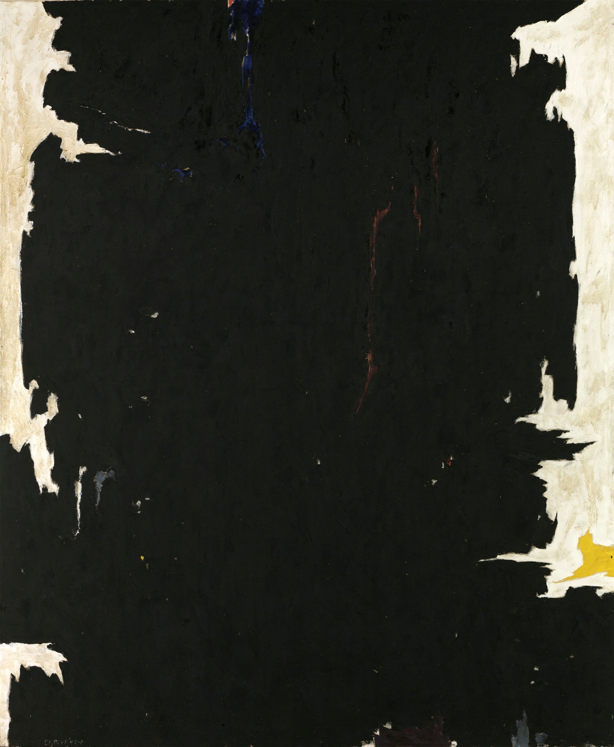
Where is the background? Which elements come forward, and which recede? And why? Does Notan always create ambiguity?
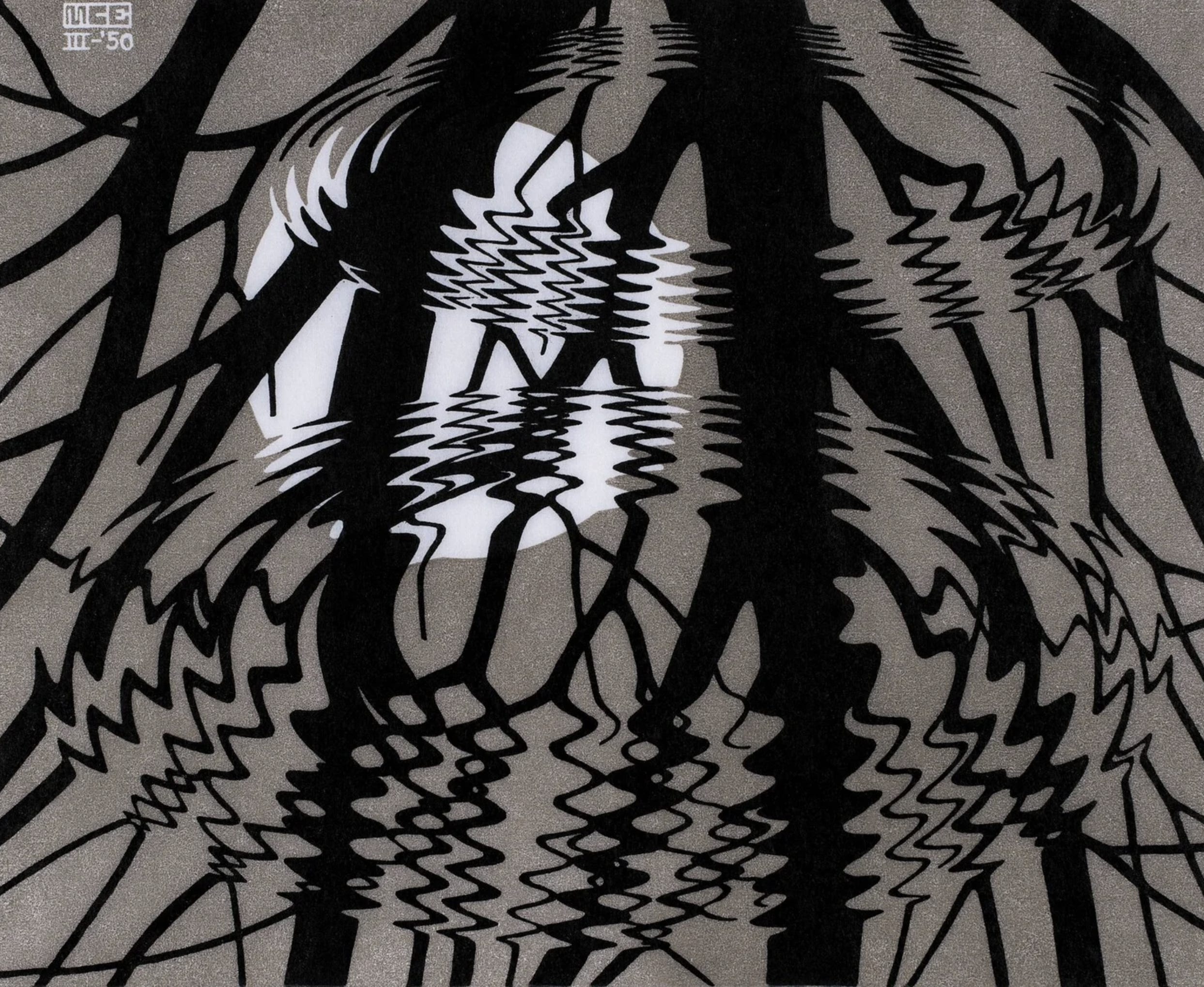
Linocut with simple Notan exchange. Deep perspective and movement with only three grayscale values. Note how the frame is referenced at upper left and upper and lower right, with almost-verticals, as a design counterpoint to the central flow and to provide an enclosing and stabilizing influence.
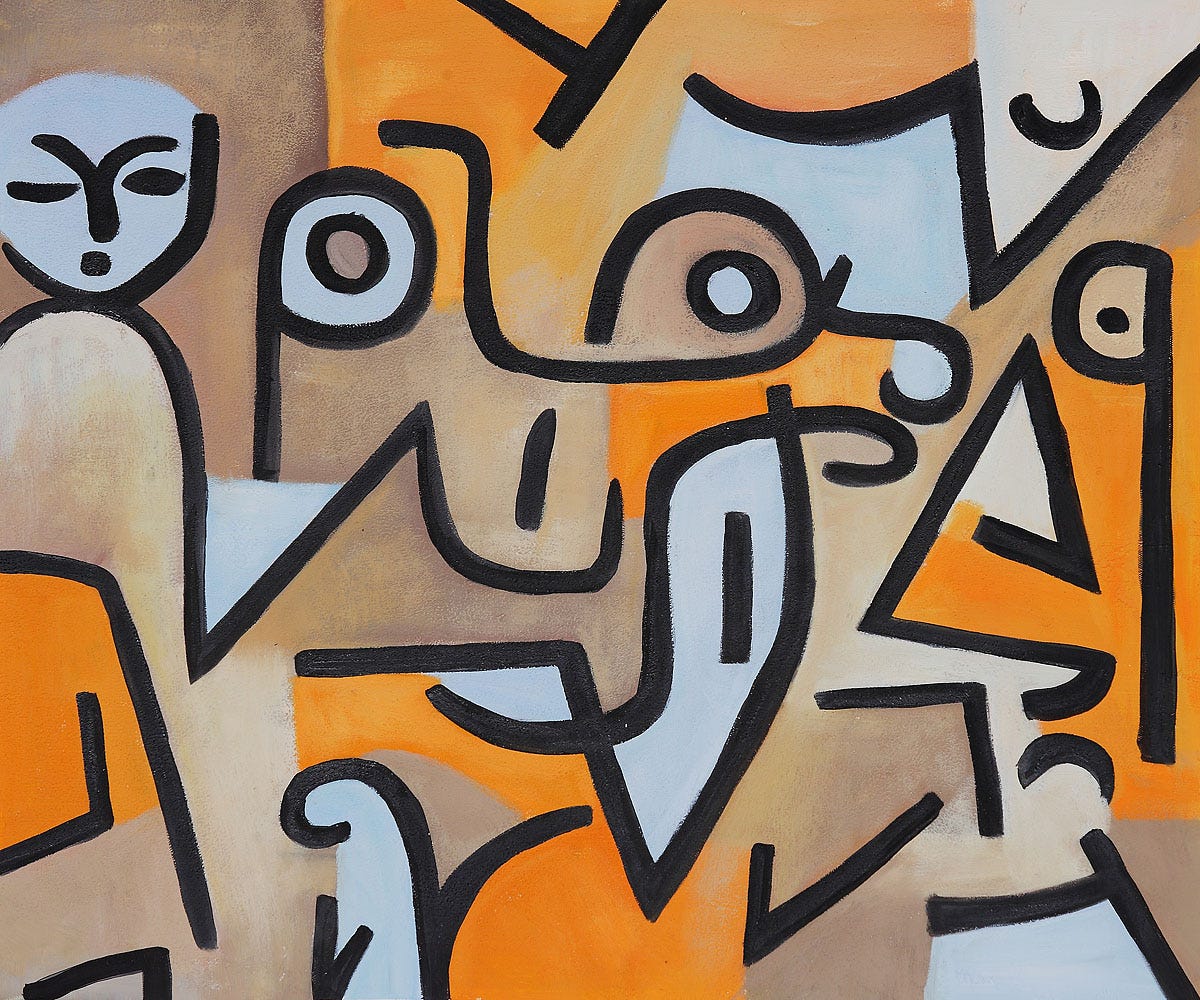
Oil painting showing balance through distribution of color and sensitivity to the interaction of shape and interval/spacing. With the hint in the title, the story this painting tells is charming. I see a wild and inquisitive child in the central focus area (the action/diagonals) and the two observing parents (static, vertical) at the sides. You can see also the basic grid of color in three vertical panels if you squint and imagine it without the black linear elements.
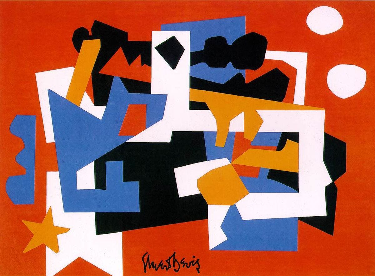
A spiraling constellation is formed by these shapes in a limited palette (primaries plus black and white). Note that the central focal point is black and white. Red, the most advancing color, is at the edges and repeated in the center providing harmony. The Notan interaction of the blue piece with the red ground at center left edge creates more spatial ambiguity; it breaks up the red frame with definition as an active, interlocking shape rather than an inert, solid red background. The wide red triangle at the bottom edge serves the design by cutting into the white strip—which would have led the eye off the page—with an arrow shape that directs the eye back into the central spiral.
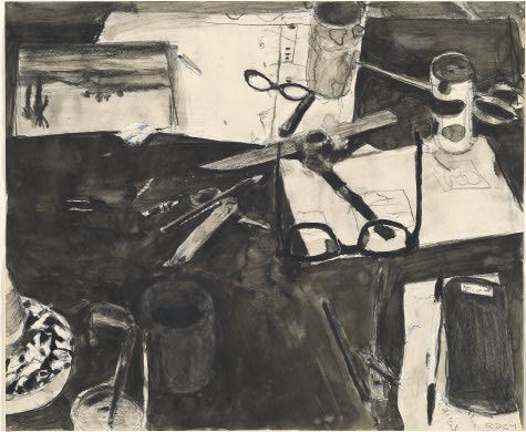
The interwoven aspect of the many elements in this ink wash drawing reflects a deep understanding of Notan. The double eye form found in the glasses, lorgnette, and scissors is either black on white or the reverse. The composition seems to be a quarter circle of rings that have their center off the page at the lower left, with concentric masses of more white, more black, then a succession of gray and white rectangles forming an arc from upper left to lower right, leaving more dark grays pushed back at the top.
The angular corner of the table that takes up 1/4 of the painting has the dark ghost of a tumbler that was apparently deemed too prominent, perhaps even cluttered; an overwash simplified the composition. The tumbler shape is echoed throughout the design, in the two cans and even the oblong object at lower right.
Compositionally, there is also a fan shape that radiates from the upper right area via the slender lines and edges that make up the geometric network.
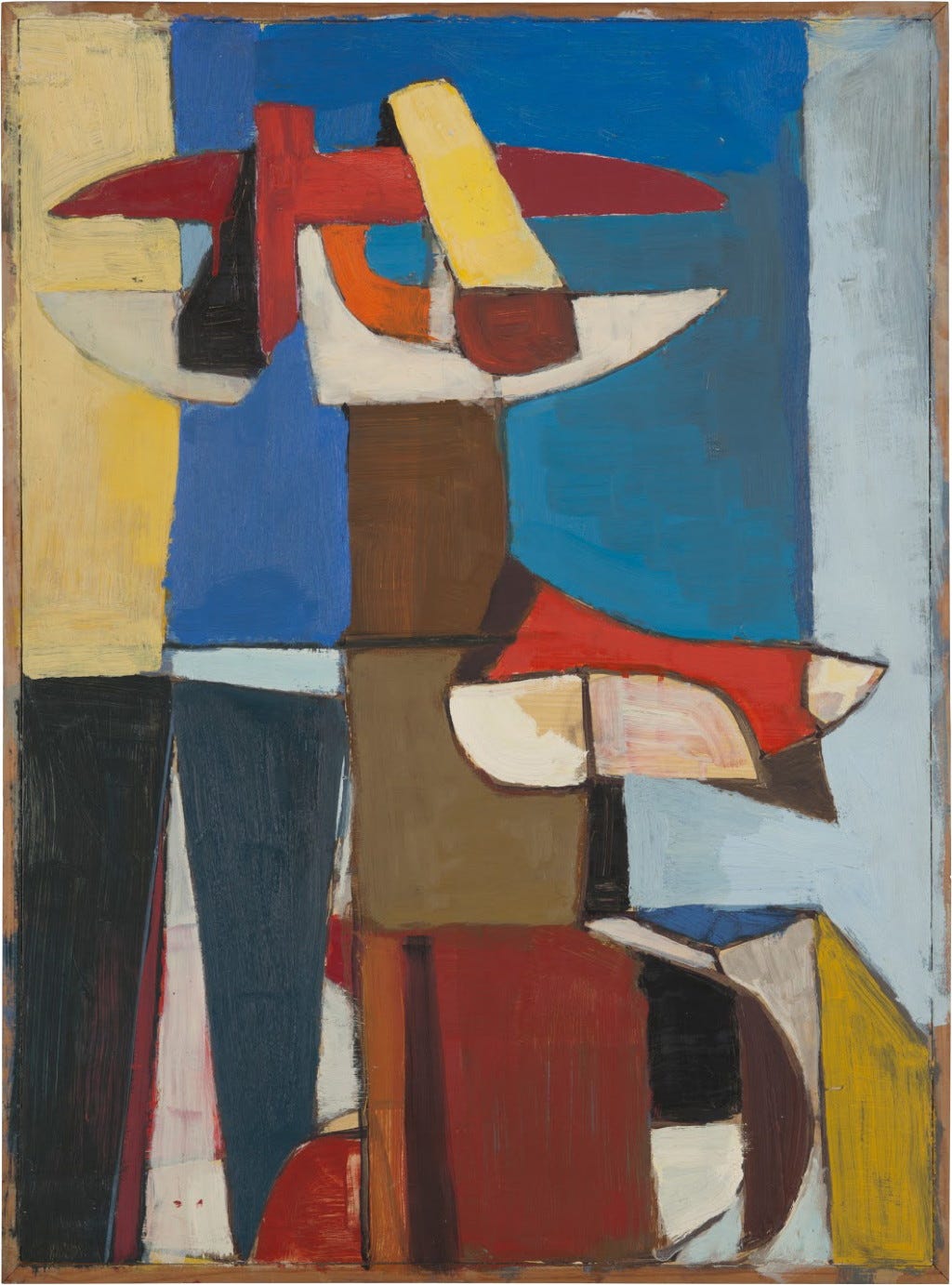
Close study of Diebenkorn’s work is rewarding, particularly his distribution of hues. Check out the yellows in this early painting. Note the small orange shapes. Next, track the use of reds of different intensity. Then the wide variety of blues, located mostly in the central panel. Pale pastel shapes recede into distance, pushing the figure forward. Note how the thin, dense black rectangles define and give depth and emphasis to the central image. And finally, look at the gradual progression of the tinted grays moving toward the whitest pie shape just below center of the design.
Diebenkorn’s choice of color tells our eye where to go on its travels inside his virtual space. I believe he is toying with the art professor’s admonition never to divide a painting into four equal quadrants! He has gotten away with a centerline and a central axis and yet has created a kinetic liveliness by bending the shapes and subtly transitioning from one area to the next.
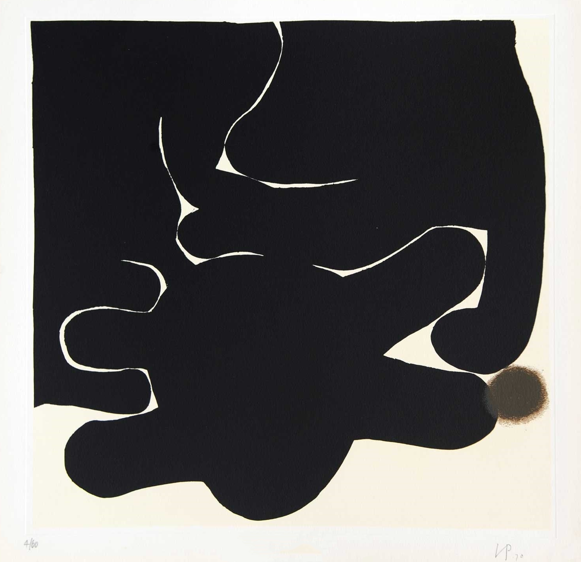
High contrast in size of shapes and play of convex/concave elements. The art is extremely organic in feeling, like cellular motion observed under a microscope. Is it a graphic metaphor? In any case, this work stands up due to the concentrated focus on interaction of dark and light elements pushed to their extreme point of size contrast.
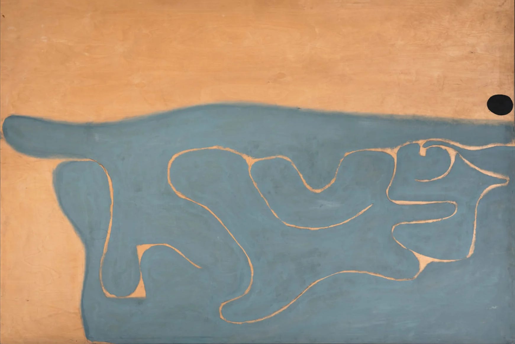
Basically, this is a complementary color scheme based on blue and orange, each tone muted. The third element is a black ovoid that provides balance as the eye meanders through the linear flow. Spatial perspective is greatly enhanced with the surprising placement of the dot that connects visually with the long finger above center left edge, and the two ovoid blue shapes at lower left as well as the kidney bean shape at center right. These ovoids form a triangle that keeps the eye moving and meandering around the composition, searching for a significance, triggering a thought. The peach-colored right angles and other non-curved elements also form a distributed grouping, as do the triangular areas at the curved junctures. The feeling of this work is slow, organic, full of discovery, and expressive of life and breath.
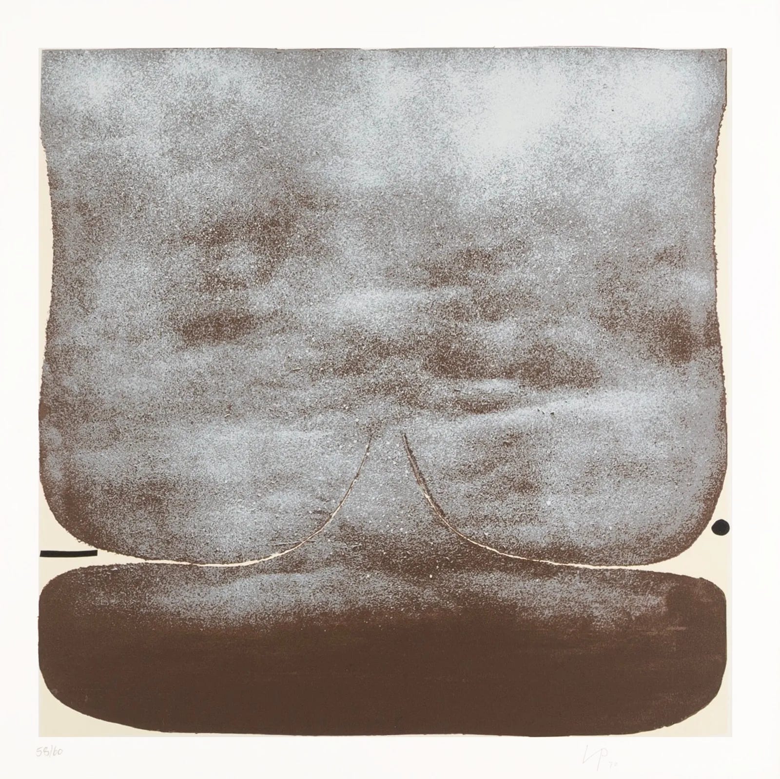
Screenprint. The main image is rounded and convex and pushes against the surrounding light blond triangular wedges and thin crescents that are only slightly more intense in color than the paper. How many passes of color do you think he used?
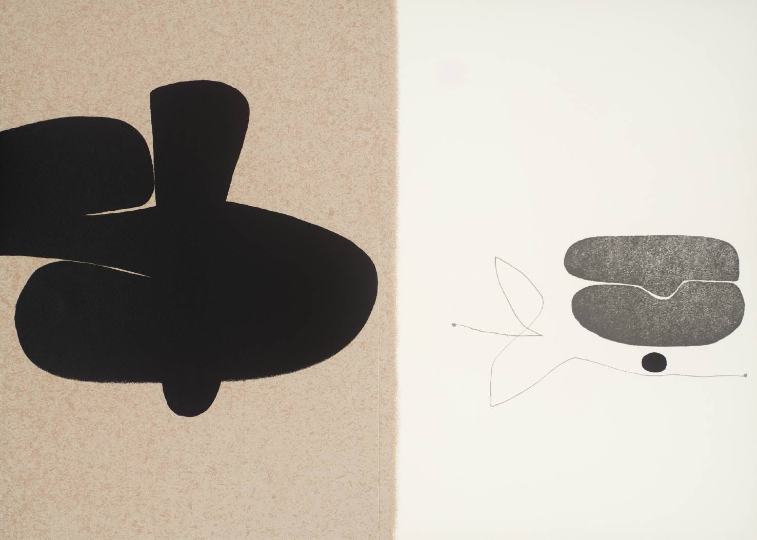
Notan balance is essential to fine art. On the left side of this work by Pasmore, the heavy black shape seems buoyant yet gains stability by the single introduction of a right angle. This allows the upper tilted square of negative shape to provide a geometric plane for the black to connect and interrelate with. The vertical element may be emerging from behind that almost vertical straight-edge, and the rounded arm (with its elbow bleeding off the edge) may be in front of that same light rectangle. It’s ambiguous, which is one of the benefits of playing with Notan for a layer of surprise. Could that big black shape be a skewed dollar sign with one vertical staff? On the right side we see a design with much lighter weight that contrasts well with the boldness of the left. Balance between both sides is carefully thought out.
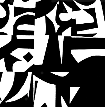
An asymmetrical design, apparently cutting out nine squares from an original black and white design, then cutting them up into a new arrangement. First, you see it as a unified thing, then the nine squares become apparent. Doing this exercise triggers imagination and invention.
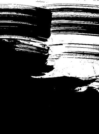
Kaz Tanahashi’s zen brushwork is particularly attentive to the figure/ground balance, which is created through feeling pressure, speed, direction, medium, and tool. See more of his work in his book Brush Mind.
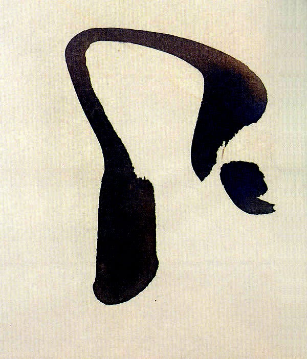
This brushwork simultaneously creates two shapes. The inner white is easily seen as a finger of land surrounded by s dark void, which works optically to make that surrounded area seem lighter than the light ground. The stroke is conscious of its relationship to the edge of the page, with varying intervals of distance between it and the edge. The wider vertical anchor at the beginning of the stroke stabilizes it for an increasing sense of movement as the brush whips toward the finishing lift and then returns for an accent dot that carries the motion through.
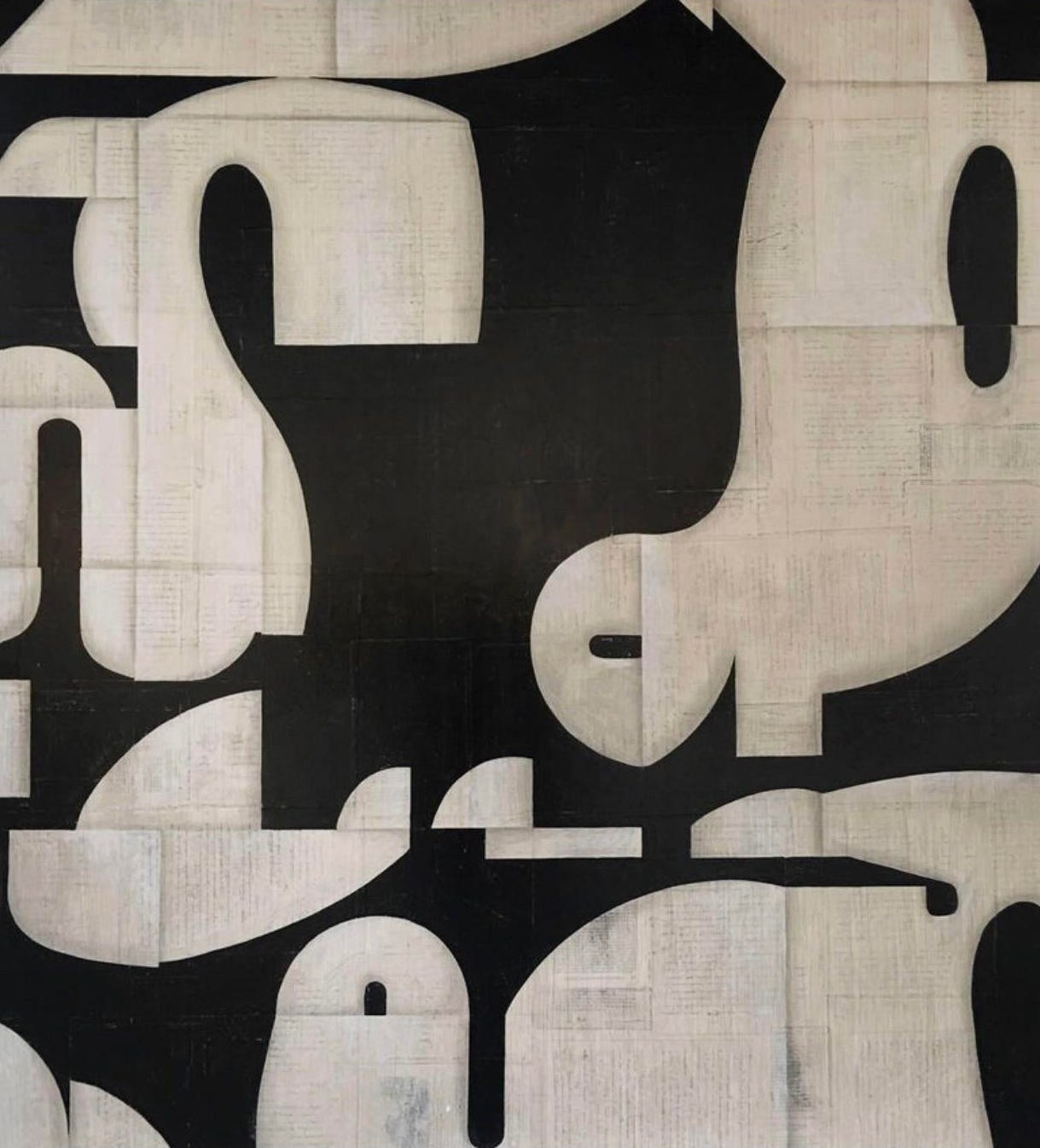
This collage by Cecil Touchon is Notan play of highest quality, with forms that advance and recede spatially; the dark and light interlock strongly in a quest for balance and intrigue.
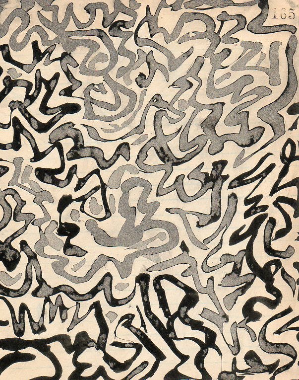
An asemic composition balancing black and white shapes with unflagging focus on interval and flow. There is a sense of foreground and background due to the use of gray wash in the upper parts and the deeper values at the bottom and lower sides.
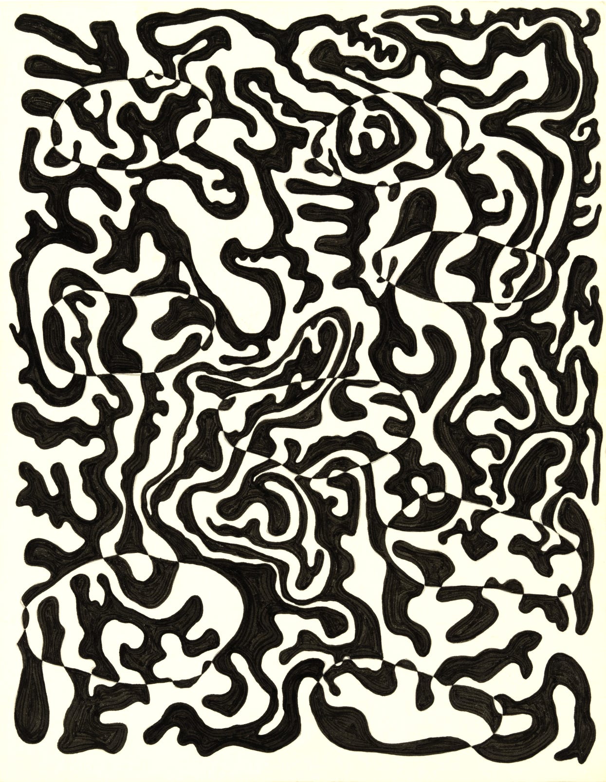
A Notan-inspired composition that is FUN. Locate the ovoid (potato-like) shapes and track how the meanders connect and flow through. This artwork follows the same concept as the Expansion of the Square, a familiar student exercise.
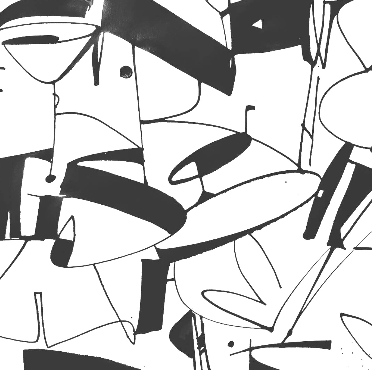
Drawn letters formed while simultaneously creating white shapes; study the joins, especially where wide black strokes meet at the corners, creating a connected network of enclosed shapes.
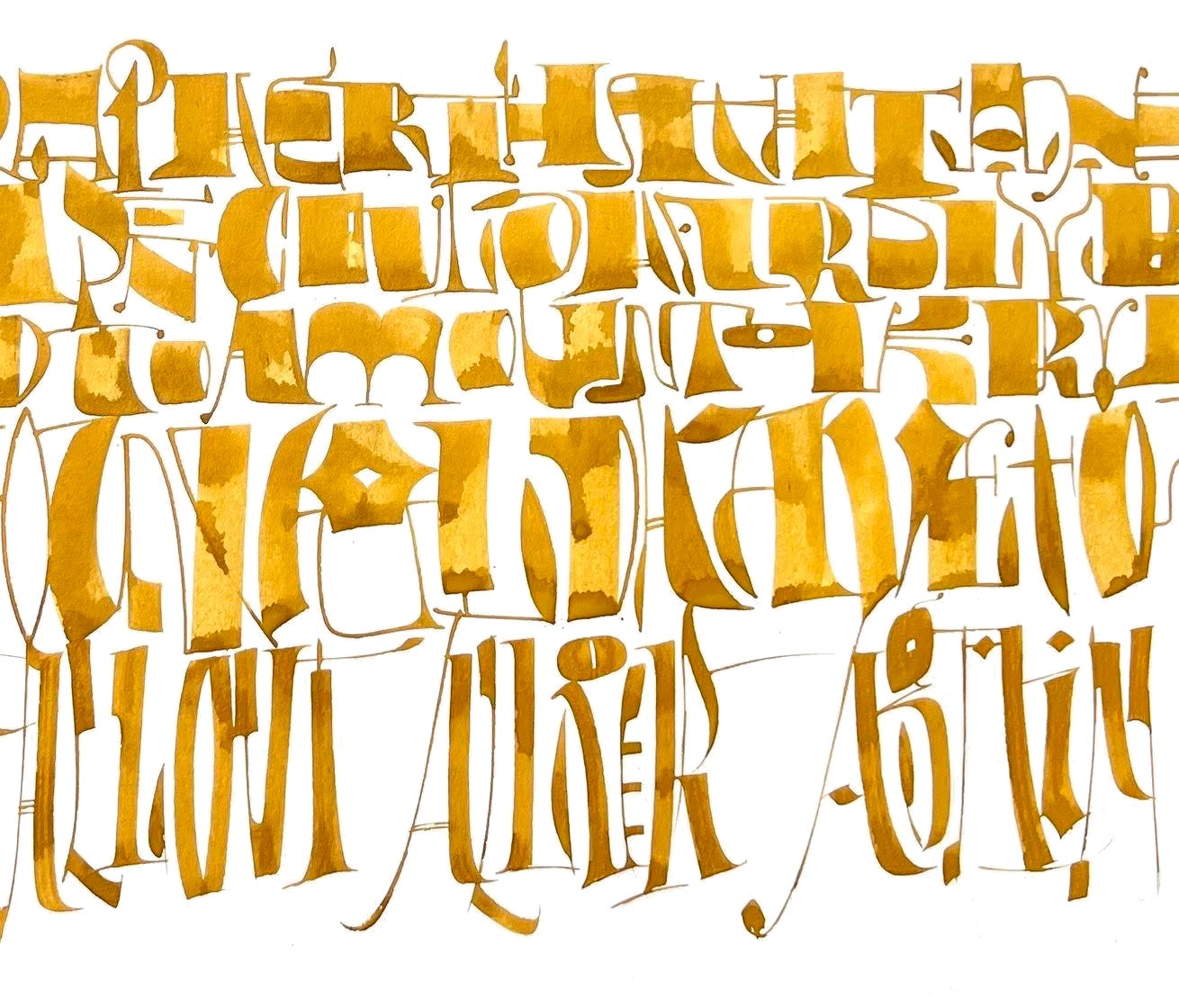
Again, drawn letters are formed while simultaneously creating white shapes that that share family similarities. There is interlinear space but there is also connection vertically. The visual rhythm of similar weights creates simple hierarchies. The pooling of the transparent ink lends a great deal of visual motion to the page.
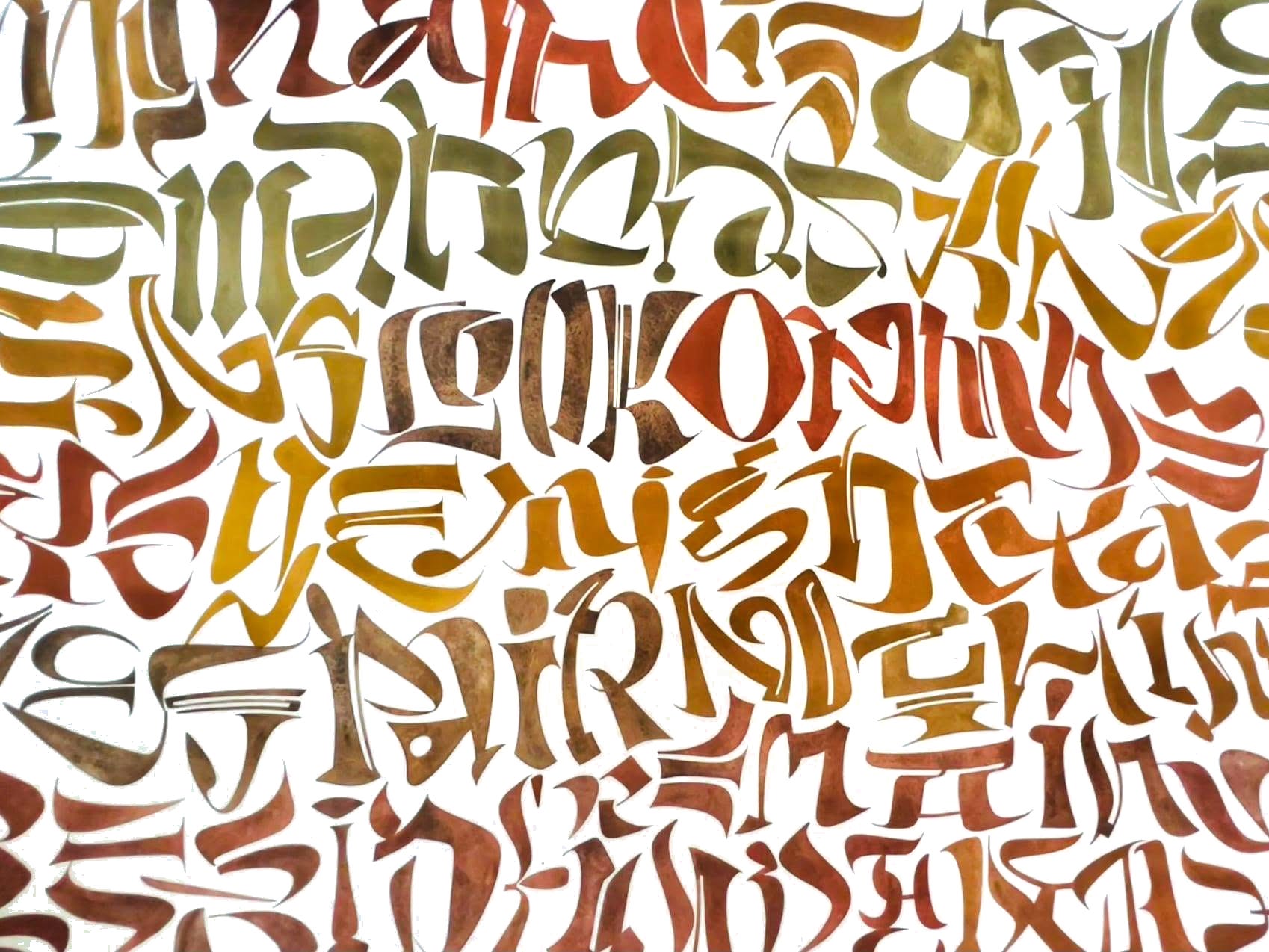
Drawn “wonky” letters are spontaneously written with an eye to equal intervals and spacing throughout. Simultaneously, the color shifts form a pattern of their own, contributing to the visual movement of the piece. Attention to the shape of the counters (inside the letterforms) and the shared interspaces are obvious use of the Notan principle, joining the white shapes to the letters and forming an undulating sea of white shapes. The letterforms are not simply thrown onto an amorphous background.
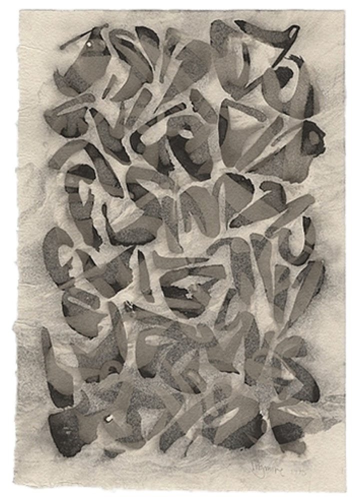
Loose brush letters are written with a close eye to intervals, spacing, and the shape of the white, which locks the writing into a harmony. Some light, opaque inks are used in a top media layer that modifies and unifies the lettering, softening it into a tower of words, something like a song. The soft paper lends itself to modulated grays.
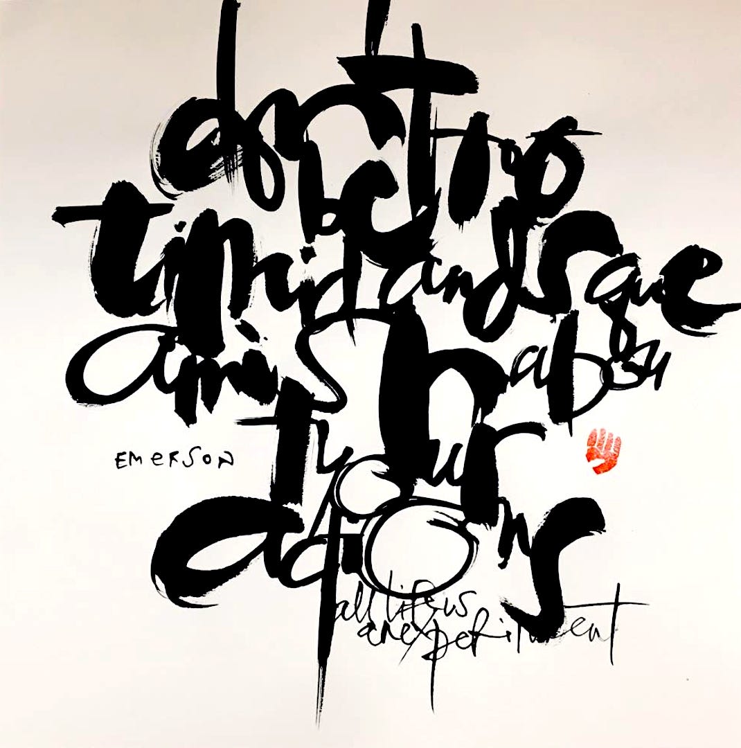
This work by Mike Gold fulfills the meaning of the quoted passage from Emerson: “Don’t be too timid and squeamish about your actions. All life is an experiment.” It follows the Notan reversal sense of balance between light and dark, in which each can be seen individually as a grouping. Note the hourglass shape of the perimeter (that engages with the margin) and the attribution and artist’s chop stabilizing the active central mass with its horizontal alignment. Also note that you can visually see all of the “o” shapes as an isolated, balanced set. Follow the connections, like the T bar connecting to the entry of the Y in “your.”
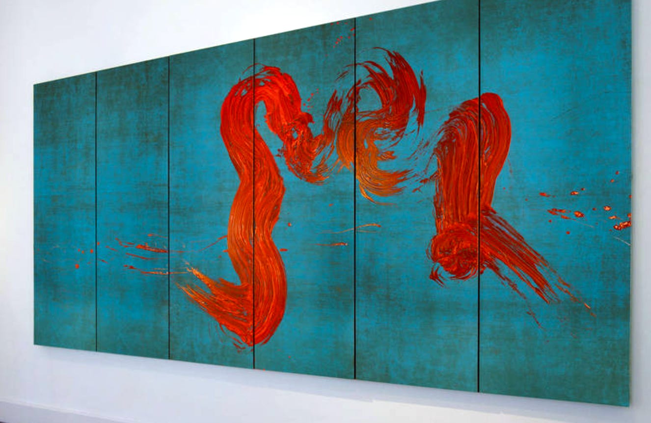
The brushwork of Fabienne Verdier takes Notan to a new level, addressing the balance of figure and ground with a breakthrough brilliance. The blue and red areas are positively interactive in shape and edge as well as exploiting the vibration of complementary color. To accomplish this visual dream, she designed an enormous brush machine that allows her to control the immense area of the joined canvases in one movement.
• • •
“The longer you look at an object, the more abstract it becomes, and, ironically, the more real.” — Lucien Freud
I hope you have enjoyed this collection of work based on dark/light contrast and its far-reaching implications. Artists enjoy the weighing of values and pursue it to the end.
Thank you all for reading and enjoying my posts. It’s great to be here with you.
NOTE TO ALL: This blogpost on Substack will always be free. Upgrade to Paid for interactive activities, individual comments and discussion, and exclusive articles. Your contribution is always immensely appreciated, and helps keep things coming your way. All images copyrighted by Ann Miller unless otherwise noted.
PAID SUBSCRIBERS: All paid subscriptions are now $75 annually or $7.50 monthly. I am eager to devote time to interactive projects and individual discussions on this basis. For you, it’s an ongoing investment in growing your graphic skills and supporting your performance in the areas of book arts, handwriting, letterformation, and calligraphy.
EDUCATIONAL DISCOUNT: I’m now offering a special 50% discount on the annual paid subscription for art instructors [you@your school.edu] and those in the art education field.
Comments
Nothing yet. Say the first thing.
Sign in to join the conversation.