
Today we’ll look at prehistoric artefacts, indigenous patterns, and examples of figure/ground design prior to the 19th century to explore how and why black and white or dark/light contrast has been used prior to its formal emergence in the West with the “Notan” label.
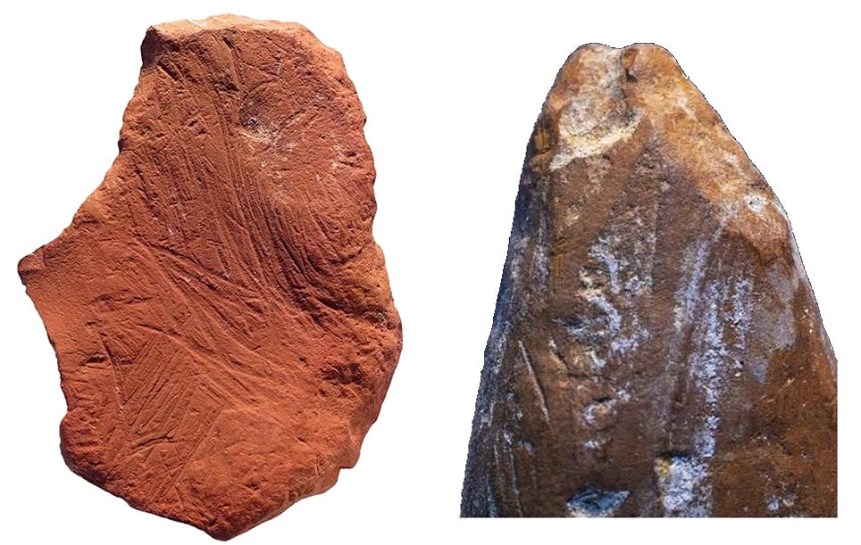
Our earliest marks show great beauty in observation of the shape, volume, and textures of the target prey. These lead to more advanced and precise patterning that enhance focus on the target and emphasize the subject’s importance to the family or tribe. Food, water, shelter. These concepts are among the first signs recorded. Some examples of markings go back 145,000 years and are seen in the form of regular striations incised into the side of a prehistoric “pencil”, like a shard of ochre sandstone used to make signs on a cave wall, for instance.
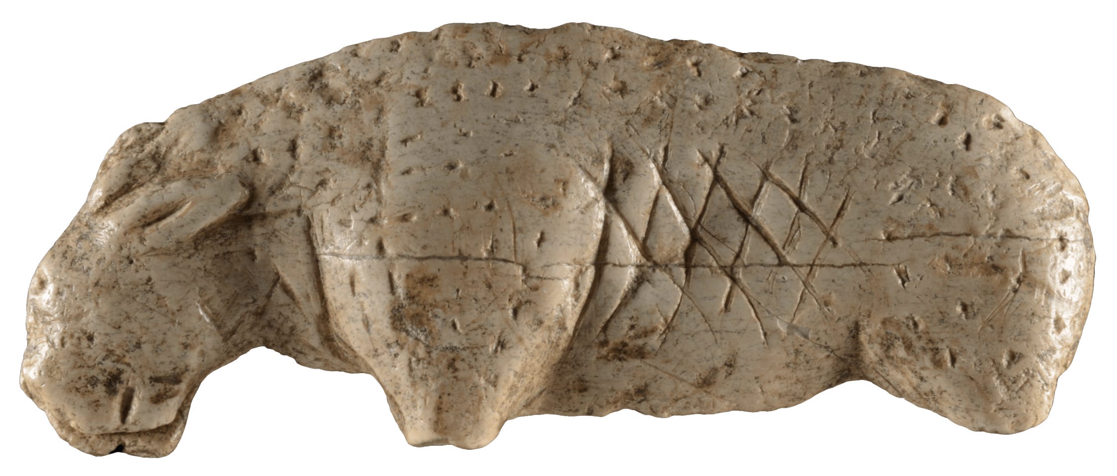
Another 100,000 years and the markings become quite realistic, showing a deep understanding of observed form, as in this portable, hand-held ivory lion from the Vogelherd Cave in Germany that shows rhythmical and regular diamond-shaped markings meant to describe the ribcage. The indentations to replicate hairiness are also spaced in linear alignment with each other, in regular intervals.
Forward to 11,000 years ago, there are over 300 Archaic era petroglyphs currently protected at Legend Rock, Wyoming. The next example shows a prominent figure pecked into the rock with regular divisions of linked segments forming an overall linear pattern but including some development of shape.
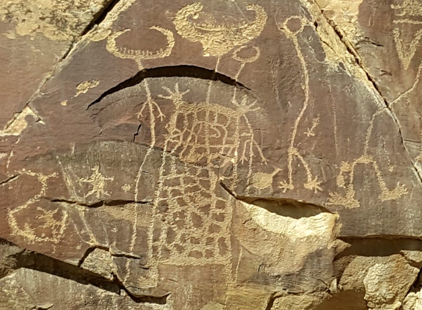
In the image below we find an equal balance of solid light and dark areas forming a simple Notan field, showing great sensitivity to positive/negative shape, pattern, and connection, alternating almost like a checkerboard. Note how the hands spread out to engage and fill the dark shapes. This image is a shape-oriented image rather than a linear, drawn image.
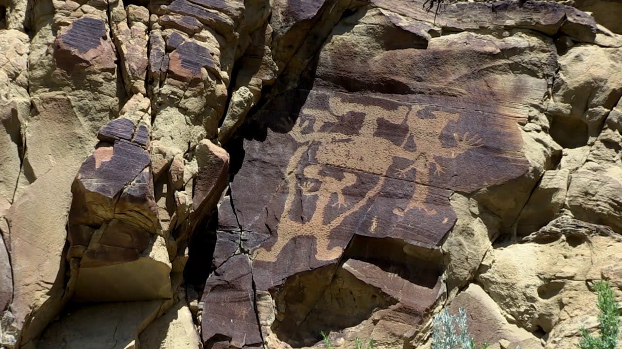
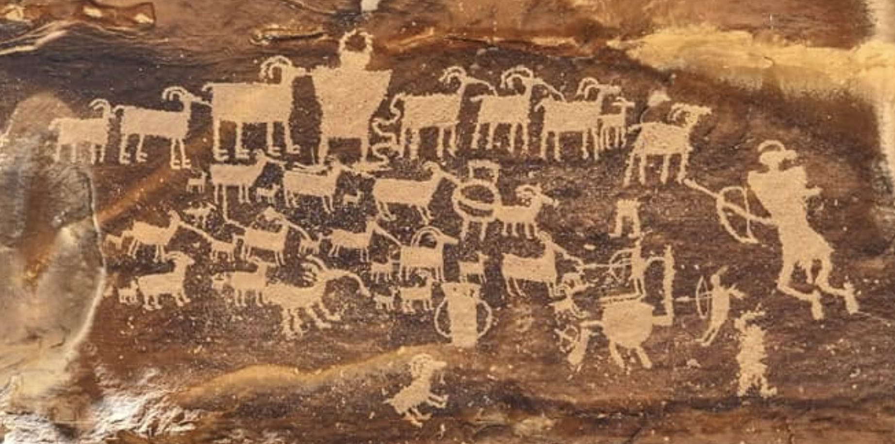
Rock carvings in Utah also show evidence of overall dark/light patterning as a complete composition. A big herd of horned animals and their new offspring—sheep and/or goats—flanked by hunters tells the story of the hunt. The artist created a rhythmical checkerboard pattern by placing the animal bodies in alternating positions. A secondary pattern is formed by the legs and split hooves. One creature already seems to have been dispatched, lying flat and diagonally on its side (bottom center). The largest hunter on the right is kneeling. On closer scrutiny, the humans seem to be wearing ritual headgear for the hunt, each one different! Do you see a river in the top row, center? The point is that every mark has significance.
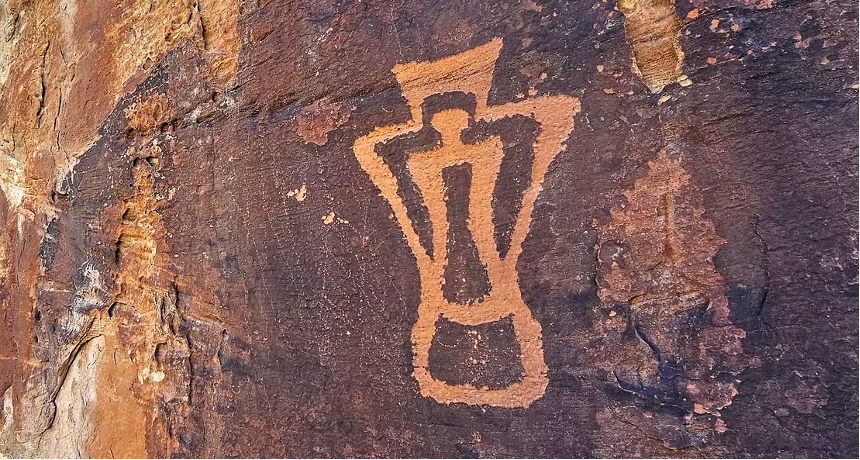
Vivid dark/light pattern has a pleasing effect as far back as we can imagine. It shows up in architectural detail.
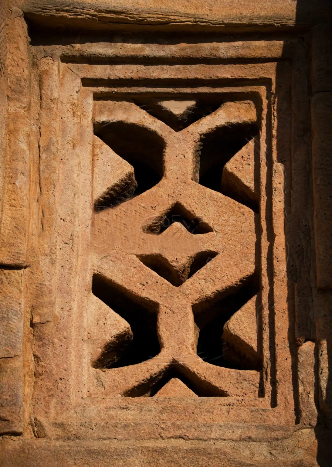
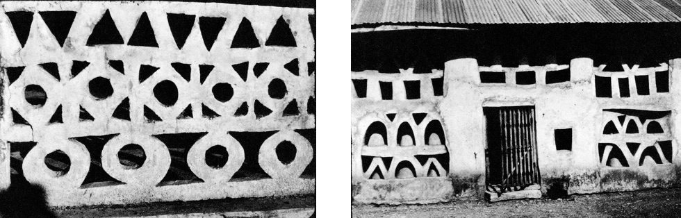
Early dwellings all over the world show use of geometric patterning, for strength and ventilation, as well as for protection from larger predators.
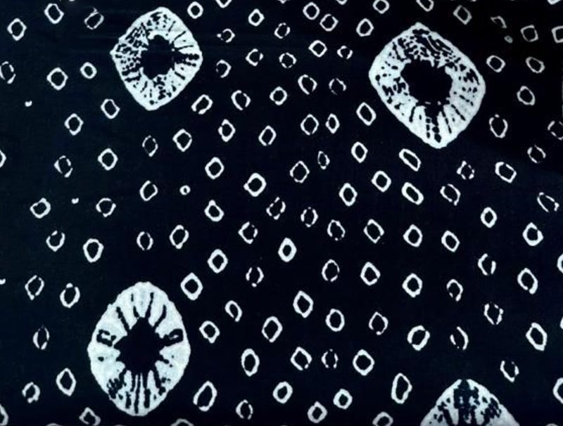
The tradition of indigo dyeing goes back centuries in West Africa. The earliest known example is from the Dogon in Mali, 11th century, dyed in the oniko style, in which raffia is tied around hundreds of individual corn kernels or pebbles and immersed in indigo dye to produce small white circles on a blue background.
In the early 1800s, a Yoruba tradition took shape in Adìrẹ designs that use resist-dyeing to create overall pattern on plain cotton by hand. The cloth is gathered and bound with raffia, sometimes so tightly the dye can’t break through. Patterns are drawn by hand with cassava paste or stitched with thread that’s later pulled loose. Sometimes wax is used. Others designs employ combs, feathers, or folded cloth. There are no stencils or templates—just practiced hands and a process passed down through generations.
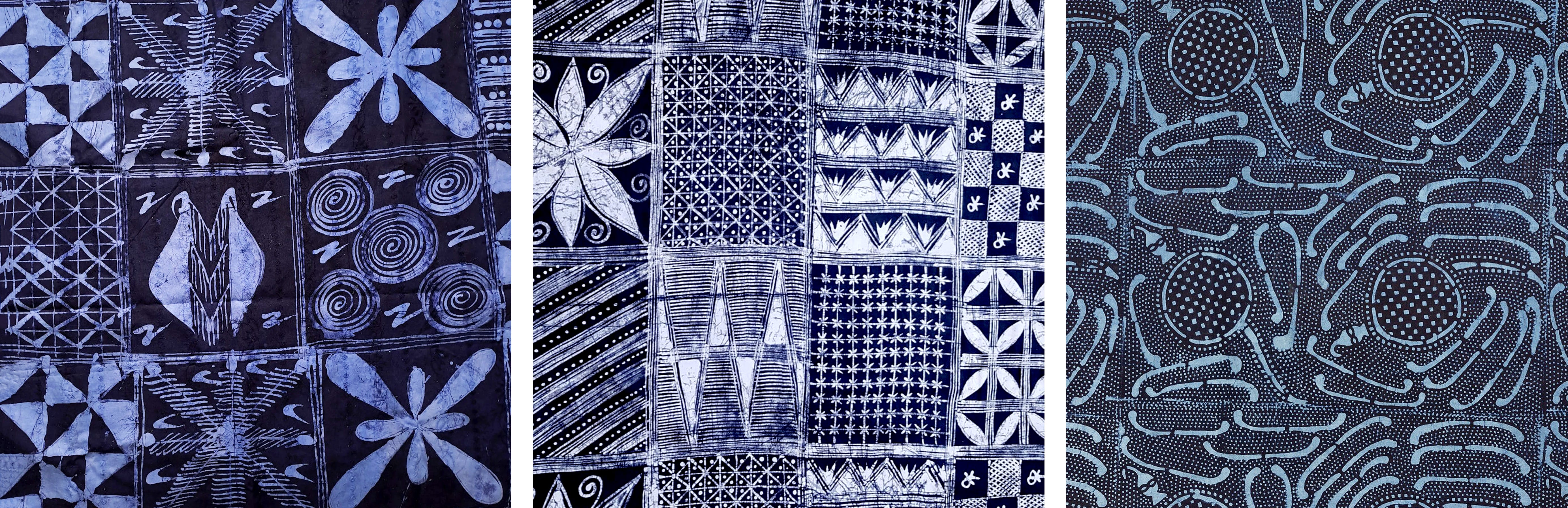
The dyeing is the last step. Indigo, drawn from local plants and deepened through repeated dips, stains everything it touches except the parts held back by thread, paste, or wax. The technique remains the same, but every untying reveals something slightly unexpected. Some designs carry meaning: echoing Yoruba proverbs, tracing stories, or marking ceremonies. Others are simply the work of the maker’s hand, shaped by instinct, practice, and the ineffable sense of the individual artist.
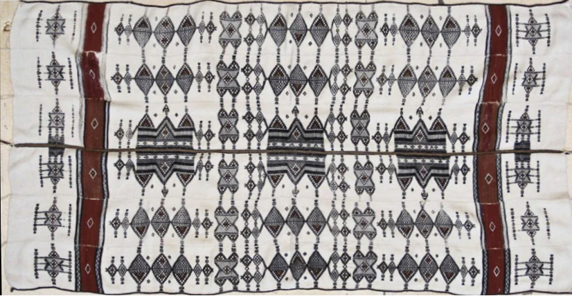
The Fulani of West Africa live a nomadic life on the edge of the Sahara. Heavy Khasa blankets serve to protect the cattle herders, or Wodaabe, from the cold in winter and the mosquitos. The weight and the thickness of the blankets are important for this purpose. The Khasa blanket is made on a double-heddle loom by hereditary male weavers, the Madoube. The cloth is woven in narrow strips and sewn together into the final blanket.
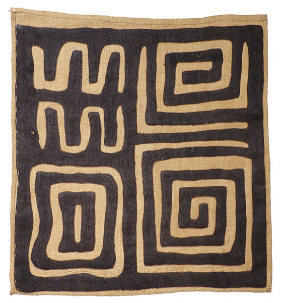
Kuba cloth is much admired for its visual intricacy and texture; it is an elaborate embroidered cloth made of raffia (palm leaf) fiber, from the Democratic Republic of Congo. Most examples are a variation on rectangular or square pieces of woven raffia fiber enhanced by geometric designs executed in linear embroidery using both flat-stitch and cut-pile stitching, the latter creating surfaces resembling velvet. The work is time-intensive from beating to soften the palm fronds to making the threads.
The textiles of the Kuba kingdom influenced artists of the 20th century such as Pablo Picasso, Paul Klee and Henri Matisse, who kept a large collection on display in his studio.
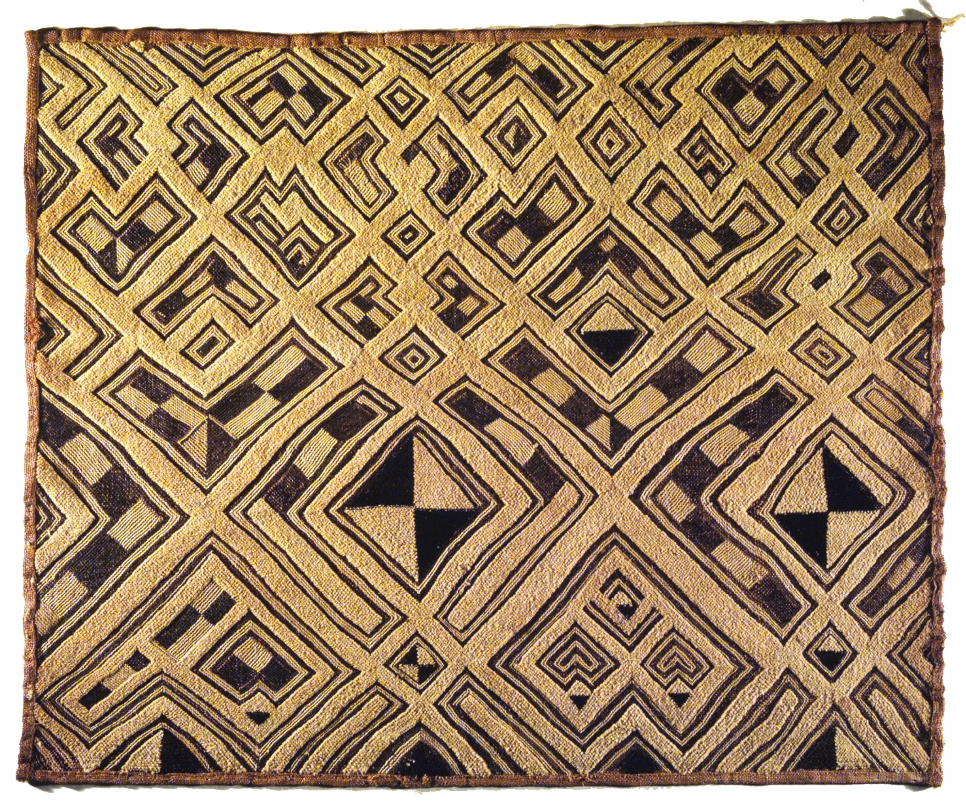
Flatly stitched Kuba designs of Central Africa have wonderful patterning that dances visually as the eye follows the maze-like labyrinth. The designs often refer to Adinkra symbols, which carry extra meaning beyond the surface pattern. A wraparound skirt would be made of panels stitched together, worn by both men and women.

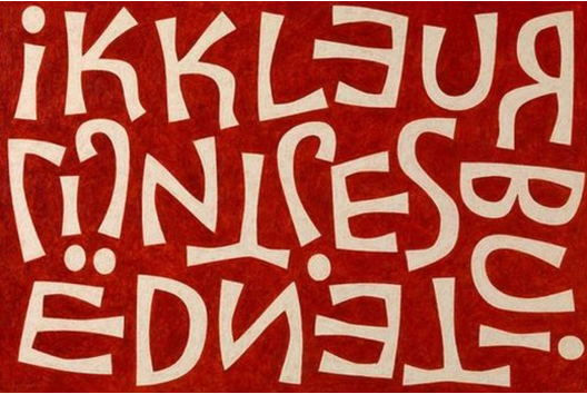
This type of flat-stitched design may be one of the influences on the carefully balanced work of the amazing Belgian letterform artist Liesbet Boudens, as there’s a sense of similarity in her strong flow of negative space and carefully-placed figures that create a 50/50 Notan balance!
Kuba patterns have even made it onto socks, and these patterns continue to carry message and meaning!

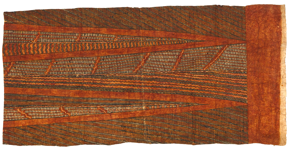
Tapa cloth is the Pacific culture’s version of the hand patterning found in Africa. Made from bark and other materials, it is a careful combination of intricate patterns that create a spatially interesting effect.
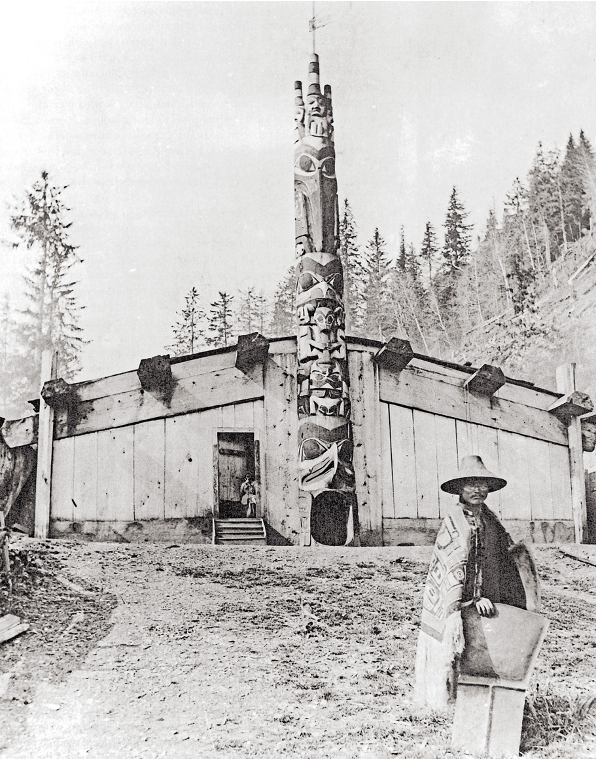
Totem poles and masks form much of the bold art of the Pacific Northwest. Traditions go back thousands of years, but North American tribes used the soft cedarwood of the Pacific Northwest, so the poles only lasted around 100 years.
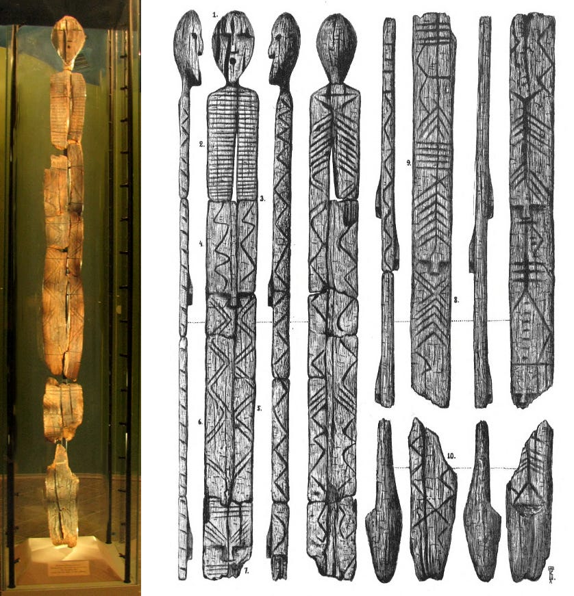
From Russia, this comparison image shows the oldest known totem pole in the world, the Shigir Idol, carved from a larch tree. It had been naturally preserved in the anaerobic conditions of a peat bog in Russia since the Ice Age, just before the Holocene, and was radioactively dated to have been carved 11,600 years ago. It is shown here with a drawing that reconstructs the detail of all sides, seen up close. Several additional head images appear throughout the 17’ height shown in the drawing. The need to incorporate many symbols into a restricted area leads to invention, distortion, manipulation, and adjustments in design that become formalized over time.
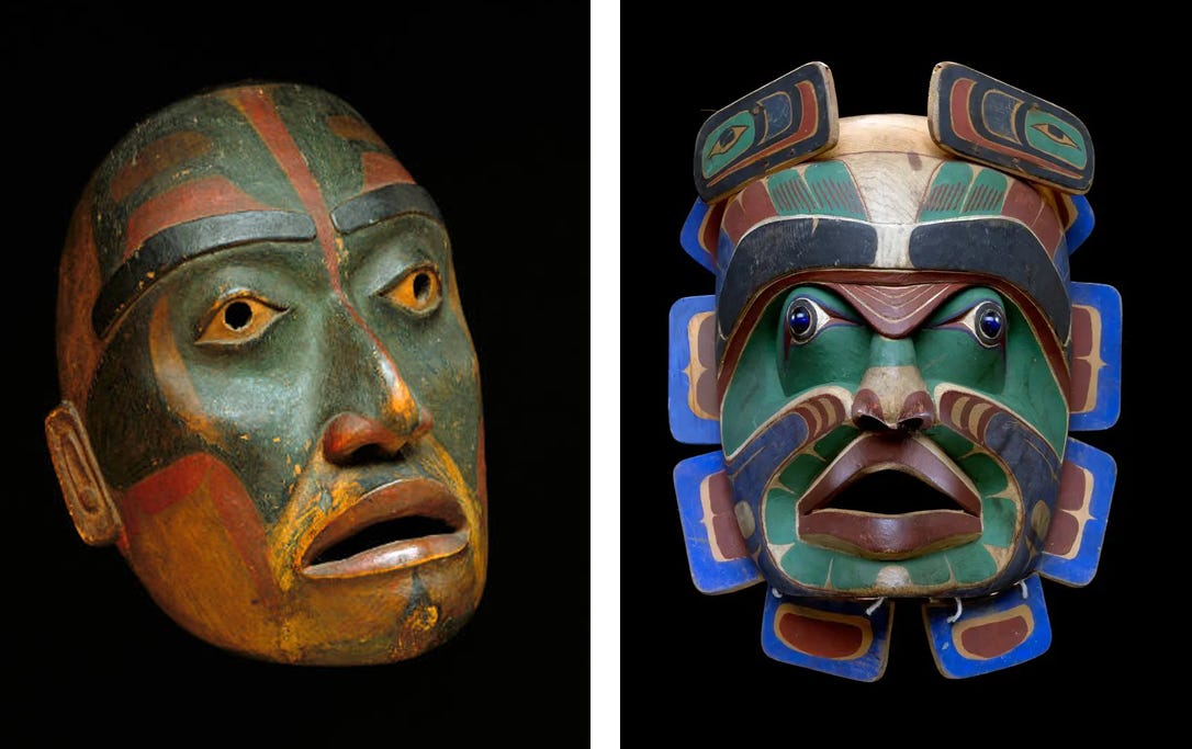
Northwest Coast tribes like Haida, Tlingit, and Kwakiutl designed their motifs to fit every kind of shape required. In 1965, Bill Holm published the book called Formline: An Evolving Art about their art form and in a 1965 video on YouTube he discusses every detail of this artform, which deals with tightly fitting shapes that represent the animals, spirits, and ancestors. The video is packed with information that is hard to find and relates deeply to our study of Notan, featuring figure/ground reversal using ovoids and U-shapes to form strong dark/light balance.
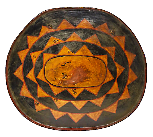
Across the Pacific in Northeastern China there is strong yet simple Notan design found in the pattern on this 19th c. horse shield. The dark and light patterns interact on an equal basis. The ovoid rings increase in width from the center outward. The black triangles are wider closer to the center and become more pointed toward the outside, especially on the narrow ends of the “cartouche” shape, while the golden triangles remain pretty much the same shape, equally formed as narrower and more pointed. There is a great sense of unity here through the element of progression, and the vibrance comes from the interaction of figure and ground.
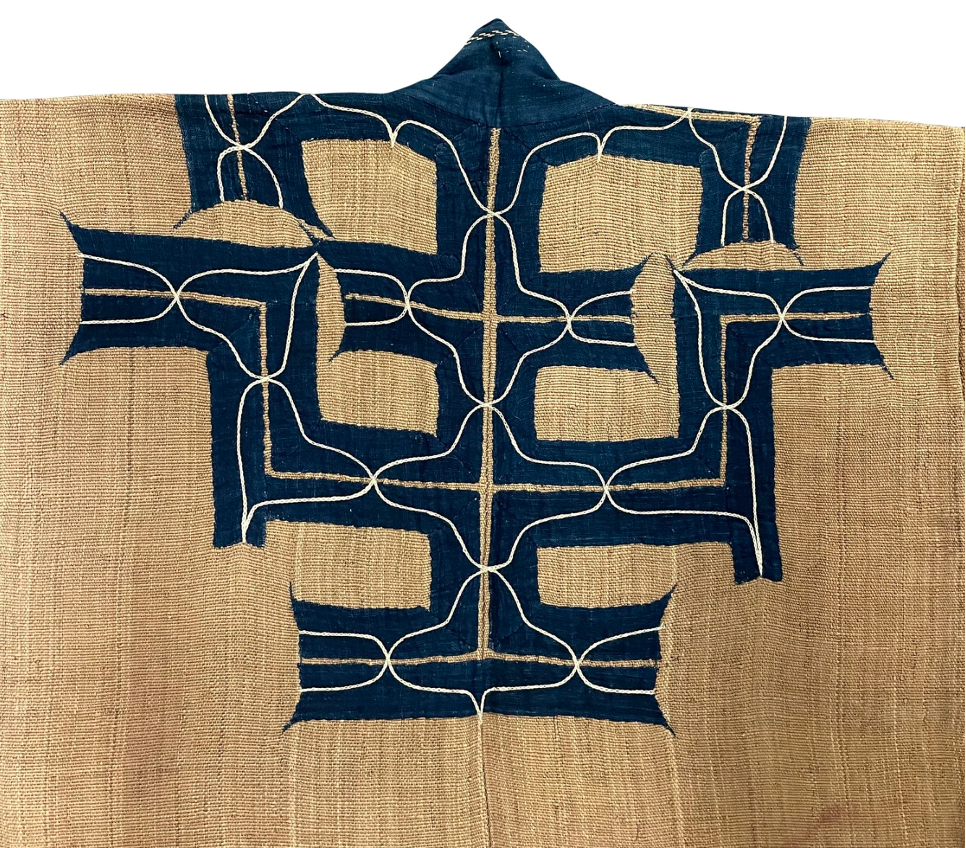
In the Japanese archipelago, the work of the Ainu is found primarily on the island of Hokkaido. The textile designs of the Ainu go back at least 10,000 years, to the prehistoric Jomon people. The same roiling patterns became increasingly refined and have strong Notan reversal qualities, making both dark and light equally forceful and integrated. Vibrant, contrasting form is powerful and designed to magnify life and person.
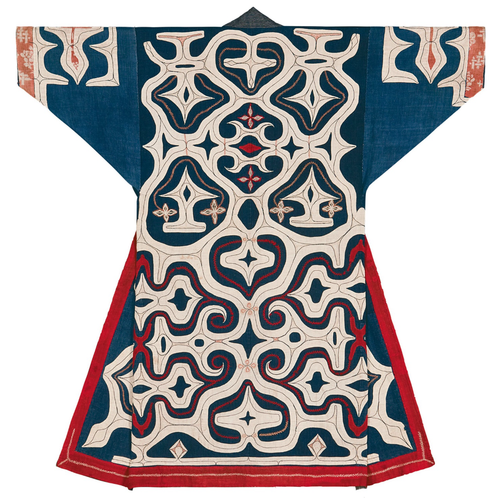
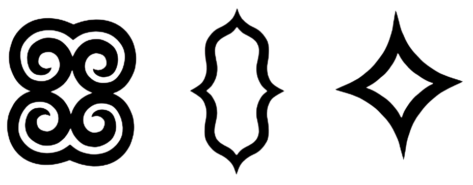
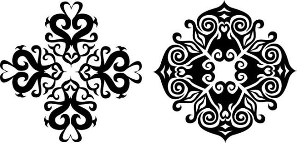
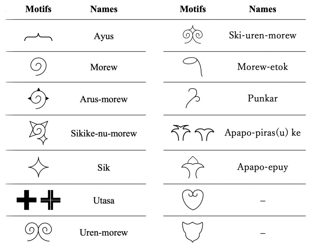
Basic elements of Ainu design may be very helpful when building a symmetrical design. There is much to explore in this area.
Traveling a bit further south, in 1646 Japanese artist Kano Sansetsu painted “Old Plum”, a classic example of Notan that illustrates the figure/ground interaction. The gold “holds” the tree and the tree pushes into the gold. Figure and ground are actively engaged with each other and locked into rhythm across the four screens, by turns advancing and receding depending on how you see it. The composition fits the interior architecture perfectly. A proper discussion of this painting would take a while!
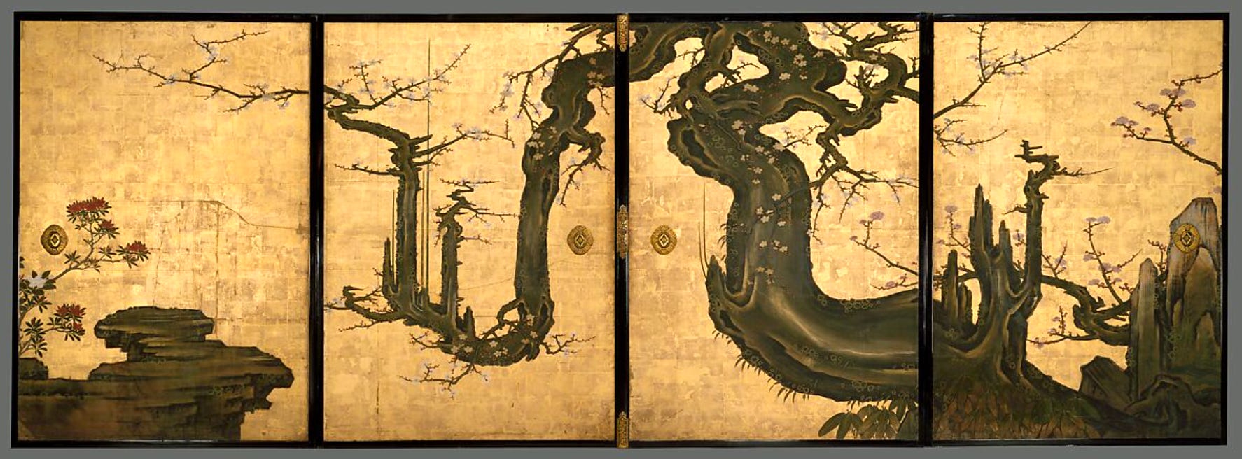
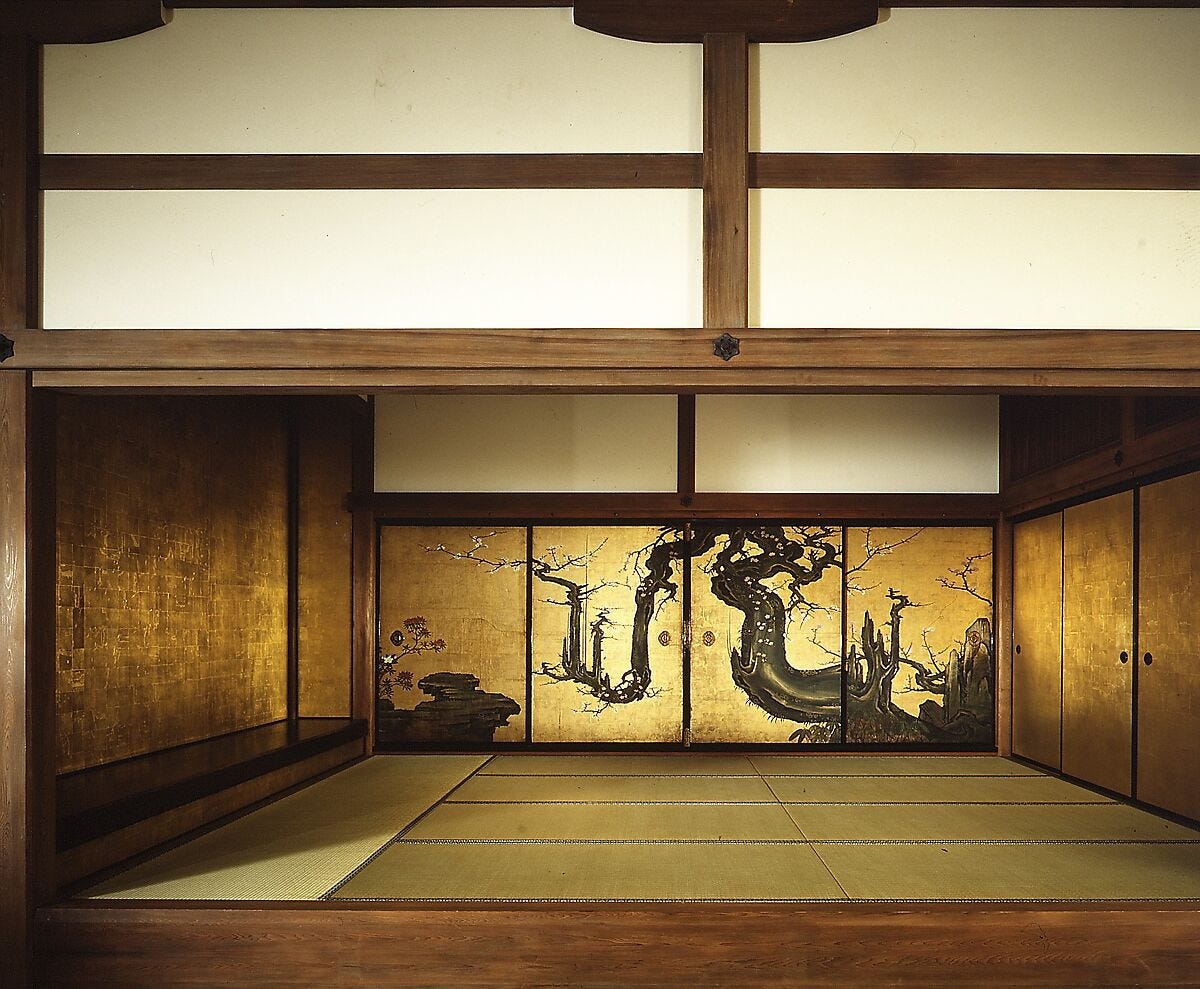
According to The Met:
The panels showing the “Old Plum” were sold to a private collector in the 1880s and later trimmed at the top. They entered The Met in 1975 as among the master works of the Packard Collection. The Shōin Room was constructed in 1987 to display the paintings in a setting resembling a formal reception room of Edo-period Japan.
• • •
“Design is not just what it looks like and feels like. Design is how it works.” Steve Jobs
This small aggregation of images spanning the long past helps us see where we are in the timeline of art and design development. The constant striving toward visual clarity is a natural yet amazing happening. It smacks of appreciation, desire, and gratitude for life.
Thank you all for reading and enjoying my posts. It’s great to be here with you.
NOTE TO ALL: This blogpost on Substack will always be free. Upgrade to Paid for interactive activities, individual comments and discussion, and exclusive articles. Your contribution is always immensely appreciated, and helps keep things coming your way. All images copyrighted by Ann Miller unless otherwise noted.
PAID SUBSCRIBERS: All paid subscriptions are now $75 annually or $7.50 monthly. I am eager to devote time to interactive projects and individual discussions on this basis. For you, it’s an ongoing investment in growing your graphic skills and supporting your performance in the areas of book arts, handwriting, letterformation, and calligraphy.
EDUCATIONAL DISCOUNT: I’m now offering a special 50% discount on the annual paid subscription for art instructors [you@your school.edu] and those in the art education field, even without the .edu suffix. Contact me.
Comments
Nothing yet. Say the first thing.
Sign in to join the conversation.