
When I was teaching calligraphy courses at the Academy of Art in San Francisco some years ago now, I put together a series of slide shows on non-traditional usages for handlettering. The influence of the Dada movement was one of these, which I share with you today.
The images in this slide show were taken from the book “DADA” published in 2005 by the National Gallery of Art, Washington. The art of this period spans the years from 1916, where it began with the founding of Cabaret Voltaire in Zurich, to 1924, when other transformations began to occur and the main group dispersed. Dadaism found active centers in Zurich, Berlin, Hanover, Cologne, New York and Paris. Marcel Duchamp is one of the three artists who helped define revolutionary developments in the plastic arts in the opening decades of the 20th century. He has had an immense impact on 20th- and 21st-century painting and sculpture, and a seminal influence on the development of conceptual art. By the time of World War I, he had rejected the work of many of his fellow artists (such as Henri Matisse) as "retinal," intended only to please the eye. Instead, he wanted to use art to serve the mind. In his own words, he “never believed in causality…it’s very dubious…it has a doubtful character.”
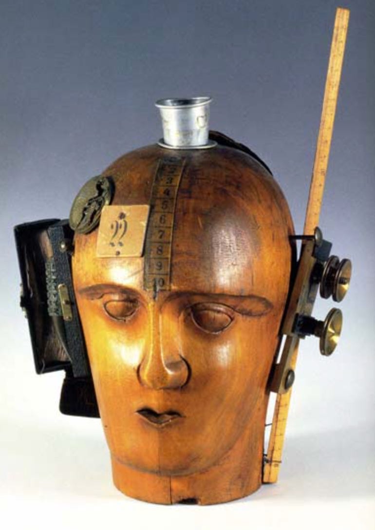
Dada is characterized by exploration of new materials and methods, spontaneity of expression, intellectual dialog with daily life, unbridled skepticism and rejection of established visual genres. In addition to the recent influences of cubism, futurism, and expressionism, dadaists were influenced by the new technologies of modern life such as photo-illustration, radio broadcasting, the popularity of the cinema, the industrial assembly line, and sights and sounds of the metropolis, and the trauma of World War I. Dada artists collaborated and formed a close-knit group, joining in a communal expression that seemed free of competition and pointed instead to awareness of one’s unique observations and a penchant for social and political commentary. Block quotes throughout are from the book DADA. I produced this slide show in 2005.
In the Dada Movement letterforms were used as objects, elements of a still life, as well as for comment and information. Here are some of the works of key figures of the Dada Movement: Hans Arp, Kurt Schwitters, Hannah Hoch, Max Ernst, Marcel Janco, Jean Crotti, Francis Picabia, Man Ray, Marcel Duchamp and others. Please read the captions carefully to realize the relationship between calligraphy and the dadaist use of letterform.
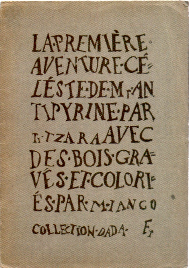
Freedom from convention of typography is shown in the irregular axis, stem width, and spontaneous shaping of interlinear space and hand drawn letters. There is still a hierarchy of design: the title is differentiated in size from the author and designer and publisher.
Tristan Tzara published this book as the first of the Dada publications. To understand Dada you can read the English translation of his 1918 “Dada Manifesto” here.
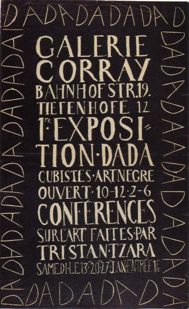
Marcel Janco was a painter who excelled in the new media. His use of repeated letterform as a border for the main text exploits the contrast and rhythms of black and white format. Note the extra D in upper right corner that “doesn’t fit” but is used to fill the space.
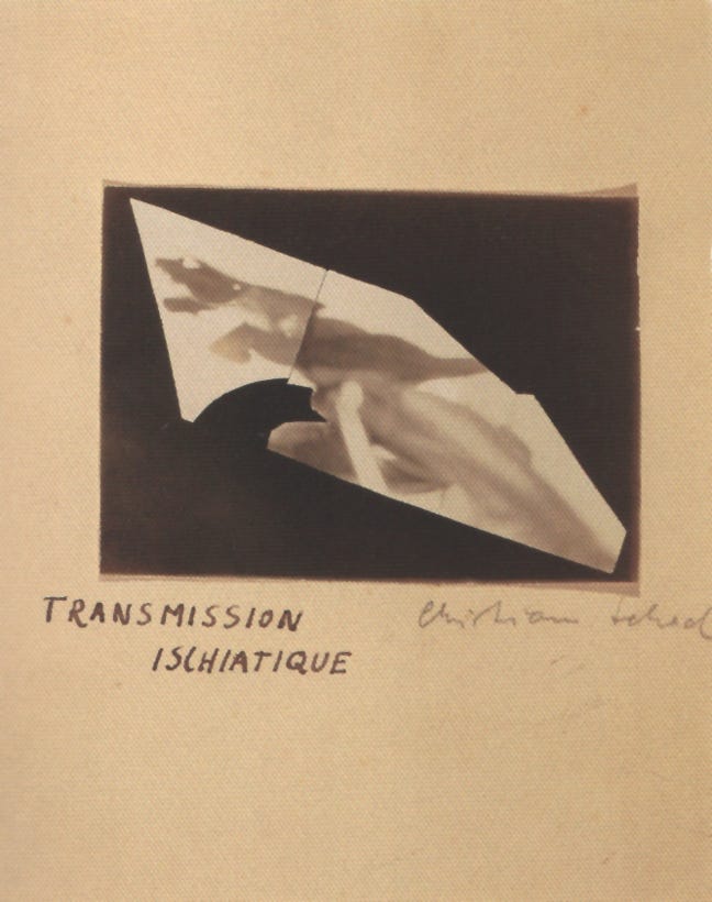
Christian Schad’s handlettered titling is informal, spontaneous, and without pretention.
A photogram is a photographic image made (without a camera) by placing objects directly onto the surface of a photo-sensitive material such as photographic paper and then exposing it to light. The result is a silhouetted image varying in darkness based on the transparency of the objects used, with areas of the paper that have not received any light appearing light and those that have appearing dark, according to the laws of photosensitivity. The image obtained is hence a negative and the effect is often quite similar to an X-Ray. This method of imaging is perhaps most prominently attributed to Man Ray and his exploration of rayographs. Others who have experimented with the technique include László Moholy-Nagy, Imogen Cunningham and even Pablo Picasso.
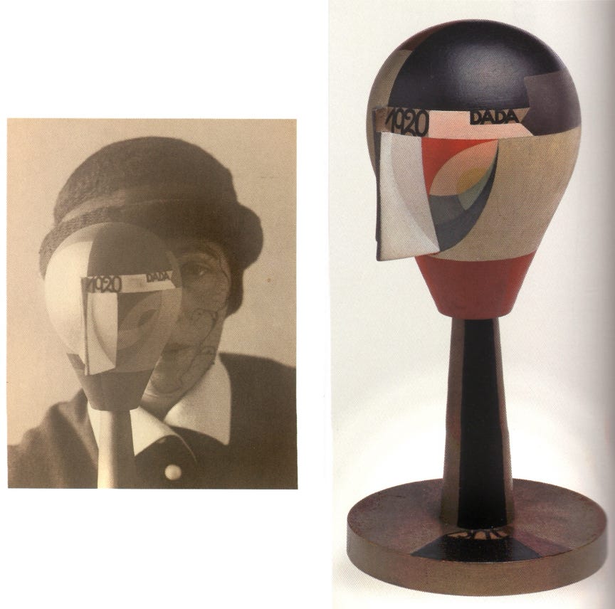
Sophie Taeuber was a teacher at the Zurich School of Applied Arts and had early freed herself from the distinctions between painting and decorative arts. She was skilled in woodworking, weaving, embroidery, and other aspects of arts and crafts.
The image on the right is a constructed and painted mannikin head. Taeuber was a skilled maker of puppet figures made of wood, metal and fabric for the Swiss Marionette Theatre and this Dada Head drew from that skill.
The image on the left is Taeuber’s Self Portrait with Dada-Kopf, a photograph taken by Nic Aluf in 1926; this gelatin silver print is in the collection of the San Francisco Museum of Modern Art.
Taeuber met Hans Arp in 1915 during Arp’s first exhibit in Zurich and as partners the two pursued a re-formation of aesthetic ideology which employed three-dimensional abstraction and symmetry, in direct opposition to the two-dimensional and asymmetrical compositions of times past. The edges between painting and craft began to blur as she wove large embroideries to frame and hang on the wall, and Arp began to sculpt flat woodworked relief images to hang as well.
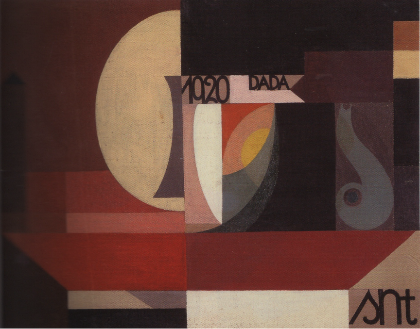
The creation of the previous mannikin head is here translated onto a flat plane, its components separated and brought together in a new composition. The transition from observing and analyzing the visual world to observing and analyzing the created object/moment is complete.
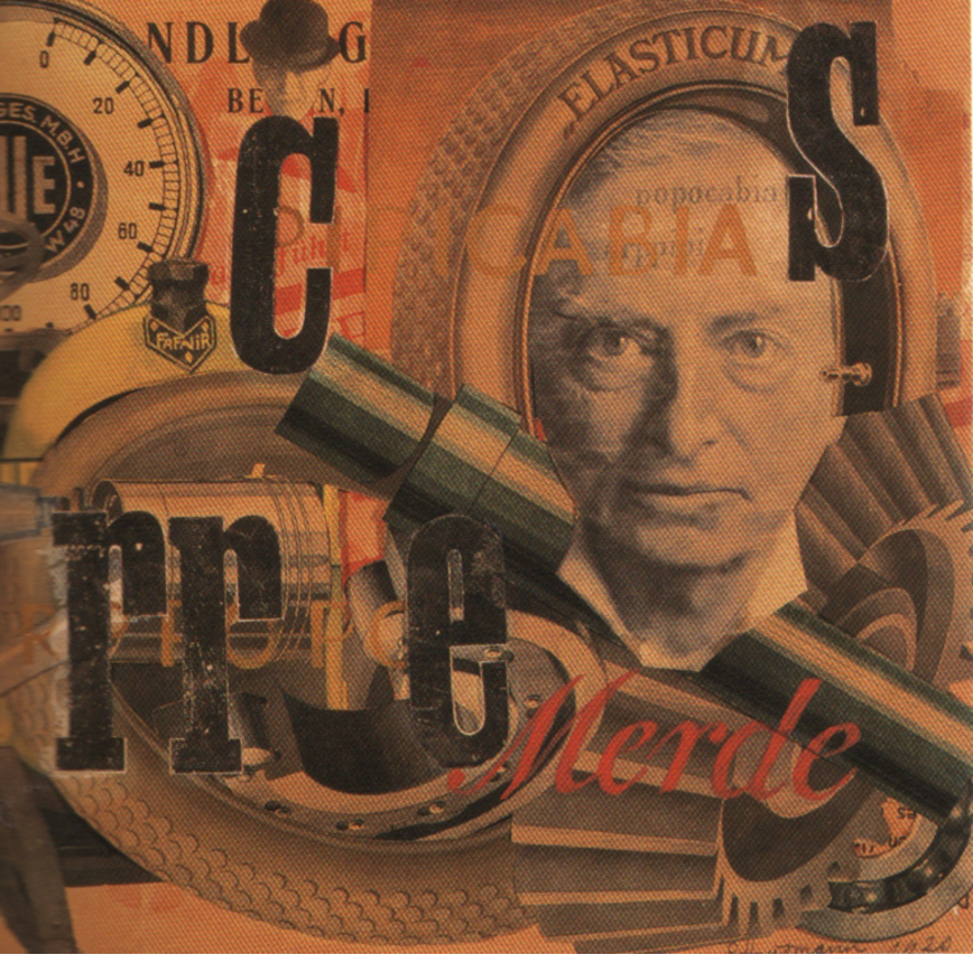
• The elegant handwritten Copperplate script in the title is used for irony.
Choosing, arranging, and placing elements from every day life in layers reflected more clearly the succession of moments and realities of life in increasingly complex times. Compositional rules of balance, color harmony, aerial perspective were not ignored, but used in new ways with new elements. Nothing was taboo if the statement succeeded.
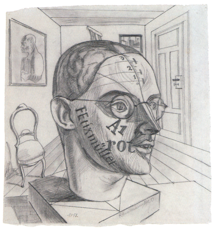
Excellent draftsmanship combined with the embracing of letterform as object, using the letters and numerals to delineate the planes and volumes of the head. Word images were integral to dadaist art.
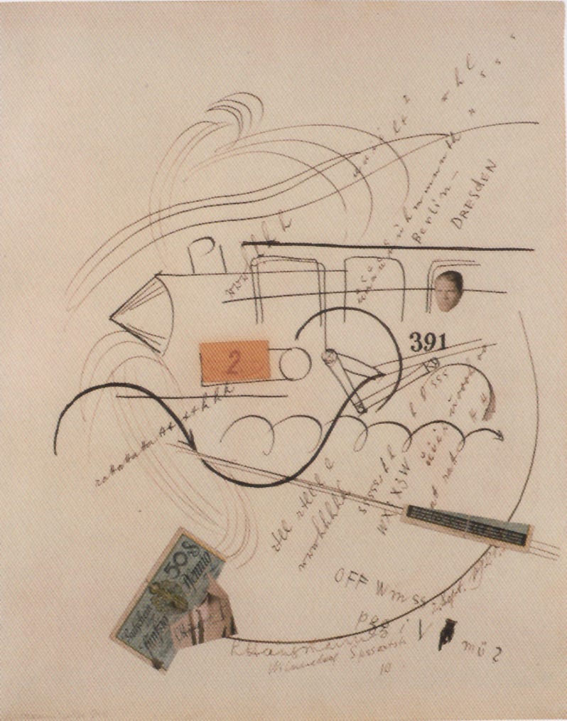
The act of traveling by train is illustrated in a collage drawing that glimpses in visual shorthand the engine, engine number, smoke, passenger, written sounds, ticket, stamp, destination, tracks, movement of wheel mechanisms, all of the elements that make up a memory of that 391 Berlin-Dresden train ride.
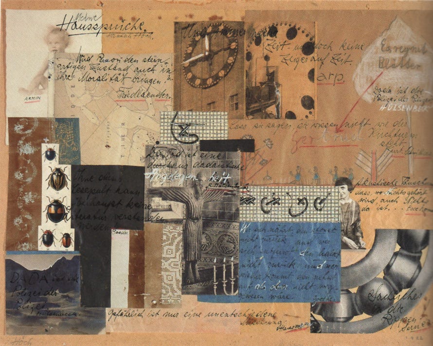
A scrapbook of experience combining diverse media provide a wide look into the artist’s psyche, personality, contemporary surroundings, and life history. Personal and impersonal are combined.
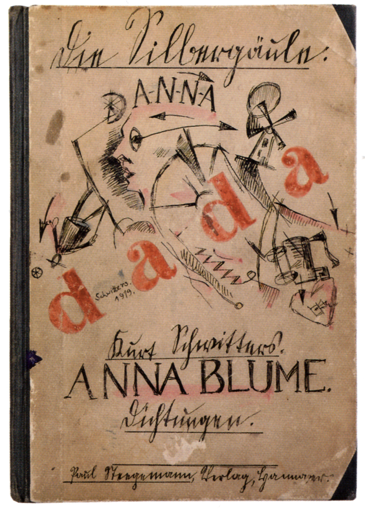
Raw sketching, spontaneous with no artifice. Letterforms are built up following typographical models. Gothic heritage can be seen in the stylized roundhand script. There is concern always with spacing and rhythm, but there is absolute acceptance of what comes out first, without much attention to the rough draft stage. The art unfolds organically.
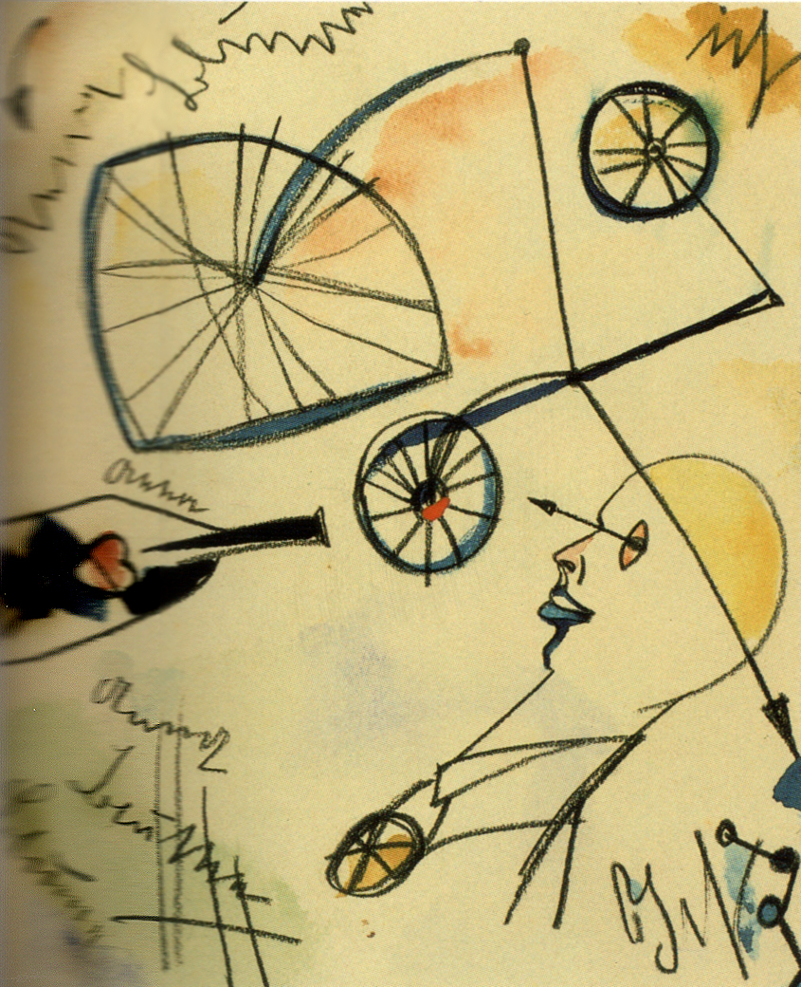
The scribbled letterforms are very rough, but certainly present here. Letterform was integral to dadaist art, signifying the spoken word. The title refers to his famous poem “An Anna Blume” translated as “Eve Blossom.” You can read the text here: http://www.costis.org/x/schwitters/eve.htm or research Schwitters on the web. This poem is written Dada art, full of non-sequitur and unexpected syntax.
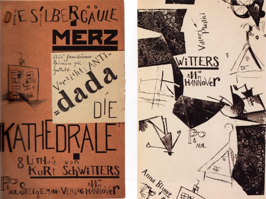
Here the letterforms are built up again from typographic models, and scattered throughout the visual field with a conviction that their placement is correct and intended, though spontaneous. Schwitters was the proponent of “Merz” art, his innovative assemblages and collages. All conceivable materials and images were available for artistic purposes. “The artist creates through choice, distribution and dematerialization of the materials.”
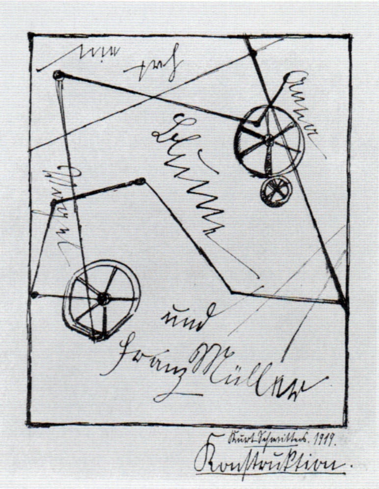
This simple drawing shows the relationship between speech and image; in a sense they are the same on paper: tools for constructing a work of art that conveys realization. Schwitters uses a comfortable and casual Secretary hand!
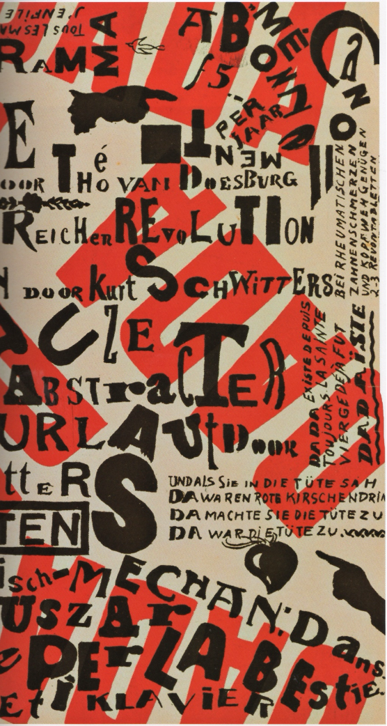
Hand drawn letters, balanced and mixing in the visual field with careful placement. There is almost a whorl creating a centrifugal effect, carried out by the angular placement of the words DADA and the outward orientation of the small text. This detail is the right side of the program only.
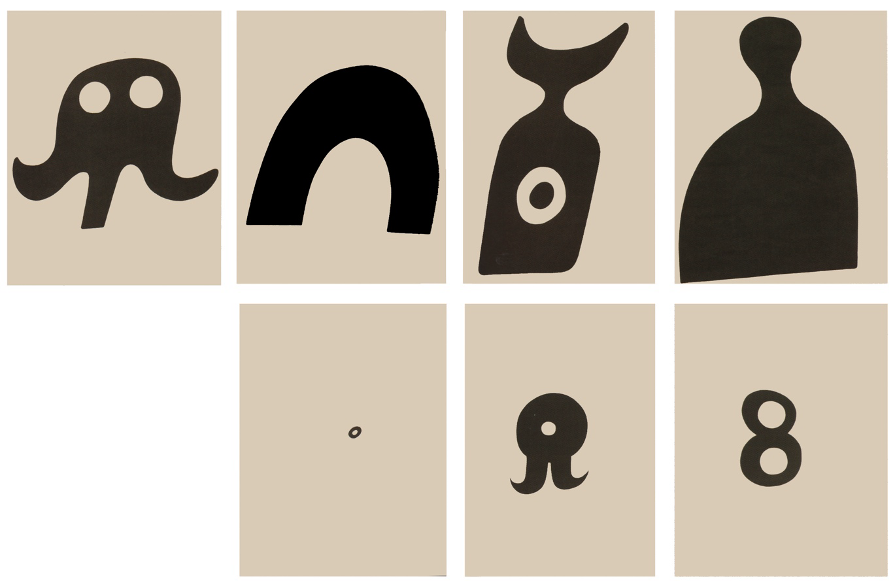
The form is the message. Look at these in the light of Notan and see how well they work in terms of black/white balance. There is no background. There is implication of distance through the placement of these minimal two-dimensional forms. Does the black recede, or is the white more distant? It is important to grasp this ambiguity, or double-vision.
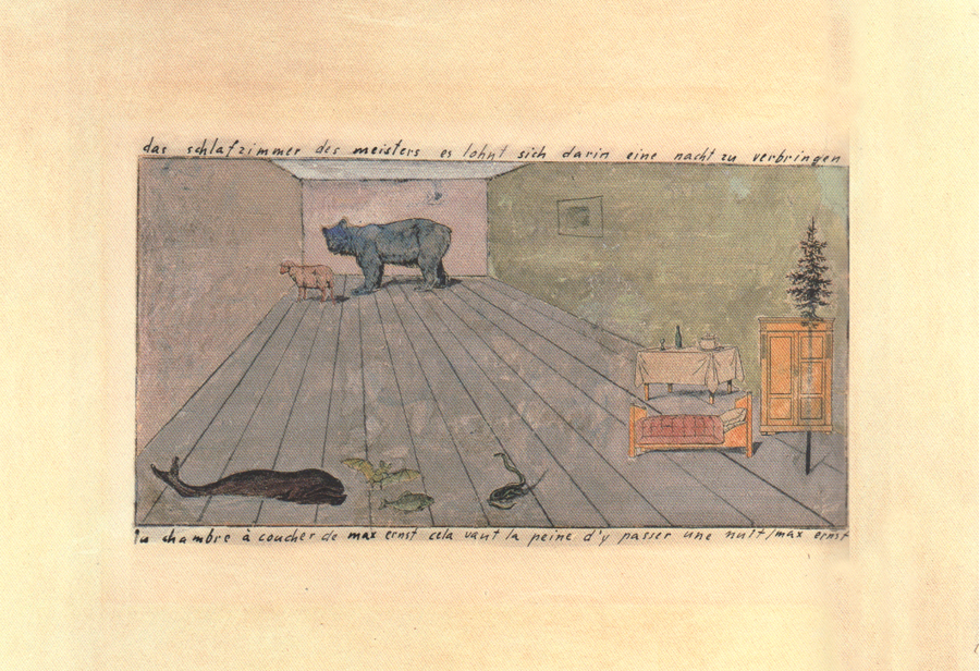
The complete title reads: In German, “The master’s bedroom, it’s worth spending a night there”, and on the bottom in French, “Max Ernst’s bedroom, this is worth the trouble of passing the night”.
How can you destroy art? By doing the opposite of the past, consciously rebelling against all “rules”, the dadaists attempted to ridicule all earlier aesthetics. Images were drawn from within, from the wealth of the subconscious, more and more pointing toward surrealism.
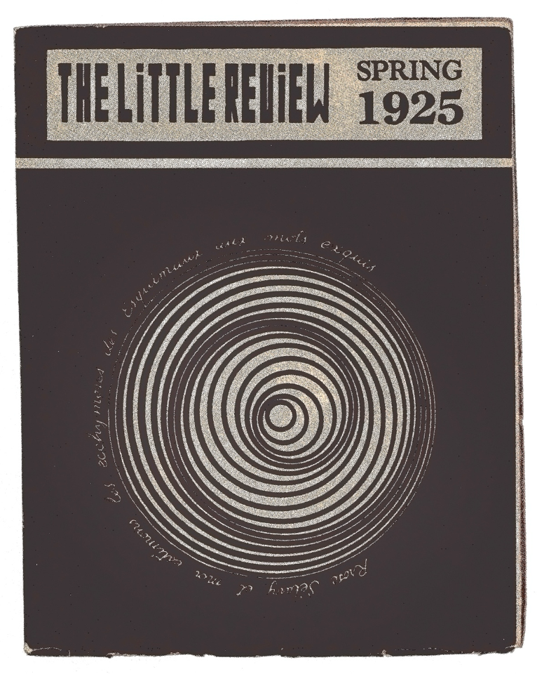
Project for the Rotary Demisphere, cover of the journal The Little Review, vol. 11, no. 1, Spring 1925
The text that runs around the circle is an elaborate play on words: “Rrose Sélavy et moi estimons les ecchymoses des Esquimaux aux mots exquis.” (Rrose Sélavy and I esteem the bruises of the Eskimos as exquisite words). From Wikipedia, “Rrose Sélavy, a pun, sounds like the French phrase ‘Eros, c’est la vie’, which translates to English as ‘love, that’s life’.”
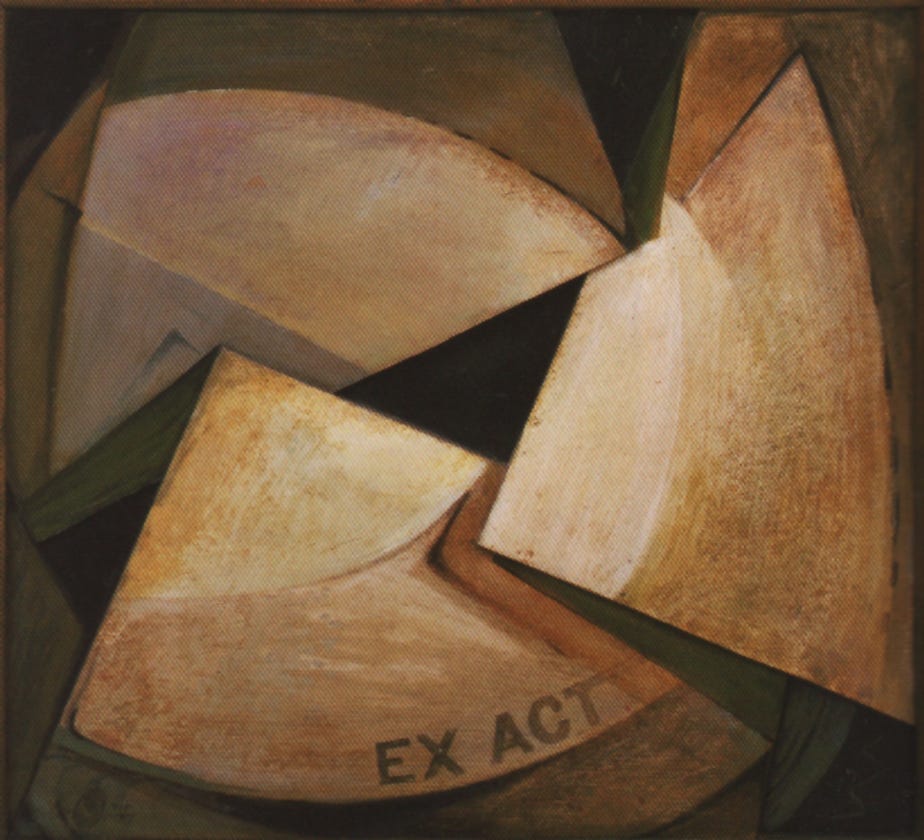
The lettering describes this composition which is based on the form of an X.
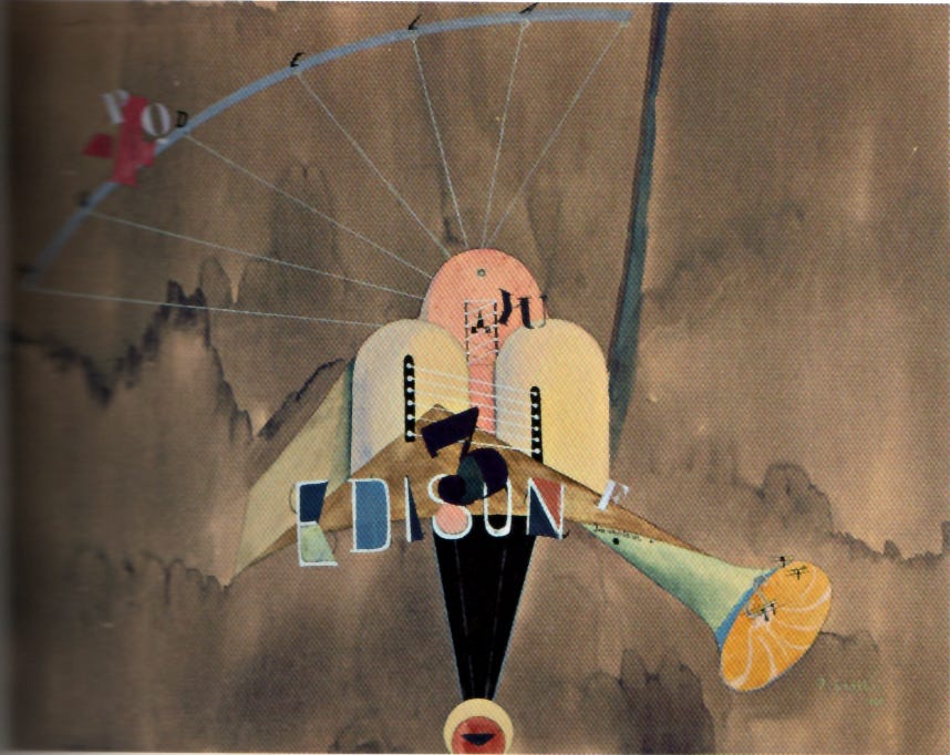
Homage to Thomas Edison with images symbolic of broadcasting sound (numerals, words, music notes). The word “audela” upper left means “above” or “beyond”.
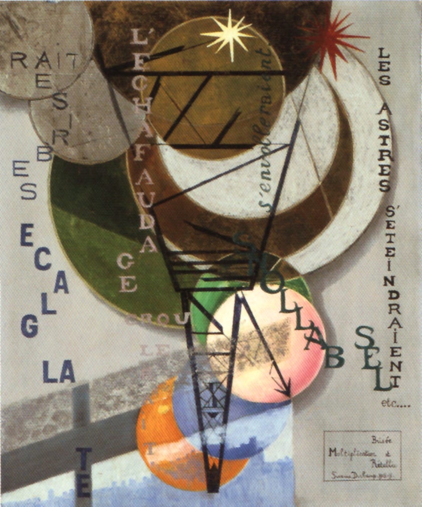
Some translations: “Et la glace se briserait” (and the ice will break up), “L’echauffage croulerait” (warmth will rock), “Les ballons s’envolleraient” (balloons or spheres will fly away), “Les astres s’eteindraient” (the stars will be extinquished), etc.
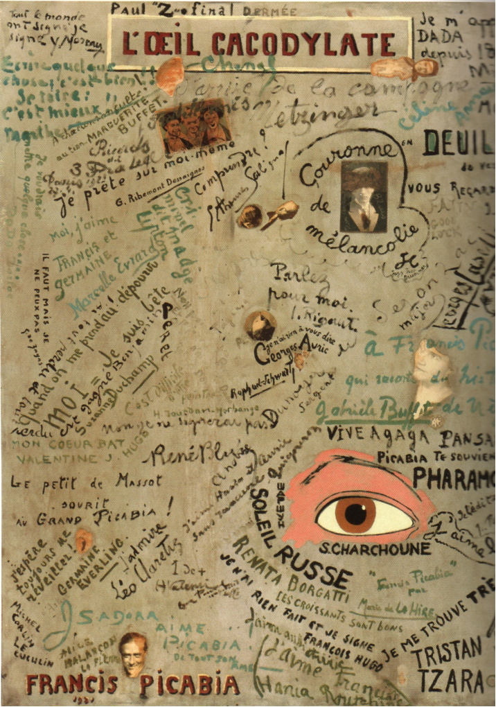
This handwritten collection of famous dadaist signatures and phrases is a record of humor, moments shared, impressions of friends, awareness of present, created by Picabia and signed by the individuals as a memory book. Many types of writing attest to the presence of friends, comrades in arms. [Cacodyle: a colorless, poisonous, arsenical liquid, spontaneously inflammable and possessing an intensely disagreeable odor.]
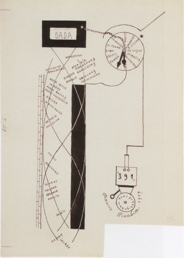
A visual plotting of the Dada Movement, with a timeline mentioning all those who were involved and contributed. There is a reference to “391”, the Berlin-Dresden train that Hausmann portrayed two years later. The imagery calls to mind a time-bomb, darkly humorous.
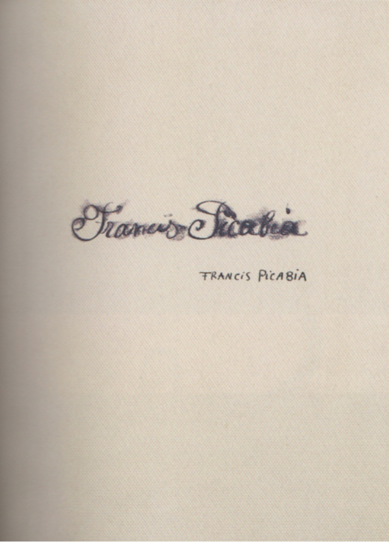
What’s in a name? Why not a self-portrait as signature, the graphic representation of the person by what they are called?
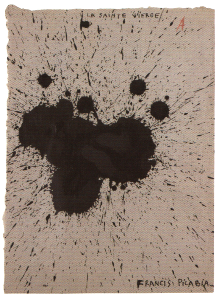
Here there is a correlation established between the title, Virgin Saint or Blessed Virgin, and the dynamic ink splash. Can you figure out the connection? If so, you will have entered the mind of Francis Picabia.
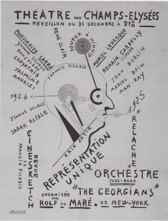
As the Dada Movement nears the end of its flourishing before moving forward into newer forms, it is represented by Picabia’s poster for a Year’s Eve reprise which includes an additional routine that furthers the play between staged and filmed reality. Called Cinésketch, this is a ballet that features intertitles as in a silent film but announced loudly through a megaphone; the lights are also switched on and off with the action in imitation of cinematic scenes. Duchamp and a young woman named Brogna Perlmutter appear briefly at one point as Adam and Eve, modeled after Lucas Cranach. The narrator cries out as the stage goes dark: “The policeman, who doesn’t understand, wants to arrest everybody.”
Dada art did not occur in a vacuum. It was part of the art community, the social fabric of the time, and was inseparable from events. It was not sentimental, nor did it ever copy. It was educated yet experiential, fearless and sardonic, and filled with excitement, energy, a strong desire for creating with an increasing range of expression and a deep appreciation and understanding of life itself.
• • •
“To think that Dada will ever die is absurd. Dada will always emerge anew one way or another, always when too much stupidity has amassed.” — Kurt Schwitters
I hope you have enjoyed this collection. The value of putting thought into words and then into handwritten letterform is somehow miraculous. As we say, “the written word remains” to honor the memory of those who were here for a time and spoke to us from the heart.
Thank you all for reading and enjoying my posts. It’s great to be here with you.
ART 232: The Design of Light and Dark: Text Art and Notan
This 6-week class covers exercises on figure/ground theories, Gestalt, optics, and related compositional methods in studio art, design, and letterform. It’s for visual artists of all stripes and trades. Hopefully it will be offered again in Winter 2027.
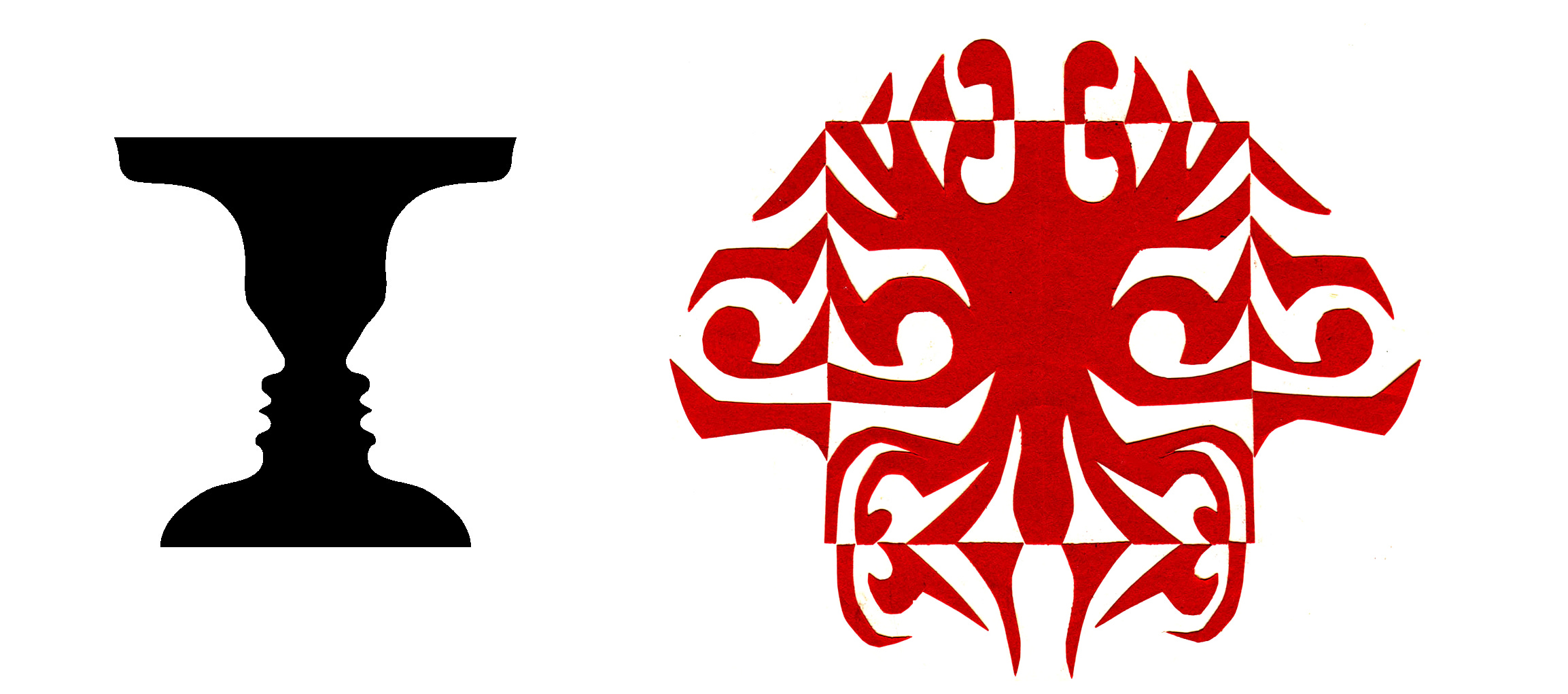
Notan class work is designed to develop a sense of double vision, the ability to see both black and white as one unified vibrational thing. Our exercises nurture that special “dichotomy of attention”, the ability to see black and white pattern in a way that changes how you appreciate art, how you make your own visual art, and perhaps even how you perceive art.
NOTE TO ALL: This blogpost on Substack will always be free. Upgrade to Paid for interactive activities, individual comments and discussion, and exclusive articles. Your contribution is always immensely appreciated, and helps keep things coming your way. All images copyrighted by Ann Miller unless otherwise noted.
PAID SUBSCRIBERS: All paid subscriptions are now $75 annually or $7.50 monthly. I am eager to devote time to interactive projects and individual discussions on this basis. For you, it’s an ongoing investment in growing your graphic skills and supporting your performance in the areas of book arts, handwriting, letterformation, and calligraphy.
EDUCATIONAL DISCOUNT: I’m now offering a special 50% discount on the annual paid subscription for art instructors [you@your school.edu] and those in the art education field.
Comments
Nothing yet. Say the first thing.
Sign in to join the conversation.