
When I was teaching calligraphy courses at the Academy of Art in San Francisco some years ago now, I put together a series of slide shows on non-traditional usages for handlettering. Calligraphy as protest was one of these, and I’d like to share that with you today.
The images in this slide show were taken from the book The Design of Dissent (Socially and Politically Driven Graphics) by Milton Glaser and Mirko Ilić and published by Rockport Publishers Inc. in 2005. In the following slideshow piece, I comment on the design in the bullet point under each image, and the items in block quotes were taken from the book. I produced this slide show in 2006. -- Ann Miller
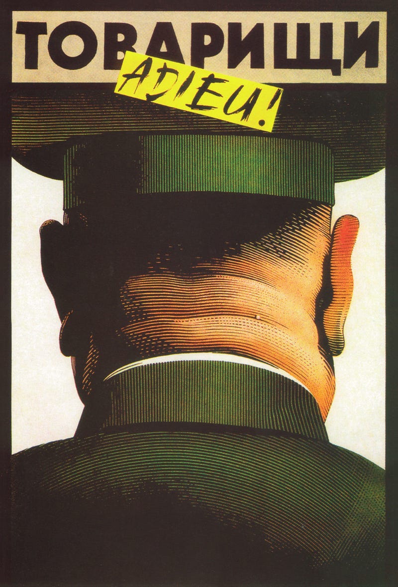
• The quick brushwork on the title’s paste-over on this poster captures the thrill of the country’s release from authoritarian domination and expresses that sentiment perfectly.
The designer/illustrator grew up in Soviet-dominated Hungary. Shortly after he drew this poster, the Soviet Army returned home.
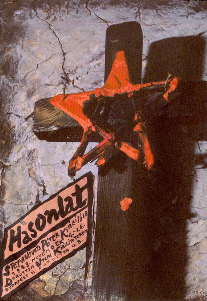
• Bold informal brush script imparts a sense of personal immediacy and grass roots directness.
This poster, created for an exhibition of graphic designer Peter Stefanovits’s work, was shown on Hungarian prime-time news. The news censored the controversial image of the communist star attached to the cross and showed only the text at the bottom.
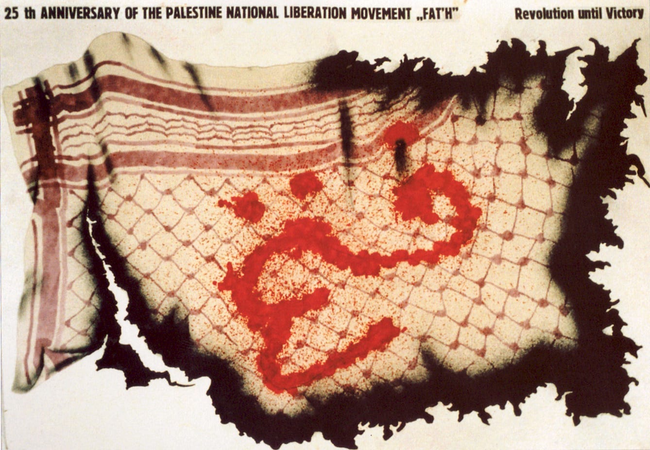
• Calligraphic red paint and splatter technique to write the word Fateh or victory.
The war-torn Keffiyeh has the word Fateh in Arabic “blood” red lettering. The Keffiyeh was turned into a symbol of the Palestinian state by Yassir Arafat and also became a symbol of the Fedayeen (Palestinian Freedom Fighters).
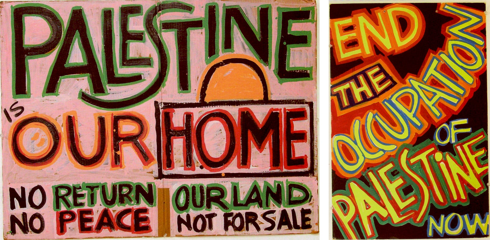
• In this designed and printed piece, spontaneous block letterforms were used to simulate street protest posters.
a) The black background and bright colors in End the Occupation of Palestine Now and Palestine Is our Home are a deliberate homage to Palestine Libertarian art of the 1970s and 1980s and appeal to the visual requirements of the news photographers. These posters were used in Washington, D.C. as protest against the first Gulf War in 1991.
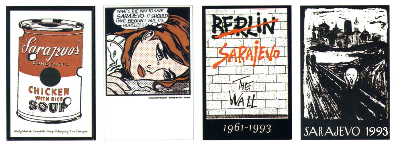
• Commercial style script, graphic novel hand lettered majuscules, brush lettering.
To convey the idea of suffering in Sarajevo, artists used any and all available images including pop and visual icons.
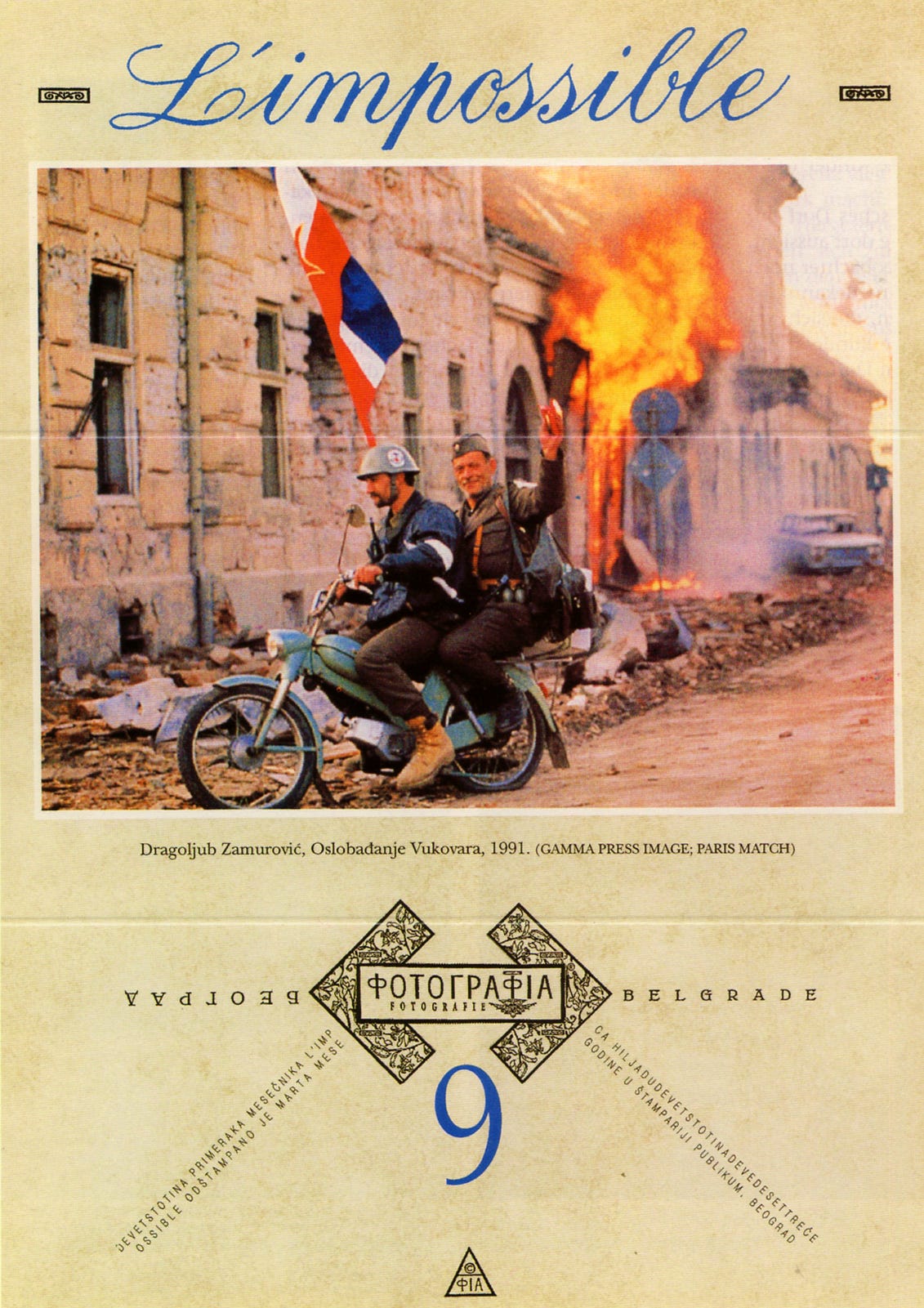
• The elegant handwritten Copperplate script in the title is used for irony.
This flyer, which was distributed in Serbia, featured an image of Serbian soldiers riding through the ruined, a.k.a. “liberated,” streets of Vukovar, proving that soldiers from Serbia took part in the war in Croatia, a fact that was not acknowledged by the Serbian media.
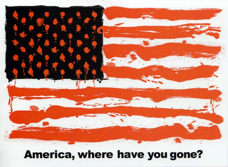
• The visual field is painted in red and black; the gestural stripes mimic lines of text, the stars as ink spots.
In this bold and simple Image, the designer creates an American flag out of blood and oil, suggesting America has forgotten constitutional ideals. The poster was used at anti-Iraq war protests.
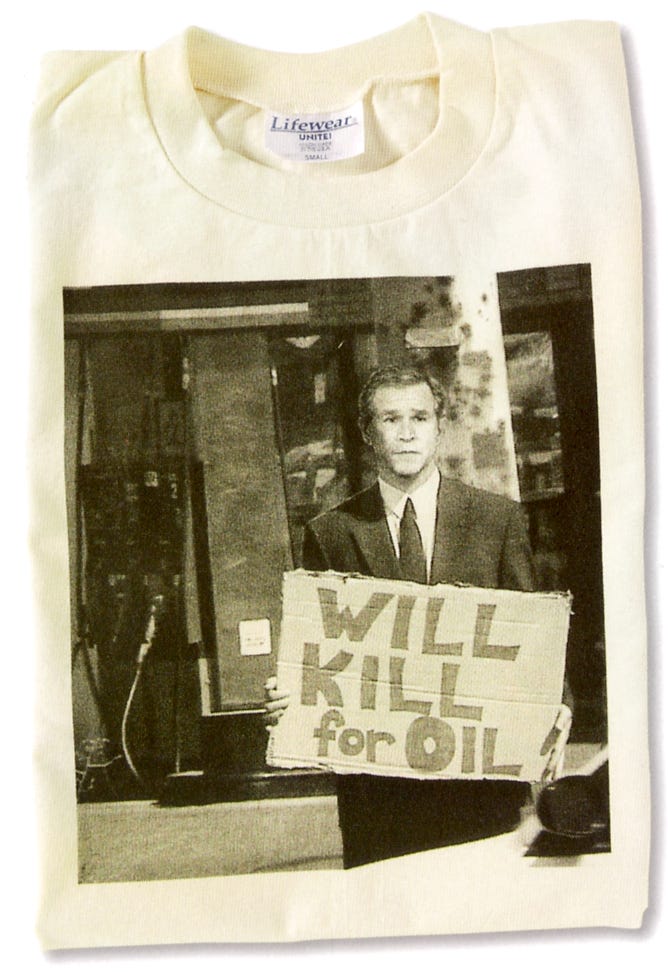
• Handwritten sign mimics street posters and Bob Dylan’s video of Subterranean Homesick Blues.
A satirical design based on the phrase “Will work for food” has been used for T-shirts, postcard, and stickers. The posture of a begging Bush reminds everyone that the continuing cooperation of Americans is needed to sustain his policies.
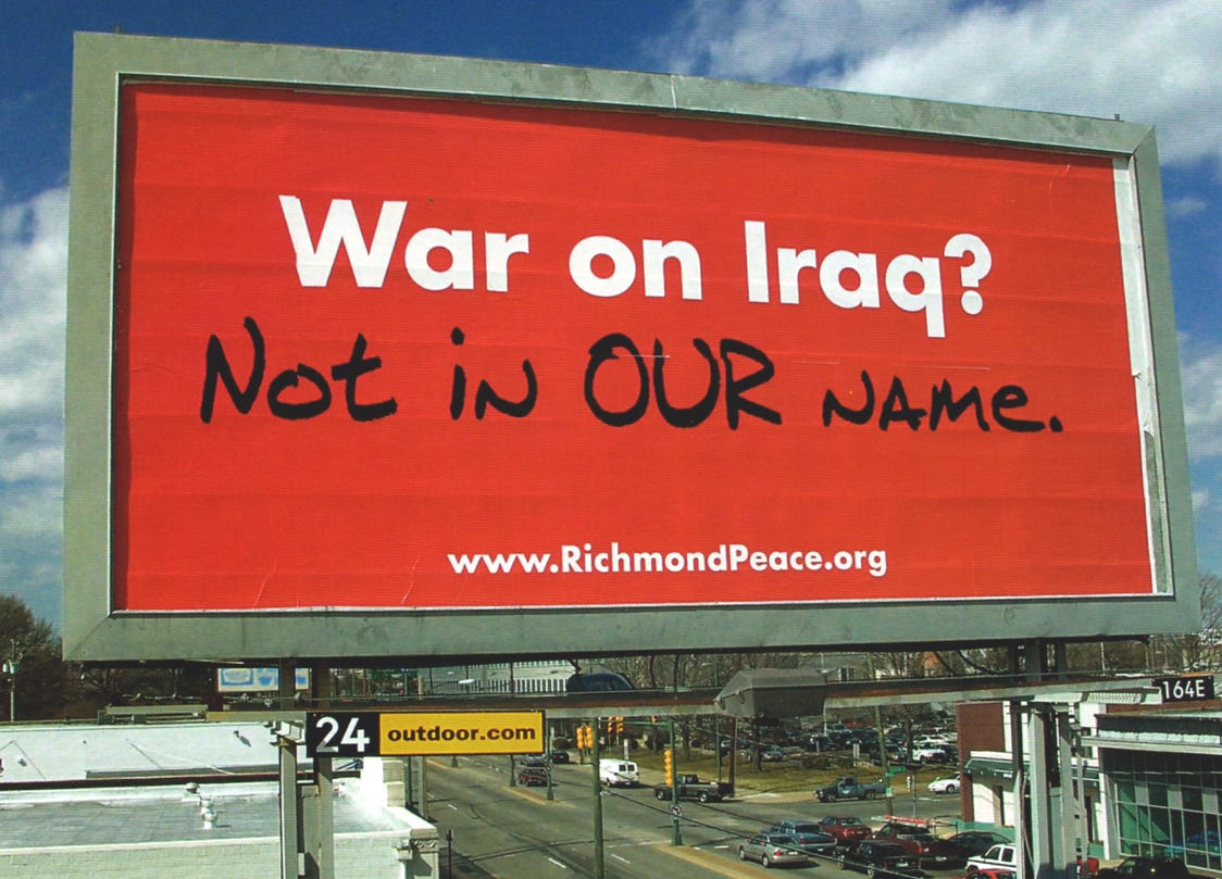
• Handwritten marker-style as a graffiti response to “established” type.
“Not in our name” became a phrase used b the peace movement before the war in Iraq was initiated. The campaign was originally planned as a series of billboards with a variety of messages but reverted to a single location after the original billboard company refused to run the series due to its content.
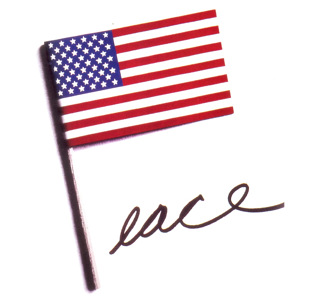
• Handwritten marker style script, increasing letterspace for emphasis.
In this poster, The American flag represents the P in the word “peace” and conveys in a simple and powerful way that the United States should get out of Vietnam.
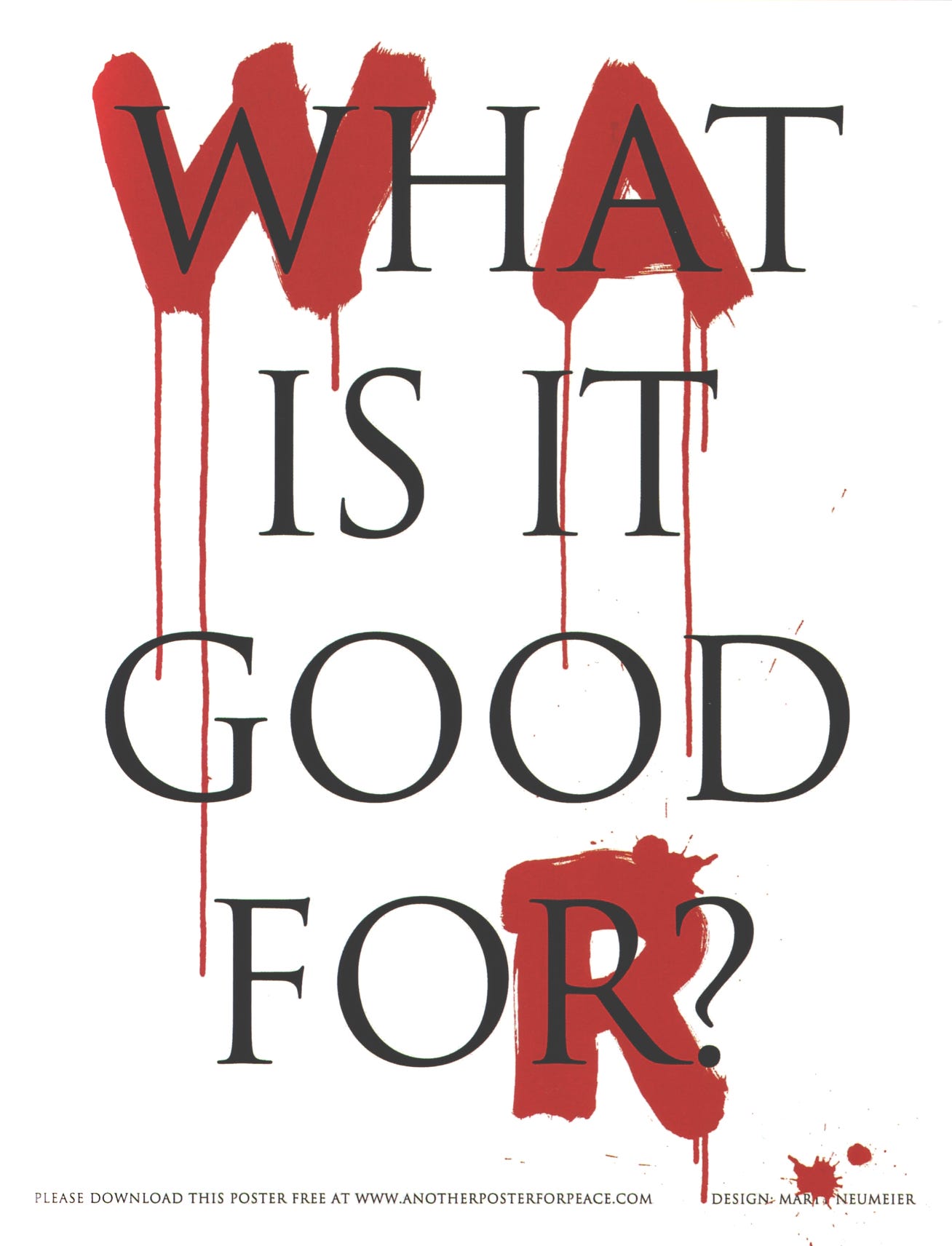
• Handwritten background lettering with large brush in paint, for dramatic contrast to the classic Roman Capitals.
Contrasting a raw, emotional typeface with a measured, thoughtful one, this artist captures the conflict between passion and reason, war and peace. The message is from the first line of a song popular in the early 1970s.
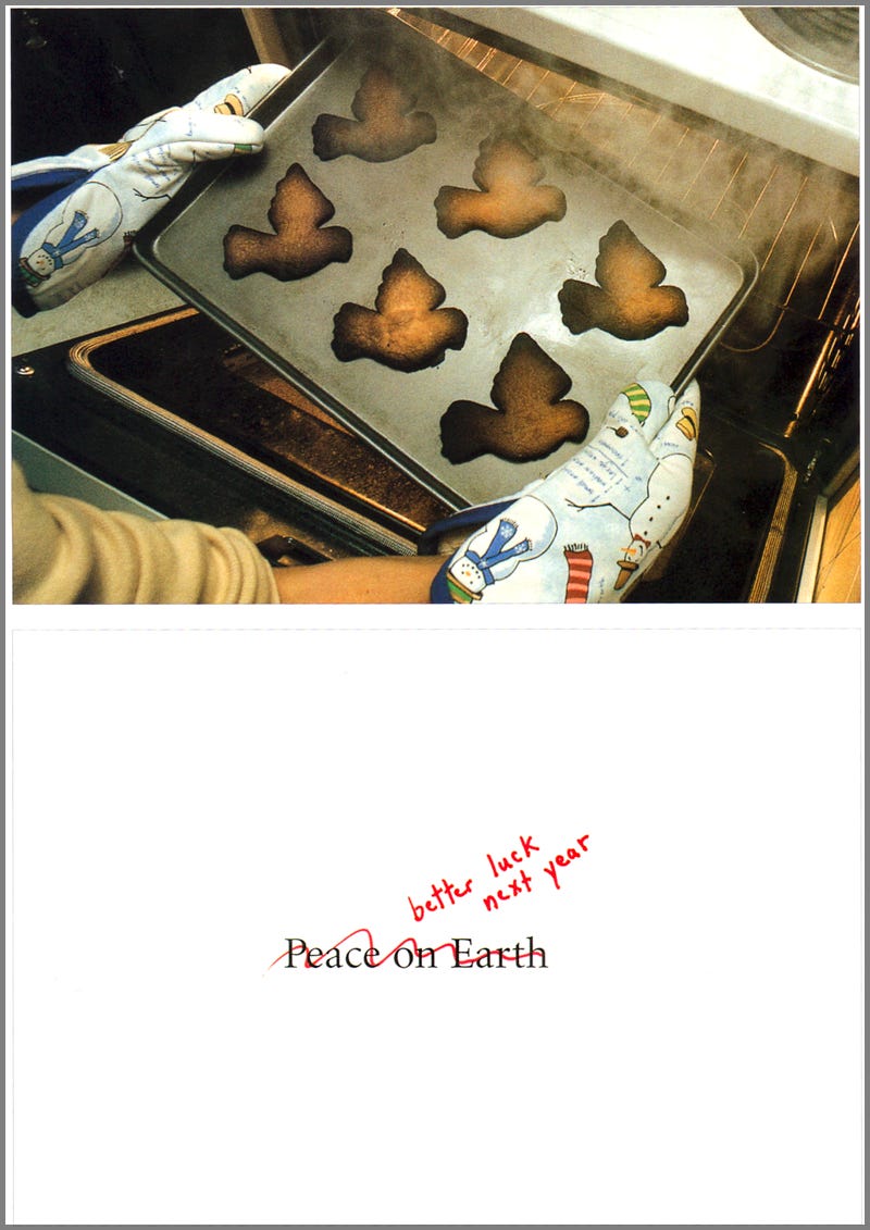
• Handwritten, informal print script in festive red holiday fibertip.
During a season of warm wishes and good cheer, it is especially poignant to receive a holiday card focused on how peace, the most vital thread keeping our world united and healthy, has been burned and broken.
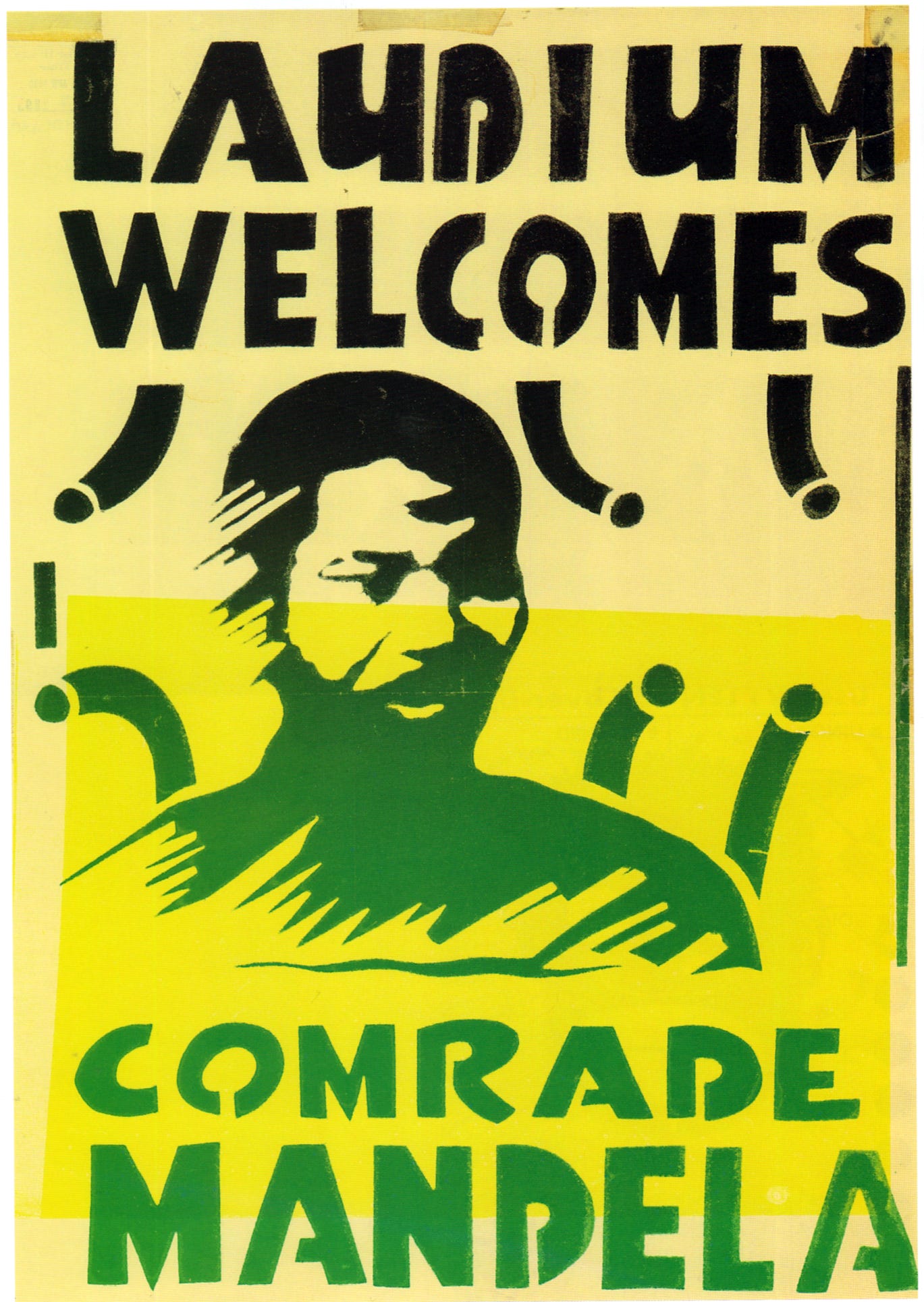
• Letterforms are in the hand-cut stencil style.
This poster welcoming Mandela for his visit to the township Laudium, and was therefore illegal under the terms of the “state of emergency.” Posters of this nature are now virtually impossible to come by.
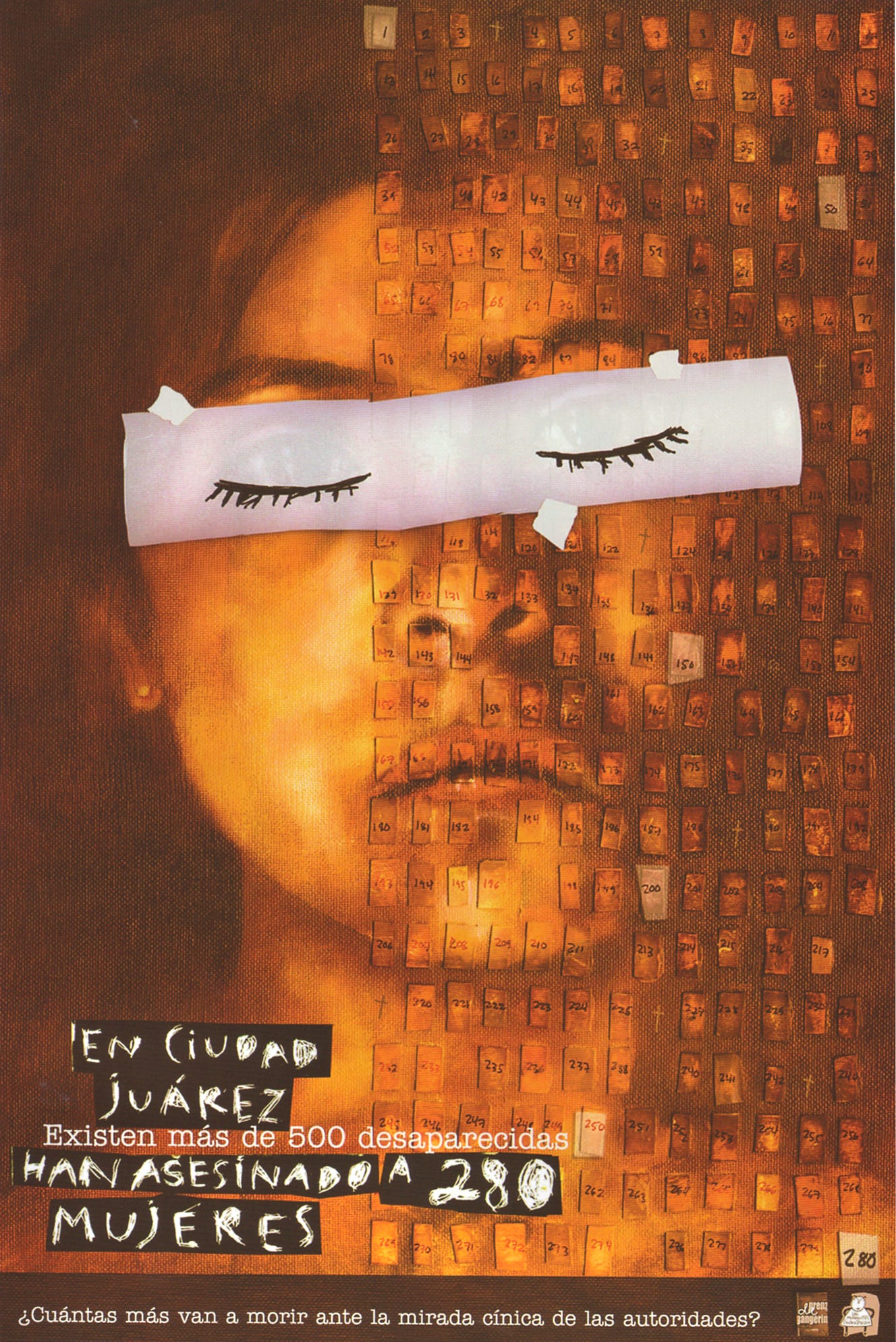
• The scratchboard script conveys the violence of this message.
The designer notes, “For more than then years, hundreds of women in the Mexican town of Juarez have been kidnapped, raped, murdered, and grotesquely maimed. After years of official apathy and police incompetence toward solving and ending these brutal murders, the families of the missing women started actions to demand justice. I made this poster to support their struggle.” The text reads More than 280 women have been murdered in Juarez City and another 500 more are going to die under the cynical stare of authorities?”
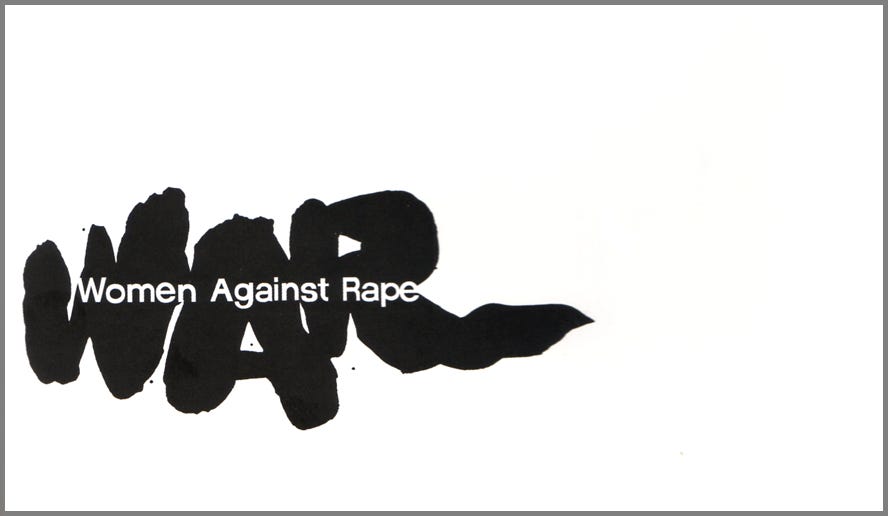
• Large brushwork provides a background for the message. Off center design is dramatic.
This clever acronym for a grassroots women’s group. Which mobilized in response to an increase in violence against women, is immediate and powerful.
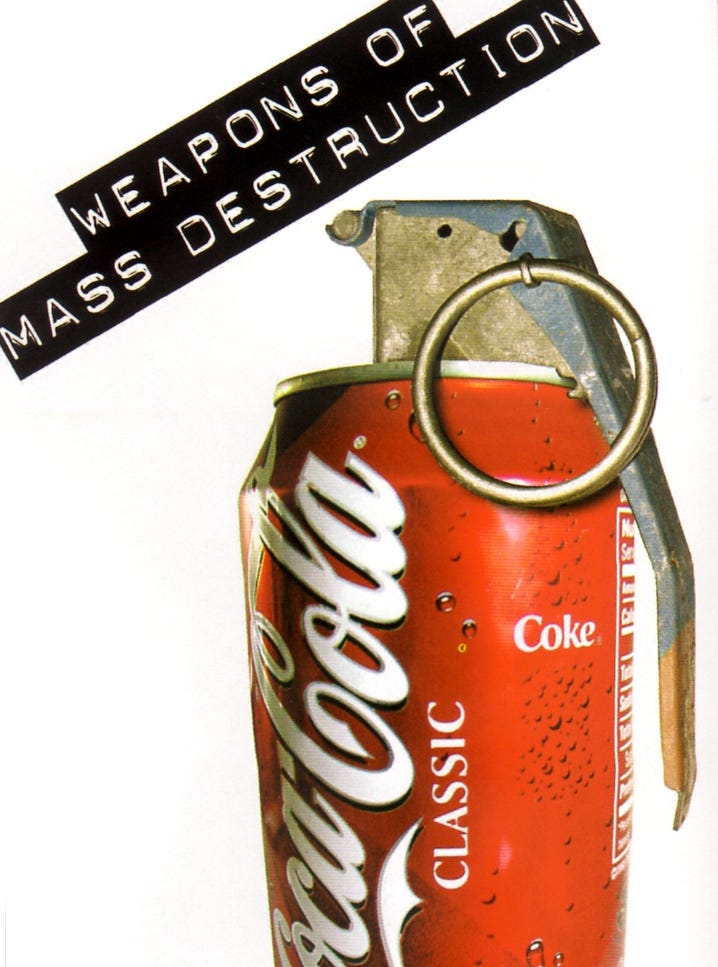
• The handlettering of the logo contrasts with the Dymo labeling.
The Designer ponders, “What are the products of globalization–the silent war?” Often the most pervasive and damaging can seem to be the most innocuous. This postcard is from a series entitled “ The Language of War.”
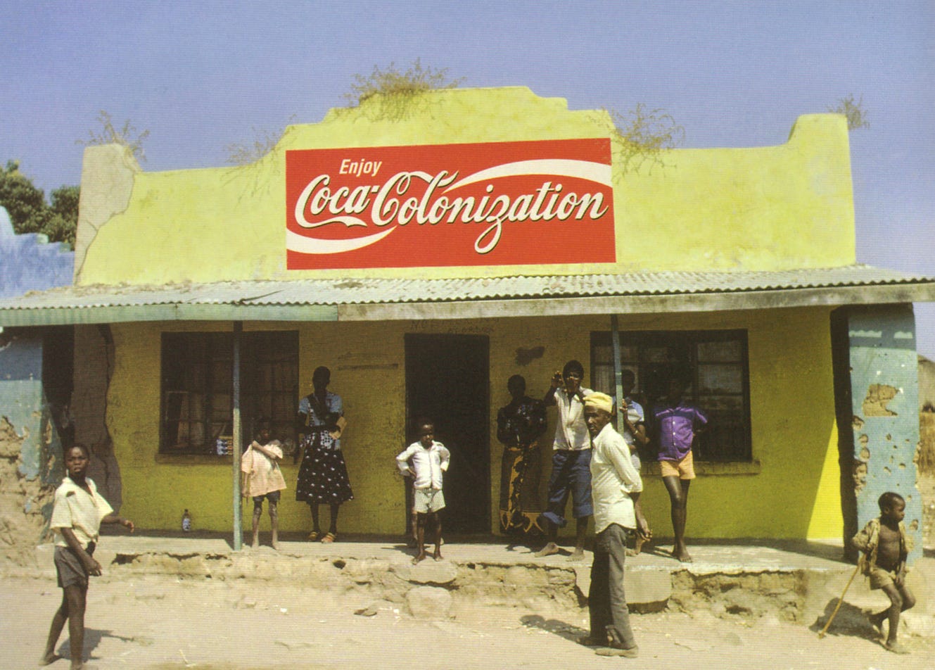
• Handlettered continuation of the logo provides the theme.
This work illuminating corporate global branding in third–world countries was run in Adbusters magazine.
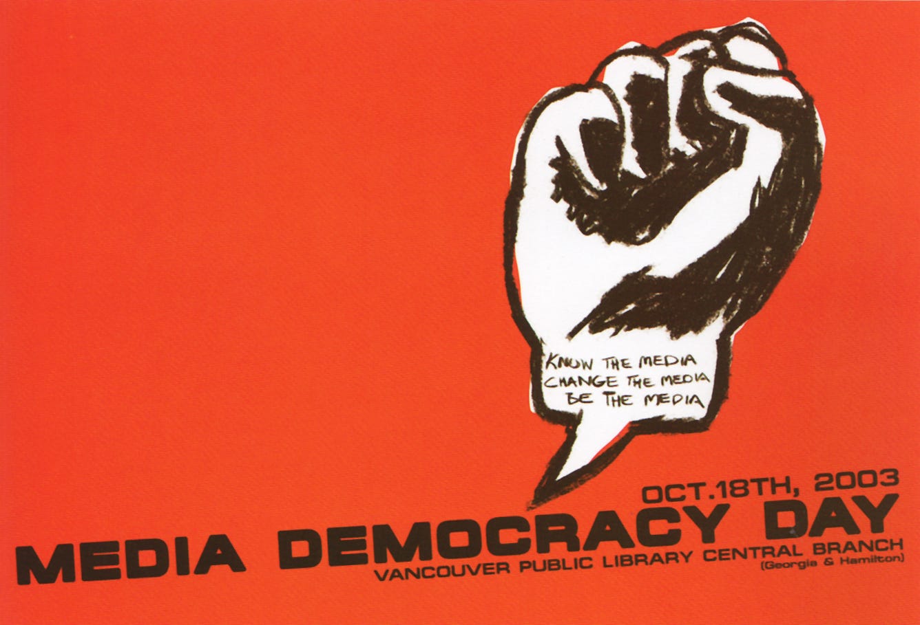
• Handwritten pencil lettering provides text that is part of the drawn image.
The image of a clenched fist as a speech balloon was created for Canada’s Media Democracy Day created to protest the dominant mass media system and promote independent media and citizens fighting for their right to news and information, and their basic right to communicate their opinions.
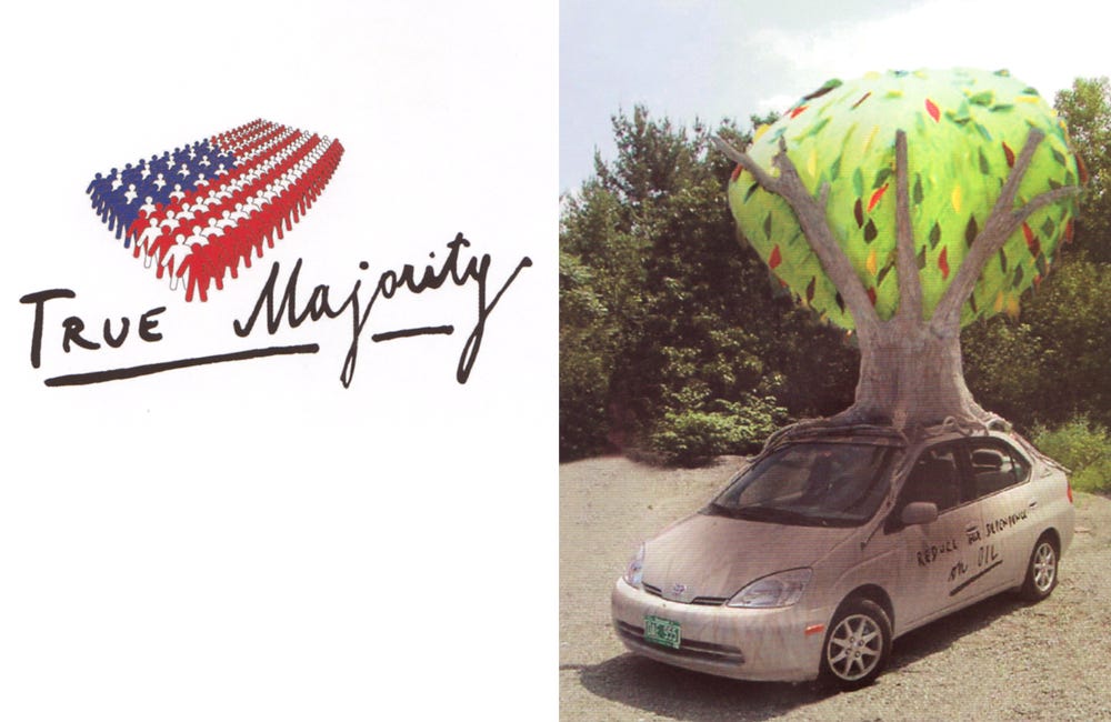
• Uneven casual writing is used to represent the average American.
This logo was designed for a grassroots education and advocacy group led by Ben Cohen (co-founder of Ben & Jerry’s) and comprised of 200 business leaders, CEOs, and military advisers. The group’s goals are to adopt long-term policies designed to prevent another 9/11 by dealing with world hunger, reducing dependence on oil, and paying our UN dues.
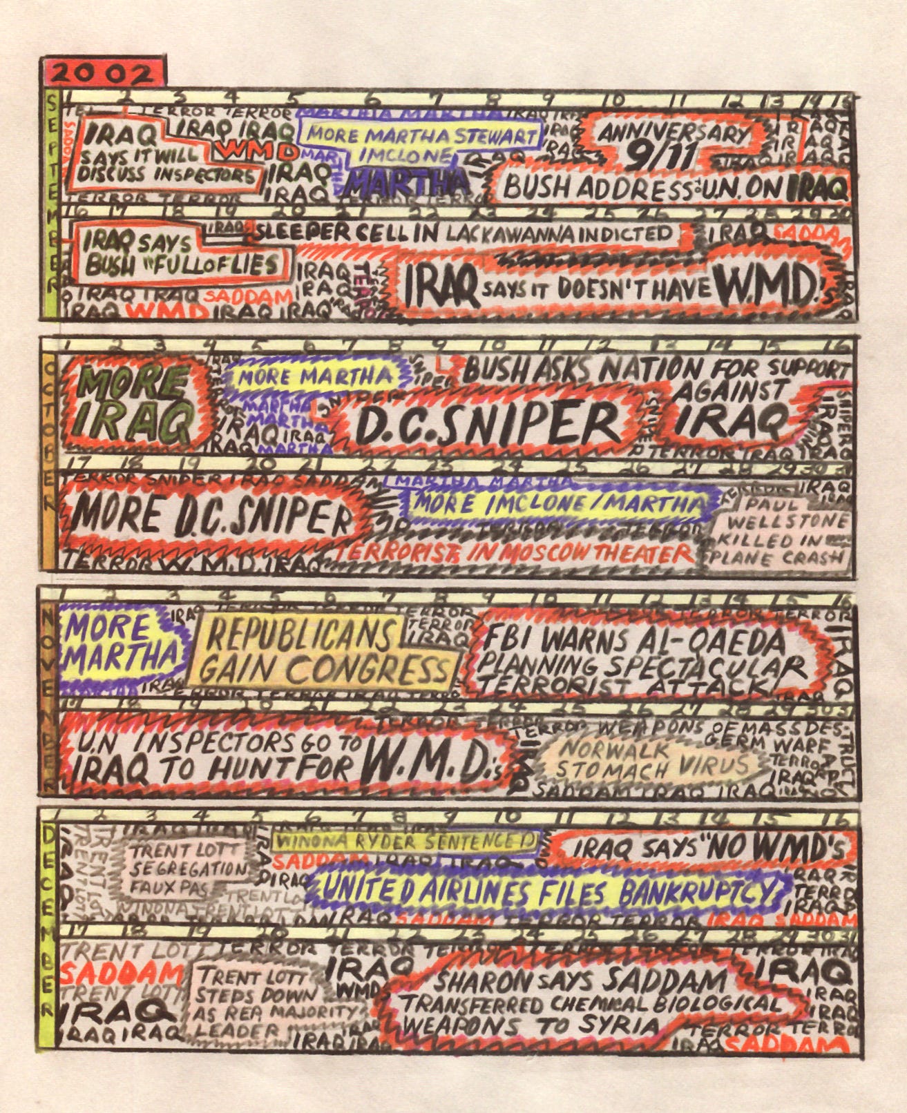
• Handwritten capitals in many colored pencils mimic the attitude of the news.
This visual essay, which appeared in Print magazine, records in a personal and powerful way, the texture of the news before and after 9/11. The author, Paula Scher, observes “The news abruptly switched from a background of sex to a background of terror, without missing a beat.” The image shown is only a small portion of the work.
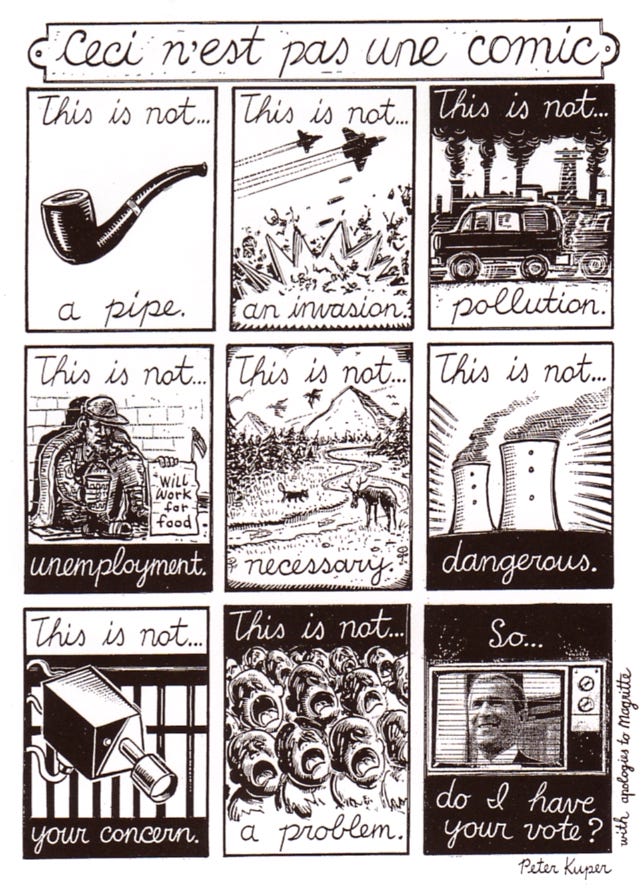
• Cursive handwritten captions recall historical usage of Magritte’s famous painting.
The comic created for the Empire issue of NOZONE magazine plays with the notion of reality compared to what the Bush administration espouses. The comic borrows style and images from Magritte’s Ceci n’est pas une pipe painting, an icon of what is termed Surrealism.
I hope you have enjoyed this little collection. Now, get out there and make a sign!
Thank you all for reading and enjoying my posts. It’s great to be here with you.
ART 232: The Design of Light and Dark: Text Art and Notan
CLICK THE LINK. It’s via Stanford Continuing Studies, and it begins on Thursday, July 16 with a zoom session from 6:00-7:50pm. Anyone can register. Canvas opens a week prior to class for orientation, a pre-class assignment, and discussion. This 6-week class covers optics, figure/ground theories, Gestalt, and related compositional methods in studio art, design, and letterform. It’s for visual artists of all stripes and trades. There are three spots left (6/18) and there will be a waitlist.
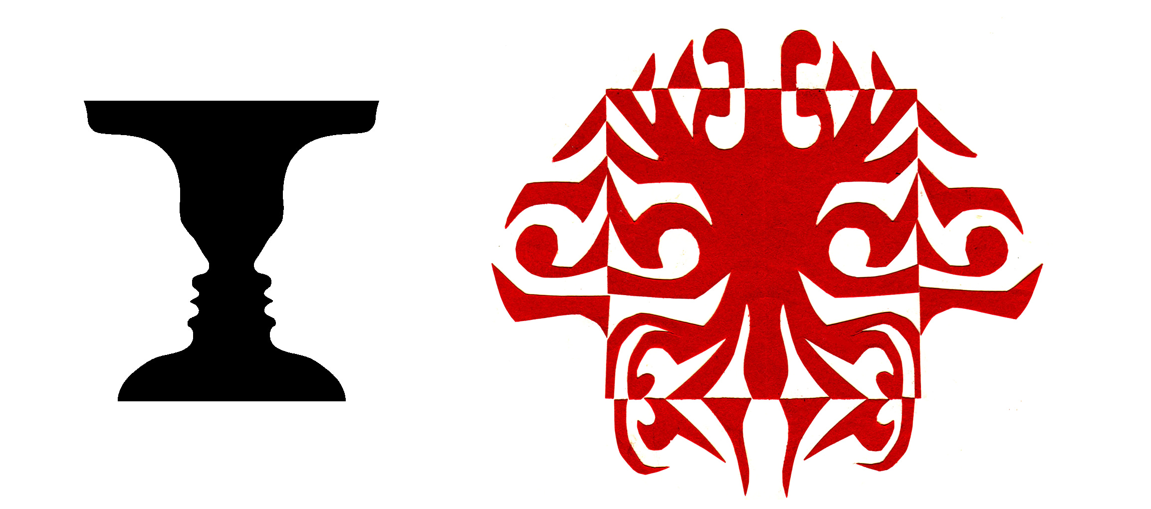
Notan class work is designed to develop a sense of double vision, the ability to see both black and white as one unified thing. Our exercises nurture that special “dichotomy of attention”, the ability to see black and white pattern in a way that changes how you appreciate art, how you make your own visual art, and perhaps even how you think.
NOTE TO ALL: This blogpost on Substack will always be free. Upgrade to Paid for interactive activities, individual comments and discussion, and exclusive articles. Your contribution is always immensely appreciated, and helps keep things coming your way. All images copyrighted by Ann Miller unless otherwise noted.
PAID SUBSCRIBERS: All paid subscriptions are now $75 annually or $7.50 monthly. I am eager to devote time to interactive projects and individual discussions on this basis. For you, it’s an ongoing investment in growing your graphic skills and supporting your performance in the areas of book arts, handwriting, letterformation, and calligraphy.
EDUCATIONAL DISCOUNT: I’m now offering a special 50% discount on the annual paid subscription for art instructors [you@your school.edu] and those in the art education field.
Comments
Nothing yet. Say the first thing.
Sign in to join the conversation.