
Since it was written in 1963, the book Interaction of Color by Josef Albers has been a staple resource for art institutions across the world. He defined and illustrated aspects of visual experience as the simultaneous contrast of color. Today I’ll share with you some of the most important ideas from this book, which was reissued by Yale University Press in 2013 as a 50th anniversary edition.
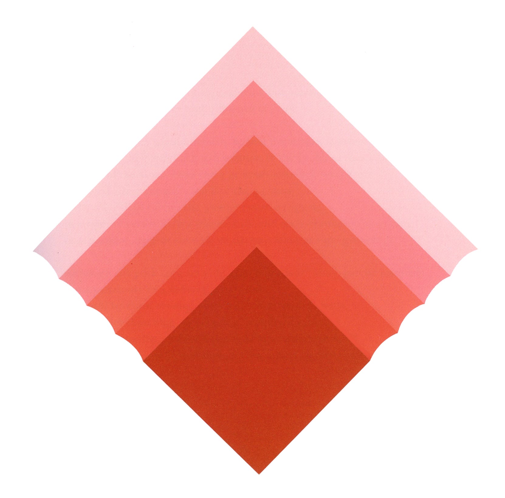
It’s in our eyes.
It would seem that anyone who wants to take up the visual arts and spend a lifetime in that place should read this small book with illustrative color plates. It was compiled through many years of research and teaching. This book tells us to trust our eyes, not photographs, and then proceeds to tell us that we are being misled, deceived, and caused to mistrust our own perceptions.
“We do not see what we see.” Josef Albers
Josef Albers (1888-1976), American artist and educator, did not take color for granted. He experimented endlessly with its nuances in what he termed the simultaneous contrast of color. He is known for his high standards of color study in his class laboratory, the results of which we enjoy and learn from. Because his color studies dealt with perception, they reverberated throughout the science of psychology as well.
We come back to that phrase by 19th century philosopher Auguste Comte: “Everything is relative, and only that is absolute.”
I’m sure many of you are deeply familiar with his work, especially through his Homage to the Square paintings, but I’m sharing a few of his plates today so you can enjoy and refresh the view, again with new eyes.
It’s in our eyes. If you haven’t done this experiment in a long time (or never) here are the instructions (which are great full screen): Stare at the tiny black dot in the red circle for longer than is comfortable, about 20-30 seconds. Then shift your eyes to look at the little black dot within the white circle.
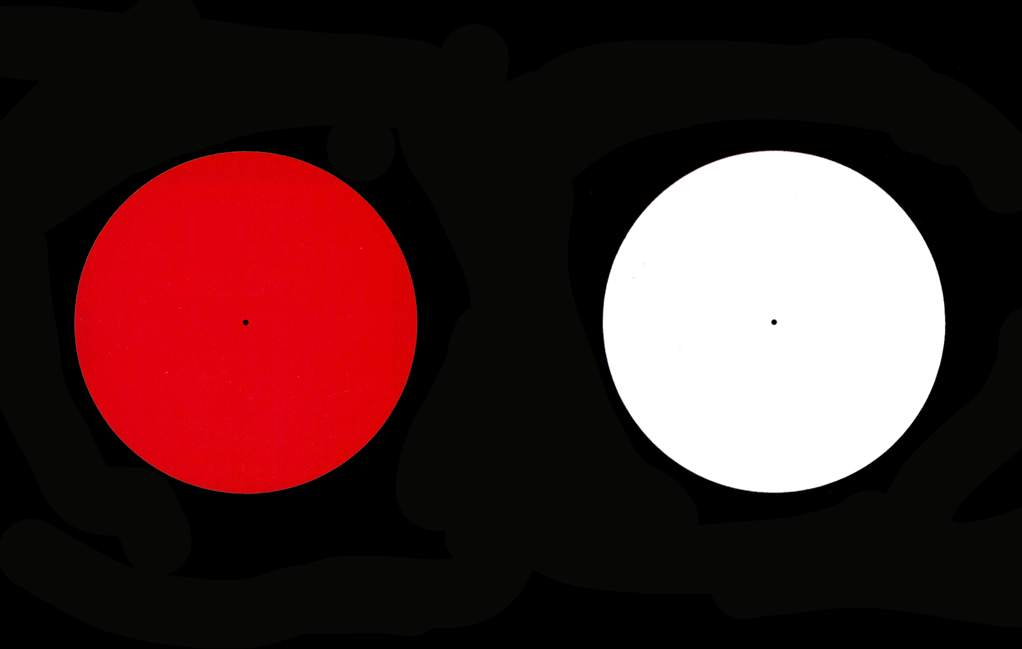
What you see first while looking at the red circle is a rim of increasing brightness at the edge caused by the afterimage of the black. Next, when looking at the white circle, you’ll see the complementary tone of the red (a bluish green) overlaying the white. Our eyes are capable of reading so many color waves, but the receptors (rods and cones) become tired when overexposed to one color or another; that fatigue causes the opposite of the tone or hue to emerge as dominant, and influences the field around the color in ways that are often not obvious in every day life.
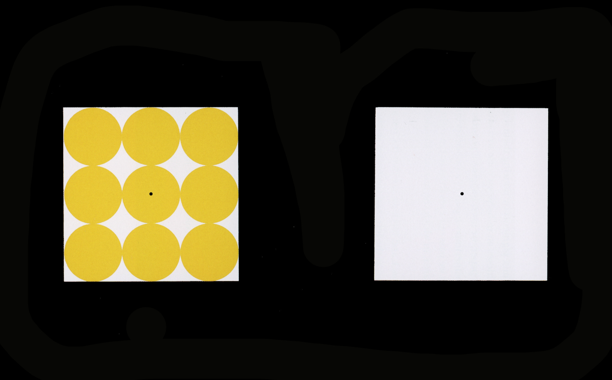
Another example has minimal contrast between the yellow and white elements. Repeat the eye exposure to the left image and then shift to the right. You should see lavender circles with dark yellow shapes between them. The opposite of yellow is purple, so you get white plus purple for the afterimage of yellow. The opposite of white is black, so you get black plus yellow, resulting in a very much darker yellow than on the left.
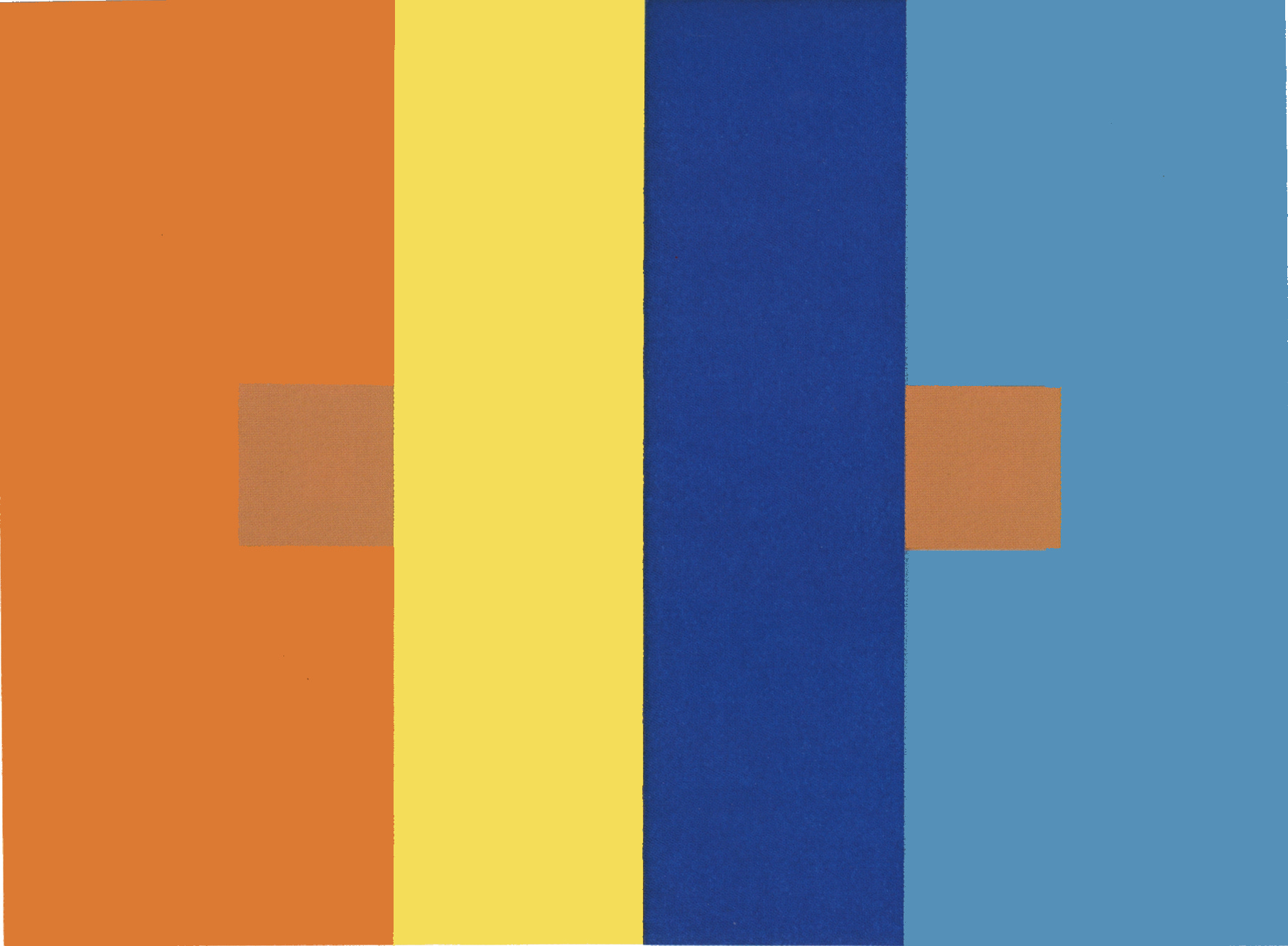
The simultaneous contrast of color can fool our eyes, and affect our reportage of what we actually have seen! The same color shown against a contrasting backdrop will look demonstrably different, so much that you question your perception. This image is from Albers’ original portfolio of color plates that were made using papers of different colors. An orange swatch was placed on top of the left orange and right blue swatches and then covered by the bright yellow and dark blue. The yellow causes a shade of purple, its afterimage, to affect the square on the left; the dark blue causes a light orange afterimage to affect the square on the right. This interaction of color happens inside the eye.
So when you look at a painting, you’ll see what the experienced artist intended for you to see, and at the distance you are meant to see it. Remove the surrounding hues and it’s easy to see that colors match.
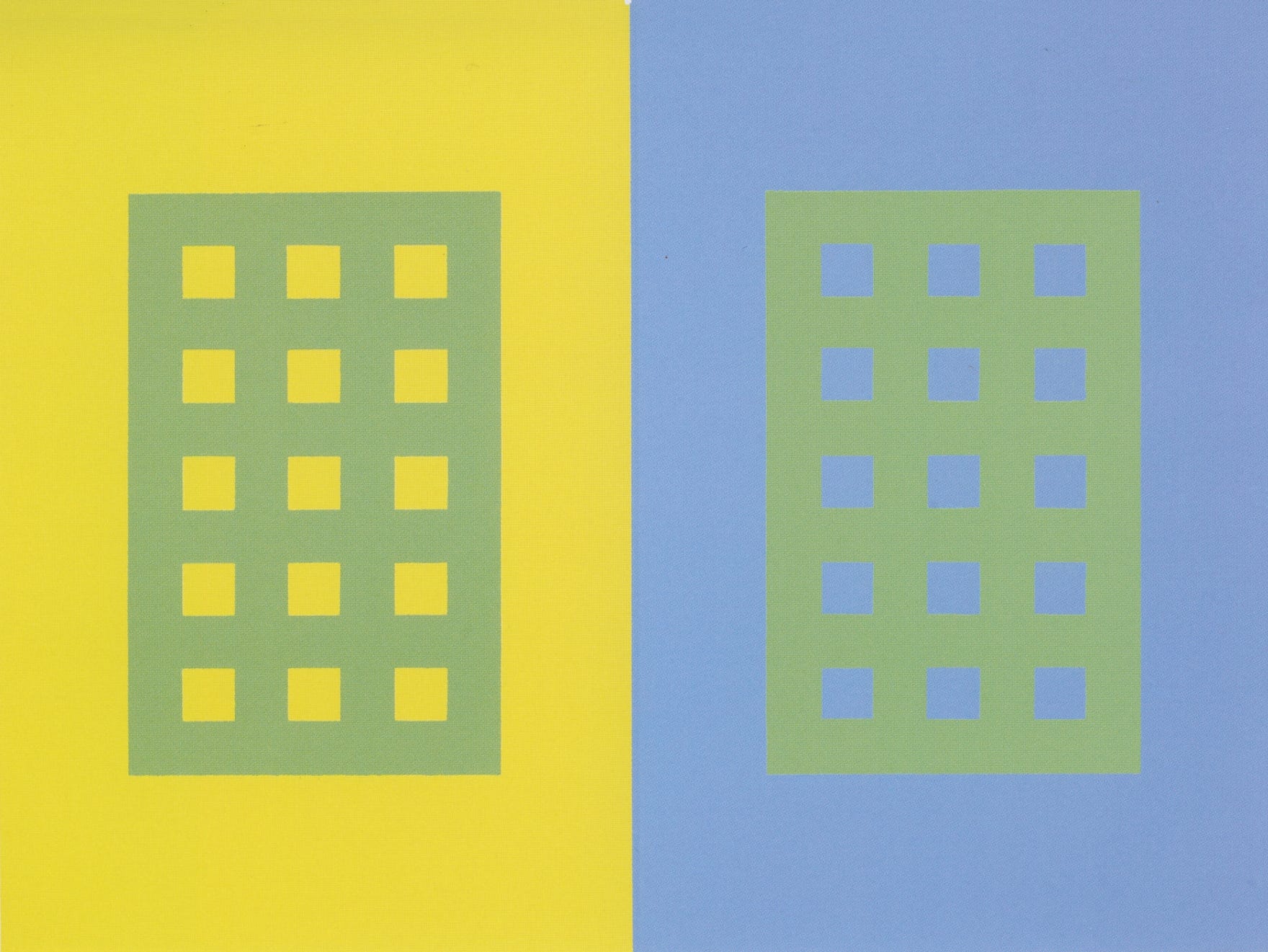
Simultaneous contrast is illustrated again with two grids of the same color placed on top of different grounds. On the left there is high value contrast; on the right the values are nearly the same (if you squint, the colors blend and the difference largely disappears). This causes the grid on the left to appear darker, and the grid on the right to almost disappear.
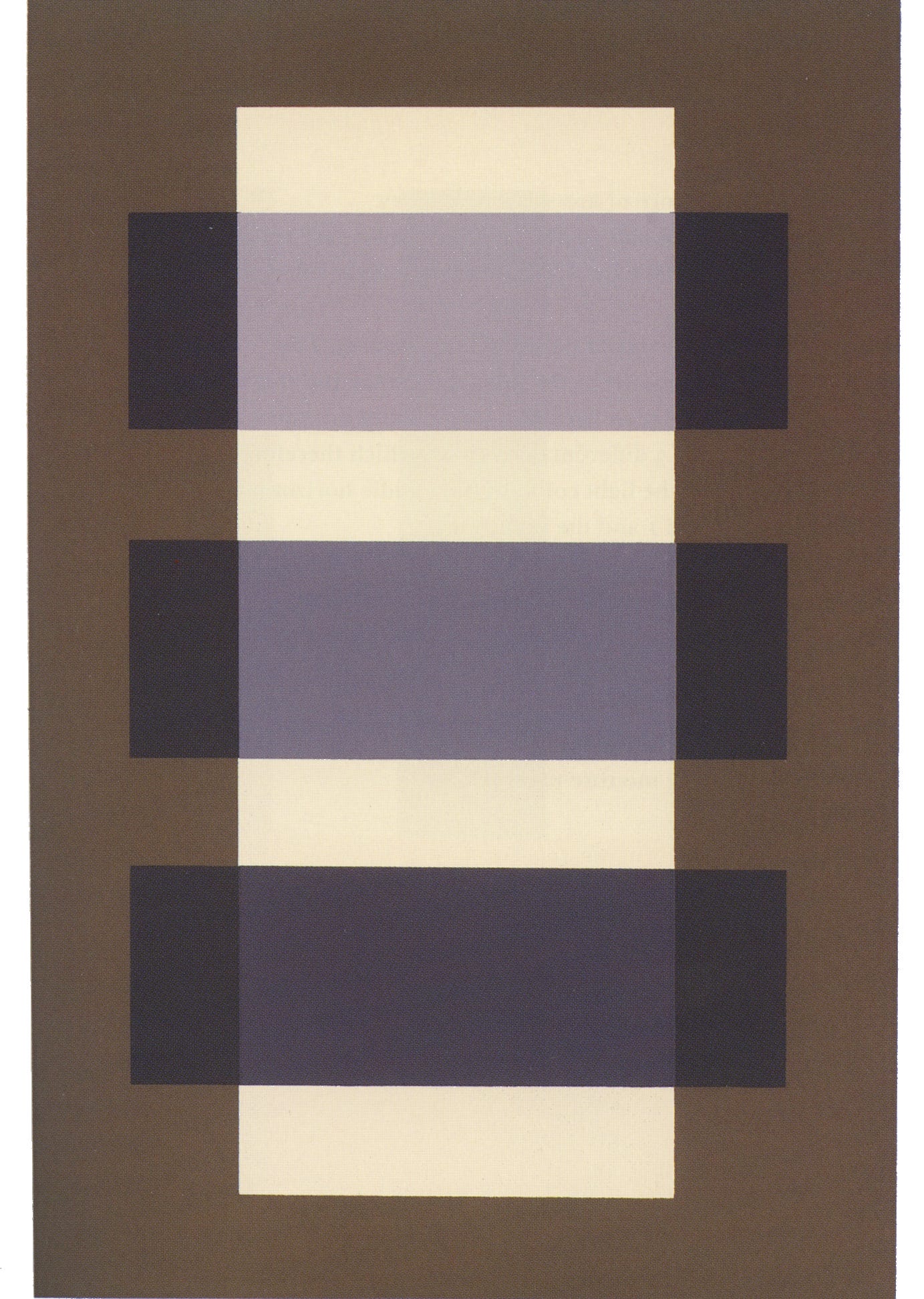
The effect of transparency can be achieved by managing tonal contrasts, light and shade. Artists can push a tone into the distance, or bring it closer to the viewer simply by hinting at transparency by lightening a tone to push it back (the lavender is behind the light strip) or darkening it to pull it forward (the darker purple is in front). This works with both grayscale and hues.
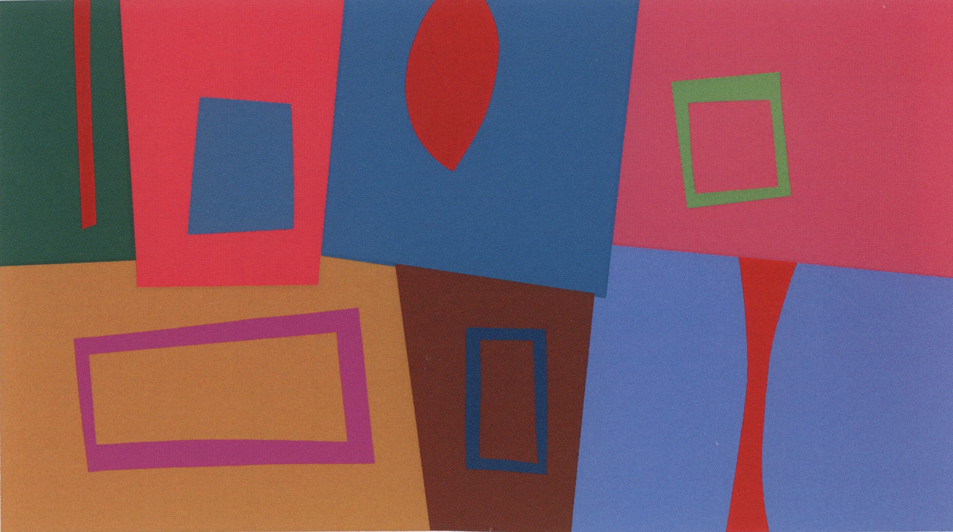
Dominance? The next plate was designed to answer whether it was possible to use all colors so that no single hue was dominant in the image. Do the shapes appear to occupy the same level in the picture plane? Is there a single dominant shape, value or hue? It helps to look at this design in terms of color distribution.
Three red elements balance across the page on their own.
Three blue solid elements form a progression from lower right to upper left.
Two green elements, one solid, one empty.
Three pinkish/magenta elements, including one window and two solids, are well-distributed.
Three windows, two lines, and one leaf shape (echoed by the curved element lower right).
Two earth tones anchor the lower left with the strongest contrast, though very low) of the group.
Josef Albers was passionate about color. We can learn so much from his sense of organization, and how art and life are inextricable from each other.
To design is to plan and to organize, to order, to relate and to control. In short, it embraces all means of opposing disorder and accident. Therefore it signifies a human need and qualifies man’s thinking and doing.
• • •
That’s it for today. Send me your questions or suggest a topic you’d like to see. The future is open.
• • •
Calm down
what happens
happens mostly
without you.
JOSEPH ALBERS
Thank you all for reading and enjoying my posts. It’s great to be here with you.
The Notan class is off to a roaring start, and it will be offered again at the beginning of 2027! I will post info here, and after this current session is complete I’ll share what the class accomplished!
NOTE TO ALL: This blogpost on Substack will always be free. Upgrade to Paid for interactive activities, individual comments and discussion, and exclusive articles. Your contribution is always immensely appreciated, and helps keep things coming your way. All images copyrighted by Ann Miller unless otherwise noted.
PAID SUBSCRIBERS: All paid subscriptions are $75 annually or $7.50 monthly. I am always ready to devote time to you with interactive projects and individual discussions on this basis. For you, it’s an ongoing investment in growing your graphic skills and supporting your performance in the areas of book arts, handwriting, letterformation, and calligraphy.
EDUCATIONAL DISCOUNT: I’m now offering a special 50% discount on the annual paid subscription for art instructors [you@your school.edu] and those in the art education field, even without the .edu suffix. Contact me.
Comments
Nothing yet. Say the first thing.
Sign in to join the conversation.