
We’re born into a grid—organic rather than geometric—and spend our lives flowing through its fiscal, environmental, and social structures. We think, configure, and make items, we prioritize in sequence, we target desired effects. The visual artist makes marks, expressing ideas in visual terms. We record moments, faces and places, and we write. We settle in to do our work and the outcome depends on how well we understand the organizing principles of visual art.
Today I’ll illustrate the 7 principles of the Gestalt theory, developed In 1920s by psychologists Max Wertheimer, Wolfgang Köhler and Kurt Koffka. Their work resulted in the holistic realization we are familiar with today, that the sum of the whole is greater than its parts. The three men studied the process of perception and problem-solving, and made “holistic” a common term.
Here is a chart illustrating the 7 principles of Gestalt.
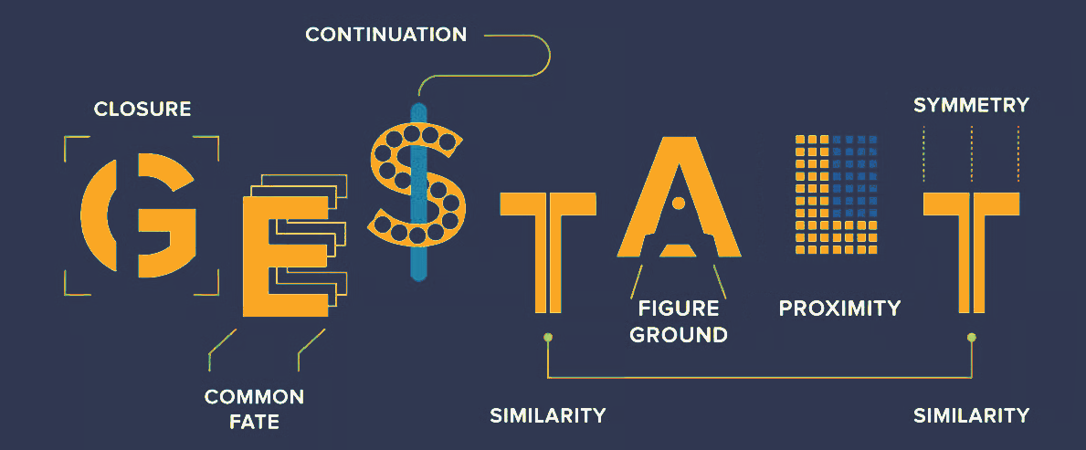
In art, awareness of Gestalt principles supports the goal of creating a harmonious unity that occurs when the collective interaction of the parts creates a new unique arrangement with its own identity. It is a holistic approach that lets the viewer at first glance see the creation as intended, rather than admiring each part separately. The artist synthesizes the whole from experience and understanding using the seven principles, which I’ve briefly noted and illustrated below.
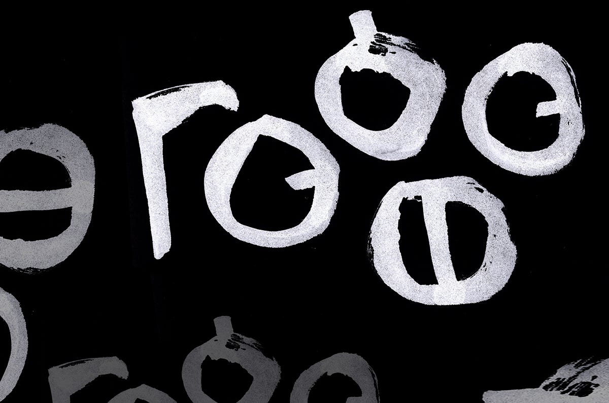
PROXIMITY - Objects placed close to one another are perceived as a single, related group. These letters spell out the word “peace” in the code language Utopia invented by Thomas more for use in his work Utopia, 1516.
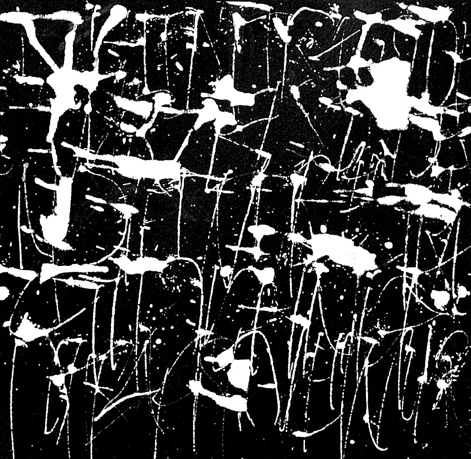
SIMILARITY - Elements that share visual characteristics (like color, shape, or size) are naturally grouped together and often assumed to serve the same function. We can “read” these white blotches as letters and the thin vertical strokes as stems and descenders. They coalesce as writing, whether or not they are legible. The message is for the artist to know.
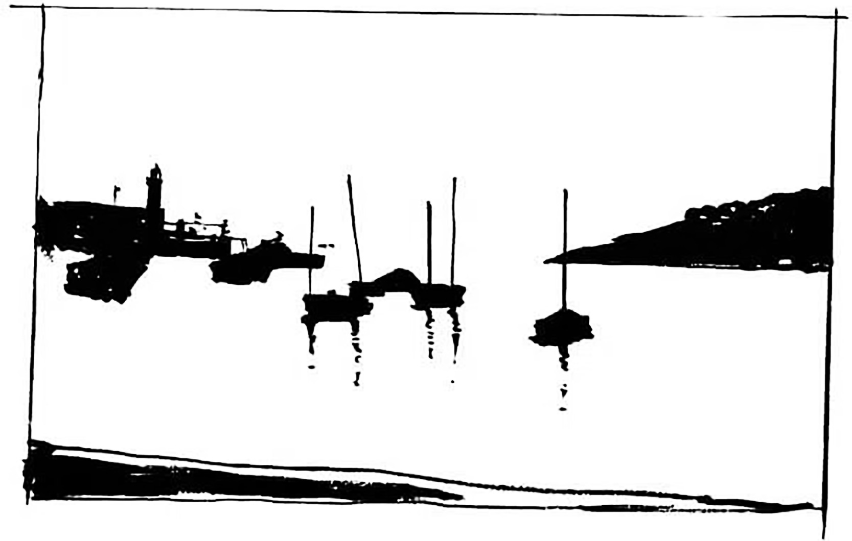
CLOSURE - The brain instinctively fills in the gaps or completes incomplete shapes to create a whole, recognizable image. In the image below, we group the boats, and the diagonals create enough closure to establish foreground, middle, and sky.
CONTINUITY - The eye naturally follows the smoothest path, line, or curve, connecting and grouping elements rather than seeing them as unrelated or broken pieces. This magazine cover expresses the joy of paper with the floating, carefree letters and bright round dots that catch the eye with their progression in size. The rough arc of black could represent deep space or a solid element closer to the viewer.
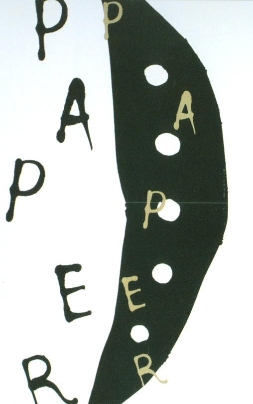
FIGURE-GROUND - The eye separates the main focal object (the figure) from its surrounding area (the ground) to establish contrast and focus. The rounded letterspaces and counters trick the eye with their positive, advancing shapes, while the white letters with their concave shapings and waisted stems tend to recede.
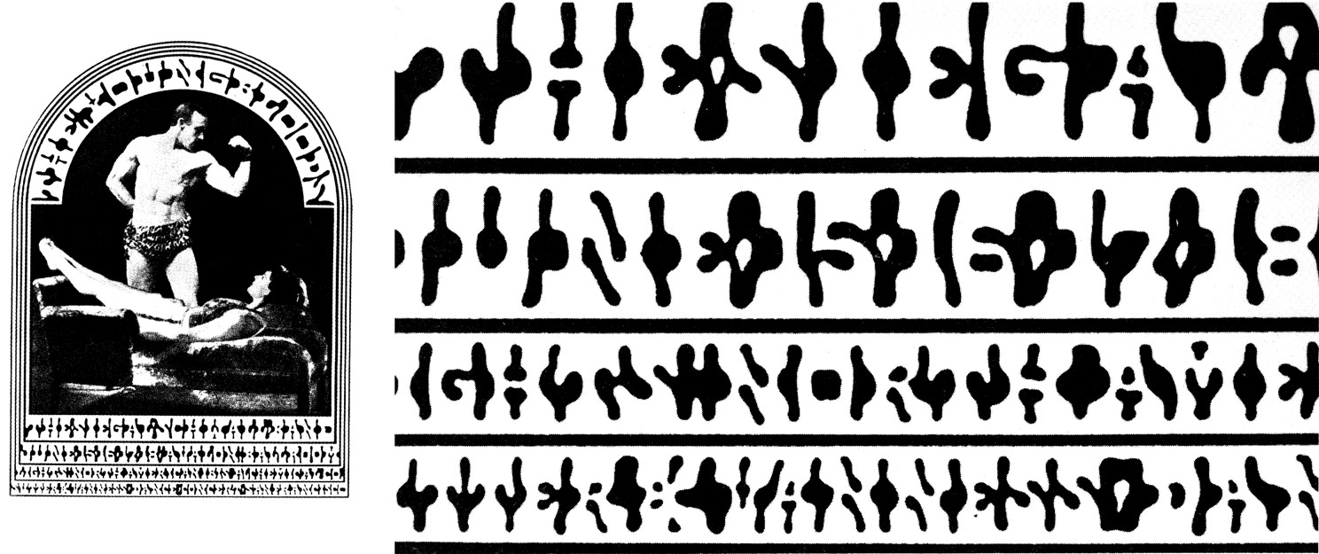
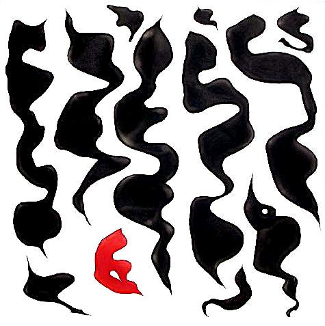
SYMMETRY and ORDER - Also known as the Law of Prägnanz, this principle states that the brain will interpret complex, ambiguous shapes in their simplest, most stable, and orderly forms. This is related to hierarchy and focal point.
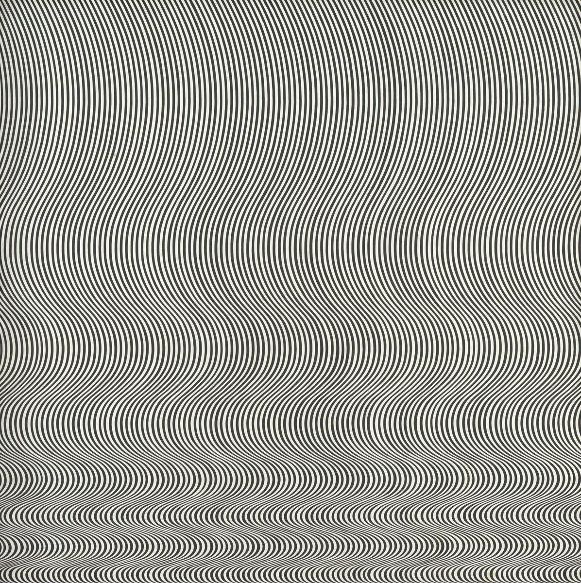
COMMON FATE - Elements that move in the same direction or at the same speed are perceived as functioning together as a unified group. This optical art work by British painter Bridget Riley is done by hand, each multi-curved line at equal intervals spaced across the canvas. The eye reacts to the whole object with astounding sense of movement, pushing a two dimensional piece beyond expectation and revealing natural laws of visual perception.
There is Gestalt and much more represented in the various artworks above. It’s exciting to explore how artists at every level are naturally conscious of these important principles that work visually. It is rewarding to use these principles consciously and strengthen your appreciation and practice of visual art.
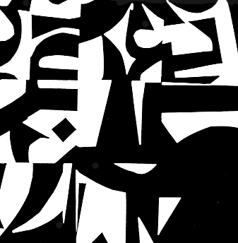
ART 232: The Design of Light and Dark: Text Art and Notan
It’s at Stanford Continuing Studies, and it begins on Thursday, July 16 with a zoom session from 6:00-7:50pm. Anyone can register. Canvas opens a week prior to class for orientation, a pre-class assignment, and begins our online asynchronous conversations. This 6-week class covers optics, figure/ground theories, Gestalt, and related compositional methods in studio art, design, and letterform. It’s for visual artists of all stripes and trades. There are a few places left!
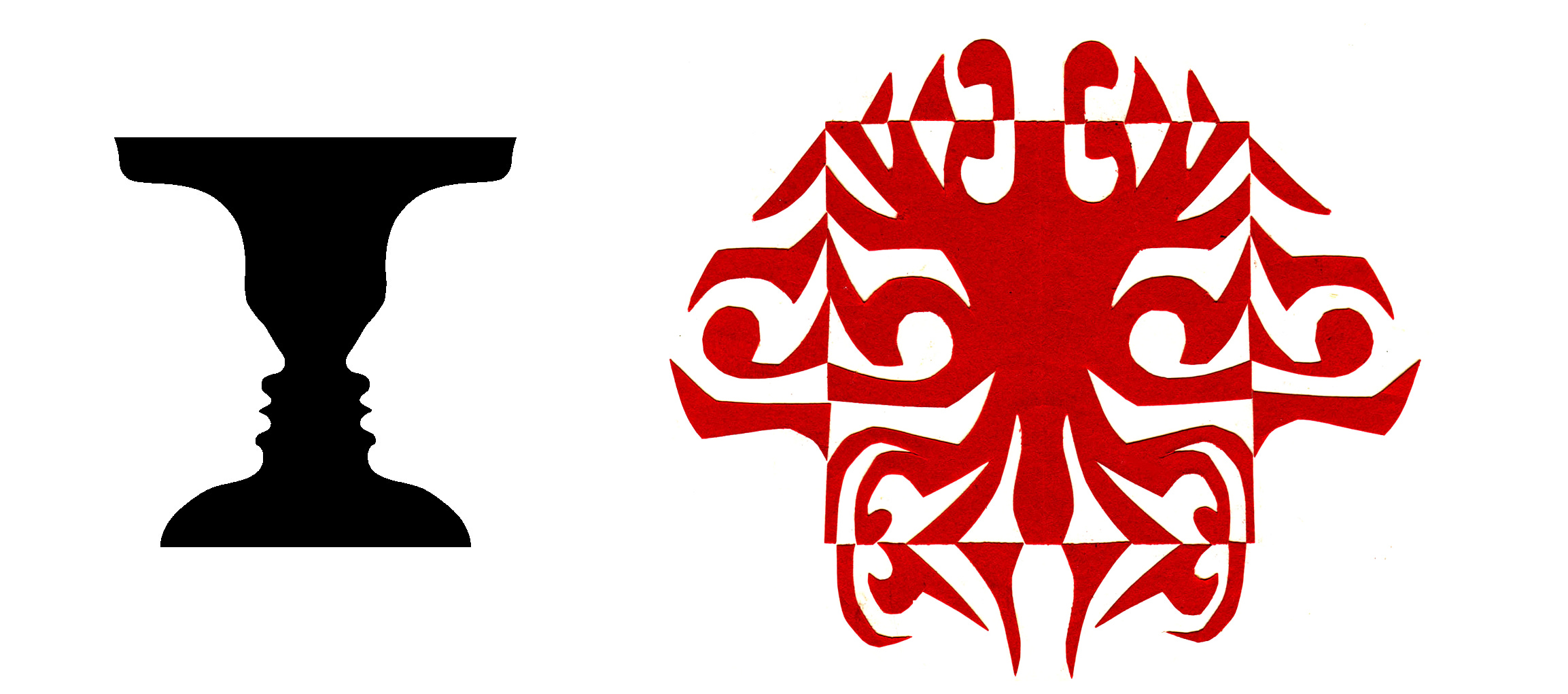
Notan class work is designed to develop a sense of double vision, the ability to see both black and white as one unified thing. Our exercises nurture that special “dichotomy of attention”, the ability to see black and white pattern in a way that changes how you appreciate art, how you make your own visual art, and perhaps even how you think.
Thank you all for reading and enjoying my posts. It’s great to be here with you.
NOTE TO ALL: This blogpost on Substack will always be free. Upgrade to Paid for interactive activities, individual comments and discussion, and content-rich articles. Your contribution is always immensely appreciated, and helps keep things coming your way. All images copyrighted by Ann Miller unless otherwise noted.
PAID SUBSCRIBERS: All paid subscriptions are now $75 annually or $7.50 monthly. I am eager to devote time to interactive projects and individual discussions on this basis. For you, it’s an ongoing investment in growing your graphic skills and supporting your performance in the areas of book arts, handwriting, letterformation, and calligraphy.
EDUCATIONAL DISCOUNT: I’m now offering a special 50% discount on the annual paid subscription for art instructors [your school.edu] and those in the art education field.
A paid subscription gives you access to ongoing conversations on my chat feed, asking questions, permanent access to exercises and how-tos and all archives. Let’s continue to talk about art and keep it fed, nourished, and productive.
Comments
Nothing yet. Say the first thing.
Sign in to join the conversation.