
When I was promoting the last post, I compared the “clock charts” of Cardinia Road and Southland Station, each with a weekday daily 1350.
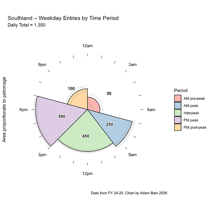
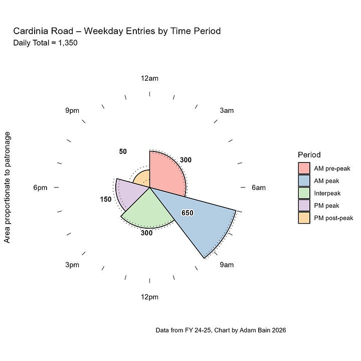
You can clearly see the difference in when people enter these stations despite them having about the same daily total.
This got me thinking however, for the bulk of users of Cardinia Road Station in the AM Peak, it would feel like the station is busier, as they are boarding in the same period as ~650 other people.
I decided that it would be worth calculating a metric for how busy a station feels and this is what I have come up with:
I took how many people board the station per hour during each of the 5 time periods and then taking the average using the number of passengers in that time period as a weight. This number in plain-English is essentially:
“What is the average number of other passengers that you can see entering the station in the same hour as yourself”
So how does this number compare between Southland and Cardinia Road Stations?
For Cardinia Road it is 145 but for Southland it is only 95. In other words, Cardinia Road feels 50% busier than Southland, despite having the same average daily patronage.
Let’s take a look at how ordering stations by this “Average Hourly Experience Entries” metric changes the ranking of “busiest stations”.
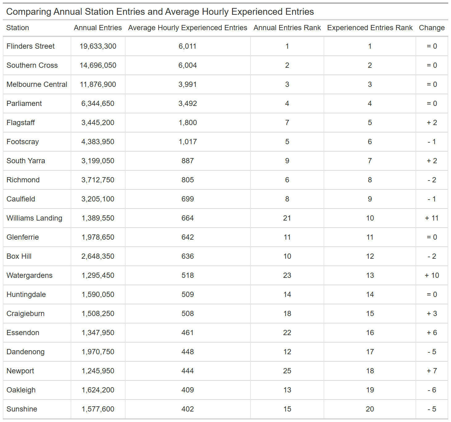
As you go down the list there’s a little bit of movement up and down until WAIT… is that Williams Landing? The station in the middle of nowhere is now considered the 10th busiest station by this metric!?
It seems so, climbing 11 places up the ladder. The pattern here is that “Average Hourly Experienced Entries” favors stations with big peaks. The next big climber is Watergardens, moving up 10 places.
Essendon and Craigieburn also climb significantly, as does Newport, but Oakleigh, Dandenong, and Sunshine fall in the rankings, as they are more ‘all‑day stations’ rather than commuter stations.
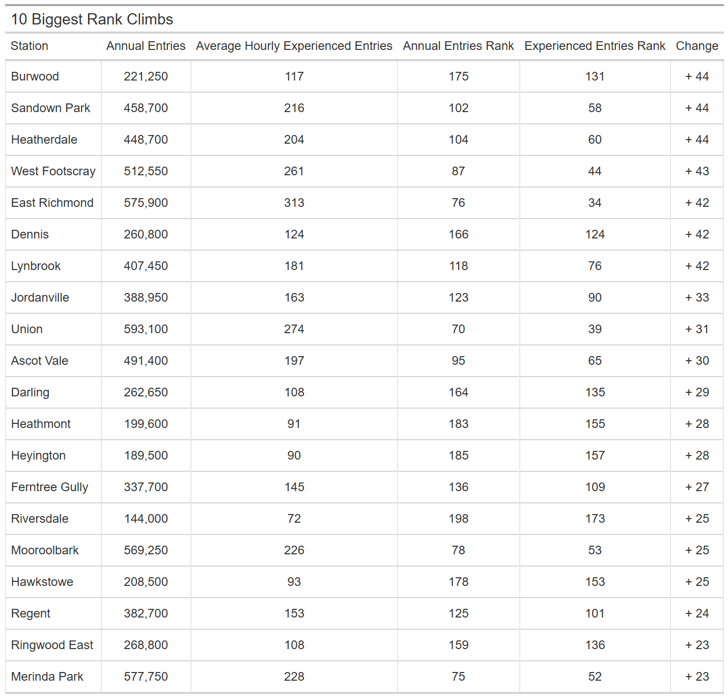
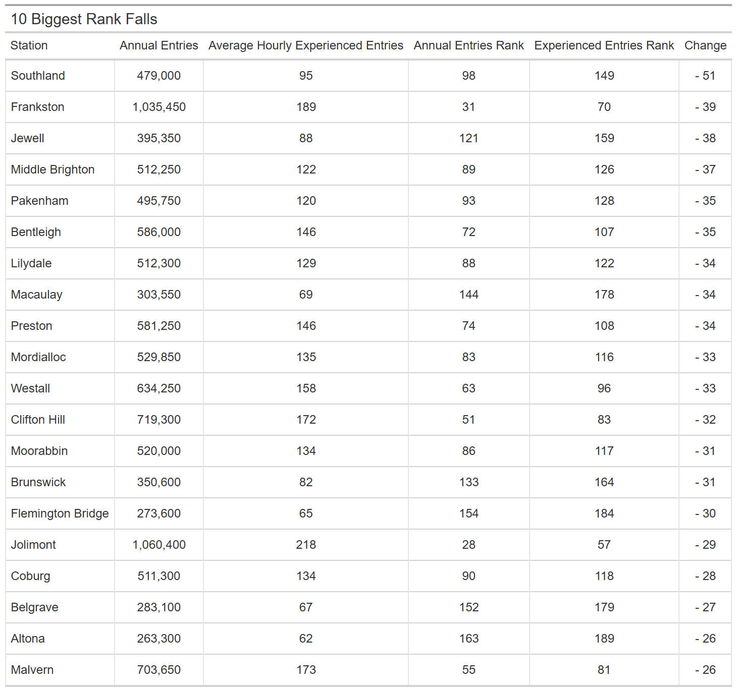
When comparing these tables, the pattern is again reaffirmed, stations that have busy peaks climb up, whilst stations that are steady all day fall down.
I have made a map website that shows this data. To access it use this link: https://adambain014.github.io/VicTrainPatronageAnalysis/AEEpH_map.html
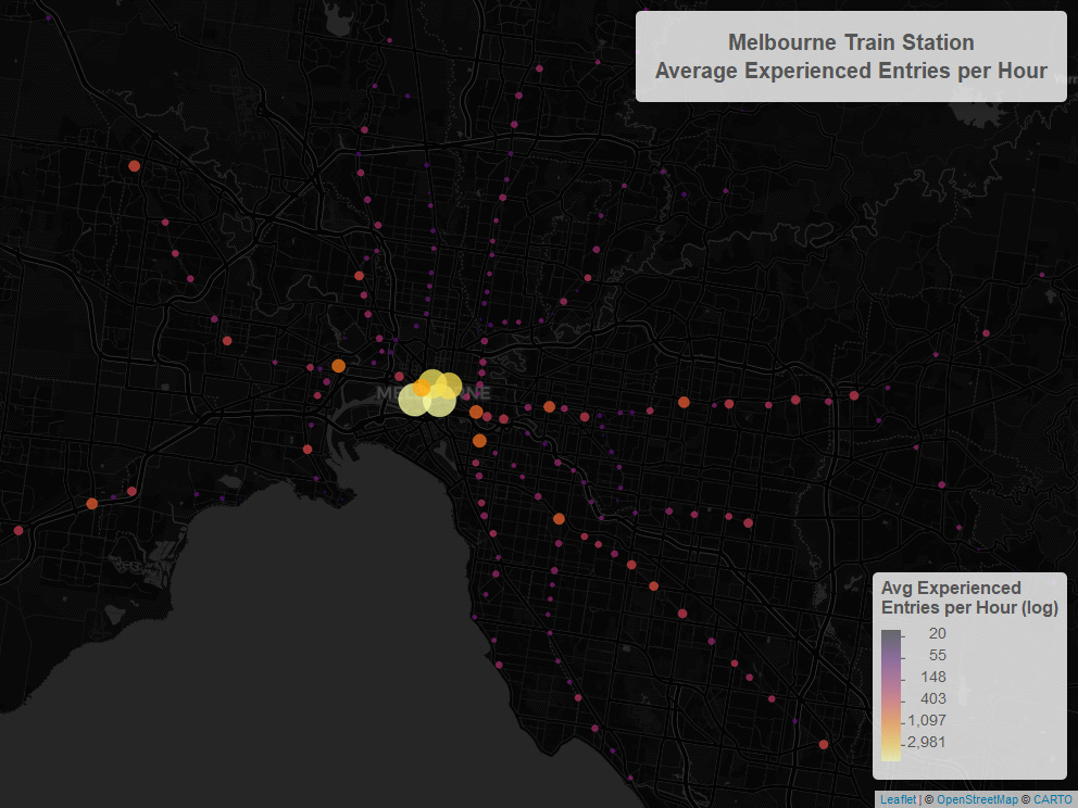
Here is a screenshot that shows the page.
This is a link to the .csv with this data:
https://drive.google.com/file/d/1CamtEc_yWo2k_Q7F8YzFRCjXbjk4A32R/view?usp=sharing
Thanks for reading this short follow-up post. (There shall be more.)
No posts
Comments
Nothing yet. Say the first thing.
Sign in to join the conversation.