
As the “Big Switch” comes online, I’ve been thinking about how Metro Tunnel will reshape travel patterns across Melbourne. Unfortunately, it will be quite some time until we get full data on its usage, so in the meantime I think it’s a good moment to look at where things stand pre-tunnel
For this post, we shall use the governments data on station entries for each financial year. This dataset includes an annual patronage estimate, as well as counts for 5 periods across the weekday. These are:
AM pre‑peak (12am–7am)
AM peak (7am–9:30am)
Interpeak (9:30am–4pm)
PM peak (4pm–7pm)
PM post‑peak (7pm–12am)
The data in these categories is rounded to the nearest 50, with a minimum of 50, meaning that for stations with particularly low patronage, the data is quite coarse. It’s also important to note that the data also only counts entries, not exits.
With those caveats in mind, here is an animated representation of how patronage changes over the day.
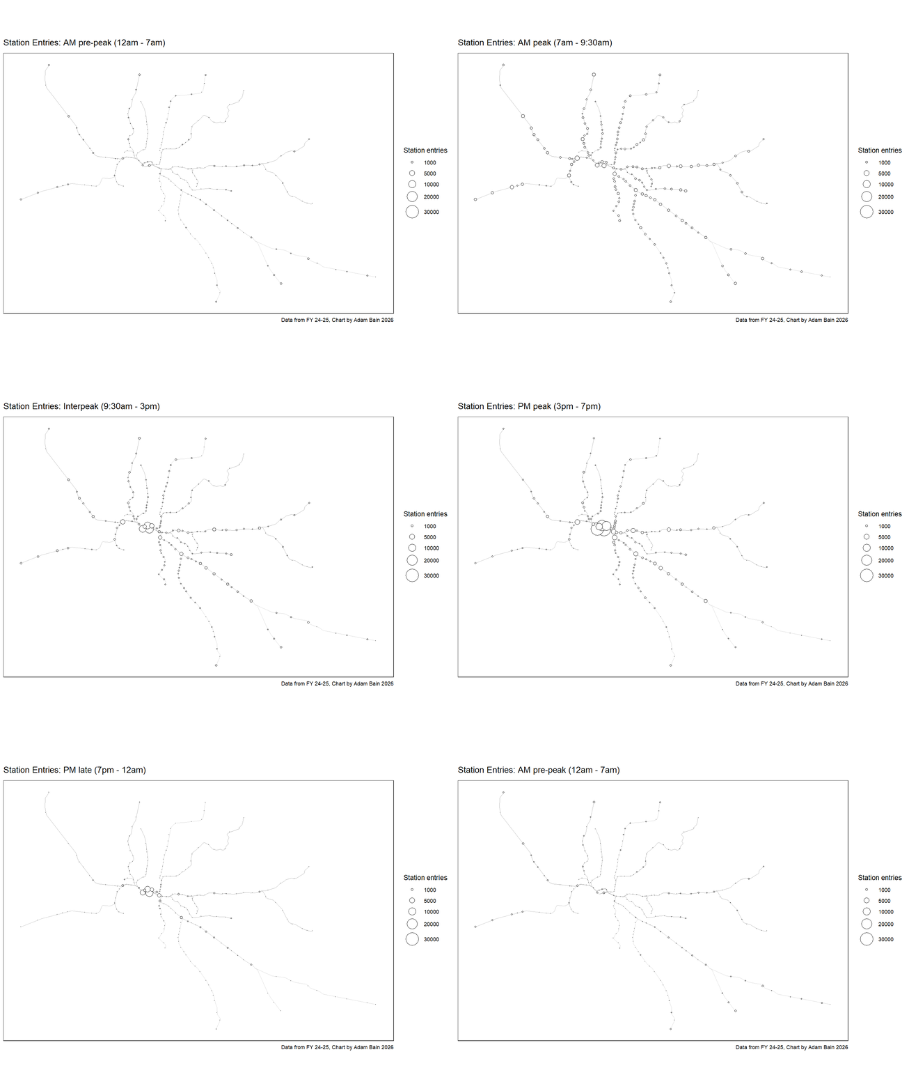
From a glance, we can see that the stations with the bigger AM pre-peaks tend to be towards the ends for lines. This is likely due to people with longer commutes getting up earlier to get to work on time.
AM peak is when entries are the most evenly distributed across the network, in stark comparison to PM peak, where the city loop and inner stations are especially prominent.
To explore these time-of-day patterns in more detail, we can zoom in on how each station’s entries are distributed across the day. To do this, I’ve designed a new visual: the “clock chart.”
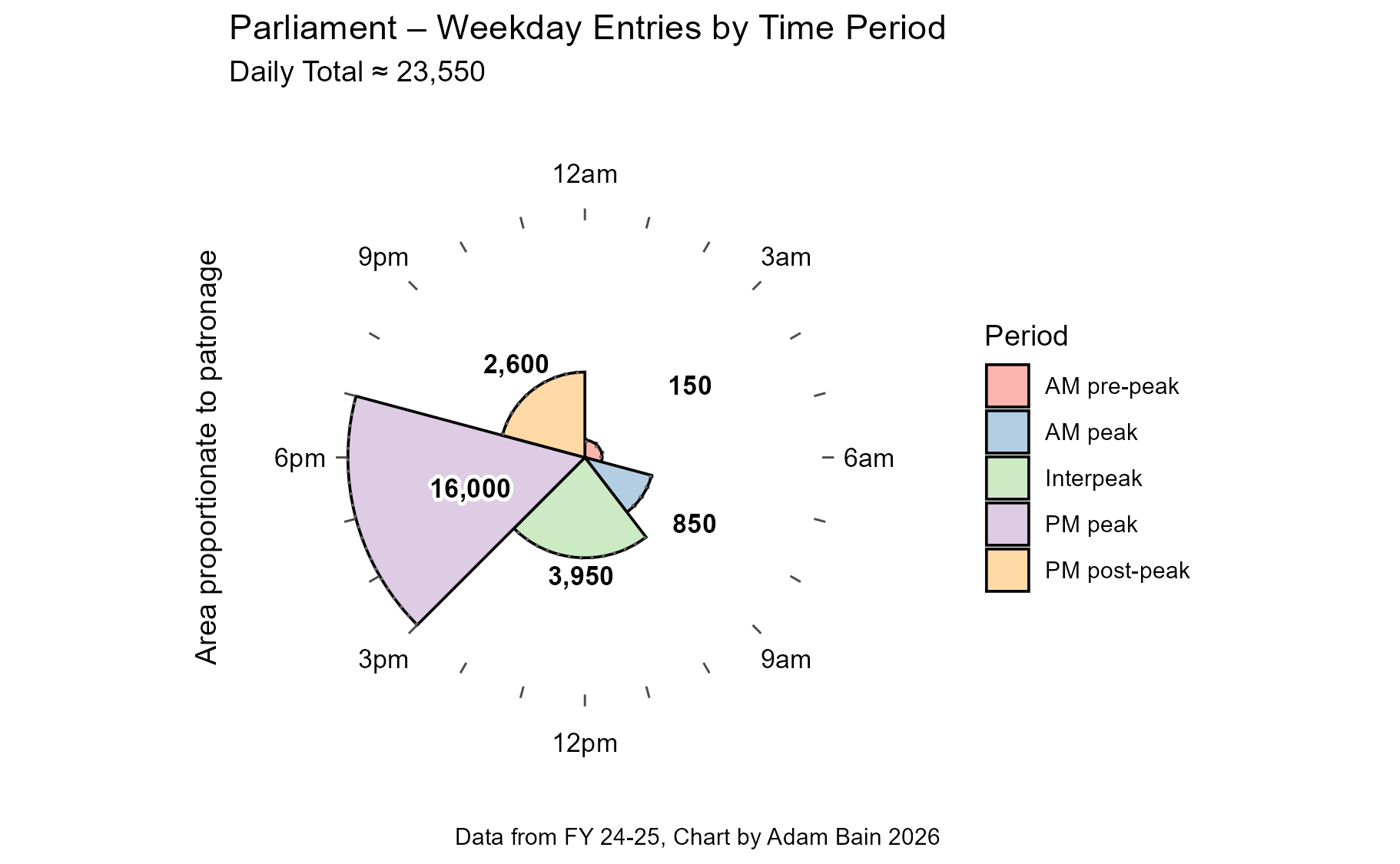
The above clock chart (for Parliament station) consists of slices, placed around a 24-hour clock, representing the different time periods of the day. They are then proportioned by area to represent the relative number of station entries.
From this chart, we can observe just how dominant PM peak entries are in the daily patronage of Parliament Station.
Whilst Parliament Station is famous for being particularly PM peak heavy, Melbourne Central shows a similar profile, but with larger interpeaks and PM post-peaks.
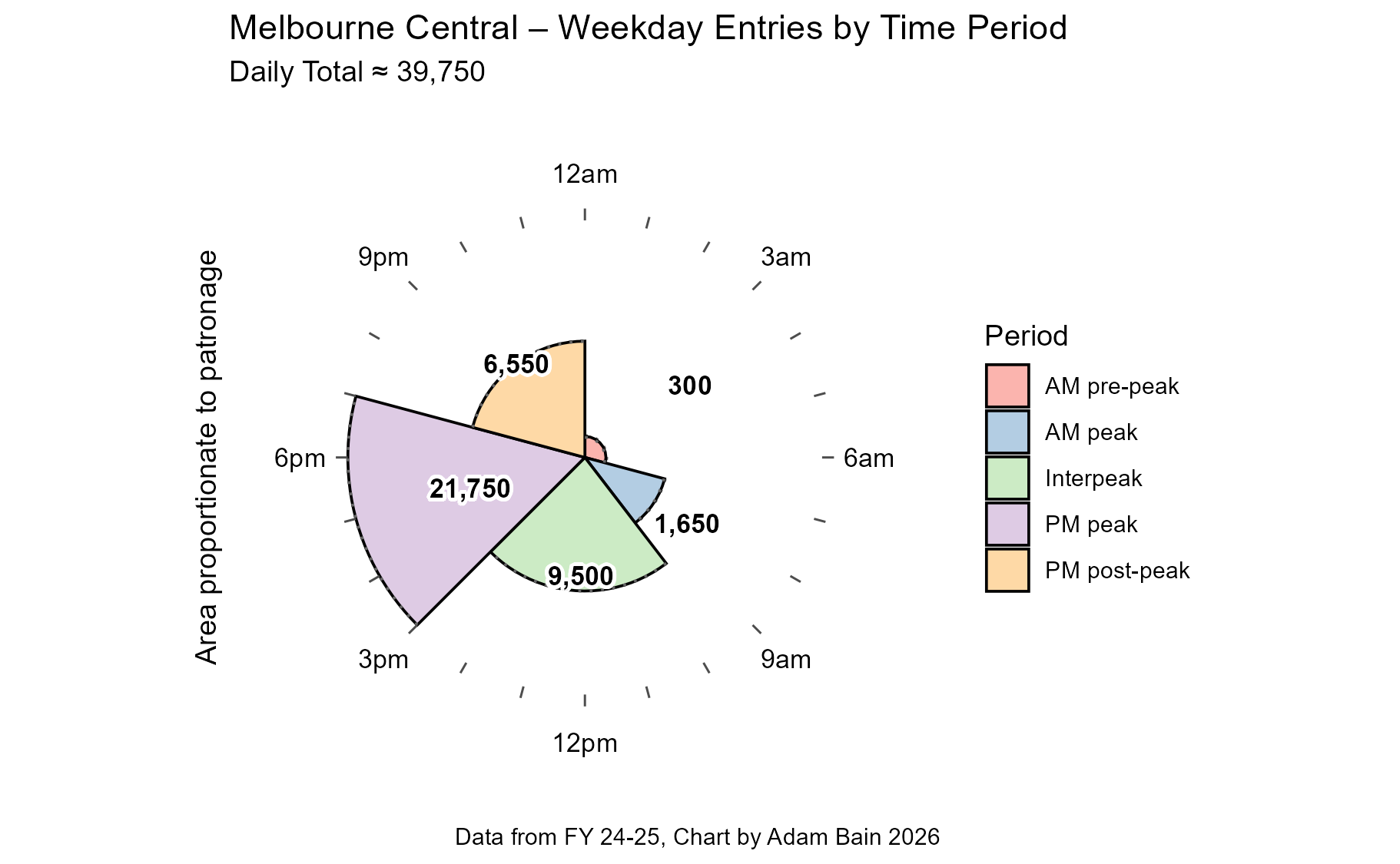
This is likely because whilst the area around Parliament is very job dense, the area around Melbourne Central is both very job dense and surrounded by non-work destinations such as education, shops and entertainment.
The clock charts for outer suburban stations look strikingly different. Take Hallam for example.
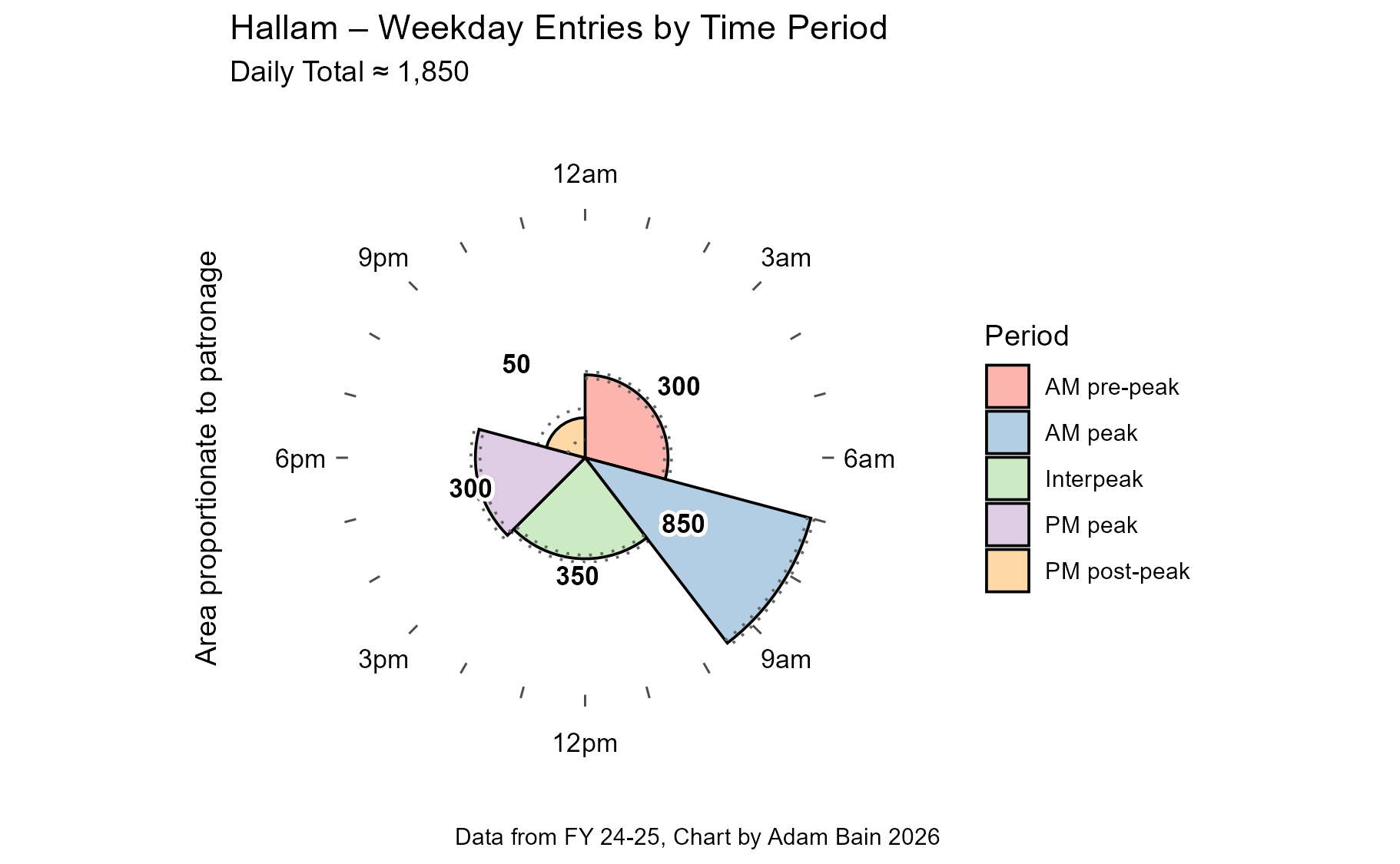
In stark contrast to the CBD stations, Hallam has proportionally huge AM peak, with ~850 entries. Curiously this is approximately the same number which enter Parliament station.
You may have noticed that on this chart, there are dotted lines near the round ends of the segments. These are error lines, to depict the uncertainty caused by the rounding of the official data.
A question that came to my mind when I was looking at these clock charts is which station’s clock chart is closest to the network average. In other words, which station is the most typically “Melbourne”? So that we can see our target, I have made a clock chart for the entire Metro Trains Melbourne network.
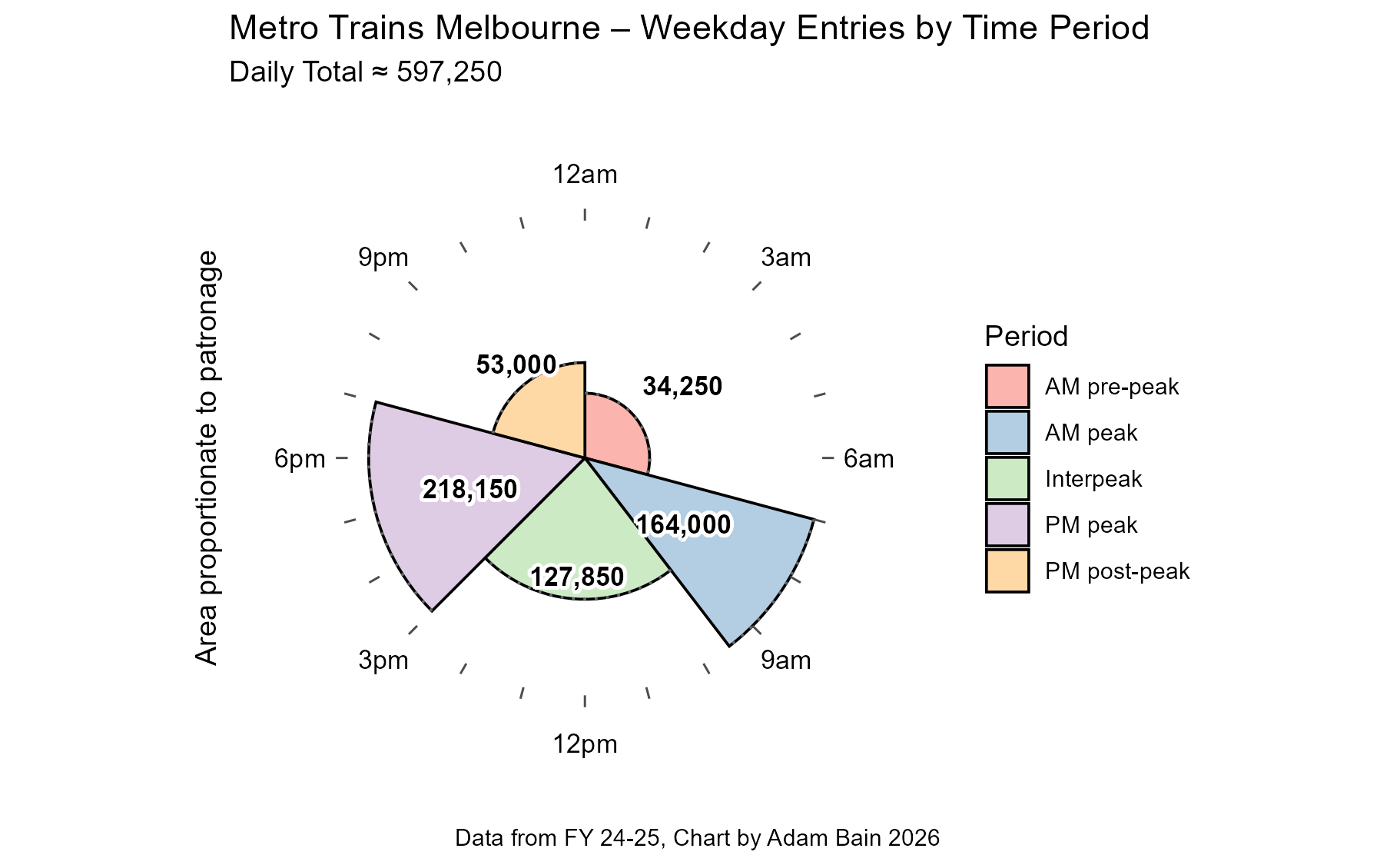
The most typical station must be used throughout the day. It should have busy peaks but not overwhelming like the City Loop or Hallam. It also must have a roughly similar number of entries in the AM peak to the PM peak. Now that I say it like that, this “most average station” is probably quite unusual.
Whilst you have a think and try and figure out the answer, how about let’s look at the LEAST typical station, with a similarity of only 4%. (Similarity is calculated by the cumulative deviation from the mean of each wedge)
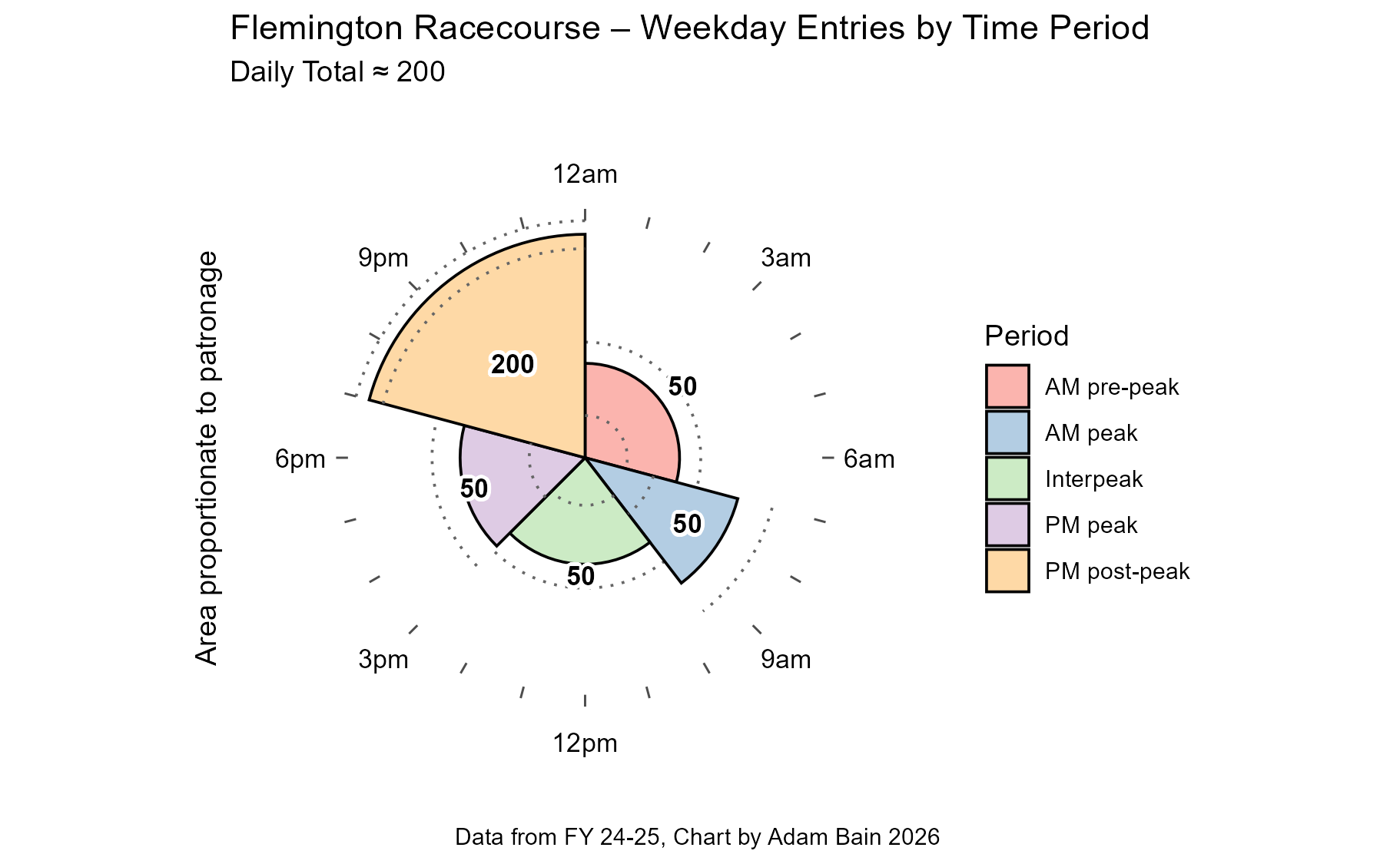
And yep, one could say this station atypical. BUT wait. Daily total of 200? Those wedges add up to 400! What is going on?
As the dataset forces a minimum of 50, it is very possible that those 50 wedges are really representing 10 or less passengers. This means daily totals, particularly for stations with low patronage, can be significantly lower than the sum of their reported parts.
To be honest these numbers look odd to me, as the principal use of the station is for racing carnival events, which don’t tend to go on late into the night (as far as I know)1, so, I thought it worth showing the second least typical station in the network with a similarity of 20% to the network average.
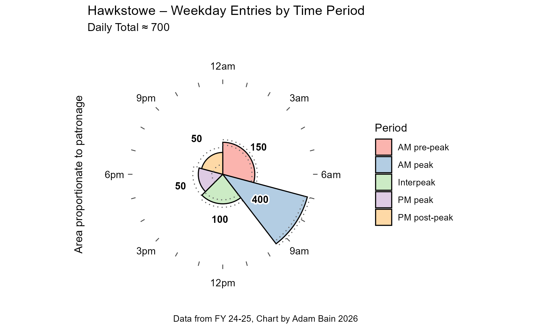
Hawkstowe is the quintessential commuter station, with a large carpark, some housing around it, and pretty much nothing else. It has however been rated the best train station in Melbourne by an RACV survey, so at least it has that going for it.
Alright, you’ve had enough time to think. You have seen what the most atypical stations on the network are, so maybe you have figured out what is the MOST typical station.
Drumroll…
🥁
🥁
🥁
The most typical is…
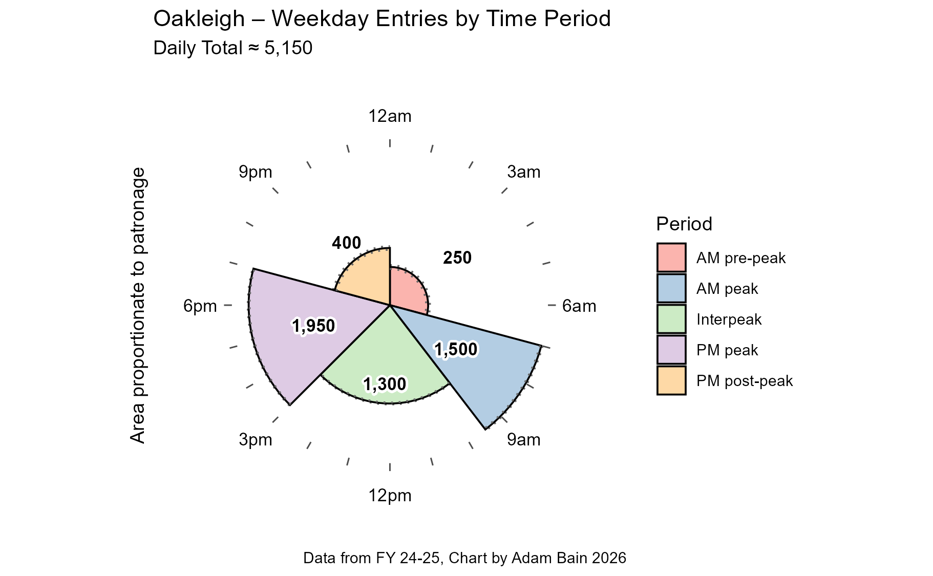
Oakleigh with a similarity rating of 94%. Congratulations! You get a medal I guess for being unusually normal!
Oakleigh station is likely used all throughout the day due to its thriving commercial precinct, as well as its major bus interchange, which leads it to busy-all-day destinations such as Chadstone Shopping Centre and Monash University.
The runners up are Prahran, Camberwell and Kooyong, all with similarity ratings of 92%. These stations are near major commercial precincts, or important bus and tram connections.
These clock charts are decent for comparing station by station, but how about for a whole line?
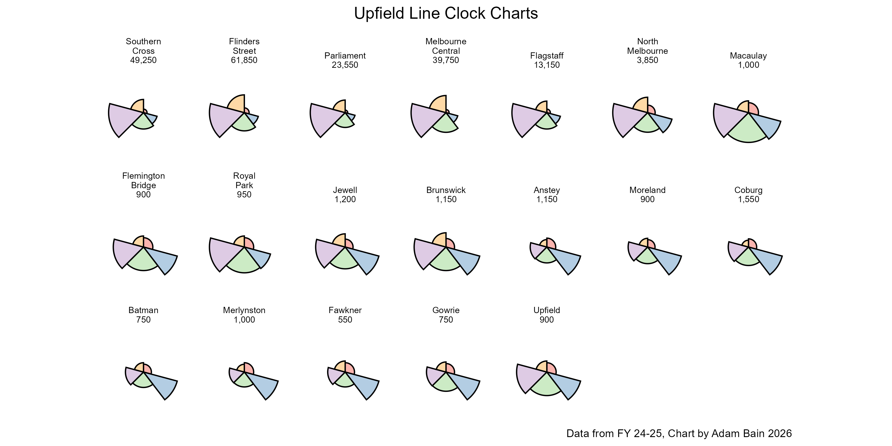
This patchwork of simplified clock charts does the job. I deliberately chose Upfield as the example because it has clearly distinct sections.
The City Loop and North Melbourne have prominent PM peaks.
Macaulay - Brunswick is pretty even across the daytime.
Anstey to Gowrie have big AM peaks.
Upfield itself looks more like the inner section with an even distribution.
What on earth is going on here.?!
Well to speculate, I think that Anstey might be the point at which taking the train with its 15-minute peak frequency becomes quicker than taking the 19 tram, with its more direct route and shorter wait times.
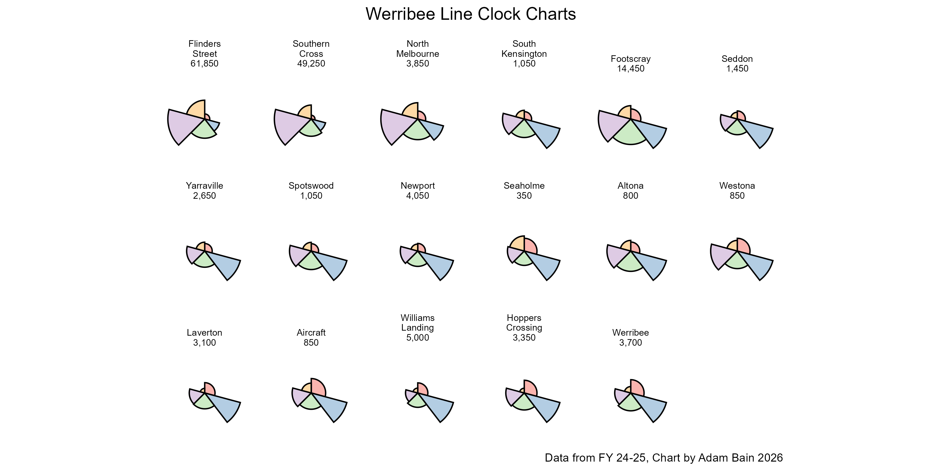
In contrast, here is the Werribee line, which as soon as you get out of the core, we see AM peak heavy clock charts dominate the line. I am curious to see if we get a larger PM peak for Footscray post Metro Tunnel, with people tapping on as they interchange between trains on their commute home.
Whilst the clock charts have been useful for comparing across the weekday, I think it is worth comparing the AM peak with the PM peak directly.
I think that PM peak entries are likely tied decently closely to AM peak exits, and vice versa, so comparing these can hint at the direction of flow during the peak.
Stations with large AM:PM ratios are likely where people live/commute from in the morning. Stations with smaller AM:PM ratios are likely where those people are going to.
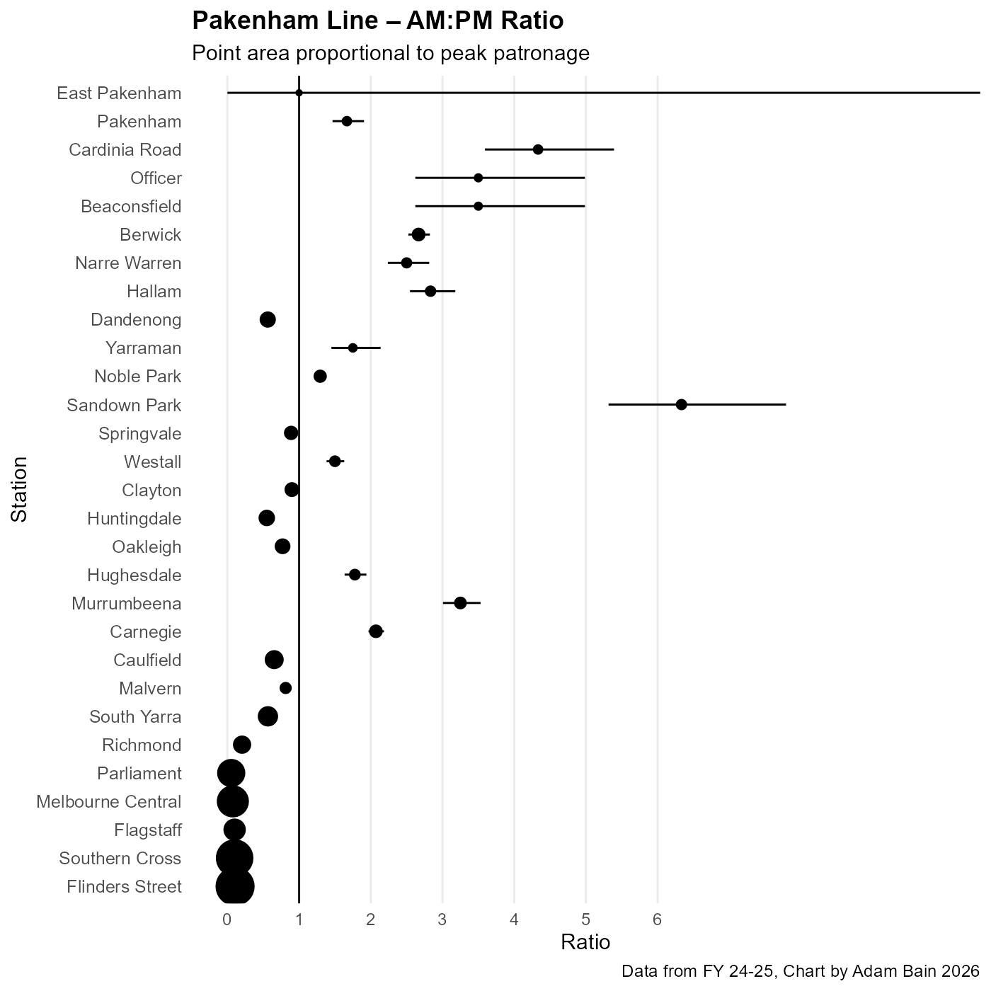
This chart depicts the AM:PM ratios of Pakenham line. The horizontal lines are error bars (due to the rounding), and the thick vertical line indicates where AM peak entries are equal to PM peak entries.
This equivalence line shows clear divide between stations, particularly in the Caulfield to Dandenong section. Caulfield, Oakleigh, Huntingdale, Clayton, Springvale and Dandenong all have less than one AM peak entry for each PM peak entry.
In contrast the other stations have more the reverse. Sandown Park is a particularly extreme case, with more than 6 entries in the AM peak compared with the PM peak, likely due to its large car park.
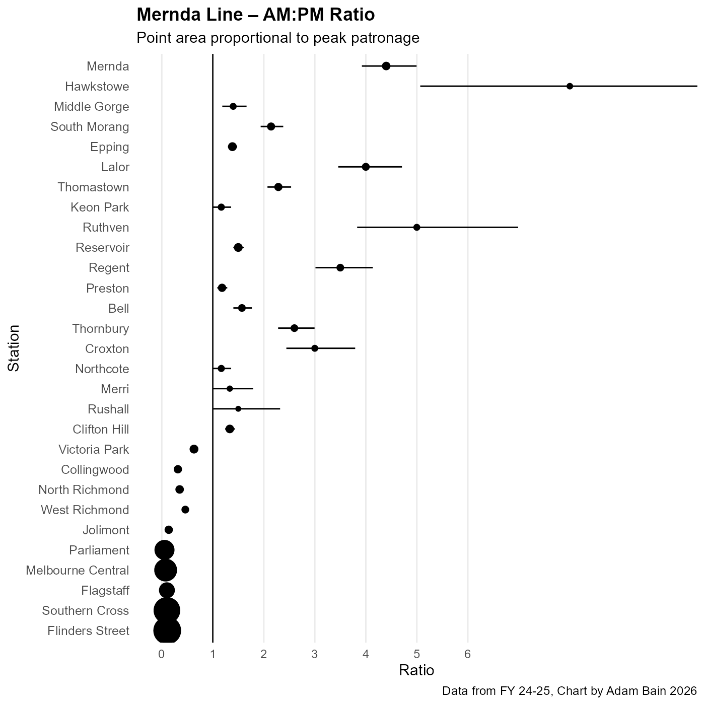
When we take a look at the Mernda line, we can see that the stations from Victoria Park inwards all have more people entering them in PM peak than in AM peak. This is likely because this stretch of the inner suburbs is job and destination rich and potential commuters into the CBD may be opting for less crowded trams.
So far, the charts in this post have been comparing patronage at different times within stations, rather than between them. This has made seeing which stations are busy in the context of the wider line difficult. These stacked bar charts should help make it clear which stations are contributing to passenger loads at different times of day.
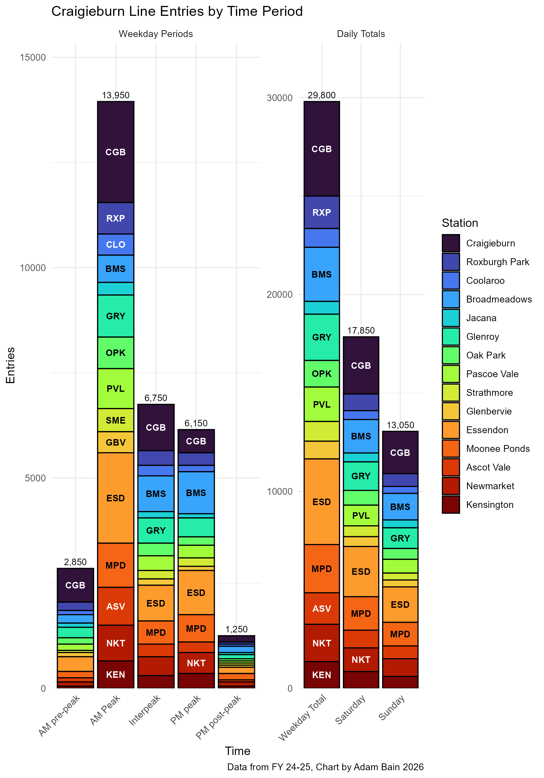
This stacked bar chart shows that during AM Peak, Essendon and Craigieburn are the most important stations, likely due to their bus interchanges and car parks, whilst during the interpeak and PM peak, Broadmeadows and Glenroy hold steady.
Ascot Vale, which in AM peak has a similar number of entries to Moonee Ponds and Newmarket, gets squished in all the other time periods. I believe this is because Ascot Vale doesn’t have a commercial area immediately adjacent to the station like Moonee Ponds or Newmarket.
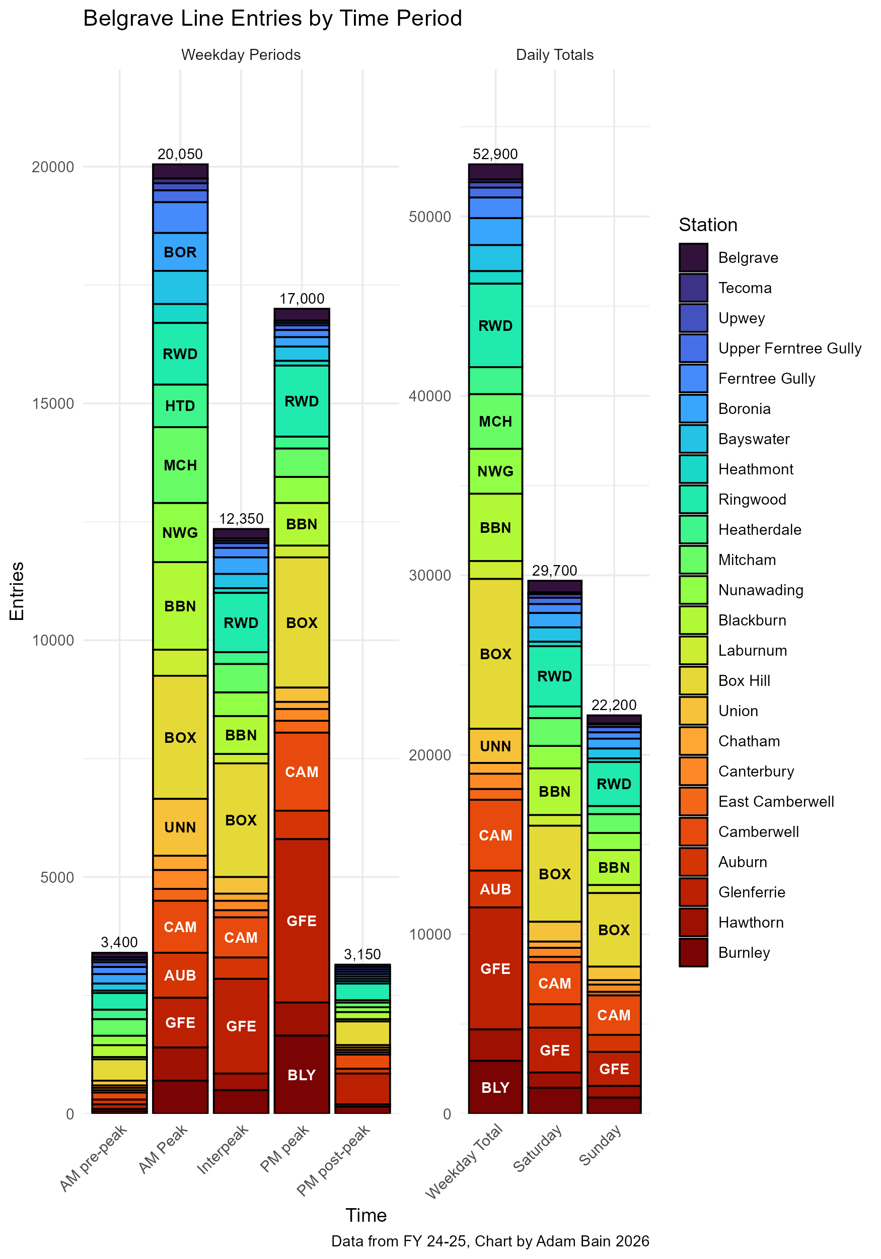
The most striking thing about the stacked bar chart for the Belgrave line is how two segments get squished due to low patronage. The first being the line beyond Ringwood, but the second is the stretch of stations between Box Hill and Camberwell.
These stations are in rich leafy suburbs that don’t have large commercial area nor apartments near them and are skipped by most trains in peak. The one, quite visible exception to this, is Union station, which during the AM peak, is prominent.
This might be because of the large car park at Union, the demographics of the area (high paid CBD workers), the fact that many express trains in peak DO stop at Union or probably all of the above.
I intend to do a follow up looking at some of the land use patterns around stations and how it might be connected to all this. But in the meantime, thanks for reading.
Oh, and one last thing… click on this link to get access to all the charts for each and every train line and station that I left out from this post:
https://drive.google.com/drive/folders/1n1pcn7ZnhTyb6SlJT1mpLj_yGpQrtpzd?usp=sharing
What I think is going on is that the biggest race days are not included in weekday counts, leaving behind non-race events to dominate the figures for Flemington Racecourse.
No posts
Comments
Nothing yet. Say the first thing.
Sign in to join the conversation.