
On Sunday 15/02/2026, The Age published an article entitled “Standing Room Only: Melbourne’s Busiest Tram Routes Revealed”.
Whilst I thought Gemma Grant’s writing was solid, and the passenger interviews built a cohesive narrative, the article was let down by its presentation of statistics, which is unfortunate as that was kind of the premise of the article.
In particular, I was not impressed with this chart:
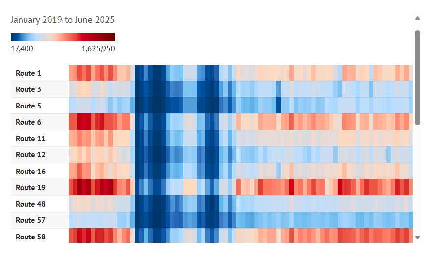
This is a chart made using Datawrapper, a subscription service for website charts that costs possibly $9,000 dollars a year depending on the contract, giving it a New York Times quality look. Despite likely being overpriced, Datawrapper is highly customizable and therefore no is no excuse for bad design.
So, what is wrong with this chart?
The colour palette used is what is a Diverging Colour Scale, specifically RdBu (Reds to Blues). Diverging colour scales typically consist of two dark ends, dominated by intense colors, with a light, relaxed midpoint.
A diverging colour scale is really good when there is a meaningful midpoint in the data, to highlight extremes against. A good example of diverging colour scale working as it should, is this map below of party registration in New Jersey.
In this data there is a very meaningful midpoint to compare extreme values against, being an equal split between Republican and Democratic party registrations.
What is the midpoint used in the colour scale for tram patronage? 600k riders a month. Is this meaningful?
I don’t see how.
But that doesn’t necessarily mean that a diverging colour scale would not be useful. It can be useful when the data is strongly bimodal, with two clusters of observations.
I decided to test the tram data used in the chart to see if it was meaningfully bimodal.
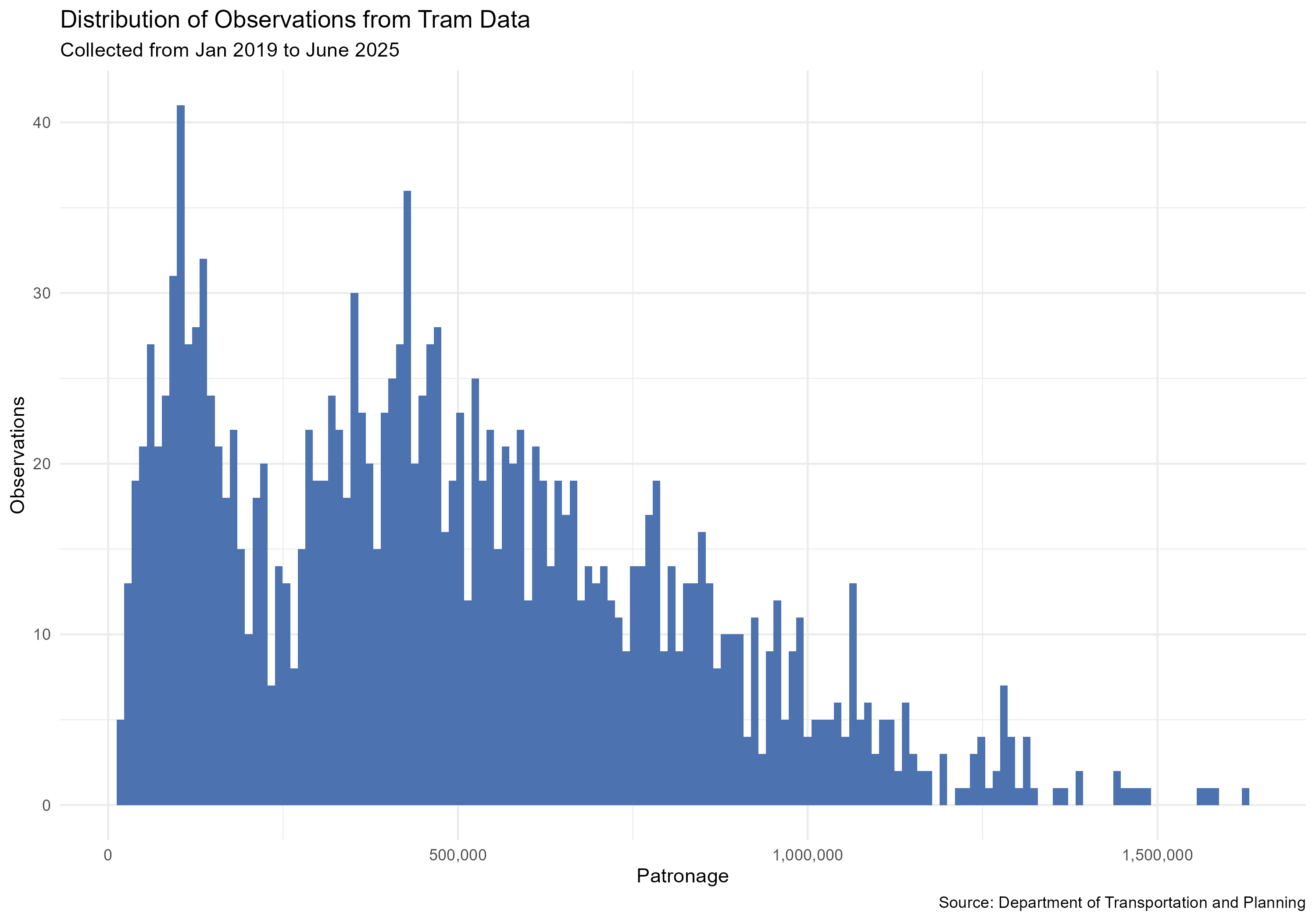
Looking at this, we can see that there is sort of two peaks here, however both are well below the original chart’s neutral colour point of ~600k riders. In addition, the second peak is substantially positively skewed, meaning that it is difficult to apply a diverging colour scale without some extreme data transformation.
So, what is the solution?
I think the data would be much better served, with a Sequential Colour Scale.
A sequential colour scale highlights continuity from one end of the spectrum to the other end of the spectrum, with a gradual, consistent colour change.
Typically, sequential colour scales play off light to dark as a central method to depict this. In some fields, light is conventionally used to describe bigger values, however in public facing data presentation, I have found that to be fraught as it can be unintuitive to the general public. So here is my attempt at remaking the chart with a sequential colour scale:
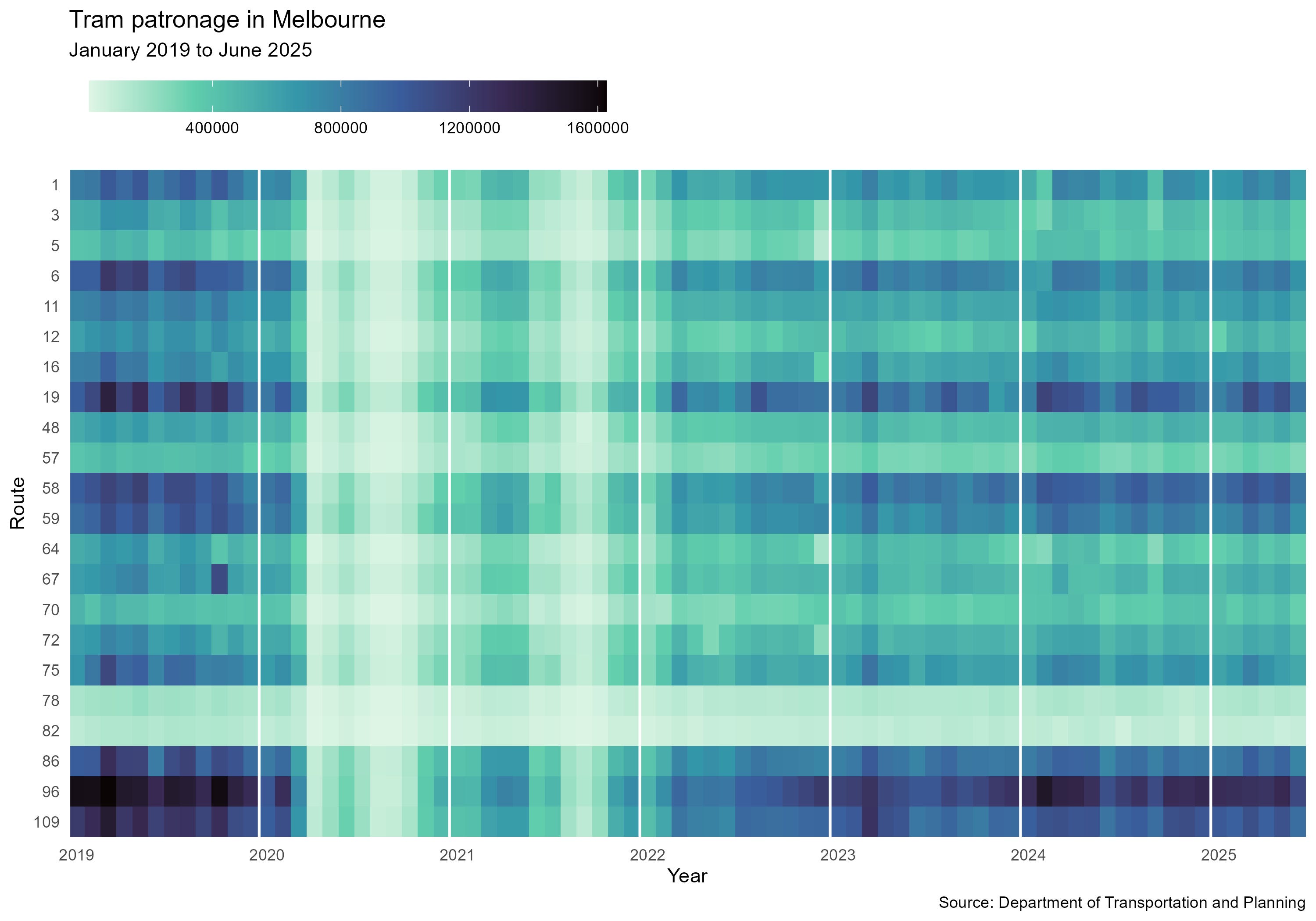
There are two things I really like about the chart with this colour scale. First, if you follow a route left to right, the gradual covid recovery is easier to see. In the original, with its insignificant light midpoint, this was actually quite hard to intuitively interpret.
And secondly, it makes the whole network patterns visible, with clear vertical lines appearing separating busy months from less busy months.
Here is the original just to compare again:
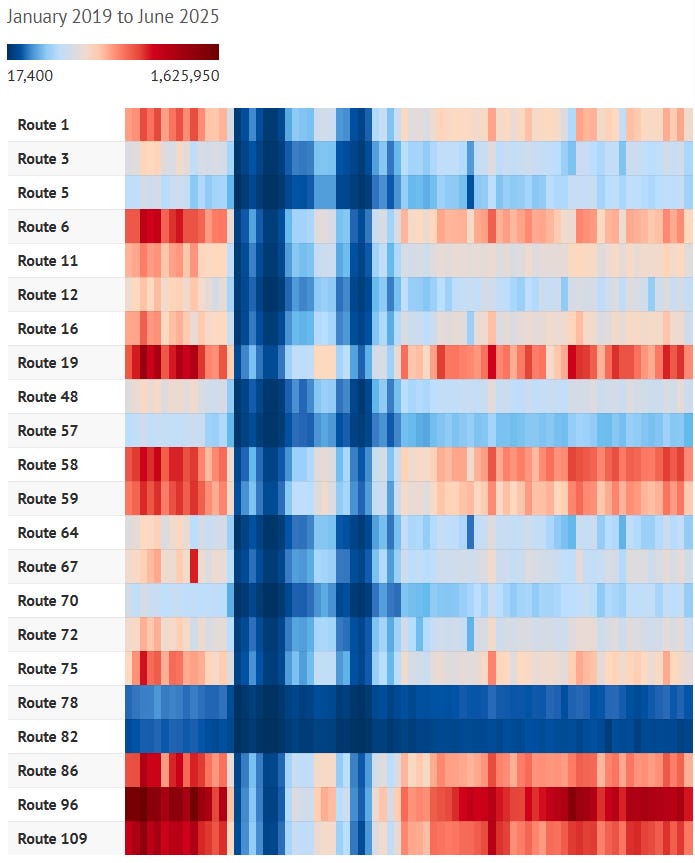
Yeah. I know which version I prefer.
I think it’s worth pausing for a moment and giving the charitable case for using the RdBu colour design. This is a palette that the readership of the age is likely quite familiar with, being built into Microsoft Excel’s conditional formatting. And it gets the point across quite quickly which observations are really high, and which ones are really low.
But it doesn’t do much more than that, obscuring patterns in the data.
But we are not done yet. There are still issues that need investigating .
The article is premised on revealing “Melbourne’s busiest tram routes”. I don’t think this is a meaningful way to describe how busy tram routes are.
The numbers come from total route ridership. It would be a valid comparison if the routes were all as long as each other, but as a regular of the 75, I can tell you that some routes are much longer.
To describe how busy a route is, in terms of “standing room”, ie, how busy on average the tram is per km, we must divide the raw patronage count by route length, or even better, service kilometers.
Here is a chart which shows how many service kilometers are used on each route per week:
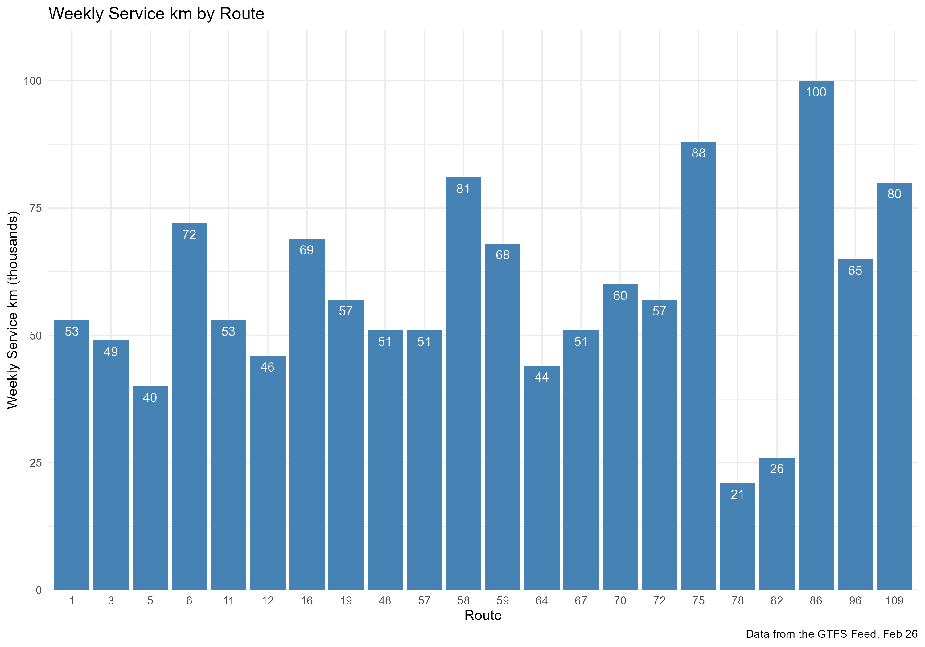
You might notice some of the bigger columns happen to be some of the routes that have higher patronage, meaning that adjusting by this well worth doing.
Here is the chart following this adjustment:
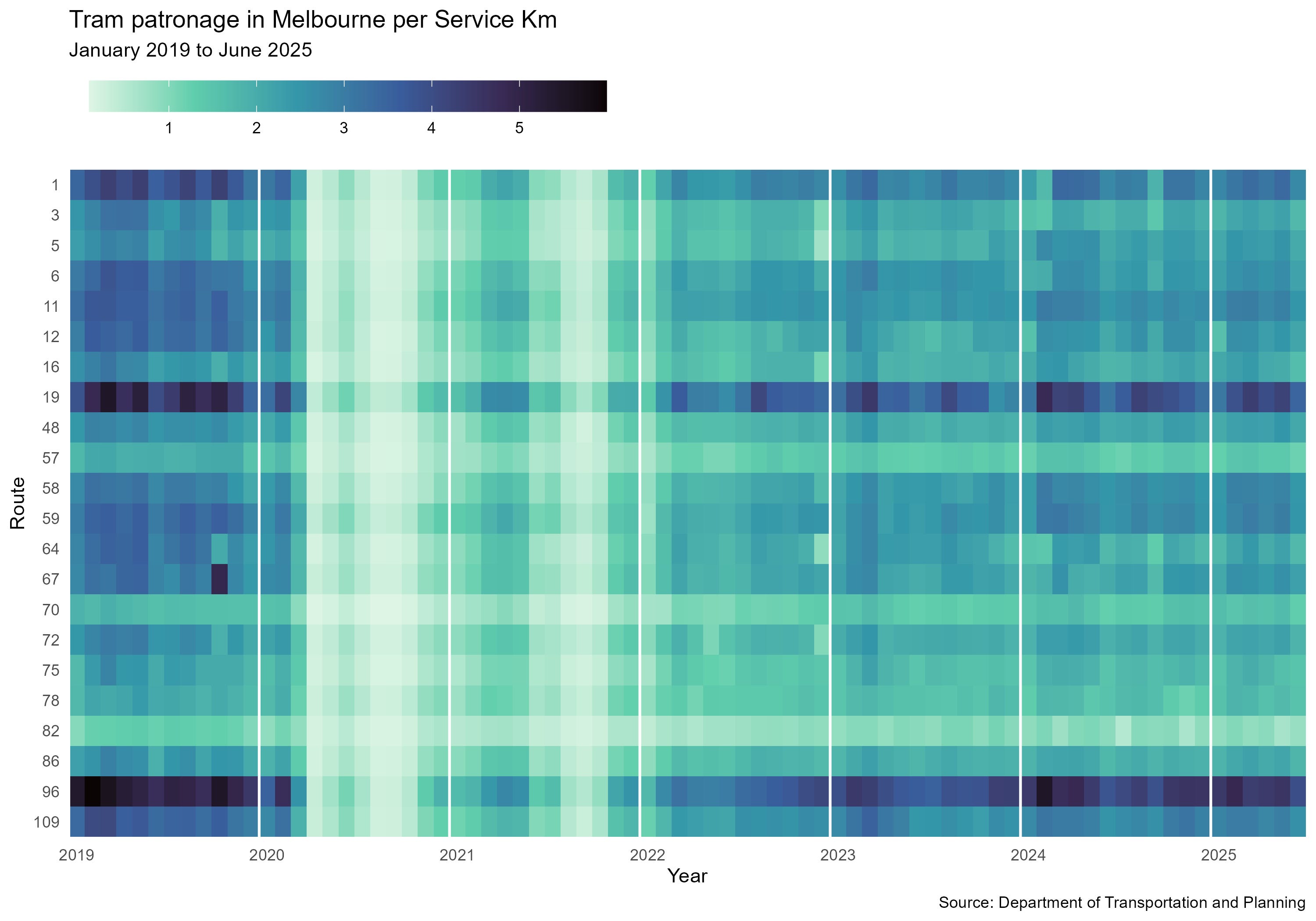
This chart has a few notable changes. Whilst the raw patronage showed 96, 19, 109, 58 and 59 all dominating the top of the chart, we can see here that 96 and 19 are in a category of their own. Following them seems to be the 1 and the 109.
Another big change is that in the raw patronage chart, the 78 is shown as consistently very low, alongside the 82, yet this chart suggests that 78 is not much different to 72 and 75, leaving 82 in a category of weaker routes it shares with 70 and 57.
By controlling for the amount of service km, we can better see which routes are truly “Standing Room Only”, which would have better aligned with the interviews in the article in The Age.
To take it a bit further, we should ask what we really want to show. If we want to focus on how the COVID recovery impacts different lines, it would be best to compare the patronage data of the given observation with the pre-covid benchmark, per line.
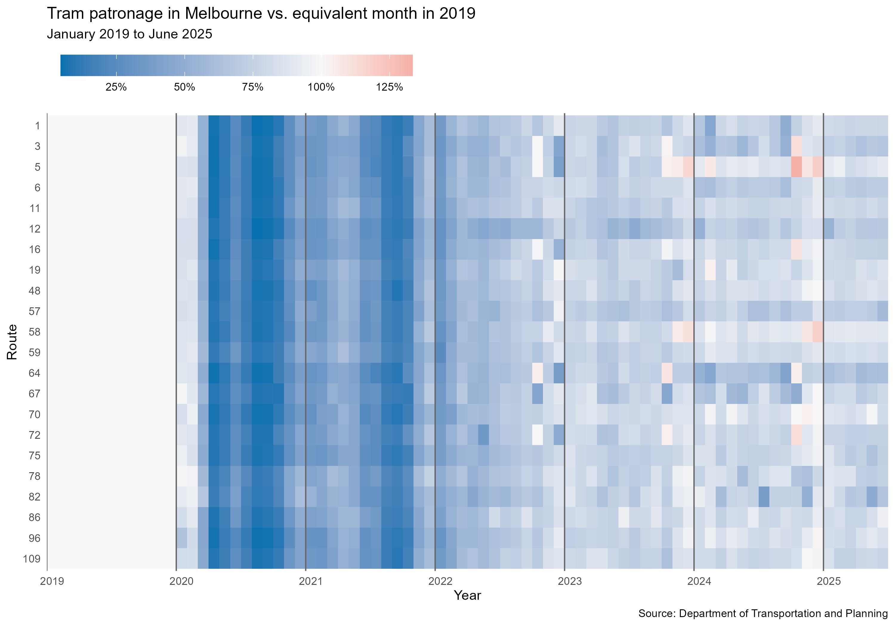
Lots of visible vertical patterns, not a lot of horizontal patterns, so I would say that there was a pretty uniform COVID recovery across the lines. I might try to scan this one at the supermarket next time. Also note how this is an appropriate use of the diverging colour scale, with an equivalence to 2019 observation being used as the midpoint.
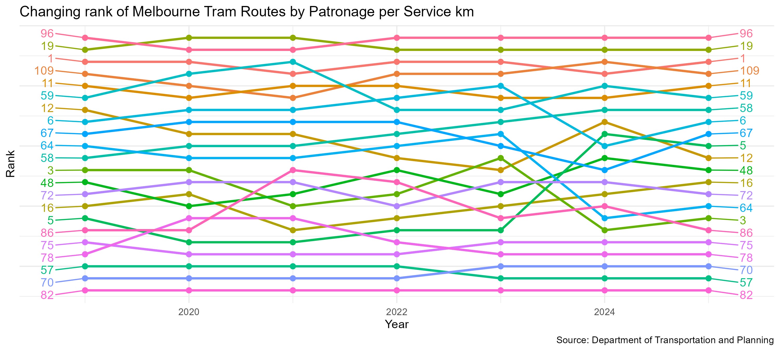
We can also look at yearly order of routes by patronage per service km:
When you present data to the public, it is really important to double check that
A: your data is appropriate to the story you are trying to tell, and B: that the data presentation is method is appropriate and non-misleading.
I am, of course, on this learning curve too (and I hope I am getting better at presenting data in a clear way), and I welcome feedback on my little graphics.
No posts
Comments
Nothing yet. Say the first thing.
Sign in to join the conversation.