
I have just returned from a trip to Sydney, and it got me thinking about population density. I was staying in the Eastern Suburbs which was filled with 5 story flats and when I visited the Western Suburbs, there were apartment budlings near just about every train station.
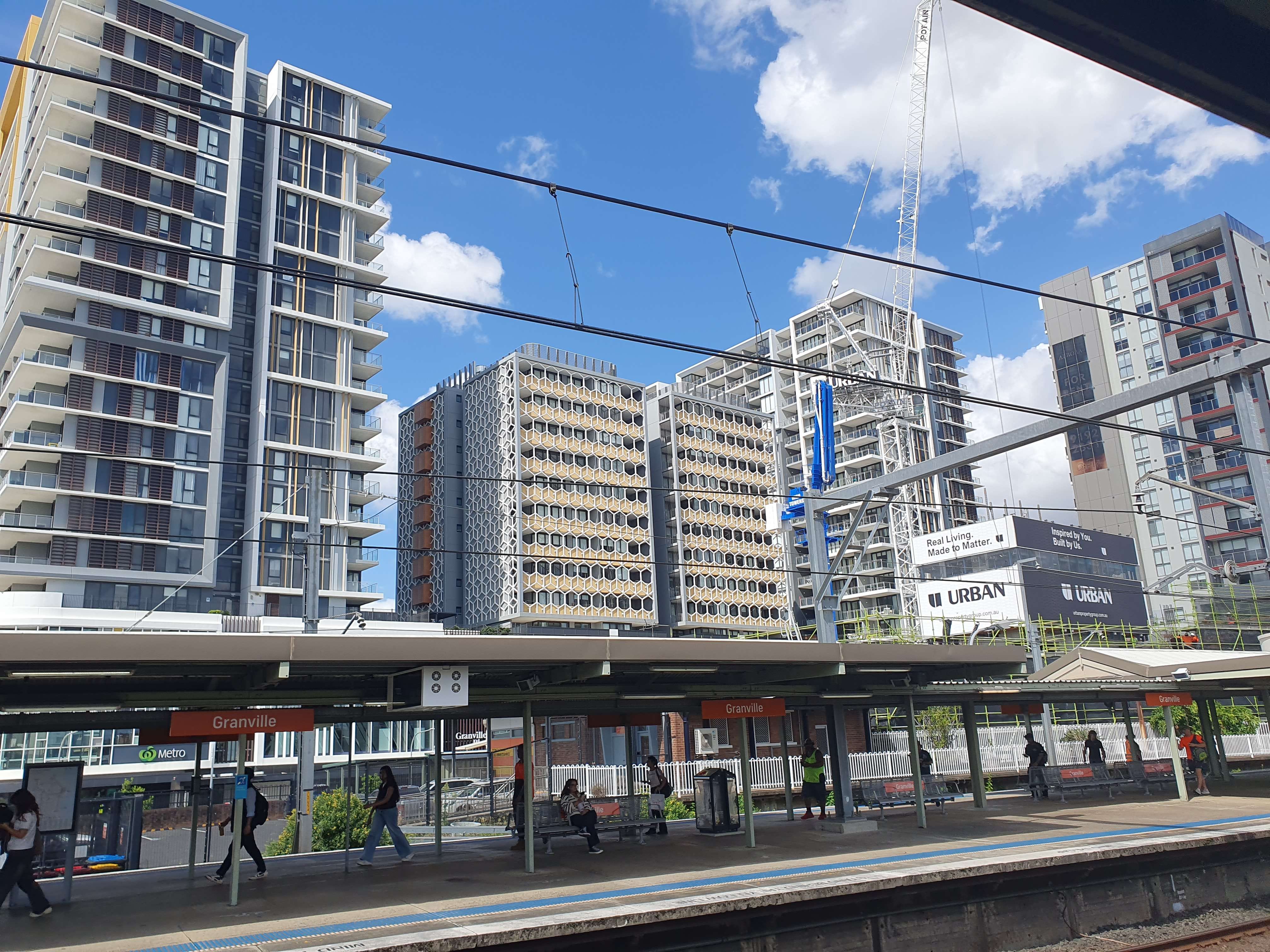
This got me thinking, Sydney is obviously denser than Melbourne, so I did what any good 21st century person does and went to check ... using Wikipedia. What I found in the infoboxes was very strange.
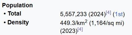
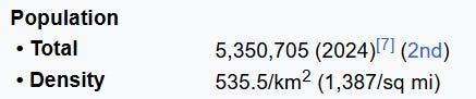
Wow! Turns out that Sydney is less dense than Melbourne. That settles it, I guess my intuition was wrong… but hang on? Sydney has a density of 449.9/km2. That is barely urban! That is way to low - barely more than the density of the whole country of India (~432.8/km2 as per Wikipedia). India may be pretty dense, but the whole country is not a massive unending metropolis. So, something is wrong here. Time to do some digging.
What is counted as a city?
Turns out the Wikipedia Infoboxes got their population statistics from this ABS page, which leads with this disclaimer: Any reference to capital city refers to Greater Capital City Statistical Area (GCCSA)
A GCCSA, according to ABS, is a collection of SA4s, which in turn are mostly made from LGAs (Local Government Areas). This is to maximise the stability of the Geographic Boundaries to make comparisons across different census years easier.
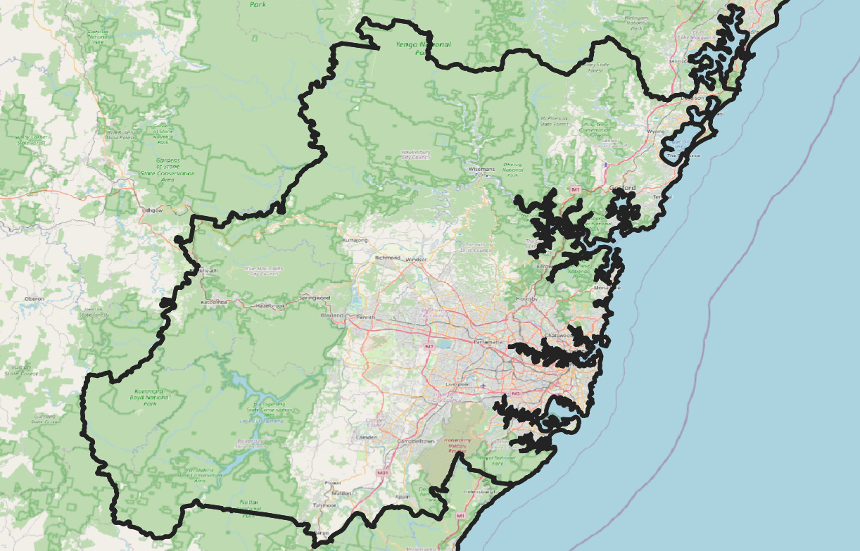
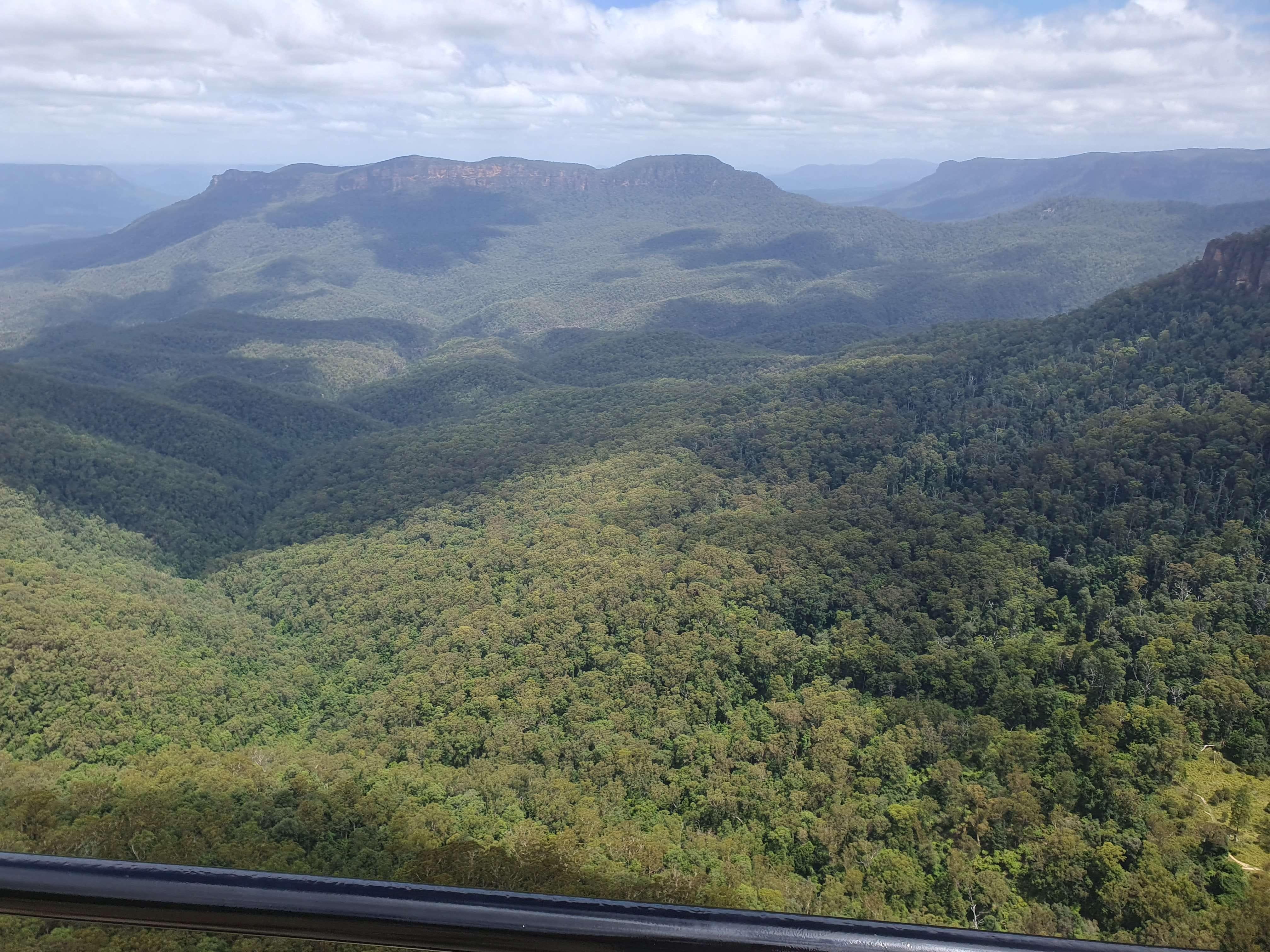
This is the boundary of the Sydney GCCSA. First thing that jumps out (apart from including Gosford and the Central Coast??) is just how much green is on the map. Sydney is surrounded by national parks, and the GCCSA liberally includes them, from Royal National Park near Sutherland to pretty much all of the Blue Mountains.
In comparison Melbourne’s GCCSA is a slight bit less extravagant, explaining how according to Wikipedia, it is a touch more dens but does include plenty of forest, and plenty of farmland.
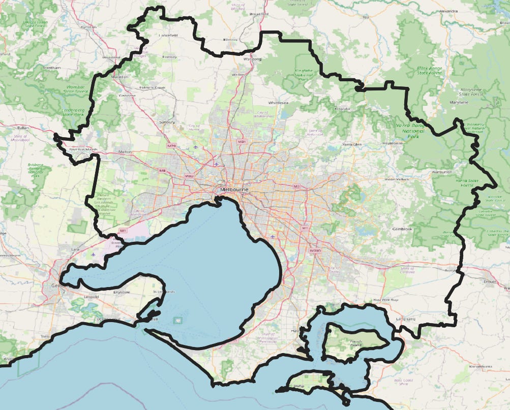
It goes to show that population statistics can be misinterpreted without understanding the geographic area that is being described. I above mentioned the unusual inclusion of the Central Coast, which if you remove it from the Sydney area, Melbourne then has a higher population. Glen Capuano has a good in depth article into this particular issue if you want to read more about the perils of the GCCSAs.
What about the inner cities?
So, looks like we will have to look elsewhere to other non-GCCSA geographic units to determine how dense. So how about the Local Government Areas (LGAs). Let’s compare the population densities of (the City of) Melbourne and (the City of) Sydney. These council include the CBDs of both cities, as well as surrounding suburbs. Back to Wikipedia!
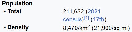
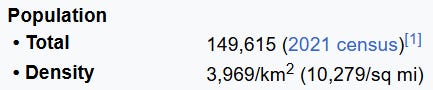
Hmm. This also seems rather odd. On my holiday, I stayed in the City of Sydney, and whilst Ultimo felt a slight bit denser than Carlton, I don’t think it was more than double as dense! Melbourne even has more residential skyscrapers in the CBD, as opposed to Sydney, which is almost all offices, so something isn’t adding up.
So, let’s do what we did with the GCCSA’s and look at the boundaries.
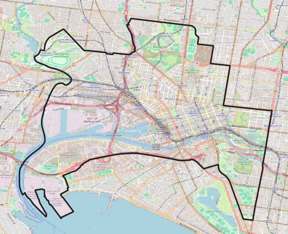
And there we have it, the culprit is the same. The City of Melbourne includes Parklands, from the Botanic Gardens to Royal Park, The Zoo and the Racecourse, almost all of the Port of Melbourne and even the General Cemetery (dead bodies clearly not included for density calculations). All land uses that are not really relevant when looking at the residential urban form.
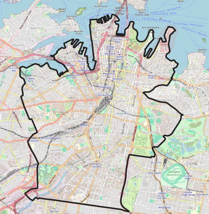
Sydney’s core LGA in comparison almost only includes residential land. They left out the racecourse, and the (sea)port is further away than the airport.
Fixing this issue
After running into the boundaries issue again with LGAs, I decided to take things into my own hands. I decided to create new boundaries out of SA1s (the smallest ABS subdivision with the data available), and excluding SA1s which fall below an arbitrary population threshold (I have chosen 200 people per square kilometer). This is the new adjusted area (green) I generated for the City of Melbourne by this method.
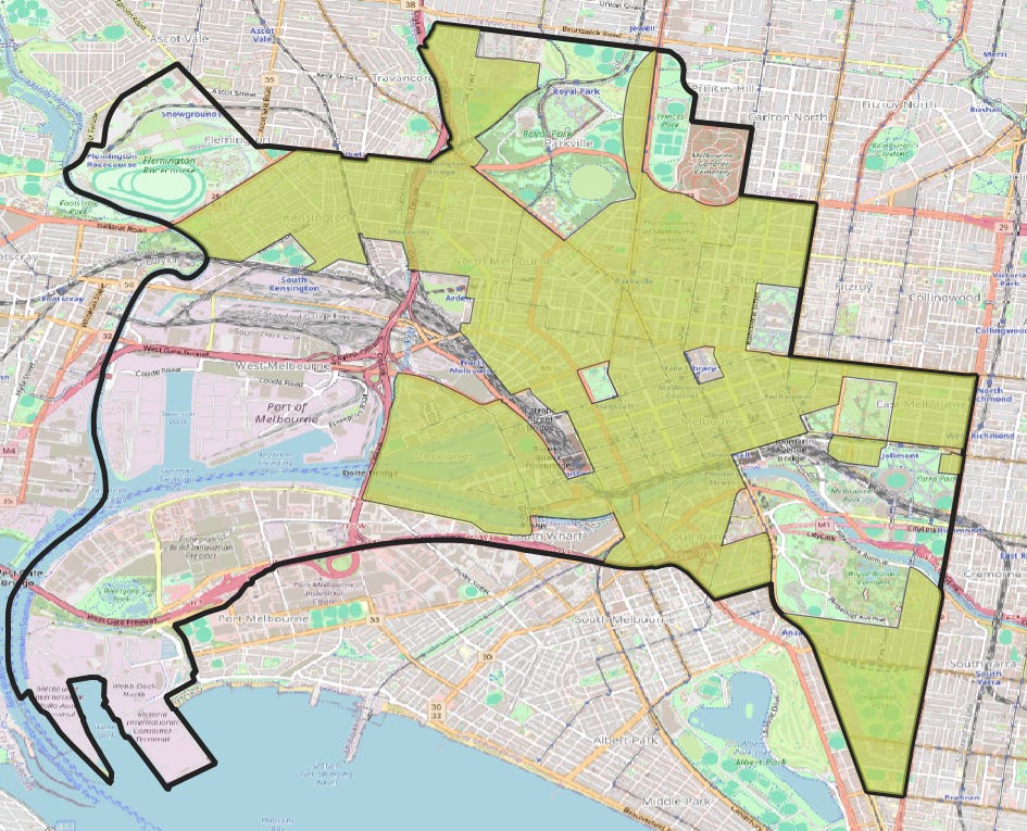
Note how it excludes all the primarily nonresidential land uses. Here is what happens to Sydney (but in red).
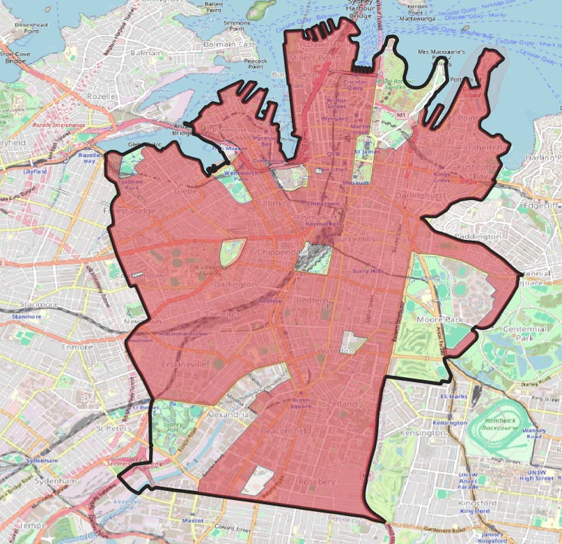
Using these new boundaries, I recalculated the densities of the cities of Sydney and Melbourne to be 10,188 and 9,238 respectively, which seems far more realistic to the conditions on the ground. Here is a summary table of the top 10 LGAs across the capital cities by this metric, showing a comparison to simple density.
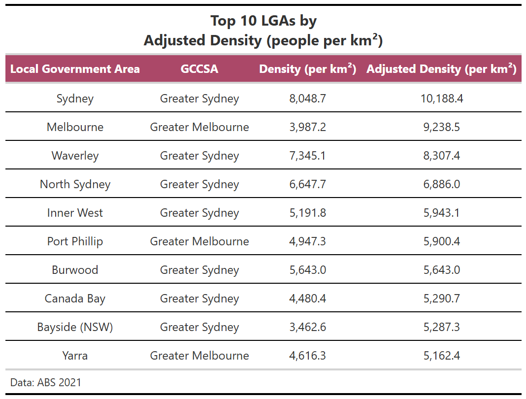
All Sydney and Melbourne, no representation from any of the other capitals! The non-Melbourne/Sydney LGA with the highest adjusted density is Adelaide with a result of 4334, followed by Perth with a result of 3679. The adjusted method is particularly useful for these cases, as both these LGAs consist of a CBD and adjacent parkland. Where is Brisbane? Well, the City of Brisbane is enormous, the largest LGA in the country by population, covering much of the metro area. So, whilst inner Brisbane is likely denser than both inner Adelaide and Perth, the LGA includes too much of non-inner Brisbane.
A deeper look at density at a fine-grained scale
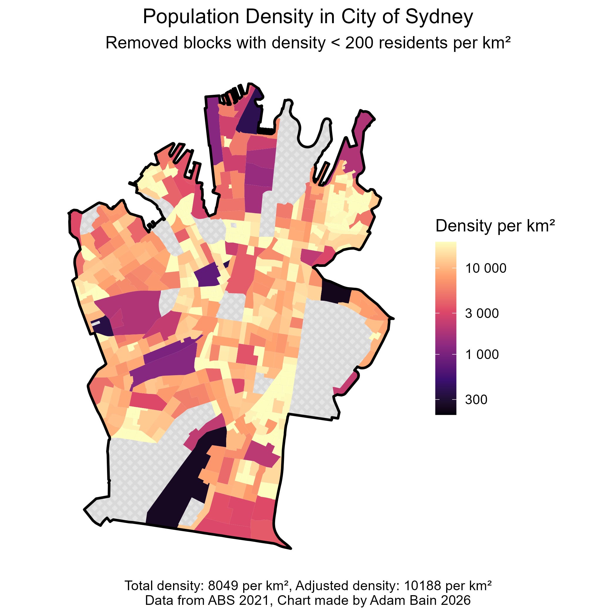
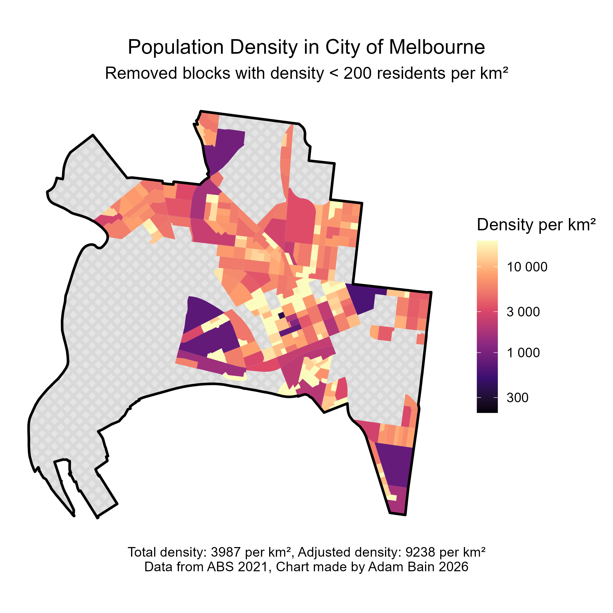
Above are two charts I made which show that whilst (the cities of) Melbourne and Sydney have similar Adjusted densities, Melbourne is more concentrated into a few key areas whilst Sydney has large areas of surrounding suburbs which are extremely dense However Sydney CBD has very few really high-density blocks unlike Melbourne.
Here are a few more charts in this style comparing different LGAs
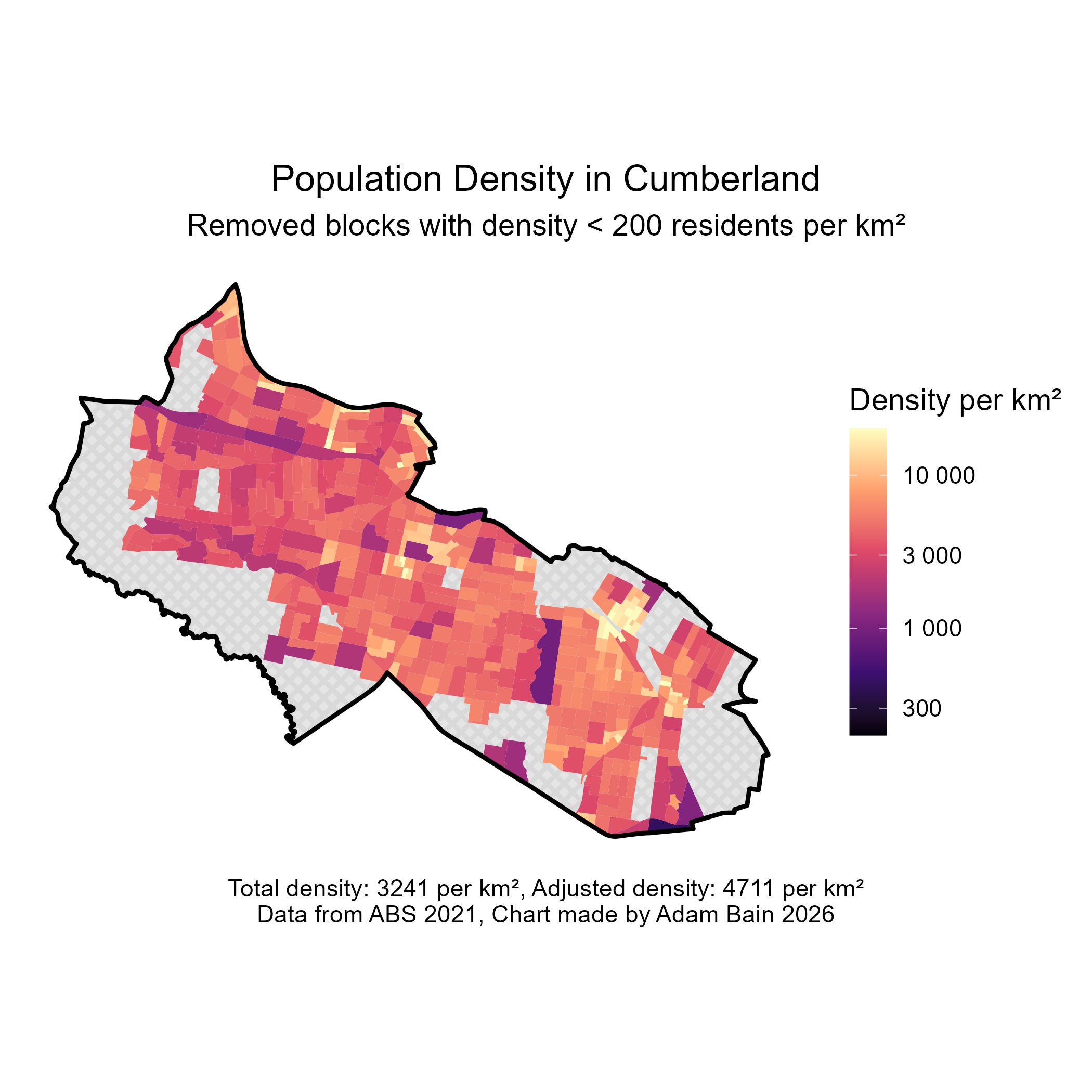
In Cumberland (Western Sydney) the impact of railway stations on development can be clearly seen with density clusters in Lidcombe, Auburn and Merrylands being most prominent. However, the general density of the space in between is also quite high, possibly due to larger family sizes of migrant communities.
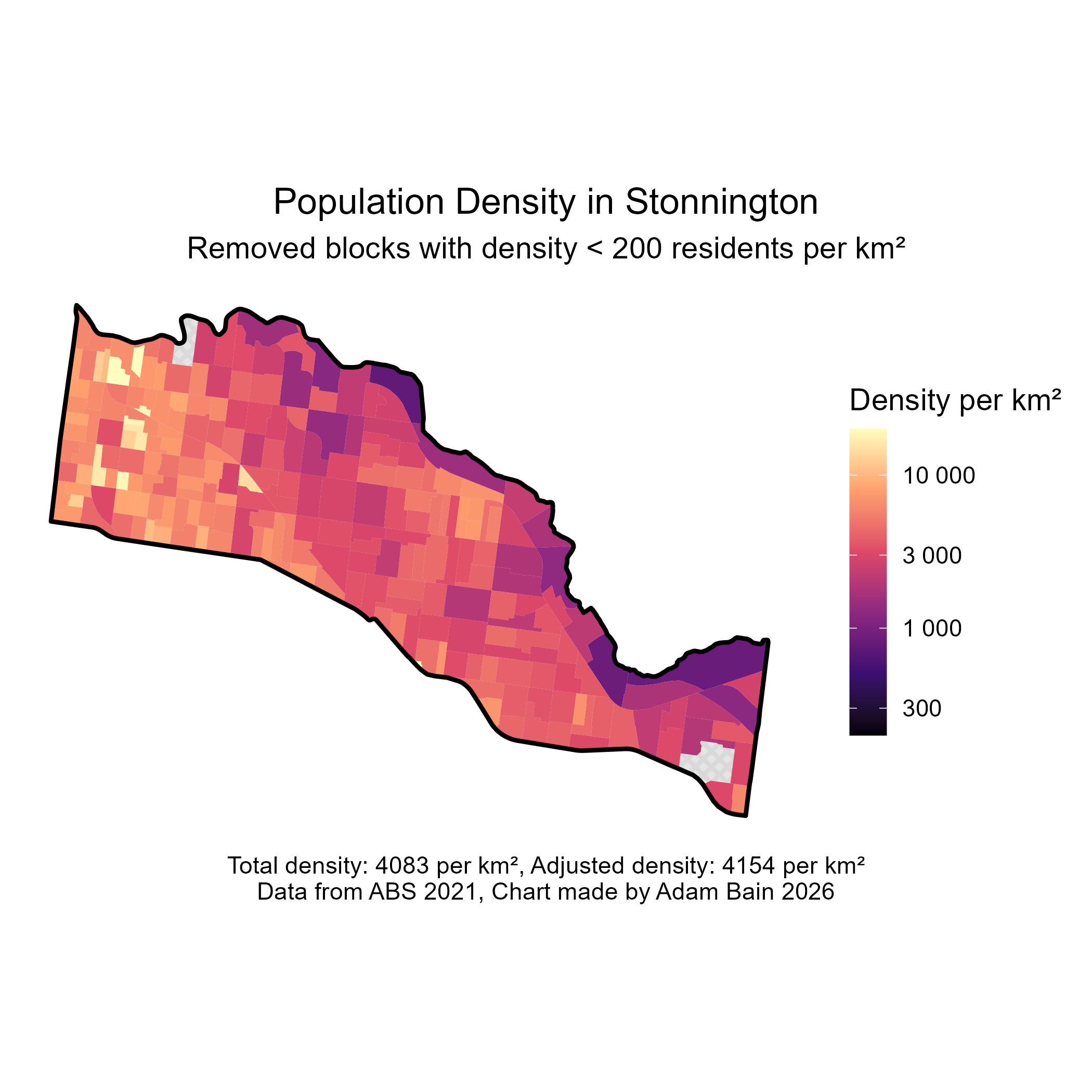
It is striking how visible the railway lines are in Stoninngton (inner SE Melbourne), almost splitting the city into three different density bands. This shows that in the case of Stonnington, railways don’t seem to have directly driven density in the same way as in Cumberland.
I then realised I could turn the code I used to make these charts to represent jobs, so I thought it would be worth sharing a couple of examples.
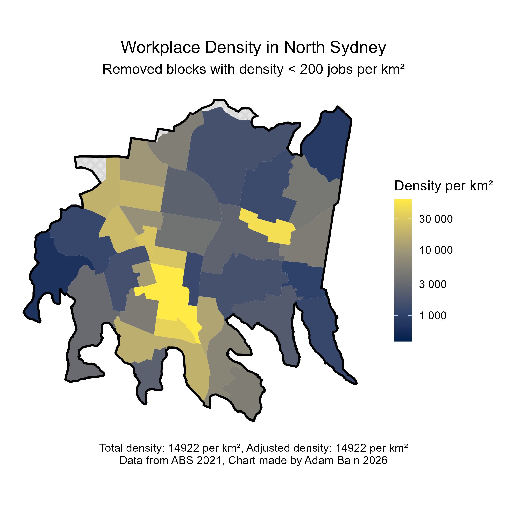
North Sydney has a very high concentration of jobs, with the biggest cluster being around the North Sydney CBD, across the harbor bridge from the Sydney CBD.
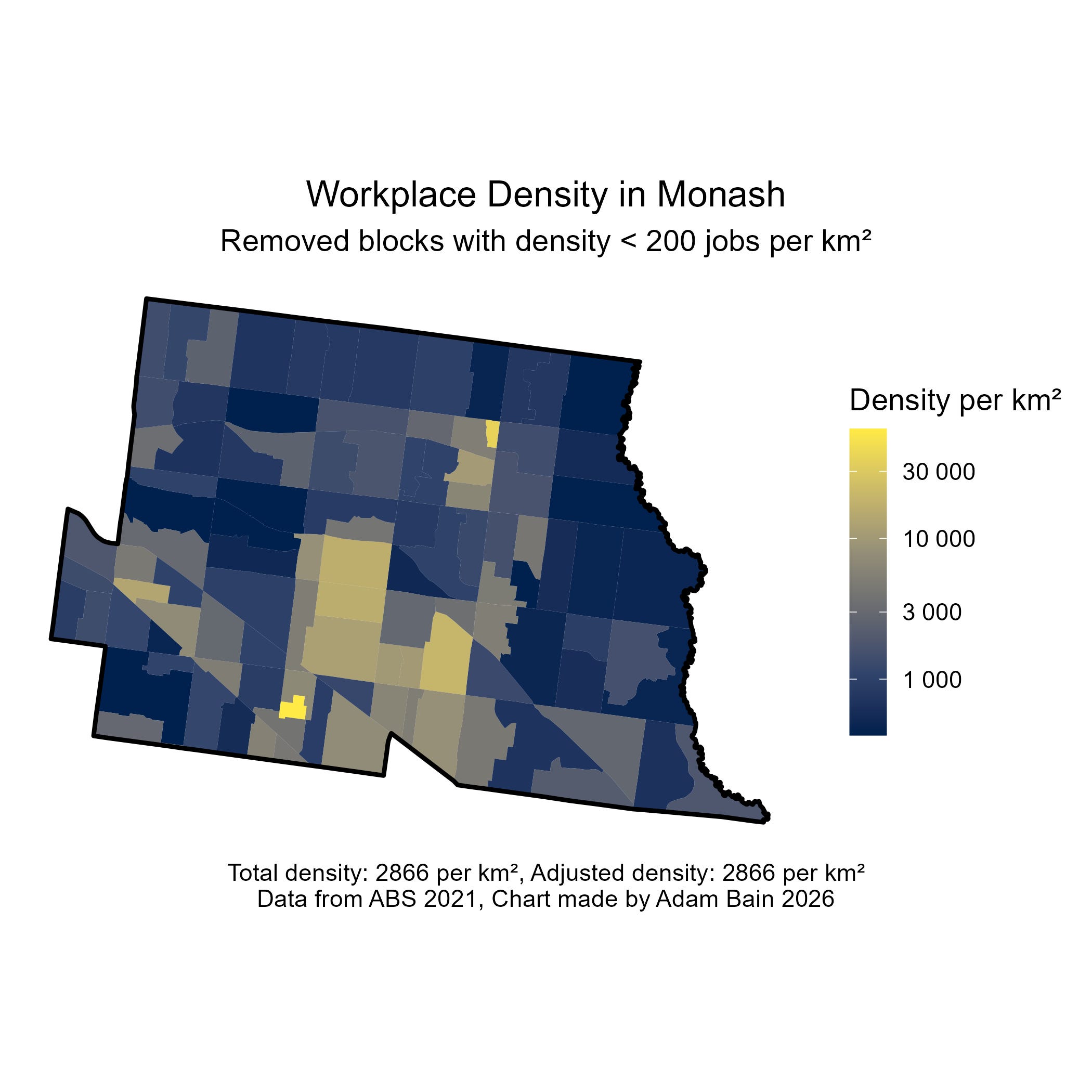
In comparison, Monash is less job dense, however key the Monash NEIC, or future SRL precinct is relatively job dense. The two really bright spots are Monash Hospital in Clayton and the Glen Shopping Centre in Glen Waverley.
What about population weighted density?
Some eagle-eyed population density enthusiasts might be wondering why I didn’t use population weighted density The reason is because I think it over does the correction and can give extremely dense spots an outsized impact. For instance, according to this metric, the City of Melbourne has a result of 50,757, compared to City of Sydney’s 26,185. Whilst these are useful stats, I want to note by this metric, the third densest LGA in the country is Bayside (NSW), with a result of 13,560. Sure, Wolli Creek and Mascot are very dense TOD precincts, but for a typical on the street experience of this place, that number does seem too high.
So, who won in the end?
Ok. Now I have delayed it long enough, time for the result we have all been waiting for. Below is how the capital cities rank by adjusted density:
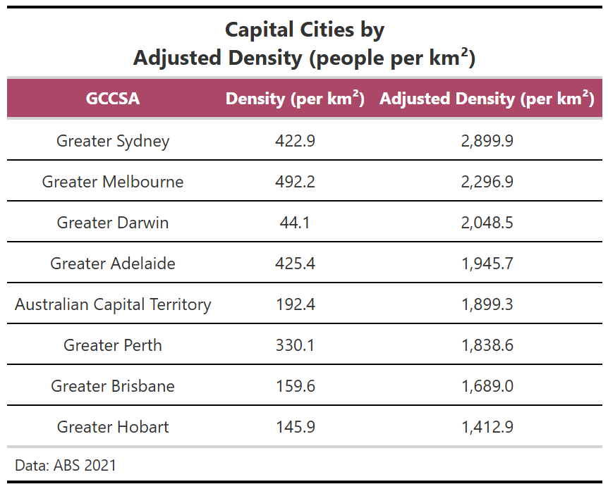
We can see that Sydney indeed came out on top, but not by a staggering amount.
It begs the question, should we update Wikipedia with these numbers?
Uhhhhh. Probably? It could help clear up confusion. However, it would not be standard practice, and Wikipedia is big on that, so it won’t happen, unless we can get every major primary source such as the ABS to use a similar method.
Final Thoughts
Population density is a metric that seems simple at first glance, is actually far more complicated and prone to being misleading.
Thanks for reading this somewhat dry post, and as your reward, here is a link to a .csv with LGA adjusted density data I generated.
https://drive.google.com/file/d/1qN-FUMSCPxFtVht_hCHLx62YDHJHQqEc/view?usp=sharing
If you want me to make one of those fancy graphics with the colour scales, please feel free to message or email at adambain014@gmail.com. :)
Comments
Nothing yet. Say the first thing.
Sign in to join the conversation.