
2 weeks ago, I uploaded a post detailing an index of bus route windiness.
Yet, I couldn’t stop thinking about it and wondering about how I could make it better. So since then, I have significantly improved my methodology for determining directness. I will explain how I did this in the next section below this one, but for now I want to highlight a few things. Instead of routes having directness scores, bus stops are given directness scores – from which the average directness in suburbs can be calculated. And of course, I added trams!
In my previous post I referred to this value as “Windiness Index”, but I have concluded that a more accurate way to describe this metric is “Directness”. What I mean by this is that this metric can be most simply described as “If I board a bus at this bus stop, how direct will my typical trip be”, with low value being closer to 0, and high value being closer to 1. By how “direct”, I specifically mean what proportion of your vehicular movement is actually progressing you towards your destination. So, without further ado, which suburbs have the most indirect buses/trams?
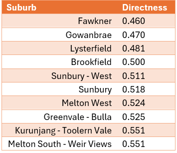
It turns out that out of all suburbs (sa2s to be precise) across Melbourne, Fawkner earns the distinction for having the most indirect buses/trams. It somehow even beat Gowanbrae – just
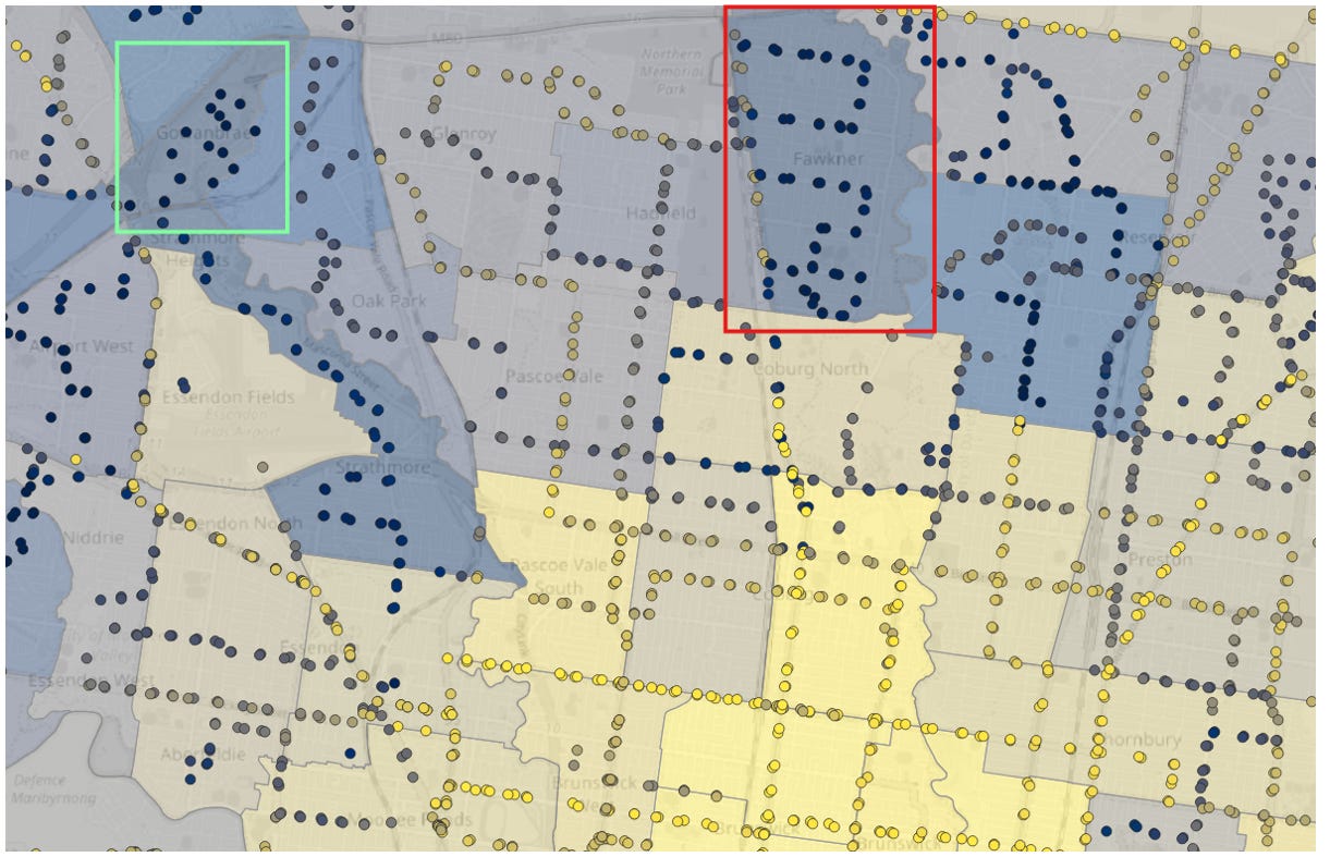
This map shows the directness by stop, and by suburb. Darker is less direct and lighter is more direct. In red, is Fawkner, where the outline of the very indirect 530 is very prominent. In yellow, is Gowanbrae where the “outline” of 490 can be seen. These suburbs are contrasted with more established suburbs to the south, which have much more direct bus and tram routes. Unfortunately, 503 is omitted in this data set due to missing GTFS data.
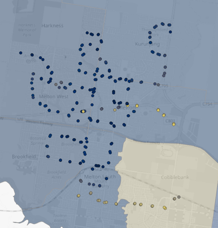
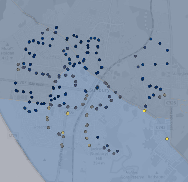
Melton and Sunbury also feature heavily in the lower end of the directness scores. This seems to be because the bus networks in these “satellite cities” are designed around one or two central point, with maximum coverage in mind. In that sense they are quasi-regional bus networks. Perhaps as more infil train stations are built into the future, and secondary centres grow, we should reconsider this model of bus network.
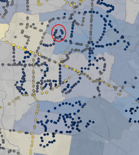
The City of Knox in Melbourne’s outer east features many indirect bus routes, but with some relatively more direct routes sprinkled in. Take special note of the Sasses Avenue on the route 737, which I circled in red. It is darker than most of the rest of the route, reflecting just how indirect it is.
On the other hand, we may ask which suburbs have the most direct routes? Unsurprisingly, these are more established areas, with more traditional core street grids.
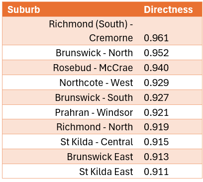
The one obvious exception here is Rosebud-McCrae, however this is misleading. The main coverage route in this area with all the windiness that is typical of the broader area, was thrown out and replaced by FlexiRide, which in my humble opinion, has a near negative directness.
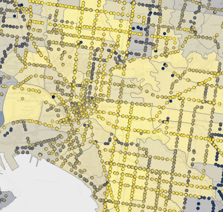
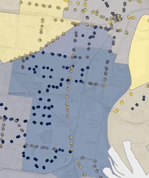
One last special mention before I go into the methodology changes, is Yarraville. This suburb is very close to the city yet has a very low average directness score of 0.566. This is an area ripe for reform.
Whilst I was initially satisfied with the way I calculated directness in the previous post, I identified weaknesses in my methodology that I have attempted to address here.
The first problem that I decided to fix was that my directness score system used points generated every 200 meters along the bus route to approximate bus stops. This was largely accurate, but it risked skewing data for routes with long express sections in particular, such as the Doncaster Express routes
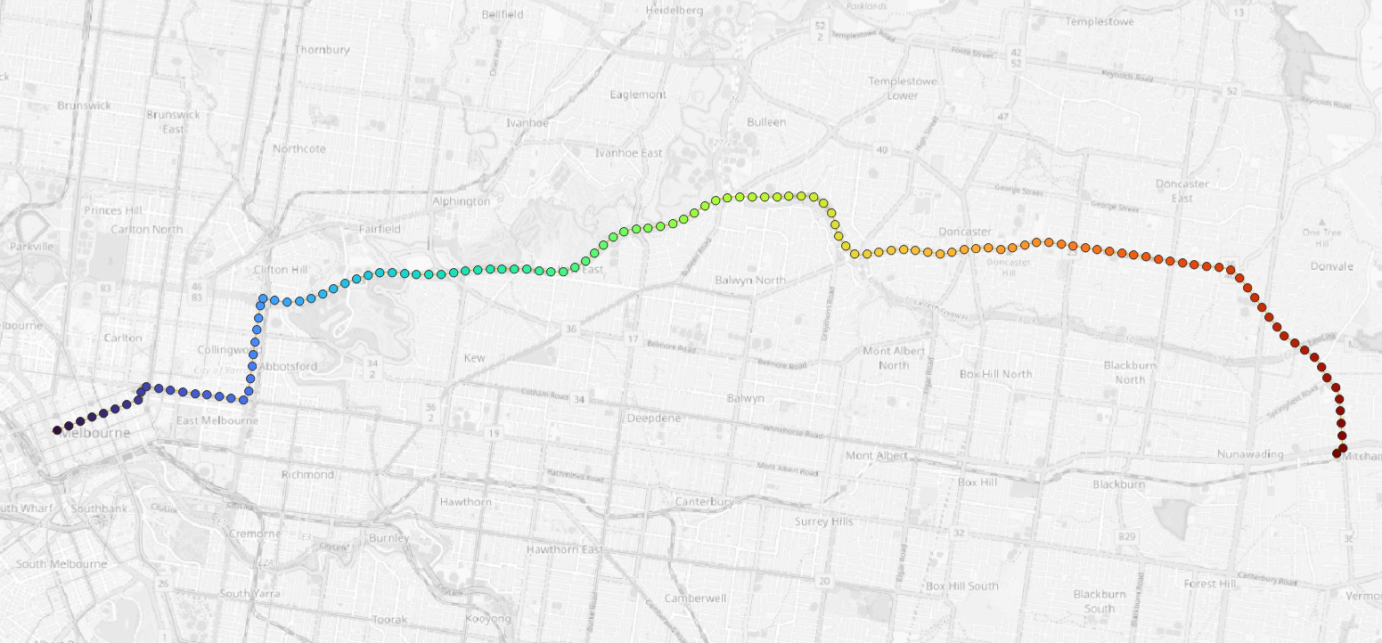
This picture shows the “stops” I generated for route 907 with the previous method. The issue with this is that for the middle section between Victoria Park and Doncaster, there are no bus stops. The most likely effect of this is to reduce the directness score.
To address this, I decided to use the real bus stop locations instead. I initially dismissed this as creating an unacceptable amount of computational work, because I assumed to calculate the route distance I’d have to come up with a very convoluted process. Luckily, I remembered that in the stop_times GTFS file, there is a value which refers to how far along the route each stop is called “shape_dist_travelled”, which turns out made the process even more efficient using real stops.
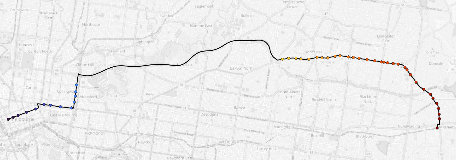
The map above shows the actual stops of route 907, and it is coloured by the shape_dist_travelled. By using the real stop locations, we avoid calculating and incorporating directness scores for trips that cannot exist, for example, Doncaster East to Burke Road on the freeway.
One change that this altered methodology allowed was a shift in focus away from routes towards stops. For each stop I was able to calculate a weighted directness score, factoring all routes that use it. This addresses the issue of different parts of routes having different directness scores, for example the 901 is very direct from Frankston to Ringwood, but it weaves through Doncaster and Eltham in a relatively indirect way
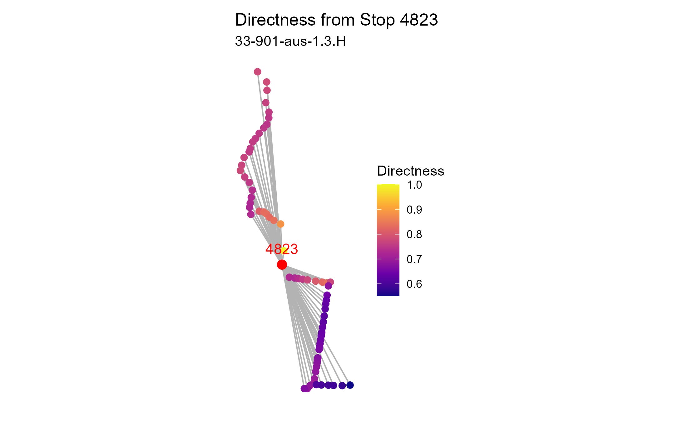
Above is a chart showing how the directness score is calculated for an individual stop on route 901, in Templestowe. The stop is then assigned an average of all directness scores for each pair in between 800 meters distance and 15km distance, just like in my original method.
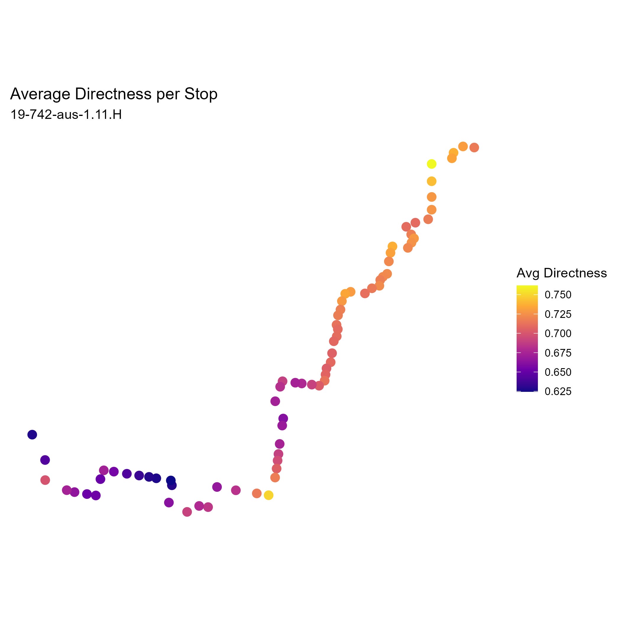
This chart above shows the directness score attributed to each stop along route 742. It is fascinating how bus stops near “hingepoints” tend to have higher directness values
A flaw in my original methodology was that I was picking only the most common bus shapefile to generate the directness value. For most routes this was fine, but some routes have many relevant variations that need to be considered (I’m talking about you route 737!). To solve this, I calculated the directness for each bus stop pair in each bus variation and weighted the pairs by the proportion of trips use that variation when I calculated the mean stop directness.
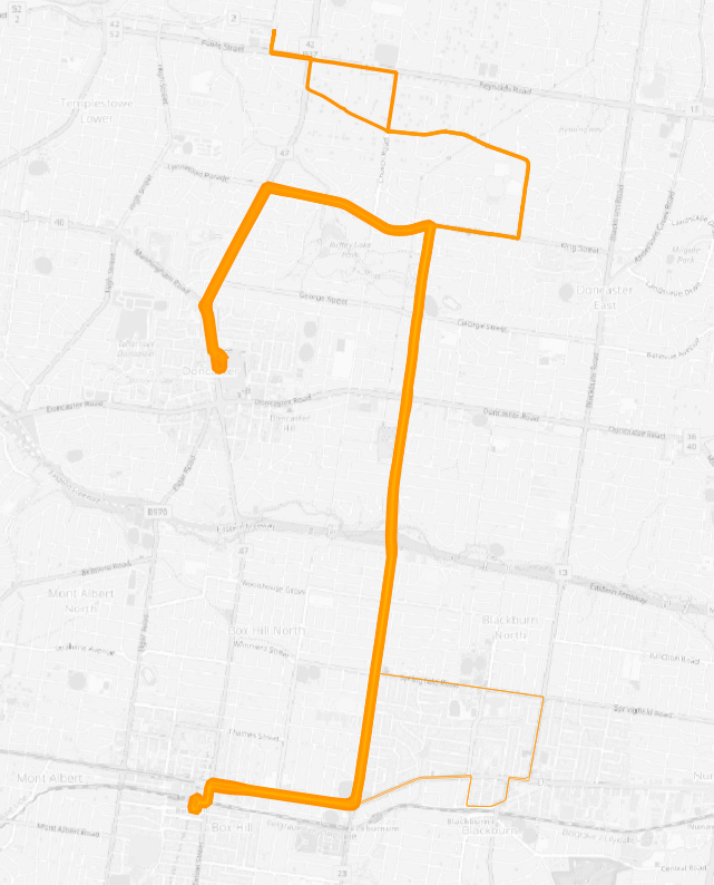
The map above is a graphic depiction the weighting each variation is given for the bus route 279 in my calculations. Given most weight is the main alignment, from Box Hill to Doncaster S.C. Second is the regular variation to Templestowe, and the occasional deviation to Blackburn Station is given some, but minimal consideration.
Another issue that I realised that needed to be solved was that some directness scores for stop pairs had values greater than 1. None by more than a tiny margin, but they still existed. In my opinion, this is due to slight errors in the shape_dist_travelled column, possibly due to stops being located on the sides of roads instead of in the centre lines of the road. To address this problem, I forced all scores greater than 1 to be simply 1.
Possibly the biggest change I have made is I have included tram stops alongside bus stops. The reason for this is that in Melbourne, our trams serve a fundamentally similar role as street transit. Both are delayed by traffic lights, and both operate in traffic, with similar stop density.
One guess that I had is that trams are typically more direct than buses. In fact, turns the most direct route of all, unsurprisingly is the 78, beating the most direct bus route, 706.
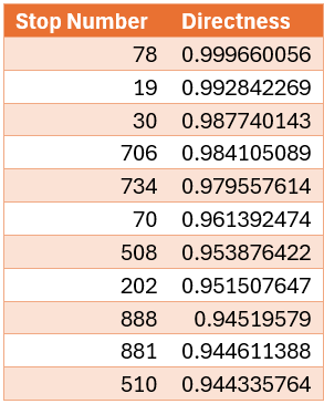
Tram routes typically follow one road for the majority of their route for instance Sydney Road for the 19. With their fixed rails, it makes it near impossible to introduce deviations which drag down directness for bus routes.
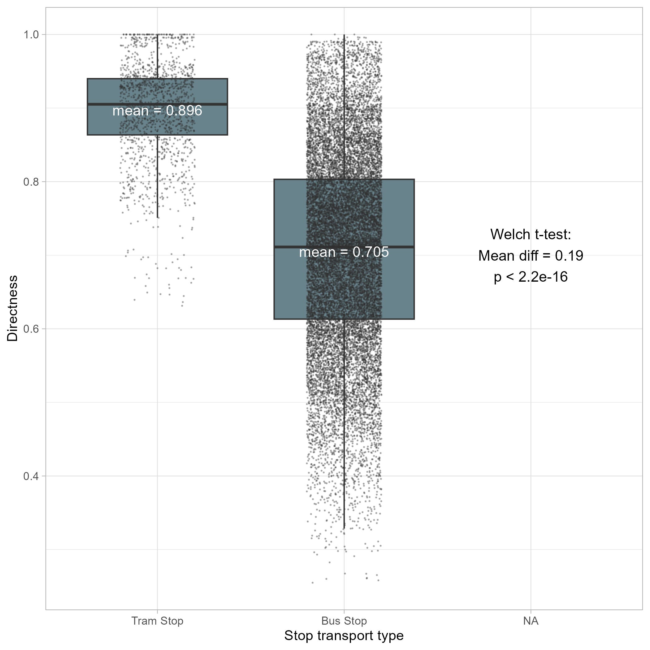
The above box plot shows the significant difference in group means between tram stops and bus stops, confirming my assumption as correct. I then thought, maybe this was due to the road network closer to the city being more grid like, promoting more direct routes.
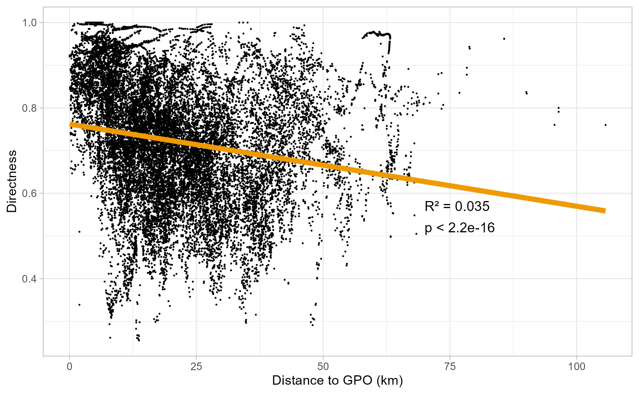
The above scatter plot shows there is a correlation between directness and distance to the GPO, but it has a low R2 value, indicating that this relationship does not explain much of the variance at all. I think that this makes sense, as whilst you have Armadale is 7km away from the city, with its direct tram and bus corridors, so too is Yarraville, which I believe is the first concentration of particularly low values on the above scatter plot. I wonder if instead of the GPO as the centre point for this analysis, that if we did it with the geographic centre of Melbourne in Malvern we’d see a better fit.
As Fawkner, Gowanbrae and Melton featured heavily in the leading suburbs for indirect stops, I thought that maybe directness could be correlated with weekly income.
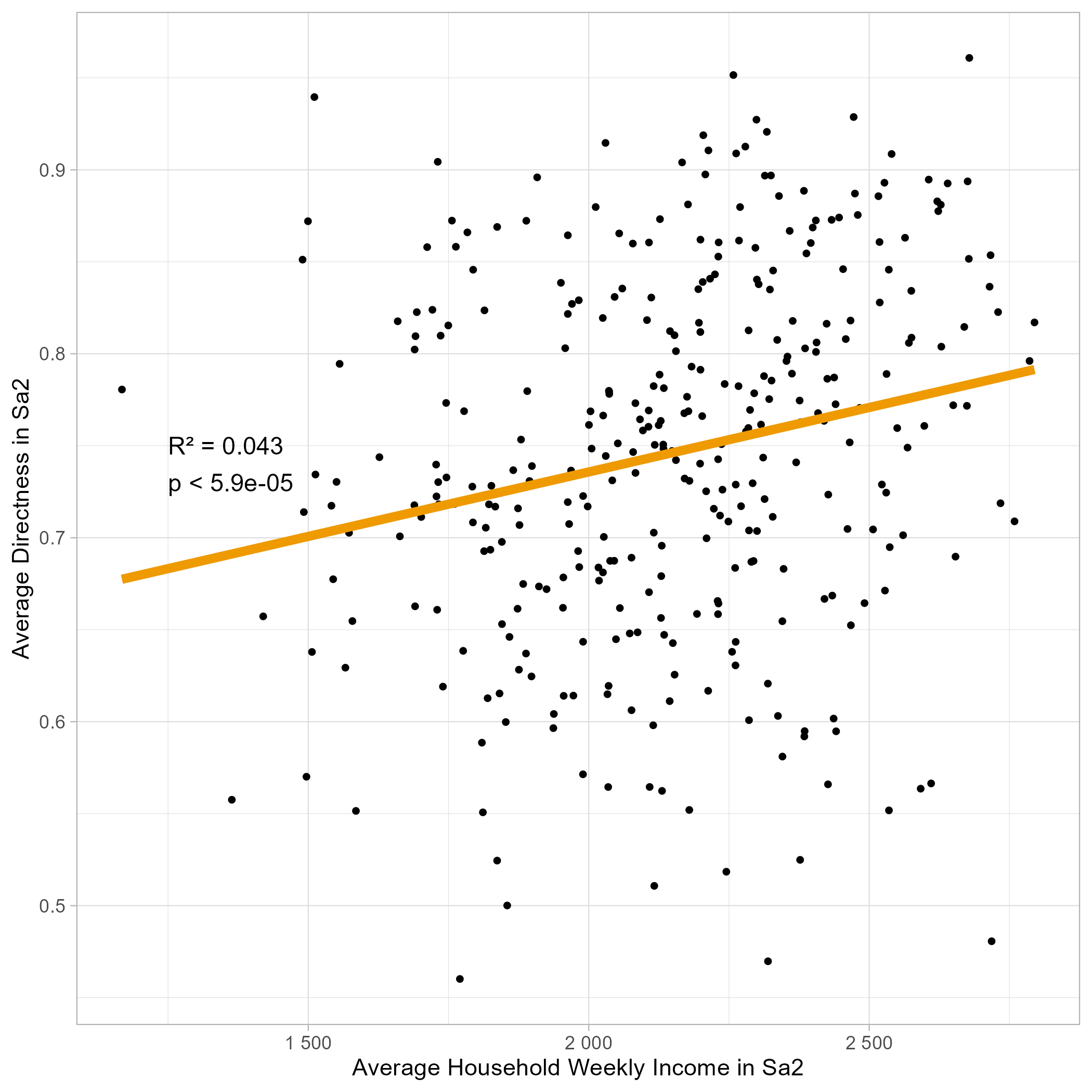
The above scatter plot shows a regression between these two metrics. It shows there is a correlation, but like the distance to CBD regression, it has a low R2 value, indicating that this metric can not explain much of the variation. I believe this is because I focused on weekly household income, which makes areas like the CBD and Richmond have relatively low incomes due to a low household size. In addition, areas such as Carlton and Clayton have low household incomes due to the large numbers of university students.
Whilst directness can give us some idea of what routes should be reformed, I thought that we can combine it the proportion of stops on a route a unique, to consider overlapping routes. However, a problem here is that the range of that value is from 0 to 1, whilst route directness largely is between 0.5 and 1. To address this, I halved the proportion of unique stops and added it to 0.5. This ensured that each factor was given equal weight when I combined them.
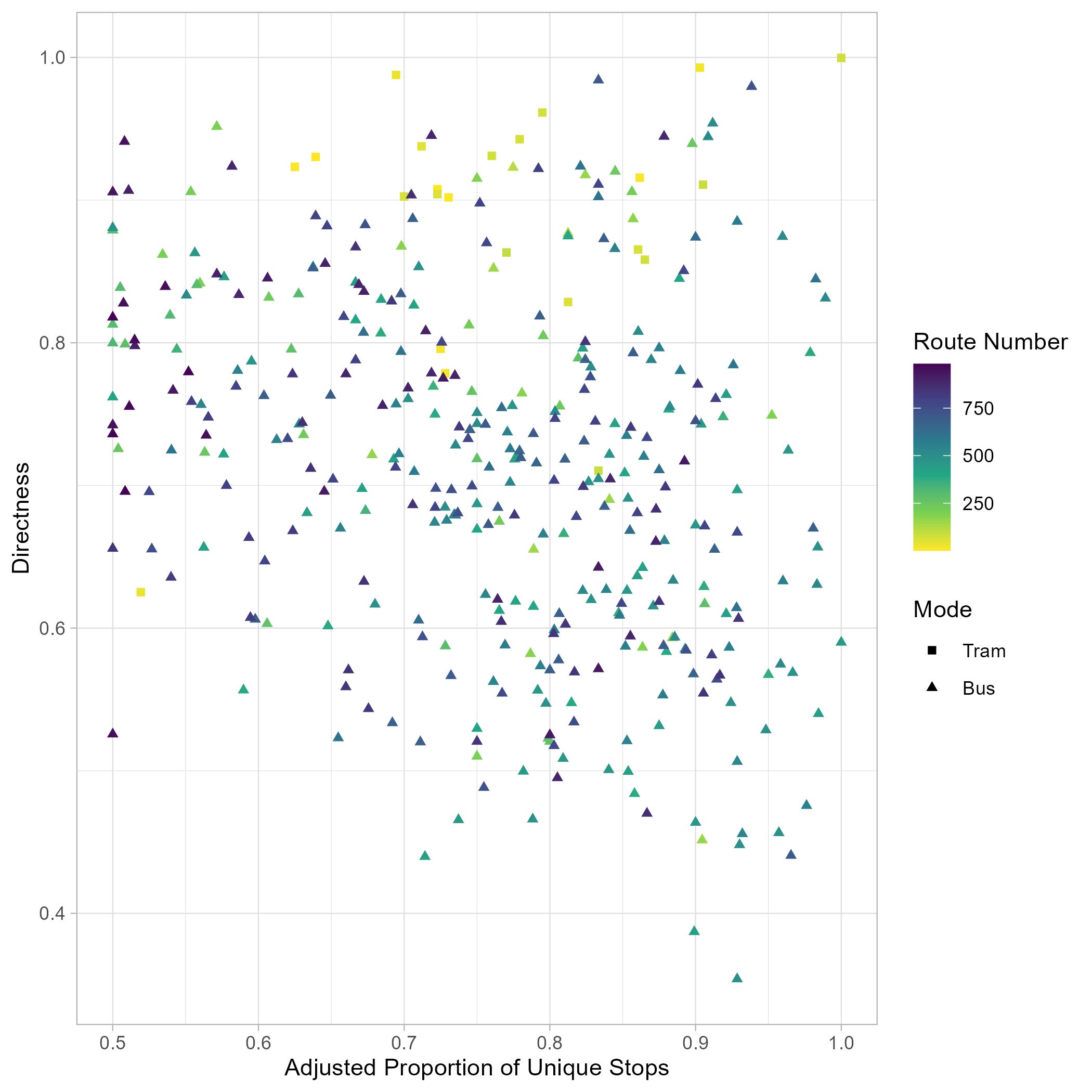
The above scatter plot shows that there is 1 “perfect” route, with no overlap and total directness. That would be the 78! As we can see from the chart there is a pretty even spread across both values. Below is a table with the top ten routes to consider reform by these metrics.
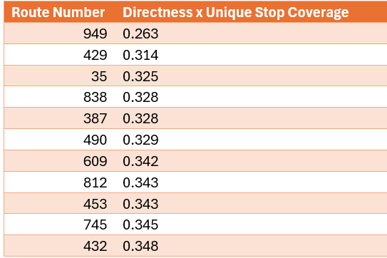
Wow! If that’s not a who’s who of routes that should be reformed. 949 is a one-way night bus only loop, which takes passengers on an inordinately long route from Williams Landing Station around Point Cook and then to Altona Meadows
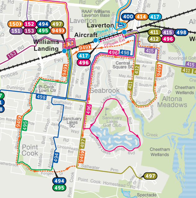
Going forward, this route would likely be a casualty of the trend of replacing night network routes with extended hours for daytime routes, which typically have higher nighttime ridership. Route 429 is a stub leftover from the reforms to the formerly cross city 216/219 routes.
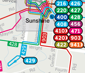
This route could probably be removed if we built a bridge across the Kororoit Creek, to allow residents of that pocket of Sunshine to walk to Fairbairn Road. Route 35 is a heritage tram which serves little functional value. 838 is an accidental inclusion on the list, as the way I counted the proportion of unique stops could not consider 838’s unique hail and ride system along the bulk of its route. Further along the list are 745, and 609 which are infamous for not only having terrible routes, but also horrid service levels.
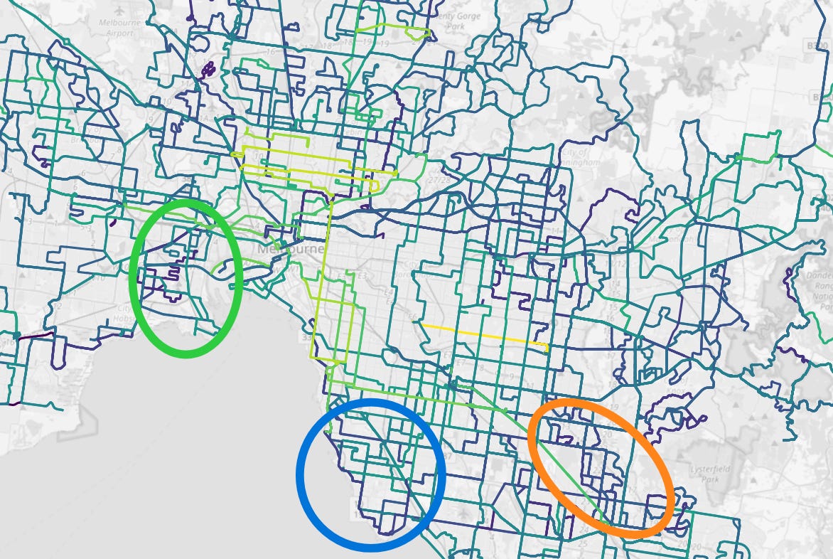
In the above map, lightness is a better score on Directness x Unique Stop Coverage, and darker is a lower score. I have circled 3 areas that have scored quite badly and should be focuses of reform. First, the blue circle includes southern Bayside and northern Kingston. Of particular note is the both highly duplicative and indirect 600/922/923 corridor but that’s only scratching the surface of that area’s incoherent bus network. In the orange circle is Dandenong North and Endeavor Hills, with a similar windy and overlapping combined corridor of 802/804/862. This area should also be greatly reformed. Finally, I want to highlight the inner west, especially around Yarraville, which I have circled in green. This area is well due for some proper bus reform. Let’s hope that the new Metro Tunnel and West Gate Tunnel projects provide the momentum to get it done!
By improving my methodology, I hope to have derived a more accurate estimation of directness. As a bonus for all that have read the whole post, the link below contains a large version of the map I created which shows stops and suburbs, as well as .csv files for stops, routes and sa2s in relation to directness.
https://drive.google.com/drive/folders/1-_zIQHI004uE2BGBfCg5AZXdhsM4-599?usp=sharing
No posts
Comments
Nothing yet. Say the first thing.
Sign in to join the conversation.