Dead on Arrival: The AI Dashboard Problem
Three prompts, three dashboards, and what the analytics practitioner still has to bring to the table in the age of AI-driven visual analytics.

The Datavist is a weekly newsletter exploring the craft of being a modern data professional: from technical skills and tools to the human stories behind data work.
Live Last read · last published · next check
Three prompts, three dashboards, and what the analytics practitioner still has to bring to the table in the age of AI-driven visual analytics.
Claude Design just launched. Here's what the design-to-code pipeline actually does in the world of visual analytics, business intelligence and dashboarding.
I asked a Claude-powered four AI agent team to debate the future of higher education using the Socratic method. Here's how it works and why it produces sharper strategic insight than a single prompt.
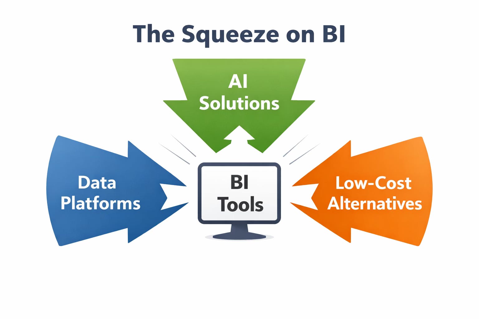
What the disruption of traditional BI tools means for analytics professionals and the skills that will matter on the other side.
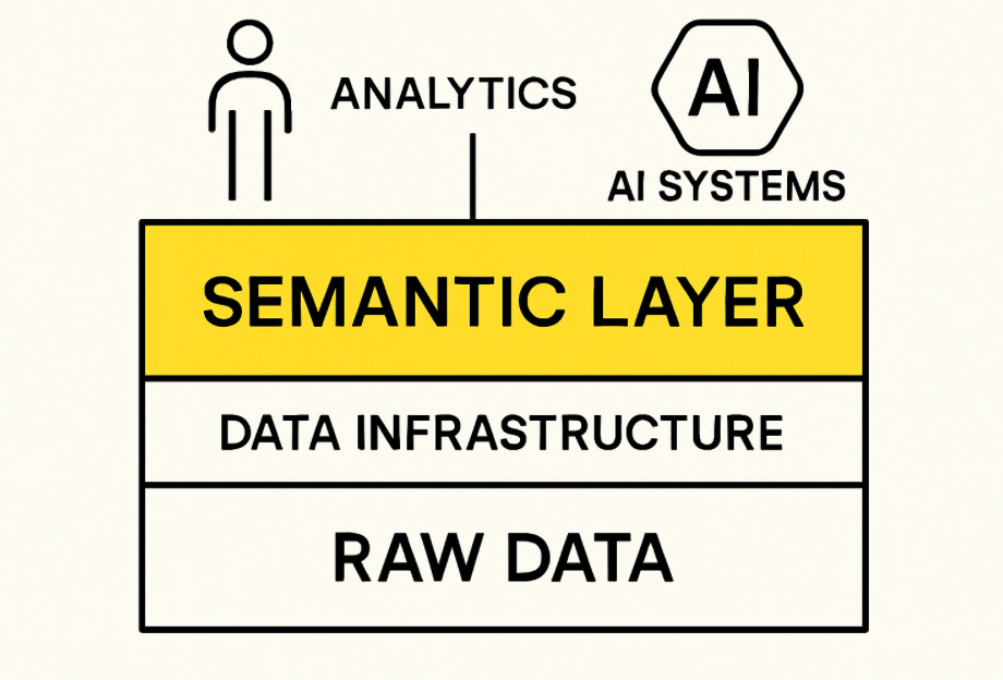
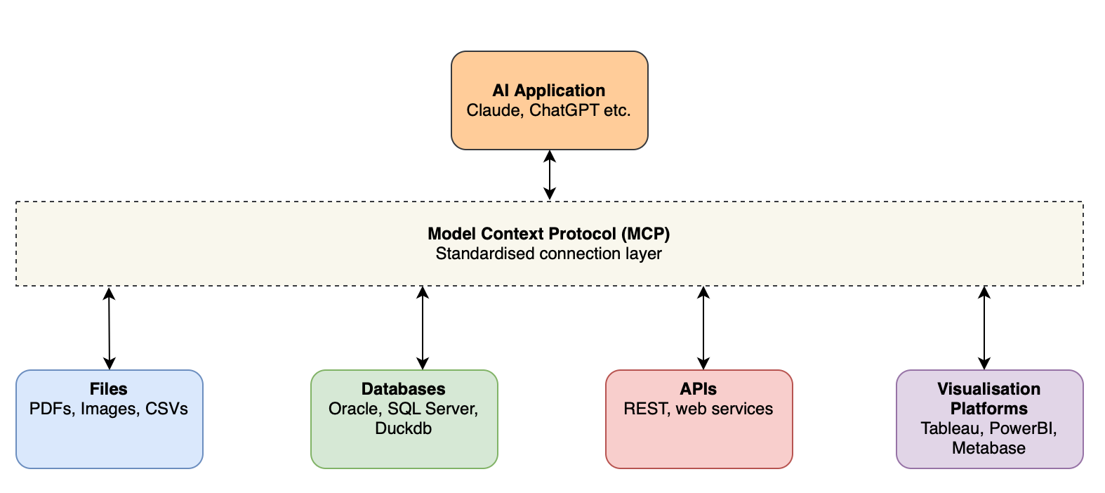
Giving AI the context it needs so it stops making up numbers at the worst possible time.
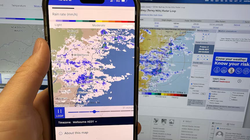
An ill-fated radar redesign reminds us that colour decisions are never cosmetic, they define how data is read and believed.
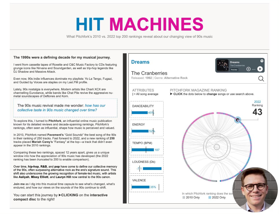
A practical guide distilled from multiple top ten qualifications in Tableau's Iron Viz.
Model context protocol may have a huge impact on the domain of insight retrieval
The choice of business intelligence tool probably doesn't matter as much as you might think it does
I'm back! I think!