
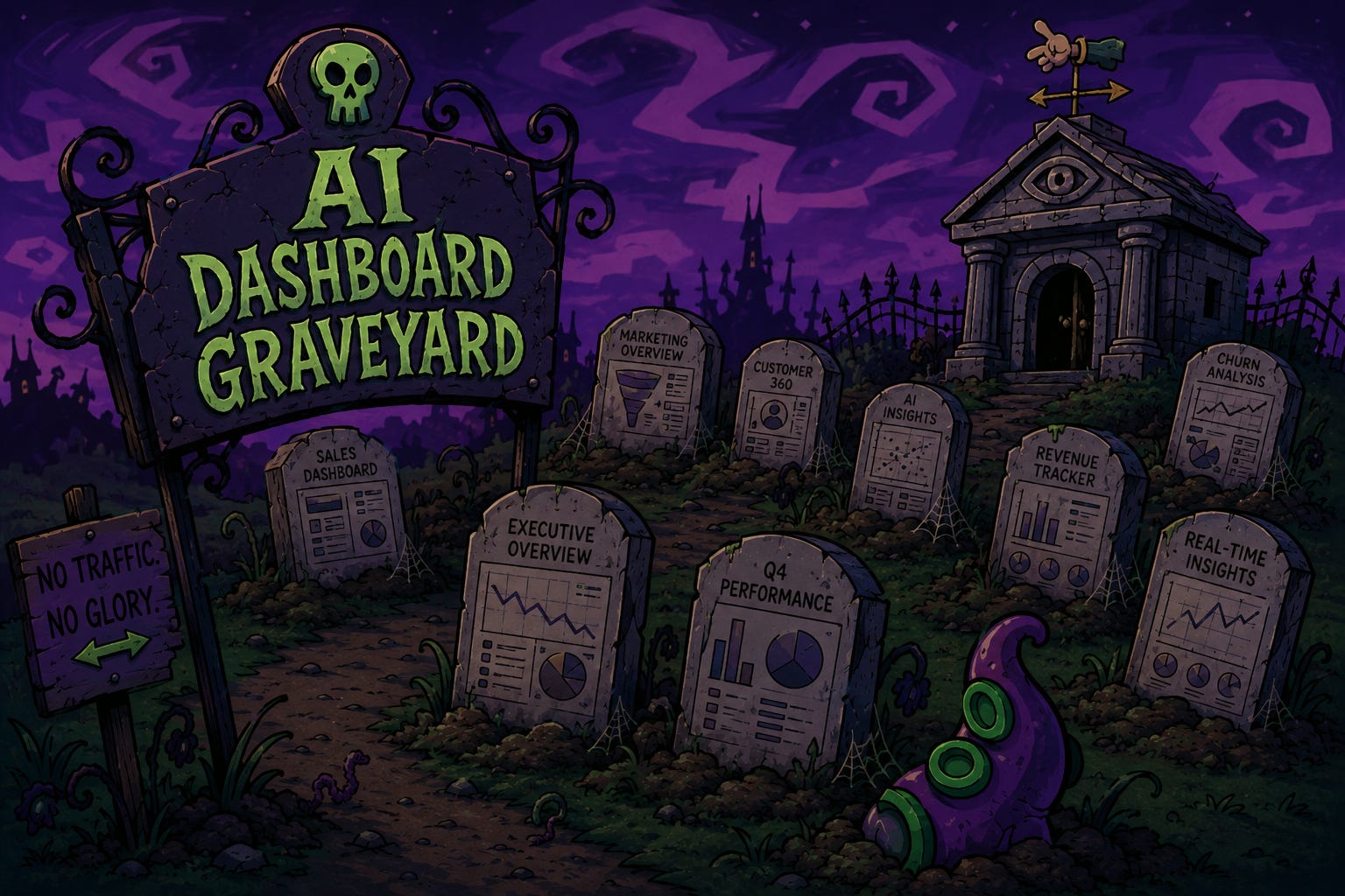
If you’ve ever shipped a dashboard inside an organisation, you’ve probably encountered this familiar pattern. You launch the “Ultimate Dashboard!” Everyone bookmarks it. Two weeks later, the audience drifts. Six months later, the data is stale and user traffic collapses.
Your work has ended up in the Dashboard Graveyard™.
The causes of death are well known:
You built it for the wrong audience;
You answered a question no one asked;
You designed it without restraint; or
You shipped it without an owner.
This is a common scenario, particularly in organisations with less experienced practitioners or no clear visual analytics governance.
A question I’ve been chewing on recently: what happens to the Dashboard Graveyard now that AI can build clean, well-typeset, sensibly charted dashboards in minutes? How do AI-generated dashboards fail differently from the ones humans have been building for thirty years? And what does a practitioner do about it?
I argue that AI does not empty the dashboard graveyard. But gives rise of a problematic scenario where people without strong dashboard design fundamentals use AI to skip critical milestones in the dashboard development cycle: they may under-cook the prompt and get a polished tour of the data, or they may over-cook it and get a confident position paper. Both fill the graveyard faster.
Like skills in many other fields being disrupted by artificial intelligence, knowing visual analytics fundamentals matters more now, not less. Why? Because the dashboards being shipped now are the ones organisations will rely on for the next decade of decisions.
The cost isn’t just dead dashboards. It’s decisions made with confidence in visual anayltics artefacts that don’t deserve it.
Chart aesthetics and effective communication are not the same thing.
Edward Tufte spent his career arguing that visual quality and substantive quality are inseparable: graphical excellence, in his framing, is complex ideas communicated with clarity, precision, and efficiency.1
More experienced visual analytics professionals know that a good dashboard isn’t just a collection of well-rendered charts; it’s a piece of communication that gets the right information to the right person at the right level of depth.
AI can be good at the first part. I wanted to find out how good it is at the second.
So I ran a test using Claude Design (Anthropic’s new visual design prototyping tool which I’ve written about using before) and Brickset’s LEGO catalogue dataset: roughly 18,500 LEGO sets going back fifty years, with set theme, piece count, US retail price, and minifigure count.2 Familiar enough to form intuitions about, rich enough for real analytical questions.
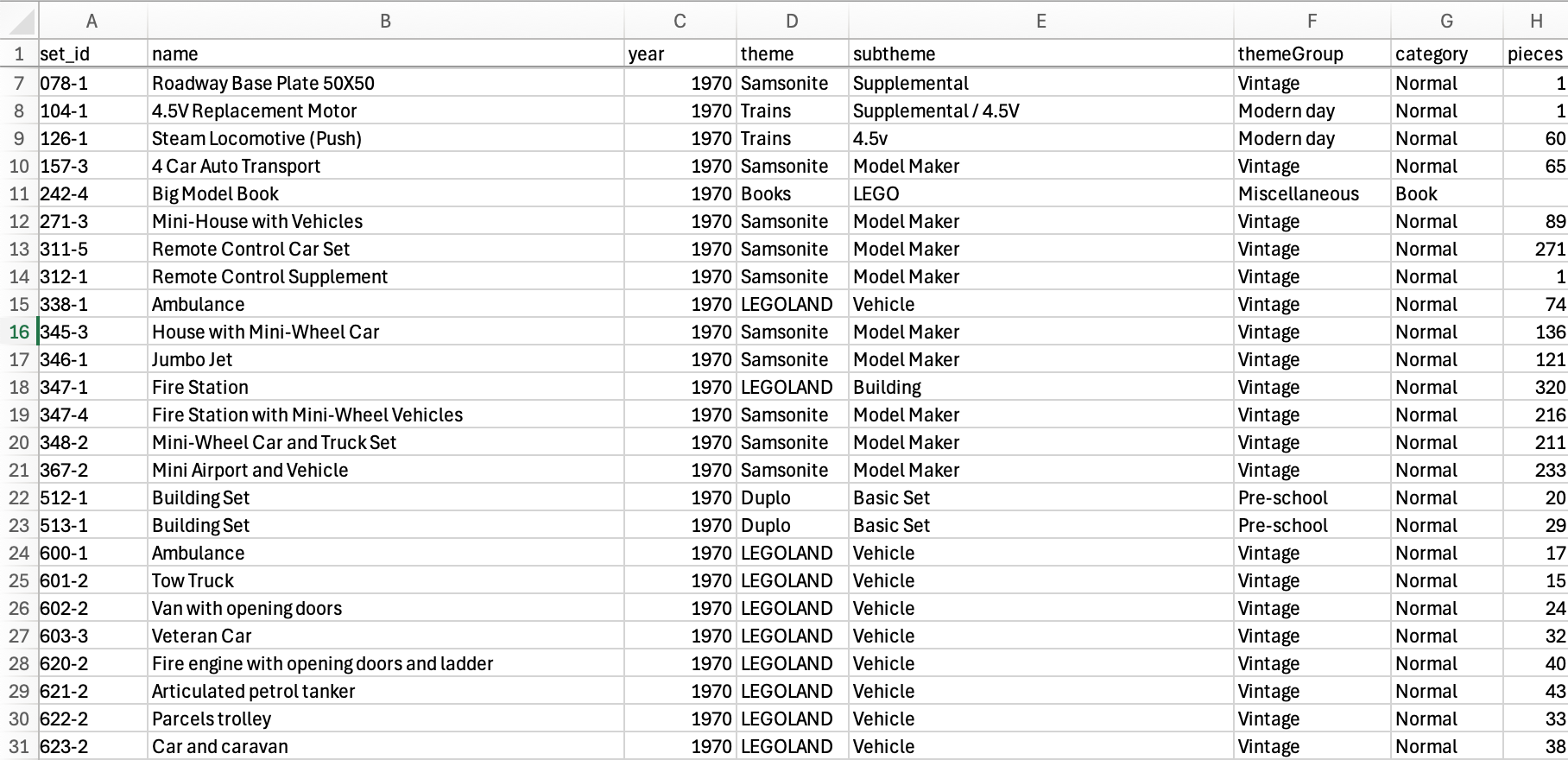
I gave Claude Design three increasingly thoughtful prompts (Iterations 1, 2 and 3), the kind of directions that separate a junior visual analytics designer from a senior one, and I reviewed what came back.
You can view each version here:
My analysis of each continues below.
I started with the naive prompt:
Build me a dashboard from this LEGO catalogue data.
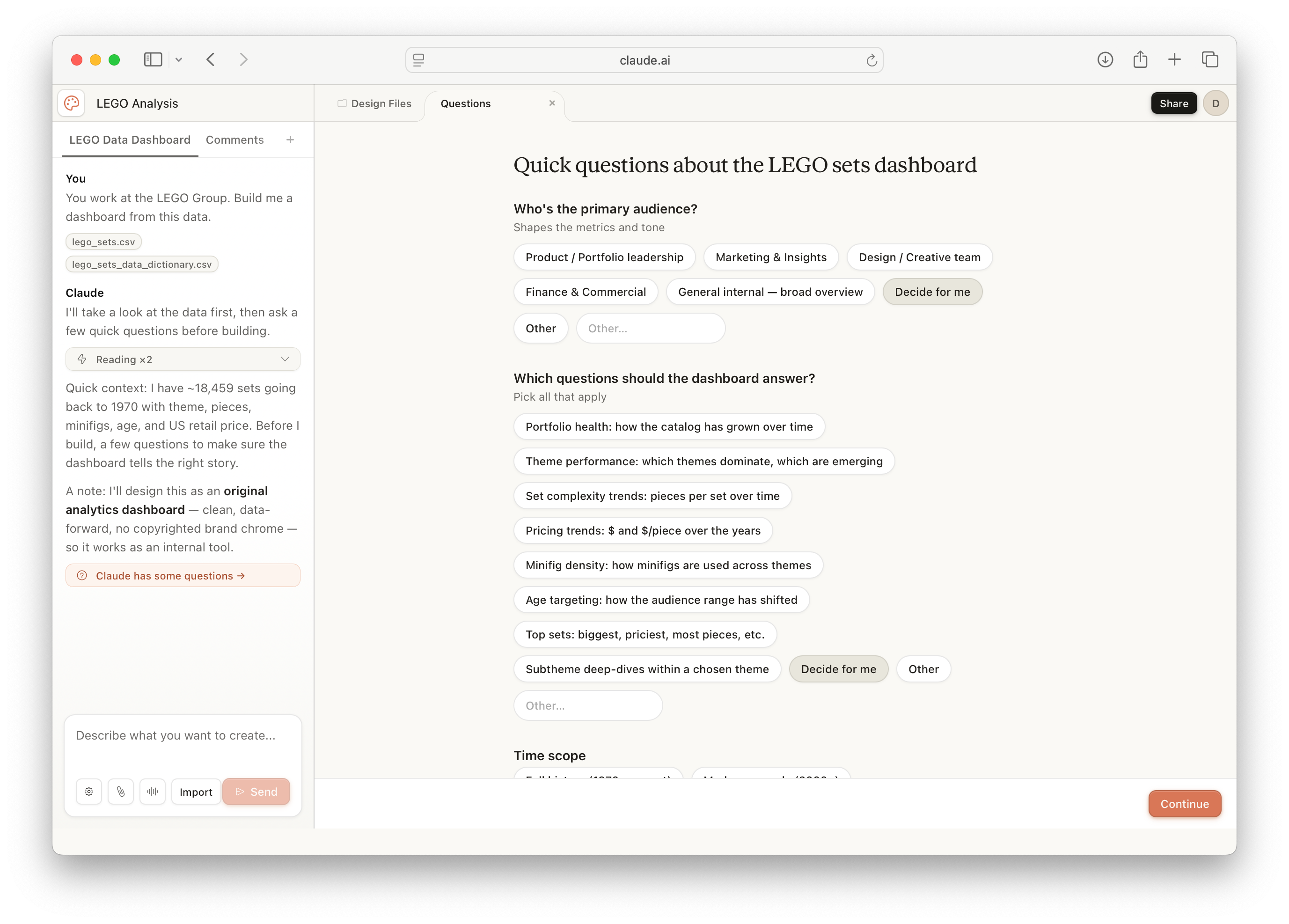
Claude did something I want to credit before I criticise. Before building anything, it asked me a structured set of questions through tappable buttons: who is the audience? Which questions should the dashboard answer? What time scope mattered? These are very pertinent and relevant questions to ask!
I deliberately chose “Decide for me” on every option, to simulate a prompter who doesn’t think too deeply about these things.
What came back looked professional. A long scrolling editorial page in monochrome with a warm accent. Five KPI tiles across the top: total sets, active themes, average pieces, average retail, latest-year output. Below that, five numbered sections walking through catalogue growth, theme leaderboards, complexity trends, flagship sets, and a sortable explorer table. The typography was good. The chart choices were sensible. No 3D, no pies, no decorative slop.
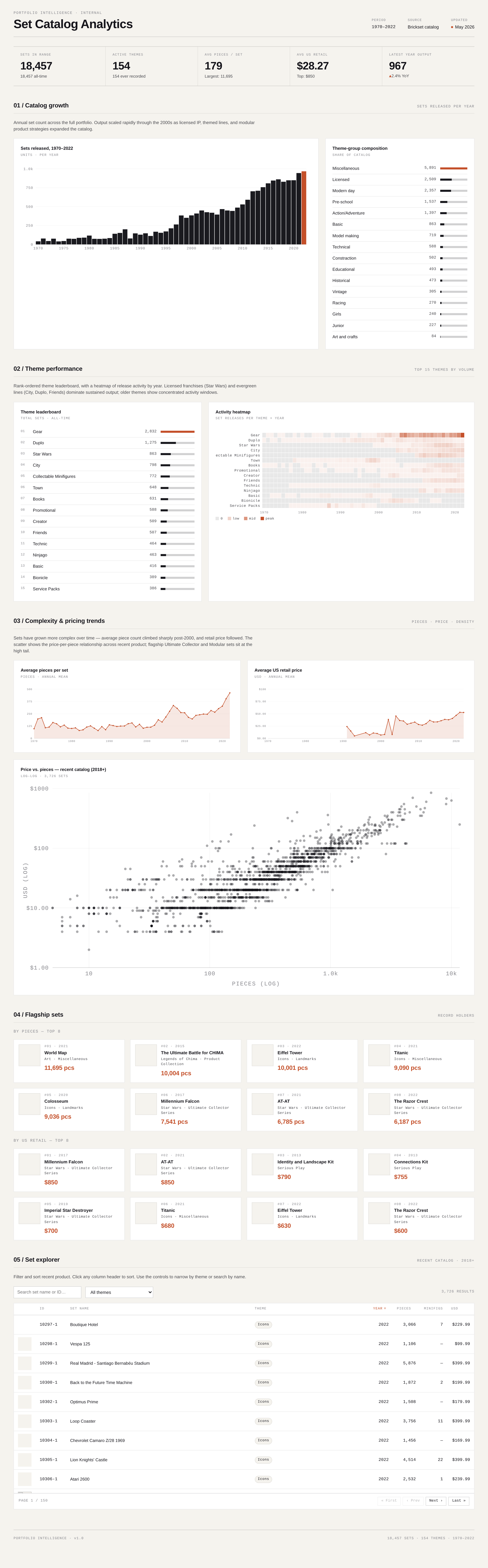
To 95% of people who saw it, this would pass for a good dashboard. But look at it more carefully: what does it actually tell you?
Nothing particularly coherent. It tells you LEGO has released a lot of sets, that some themes are bigger than others, that piece counts have crept up over time, that prices have followed. It’s a tour of the dataset. Five sections of inventory. I’m unsure of what decisions it helps the audience make.
Aurélien Vautier calls this the Mailbox Dashboard Syndrome: something built because the data is there, not because anyone needs the answer.3 It’s a pattern as old as BI software, and these new tools will almost certainly fall into the same trap without expert guidance. The polish makes it harder to notice, not easier.
The data quality problems make this worse. “Miscellaneous” tops the theme-group chart because the dataset bundles plush toys and homewares alongside actual brick sets, and Claude didn’t ask what counted as LEGO. The KPI tiles repeat data the explorer table already shows directly below them, which is a visual burden good dashboards work to remove. These are softer failures than outright hallucination, but the mechanism is the one Andy Cotgreave has been writing about recently: dashboard aesthetic polish lowers your guard.4
Iteration 1 is what happens when a practitioner skips the brief. I declined every option Claude offered me, and the dashboard reflects that, not a failure of the tool. The Mailbox Dashboard is an old pattern. AI hasn’t introduced it; it’s just made the surface convincing enough to slip past a casual review. If you under-cook the brief, you fill the graveyard.
For the second iteration, I wrote the kind of brief any senior analyst would recognise:
You are a strategic planner at the LEGO Group. Build me a dashboard that tells me which themes to invest in, which to maintain, and which to retire. The user is a senior strategic planner. They have 60 seconds before a Monday strategy meeting to scan this dashboard and walk in informed. The dashboard answers exactly ONE question. Everything on the page must serve that question. Cut anything that doesn’t.
One decision, one audience, one time window, with explicit permission to cut.
Claude Design returned an entirely different artefact. Gone was the long scrolling inventory. In its place, a three-lane decision page (Invest, Maintain, Retire), with each lane led by a single number (14 themes, 11 themes, 13 themes) and a one-sentence caption naming the standout theme. Below that, a detail grid: every theme rendered as a small card with 3-year volume, a delta against the prior 3-year window, and a sparkline.
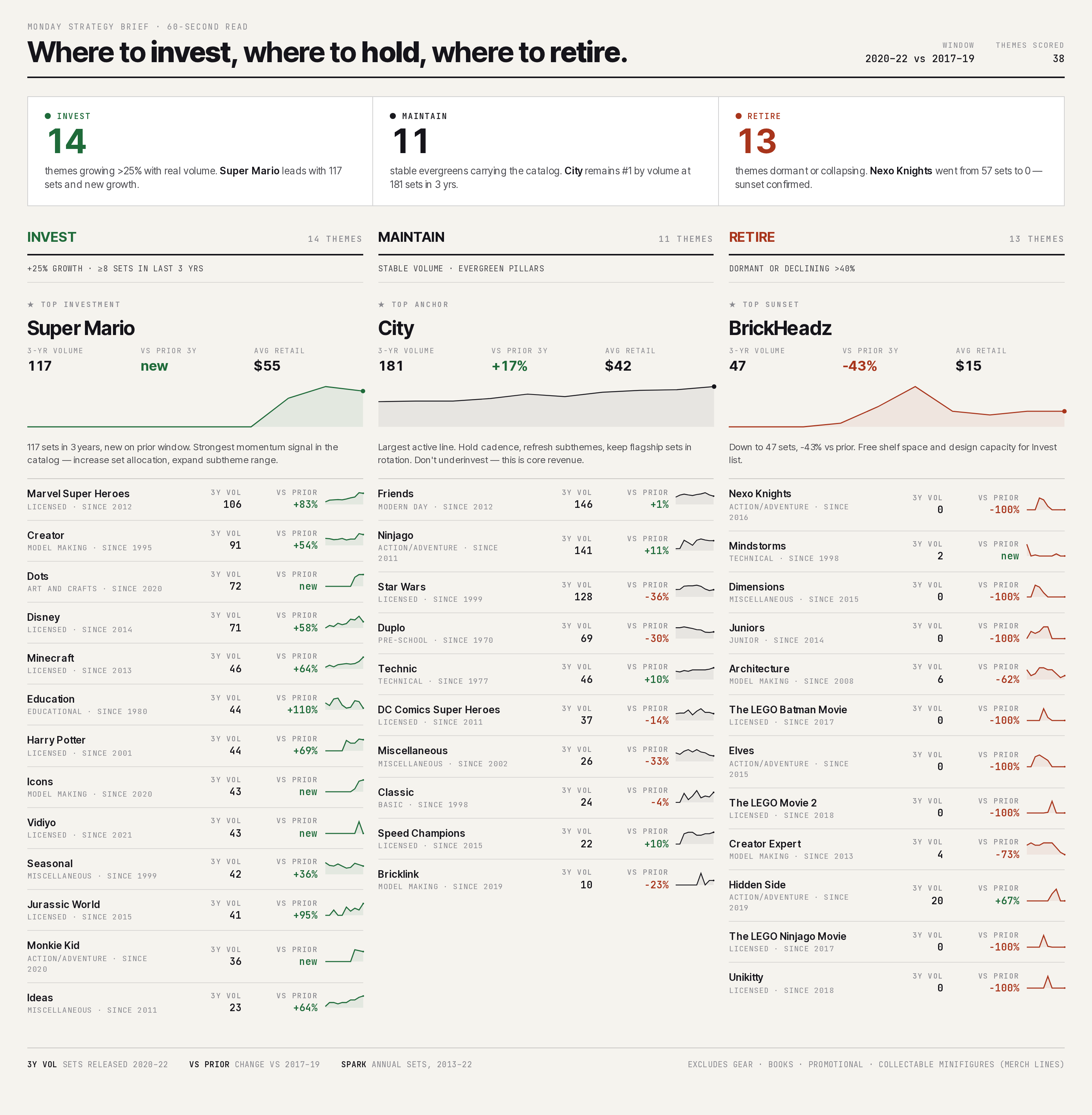
The dashboard structure now answered a relevant and useful question. A LEGO sales analyst could walk in, scan the three lanes, and form a point of view in under a minute. This is what the dashboard literature has been arguing for. Steve Wexler, Jeffrey Shaffer and Andy Cotgreave call it action-orientation; Cole Nussbaumer Knaflic calls it "starting with the so-what".5 Both reduce to the same instruction: lead with the decision, not the data.
But under heavily scrutiny, issues did appear.
Several themes in the Retire lane were already dead. Nexo Knights, Mindstorms, Dimensions, Juniors, Elves, all showing −100% against the prior window with sparklines ending at zero. LEGO retired them years ago. Telling a marketing executive at LEGO to retire something that’s already retired isn’t useful. The dataset contained the information needed to filter these out, but Claude didn’t ask and didn’t filter.
The dashboard header read “themes scored: 38” with no explanation of where the other 115 active themes went. Andy Kirk frames trustworthiness as a foundational layer of effective visualisation, and this is exactly what he means: when a senior analyst sees an unexplained number sitting under a confident headline, trust breaks before the dashboard has earned its chance to deliver effective insight6.
The vocabulary also drifted halfway down the page. Invest / Maintain / Retire in the hero section became Investment / Anchor / Sunset in the detail sections. Same concepts, different words, no reason for the swap. The kind of thing a careful design review would catch.
There’s also a deeper problem: is the dashboard answering the right question?
An invest/maintain/retire decision is about return: where LEGO is making money, where it isn’t. But Claude’s only input was set count. A LEGO theme could release fifty sets a year and lose money on every one. Another could release five and be one of the most profitable lines in the catalogue.
The dashboard isn’t telling a strategic planner where to invest. It’s telling them where LEGO is releasing more sets, which is an adjacent question and a much less useful one. The dataset I gave Claude didn’t contain revenue or margin data, so Claude couldn’t have answered the real question even if it tried. A senior analyst would have flagged that gap before building anything. Claude built around it.
The brief gave the dashboard the right shape, but it couldn’t give Claude the instinct to push back: to ask what counted as an active theme, to notice the dead candidates, to flag that the dataset couldn’t really answer the question. Structure, the brief delivered. Judgement still needed a person, or perhaps a more comprehensive prompt.
Iteration 2 is what a competent brief can do, and where it stops. The structure matched the question. The substance still needed an analyst who knew the data well enough to push back on it. Ryan Dolley calls this the three-layer cake of BI context: data context, knowledge context, decision context.7 My prompt moved Claude through Layer 1. Layers 2 and 3 still live in the analyst’s head.
An AI prompt good enough to ship a dashboard isn’t necessarily the same as one good enough to ship a trustworthy dashboard. It still requires intervention and review by competent analysts.
For the third iteration, I updated my brief with extensive guardrails: some that a dashboard design professional might apply when prototyping a visual analytics product.
You are a strategic planner at the LEGO Group. Build me a dashboard that tells me which themes to invest in, which to maintain, and which to retire.
GUARDRAIL: HIERARCHY
The headline metric, the single number that answers the question best, must be top-left, sized largest, with comparison to a prior period and to a relevant benchmark.
Visual weight must reflect importance. The most important element is the most visually prominent.
GUARDRAIL: SCAN / ZOOM / LINK
The dashboard has three layers of depth, top to bottom:
SCAN (top 20%): headline metric. Answer in 3 seconds.
ZOOM (middle 50%): supporting story. 3–5 charts that explain why the headline is what it is.
LINK (bottom 30%): drill detail. Tables/lists/specifics that let the user investigate cases.
The eye must travel top-down, getting deeper at each layer.
Do not arrange charts as a flat grid.
GUARDRAIL: CHART CHOICE + RESTRAINT
BANNED: pie charts, donuts, gauges, speedometers, radar/spider charts, 3D effects, drop shadows, decorative icons.
DEFAULT to bar charts for comparison and line charts for trends.
Use ONE accent colour. Apply it ONLY to the headline metric and to threshold breaches. Everything else greyscale.
Do not add visual elements that don’t carry information.
GUARDRAIL: EDITORIAL DISCIPLINE Filters must justify themselves; titles must be directive; cockpit principle: default view is the answer.
At that point I wasn’t briefing Claude Design. I was handing it a methodology and asking it to execute, very specifically.
Claude Design returned a different artefact again, and this time the failure was mine, not necessarily the AI.
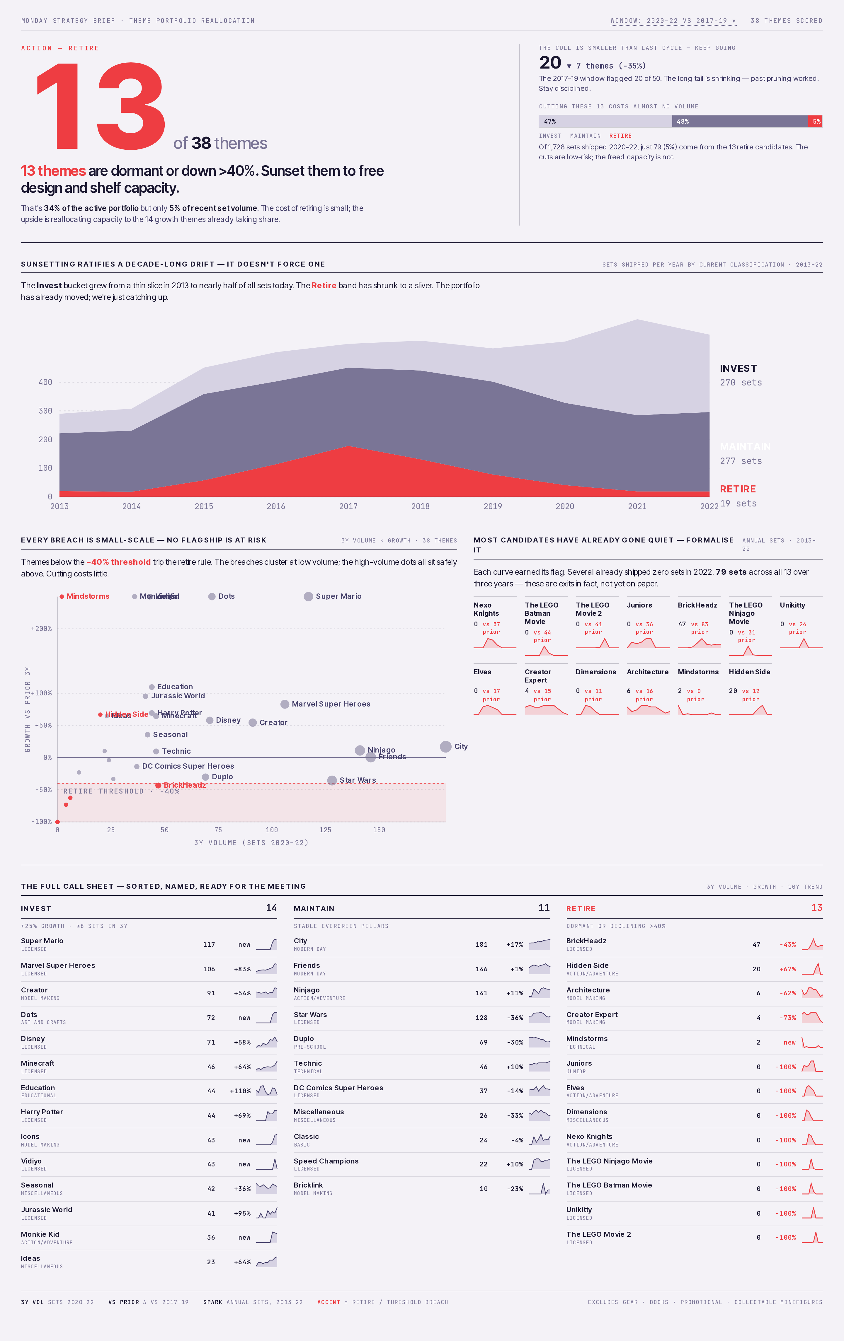
Visually, it's impressive. But the artefact drifts towards a data-driven briefing or memo, rather than a traditional dashboard. So while I'd say it fails as a dashboard, it's not necessarily a failure of visual analytics more broadly.
The page opens with a single number (”13”) sized like a magazine cover figure, alongside the line “13 themes are dormant or down >40%. Sunset them to free design and shelf capacity.” A one-paragraph framing follows: 34% of the active portfolio but only 5% of recent volume.
Below the fold, a stacked area chart titled “Sunsetting ratifies a decade-long drift: it doesn’t force one.” A scatter of every theme on a volume × growth grid with the retire threshold shaded. Small-multiple decay curves for each of the 13 candidates. At the bottom, a table listing every theme, ranked.
Structurally, this iteration uses textbook visual design principles. Hierarchy, scaffold, restraint, directive titles, all executed faithfully.
BUT the mistake here was applying every principle at once, on top of a question I hadn’t yet analysed. Each rule is sound on its own. All four together force the dashboard into a shape that prosecutes a single answer, whether the data warrants one or not.
The result is arguably worse than Iteration 2. The real problem sits upstream of the prompt: I hadn’t done the analytical work before writing it.
I jumped straight to applying data visualisation theory without first sitting with the dataset to figure out what it showed. I should have sat with the data and asked questions like:
Which themes were already retired?
Is volume a defensible proxy for value?
Which of invest, maintain or retire was the story the data actually wanted to tell, and which were secondary?
A senior analyst would spend time with the data first, and then write the brief, with that understanding shaping which question deserved the hero treatment.
I skipped that step. The guardrails told Claude Design how to present an answer. They didn’t tell it what the answer should be, because I didn’t know yet. So Claude picked one: Retire, because the −40% threshold made it the most visually loaded story under the hierarchy rule, and it prosecuted that story confidently.
This is the opposite failure of Iteration 1. Iteration 1 was so non-committal it said nothing in particular. Iteration 3 is so committed it forecloses everything except the one thing it’s decided to say. Iteration 1 was style without thinking. Iteration 3 was style without analysis.
A dashboard, in Stephen Few’s original framing, exists to support a decision.8⁸ Iteration 3 announces one. An analyst can ratify the recommendation, but they can’t easily interrogate it. They can’t ask “is Super Mario’s growth durable?” or “what does the City trend look like year-on-year?” The page has decided those questions aren’t the point.
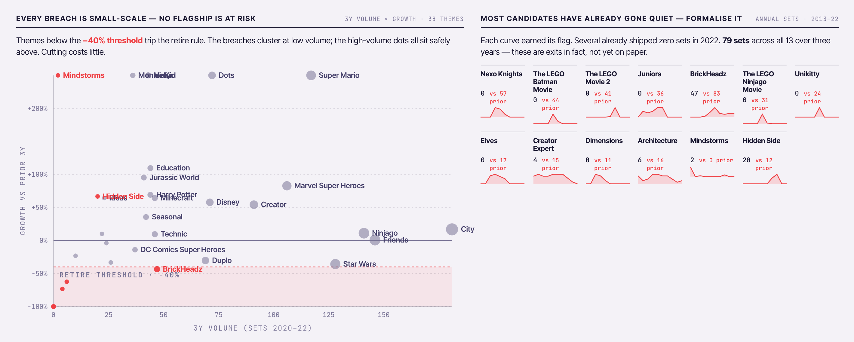
Furthermore, despite my fairly intensive prompt, some execution issues do exist. The scatter plot has labels overlapping badly enough that several are unreadable. Mindstorms appears in the accent colour (which the dashboard has trained the reader to read as the "retire flag"), but sits in the high-growth quadrant. The intended meaning is "retired despite growth," but the visual grammar the rest of the page has carefully established breaks at exactly the moment the reader most needs it intact.
The table at the bottom of Iteration 3 covers the same ground as Iteration 2's detail grid: every theme, by lane, with growth and a sparkline. The format is different. Iteration 2 used cards, giving each theme its own block of space and showing its classification (Licensed, Modern Day, Action/Adventure) alongside the numbers. Iteration 3 compressed the same data into denser rows. Cards reward browsing; rows reward searching. The brief asked for sixty seconds of scanning, which is browsing.
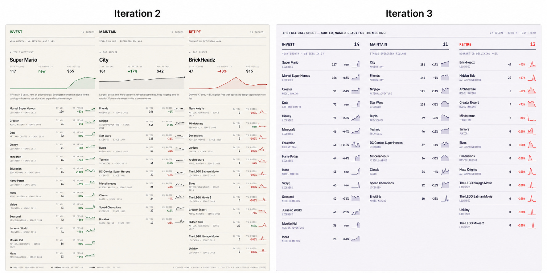
The bigger difference is where each version sits on the page. In Iteration 2 the detail grid is the main body of evidence, directly under the three lane numbers it explains. In Iteration 3 the same view is fifth in line, after the hero, the stacked area chart, the scatter, and the small multiples. By the time the reader reaches it, the page has already told them what to think.
That's what over-cooking the brief produces. A dashboard that's decided the answer before its audience has finished asking the question. Iteration 1 fills the graveyard by saying nothing. Iteration 3 fills it by saying too much. Both are actually practitioner failures, just at opposite ends. AI didn't introduce either one. It just made them harder to spot.
The Dashboard Graveyard has always been filled by a poor understanding of fundamental dashboard design principles. AI doesn’t fix that. What it changes is the scale.
Tools like Claude Design, Figma Make and ChatGPT now empower anyone with a dataset to build something polished in minutes, which means the risk we now face is a wave of dashboards that look professional and are quietly incoherent.
Across all three iterations of the experiment above, Claude Design made some genuine mistakes. It didn’t ask what counted as LEGO. It let “themes scored: 38” sit under a confident headline with no explanation. It left dead themes in the Retire lane.
But the bigger failures were mine.
Iteration 1 was a polished tour of the data because I declined to brief it. Iteration 2 caught most of the prompt failures, but Claude couldn’t catch its own. Iteration 3 prosecuted a single answer because I told it to, before I’d done the analytical work to know what the answer should be. Under-cook the prompt or over-cook it, the result lands in the same place: a dashboard that looks like a dashboard but arguably is not useful at all.
So before you ship that AI dashboard, do the analytical work first. The prompt can’t substitute for it. Sit with the data, know what it shows, and write the brief from that understanding. Leave the model some judgement, and leave the reader some questions to ask. Knowing the fundamentals matters more, not less.
AI has made it easier than ever to ship a dashboard, and potentially harder than ever to ship a good one. Ignore dashboard design principles at your peril!
Edward Tufte, The Visual Display of Quantitative Information, 2nd ed. (Graphics Press, 2001). Tufte’s framing of graphical excellence as “complex ideas communicated with clarity, precision, and efficiency” remains the canonical statement of the principle that visual quality and communicative quality are inseparable.
Brickset.com is a community-maintained LEGO catalogue and database. The dataset used here was extracted from Brickset and contains every catalogued set from 1970 to 2022, with theme, piece count, US retail price, and minifigure count. This dataset was acquired via Maven Analytics.
Aurélien Vautier writes about the "Mailbox Dashboard" pattern at Dataviz Clarity, arguing that dashboards built around the data that happens to be available, rather than around a question someone needs answered, will inevitably fail.
Andy Cotgreave, “Hallucinations in AI Analytics: still real and dangerous,” How to Speak Data (Substack), 2 May 2026. Cotgreave documents an episode of Chart Chat in which a Claude-built dashboard misidentified the peak year on a chart that was sitting directly above the incorrect label. Neither he nor his fellow practitioners caught the error during the build or the recording. He writes: “Wowed by the attractive styling, neither he nor us spotted it.”
This argument runs across most of the modern dashboard literature. Steve Wexler, Jeffrey Shaffer and Andy Cotgreave, The Big Book of Dashboards: Visualizing Your Data Using Real-World Business Scenarios (Wiley, 2017), frame dashboards as instruments that should "drive action" rather than "present data." Cole Nussbaumer Knaflic, Storytelling with Data: A Data Visualization Guide for Business Professionals (Wiley, 2015), makes a similar case for leading with the decision, not the dataset.
“Trust contract” paraphrases Andy Kirk’s treatment of trustworthiness as a foundational layer of effective data visualisation. See Andy Kirk, Data Visualisation: A Handbook for Data Driven Design, 2nd ed. (SAGE, 2019), chapter 3.
Ryan Dolley, “The Context Your BI Tool Can’t Model,” Super Data Blog (Substack), 7 April 2026. Dolley argues that BI context operates in three layers: data context (tables, joins, definitions), knowledge context (what concepts mean and how they relate), and decision context (the political, social and unwritten rules that shape what gets built and how). The top two layers, he argues, still live in the analyst’s head and are the BI practitioner’s main point of leverage in an AI-driven world.
Stephen Few, Information Dashboard Design: Displaying Data for At-a-Glance Monitoring, 2nd ed. (Analytics Press, 2013). Few defines a dashboard as “a visual display of the most important information needed to achieve one or more objectives, consolidated and arranged on a single screen so the information can be monitored at a glance.”
No posts
Comments
Nothing yet. Say the first thing.
Sign in to join the conversation.