
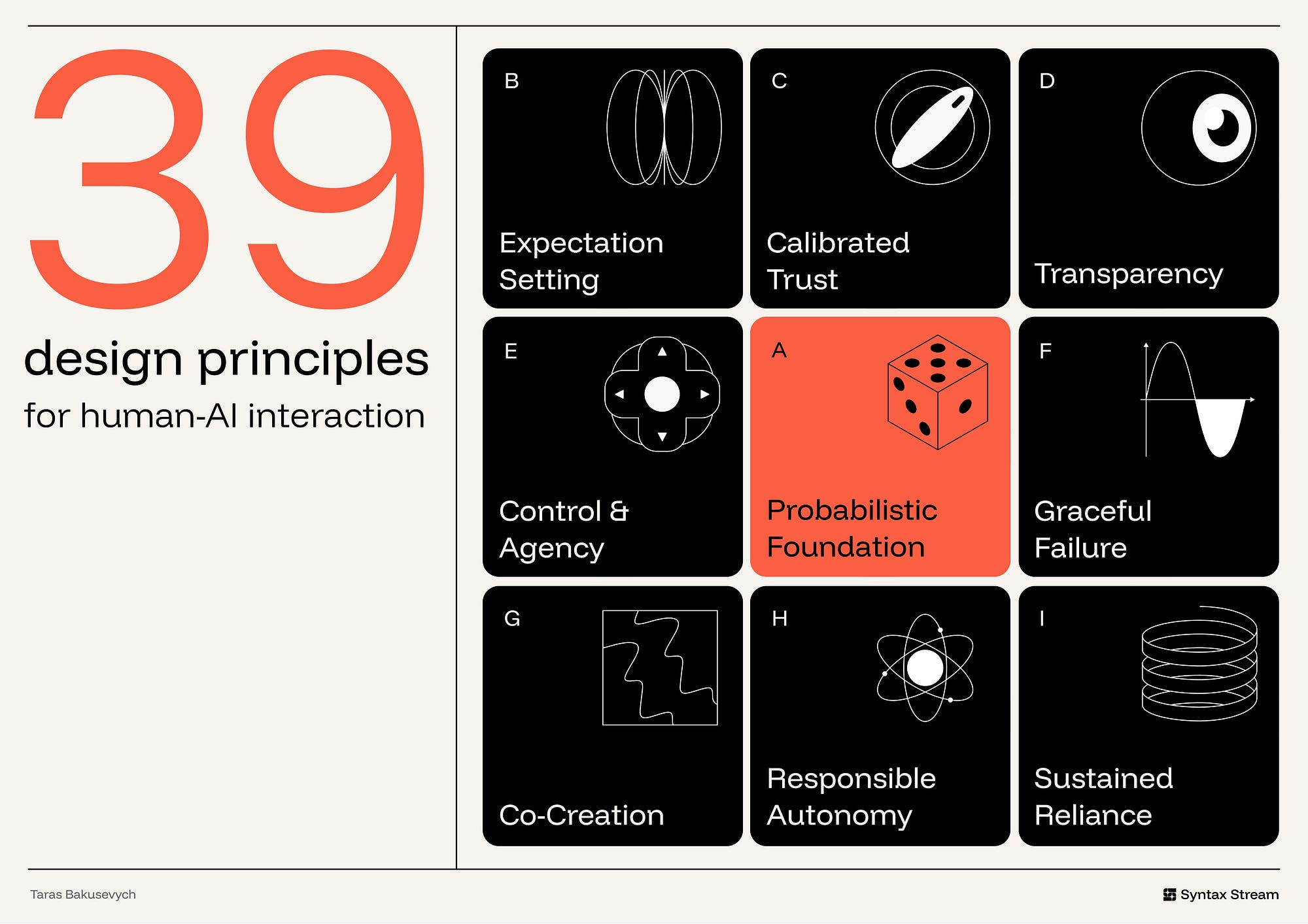
39 principles for designing human-AI interaction
An applied framework for designing AI interfaces that support appropriate reliance, user control, transparency, and responsible autonomy.
On the legibility of effort
How hard is anything now? I don’t know.
Lots of work is easier because of LLMs, and
Lots of heuristics we used to gauge effort are broken because of LLMs, so
Conveying effort to others is harder because of LLMs
And:
“Someone spent time on this” is a proxy for “this is worth engaging with” and
I appreciate projects that take a lot of effort and
I like it when people appreciate that I spent effort on something
But also:
Making a good thing still requires making lots of decisions, and
Making lots of decisions is still very hard, despite LLMs, so
Making good things is still very hard
As a creative technologist I’ve found this paralyzing. And as someone who loves novel internet projects I’ve found it frustrating. I’ve heard similar things from many of my friends.
What software (and writing, to an extent) is missing now is legibility of effort - the ability to tell at a glance whether something took a human meaningful work.
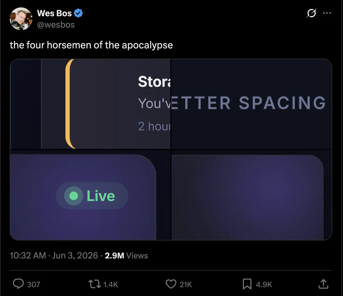
The organizational cost of low taste
When taste is weak, organizations don’t fail in strategy. They fail in decisions.
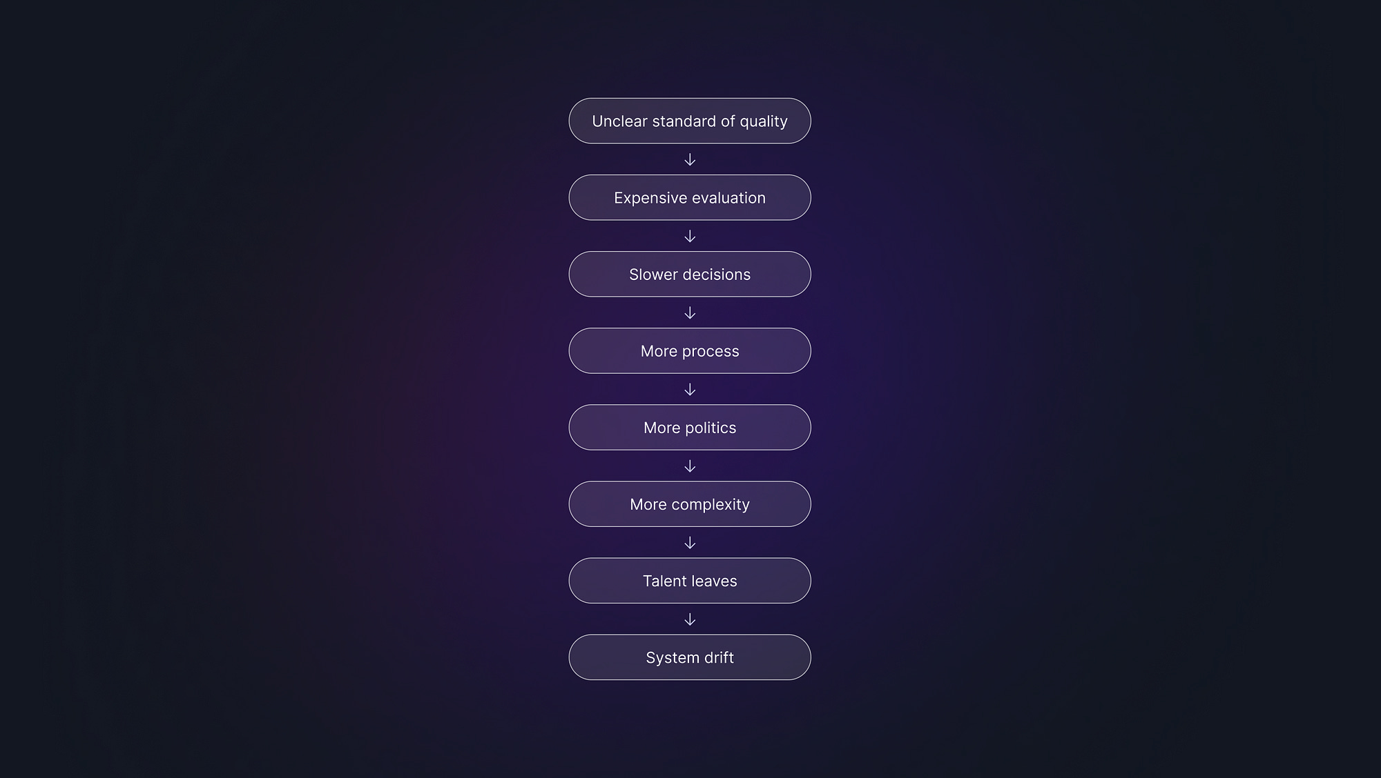
See also: ‘You can’t unit test for taste’
Designing services for people who’ve lost trust online [via Gov.uk]
When people trust something, it makes them feel safe. But how do you support users when it’s getting harder to tell what’s real online?
Principles in motion via Figma
When you’re designing motion, you’re designing with time. Understanding the mechanics turns movement into meaning.
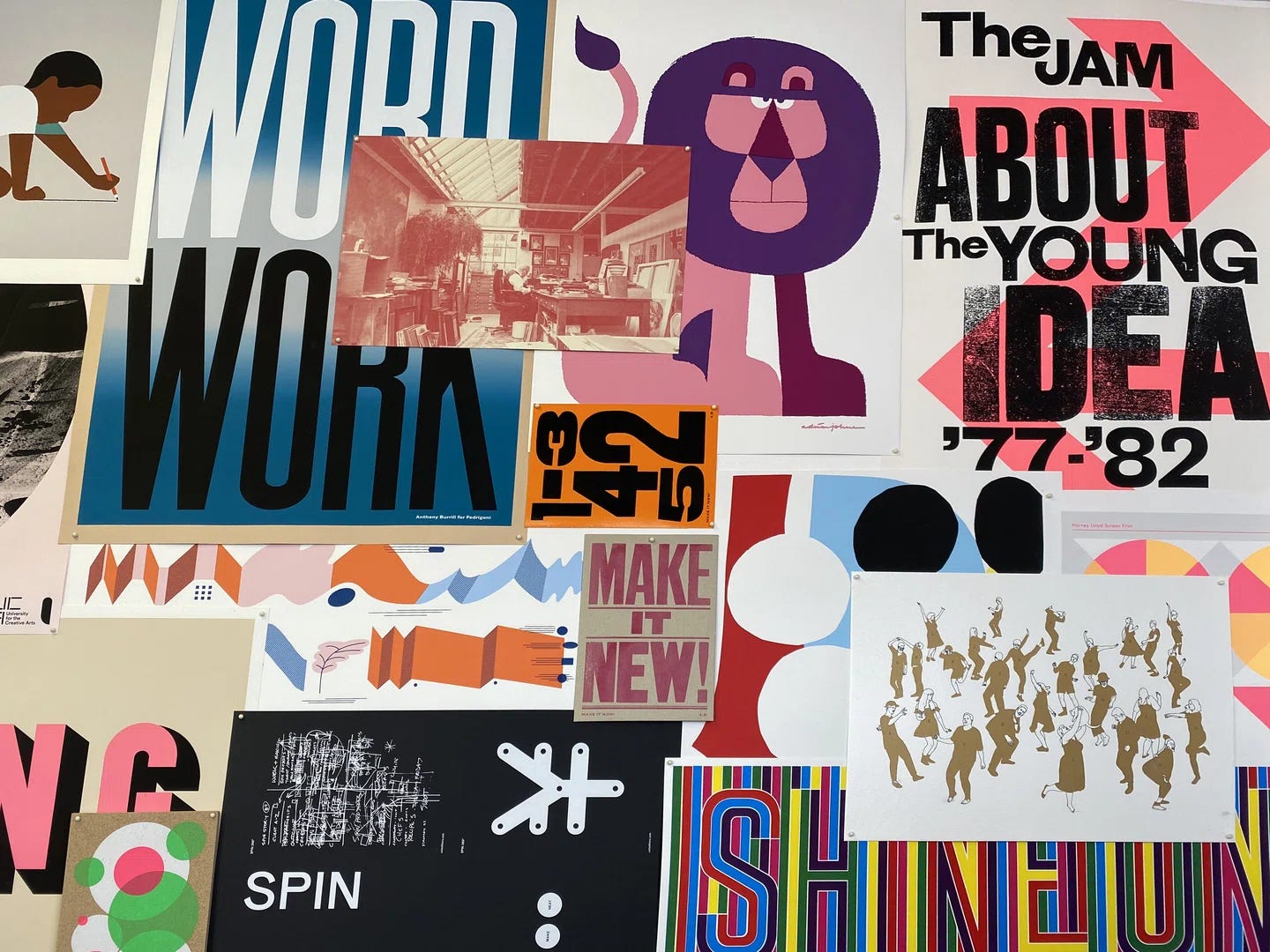
Meet the iconic printmakers that shaped half a century of the UK’s contemporary graphic art [via Itsnicethat]
In this deep dive into 50 Years of Print, the exhibition celebrating art from the archive of Harvey Lloyd screens, we go behind the scenes on the studio’s remarkable legacy and its imprint on design and illustration today.
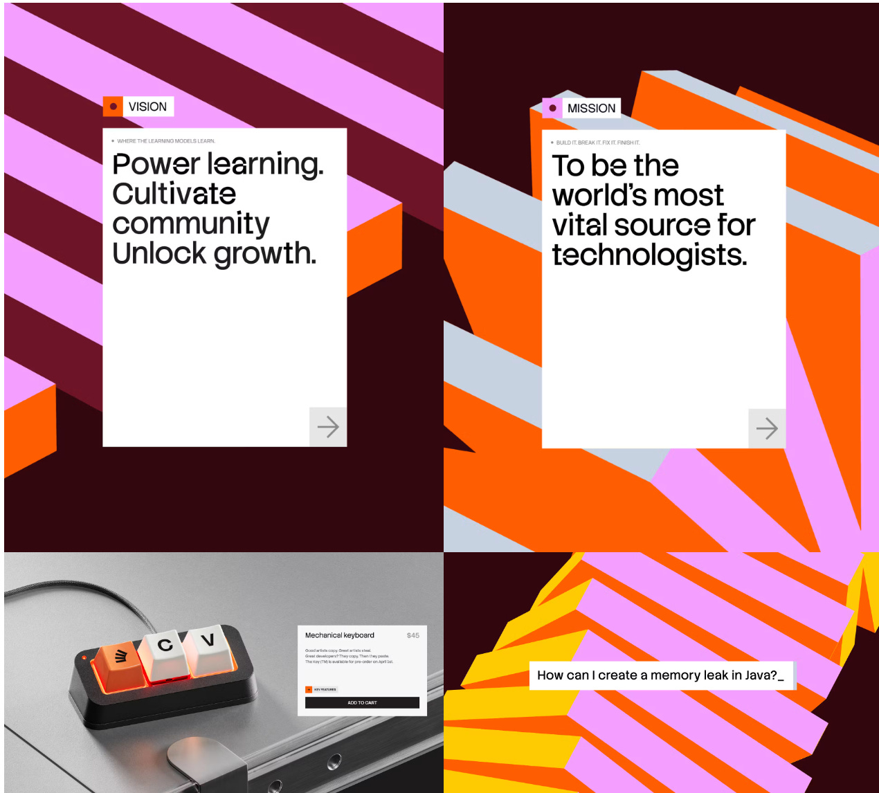
Koto redesigns Stack Overflow to champion human knowledge in the AI era
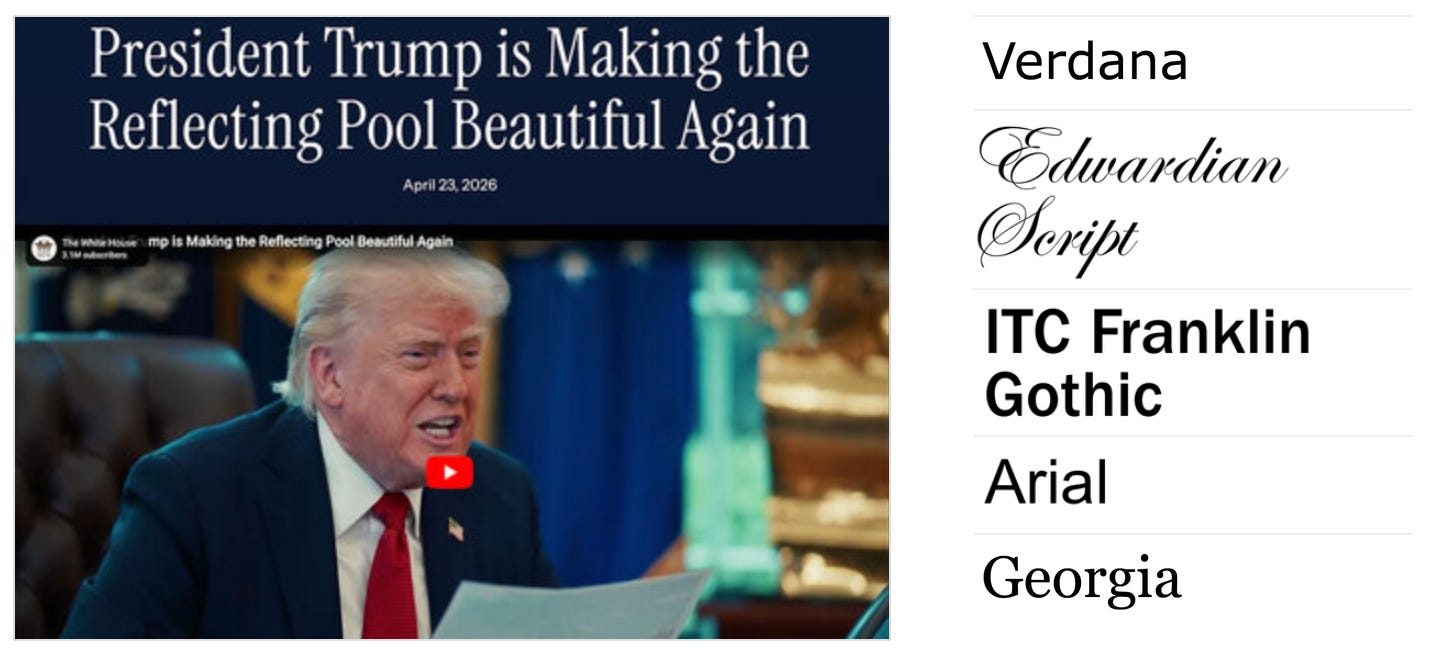
The Typography of whitehouse.gov, 2000–2026 [via Fonts in Use]
An in-depth A survey of type used on the website of the People’s House doubles as a capsule view of web designers’ evolving professional identity.
No posts
Comments
Nothing yet. Say the first thing.
Sign in to join the conversation.