
As a resident of Tasmania—a gorgeous, sparsely populated island-state of Australia—I probably shouldn’t care much about the United States of America, let alone its president, let alone his official residency’s website. And yet, his actions, words, and hairdo shake the world so badly, they are impossible to ignore, especially given his disdain for inclusivity, his war on DEI programmes, and his endless attempts to erase the past.
So, in the midway of my second year as a PhD candidate, on one cold, gloomy spring morning, I found myself wandering the White House website. I can’t quite recall what brought me there—fate’s cruelty, I reckon—but what I saw there left me devastated.
You see, Australia takes accessibility very seriously. Its Digital Government standards are constantly upgraded to “strengthen inclusion and accessibility requirements, so no one is left behind when accessing government’s digital services”, and every product, essential or otherwise, is expected to innovate with purpose, know their user, and do no harm.
Until recently, the U.S. government agencies took it seriously, too. Its Digital Government proudly proclaimed: “accessibility isn’t just the right thing to do; it’s the law.” The 2024 U.S. General Services Report listed a “digital Government that delivers for the public through trusted, accessible, and user-centered technologies” as its top strategic goal for the coming year. From the Federal Website Standards to the American with Disabilities Act, the U.S. pioneered and advanced many standards, not only committing to delivering accessible services but prosecuting those who failed to do so. Many positive developments of the recent years wouldn’t be possible without the U.S. setting the precedent and leading by example.
Then, came Trump.
“The Accessibility Apprentice” is a free newsletter. If you wish to support its charming author, donate a few dollars!
The official website of the White House is a flexible digital entity that changes significantly (as does the White House itself) under every new president. For millions of people visiting it, the official page of the American leader serves as the primary source of information on a myriad of topics, and the website constantly adjusts to prioritise the most relevant updates and reflect strategical changes and new priorities.
With every term and every power shift, the look and feel, the architecture, the tone of voice of the website change, often starting from scratch, symbolising the radical turn. The White House website is an important representation of the presidency as an institution and the president as a public figure and a person. It communicates with the viewer on behalf of the country’s leader, and as such, needs to be perfectly in line with their views and values in every detail.
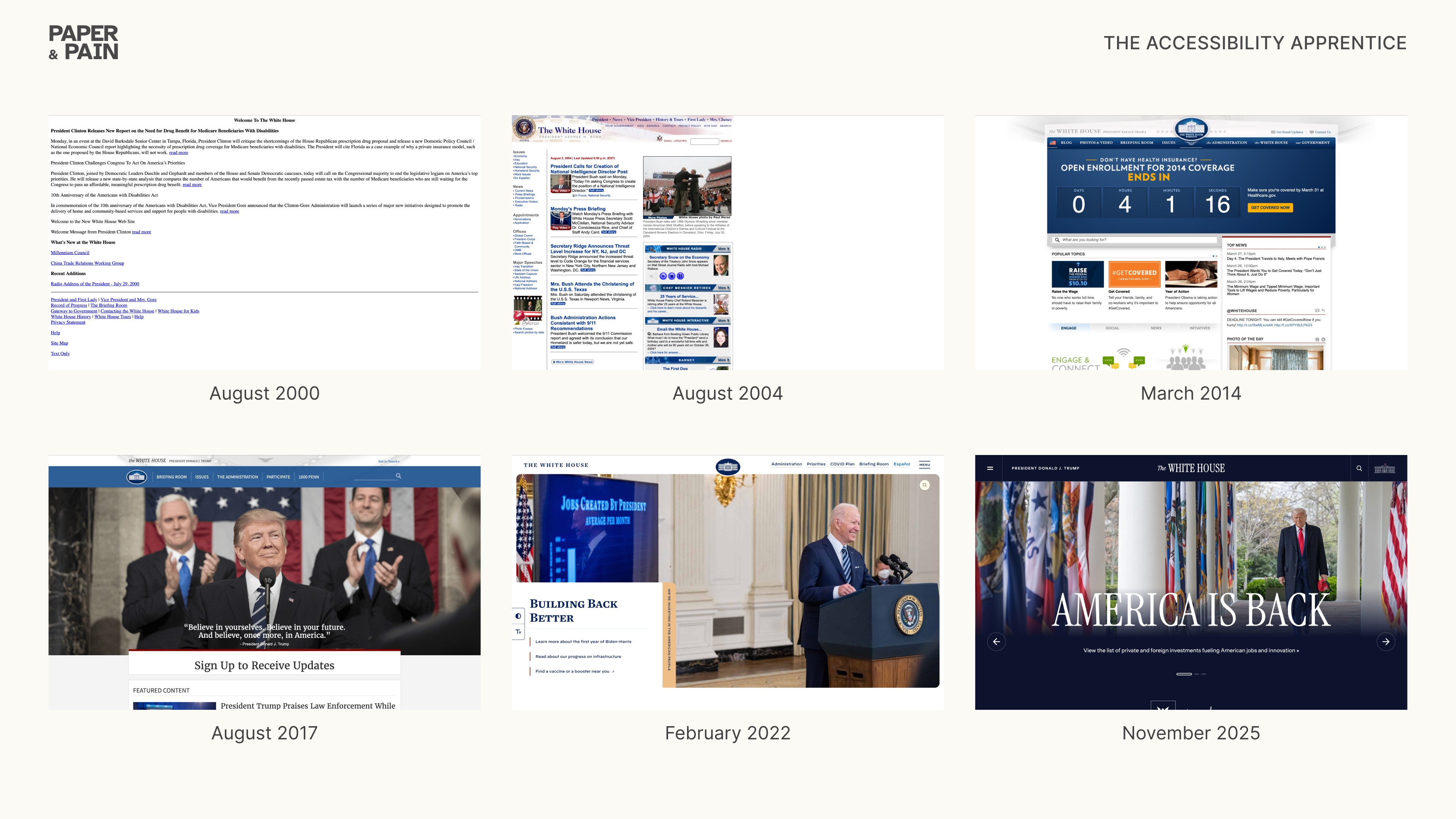
You may think that this interpretation is the classic example of overthinking (even though in the world of politics, a wrong tie colour can end someone’s career), but on the first day of Trump’s new term, the White House website purged several features, including the Accessibility Statement, perfectly reflecting the new president’s crusade against DEI programmes. Moreover, the website also dropped its Spanish version, robbing 45 million Spanish speakers living permanently in the U.S. (~14% of the population, according to the latest census) of the option to browse it in their first language.
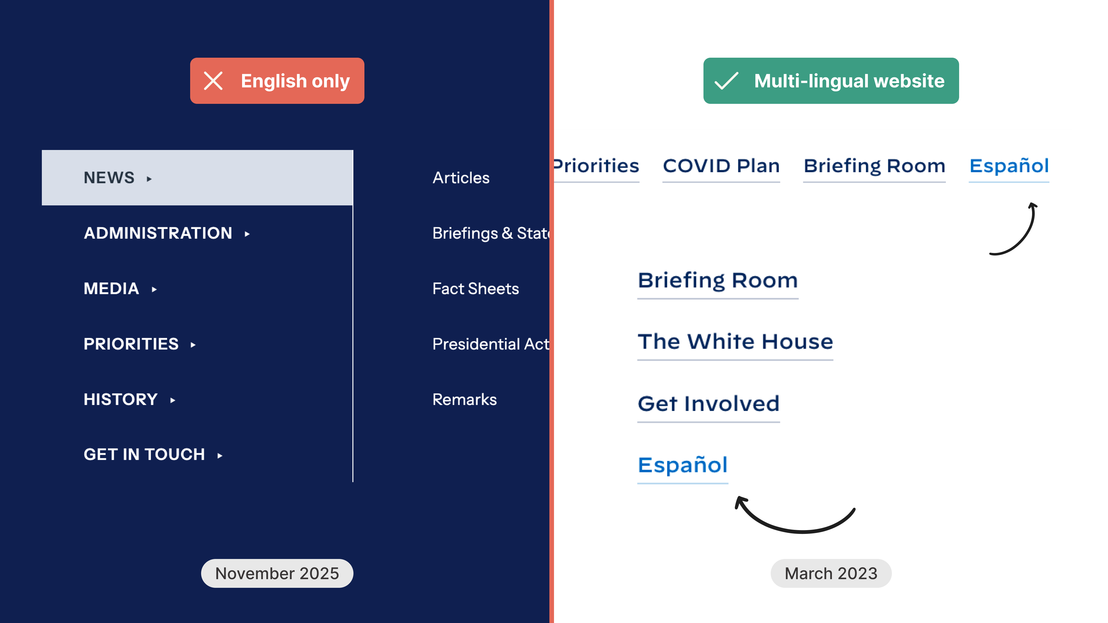
What else was lost, I wondered, and what could it tell us about the place of accessibility among the new administration’s priorities?
The transformation of the White House website is quite emblematic of Trump’s disdain for his predecessor, who is currently represented in the “Presidential Walk of Fame” by the photograph of an autopen. Unfortunately, these changes not only affected the tone of voice and the visual language but accessibility, too: having demolished the previous incarnation of the website, the new administration rolled out a poorly-built, half-baked product that violates way too many standards. To illustrate it, I pulled the 2023 White House website from the Web Archive and put it side by side with today’s version.
What I saw broke me.
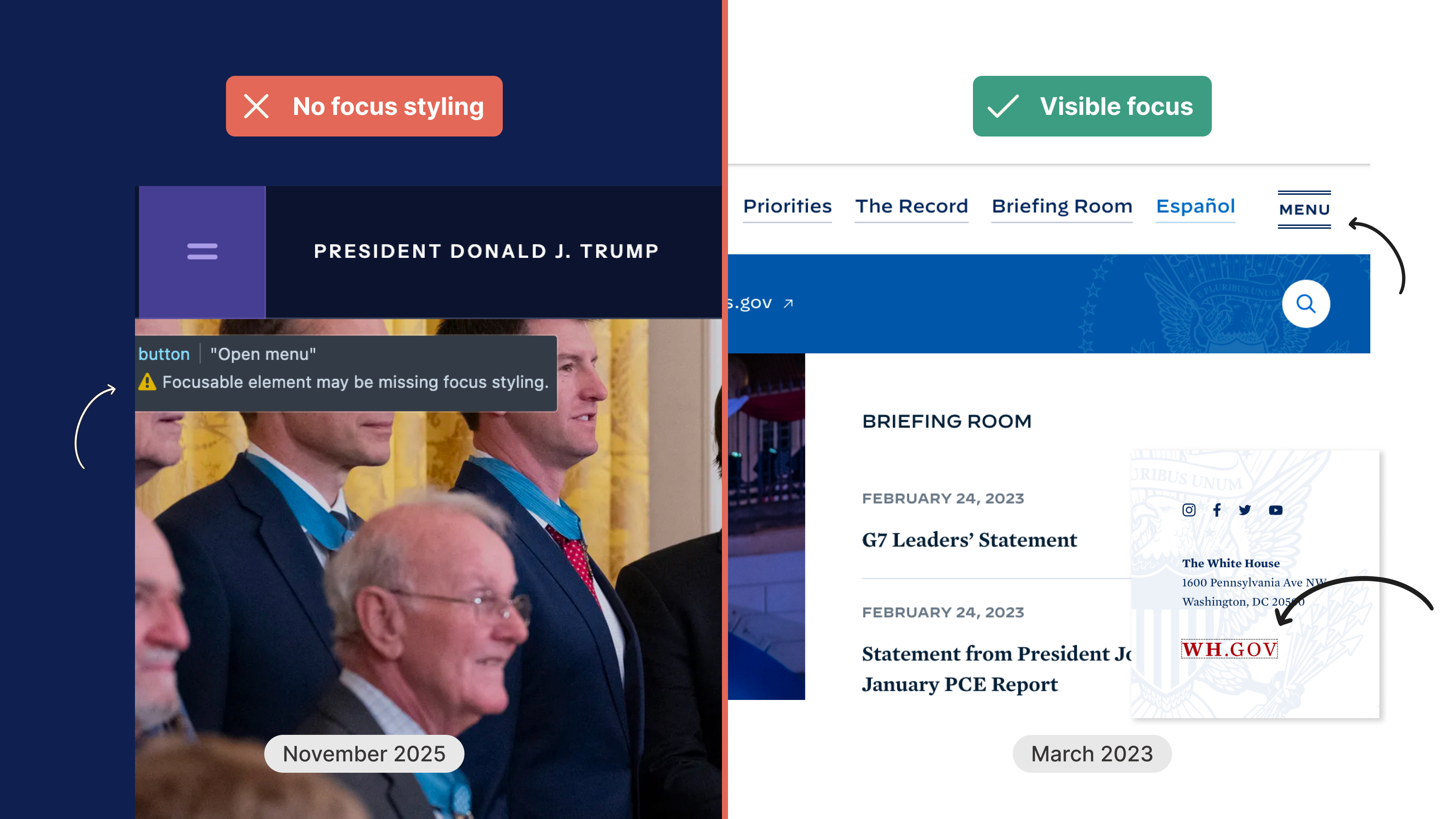
2.4.7 Focus Visible: Each item receiving focus must have a visible indicator.
One may notice that the new website rocks a fancy label-less burger menu icon, which Trump’s IT folks equipped with a title attribute. Unfortunately, they forgot to add visible focus state to it, as well as to some other clickable elements, which makes navigating the White House website with a keyboard basically impossible.
Compare that to the 2023 version, where all outlines are in place, with some elements—such as the website logo in the footer—even adding a colour change to an outline to emphasise the focus state.
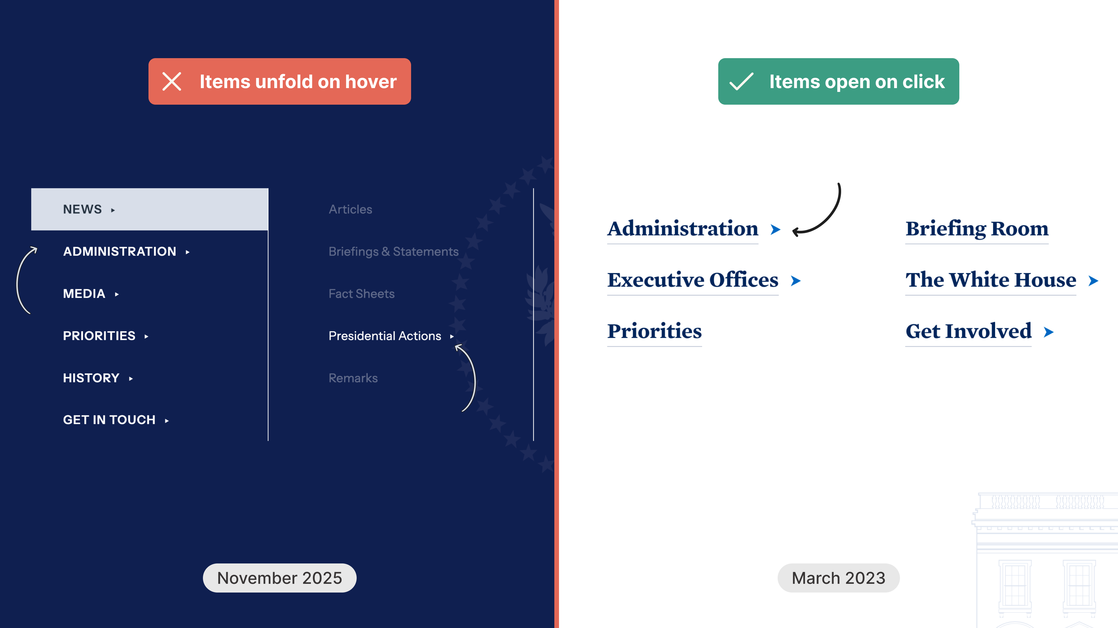
The menu itself underwent an overhaul as well: a simple navigation was replaced with a massive mega-menu with 3 layers that unfold on hover. Paired with invisible focus states and the complete lack of consideration for keyboard navigation, accessing anything within this massive structure is basically impossible without a mouse.
Luckily for us, the new website offers another navigation—or shall we say, three navigations—in the footer. Unlike the March 2023 version that uses a single <nav> tag for the bottom navigation and replicates the top menu (beside, perhaps, adding the “the” to “Administration”) in the footer, the new White House portal’s menus are all over the place. Can you find, say, the link to the Executive Office or the Wire pages in the main navigation? Would you expect “Issues”, featured prominently in the footer, to be placed under “Priorities” in the top menu? Instead of providing a complete alternative navigation, the footer menu features a completely different list of manually curated pages, not organised by themes or representing the site’s hierarchy.
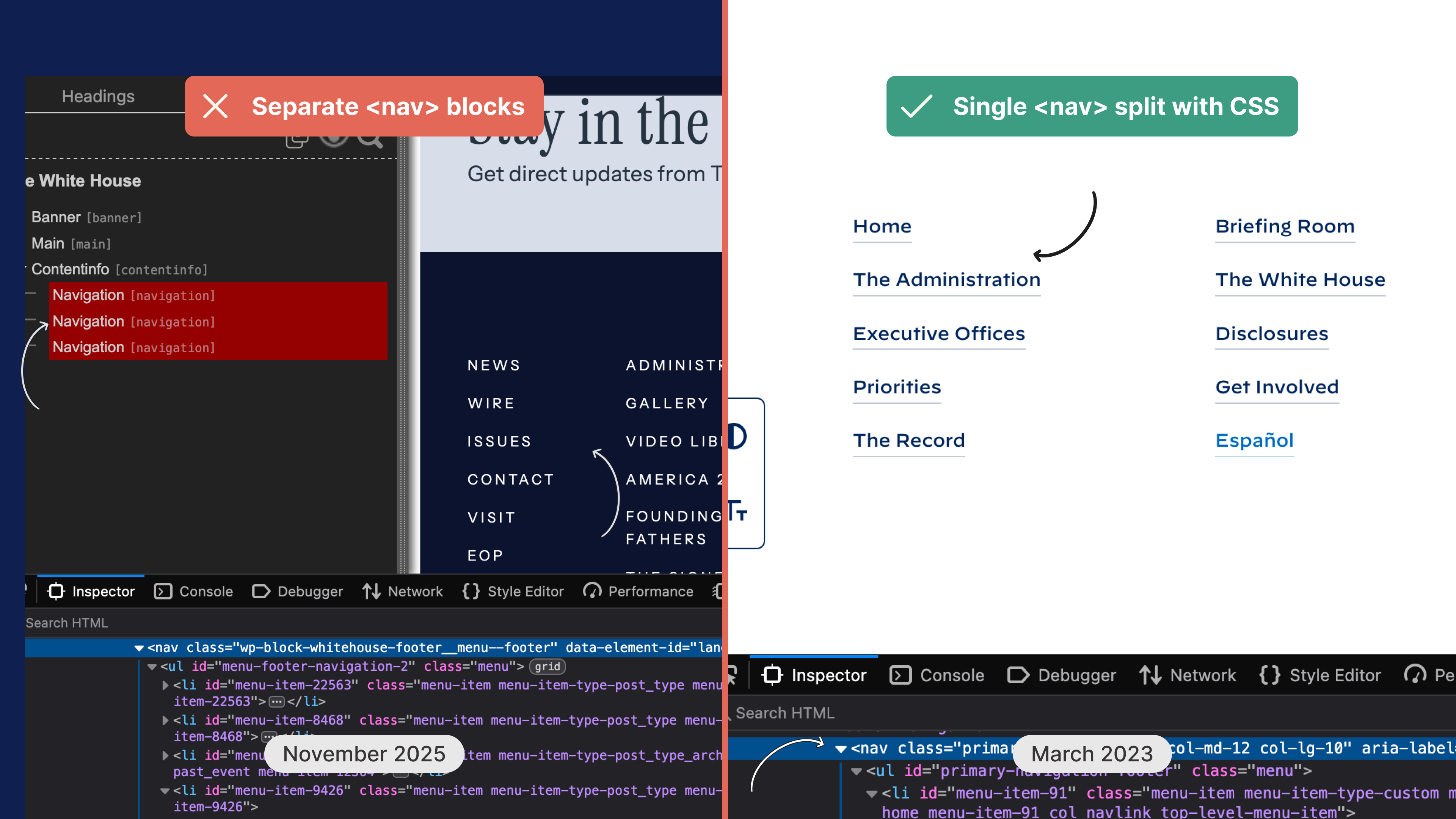
1.3.1. Info and Relationships: use code to reinforce relationships and information conveyed through presentation
Trump’s team is having a real problem with hierarchy, which unsurprisingly reflects on the White House website as well. Several pages, including Home and the newly added Media Offenders, are missing the <h1> tag, using second level headings instead. “Stay in the know” and “Subscribe to the White House newsletter” ended up tucked under “Videos”: Trump’s IT folks clearly wanted these to be visually smaller, but forgot that numbers in heading tags are meant to represent content structure, not styling options. Once again, the March 2023 version represents the proper use of headings for conveying relations between sections.

WC3: A semantic Web allows data to be shared and reused across applications, enterprises, and communities.
Clearly, Trump’s order was to leave no stone unturned: otherwise, how could anyone explain the sudden disappearance of all semantic HTML elements and the spread of generic <div> tags? The significance of self-descriptive elements, such as <section> and <aside>, is lost on the new IT team that chooses unorganised lists (<ul>) to display recent articles, adds loading lazy attribute twice to the same image, and adds a mysterious non-existent rel=”follow” to some internal links.
A quick run of an online HTML linter found 85 errors in the source code of the new Home page against 0 errors in its old version (don’t forget to remove the Wayback Machine’s code first).
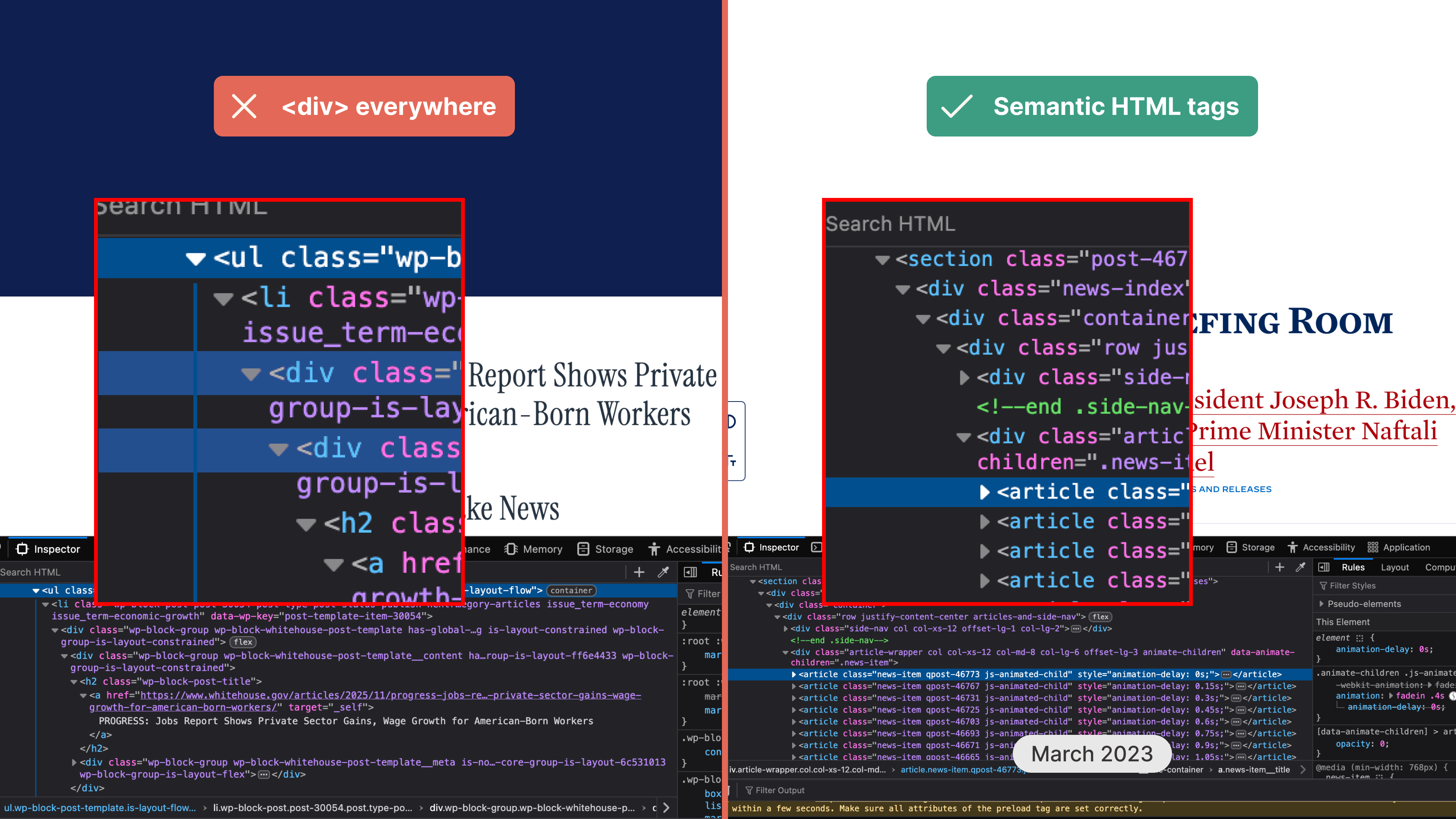
1.1.1. Non-text Content: create a text alternative for visual and auditory content
As the disgusting cherry on top, the new White House website with its shiny galleries, brand-new media pages, and visual-heavy aesthetics terribly misuses the alt text attribute, forgetting its purpose and at times, neglecting it completely. If the previous administration’s tech personnel cared about providing meaningful descriptions to featured photographs, the new IT slaps the page title in its place and calls it a day.
To illustrate the point, take two images and fetch their alternative text descriptions. The front page photograph from March 2023 is described as “President Biden and Vice President Harris speak to each other while wearing masks and blue suits”, helping the viewer grasp the essence of the photo without seeing it. Trump’s gallery post, on the other hand, repeats the same text (which in most cases, happens to be the title of the page) over and over, missing the chance to let the viewer bask in fabulous descriptions of the president’s glory.
, repeated several times in a grid. On the left, the text replacing the image reads: "President Biden and Vice-president Harris speak to each other while wearing masks and blue suits"")
A famous modern proverb known commonly as the Hanlon’s razor half-jokingly states: “never attribute to malice that which is adequately explained by stupidity”.
Trump himself certainly doesn’t know anything about technology: no one would expect a guy claiming that magnets are a mystery to be able to even comprehend how websites work. It should not be the president’s job to manage a web page, although Trump clearly has a say in what gets posted, added, or removed.
It is the president’s job, however, to ensure that the top jobs are done by competent and experienced people, who in turn, recruit other competent and experienced people, and so on and so forth.

The White House website is merely a symptom of a wider systemic problem: the problem of incompetence, ignorance, and lack of care. Trump’s team couldn’t be bothered to look for web specialists who would go the extra mile ensuring everything was up to standard because standards no longer matter. These people do not think about semantic HTML, focus states, and alternative text descriptions because they are not building this website for the people: they are building it to satisfy their able-bodied bosses. Obviously, the White House website is not managed by Trump himself, but it does capture the true spirit of his presidency.
Unfortunately for us, the White House website is certainly not going to be the last victim of the new American administration’s war against quality. The removal of the Accessibility Statement and the subsequent degradation of the website send a strong message to all government agencies, media giants, social platforms, and digital corporations. The new White House website rolled out the same year the European Accessibility Act came into effect: as the EU turns to enforcing the standards, the new American administration openly dismisses its role in championing global accessibility.
Who knows what mayhem will follow.
No posts
Comments
Nothing yet. Say the first thing.
Sign in to join the conversation.