
Over the past few articles, we’ve looked closely at South Australia, which has become one of the clearest real-world examples of what a high-renewables power system looks like. The state now sees remarkably low wholesale prices in the middle of the day when solar is abundant, and at times remarkably high prices in the early evening when that solar fades and the system has to rebalance quickly. It is a striking picture: cheap power when the sun is shining, expensive power when the sun goes down, and a grid that is visibly changing in front of us.
That raises the obvious next question. If South Australia can produce so much very cheap electricity for part of the day, what does that actually mean for the price people pay? And since the rest of the National Electricity Market is moving in much the same direction — more rooftop solar, more utility solar, more wind, more batteries, and more stress on evening supply and on the transmission system — what does the South Australian experience tell us about electricity prices more broadly across eastern Australia?
The answer is that wholesale prices and household bills are connected, but they are not the same thing. Wholesale prices are what electricity trades for in the market, region by region, every five minutes. Retail prices are the bills households receive after wholesale costs are combined with network charges, environmental scheme costs, hedging, retail operating costs and margin. So the fact that wholesale prices can be extraordinarily low at noon does not automatically mean household bills will be low as well.
That is why it helps to step back and look at the longer sweep of the data. The wholesale charts show a market that has become more volatile, more seasonal and more shaped by renewable output. The retail charts tell a different but equally important story: what households actually experience after all the other pieces of the electricity system have been added in.
Retail bills fold in far more than the five-minute spot price. In the AER’s 2025–26 default-offer framework, wholesale costs make up roughly 33% to 41% of the bill, network charges about 33% to 48%, and environmental costs about 3% to 4%. Retailers also hedge heavily, because households are billed on relatively stable tariffs even though wholesale prices can swing violently from one interval to the next.
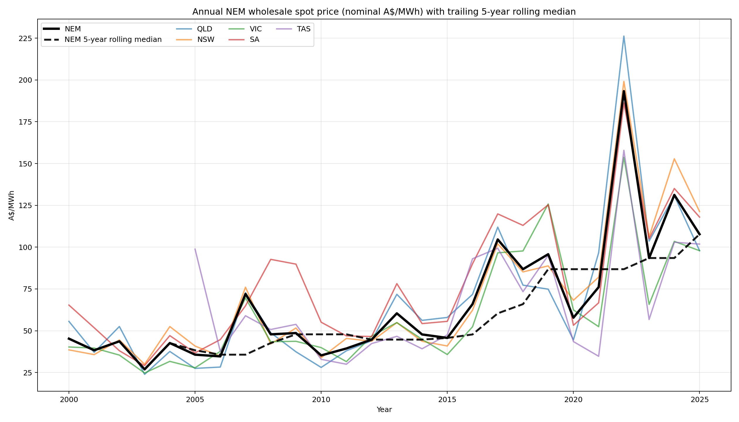
The wholesale story over the past 25 years is dramatic - nominal prices:
And taking inflation into account:
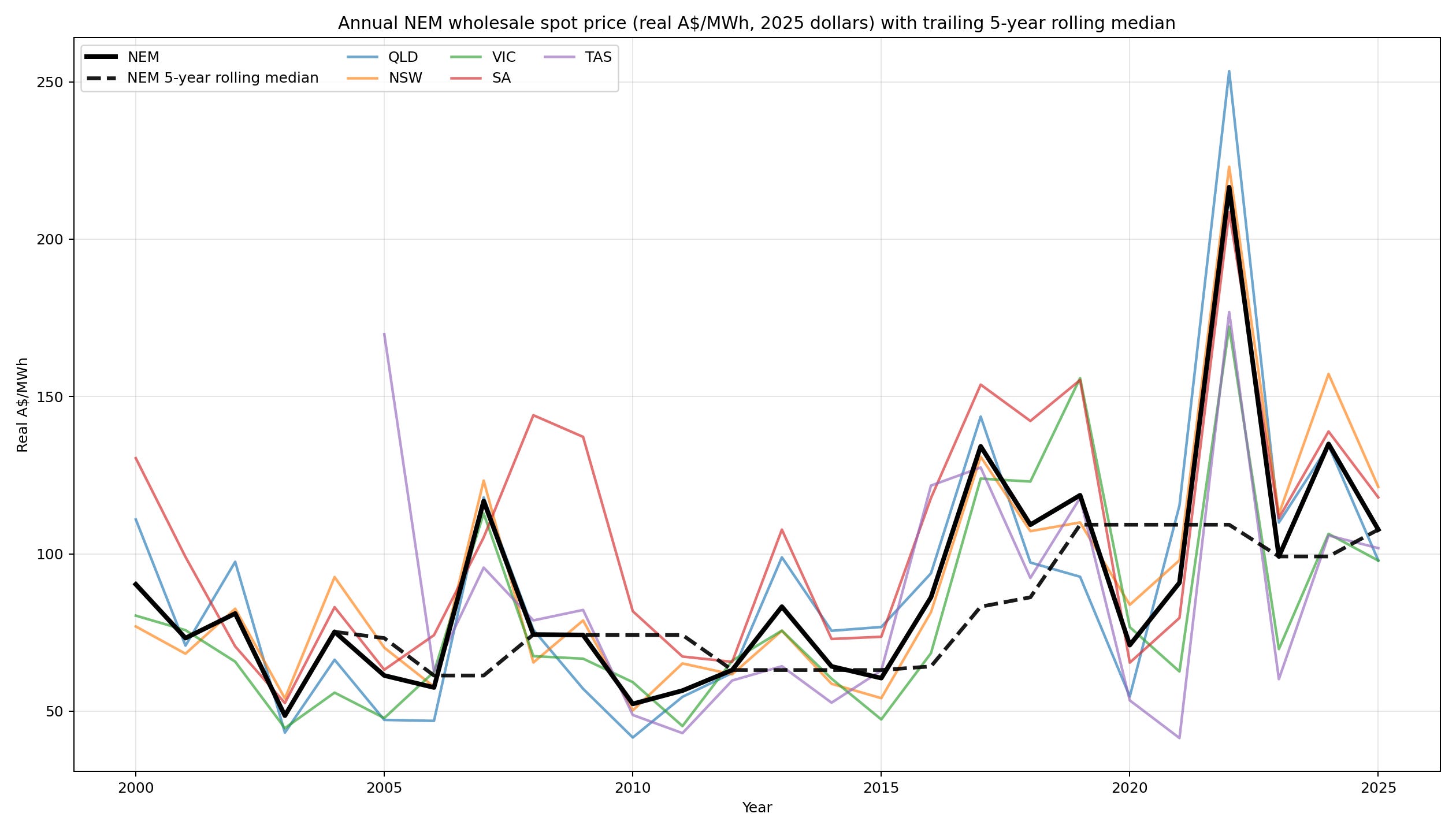
Prices were volatile in the 2000s, surged at times in the late 2010s, then blew out in the energy crisis of 2022. The AER says prices in the NEM fell from those unprecedented highs as fuel prices eased and renewable generation increased, but remained above pre-2022 levels and still showed significant volatility.
Then came a sharp easing late in 2025. AEMO says wholesale electricity prices across the NEM averaged $50/MWh in Q4 2025, down $39/MWh, or 44%, from Q4 2024 and down $37/MWh, or 43%, from Q3 2025. It also says the contribution from prices above $300/MWh dropped to just $3/MWh of the quarterly NEM average, down from $17/MWh a year earlier.
Why did wholesale fall so hard? Because the grid got more renewable and more flexible. AEMO says renewables including storage supplied 51.0% of NEM energy in Q4 2025, the first quarter above 50%. Wind output was up, solar was up, and batteries mattered most when prices usually bite: during the 4 pm to 8 pm evening peak, battery discharge was marginal in 25% of pricing intervals, displacing gas and hydro. That combination lowered both ordinary energy prices and the number of extreme price spikes.
But that is only half the story, and South Australia sits right in the middle of the other half. AEMO says transmission constraints and interconnector limits helped drive record occurrences of zero and negative prices in South Australia (48% of intervals) and Victoria (43%) in Q4 2025. In other words, Australia is increasingly producing very cheap electricity at some times of day, especially when solar is abundant, but not always moving it to where it is needed, when it is needed. Cheap generation does not automatically mean cheap firmed, delivered power.
And adjusted for inflation:
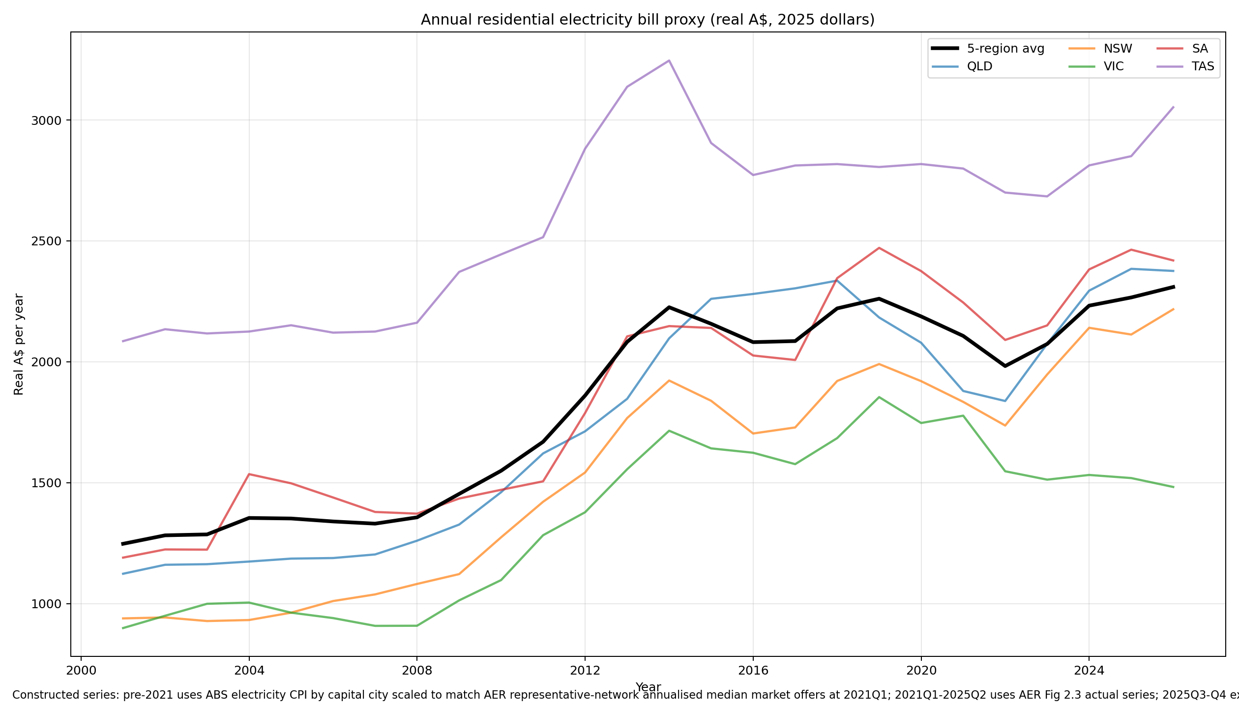
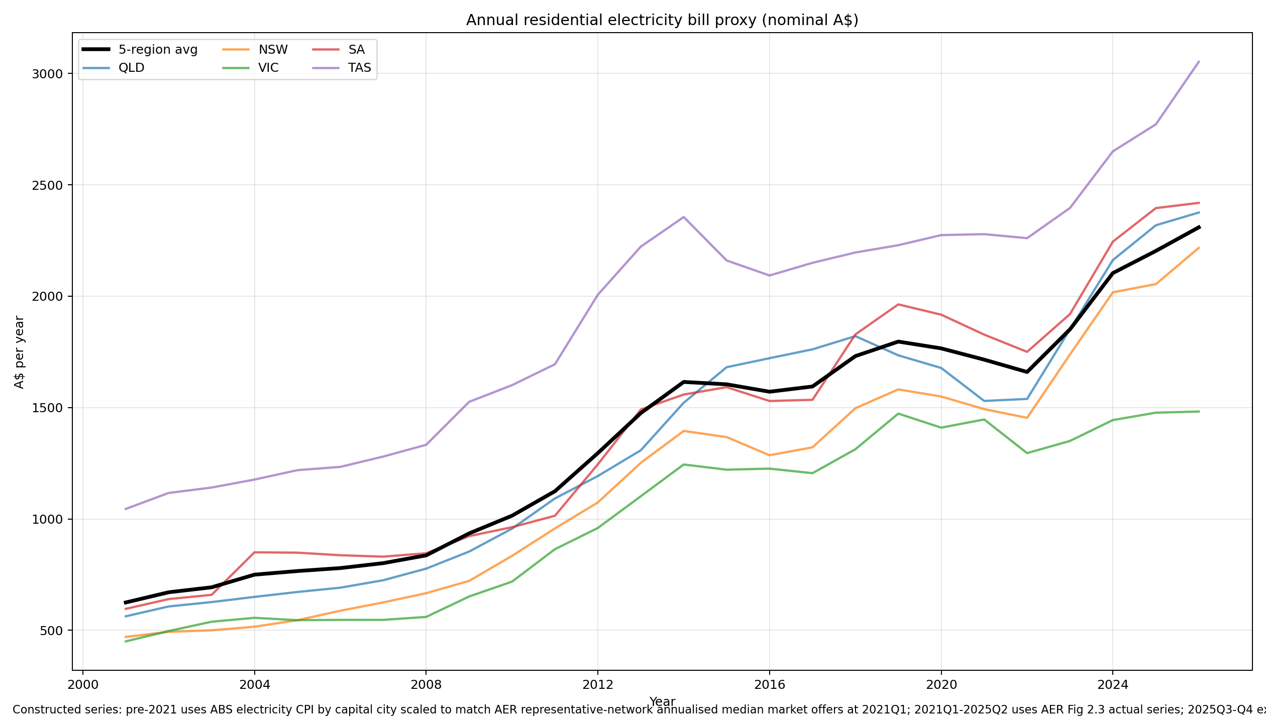
That is why retail bills can keep rising even when spot prices cool. The most useful official example is South Australia’s 2025–26 default offer. The AER says a South Australian residential customer without controlled load saw the safety-net price rise by $71, or 3.2%, to $2,301. But the cost stack underneath that total tells the real story: network costs fell by about $25, environmental costs fell by about $25, while wholesale costs rose by about $53 and retail costs rose by about $64.
The AER says the wholesale increase in South Australia was driven by higher contract prices and a load profile that had become peakier in the evening, raising hedging costs. It says retail costs rose because of higher operating costs and increases in bad and doubtful debt and smart-meter costs. That is the key point: bills do not follow the spot market quarter by quarter; they follow hedged costs, network charges and retail overheads as well.
The retail charts tell the public story more directly than the wholesale charts alone. What households feel is not the elegance of a falling midday wholesale price, but the lived cost of the full electricity system: energy, networks, risk management, retail overheads, policy charges, and the cost of keeping supply available when the easy solar hours are over.
This also matters for one of the most politically loaded claims in the energy debate: that “green certificate” costs are the main reason household bills are high. The AER’s 3% to 4% figure is real, but it is narrower than many readers may assume. In the regulator’s accounting, “environmental costs” mainly means compliance costs for schemes such as the federal Large-scale Renewable Energy Target (LRET), the Small-scale Renewable Energy Scheme (SRES), and jurisdictional schemes. The AER says most of that bucket relates to complying with the LRET and SRES. It is not a measure of every cost associated with the energy transition.
For South Australia’s 2025–26 default offer, that environmental line is $72 on a $2,301 annual residential bill — about 3.1% of the total. By contrast, the wholesale line is $859 and the network line is $897. So the AER is not saying that renewables or the transition only affect bills by 3% to 4%; it is saying that this specific policy-compliance bucket is 3% to 4% within the DMO cost stack.
That distinction matters, because broader transition-related costs often sit elsewhere. The AER says network charges cover the efficient costs of building and operating electricity networks, and those charges make up roughly a third to almost half of DMO 7 prices. So if readers are thinking about shared transmission, interconnectors, resilience spending, or the cost of adapting the grid to a different generation mix, much of that is more likely to show up under network costs rather than under the environmental line. In its South Australian DMO summary, the AER explicitly points to resilience spending, consumer energy resource integration, safety, cybersecurity, and network revenue decisions as important drivers inside that broader network bucket.
And in South Australia specifically, the latest bill increase was not driven by that environmental bucket anyway. The AER says environmental costs fell across all South Australian customer classes in 2025–26, mainly because federal and state renewable scheme costs fell. For residential customers without controlled load, that environmental component fell by 26% year on year.
There is one caveat to the retail proxy. ABS electricity CPI in 2024–26 was heavily distorted by government rebates. The ABS says electricity prices were up 37% over the year to February 2026 including rebate effects, but only 5% excluding those rebates. So the proxy is best read as a long-run picture of trend, scale and relative movement, not as a precise measure of what happened to actual out-of-pocket bills in each recent quarter.
The practical conclusion is not that electricity has become cheap. The longer-run charts suggest the opposite: even after the recent easing, wholesale prices in real terms remain well above where they stood two decades ago. What seems to be changing is not the long-run fact of higher prices, but the shape of the market: more hours of extraordinarily cheap electricity, especially around midday, coexisting with periods of intense scarcity and very high prices in the evening.
That is why South Australia matters so much. It is showing, earlier and more clearly than most other regions, what a solar-heavy system looks like in practice. It can produce astonishingly low prices when renewable output is strong, but that does not automatically translate into cheap electricity across the whole day, let alone across the whole household bill.
So the hopeful case is narrower, and more conditional, than a simple claim that renewables are making electricity cheap. It is that wholesale prices may finally be starting to soften at the right times and in the right conditions — when wind, solar and batteries are plentiful — even though the long-run trend remains higher than it used to be. Whether that becomes a durable fall in average delivered prices is still an open question.
Residential bills will only come down clearly and persistently if those wholesale savings are large enough, frequent enough and stable enough to feed through hedge books, if network costs stop adding upward pressure, and if retail competition passes more of the benefit through to households. And even then, some of the costs of a changing system will continue to sit elsewhere in the bill, especially in networks, resilience and system integration.
So the real question is no longer whether solar can make electricity very cheap in the middle of the day. We already know it can. The question is whether the whole system can turn that into lower and more stable prices over the full day, and ultimately into lower bills for households.
Wholesale price series
Wholesale electricity prices in this chart are based on the official National Electricity Market regional spot prices published by AEMO. I use AEMO’s regional price-and-demand data to calculate demand-weighted annual averages for each NEM region; the same kind of annual and quarterly volume-weighted regional price series is also published by the AER using AEMO data. In that sense the wholesale series is market-observed and directly verifiable, not a constructed estimate.
Retail price series
Retail electricity prices are harder to show as one long-run series because the official bill data are recent and area-specific rather than a single published 2000–2025 household-bill series. AER retail-bill estimates are built from offers observed in different pricing areas and are not directly comparable across all areas because they depend on local average consumption; ACCC bill estimates also depend on benchmark consumption and offer data. For the long-run chart, the retail line is therefore a constructed proxy: recent AER bill estimates are used as anchors and earlier history is extended with ABS capital-city electricity CPI (Sydney, Melbourne, Brisbane, Adelaide and Hobart as proxies). It is useful for trend and scale, but not as an exact measure of any one household’s bill.
Comments
Nothing yet. Say the first thing.
Sign in to join the conversation.