
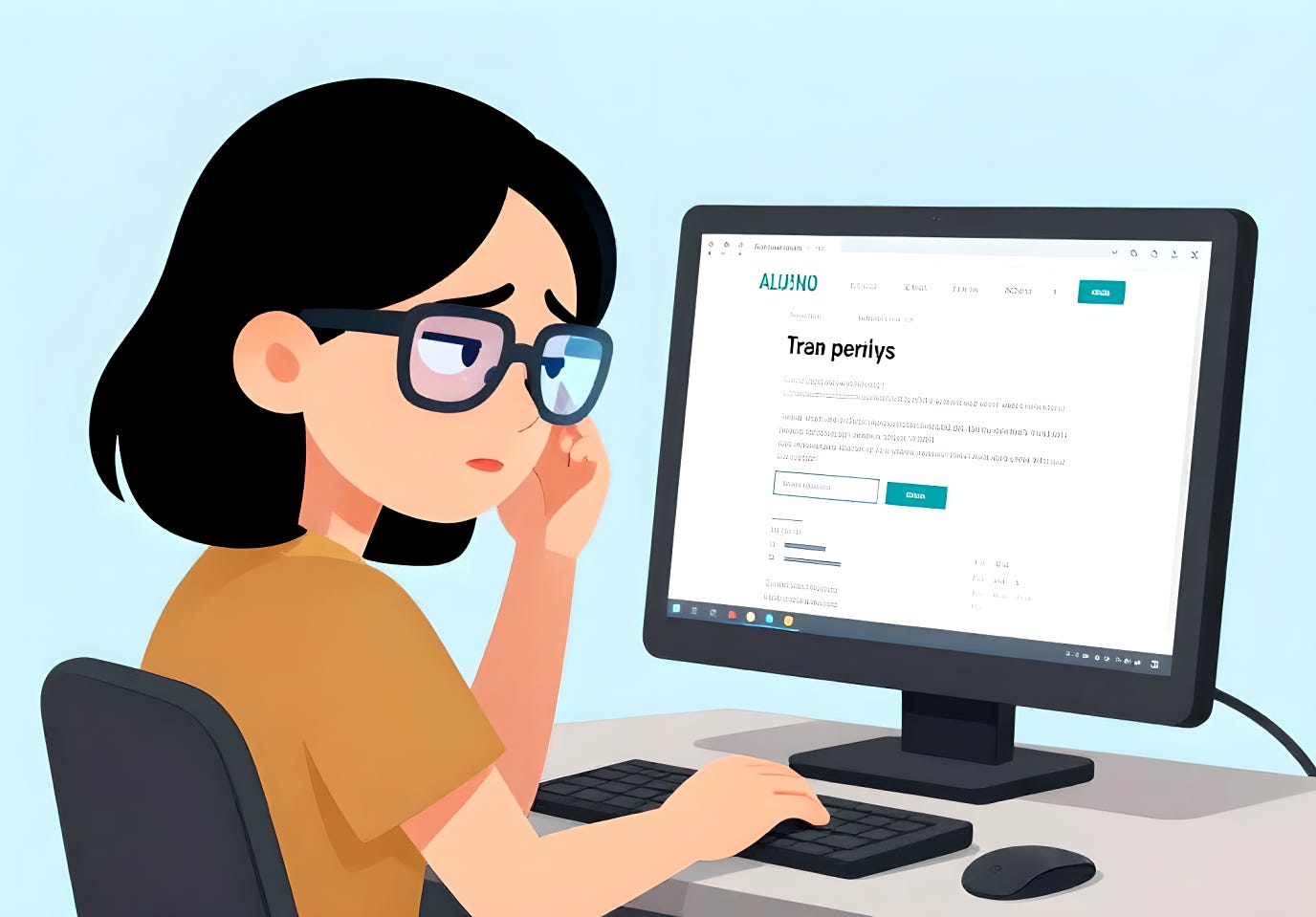
Aging comes with surprises no one warns you about. One day you’re cruising along, the next you’re squinting at your computer like it’s a supernova and wondering when the color white became an act of aggression.
To listen to this post, please click on the Play button below:
0:00
-3:08
I’ve discovered a pet peeve that isn’t really a peeve at all—it’s a genuine obstacle in my daily life. It’s white. More specifically, white computer screens and bright sunlight. After decades of working on computers eight hours a day, my eyes were already well‑trained to endure glare, but aging has a way of rewriting the rules. Add cataract surgery and skin cancer surgery into the mix, and suddenly the world feels a lot brighter than it used to be, and not in the poetic sense.
Driving into sunlight has become nearly impossible for me, even with sunglasses. It’s like staring into a spotlight. And computer screens? The majority of websites insist on blinding white backgrounds that feel like someone pointed a flashlight directly at my retinas. Even when I turn on dark mode, those cheerful white pages still pop up like little landmines of glare. I’ve added blue‑light filters to my devices, but they only soften the blow—they don’t solve it. I also use the special glasses to cut glare.
What surprises me is how unnecessary this all feels. A website doesn’t need to be stark white to look clean or modern. A light tan, pale yellow, soft cream—any of these would dramatically reduce the glare without sacrificing readability or design. Those subtle shifts make a world of difference for people like me, whose eyes simply can’t handle the brightness anymore.
Even my own websites are usually tamed to a soft pastel color, but I’ve noticed that although my screen here on Substack is a pale blue, it doesn’t transmit that color to everyone who reads it. Are you seeing a blue or white background as you read this?
I wish more companies and designers would consider this. Accessibility isn’t just about screen readers or font size. Sometimes it’s as simple as choosing a background color that doesn’t feel like staring into the sun. A little warmth in the palette could go a long way toward making the digital world more comfortable for those of us who are light‑sensitive, aging, or recovering from eye surgeries.
Until then, I’ll keep squinting my way through the internet, hoping for a future where “easy on the eyes” is more than a figure of speech.
I’d love to hear from others who deal with light sensitivity, post‑surgery eye changes, or just plain dislike the blinding white trend online. Does bright white bother you too? Have you found tricks, tools, or settings that help? Or maybe you have your own unexpected sensory nemesis. Share your thoughts or experiences—I’m genuinely curious how others navigate this overly illuminated world.
Thanks for reading Rene’s Substack! This post is public so feel free to share it.
No posts
Comments
Nothing yet. Say the first thing.
Sign in to join the conversation.