
The Greenwich was already doing almost everything right. The food was thoughtful, the cocktails were confident, and the restaurant had built a loyal following in RiNo. The problem was that the branding hadn’t caught up to any of it.
The original identity leaned hard into New York, with posters, skyline references, and city cues covering the space. It made the concept obvious, but it also flattened it into something closer to a caricature than a restaurant. It read casual, when everything happening at the table was anything but. The job was to bring the brand in line with the restaurant itself: to give it the presence and confidence the food and service already had, without losing the ease that made people want to come back.
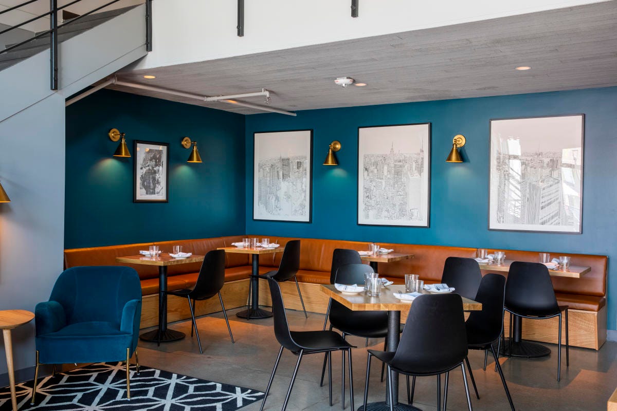
The Greenwich is lively, polished, and easy to come back to. It has a clear emotional center: warm, social, full of the kind of energy that makes dinner feel like the beginning of the night rather than the end of it.
The name gave us a natural starting point, and since Italian-American culture is already woven into New York’s fabric, we didn’t need to force the reference. We needed to refine it. So we looked past the obvious and toward the texture underneath it: vintage menus, matchbooks, imported Italian packaging, old advertisements, everyday ephemera. Not to copy a place that already existed, but to find something that felt familiar, social, and full of character on its own terms.
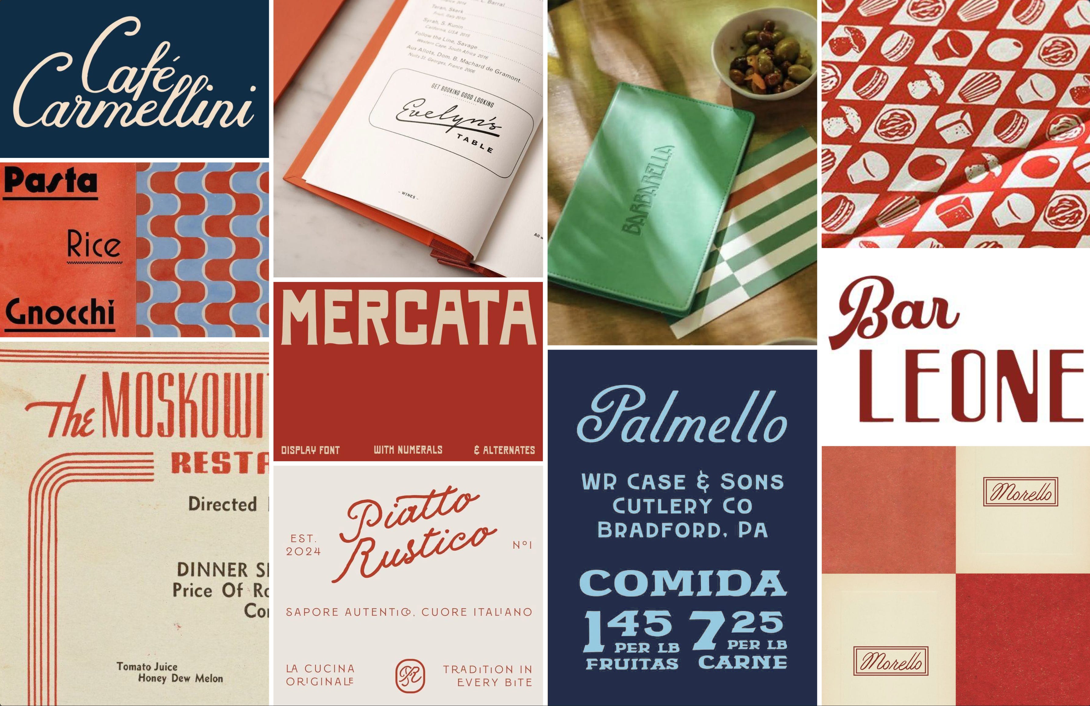
The central decision was to close the gap between the quality of the experience and the way the brand presented itself. The Greenwich was already a place for birthdays, dinner with friends, cocktails before a night out, and regular nights that still felt special, but the branding read more casual than the food, bar program, and service actually were. It needed more presence, not more noise.
We wanted the identity to feel like it had always been there: established, confident, rooted in RiNo, while still carrying the spirit of New York. The goal was to draw in a younger, more energetic neighborhood crowd without pushing out the loyal base that already loved it. It had to feel special and still feel like yours.
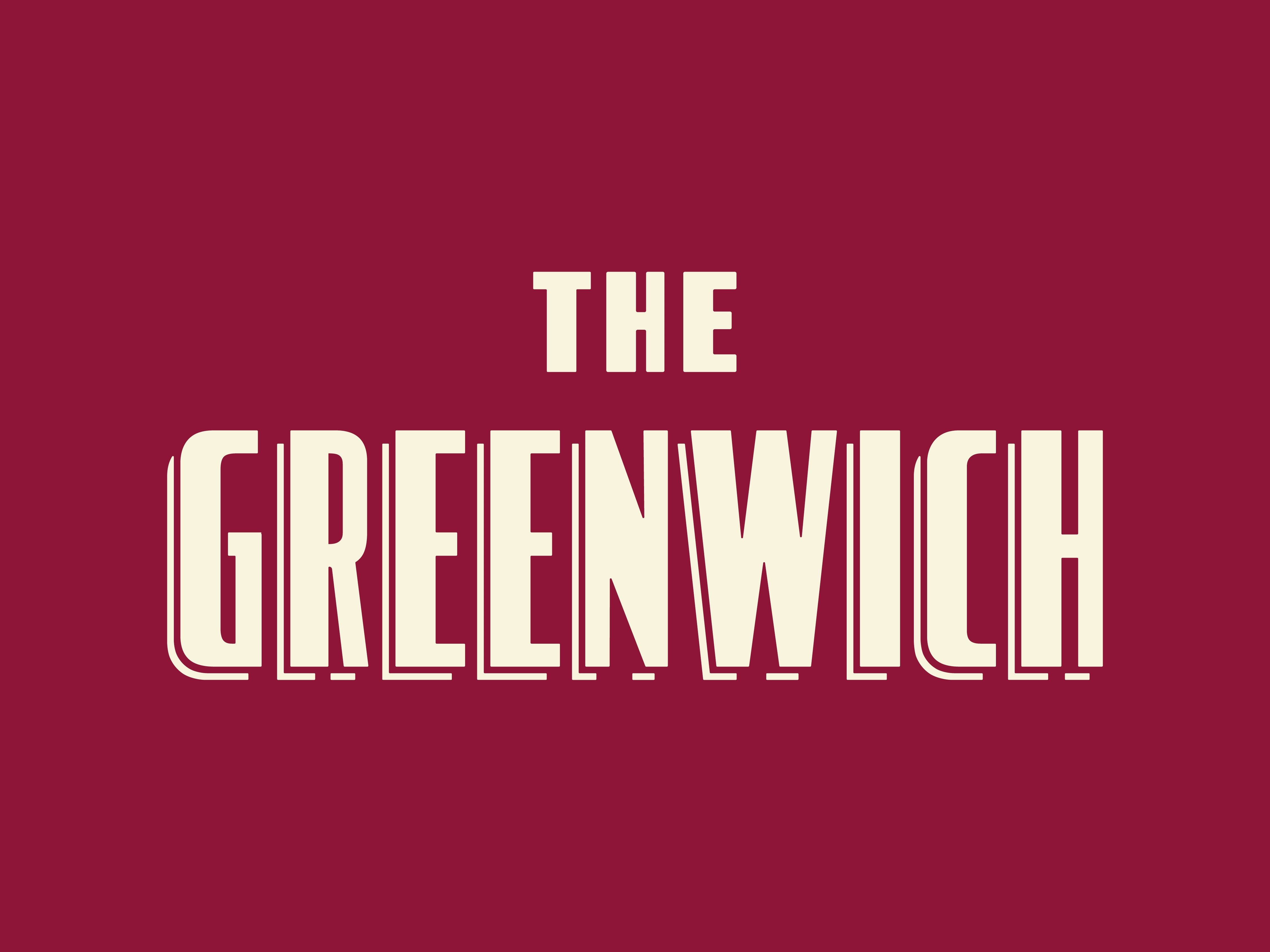
The system is built from familiar pieces, sharpened into something distinct. Typography does a lot of the heavy lifting, carrying the confidence of a classic Italian restaurant with enough graphic personality to feel fresh in Denver. The lettering is sturdy, recognizable, and a little theatrical, which gave the brand immediate presence across menus, signage, and merch.
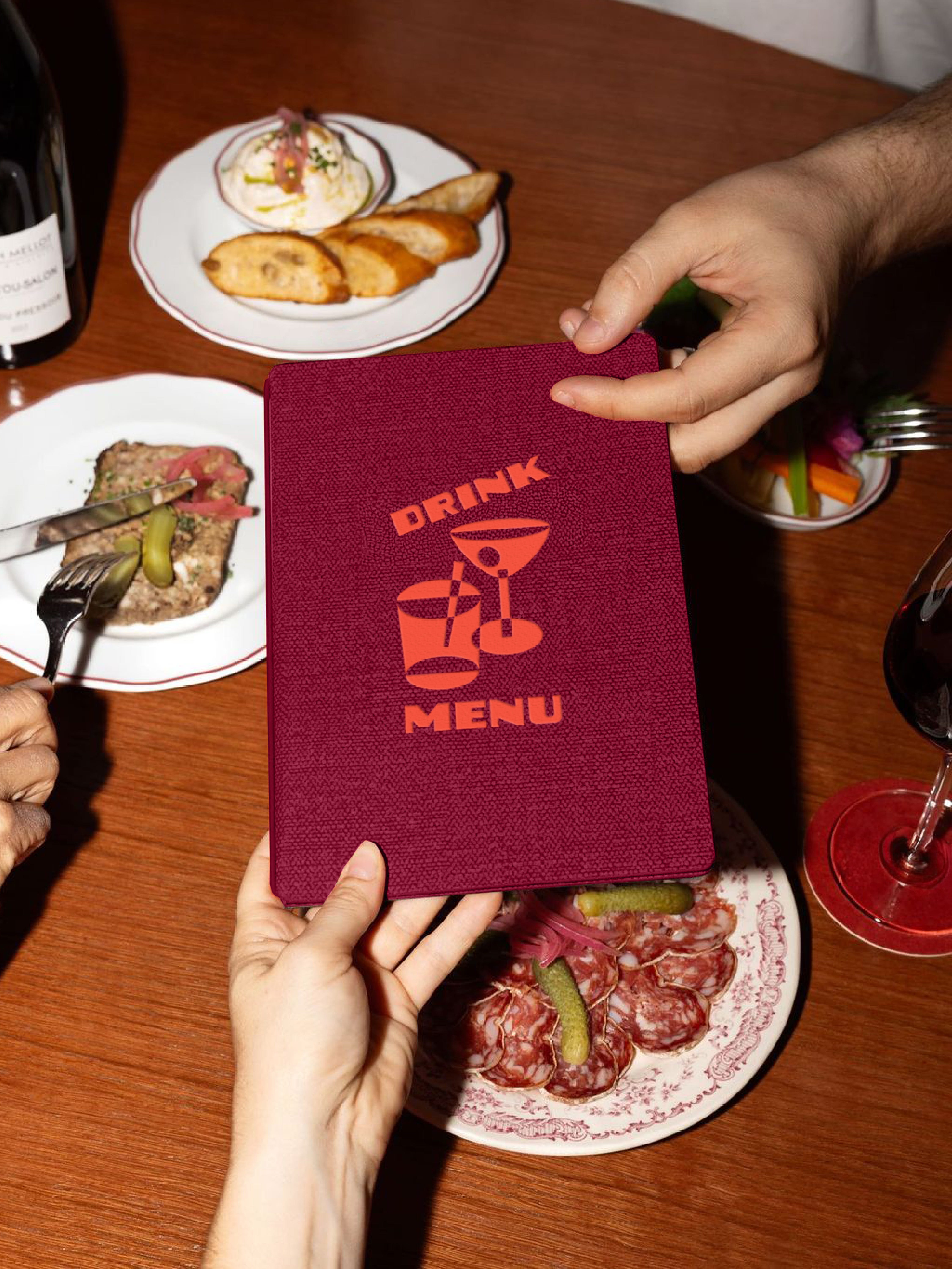
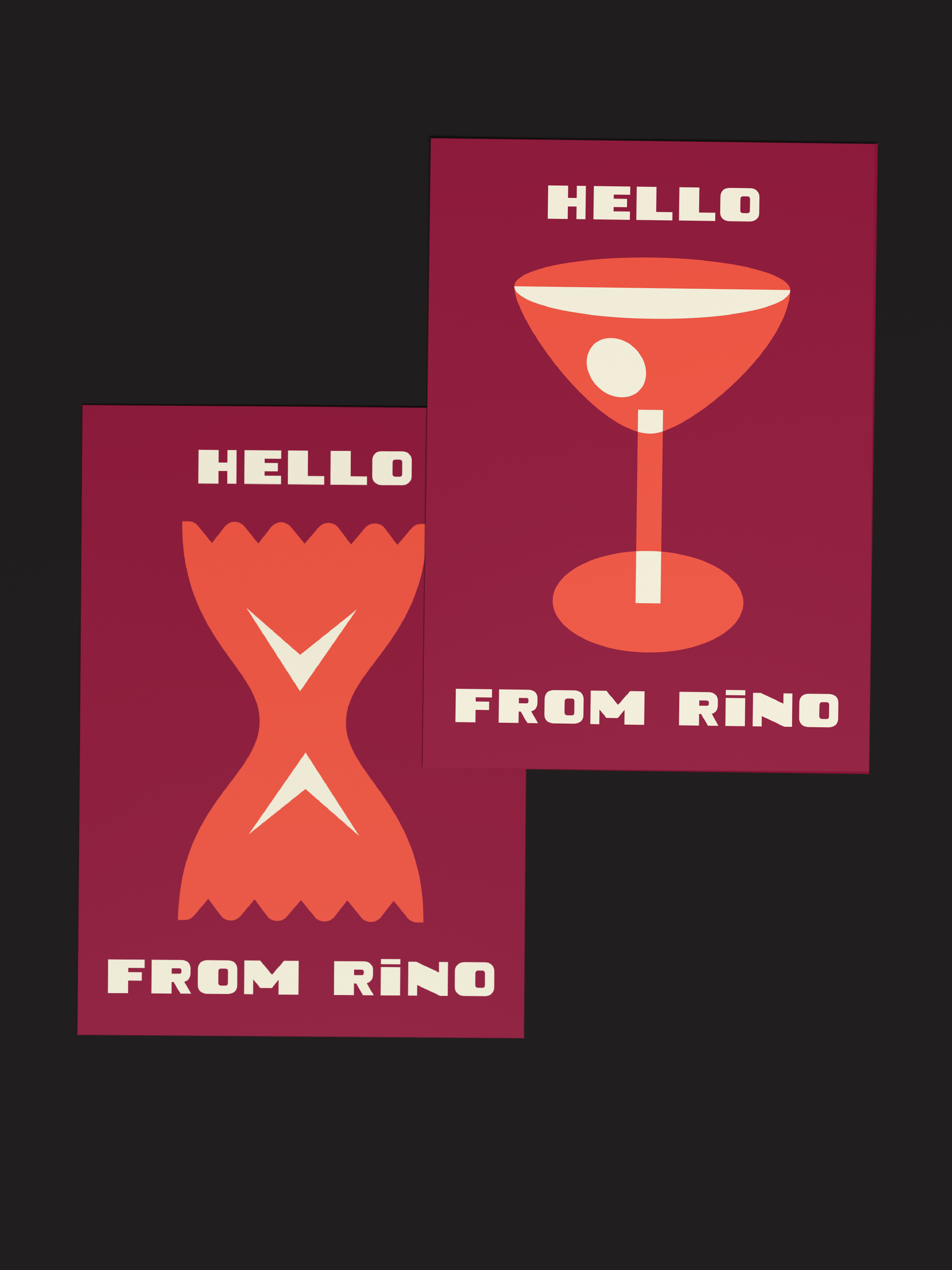
Color was the surprise. We initially avoided red, wary of tipping into the expected red sauce restaurant lane, until we landed on a deeper burgundy paired with a warm orange. Those hues gave the brand richness and energy without the cliché. The illustrations brought the looseness: simple geometric forms that add movement to the system and give the brand something expressive to use on menus, pos
tcards, and social posts, a reminder that this is still a place to have fun.
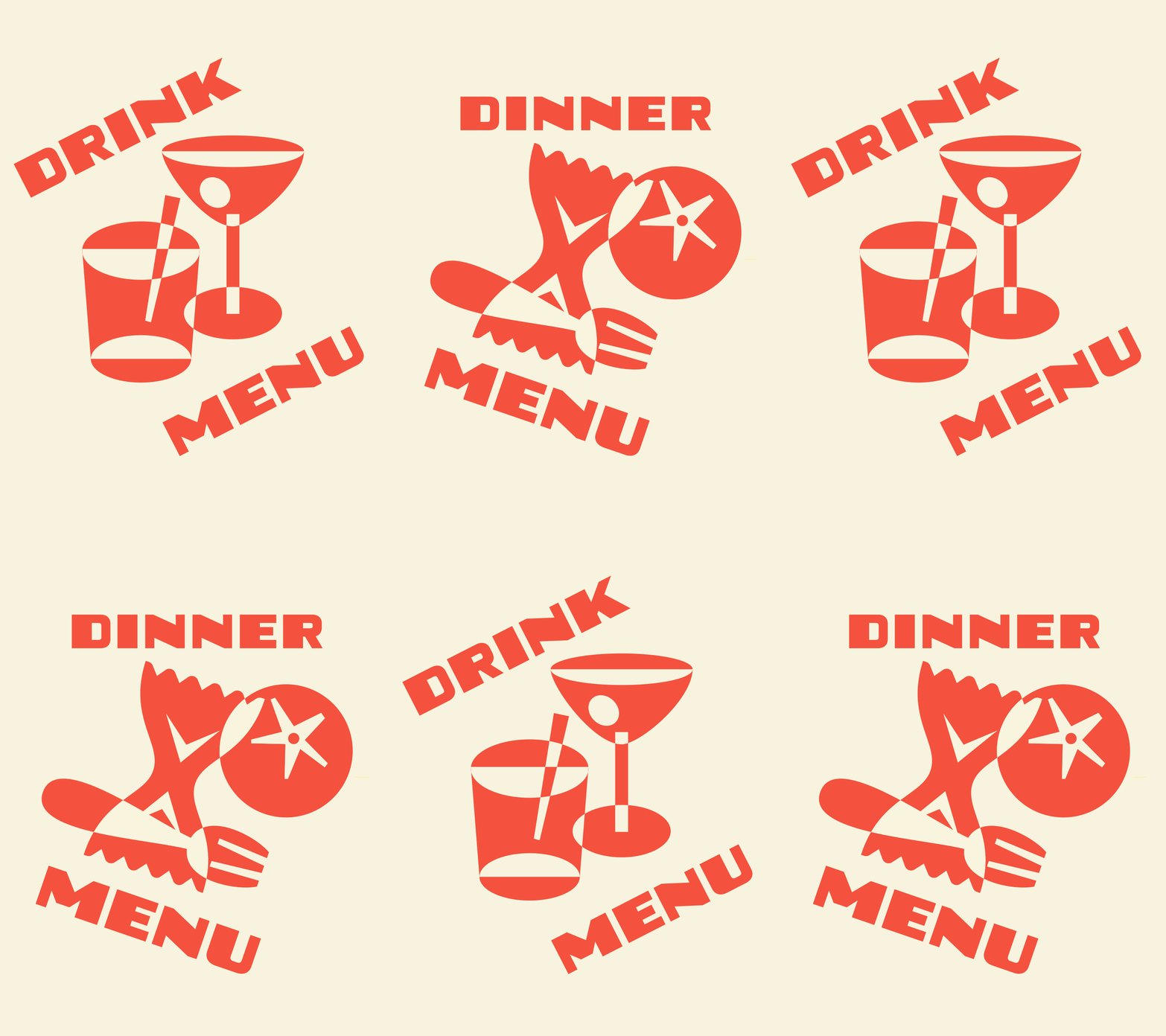
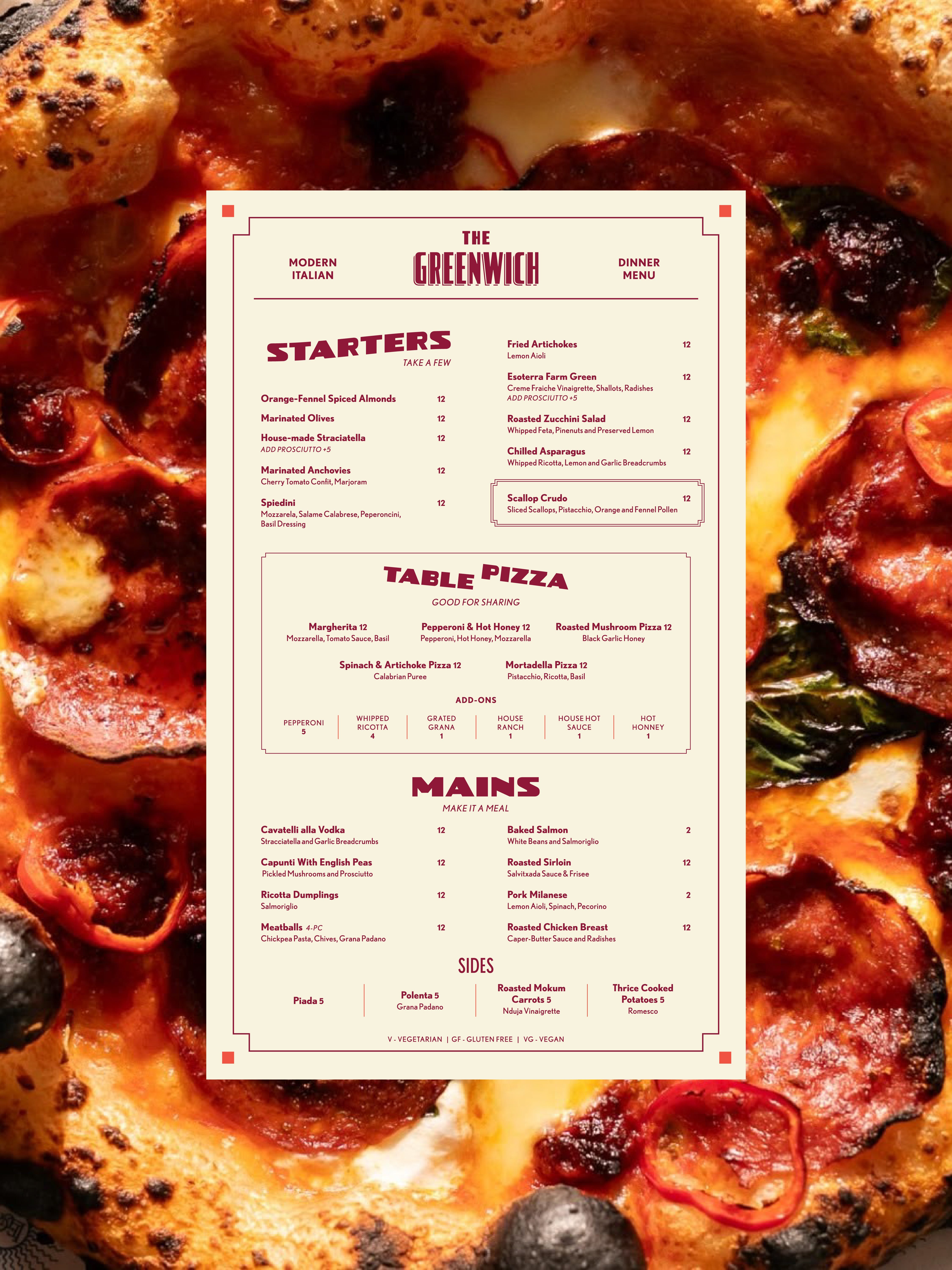
The identity comes through in the details people actually touch. The menu feels structured and generous without becoming precious. The cocktail pages have rhythm. The postcards feel like something you’d pick up and keep. Matchbooks, signage, aprons, and social graphics all carry the same sense of confidence, but each one has its own little spark. Nothing is trying too hard. Everything is doing its job.
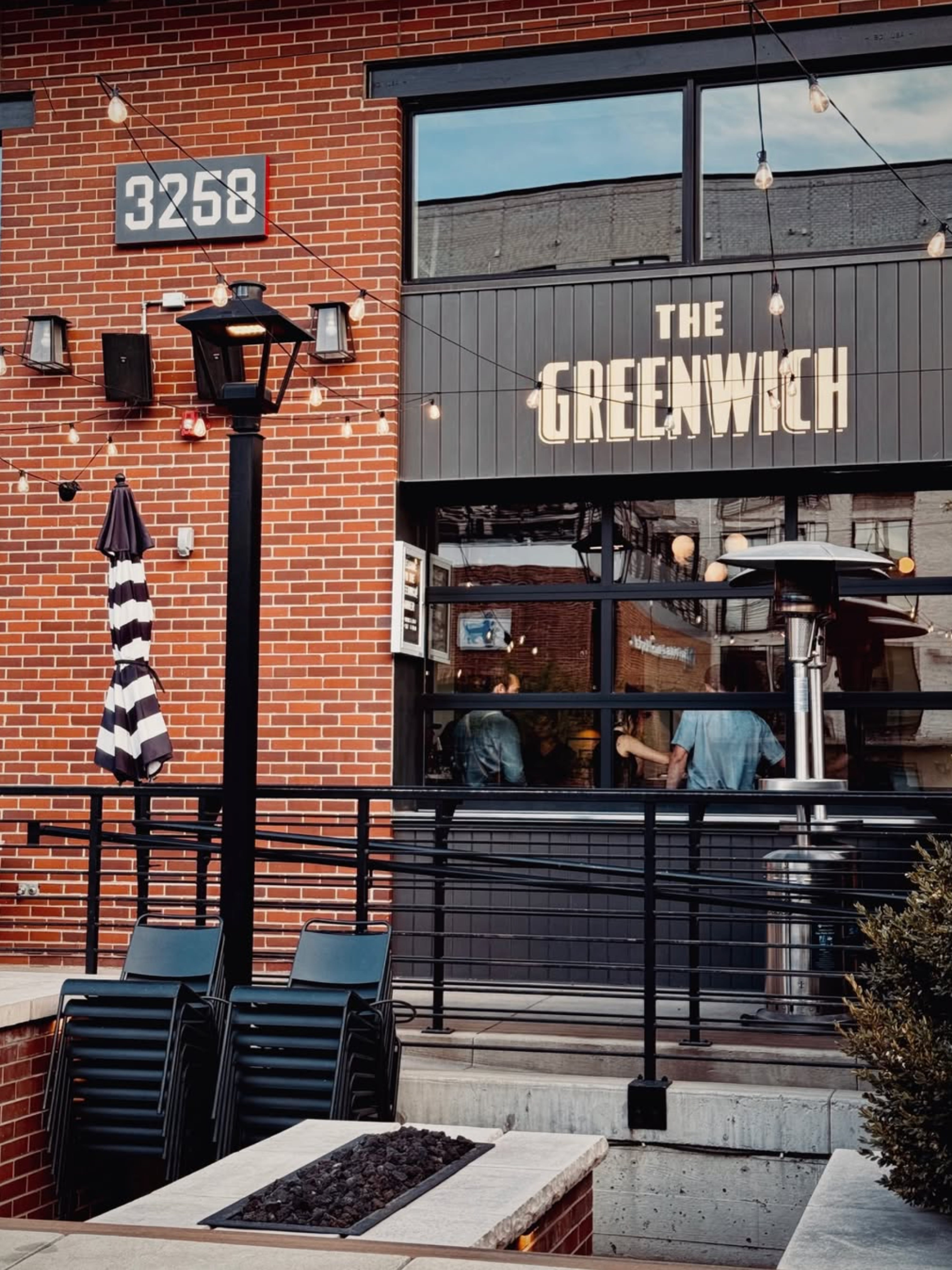
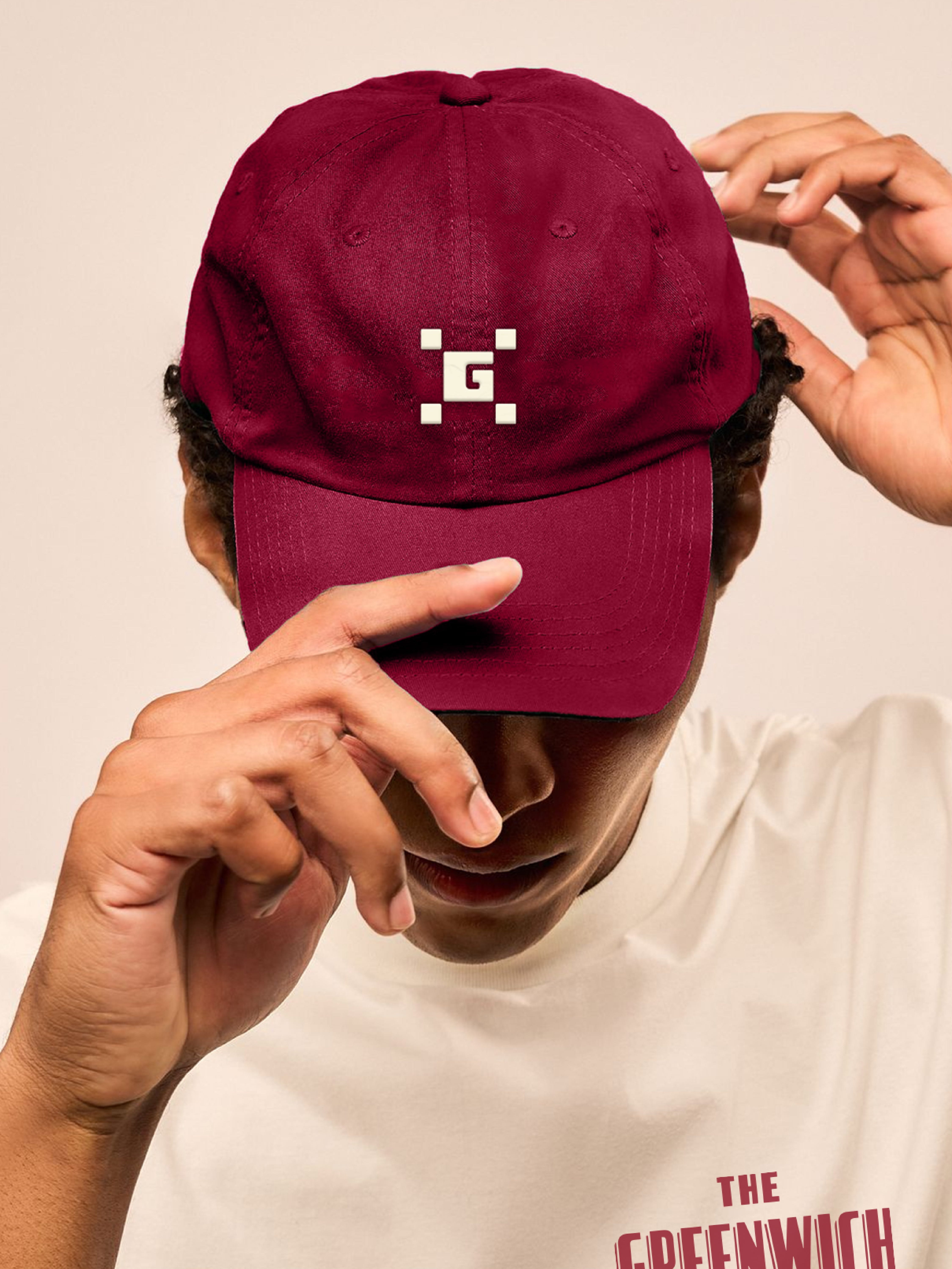
The strongest restaurant identities don’t rely on novelty. They feel like they belong. For The Greenwich, that meant holding New York nostalgia, RiNo energy, and the quality of the restaurant in one clear visual language, familiar but not predictable, polished but not precious. A good night out, in good hands.
No posts
Comments
Nothing yet. Say the first thing.
Sign in to join the conversation.