
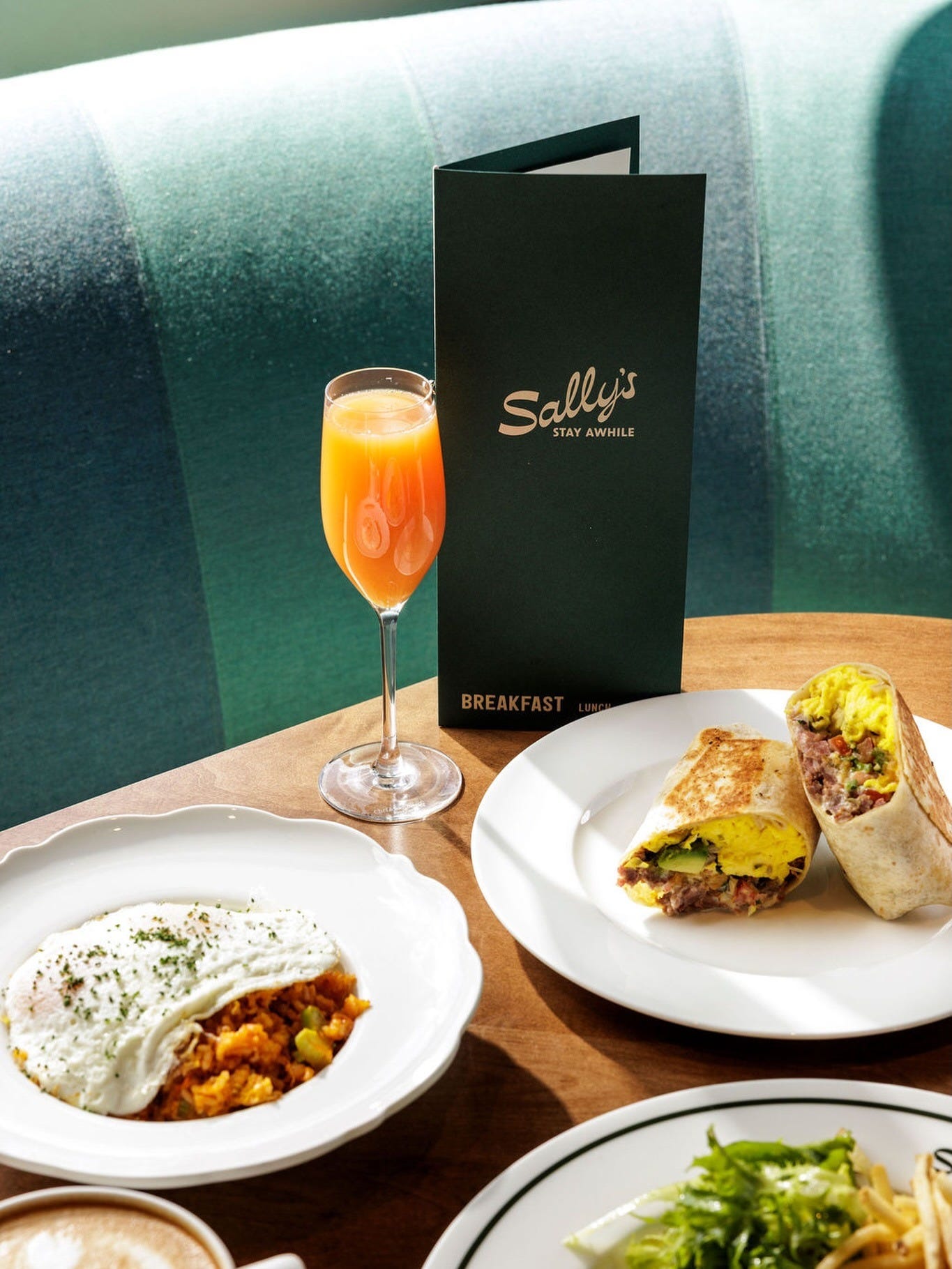
Before a server introduces themselves, before the bread arrives, before the first drink is ordered, a guest picks up the menu. It's the first object the restaurant puts in their hands. Most operators think about what's on it. Very few think about what it is.
The menu as a designed object carries information that has nothing to do with what’s printed on it. Its weight tells you whether the restaurant thinks this is a destination or a transaction. Its format — tableside bound versus single laminated sheet versus printed fresh daily — tells you how the kitchen thinks about itself. Whether the cover is the same material as the interior, whether the spine is sewn or stapled, whether it opens flat or fights you: all of this communicates before a single price is read.
We have worked on enough restaurant projects to know that the menu object is where brand strategy either lands or evaporates. A beautifully designed mark above the bar means nothing if the menu it refers to feels like it was produced at a copy shop. The guest doesn’t register the inconsistency consciously. They register it as a feeling — something slightly off, something that makes the whole experience feel less considered than the price point suggested.
What operators are actually deciding when they decide what kind of menu to make is how they think about the guest relationship. A menu that is heavy, tactile, designed to be held — that decision is a claim about value. It says: you are here for a while, this is worth your attention, we made something for you to hold. A QR code says something different — not necessarily worse, but different — and the restaurants that use them well know exactly what they’re trading and what they’re gaining.
The laminated menu is the tell we return to most often. It is a practical decision — easy to wipe down, doesn’t need to be reprinted when a dish 86es — and it carries the logic of the back of house applied to the front. Which is not always wrong. A diner that has been operating for forty years with laminated menus is coherent. The problem is when a restaurant with $180 covers and a design-forward dining room uses one because nobody stopped to think about it. The menu didn’t get designed. It got produced.
When we begin a project, the menu is one of the first objects we pull apart — not to redesign it immediately, but to understand what the operator already believes about their guest. The size they defaulted to, the format they chose, what they kept from a previous iteration and what they changed: all of it is diagnostic.
The menu is also where we watch brand systems break down in real conditions. A typeface that works on a sign at two hundred points becomes illegible at nine. A color palette that reads beautifully in a brand presentation loses its relationship to itself when reproduced across different paper stocks and print runs. The menu is the proof of concept for everything else. If it can hold the brand at that scale and in those conditions, the rest of the system follows. If it can’t, that’s where we find out.
There is a reason we start here and not with the mark, the sign, or the website. Those are things guests see. The menu is something they hold. The gap between seen and held is larger than most operators account for.
A brand that works in the hand works everywhere. Build the menu right, and the rest of the system has something to prove itself against. Get it wrong, and no amount of considered typography above the bar closes that gap.
No posts
Comments
Nothing yet. Say the first thing.
Sign in to join the conversation.