
Advertising was de rigeur in the 1960s. The work of Doyle Dane Bernbach (e.g., the VW campaign) captured the spirit of the times, when commercial art and pop art blended into one big, happy ethos. Art directors like Helmut Krone and George Lois luxuriated in the excitement coursing through the industry.
This is the era I was “born into," when ads treated audiences as intelligent beings, delighting in a game of cat and mouse. The ads were saying, “We both know I’m an ad. If you read me, I’ll make it worth your while.”
Today’s advertising is mostly driven by complex digital programming, where ads are carefully targeted at narrow audiences instead of broad, general ones. There’s less need for charm or wit or even persuasion in today’s ads. As a result, audiences now treat advertising as transactional offers or they tune them out, aided by the invention of the mute button.
It was fun while it lasted. Here’s some of the residue from the days when print ads drove campaigns and clever concepts drove sales.
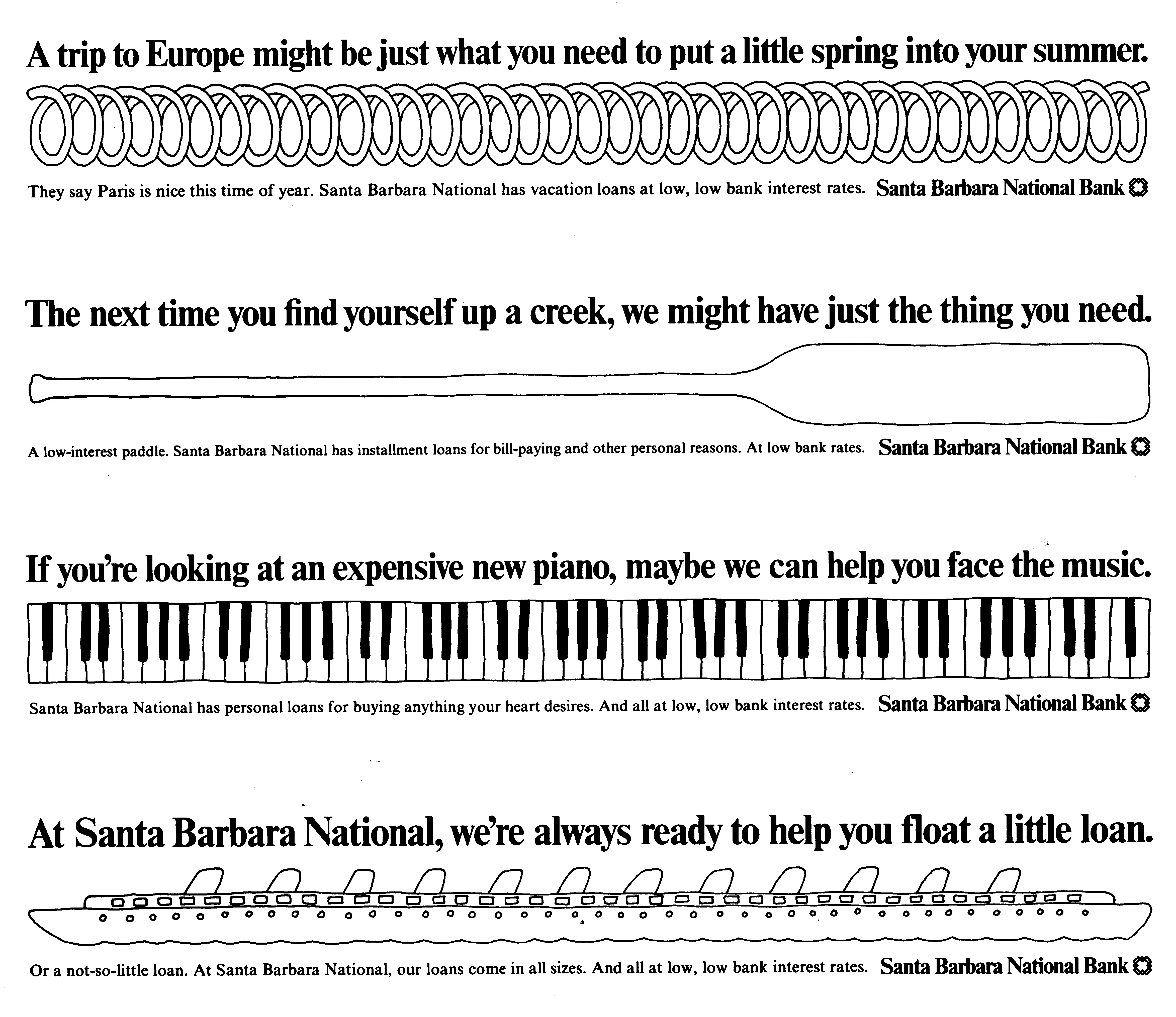
1975. For my first newspaper campaign, my brief was to replace an awkward 2x14-inch space at the bottom of the stock page with a normal-size ad elsewhere in the paper. I told the marketing manager he was giving up a golden opportunity. “Look at what you’ve got here, George. You’ve only paid for a small-space ad, but it has the whole page to itself except for a lot of gray type full of boring numbers. So here’s what we’re gonna do…” The campaign above ended up winning gold medals and putting me on the map.
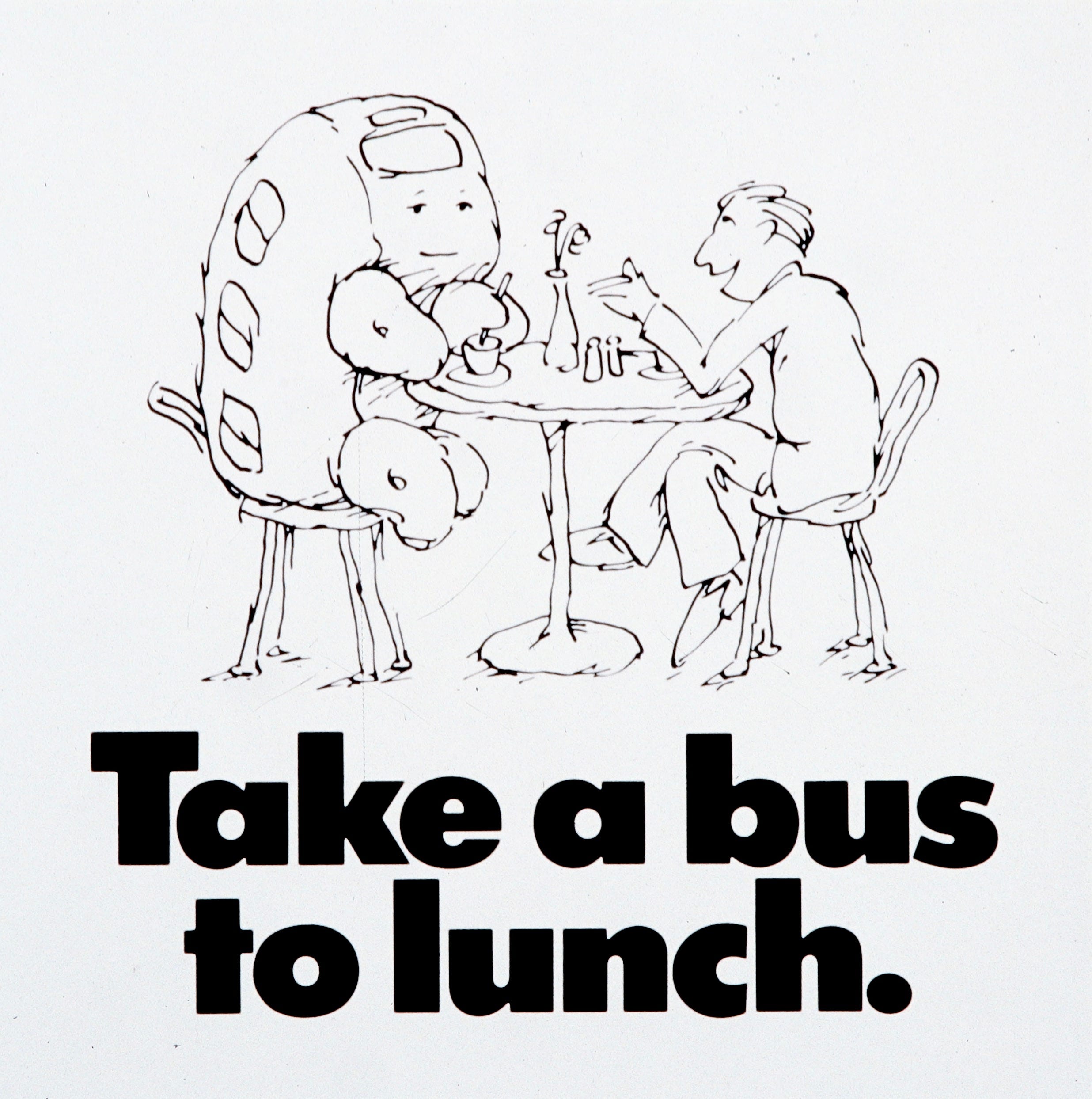
1978. This ad was the beginning of a beautiful relationship with MTD, Santa Barbara’s once-stodgy transit system. The headline for the first ad in the campaign was “Give a bus a chance,” a play on “Give peace a chance,” a slogan from the political protests of the ’60s. It showed a lonely cartoon bus sitting on the curb under the bus sign. I couldn’t find that one, but this one gives you the idea.
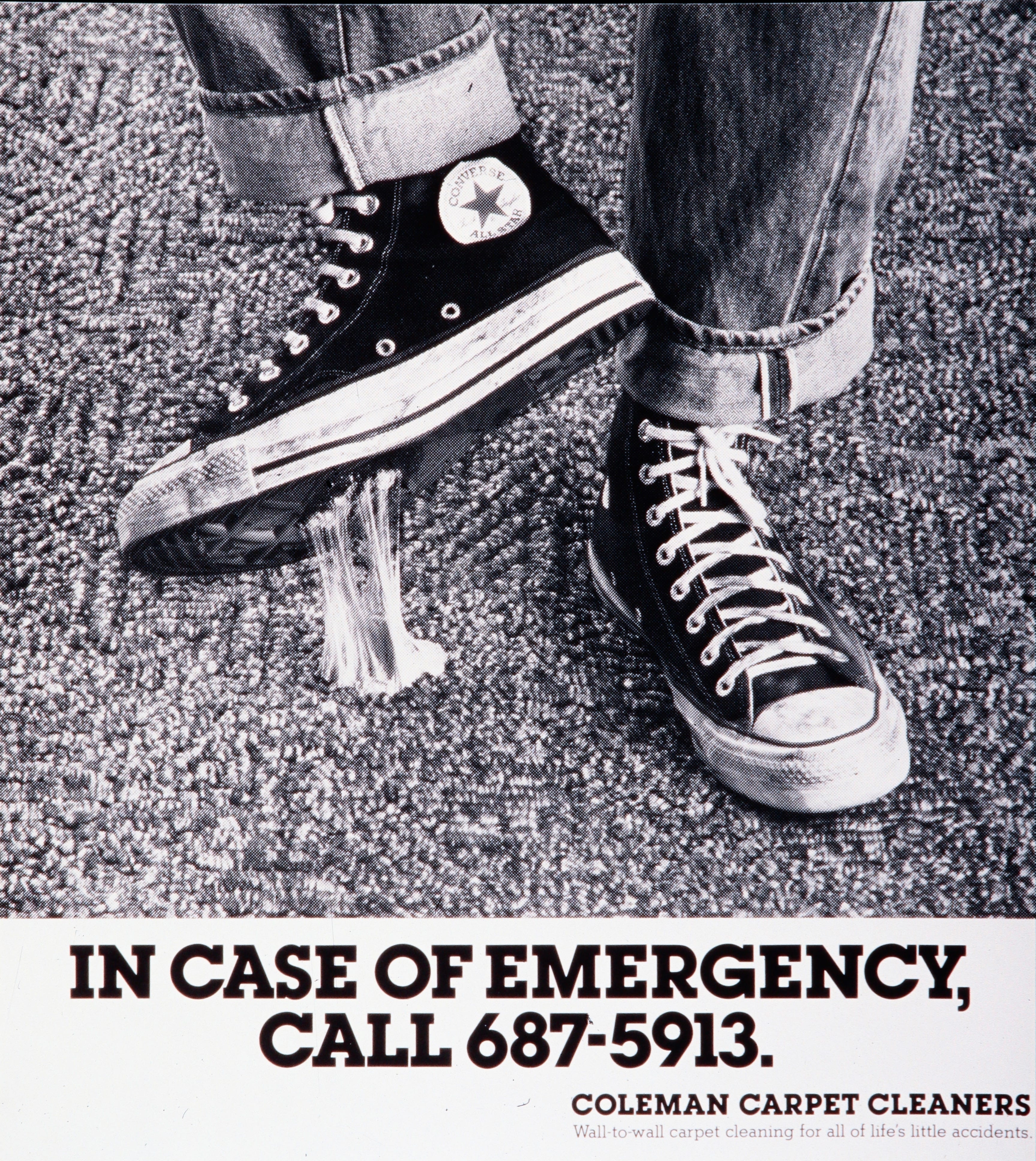
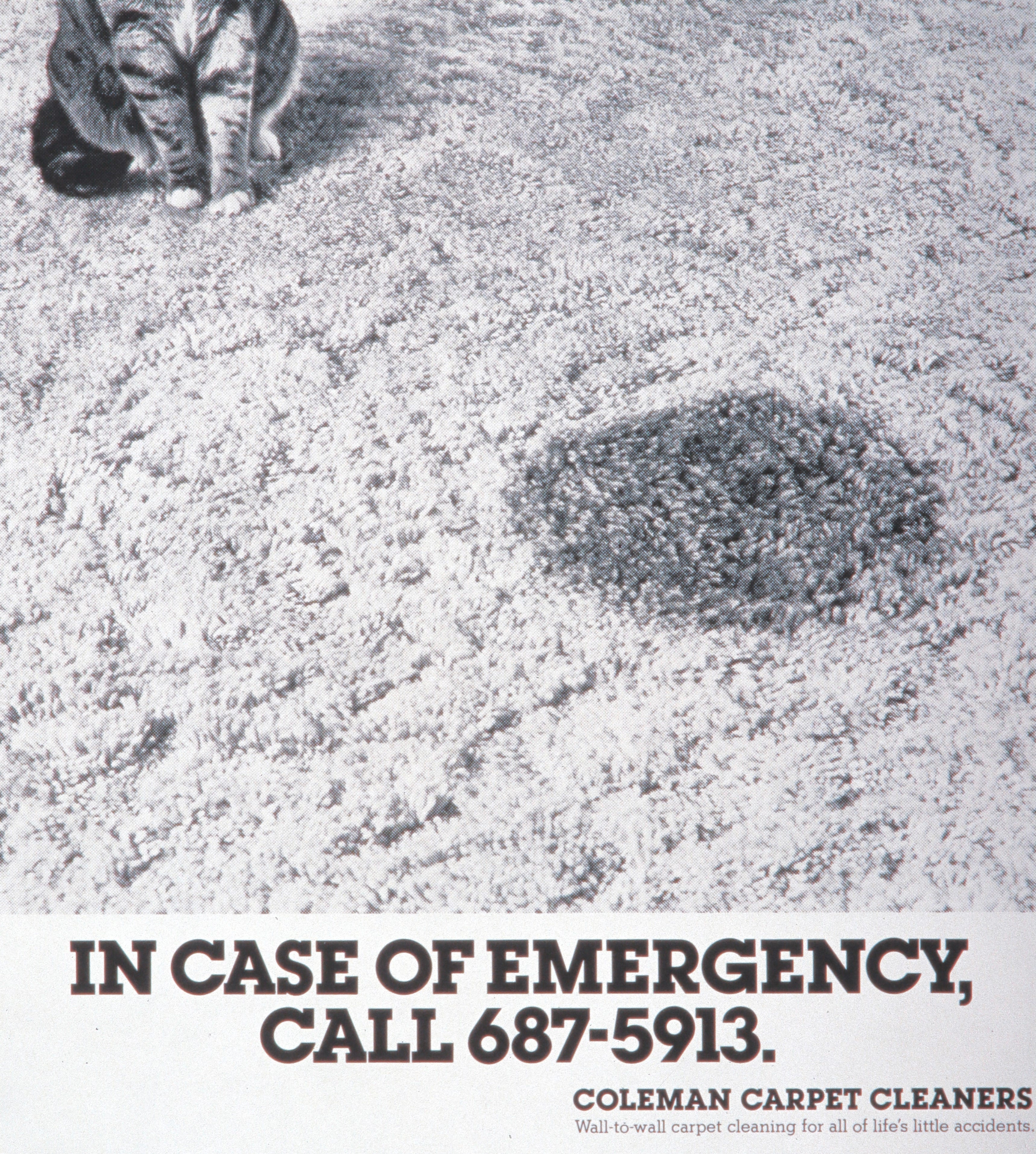
1979. Client John Coleman told me that most people call him to clean their rugs only after a bad accident—a pet stain, an overturned plate of greasy food, a wad of sticky chewing gum. We agreed that there was no reason we couldn’t have a little fun with the idea. The tagline says: “Wall-to-wall carpet cleaning for life’s little accidents.” It wasn’t long before he was the leading carpet cleaner in town.
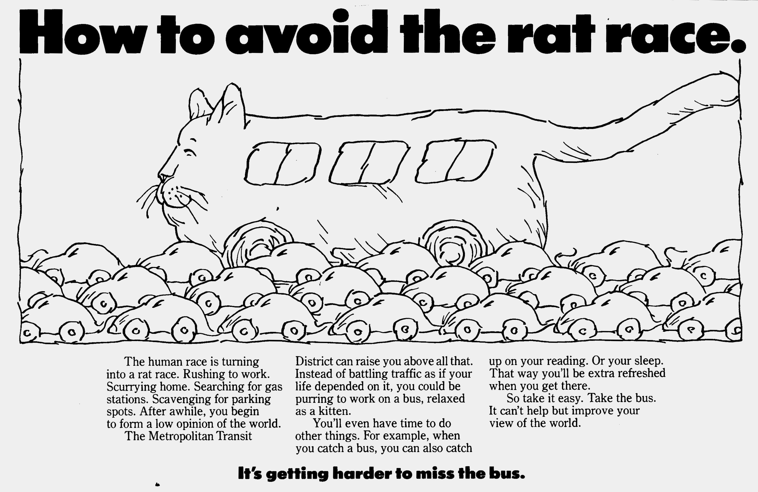
1979. Another year, another campaign for MTD. The company was able to lay on more buses and routes, so we announced the change with the tagline: “It’s getting harder to miss the bus.” We didn’t even bother with a logo, since everyone just called it the “bus” anyway. The cartoon illustrations were mine, as well as the copy. This was probably the first time I wrote more than just a few lines of an ad. I was gaining confidence.
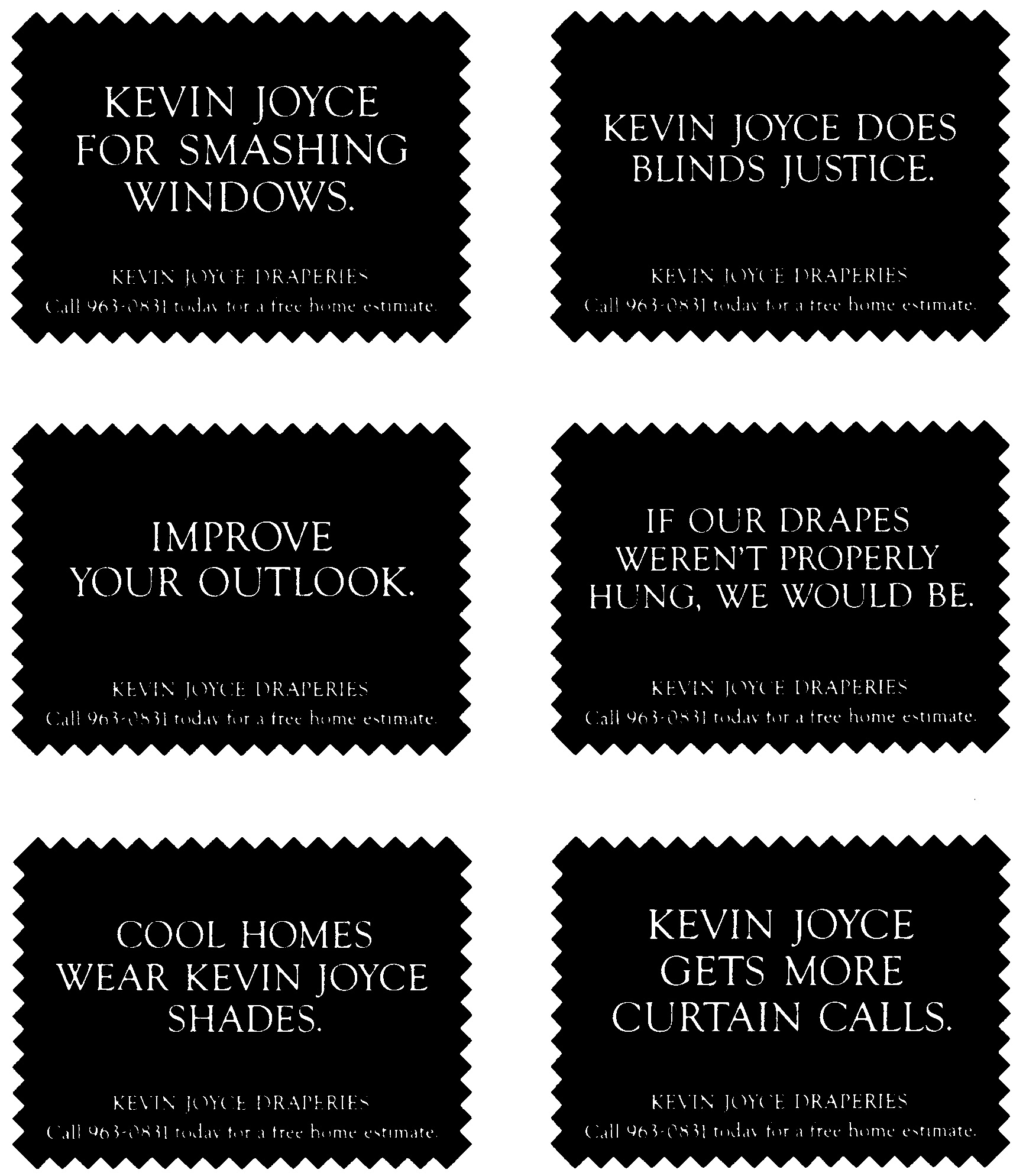
1980. Another shop owner, Kevin Joyce, asked if we (I now had an assistant) could cook up a campaign for his drapery business. He took me to the shop to show me the kind of precision he brought to his craft. This series of 2-inch ads ran several times in every issue of the newspaper, all year long, which allowed him to grow his business while raising his prices to match the quality of his work.
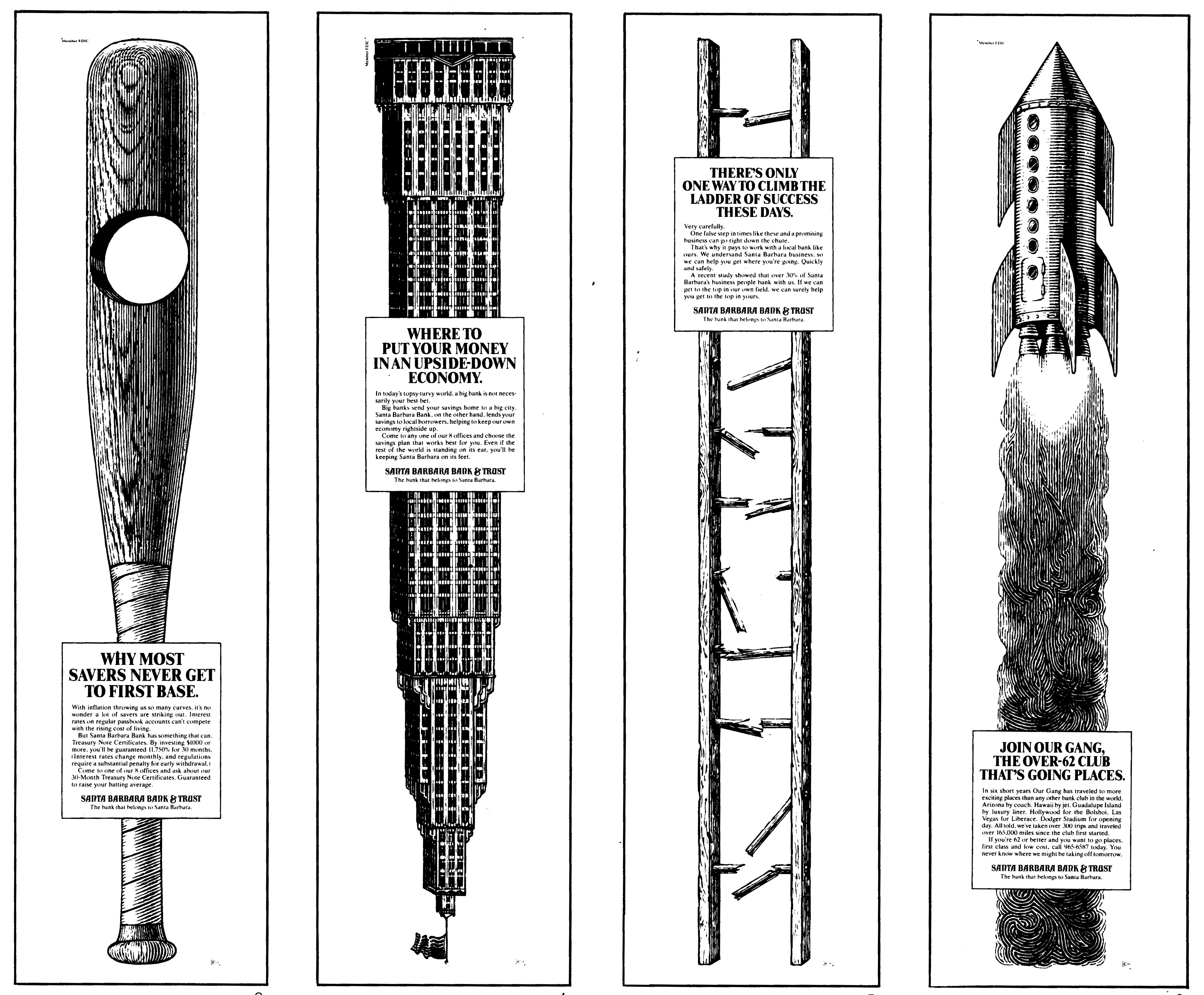
1981. Following the precedent of Santa Barbara Bank’s “long-skinny” ads, we designed a new campaign of “tall-skinny” ads—two columns wide by the full height of the paper. The design rational for using engravings was that line drawings worked extremely well in newspaper printing. AI isn’t capable (so far) of creating engravings of this charm and complexity. The illustrator was local artist James Michaelson.
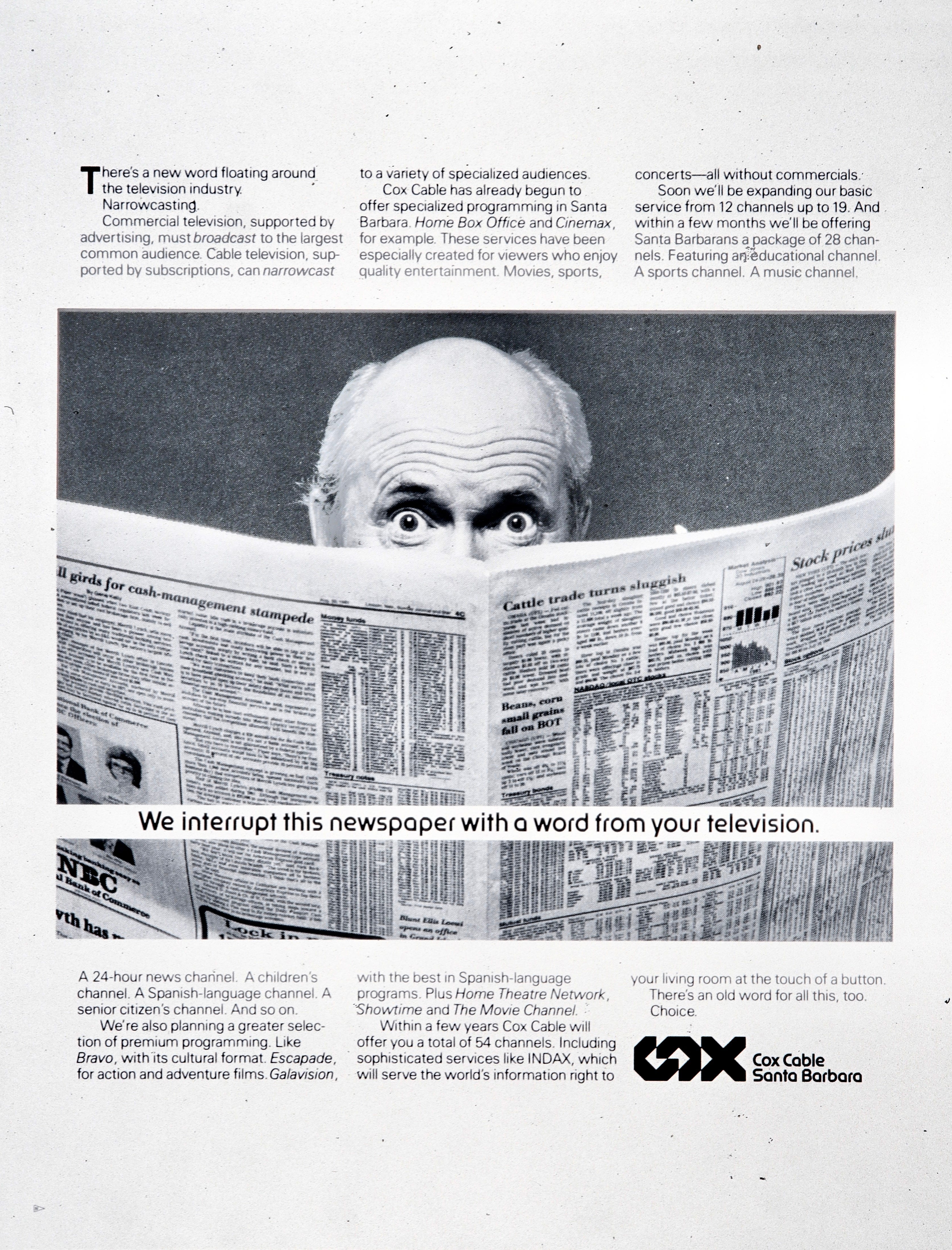
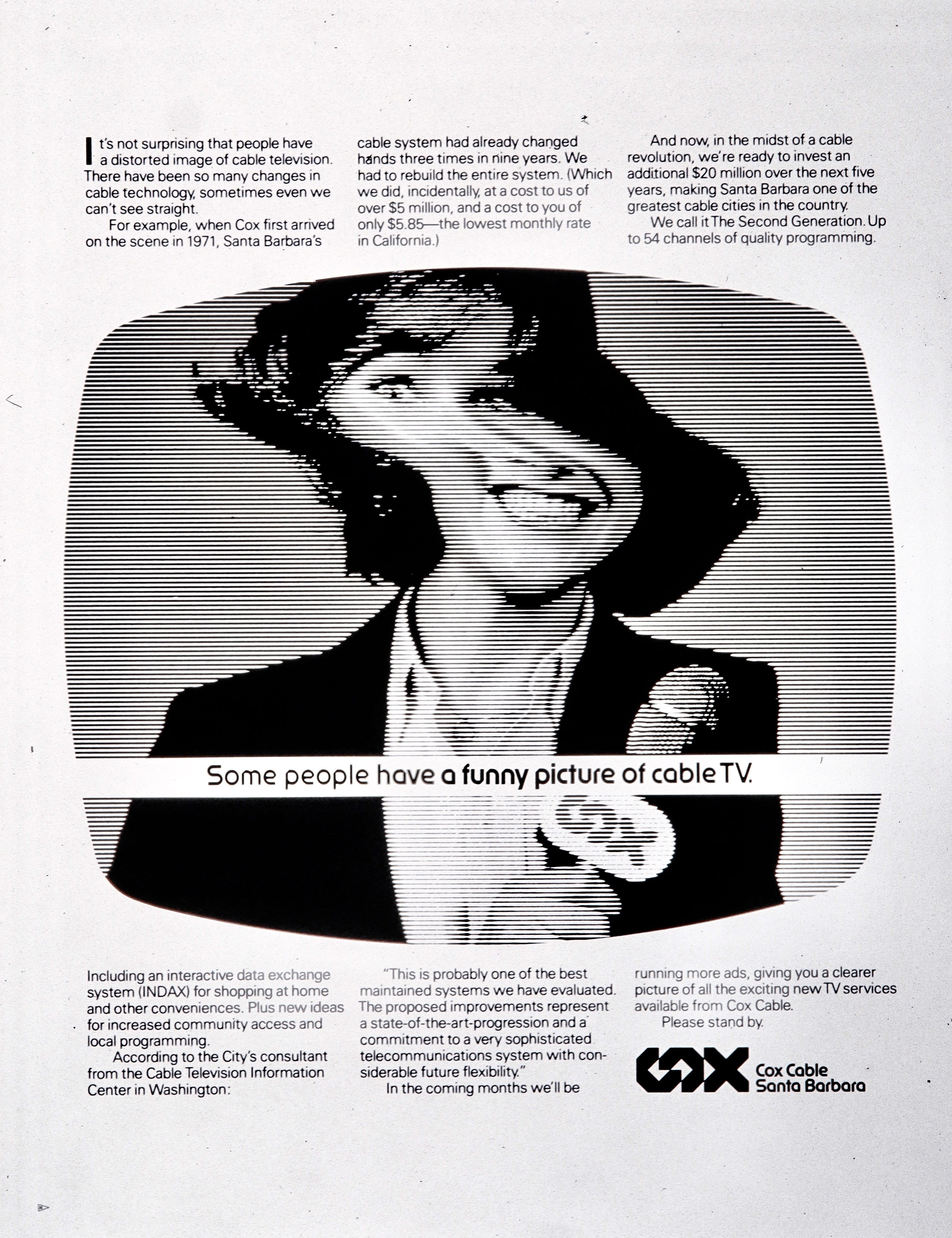
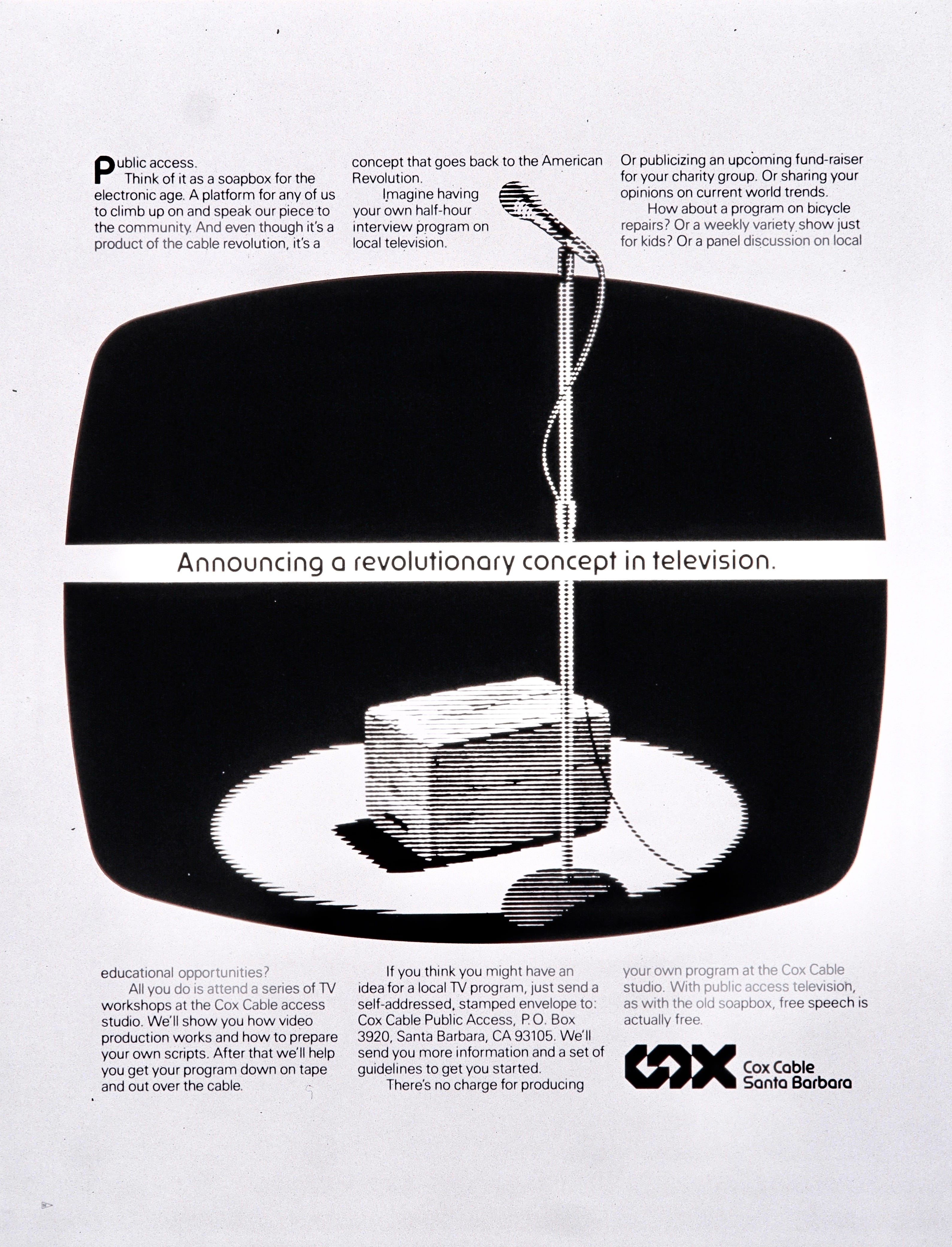
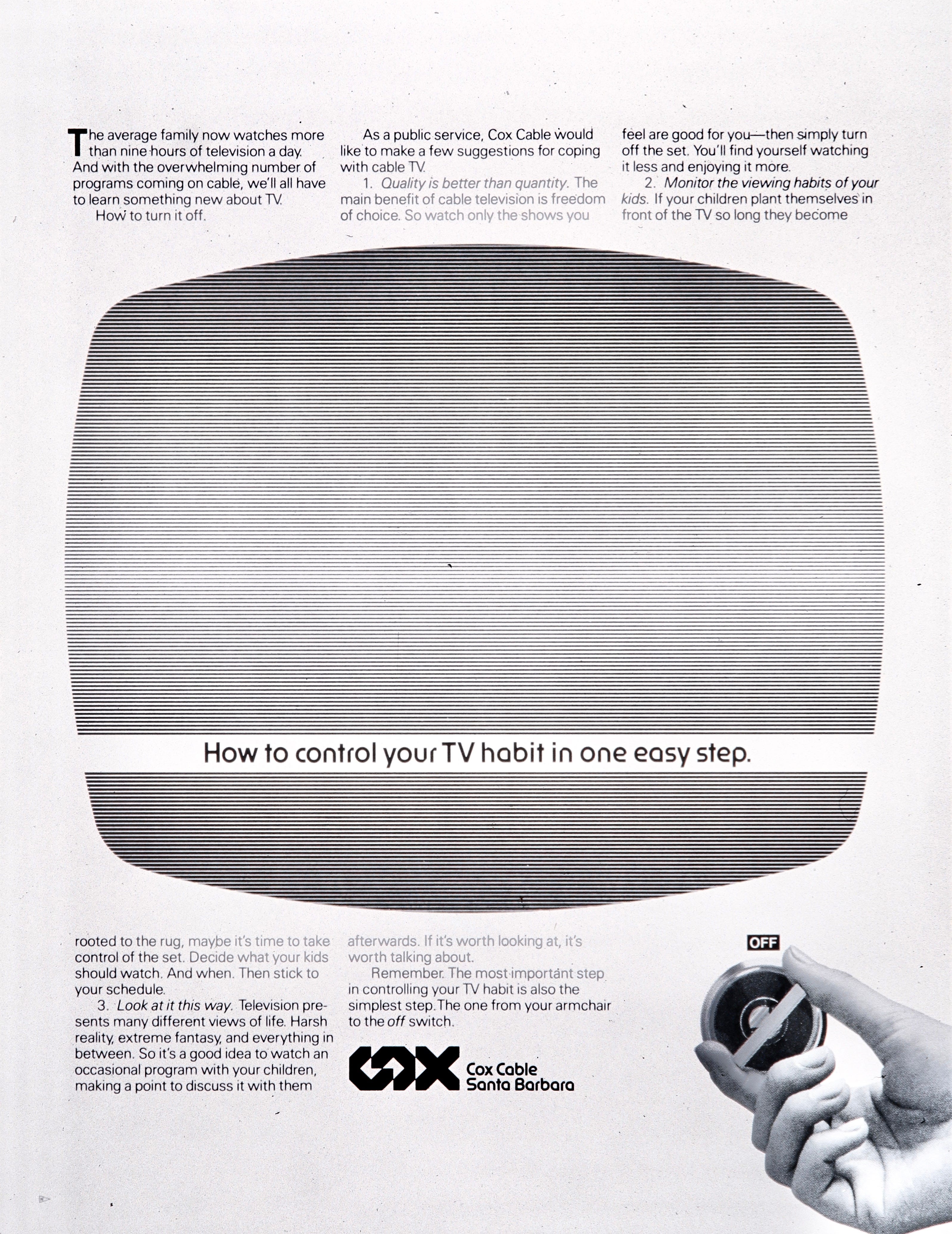
1983. This was the year Cox Cable TV came to town. They arrived at a time when people were skeptical of watching more television than they already were, which caused me to think about advertising as a strategic medium and not just a sales tool. We used full-page newspaper ads persuade the community that TV could be a force for good. We announced a special channel for free public use, and also addressed the potential problem of screen addiction, which in retrospect was naive. Few people could resist the explosion of channels that would soon overtake the mediascape.
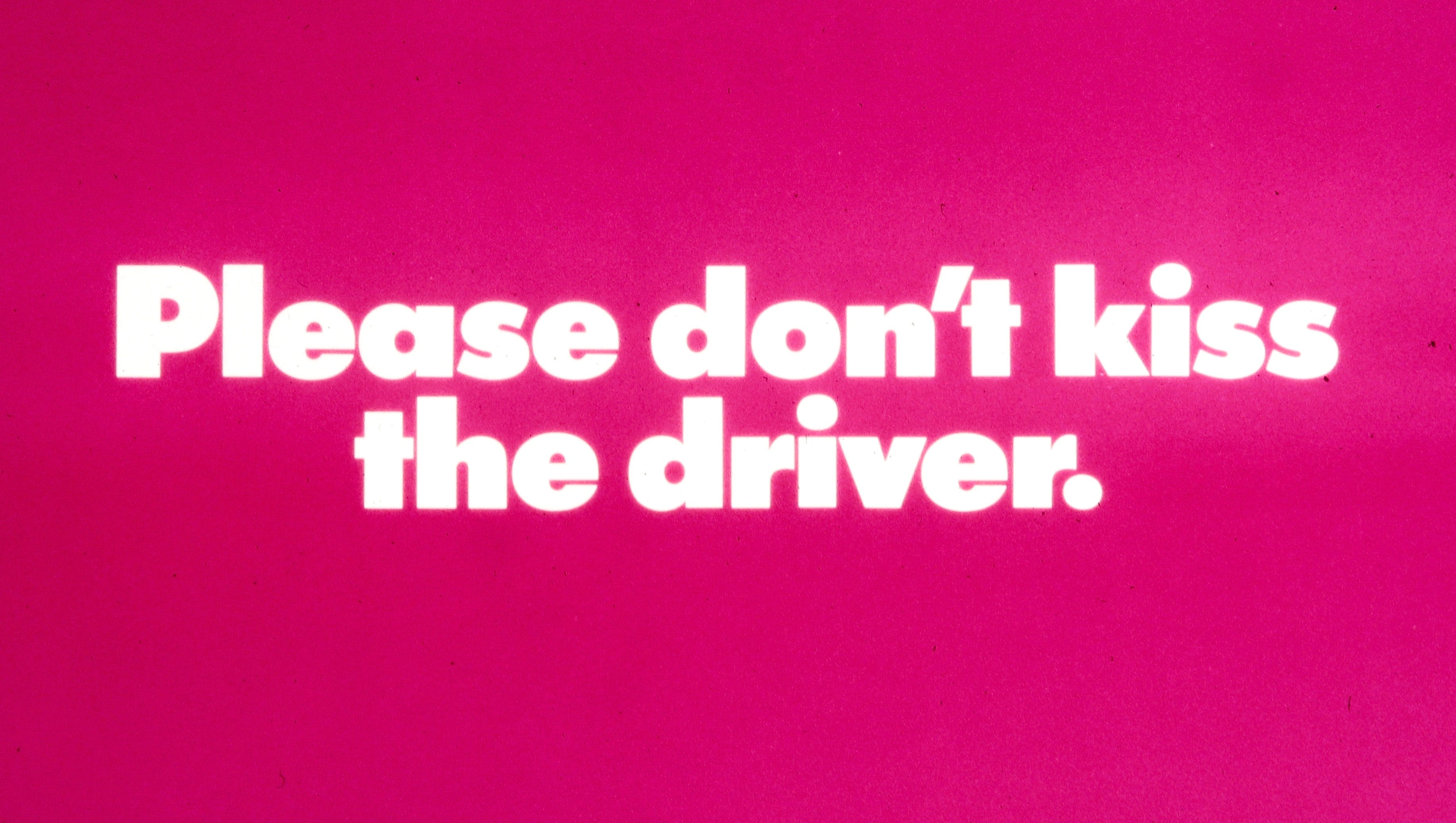
1983. Gary Gleason, general manager of MTD, was proud of his bus drivers and found ways to celebrate them. Most transit systems have small notices inside the cars that say “Do not disturb the driver while the bus in motion.” We turned it around with a campaign to bring attention to the drivers’ calm and courteous demeanor. Each wore a matching campaign button on his or her shirt. As a result, there were several reports of unnecessary kissing.
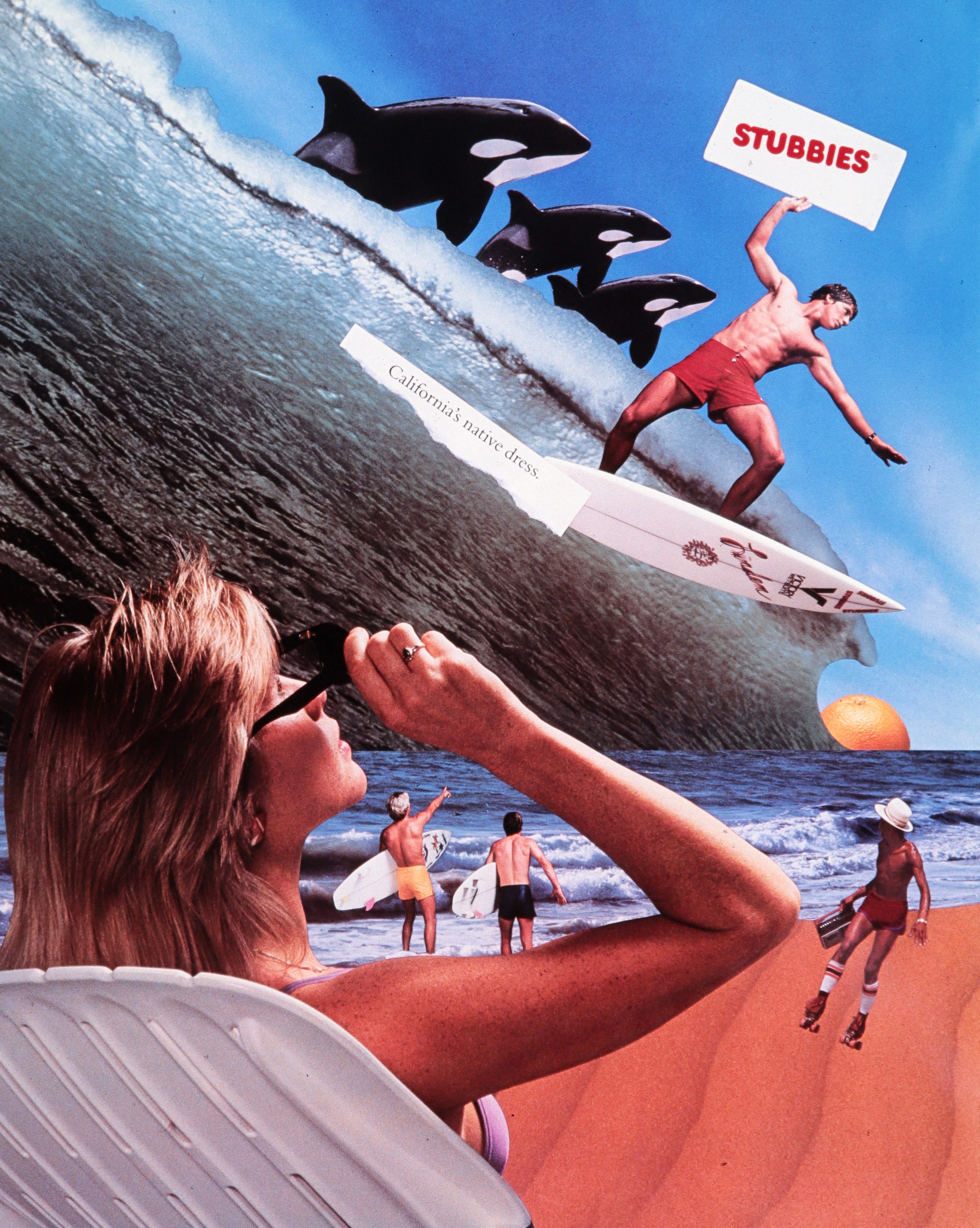
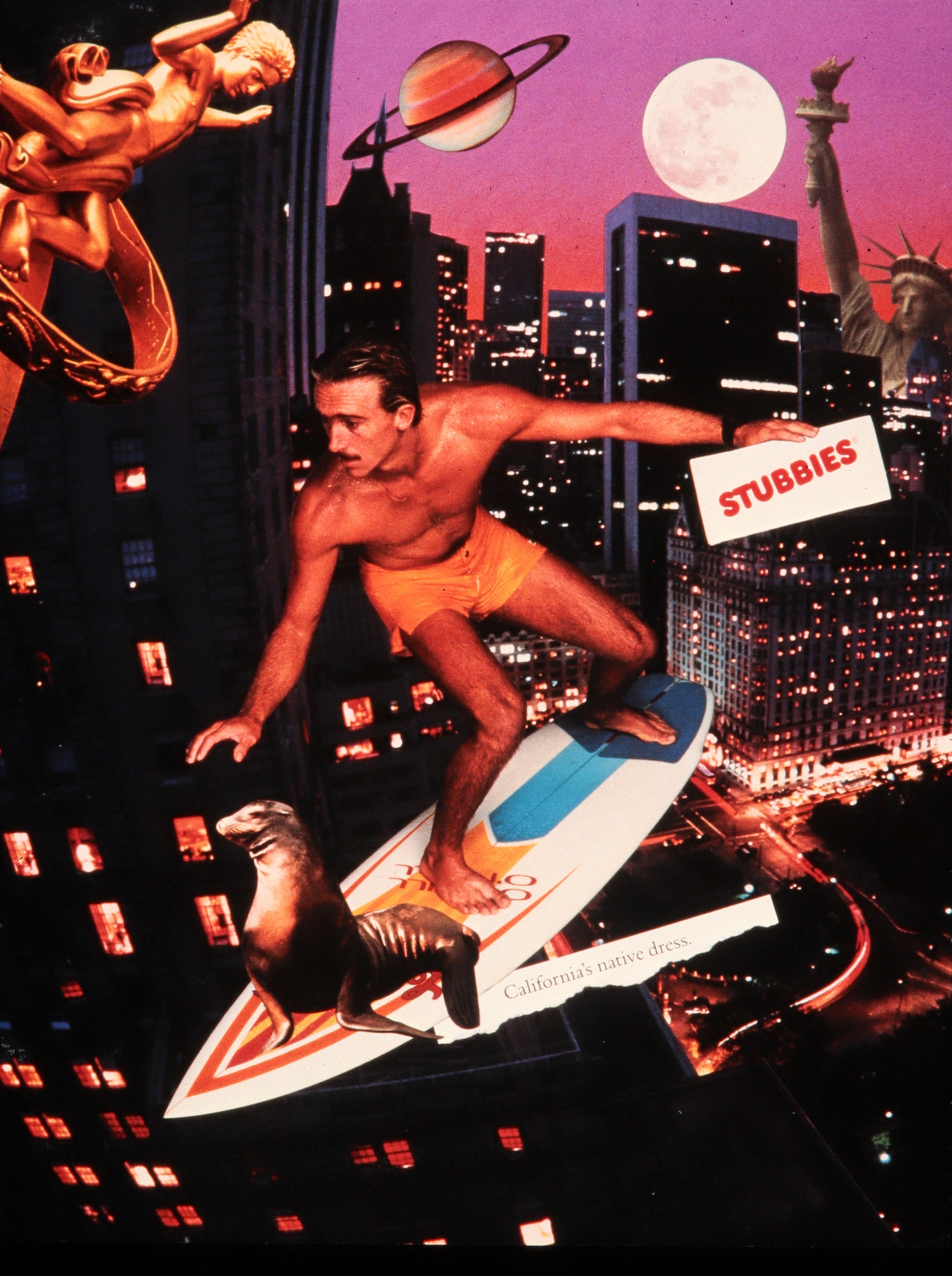
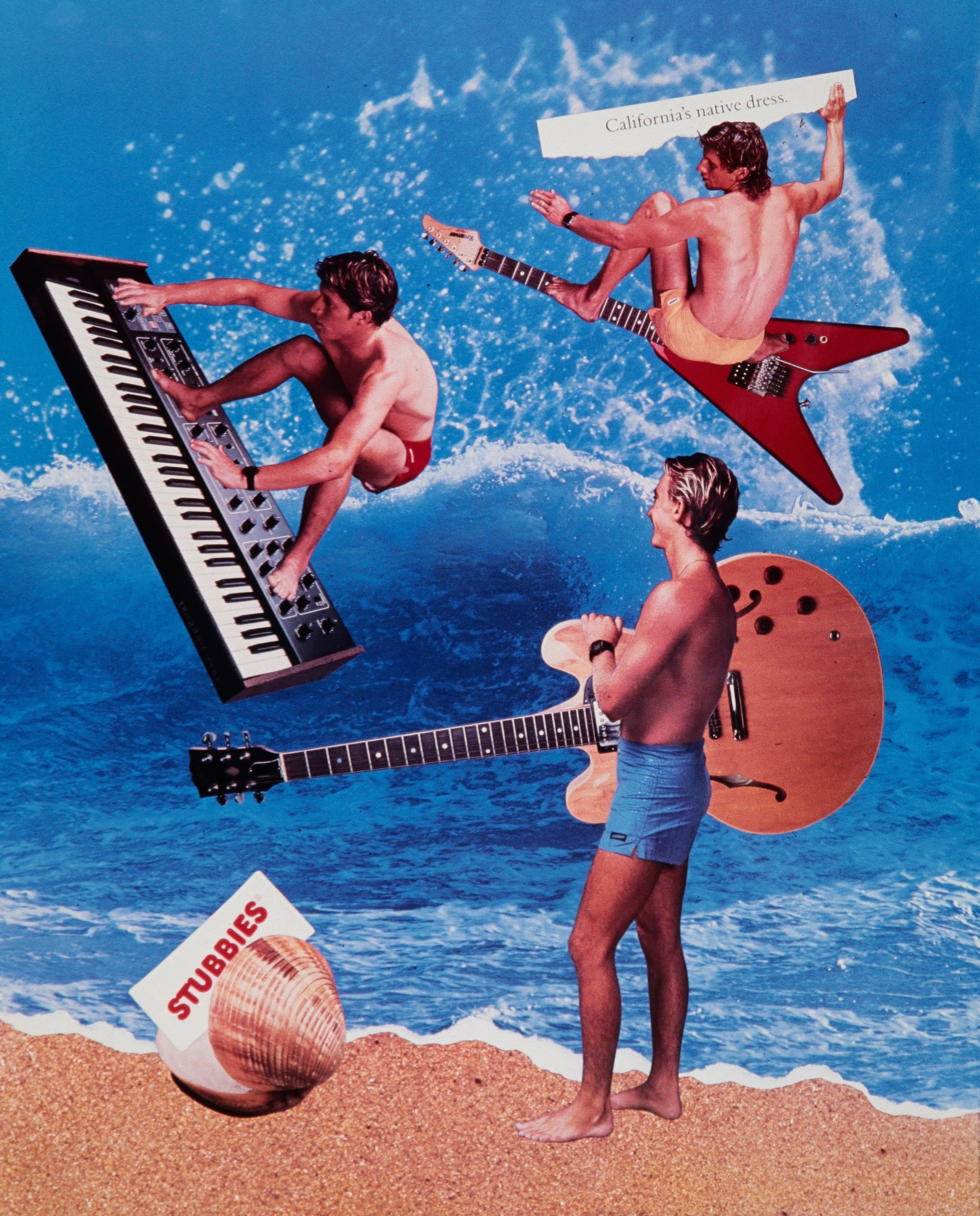
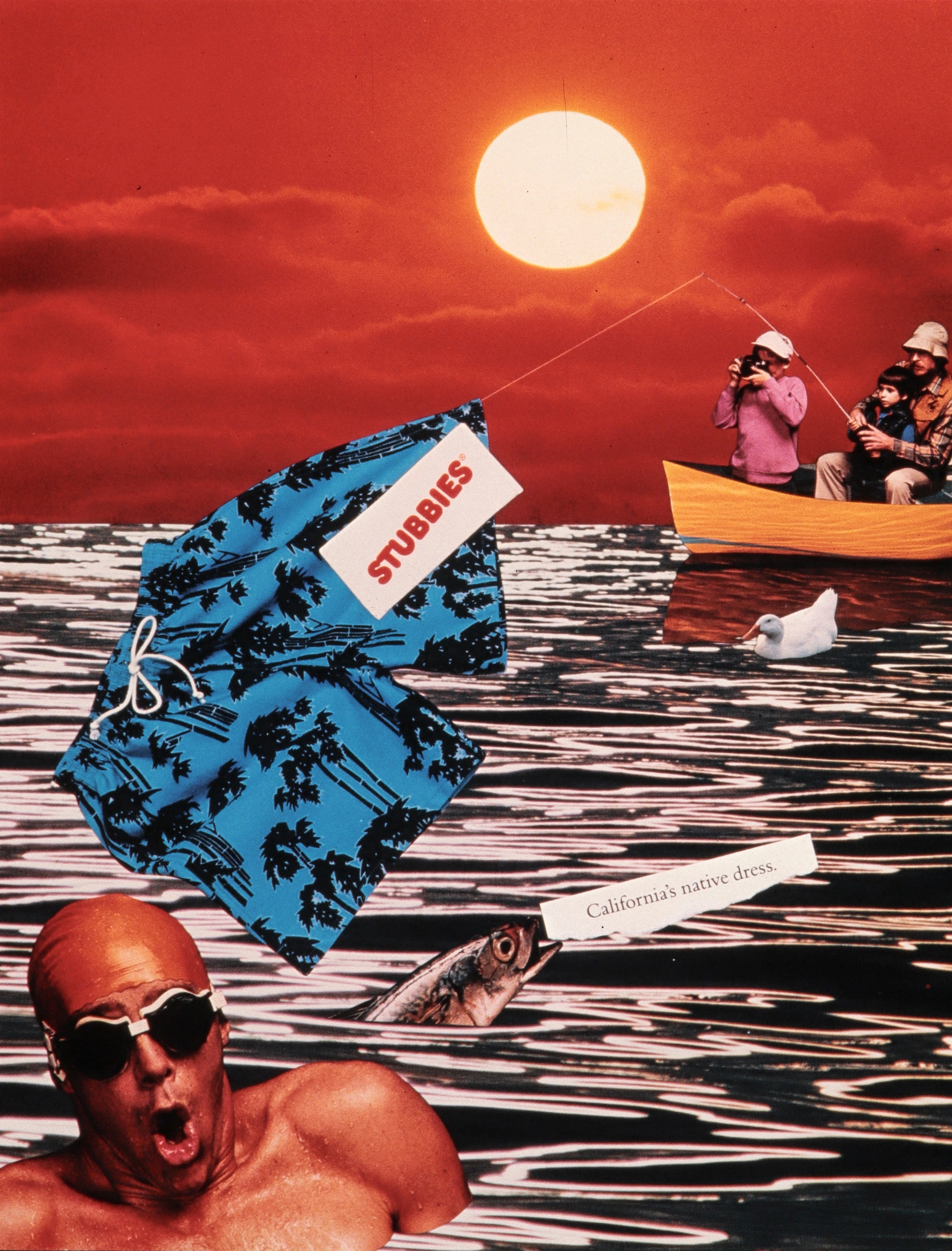
1984. My colleague Mark Oliver brought us a project to art-direct a campaign for Stubbies, a beachwear company that used celebrity surfers as spokespeople. We featured them in a series of ads as well as a 30-second TV spot (which I no longer have). In the days before Photoshop, you had to create collages by making large photo prints, cutting out the images with a knife, and sanding down the edges so they wouldn’t create shadows when copied for reproduction. An advantage was that we had little competition from style thieves.
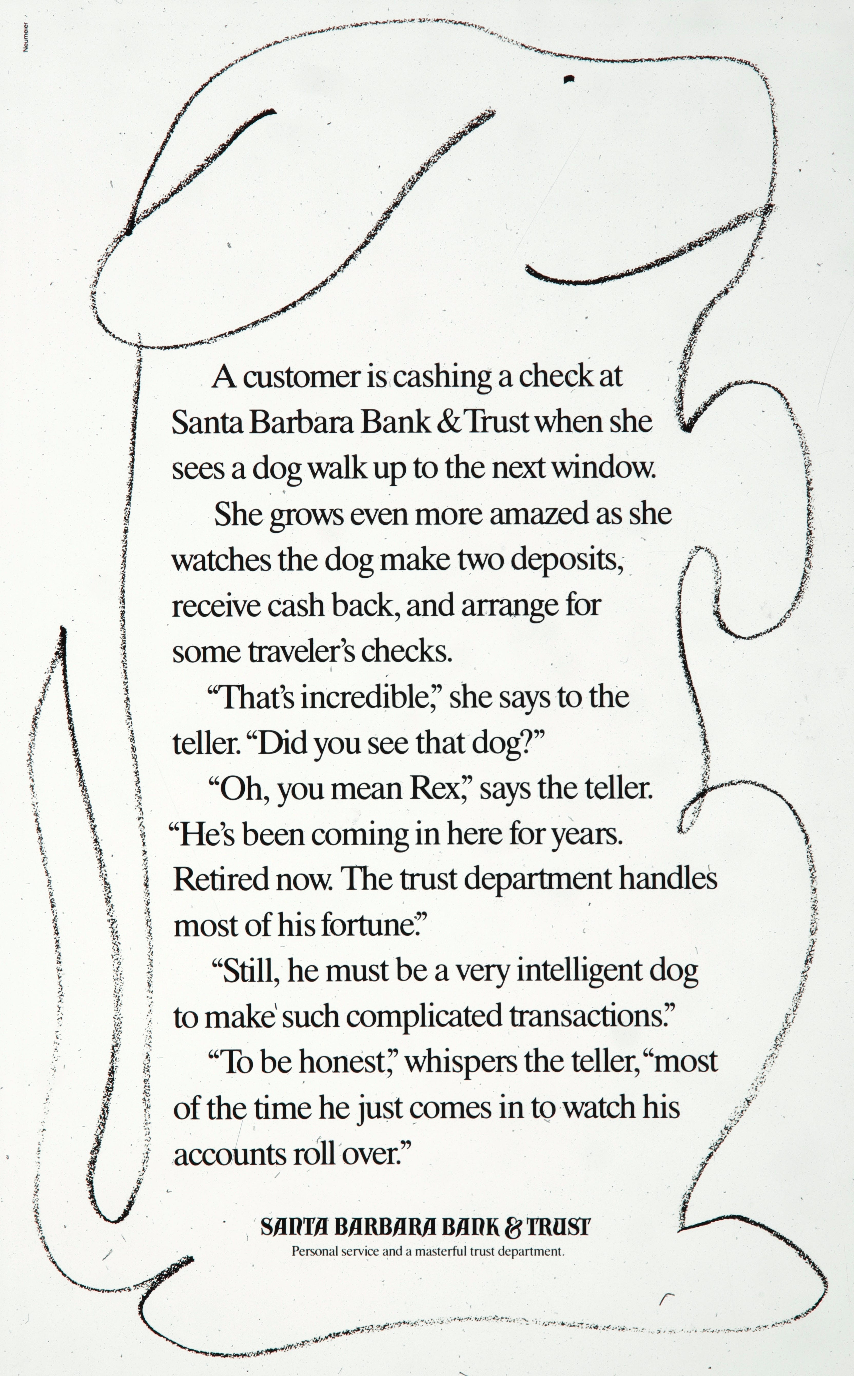
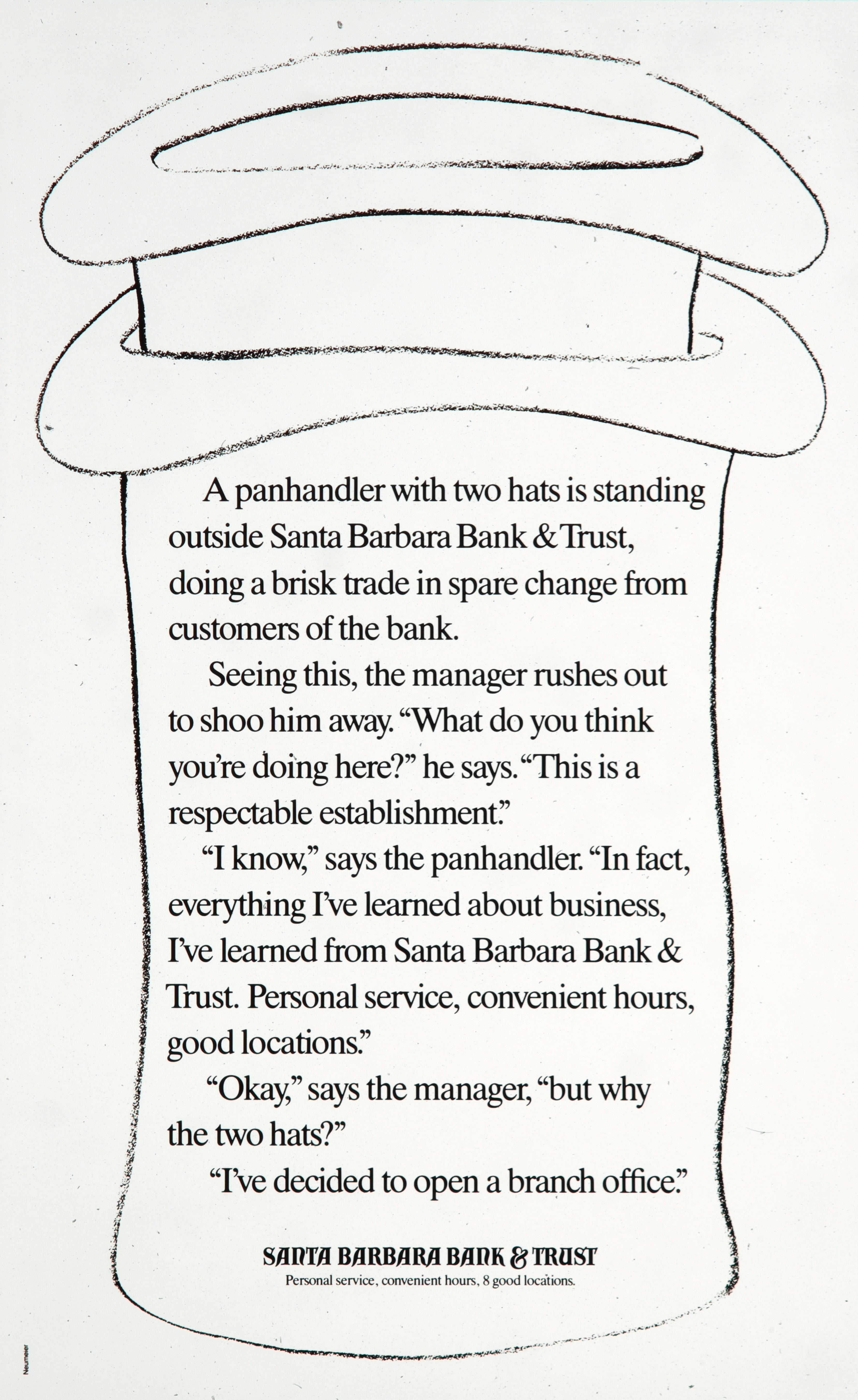
1986. Will people read an ad without a headline? They will! Can an ad be a joke? It can! There were more in this series, but I could only find these two. The goal was to deepen the company’s powerful position as “The bank that belongs to Santa Barbara.” Competing banks were headquartered elsewhere, and routinely focused on interest-rate cuts and other minor initiatives. When the panhandler ad hit the paper, it made some of the execs nervous, so they pulled it. Homelessness was just becoming an issue in Santa Barbara. We had already moved the studio to Silicon Valley and had been out of the loop.
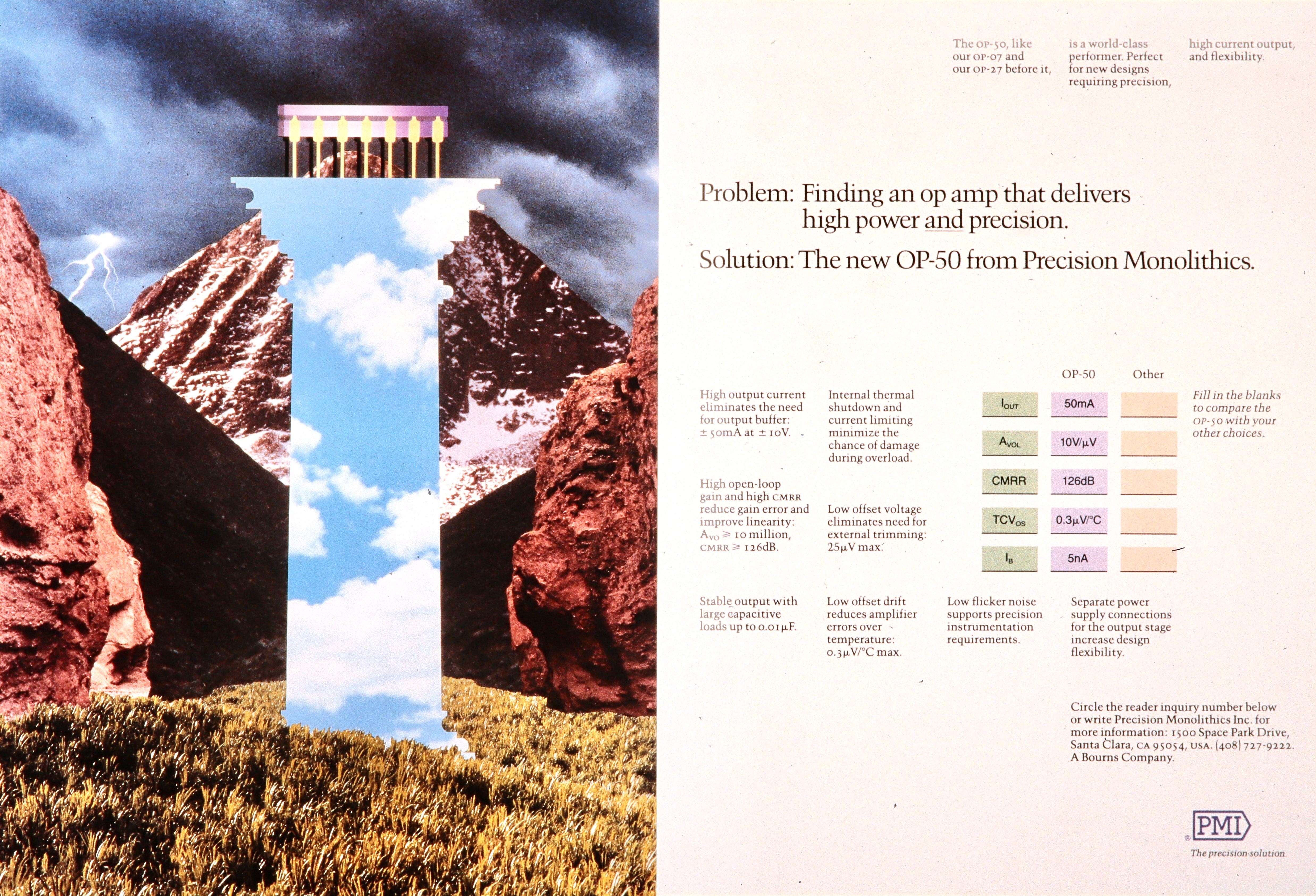
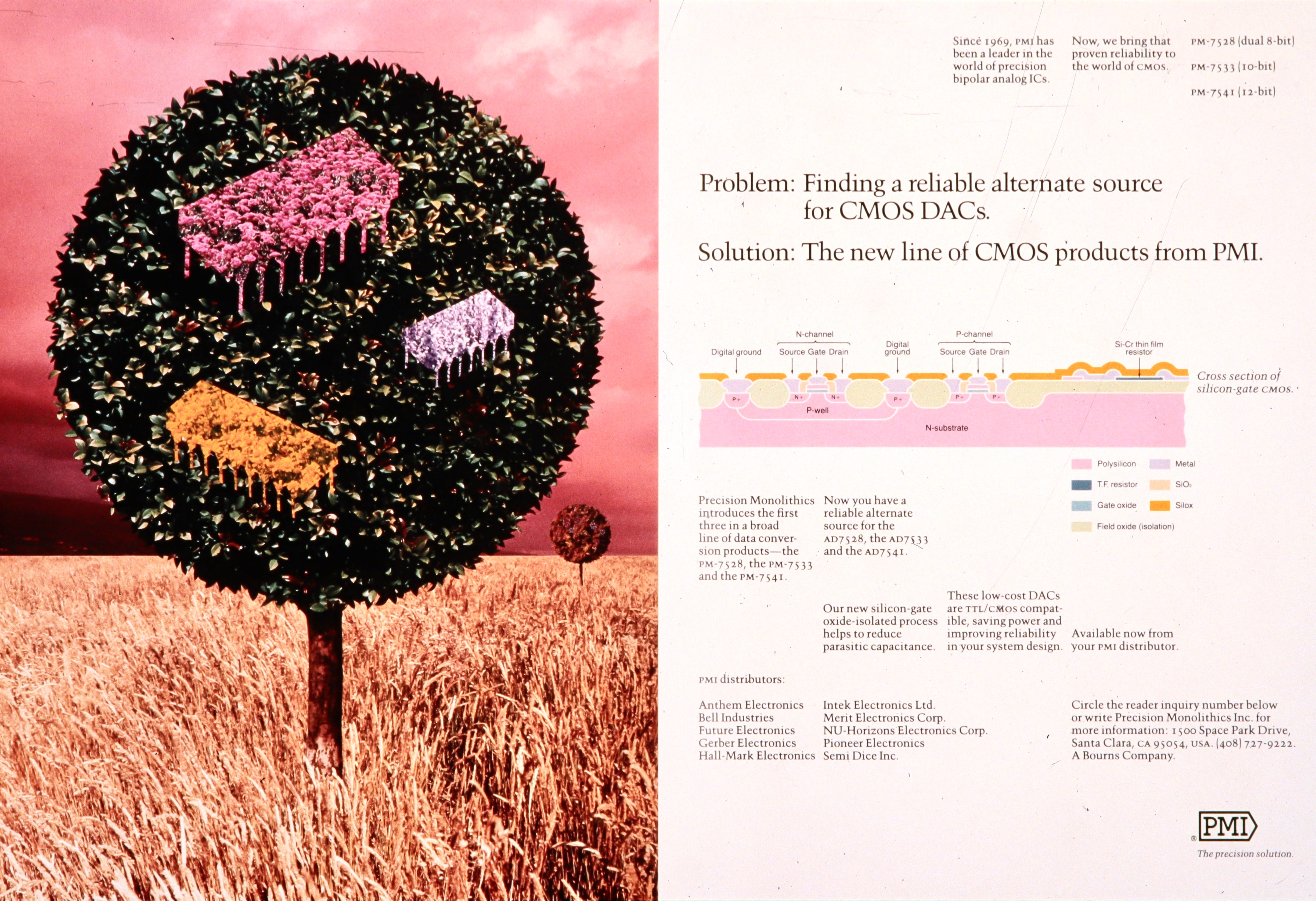
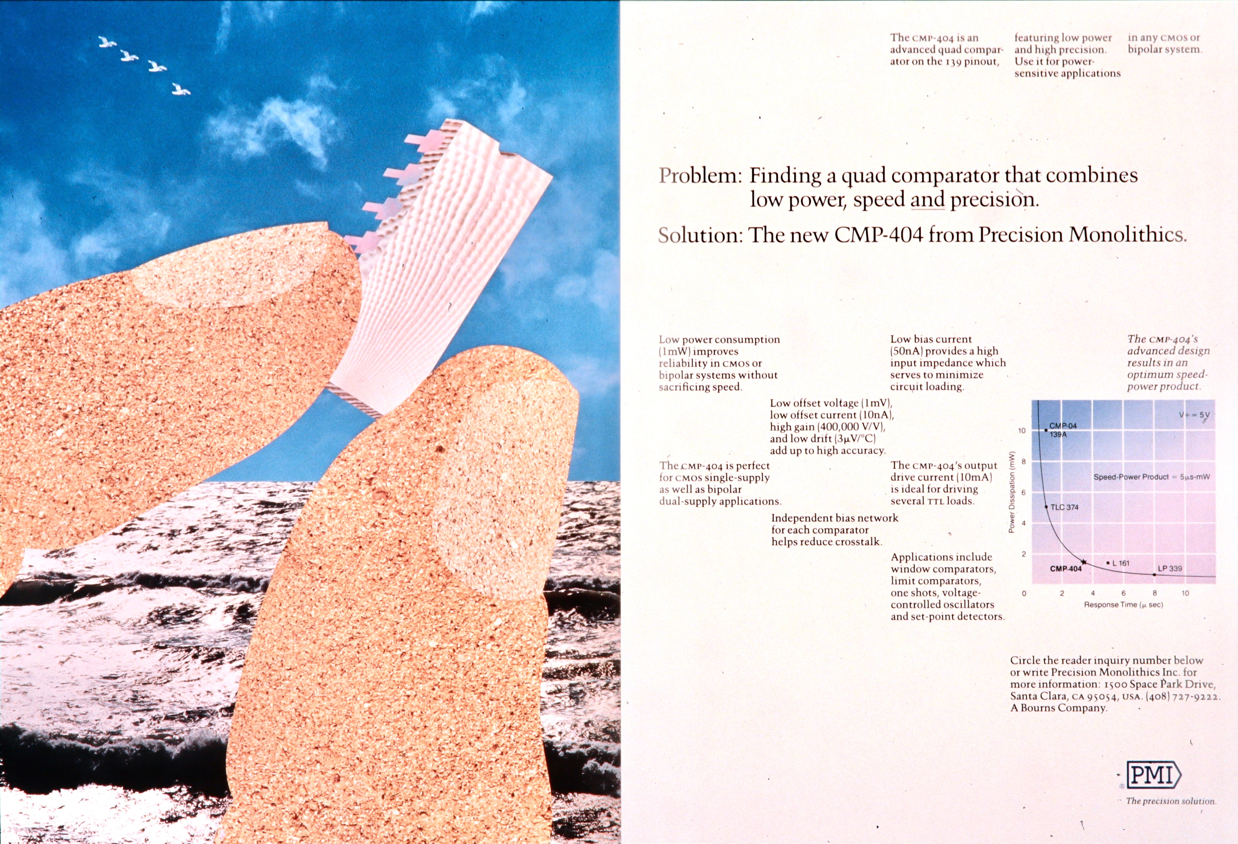
1987. For our first major campaign in Silicon Valley, we returned to our patented collage look. Precision Monolithics (PMI) was a chip company with an audience of hardcore engineers. We went right for the sweet spot, their insatiable need for specifications. An emotional appeal would never work with these guys. But they loved the illustrations, which brought a certain sex appeal to their logic-based discipline.
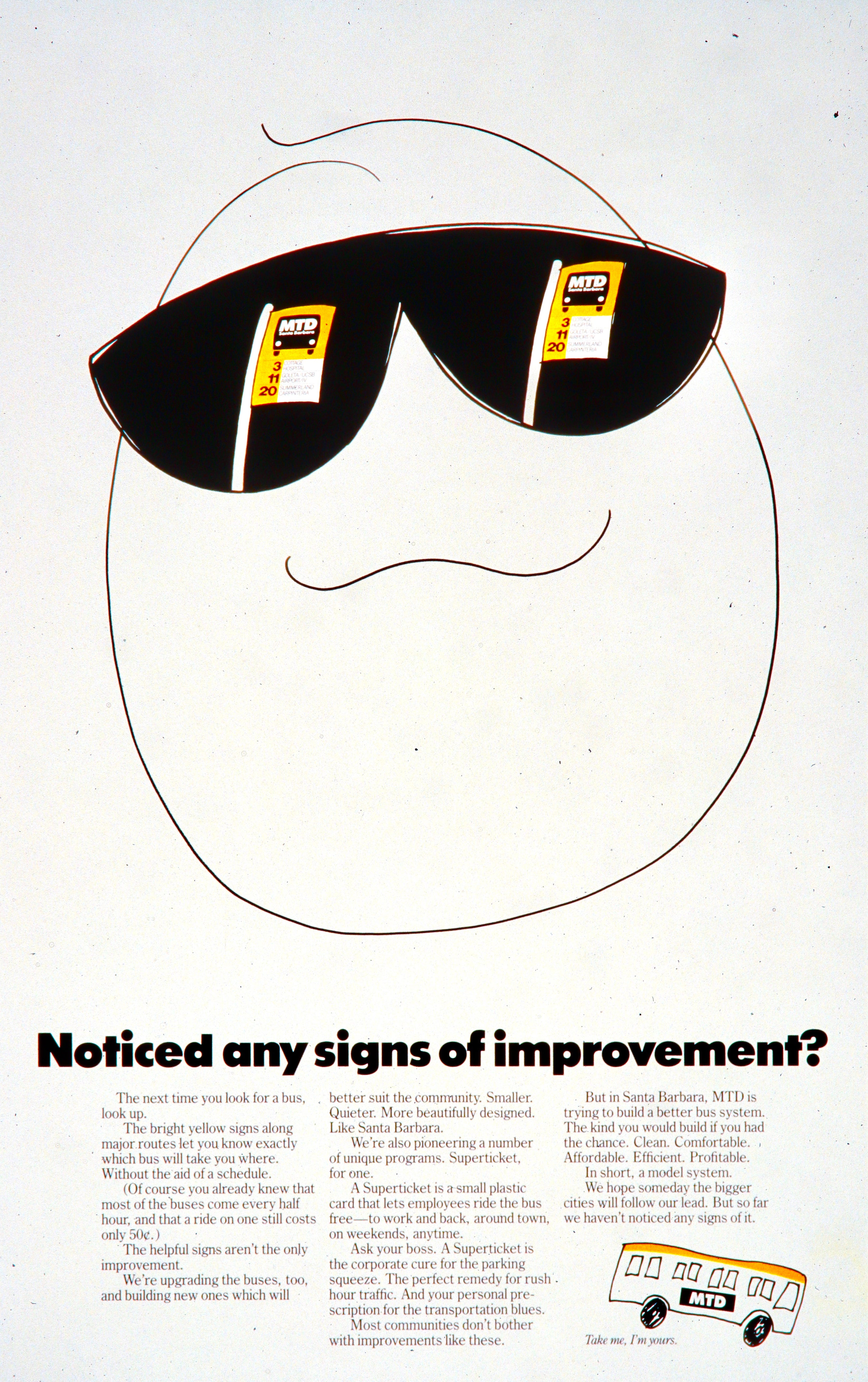
1988. MTD had upgraded their buses, signage, and schedules, work we were heavily involved in. One of the initiatives has to replace the thousands of old bus-stop signs with smaller, cleaner versions that matched their new colors. We used a full-page in the newspaper to announce the change.
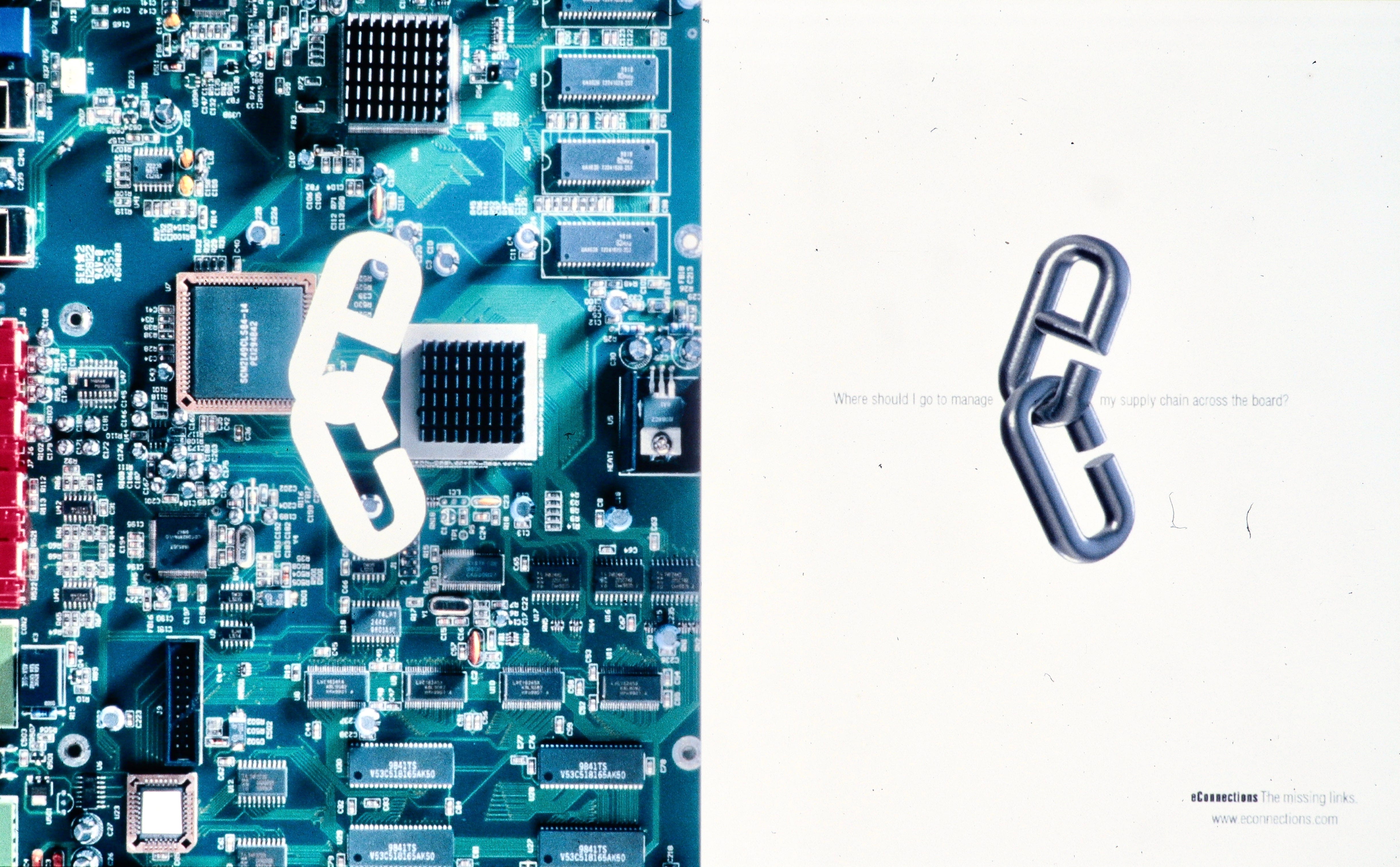
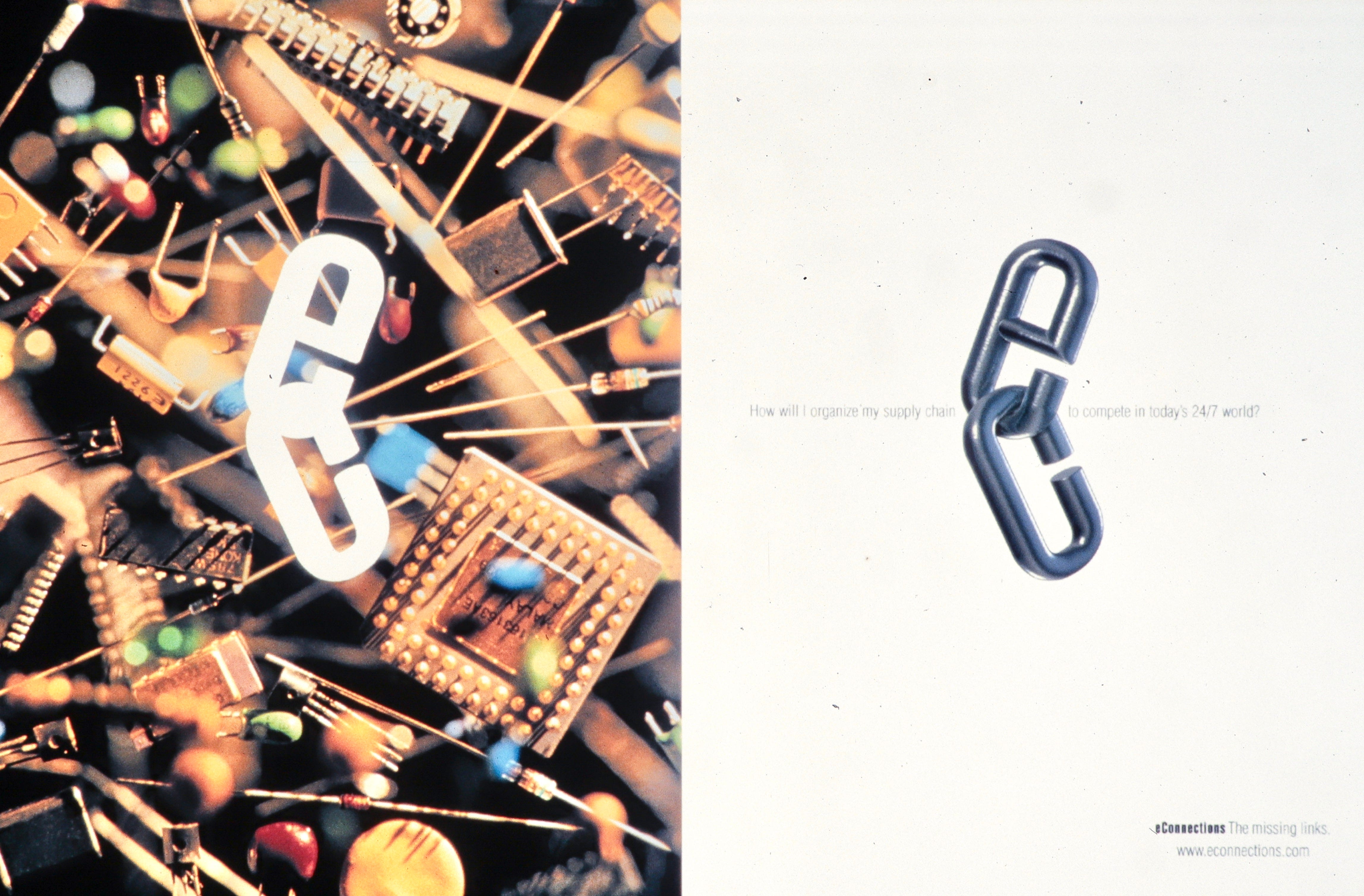
1999. Most of our work had been in software packaging during this period, but we still made room for our best non-packaging clients. This campaign for eConnections was, I believe, the last campaign we ever did. There may have been others, but I didn’t see them in my archives. The tagline for eConnections was “The missing links.”
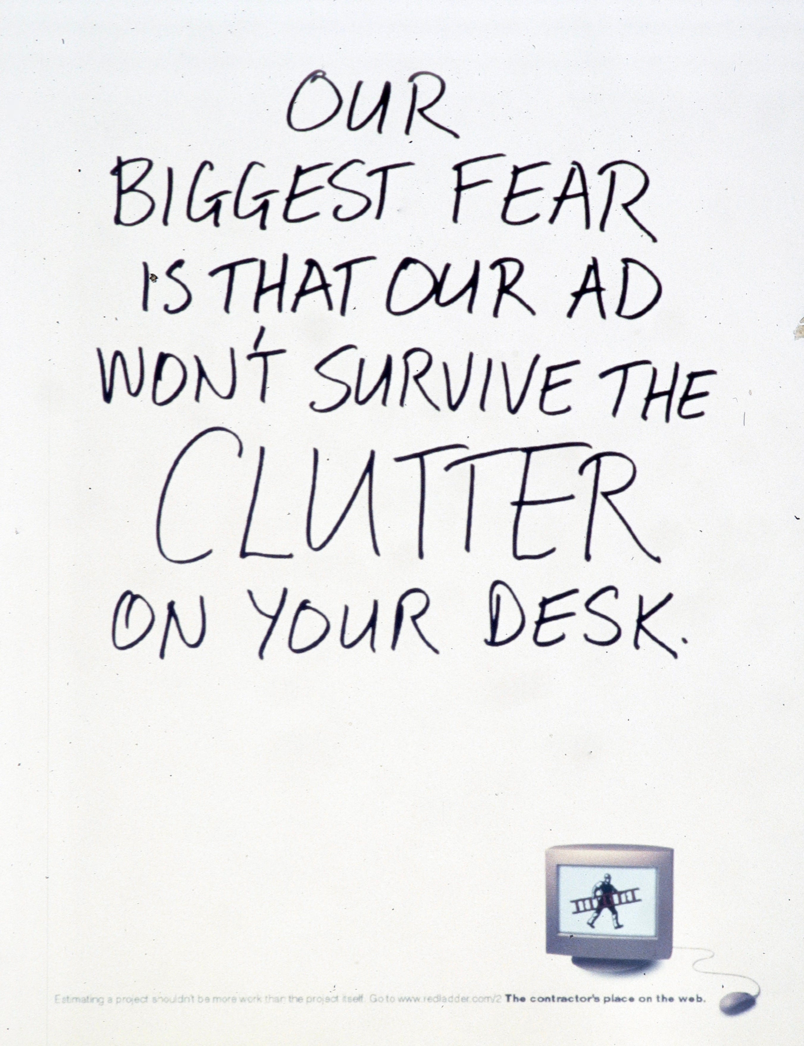
In our interviews with Redladder’s audience, building contractors and their project managers, we found they were reluctant to swap their old-school management habits—handwritten lists, sticky notes, bulletin boards, memos taped to lamps—for a more streamlined alternative. But when we asked what scared them most, it was losing track of key details in all the piles of paper. That’s where we aimed our ad.
My sense is that the output of advertising agencies in the U.S. today is much less about creativity than programmatic media buying. I no longer see the witty copywriting and sharp art direction that marked the period between 1960 and 2000. But I’m old now, and my vision isn’t as good as it was. Maybe it’s still there if you look closely.
Comments
Nothing yet. Say the first thing.
Sign in to join the conversation.