
Publications are multi-page, sequentially-organized documents that require something that other types of types of graphic design don’t—pacing. I wasn’t very good at designing publications until I began to focus on this elusive skill. You want the reader to be totally engaged in the experience of reading and to keep turning pages to the very end. Part of this comes from the text, or copy, but in commercial work it often requires a cinematic touch.
There’s no good way to give you this experience without handing you an actual publication. Even if I still had them in my files, displaying all the pages in miniature would bore you to death. So the best thing I can do is show you the covers—the first and most important point of contact—and maybe a spread or two from the interior.
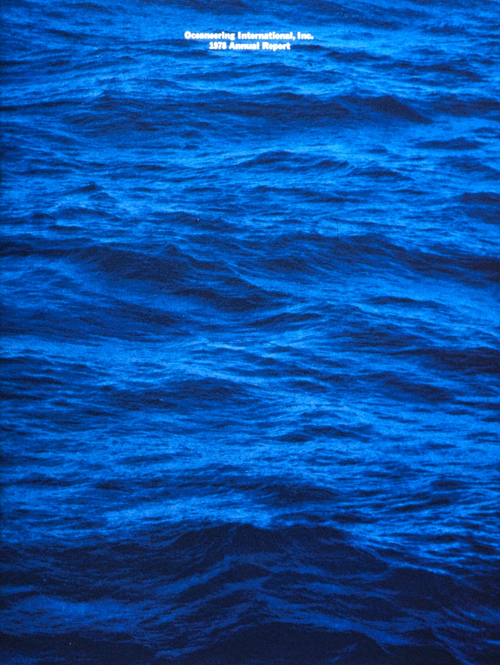
1979. This wasn’t my first annual report, as I’d already done three reports for Santa Barbara Bank & Trust. Those were interesting booklets, and even won some awards, but they didn’t capture the financial story as well they did the human story. I was still learning what was important. For Oceaneering International, a scientific diving company, I hired my mentor Bob Overby to design the interior. He drove the whole project, including pricing and client management. I learned a ton. My only contribution was the cover. I said to Bob, “Why don’t we just show a deep blue ocean so investors can imagine the adventure of descending a thousand feet in the dark?” He said, “Sure, why not.” The photographer took the shot standing in the water about twenty feet from the shore.
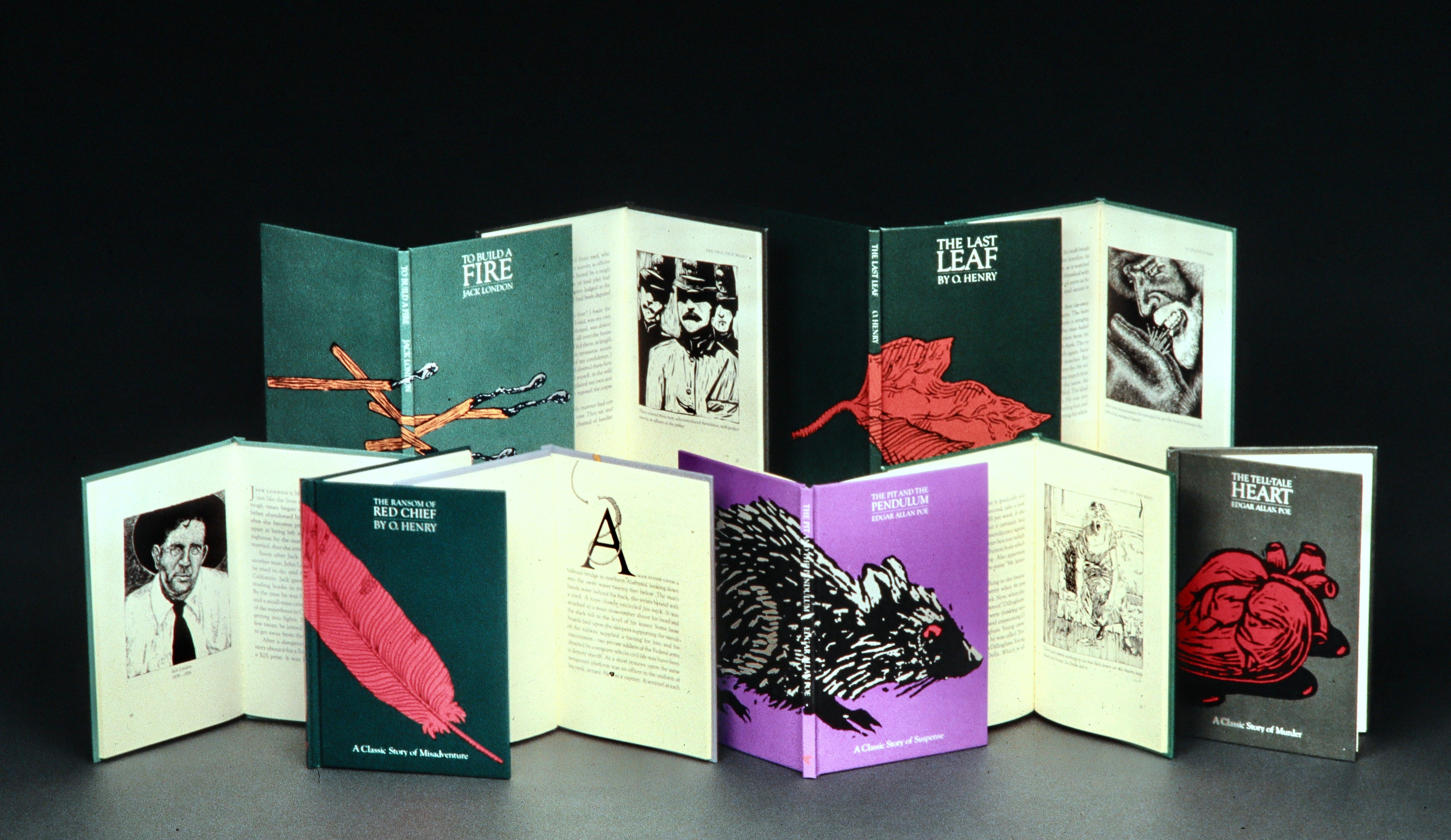
1980. We had been designing book catalogs for Creative Education (which I no longer have), but in 1980 we got a chance to design the actual books. Here’s a series of individually packaged short stories we both designed and illustrated. I can trace my interest in writing stories back to this assignment. I still remember the opening line of O. Henry’s comedic tale, The Ransom of Red Chief: “It looked like a good thing, but wait till I tell you.”
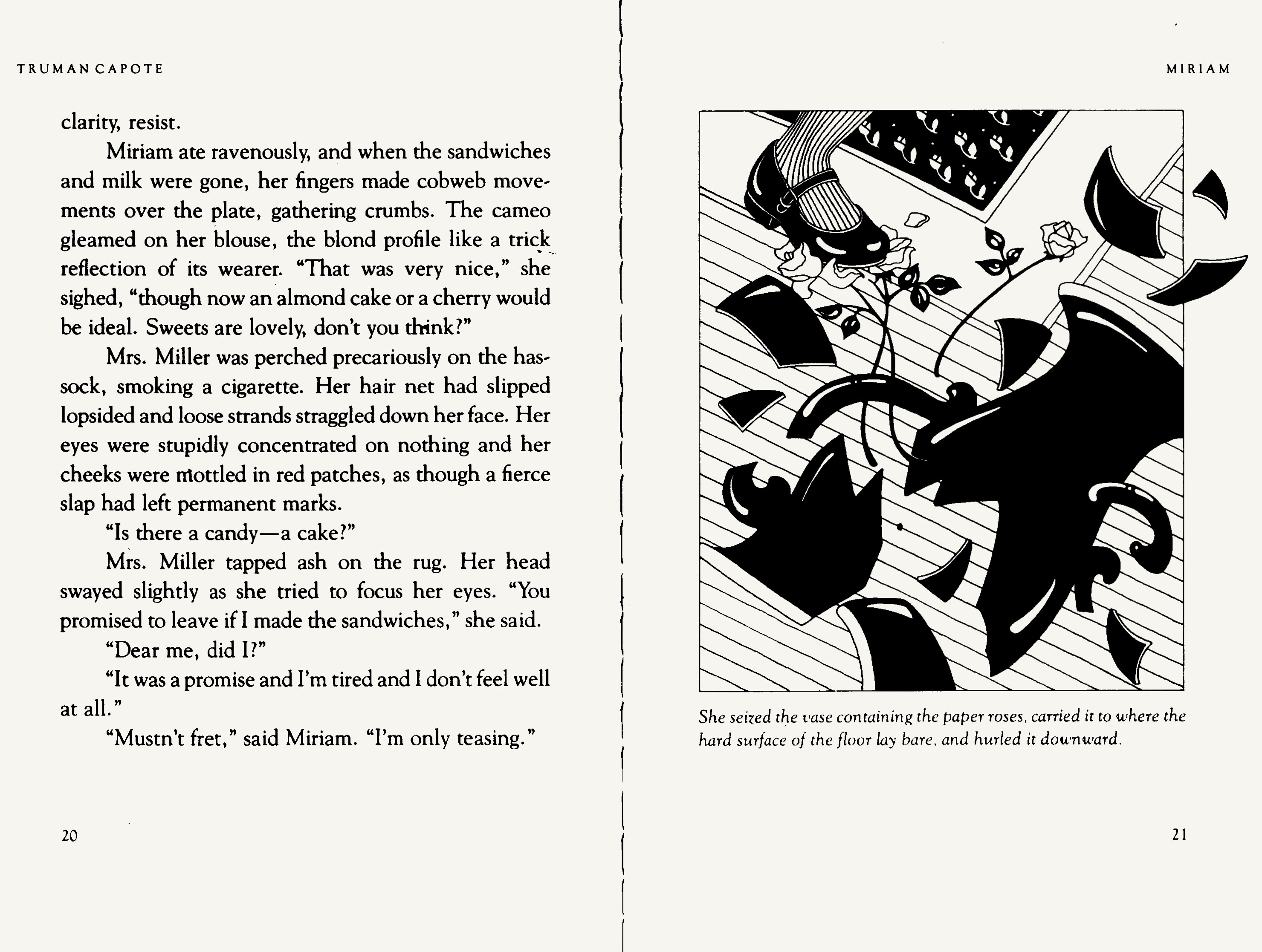
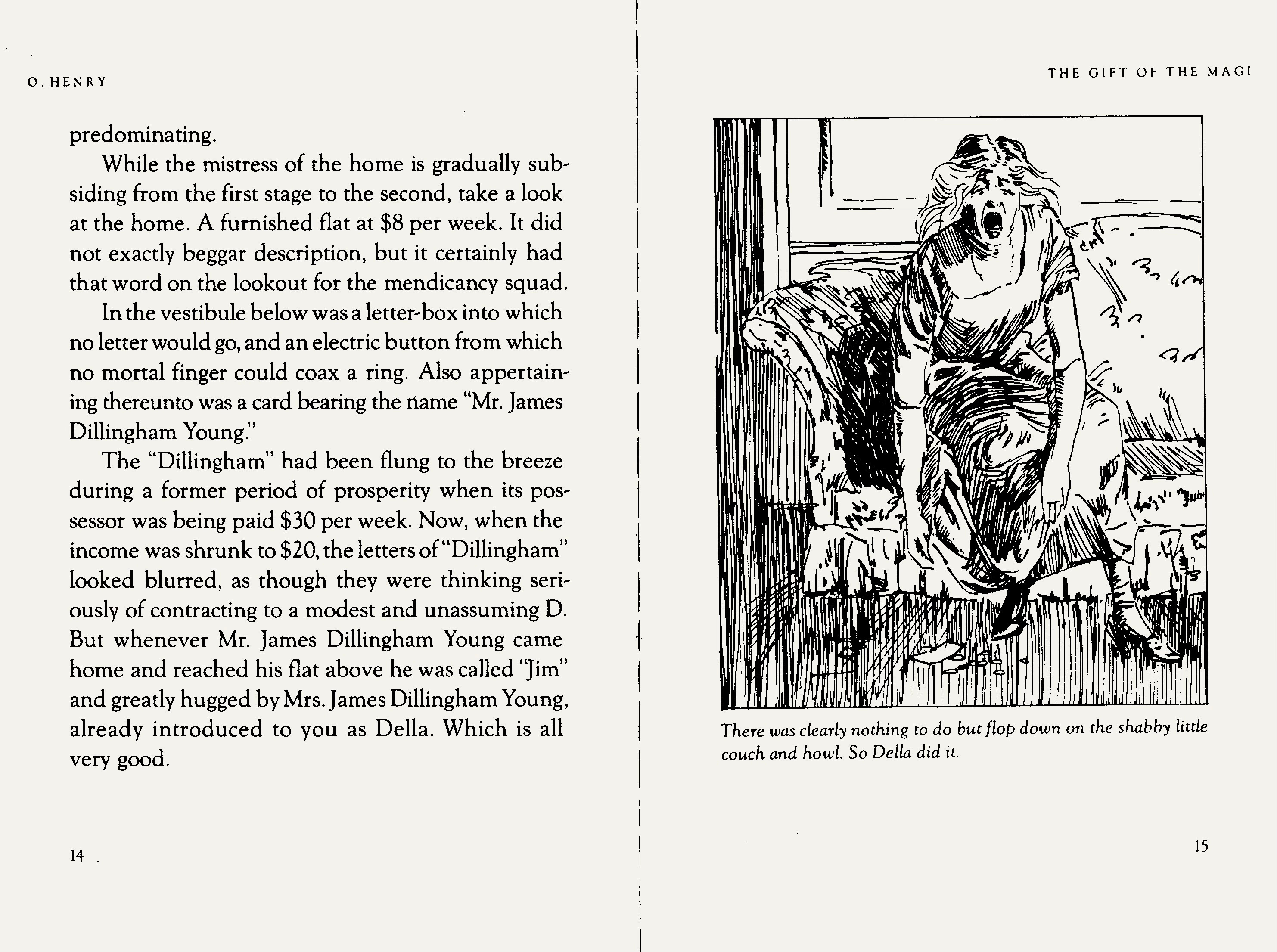
1981. A couple of spreads from the series of books above. All the illustrations were done by my excellent staffers, Sandra Higashi and Byron Glaser. Their skills were so broad that they could mimic illustration styles from any era. Sandra did the top one, from Truman Capote’s Miriam; Byron did the bottom one, from O. Henry’s The Gift of the Magi. I only have these examples because the studio was written up in Print Magazine and I happened to keep a copy.
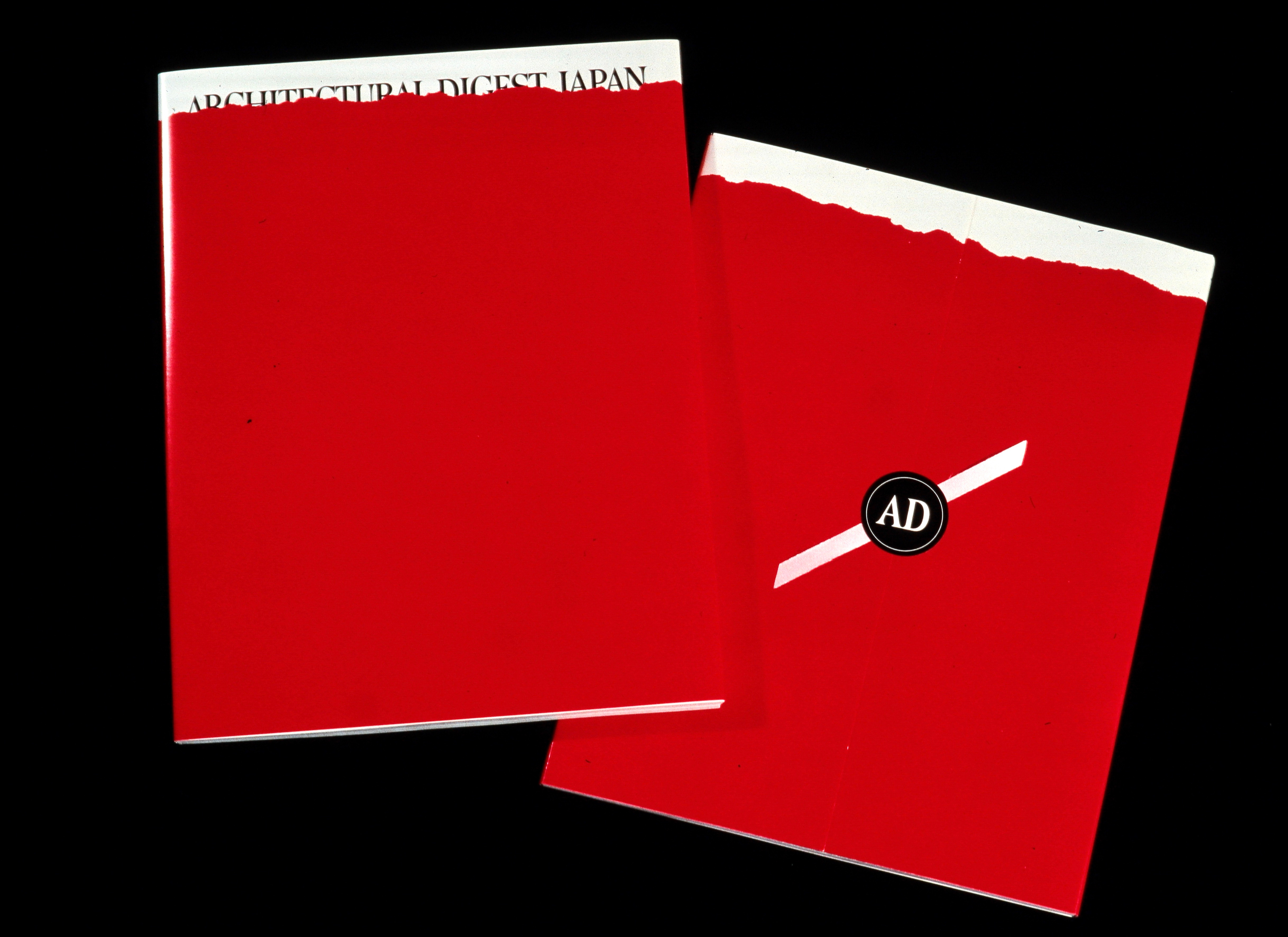
1986. Architectural Digest hired us to design the covers and packaging for their special Christmas issue. I no longer have the various cover designs—one for each regional version. For the packaging, we settled on a simple wrap that could be applied by machine to all the copies worldwide, including a seal and ribbon on the back. It wasn’t our most amazing concept, but the editors were a blast to work with. They flew up to meet us in Silicon Valley, and we ended up driving around Atherton to ogle the gorgeous estates.
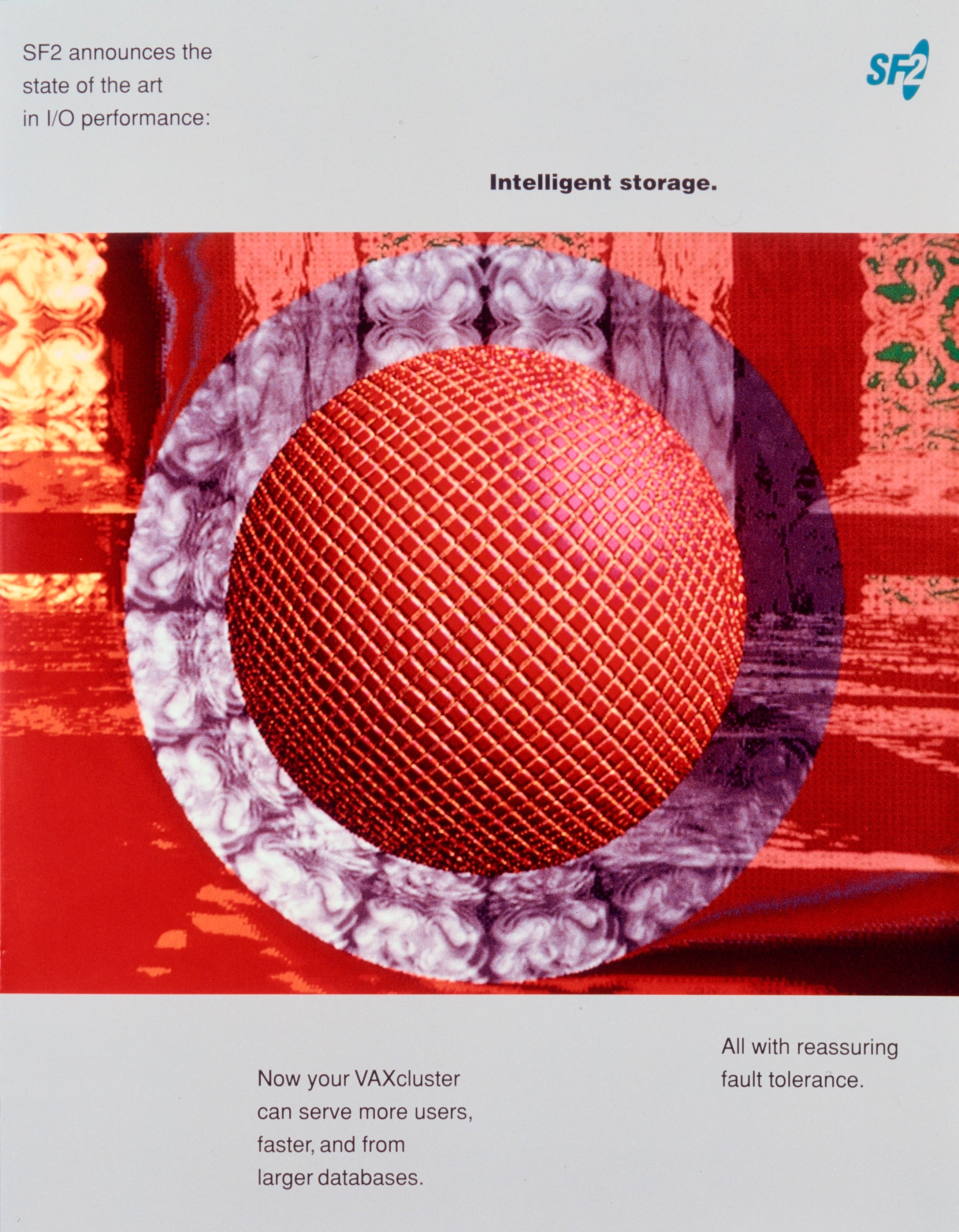
1987. Our work was turning more toward tech in this period. We started getting some geeky clients that forced us (well, me), to begin absorbing the concepts of high technology so I could write thousands of words of copy for brochures and ads. For the cover of SF2’s corporate brochure we used a piece of art from the world’s first computer artist, David Em. He would mess around with university mainframes at night when they weren’t being used. Some of his output was stunning.
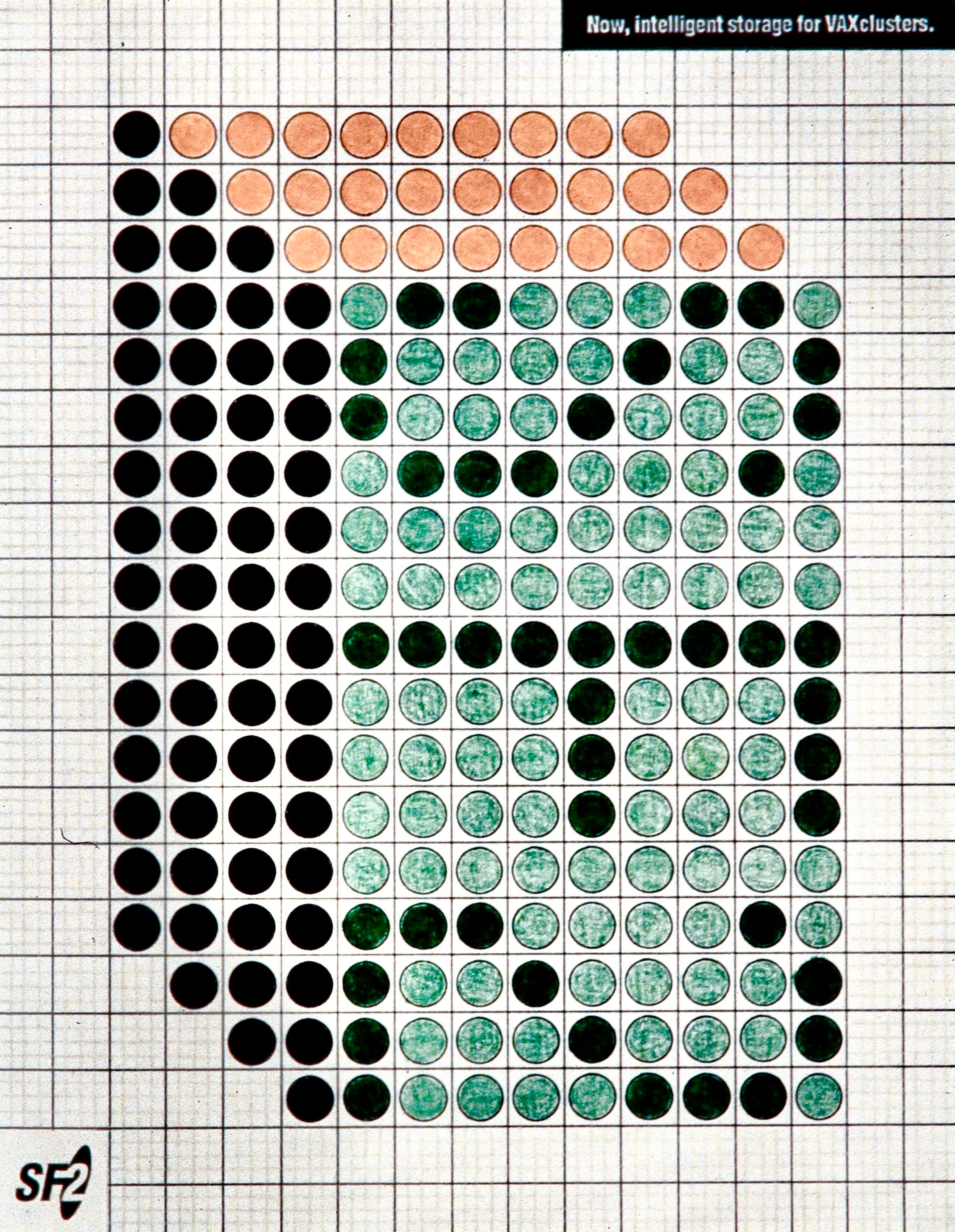
1988. This publication is a product brochure for the same company, full of technical diagrams, charts, and specification. I drew the products and charts by hand on graph paper, the way a meticulous engineer might do, to capture the feeling of a work in progress. Did you see the secret “SF2” hidden in the diagram?
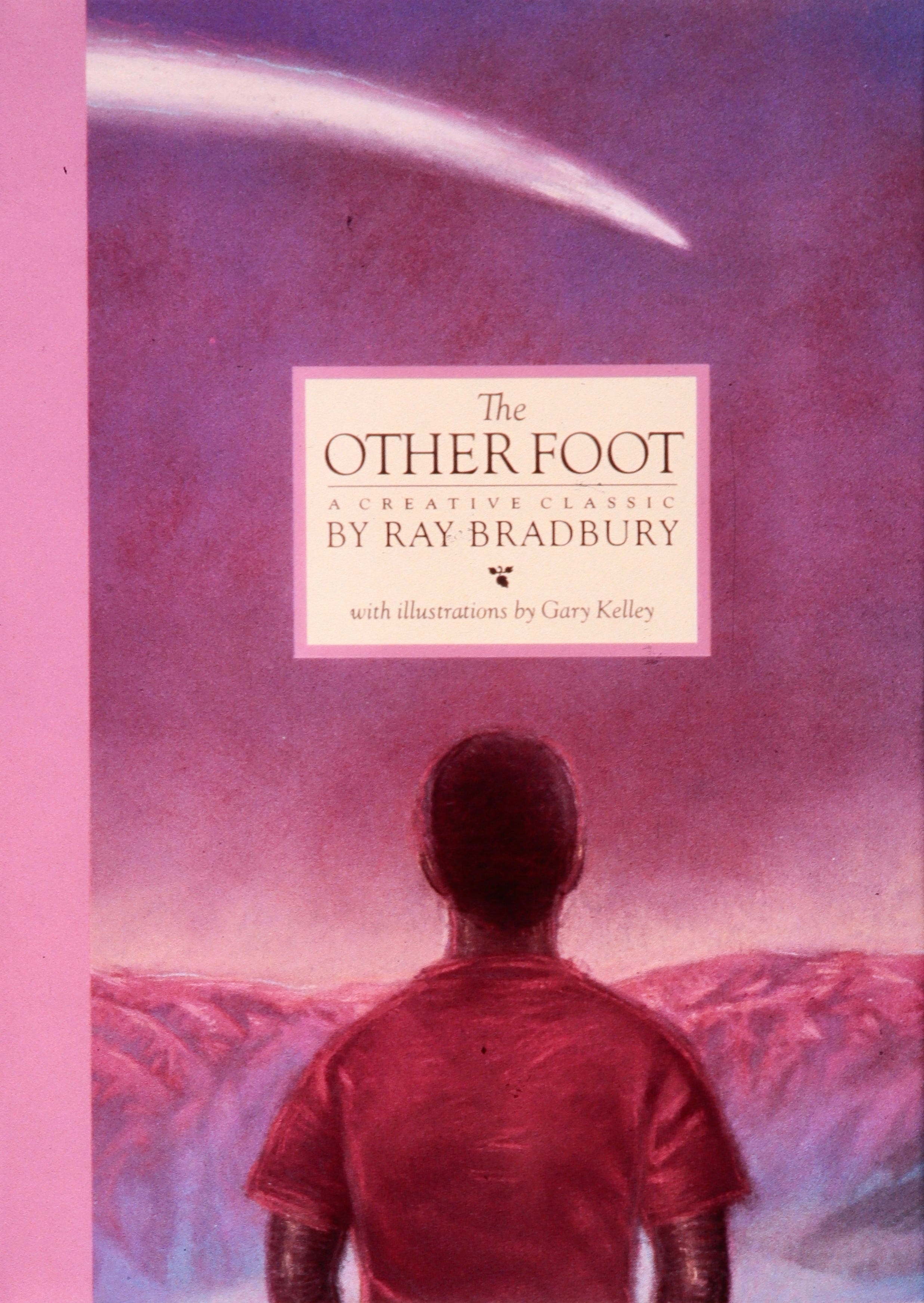
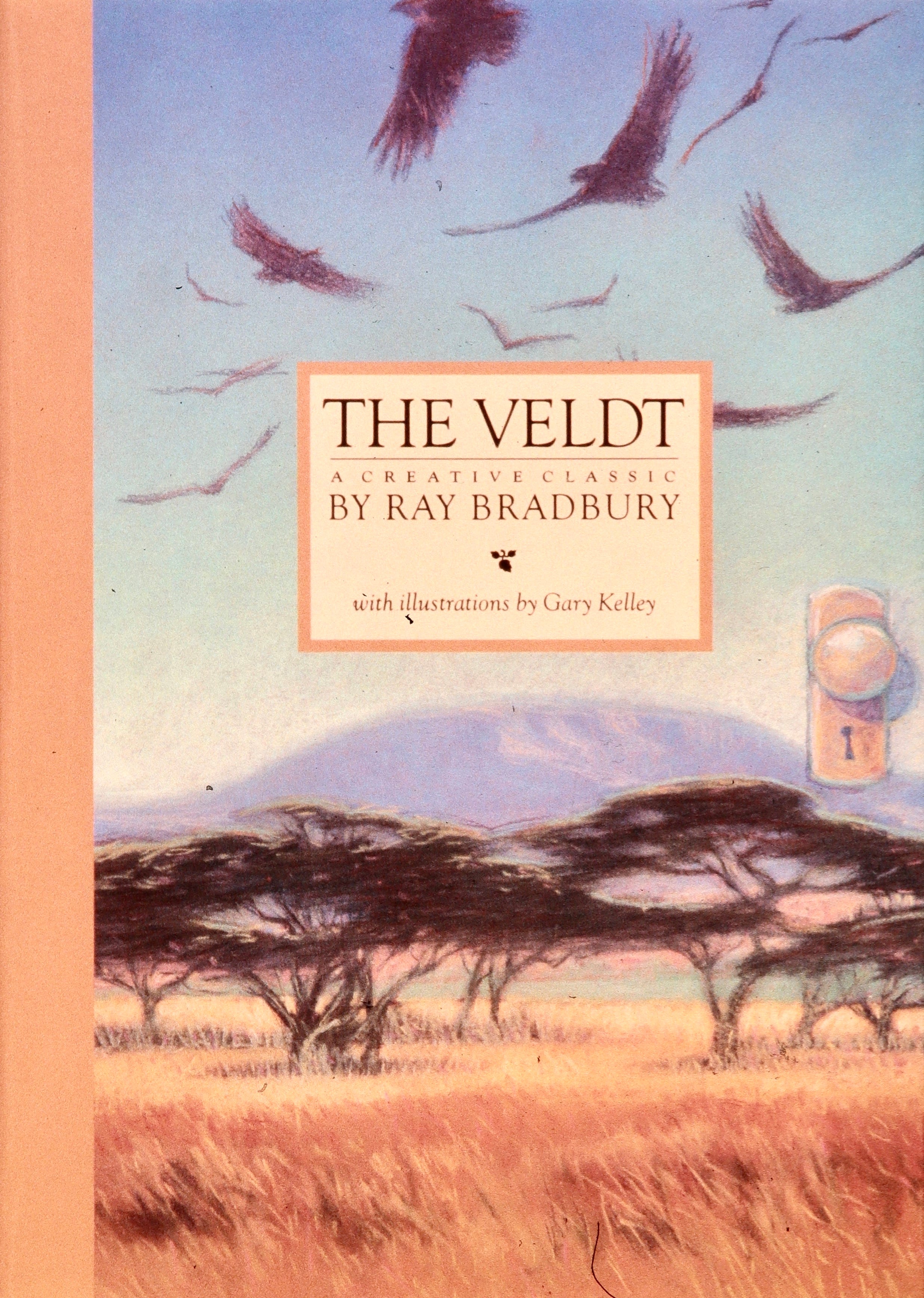
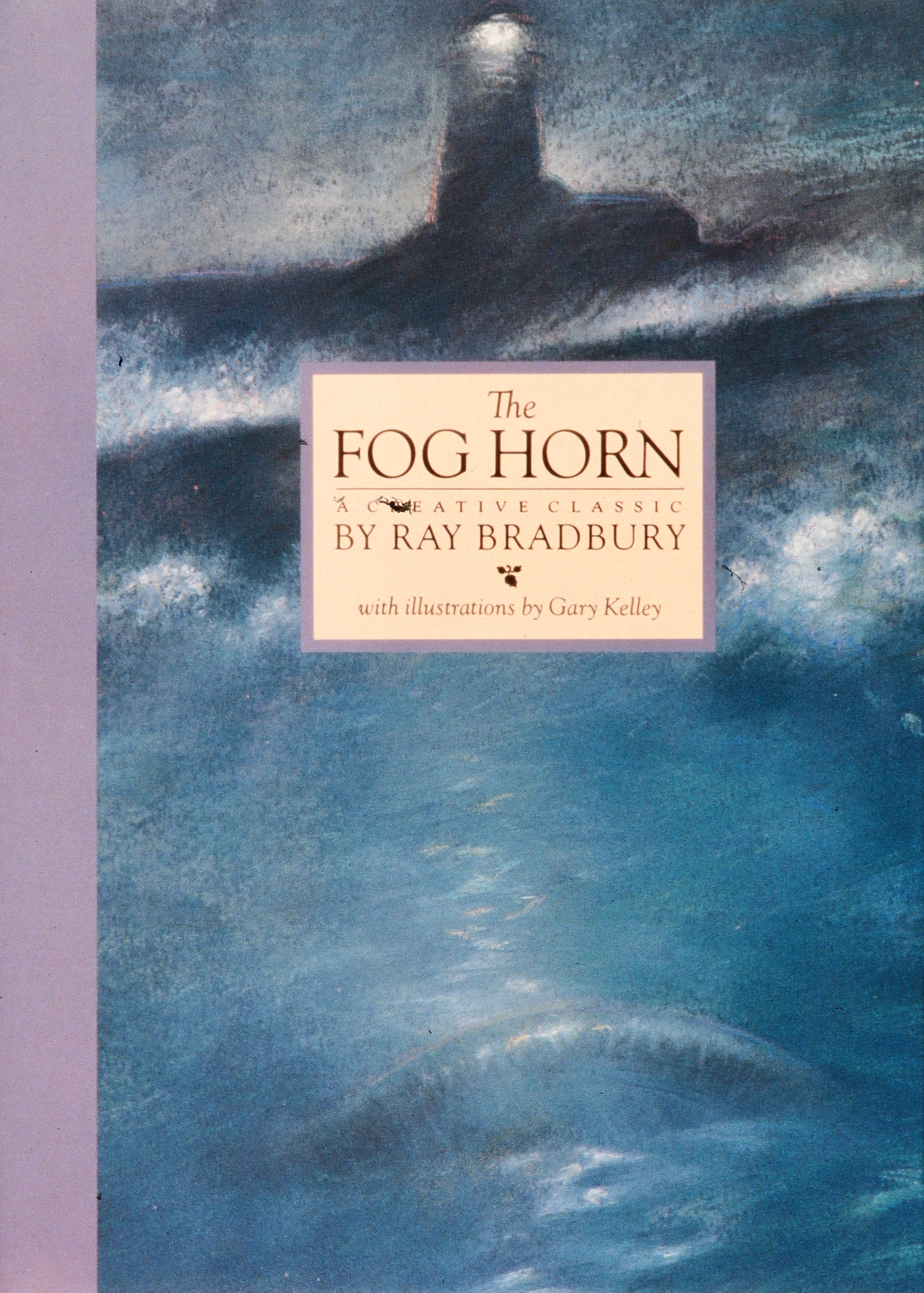
1988. Science and science fiction were in the air. Creative Education came back to us with a series of classic short stories by Ray Bradbury. We called on illustrator Gary Kelly to create the illustrations, a series of over twenty large chalk drawings. But almost had a group heart attack when the printer in Italy sent back with the proofs. They’d sprayed the drawings with Fixatif so the chalk wouldn’t come off on the glass of their camera setup. The drawings turned to mud. It fell to me to tell Gary he’d have to do them over. “Sure,” he said. “I’ll have them to you in a week. No charge.” And you know what? They were even better.
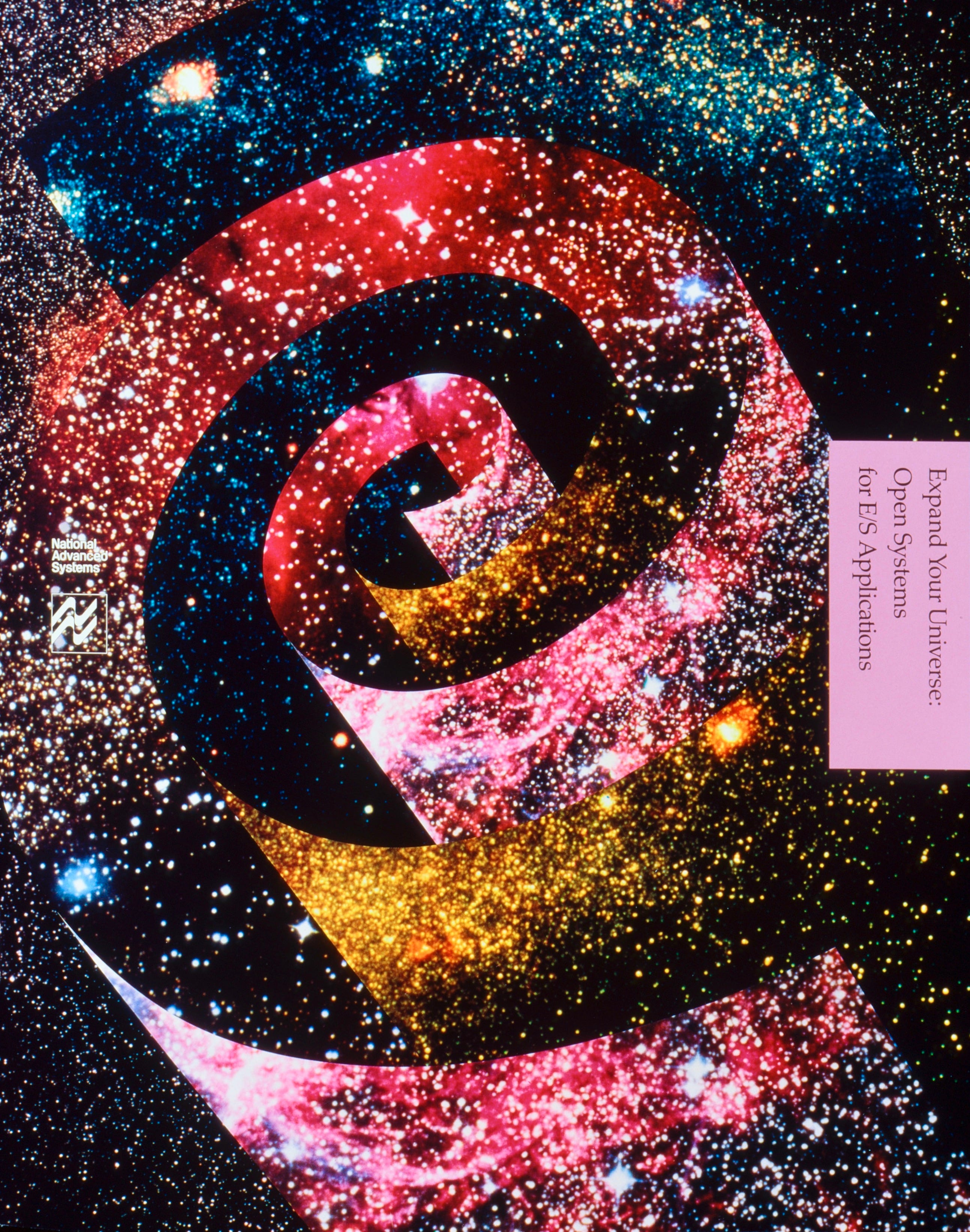
1989. We returned to our collage technique on this product brochure for National Advanced Systems. Photoshop hadn’t been invented, so the work had to be done by hand. Imagine the skill it took to cut perfect curves out of photo prints and piece them together. When Photoshop finally arrived, it killed the gee-whiz factor of our special technique. Anyone with a computer could do it in minutes. Today, the same thing is happening across multiple creative disciplines with AI.
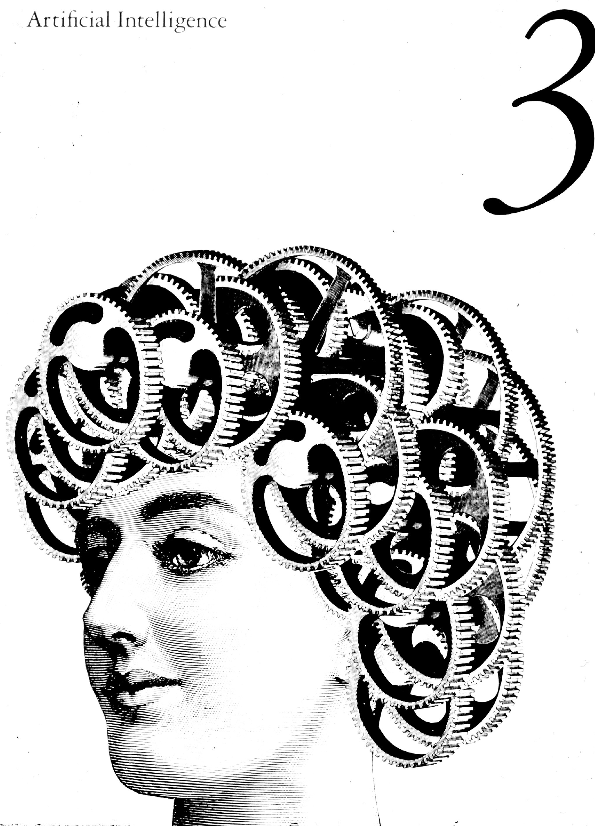
1989. Speaking of AI, here’s an illustration from a huge software catalog we designed for Sun Microsystems. There were 30 sections of software, each section requiring an illustration, all done by collaging (what else?) parts of old engravings. “Gearhead” was my favorite.
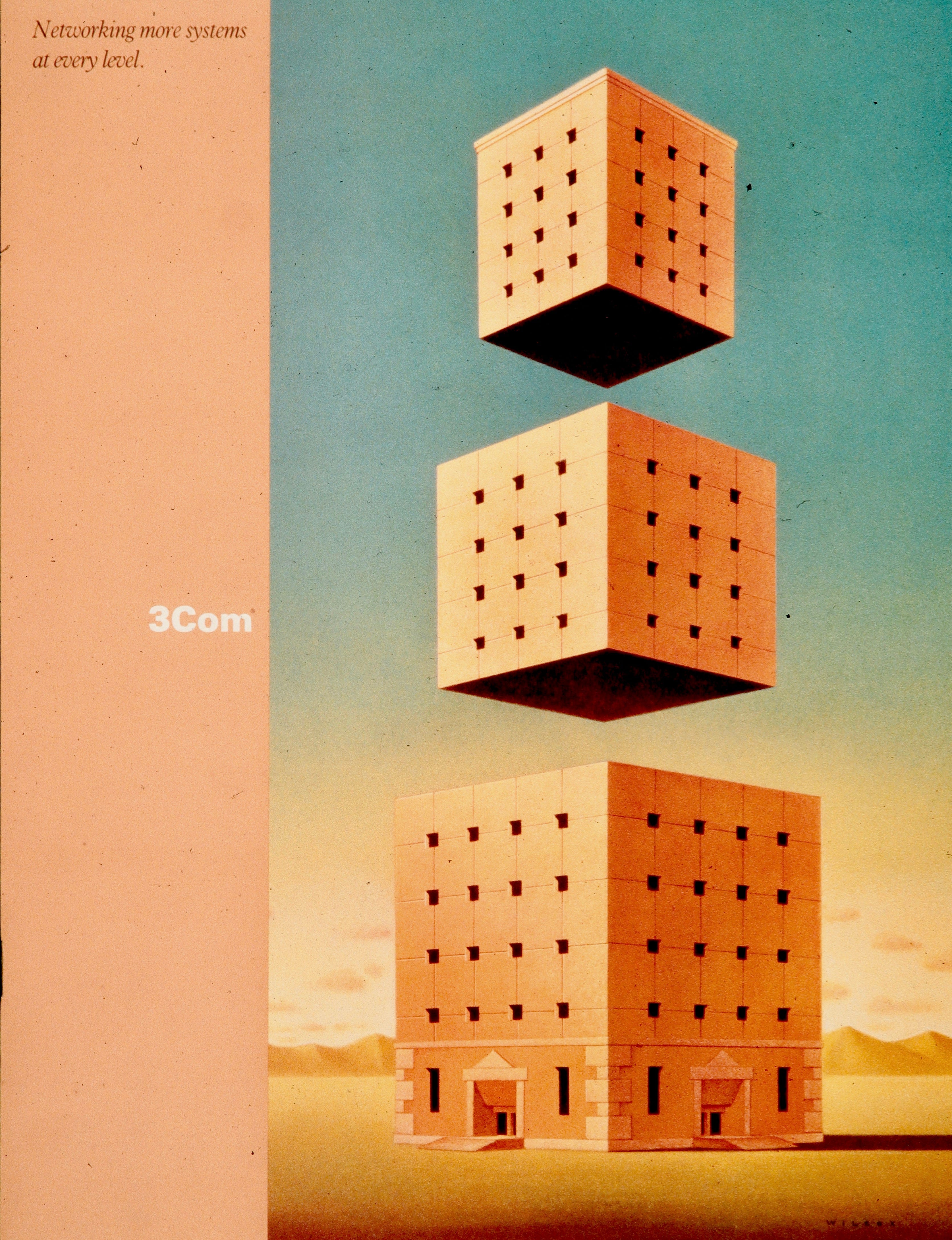
1989. This corporate brochure above, for 3Com, was one of the last we designed, as the studio had already begun specializing in software packaging. The theme of the brochure was “Networking more systems at every level.” Illustrations by David Wilcox.
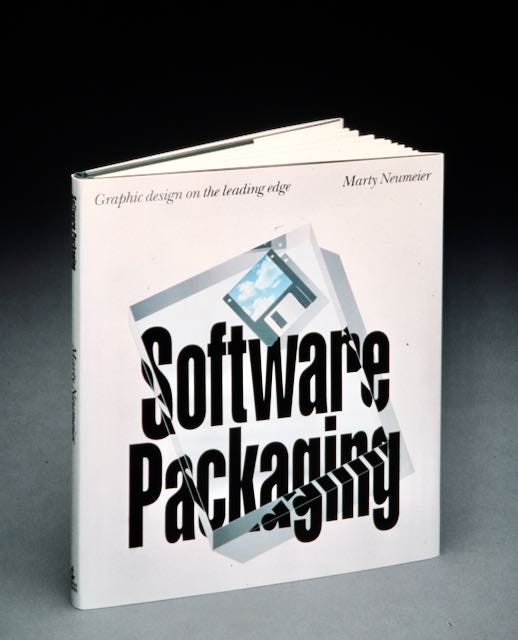
1990. I started a book about our work to attract packaging clients, but I only got as far as the cover and an outline. The floodgates opened and we were deluged with more packaging than we could handle. I especially like the distortion effect of the glass slab over the type. We did this with Adobe Illustrator after studying the way glass reflects images at various angles. It lends a magical effect to what’s little more than some type and a floppy disc.
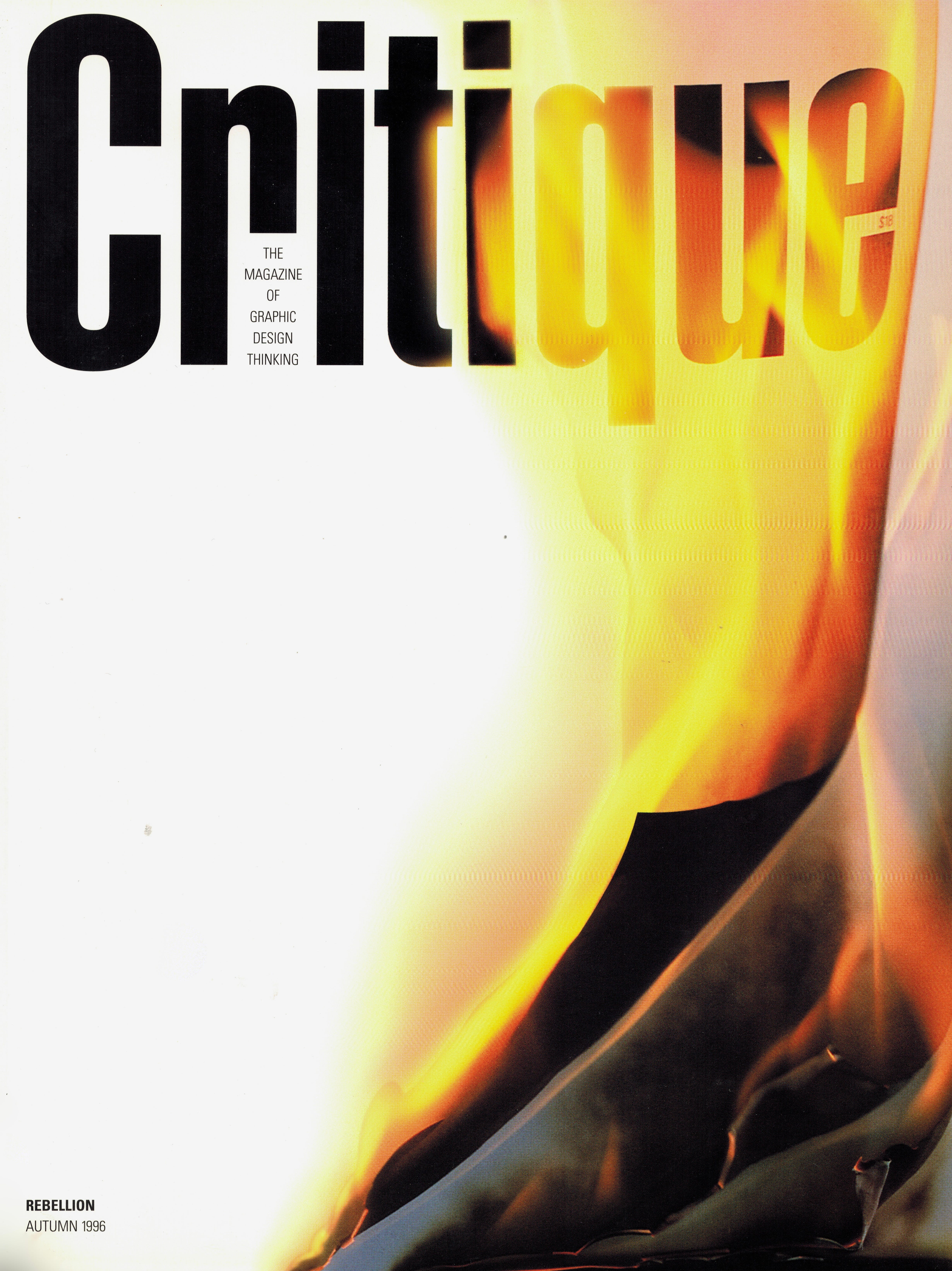
1996. After two years of designing hundreds of packages for Hewlett-Packard, the members of my team were burnt out from “package after package.” I surprised them one morning by announcing that, from this day forward, we would be a magazine publisher. I thought they might quit on the spot, but instead they embraced the enormity of the challenge. Each quarter we spent an hour or two together discussing cover ideas for the next issue. Whoever came up with the best idea got the assignment. For the second issue, “Rebellion,” a timid young newbie raised her hand and said: “What if we just set it on fire?”
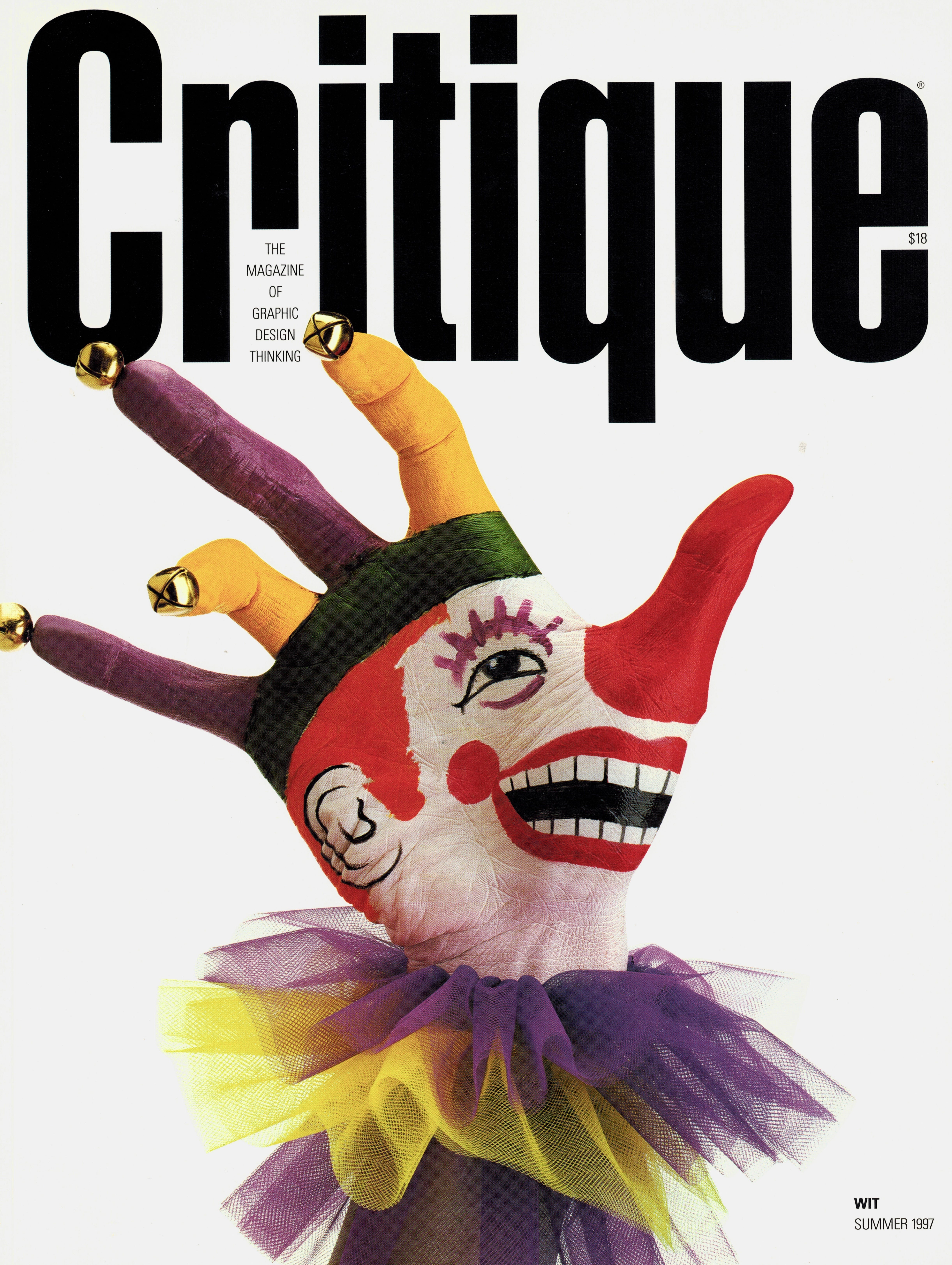
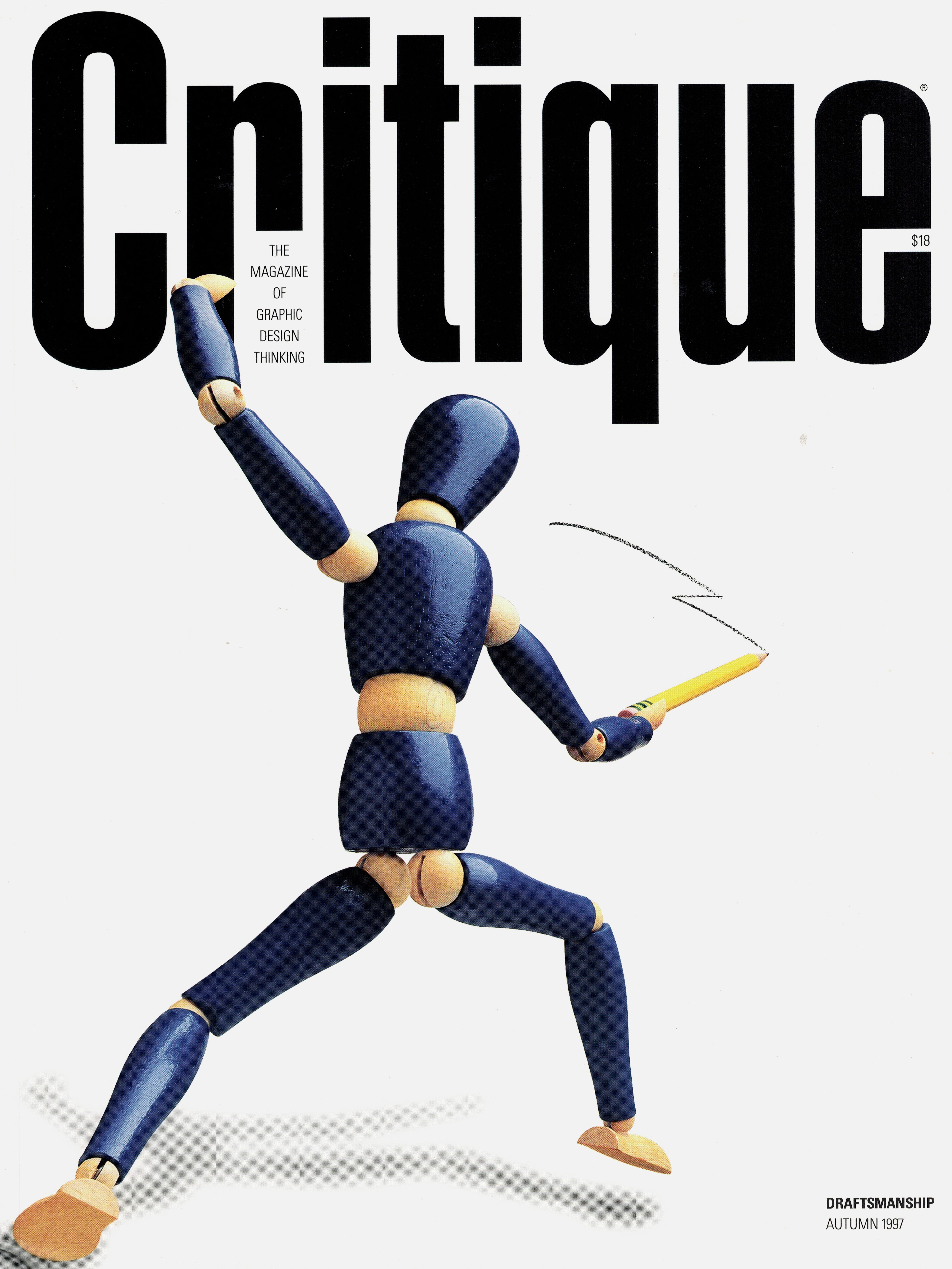
1997. Creative director Chris Chu came up with two great covers in a row, the first a clown puppet for the Wit issue, and the second a pencil-wielding swordsman for the Draftsmanship issue. For the clown, he face-painted his own right hand (he’s left-handed), then went around the studio frightening everyone.
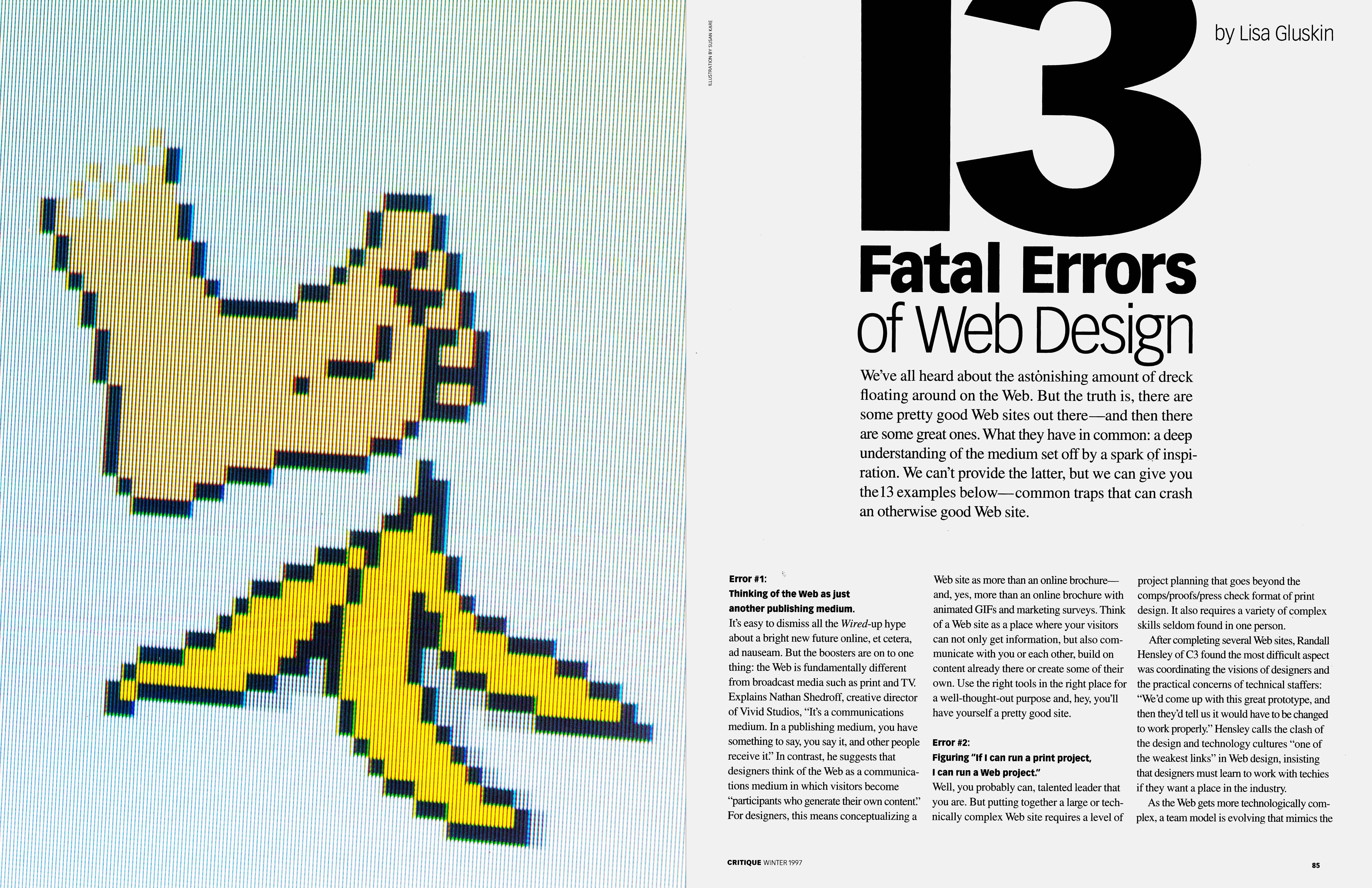
1997. One of our regular freelancers, Lisa Gluskin, was an early adopter of the World Wide Web (now known as “the web”). She was the first to critique the flood of websites appearing online. It didn’t take her long to develop a cogent opinion about what worked and what didn’t. The pixellated banana-peel illustration was designed by the so-called Mother of the Trashcan, Susan Kare, who created the first screen icons for Apple.
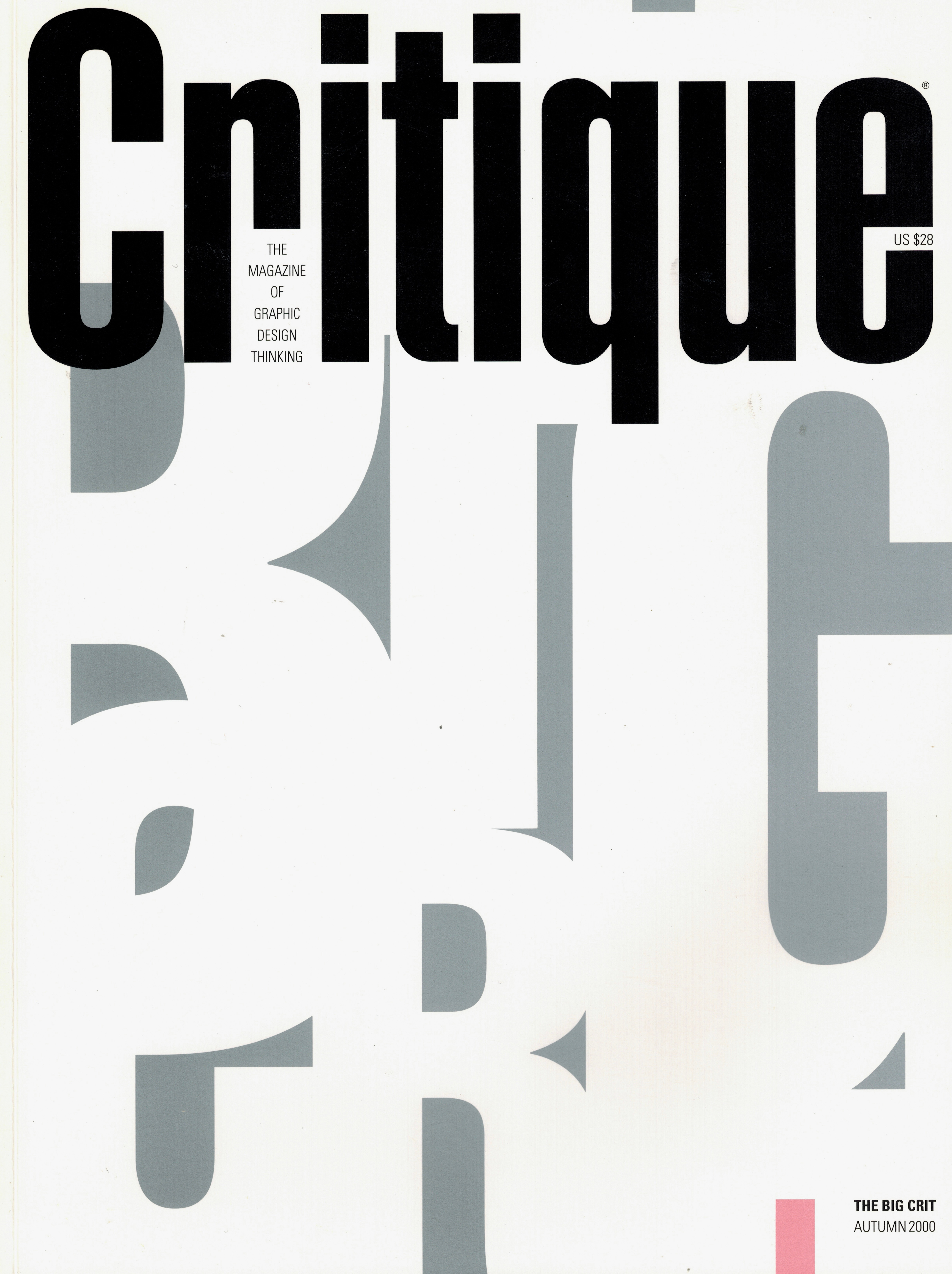
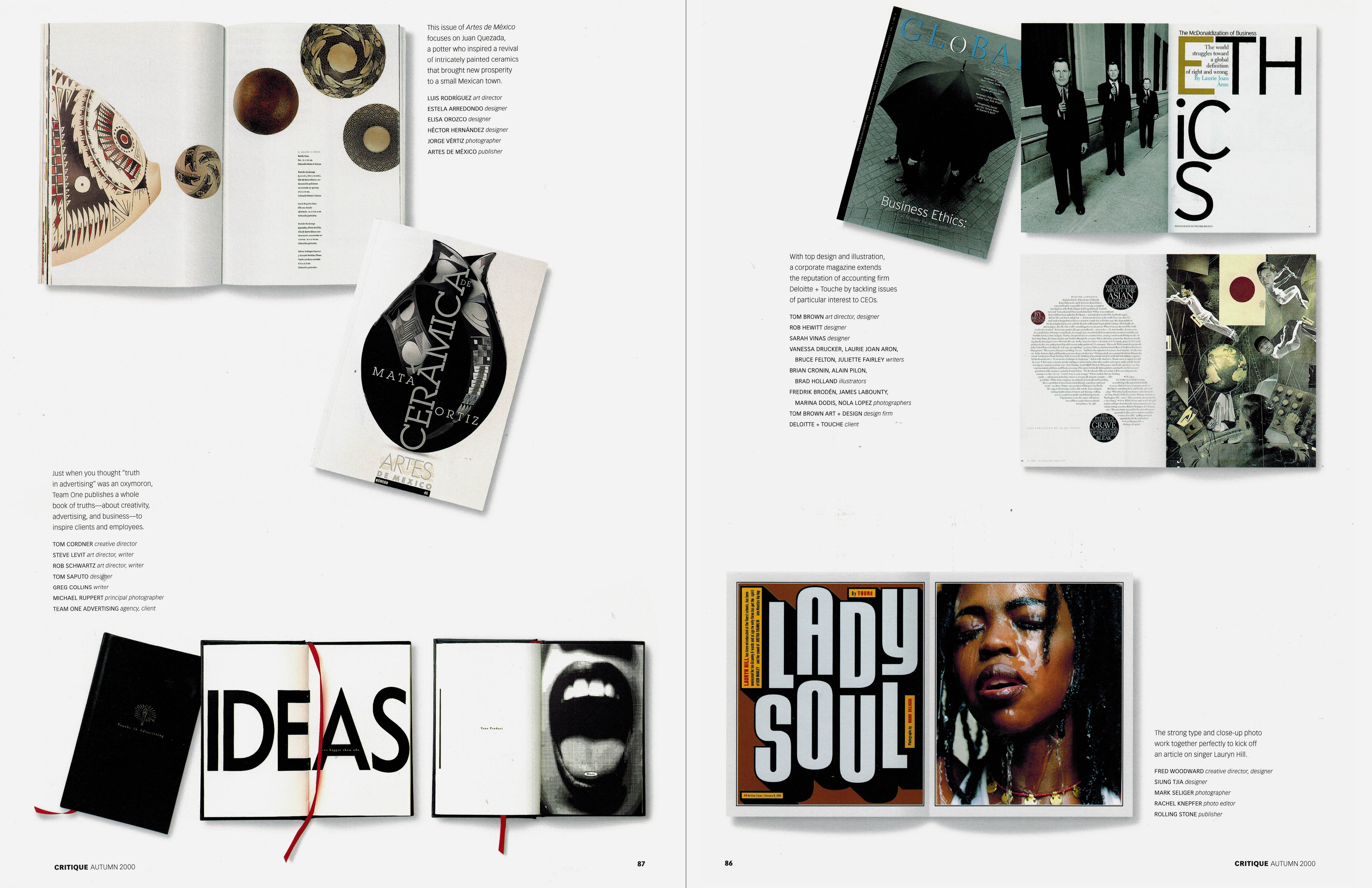
1999. Year three of Critique, and the deadlines were coming like fastballs. To make the job easier, we’d turned one of our quarterly issues into a competition annual called The Big Crit. It was still a lot of work, but it was a break from writing so many original thought pieces. I could design most of the pages myself using a copy machine and Scotch tape while the other writers and designers prepared the next issue. What made The Big Crit unique was that the judges had to explain their thinking, a feature which hasn’t been equalled in other design competitions.
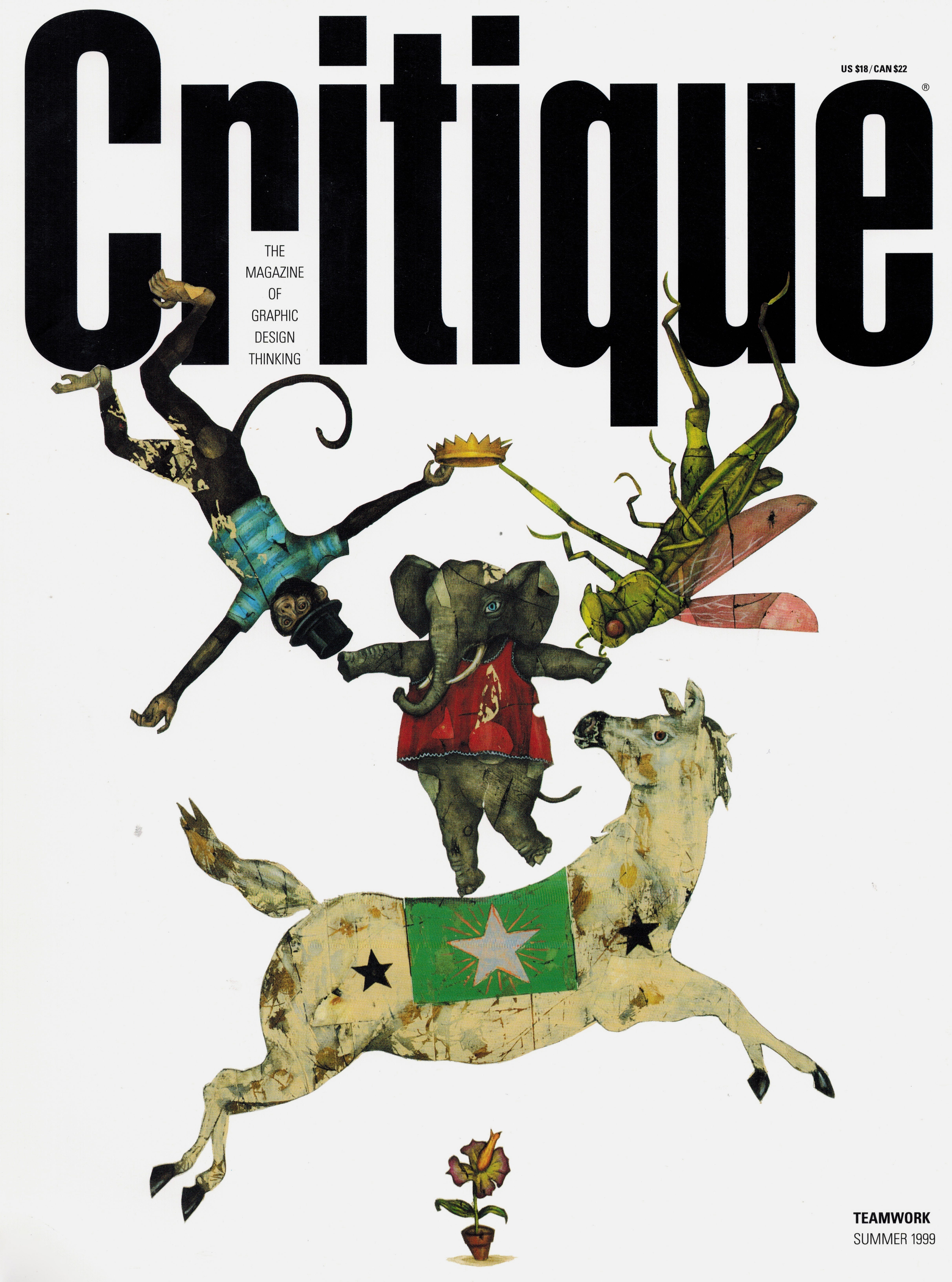
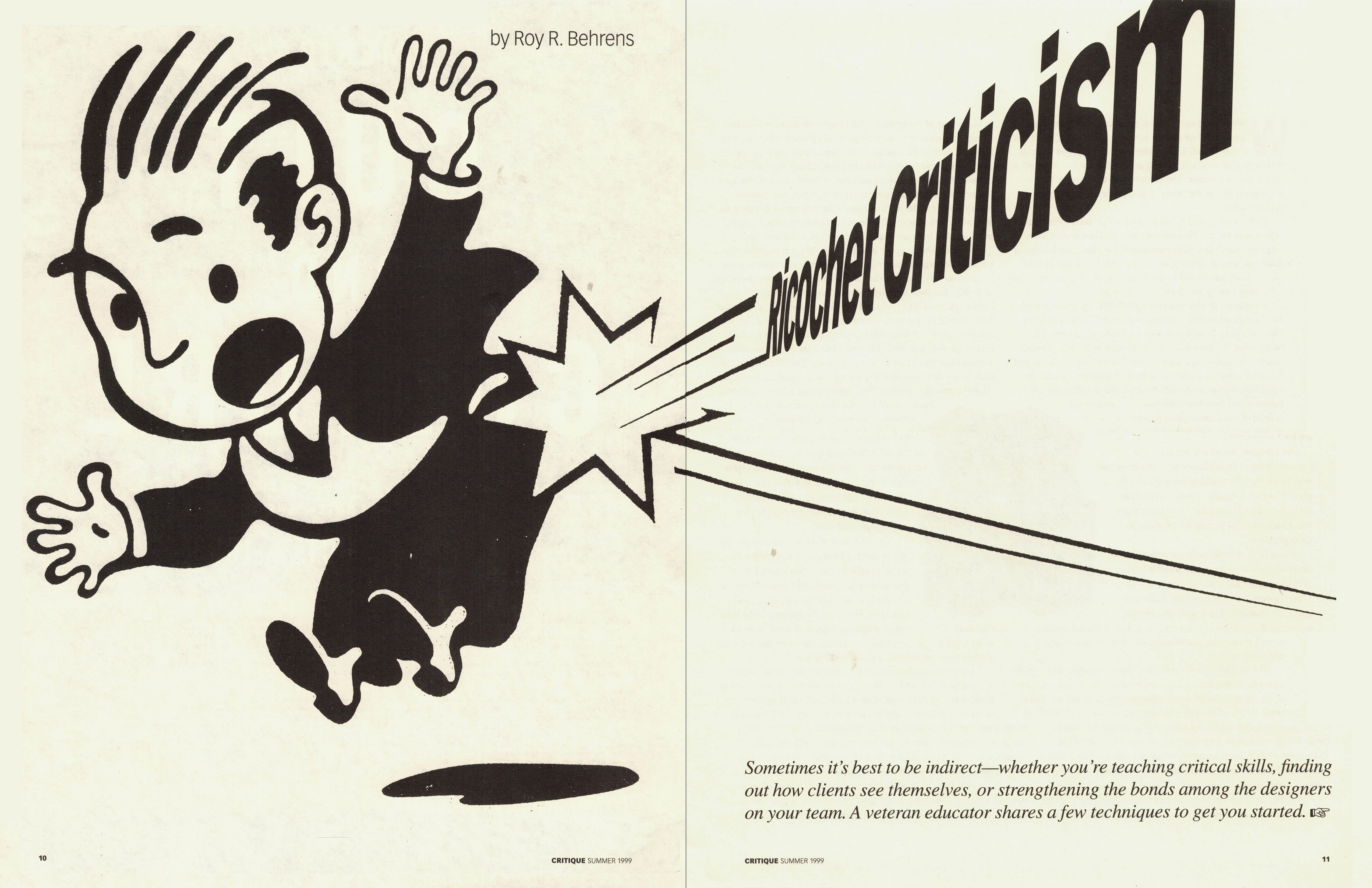
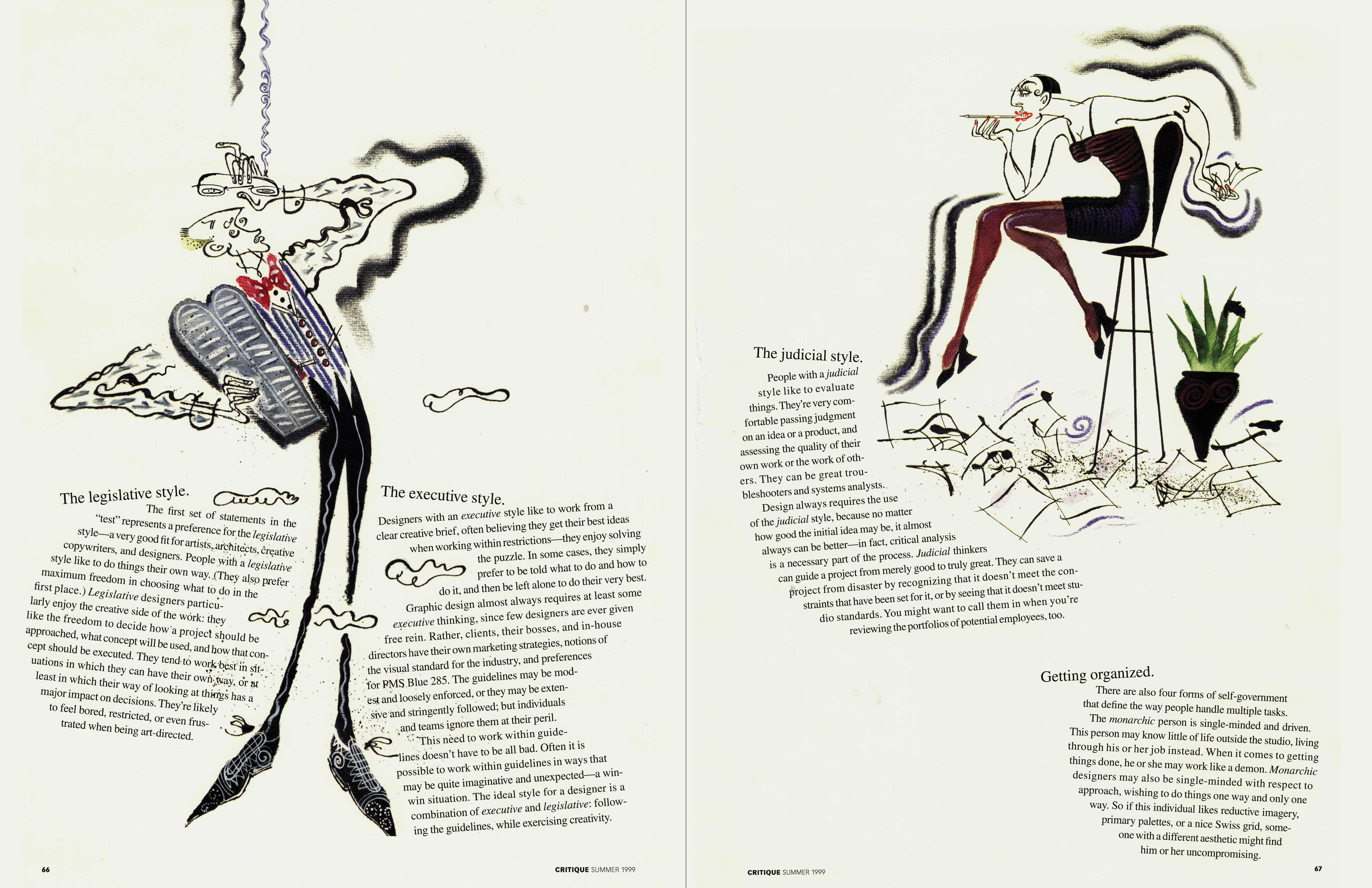
1999. The Teamwork issue took on a new subject in graphic design—collaboration. Our view was that we graphic designers would never be taken seriously until we learned to collaborate—with strategist, researchers, writers, marketers, and other designers. This became a theme I would bring into my brand books and masterclasses in the coming years. The cover illustrator was Jason Holley. The spreads below were from articles that explored two aspects of teamwork: how to give criticism, and how to allow for different styles of thinking. The illustrators were Chris Willis and Rowan Barnes-Murphy, respectively.
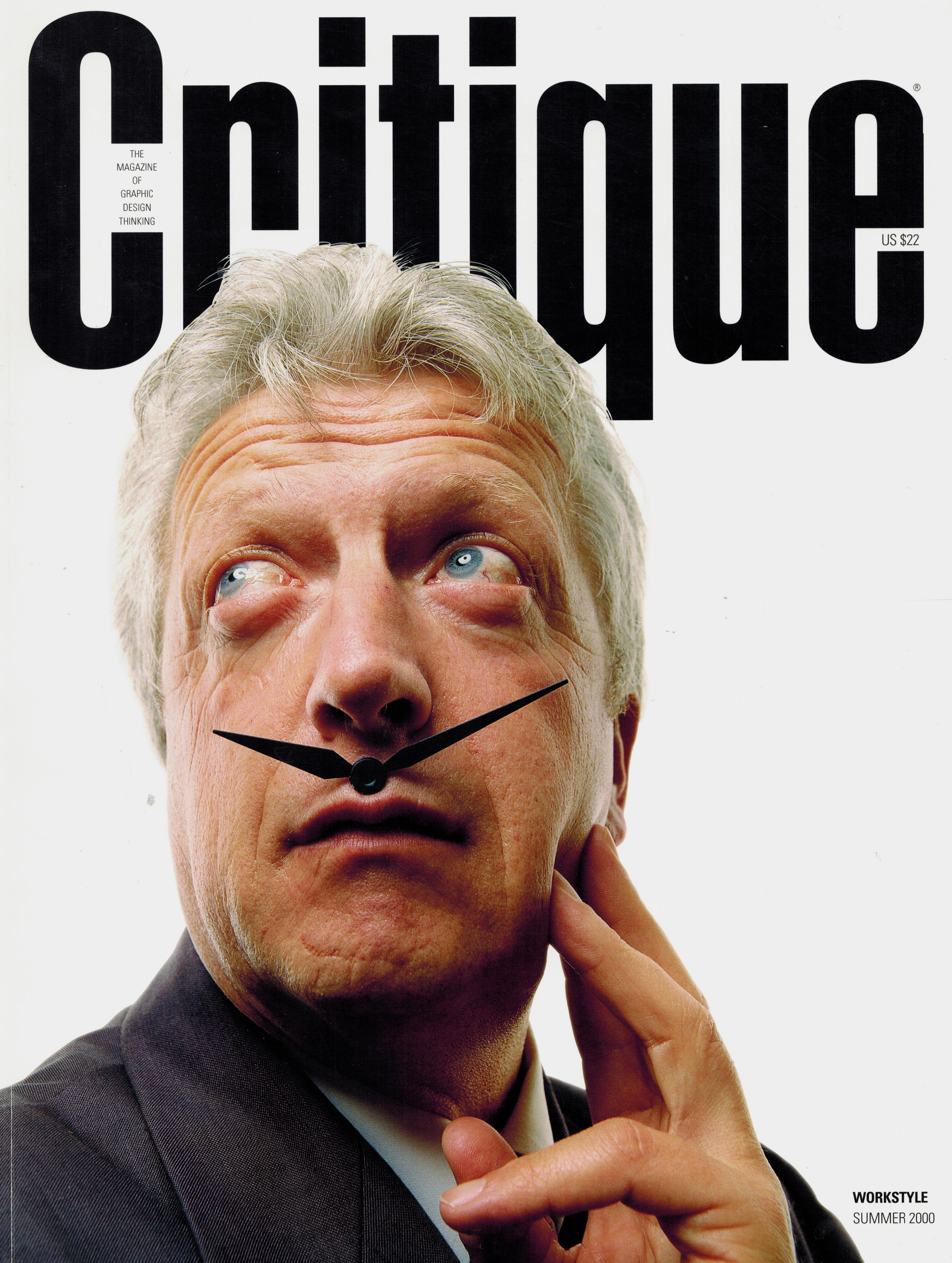
2000. After five years of not-quite-profitability, we began to run out of money. Our last regular issue was Workstyle, a practical topic that dealt with time management, studio environments, design firm management, and work-life balance. On the question of balance, the prolific Milton Glaser said this to our readers: “What’s in balance at any given moment is subject to becoming unbalanced at the next. Balance isn’t passive; it’s not a form of entropy. Rather, balance is a matter of being actively engaged in the attempt to achieve balance.”
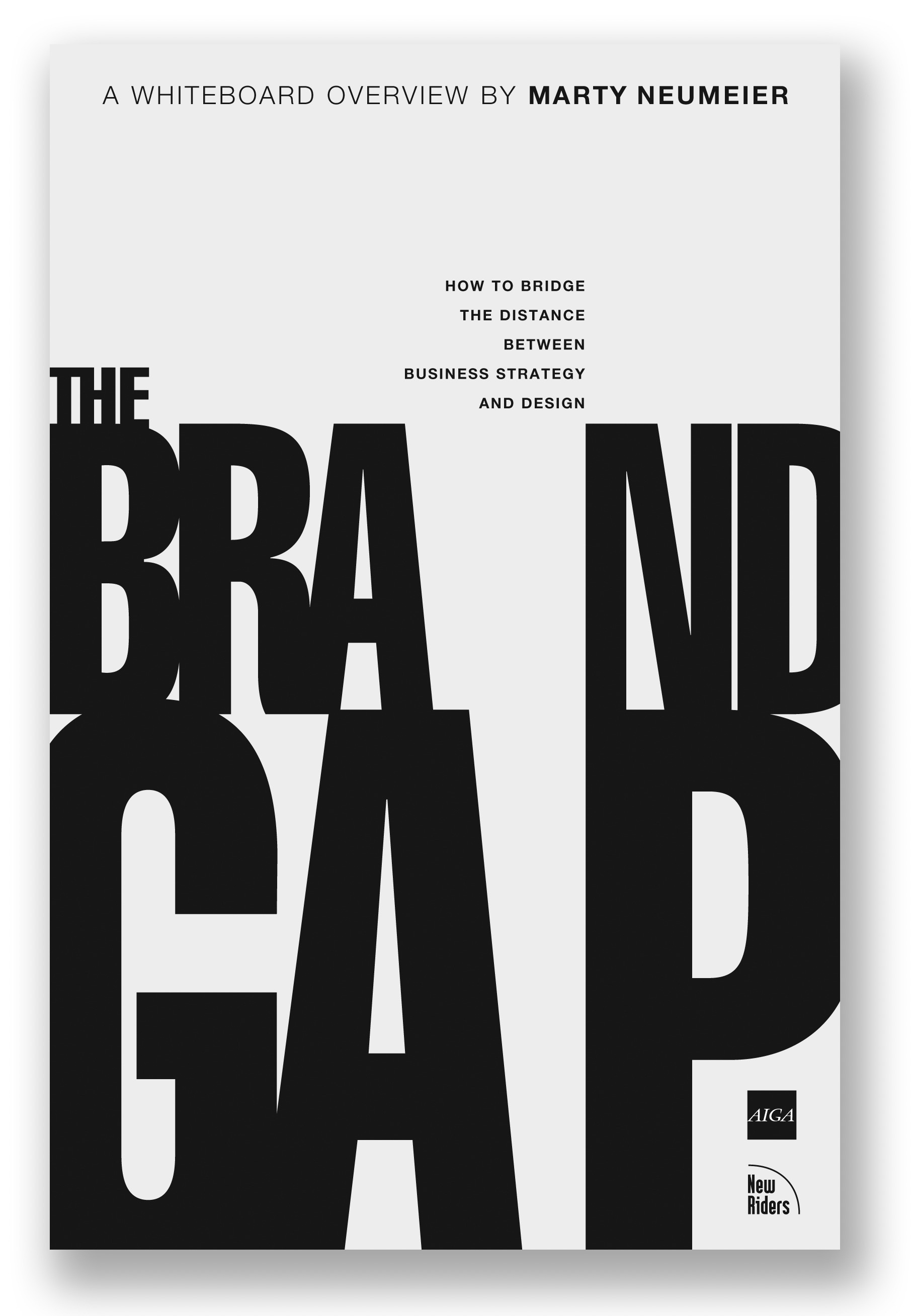
2000. By the end of the year we could no longer afford to keep the studio open. The next couple of years would see 9/11, the dotcom bust, and a worldwide recession—a perfect storm that made our continued existence untenable. In the final months of 2000 I’d been working on a book about the tension between strategy and design. I scribbled an idea for the cover and handed it off to creative director Chris Chu. The premise was simple: customers, not companies, define the meaning of brands. Our brilliant managing editor, Nancy Bernard, said, “Oh, I see. It’s not what you say it is, it’s what they say it is.” Three years later the book reached #15 on Amazon, and I headed off on second beautiful career.
Comments
Nothing yet. Say the first thing.
Sign in to join the conversation.