
I came to packaging late in my career. I didn’t think it was in my wheelhouse, probably because the designers I admired didn’t do very much of it. They didn’t do much advertising, either, a genre I loved. (See Ads). Eventually, I embraced the idea that the studio could spread out beyond the traditional boundaries of graphic design and take a fresh look at the creative possibilities of retail packaging.
I’m glad we did. By the 1990s the Neumeier Design Team had taken over the niche for software packaging, bringing more prosperity to both our clients and our firm than anyone thought possible. We eventually got tired of making money this way. We felt we’d exhausted the possibilities of packaging, and were itching for a new challenge. We found it with magazine publishing. But more on that later.
Now, in the category of packaging, the winners are…
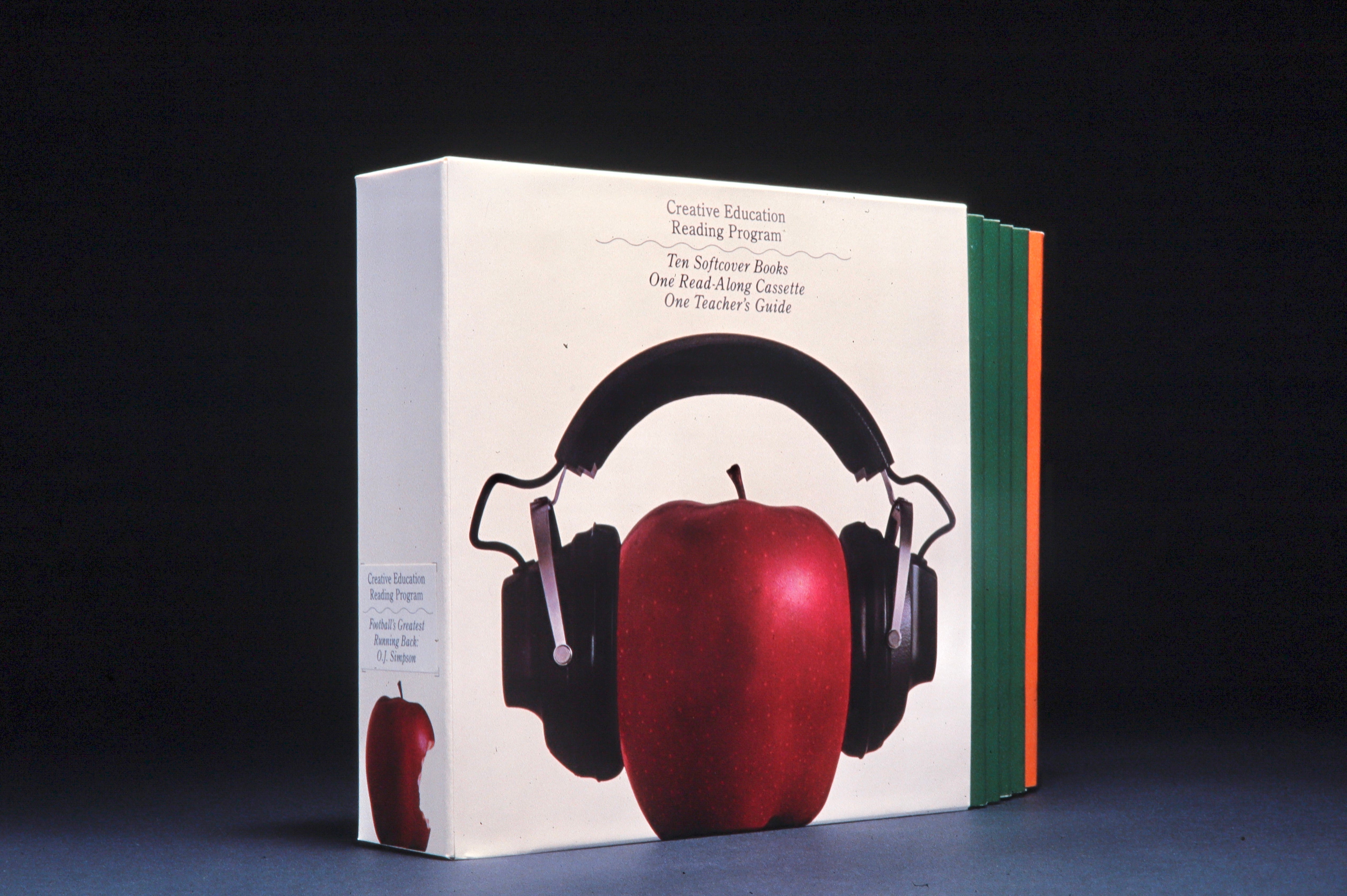
1978. Here’s early package for an audio-and-text reading program from Creative Education. The apple is a reference to the company’s trademark, shown on the spine in photographic form. As the package wasn’t sold at retail, it only had to contain the product and identify itself. Yet the use of an iconic image on a white background became the winning formula for software packaging a decade later. You can draw a line from this package to Apple’s white packaging of today.
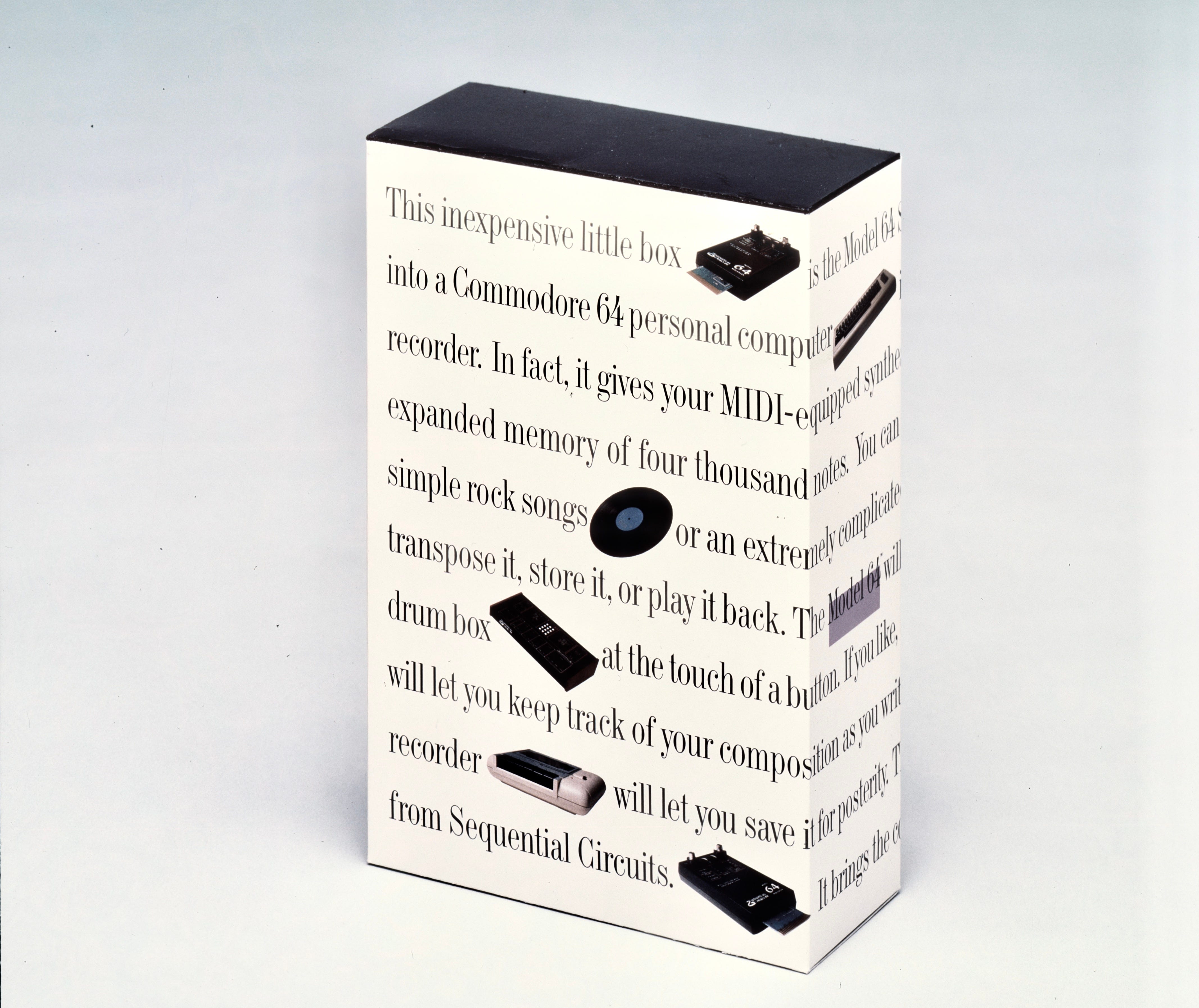
1984. Just before we moved to Silicon Valley, this assignment for Sequential Circuits came in through my friend, designer Mark Oliver. The product was a plug-in for a Commodore 64 personal computer that let you record, store, and play back music made with MIDI-enabled instruments. This was pretty technical stuff for the times, so I decided to make the description the whole package. The copy wrapped around the back, where the detailed specs were printed. Musicians loved it. We were heroes, and yet I still couldn’t see myself as a packaging designer.
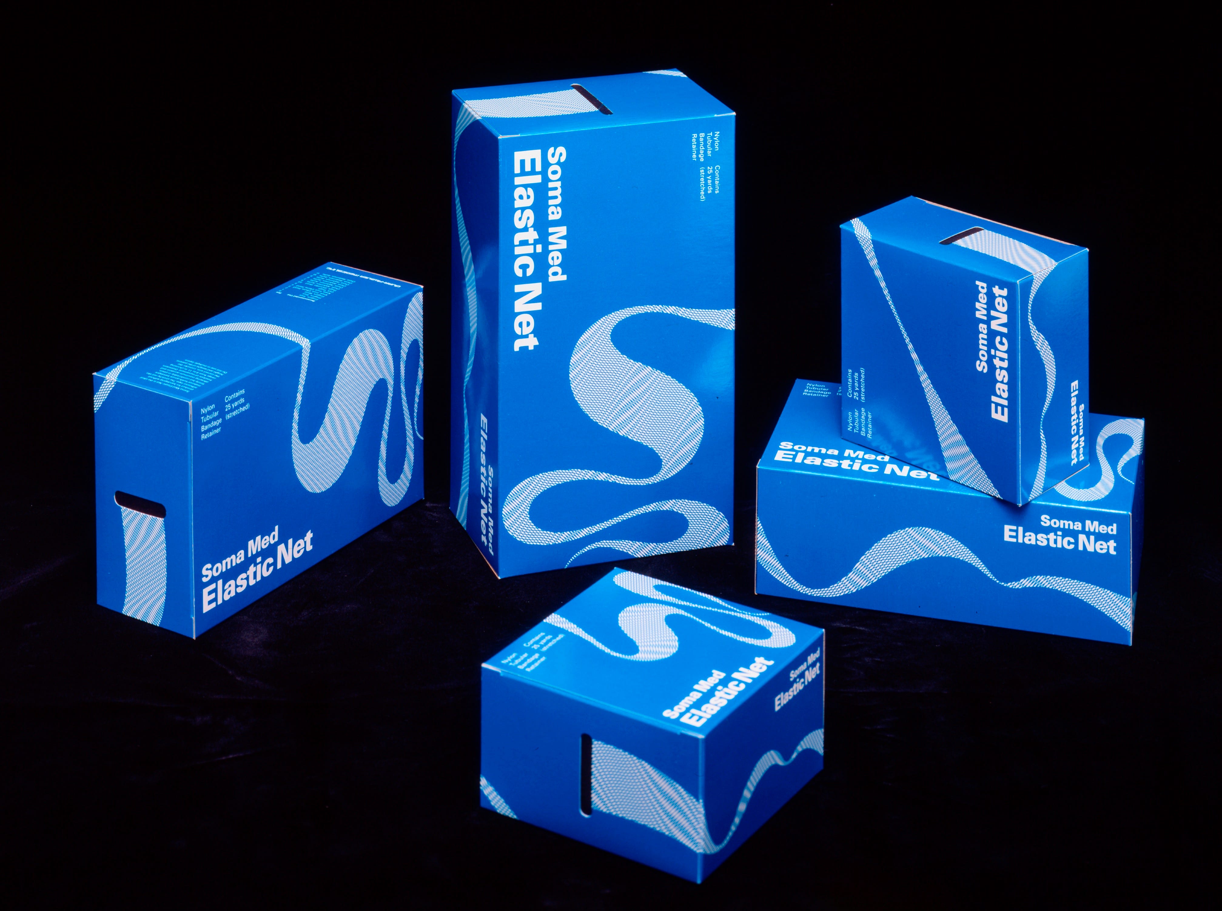
1987. My father had started a company called Western Medical to sell a product for hospitals and burn units. He made a connection between a stretchy, tubular netting used to wrap meat products in Europe, and a need for a more humane way to treat skin wounds worldwide. It completely revolutionized ER bandaging. We designed a set of simple packages that doubled as dispensers.
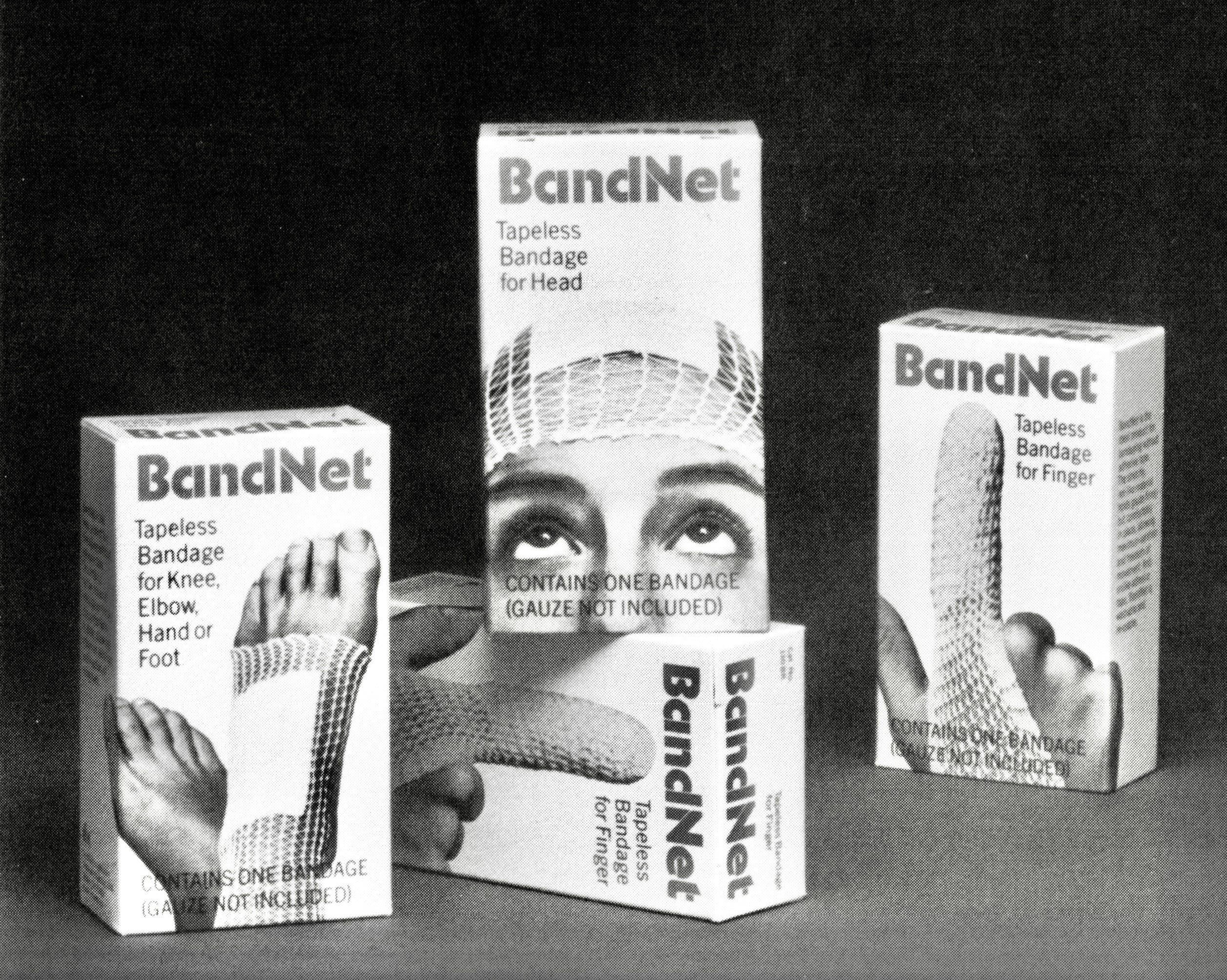
1988. Western Medical then went into retail with a consumer version of the same product. It didn’t do as well as the hospital version, and was later discontinued. But my whole family got into the act. This is my sister Elly posing as a patient. The packages were the size of a Band-Aid boxes.
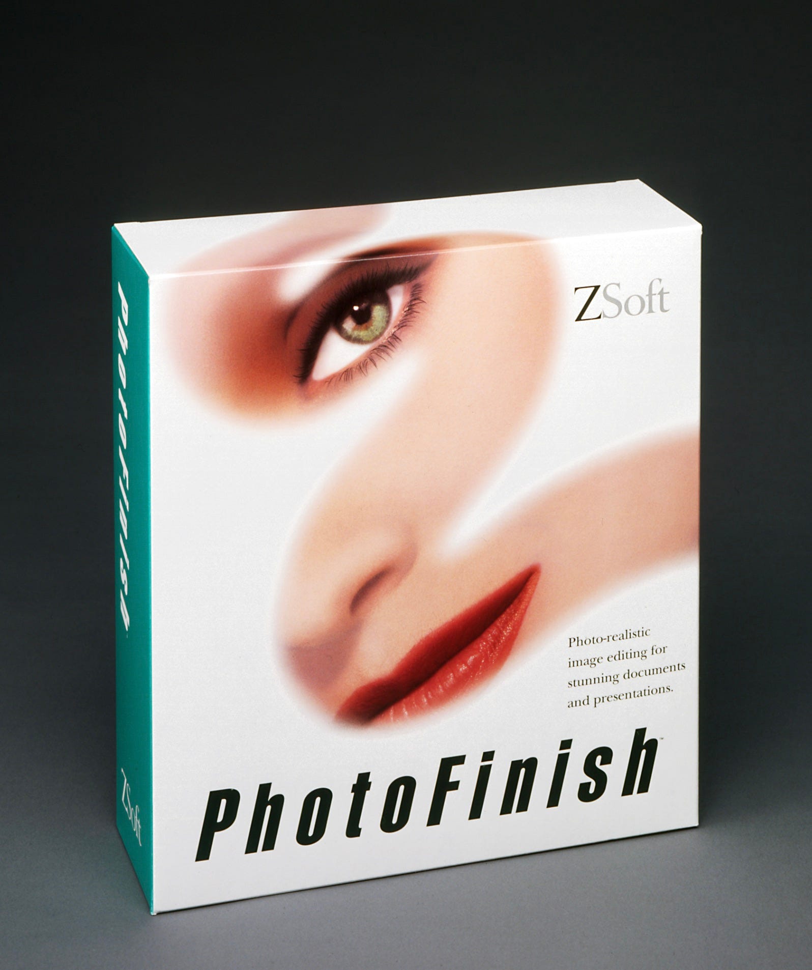
1990. This was the assignment that caused the light to dawn. We tailored the design for software shelves, where extreme clutter made it difficult to stand out from the competiition. The startling face on the front of the package, with its soft, flowing movement, made it pop off the shelf better than most. Notice the subliminal Z of the image, hinting at the ZSoft name. It was so successful that the client gave us three more products to package. We were hooked.
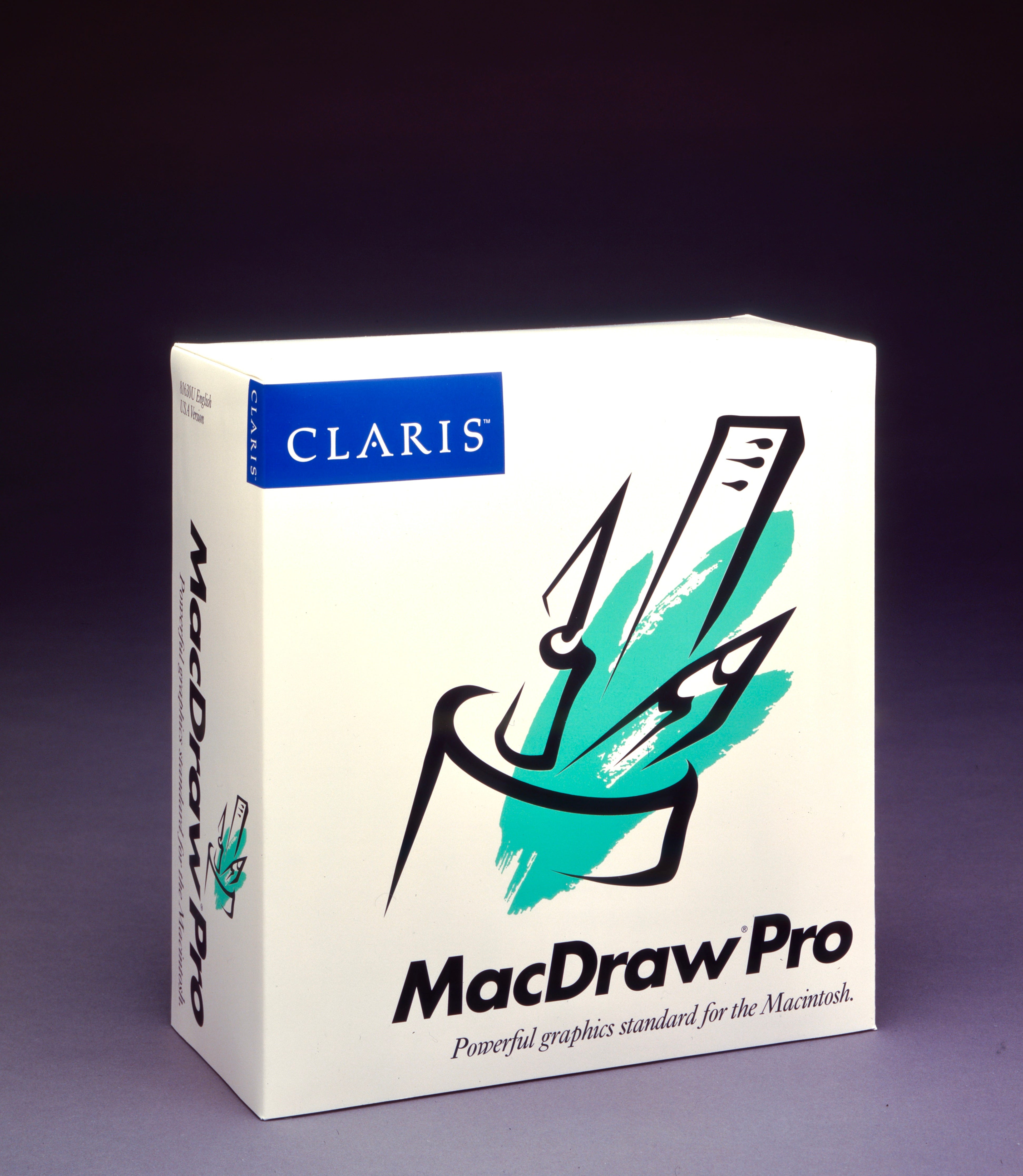
1990. Our big break came six months later when we landed 15 packages, the whole product line for Claris Corporation, Apple’s software division. We started with one package as a test, using everything we’d learned to date about what should go where on a software package. The design for package above was initially rejected on the basis of its arty look and feel. The CEO agreed to test three of packager designs with real customers in the store, and a Claris marketer lobbied for this one to be included. It blew the others out of the water.
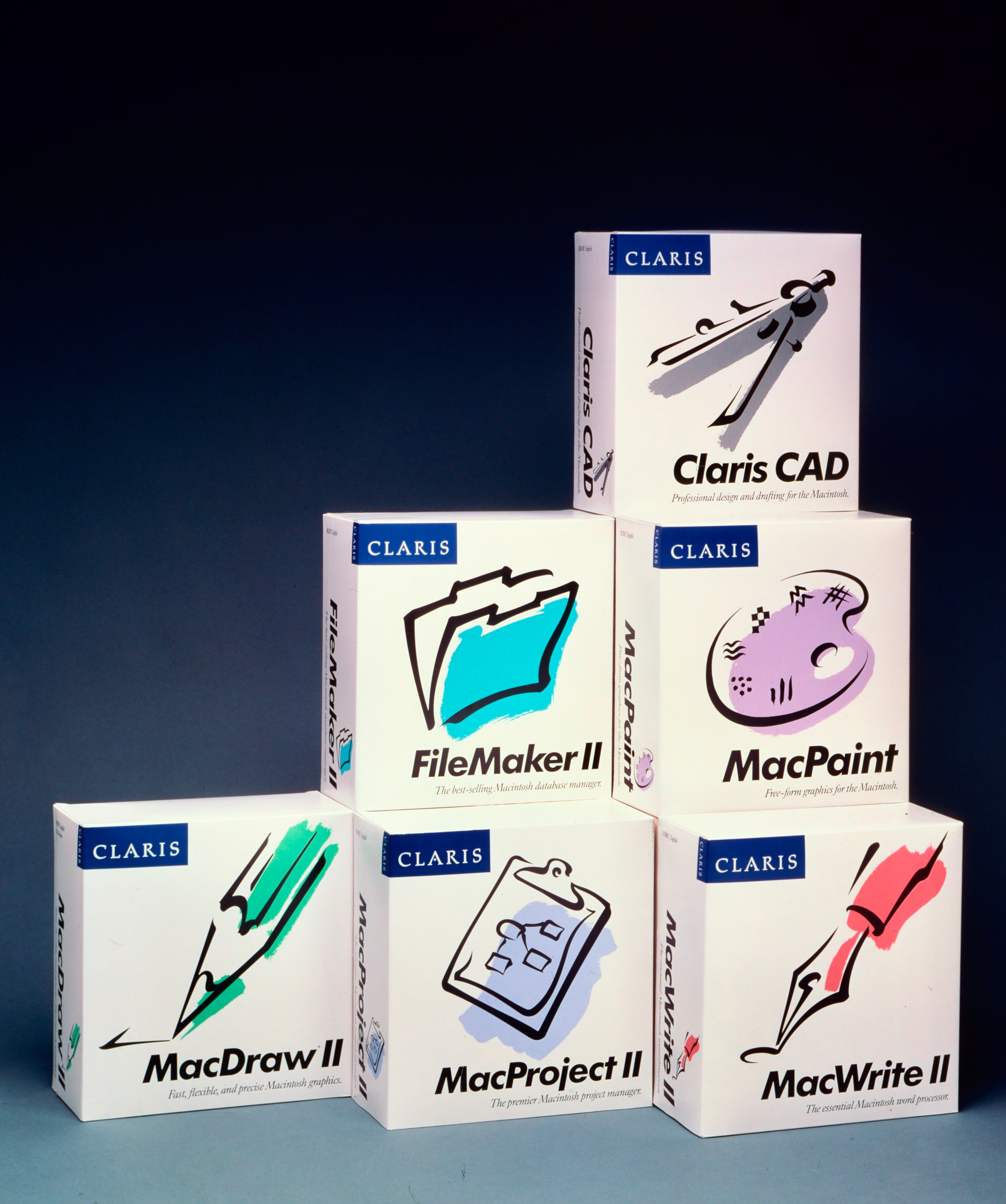
1990. We designed six more packages (shown above), and then eight more in rapid succession. CEO Bill Campbell told me they drove a 40 percent increase in sales across the board, with no change to the products themselves. That was the statistic I took to the bank. More orders for software packages flooded into the studio.
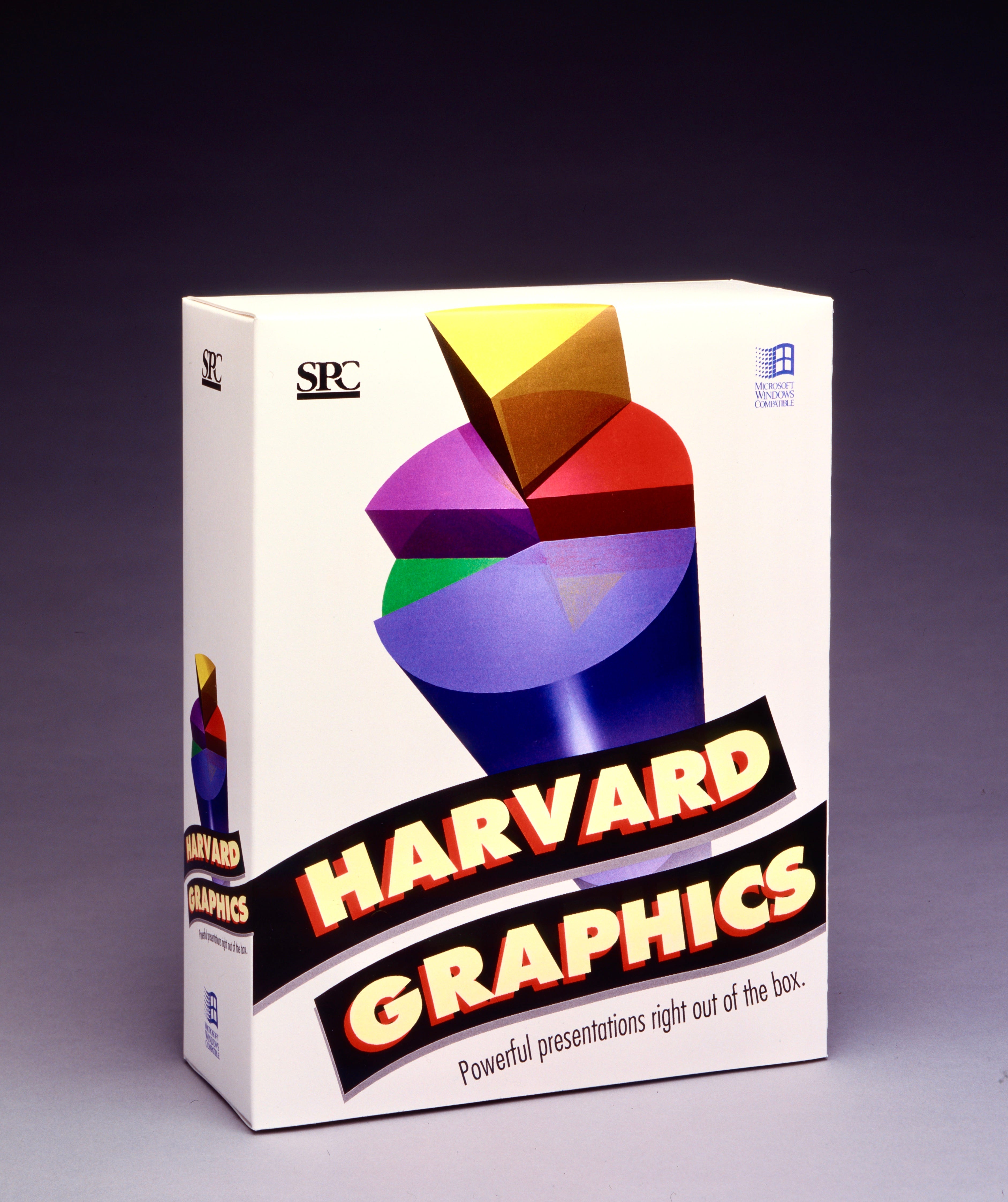
1990. At the time, Software Publishing Corporation was the market leader packaged software for Windows. Seeing our results with Apple, they came into the shop with their bestselling product, Harvard Graphics. Through testing, we had learned what makes packages pop of the shelf is strong graphics with a feeling of movement. We gave it to them. Success again.
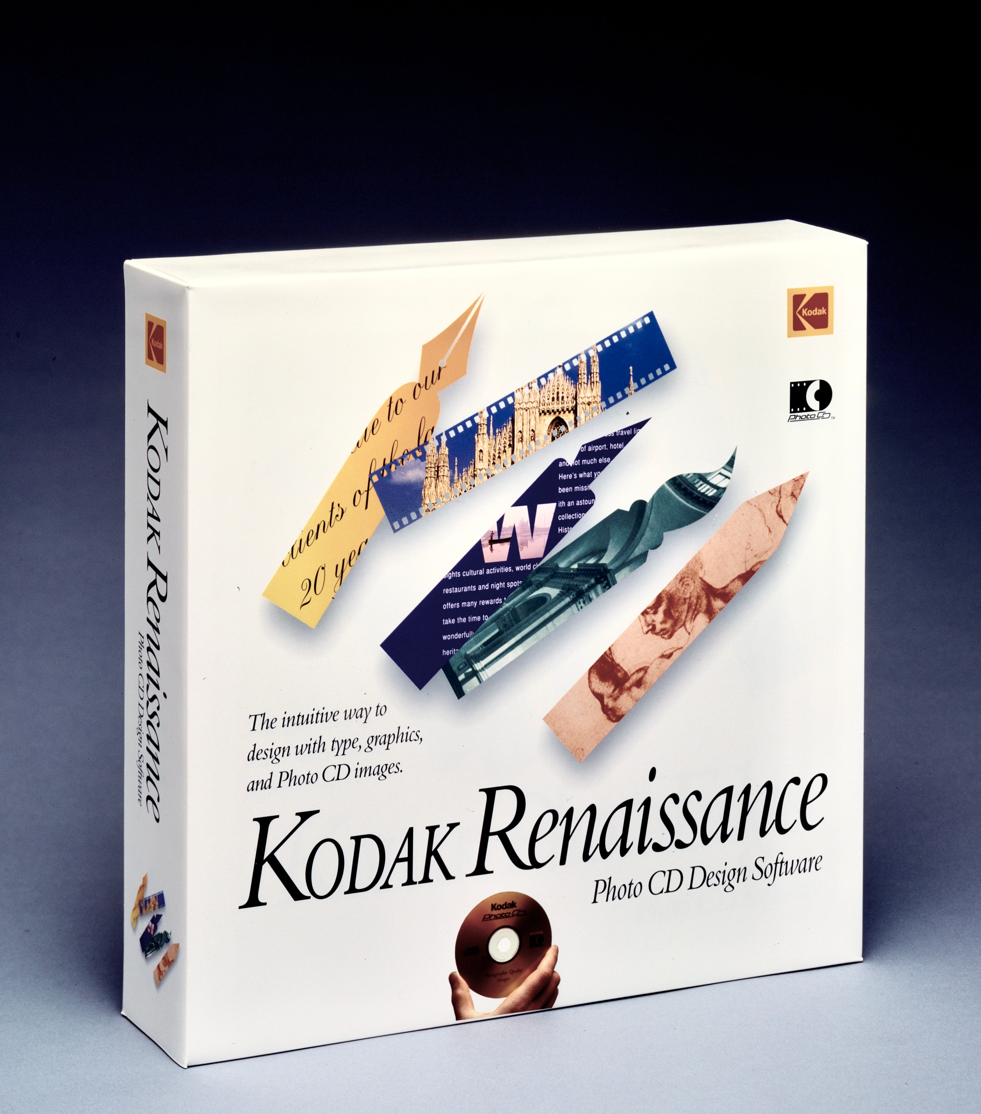
1991. Our client Kodak joined the digital revolution with a line of photography products. The first off the blocks was Kodak Renaissance, a tool for designing with Photo CD images. It was great to work with a company that had visual sense in its bones.
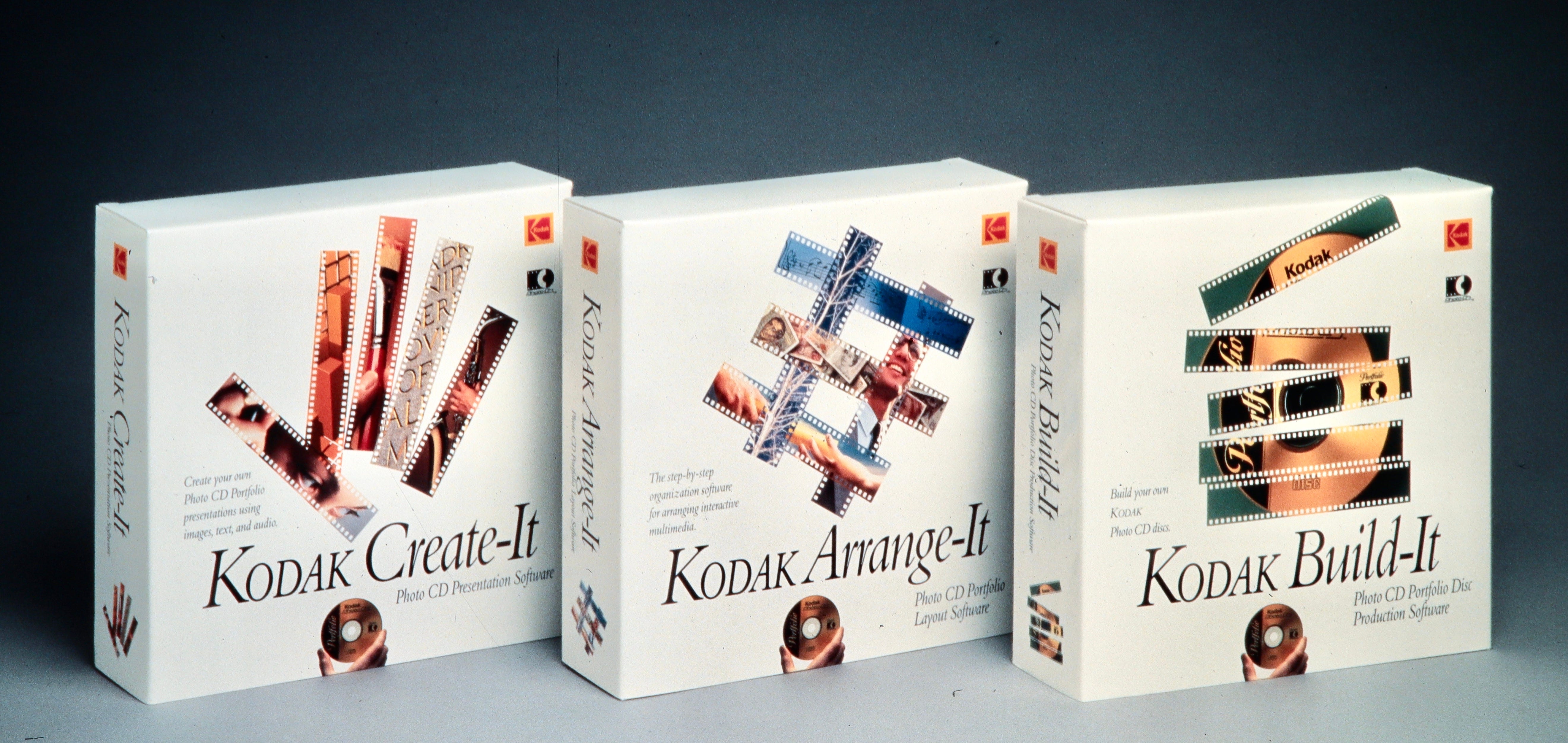
1991. A busy year for packaging. Three more for Kodak, challenging our ability to come up with more things you can do with film strips. The guys in Rochester were designing products faster than we could design the packages.
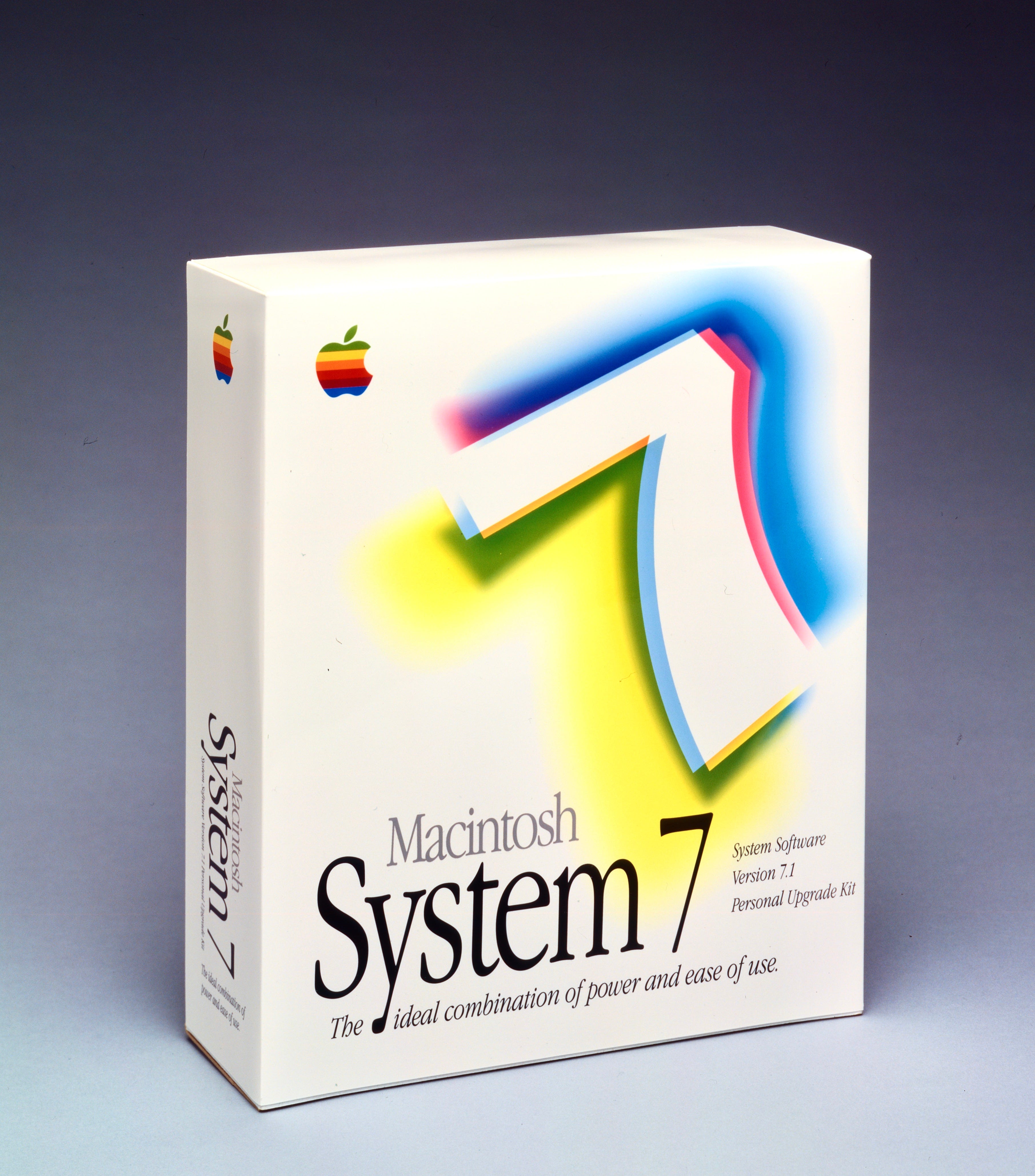
1991. Apple came to us to design a package for their blockbuster System 7 release, along with a few other packages for utility products. Once again, we used a clean white background to give what we were now calling the “icon,” or illustrated symbol, a buffer zone from other products on the shelf. This wasn’t laziness. White backgrounds consistently beat out colored background in our store tests. Going forward, Apple was the only company that parlayed our tested “white look” into future packages.
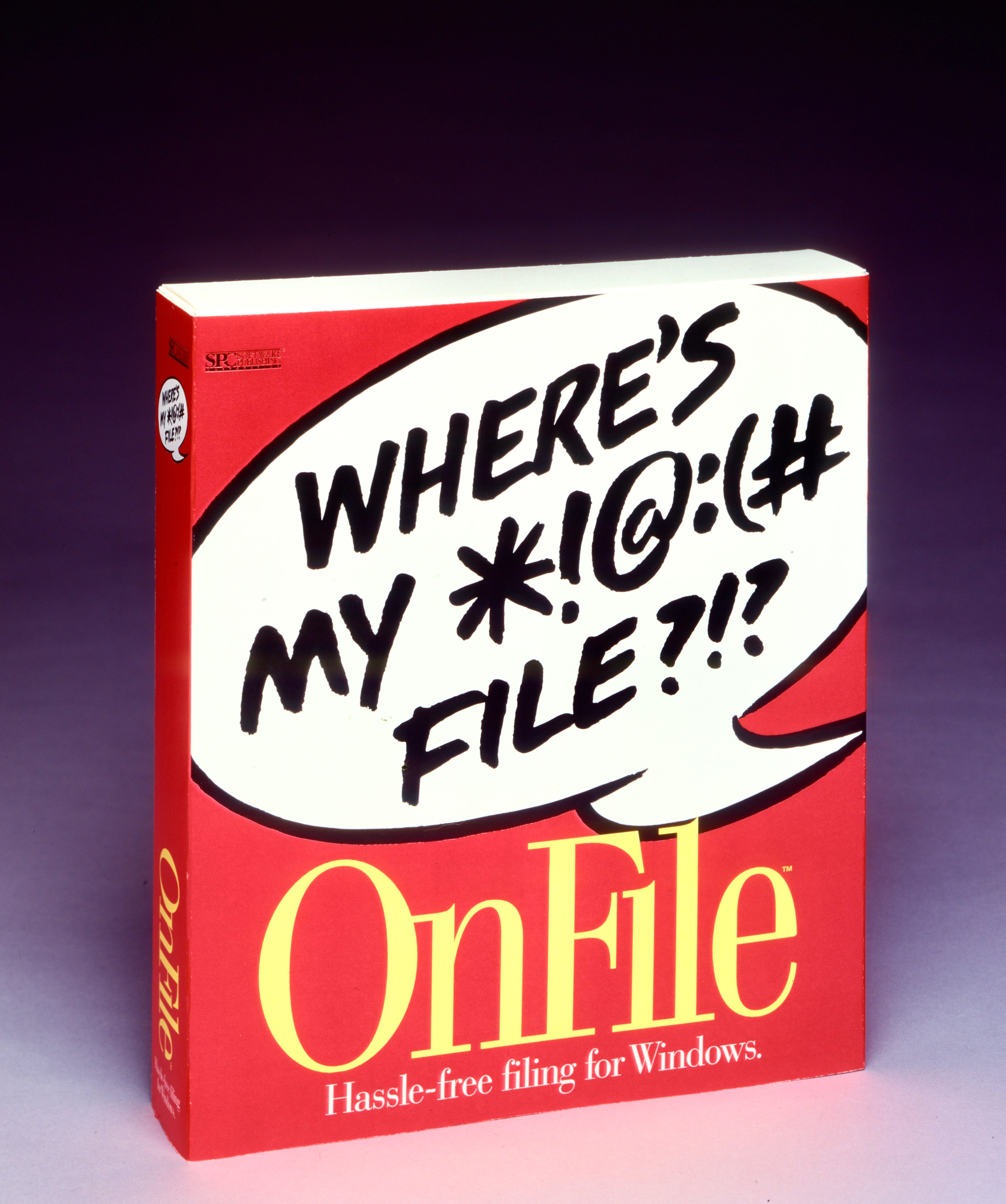
1993. SPC worried that our the white look was becoming too common, even though our prototype-testing for OnFile proved that the white was winning again. Instead, they chose the number two concept with a bright red background, and worked it into all their advertising, instore collateral, merchandise, and trade show booth. I loved the in-your-face concept, but the market grew tired of it after a year or so. The product soon died along with the package.
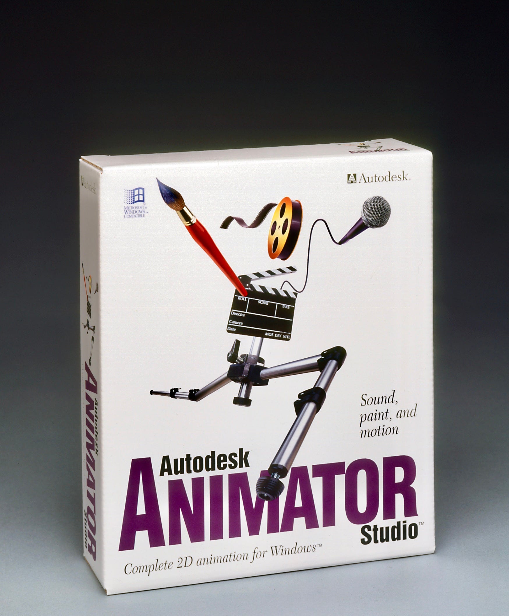
1994. Talk about jumping off the shelf! Our animated robot leaps over the logo and right out of the store. You may have noticed that our product names were always at the bottom of the package face. That’s because the leading retail software chain, Egghead, used to layer the packages on their shelves so that only the bottom half showed. I was amazed at how long it took other designers to figure out that their packages were effectively invisible when they placed the product name was at the top.
We did many more packages between 1994 and 2000, including several hundred boxes for Hewlett-Packard products. We had become a packaging factory, and the designers were burning out. I could have replaced them with fresh young horses, but I was burning out, too.
The most important thing I learned over those ten years was this: you can learn a lot from studying the work of other designers, current and past. But you’ll never be truly effective until you start testing your prototypes with actual audiences. That’s when you see if you’re really any good.
Comments
Nothing yet. Say the first thing.
Sign in to join the conversation.