
A world without colour would make me very sad. Over the years, one of my favourite parts of design has been experimenting with colour by mixing, layering, and seeing how it changes a space or a mood. An innate instinct within me that stems from my early childhood growing up in such a colourful world.
My fine art background definitely shaped how I work today. I’ve always been someone who needs to get hands on with paint, fabrics and finishes and have always let my hands guide my thinking. Like when I’m creating a painting or drawing, building a physical mood board of colour and finishes has always been the foundation to a winning design. This is where my intuition takes over and the magic happens.
Consider this a dive into the world of colour and interiors – how I think about it, how I use it and how to feel more confident bringing it into your own space.
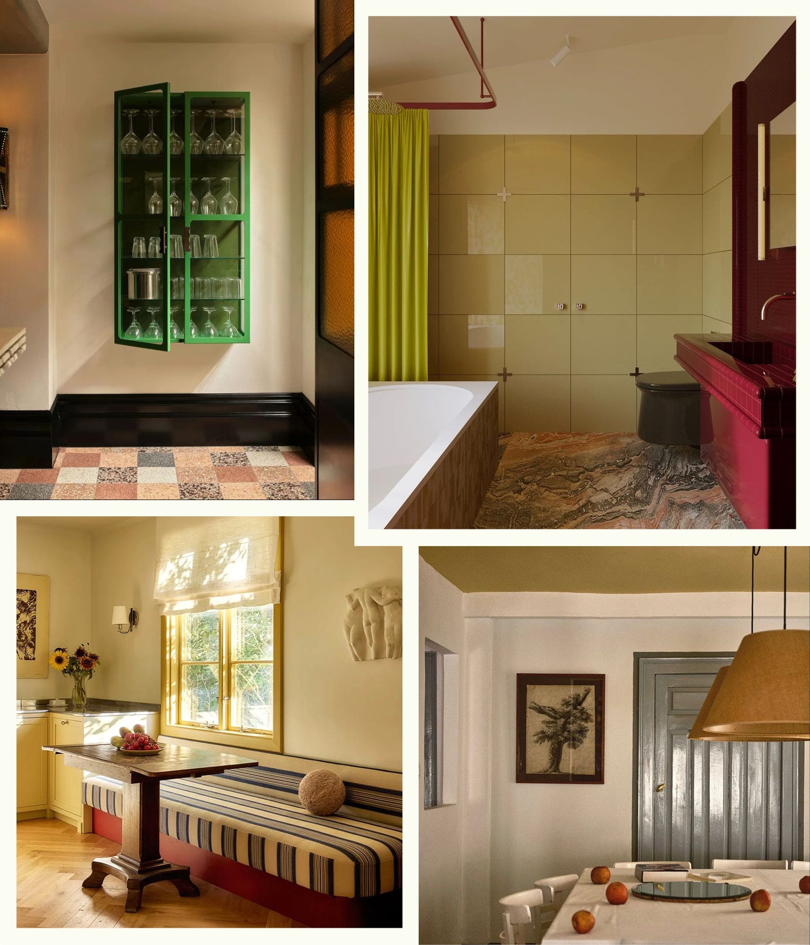
When it comes to paint colour – my first point of call is always Farrow & Ball. They have a tight range of colours and always seem to have the right tone. Earthy but punchy! As they are based in England, I usually get their colours matched here in Australia through a preferred paint supplier. Porters Paint is my go-to.
Having a fan deck is a good start, but I always find it helpful to brush out paint colours and take them into the desired space or paint them directly on the walls so you can see them in their true light. It’s also nice to have these colour samples to add to a physical mood board as you build out the palette and direction. Farrow and Ball have beautiful imagery of their colours used in inspiring spaces as well as different applications which can be really helpful.
Comments
Nothing yet. Say the first thing.
Sign in to join the conversation.