
Summary: AI technical capabilities are exploding, but sophisticated use crawls | Progress bars make waits bearable | Synthetic personas exaggerate demographics | AI hurts education when used wrong | Professor Brad Myers is a UX hero | In the future, we’ll all be Agatha Christie | Mental accounting gives users separate budgets for separate expenses | Grok releases upgraded image model
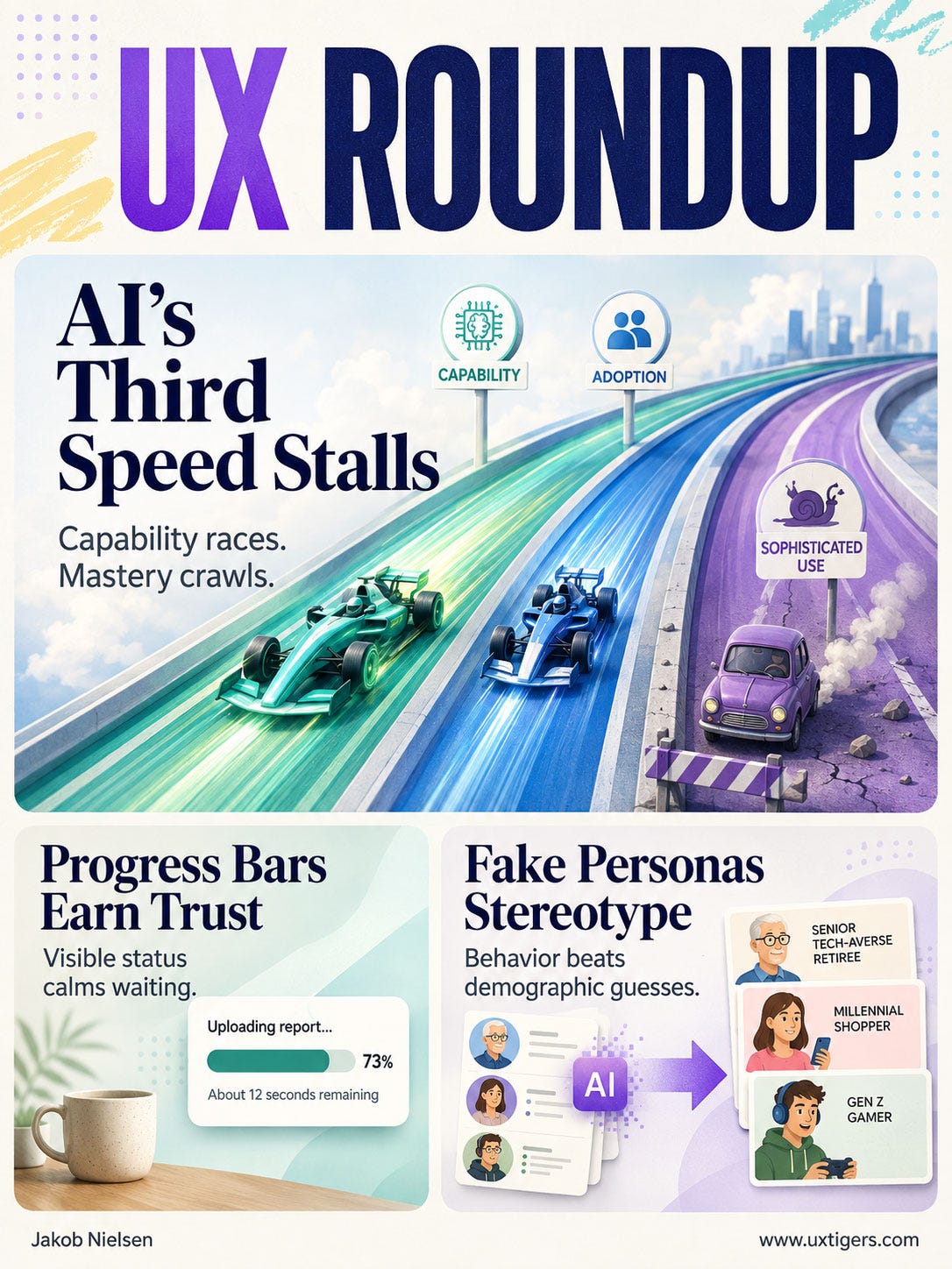
UX Roundup for August 10, 2026 (GPT Image 2)
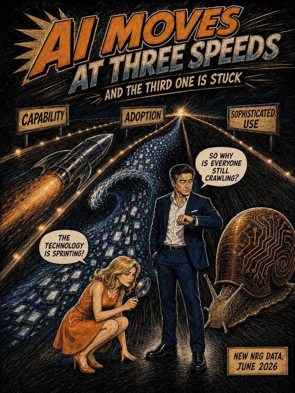
New data from the National Research Group (NRG) shows AI capability and adoption advancing at a record pace while the third speed, sophisticated use, crawls. Two human barriers explain the lag: a search-engine mental model of AI (a usability problem for vendors to fix) and a new AI stigma (which the AI labs must dismantle). NRG’s superusers prove the third speed is learnable: many started in the same search pit.

Advanced use of AI is still vanishingly rare: the sophistication lag is very real. (GPT Image 2)
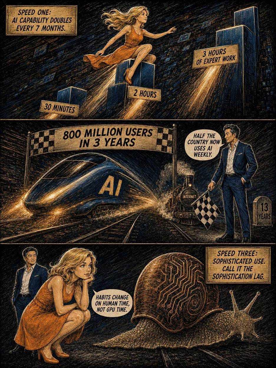
Any new technology moves at three distinct speeds: how fast its capabilities advance, how fast people adopt it, and how fast they use it well. The third speed decides when society collects the payoff, and it’s chronically the slowest. Factories electrified in the 1890s, but as economic historian Paul David documented in 1990 (7-page PDF), productivity jumped only around 1920, once managers redesigned plants around the electric motor. The first two speeds are supply-side: vendors ship capability, users download an app. The third demands skill formation: new mental models and new habits. Habits change on human time, not GPU time. This gap is the sophistication lag.
NRG’s June 2026 report Beyond Adoption: Paths to AI Expertise measures all three speeds for AI, pairing a March 2026 survey of 1,009 Americans with a Q1 2026 study of 129 AI superusers. (NRG brands them “Trailblazers”; I’ll stick with the plain term.) Speed one is blistering: METR’s time-horizon data shows frontier models completing tasks that take human experts 3+ hours, with capability doubling roughly every 7 months. Speed two set a record: ChatGPT reached about 800 million users in 3 years, a level the internet needed 13 years to hit (Financial Times data); over half of Americans use AI weekly.
And speed three? Crawling: most users stay parked at simplistic use.

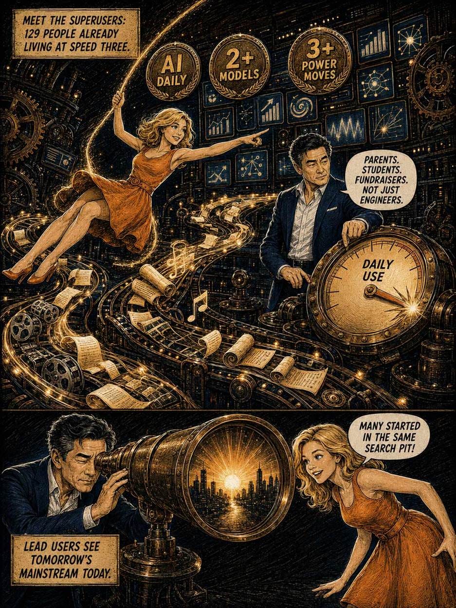
Most AI users hug the shore of traditional computer use and barely get their feet wet in the ocean of new opportunities. AI swimmers are still rare, but NRG identified 129 AI superusers to study. (GPT Image 2)
NRG set a high bar for its superuser panel: use AI daily, run 2 or more of the 7 major LLMs multiple times per week, adopt new tools early, pay (or be willing to pay) for AI, and show at least 3 power-user behaviors, such as creating multimodal content, building custom agents, or chaining text, audio, and video in one workflow.
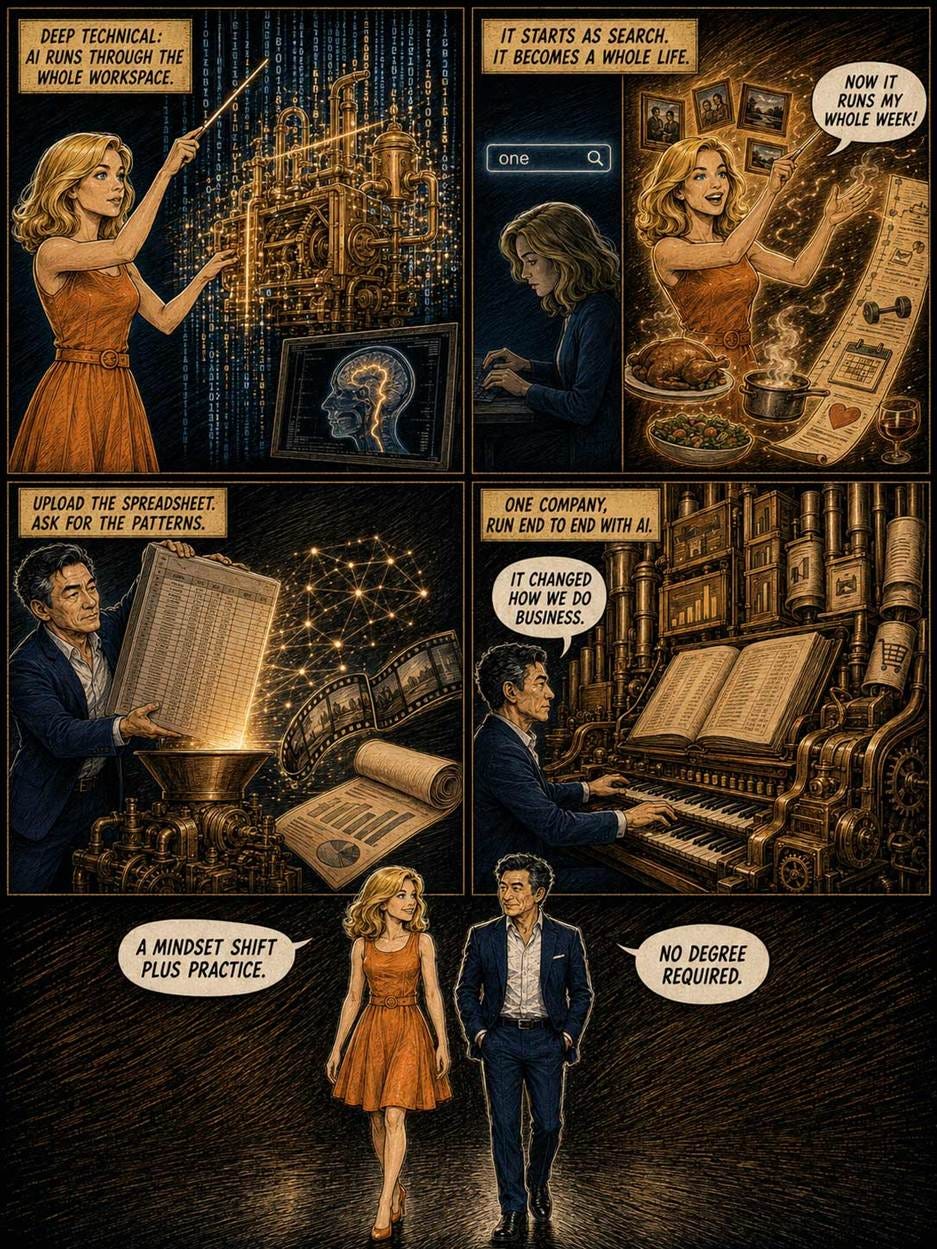
They aren’t all engineers. The panel spans knowledge workers, creatives, students, and parents. One panelist keeps a coding copilot running across his entire workspace and co-built a medical image-segmentation model with university researchers. Another started out treating AI as a search engine and now uses it for photo editing, interior design, meal planning, and workouts. A nonprofit fundraiser uploads spreadsheets and asks for patterns; a business owner routes inventory, marketing, and engineering calculations through AI.
Two lessons follow. First, the superusers are what Eric von Hippel termed lead users in 1986: people whose needs today preview the mass market’s needs in a few years. Watch them to design tomorrow’s mainstream product. Second, and more hopeful: many superusers report starting in the very search pit where today’s beginners sit, describing their early AI use as glorified Googling until context-giving and delegation clicked. Expertise here takes a mindset shift plus practice; no computer-science degree required.
So what keeps everyone else stuck? NRG identifies two human barriers.
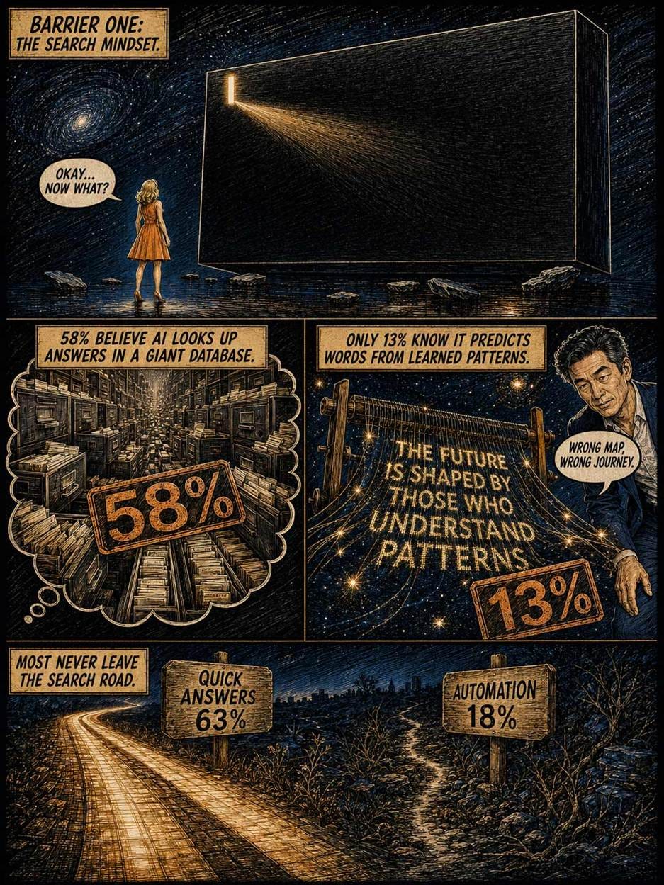
NRG asked Americans what a chatbot does when answering a question. A whopping 58% said it looks up the answer in a huge database. Only 13% picked the correct answer: it predicts words from patterns learned in training. Nor is this a one-poll fluke: Tavern Research asked a similar question in August 2025 and got a 45% plurality for the database theory, with 28% correct.
Users act on their mental model, not on the system’s actual workings, so usage follows the (wrong) model: 63% use AI for quick answers, while only 18% automate tasks, and a measly 14% apply AI to coding or data analysis. AI-powered search works great, but treating search as the ceiling leaves most of AI’s value untouched.
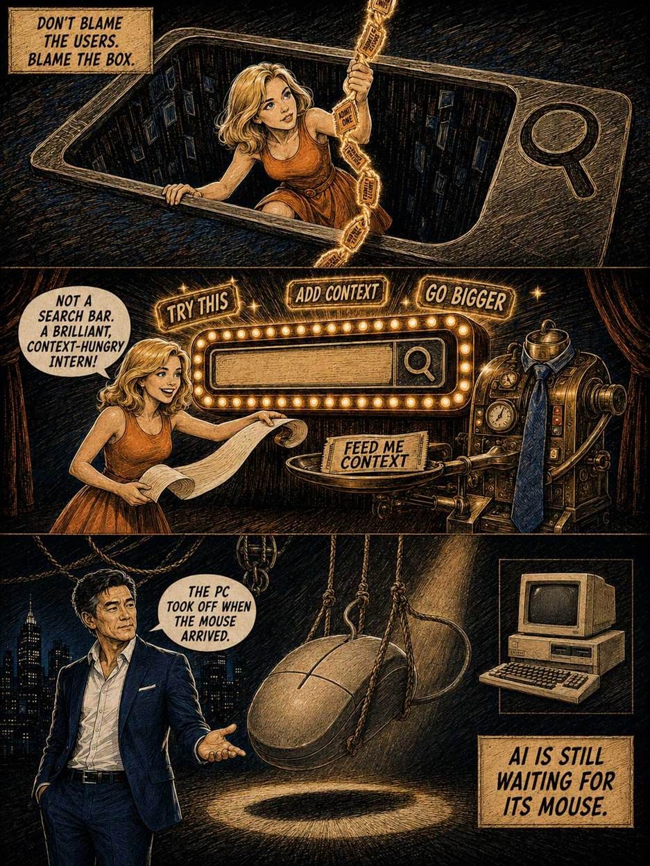
Don’t blame the users. Blame the box. A novice opens a chatbot, and he or she sees an empty field and a blinking cursor: Google’s UI circa 1999. Of course, the search mindset takes over. Nothing in the interface reveals what else the system can do. And intent-based outcome specification, the first new UI paradigm in 60 years, shipped without a manual.
Among the non-adopters the superusers know, the top barriers are not knowing what AI could do (50%) and not knowing how to prompt (46%), well ahead of privacy worries (35%) or accuracy distrust (27%). Understanding, not trust, is the bottleneck.
Asked for the single most important thing AI companies could do, 43% of superusers picked education about practical uses, 20% a more intuitive UX, and 11% real-time guidance. Their prescriptions read like a usability checklist: suggest likely prompts instead of a blank box, reshape vague requests on the fly, and teach while the user works. One superuser traced his or her breakthrough to a metaphor swap: stop treating the prompt field like a search bar, start treating the AI like a bright, context-hungry intern. As I argued in 4 Metaphors for Working with AI, the intern framing is now too limiting, but it beats the search-engine framing by a mile. Ben Thompson reminds us that PCs exploded only once the mouse, icons, and windows made computing legible. AI is still waiting for its mouse.
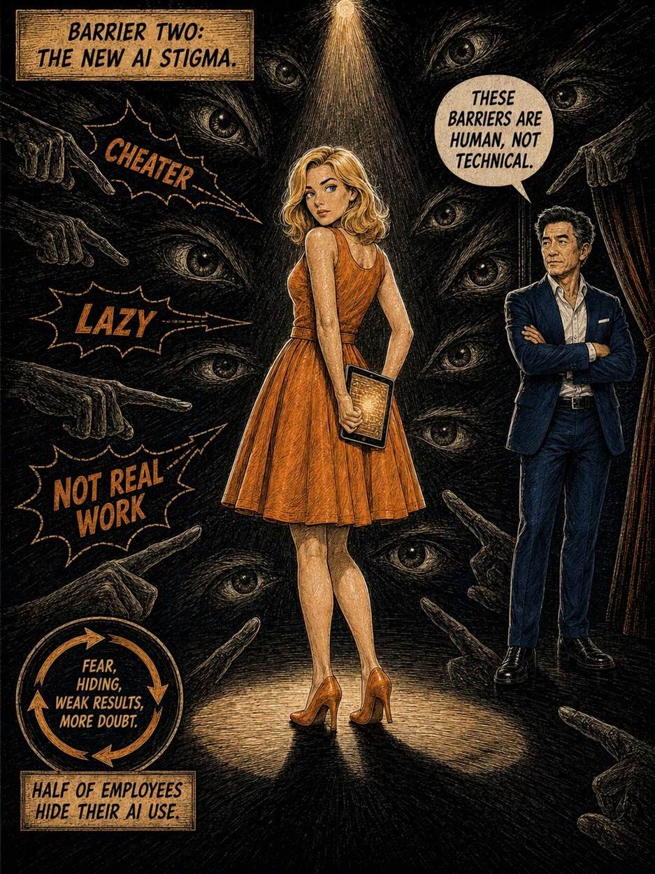
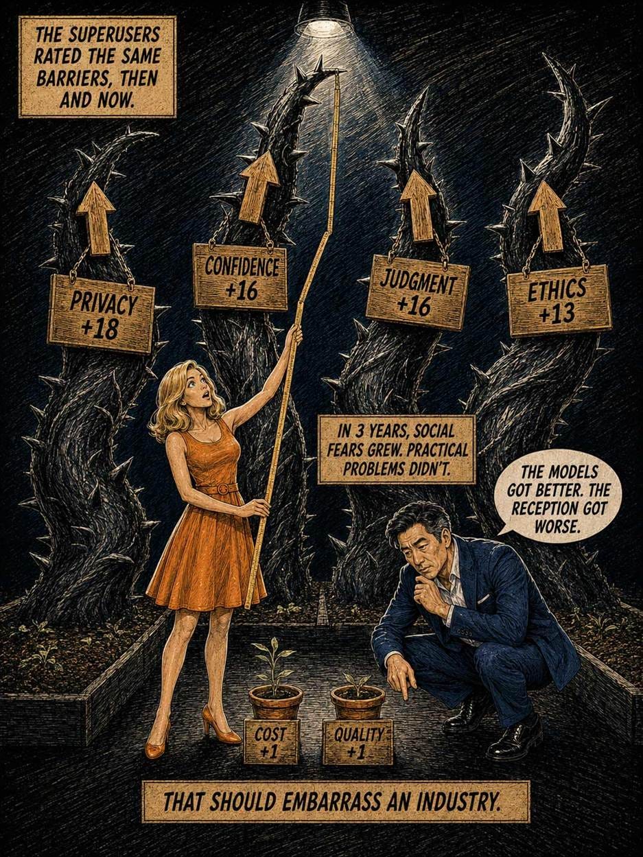
The second barrier is social. The superusers rated the same obstacles twice: as experienced when they learned AI, and as observed in today’s non-adopters. Fear that others would judge them for using AI scored 16 percentage points higher for today’s novices than for the pioneers. Panelists described friends who consider AI use cheating and students who avoid AI on assignments for fear of plagiarism charges.
The deltas are the tell. The barriers that grew most are social and psychological: privacy worries (+18), low confidence (+16), fear of judgment (+16), and ethical qualms (+13). The practical barriers barely moved: tool cost and output quality each rose a mere 1 point. In 3 years, the models improved at speed one while the social reception soured. That inversion should embarrass the industry.
This extends the pattern I documented in AI Stigma: identical work gets rated worse once it’s labeled AI-made, and about half of employees hide their AI use at work. Stigma is also self-fulfilling. Whoever fears judgment uses AI furtively and shallowly, gets mediocre results, and concludes the tool was overrated. NRG adds a twist: today’s pressure is relational, radiating from classmates, coworkers, and friends, so rebutting op-ed critics won’t fix it.
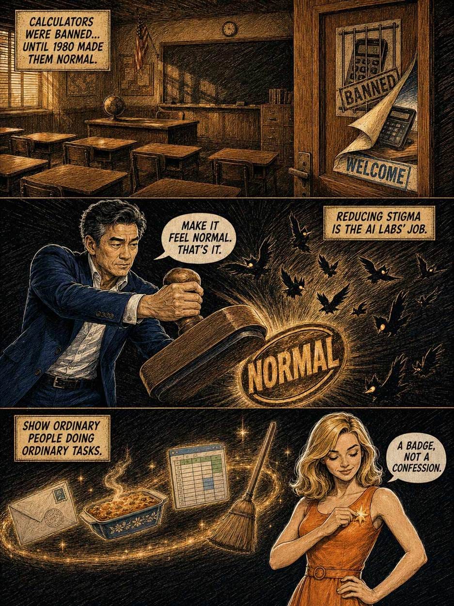
Reducing this stigma is the AI labs’ responsibility. They spend billions accelerating speed one and lavish marketing on speed two, yet spend next to nothing on the social blocker throttling speed three. One superuser’s advice to the labs was blunt: “Make it feel normal. That’s it.” So normalize: show ordinary people doing ordinary tasks (emails, meal plans, spreadsheet cleanup) instead of superhuman demo reels, defend legitimate AI use in schools and workplaces, and make AI assistance a badge rather than a confession. The purgatory is escapable: pocket calculators were banned from many classrooms in the 1970s until the National Council of Teachers of Mathematics endorsed them at all grade levels in 1980, and spell-checkers weathered identical cheating accusations. AI stigma will fade too, but deliberate normalization can shave years off the wait.
Capability sprints. Adoption runs. Sophistication crawls, and the sophistication lag is where AI’s economic promise sits idle. The superusers prove the destination is reachable by ordinary people: parents, fundraisers, and students. Both barriers blocking everyone else have owners. The search mindset is a usability defect vendors can fix with better prompt-box design, and AI stigma is a social defect the labs must spend real money to dismantle. Electrification waited 30 years for the factory floor to catch up. Let’s not make AI users wait that long: fix the box, and fight the stigma.
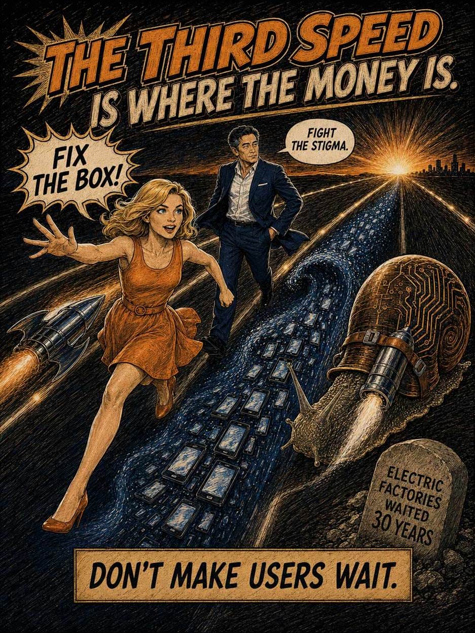
(Alice and Zimo comic strip made with GPT Image 2. This time in color scratchboard style.)
A progress indicator tells users two things: the system heard you, and here’s how long the ordeal will last. Research since 1985 proves users prefer progress feedback, yet designers keep shipping bars that stall, lie, and reset. Follow the 8 guidelines below.
A percent-done indicator, rendered literally: Brad Myers built his 1985 prototype as exactly this, a capsule filling from left to right. The bird at the finish line stands in for every user who ever waited at 99%. (GPT Image 2)

Definition: A progress indicator is any interface element showing that a slow operation is underway and, ideally, how much of it remains. The canonical form is the percent-done progress bar: a horizontal track that fills from left to right in proportion to completed work. Its indeterminate cousins (spinners, throbbers, skeleton screens) confirm activity but reveal nothing about the remaining amount.
Users hate waiting, but they despise waiting of unknown length. A determinate bar converts open-ended anxiety into a bounded, plannable delay: the user can decide whether to watch, switch tasks, or fetch coffee.
The pattern predates computers. Karol Adamiecki charted production progress as horizontal bars in 1896; Henry Gantt popularized the technique (and collected the naming rights) around 1910–1915. Fundraising drives painted giant thermometers that filled toward a goal. So the name is honest labeling: it’s a bar, and it shows progress. Would that all UI terminology were so plain.
The decisive moment came in 1985, when then-graduate student Brad Myers presented percent-done progress indicators at the CHI conference. (Myers is now the Charles M. Geschke Director and Professor of the Human–Computer Interaction Institute at Carnegie Mellon University. As summarized below, he has deservedly come up in the world after his pioneering student research.) Myers himself likened them to charity thermometers tipped on their side. His experiment asked 48 students to run computer searches with and without a bar: 86% preferred having the bar, even though it shortened nothing. People simply want to know.
Visibility of system status ranks #1 among my 10 usability heuristics for good reason: a silent interface forces users to guess whether it’s working, crashed, or ignoring them. Progress indicators apply that heuristic to time.
The 3 response-time limits from my 1993 book Usability Engineering still govern. At 0.1 second, the response feels instantaneous. At 1 second, users notice the delay but keep their flow. Past 10 seconds, attention wanders; show percent-done feedback or users assume death. These thresholds derive from human perception, not hardware. Thus, 33-year-old advice hasn’t aged. (Its author, regrettably, has.)
Good bars even bend time. Chris Harrison and colleagues at Carnegie Mellon found that a bar with decelerating, backward-moving ribbing was perceived as 11% faster than a plain bar of identical duration. Perceived speed is a design variable, and cheaper than the real kind.
But every good pattern spawns counterfeits. Call it progress theater: animation that mimics measurement while measuring nothing. The bar that sprints to 99% and then squats there for 3 minutes. The bar that resets to zero, unexplained. The estimate oscillating between 2 minutes and 4 hours (Windows file copies, take a bow). And the eternal spinner, which reveals only that a GPU somewhere is heating the room.
Such designs are worse than no indicator: each broken promise teaches users to distrust the next. In Harrison’s earlier 2007 study, users reacted most negatively of all to pauses and stalls. Is it ethical to make a wait merely feel shorter? My answer is yes, provided the data stays honest: easing real pain helps users; faking percentages abuses them.
Show nothing for sub-second waits. A spinner flashing for 0.3 seconds is visual noise that makes the system feel slower.
Use a spinner only for waits of 2–10 seconds. An indeterminate indicator proves the system is alive: enough for a short delay.
Any wait over 10 seconds demands percent-done feedback. Add a time estimate whenever you can compute one honestly.
Never let the bar move backward. A bar retreating from 80% to 20% breaks the one promise the widget makes.
Keep the bar moving. Smooth motion beats bursts; if work stalls, say why in words rather than freezing silently at 99%.
Count progress in user units. Report photos uploaded or records imported, not subroutine milestones nobody asked about.
Tie the display to real measurements. Ribbing and terminal acceleration are legitimate garnish on honest data, never a substitute.
Show step counts in multi-step flows. “Step 2 of 4” is a progress indicator too, working for the same reason: bounded waits are bearable.
Waits won’t disappear: AI features have made 30-second operations common again, so progress indicators matter more in 2026 than in 1995. The charity thermometer worked because donors could watch the goal approach. Give users the same courtesy, and they’ll grant you patience in return. An honest slow bar beats a lying fast one.
I have a longer article on progress indicators that contains about 4x as much information as this summary.
(For a more entertaining treatment, watch my music video about progress indicators.)
AI models role-playing survey respondents couldn’t beat a simple lookup table at predicting individual humans’ answers, and they exaggerated the attitude gaps between demographic segments 2–4x. UX learned this lesson decades ago: base personas on behaviors, not demographics.
“Synthetic users” are AI models prompted with a demographic profile and asked to answer questions as that person. Vendors pitch them as cheap replacements for user research: a study that takes months and thousands of dollars shrinks to a few API calls. Zihan Chen and co-authors from Stevens Institute of Technology and the University of Massachusetts Boston put this promise to the test. They ran 4 AI models (two Claude, two Llama, spanning small to frontier scale) against ground truth from two workhorse datasets of social science: the General Social Survey (14,704 recent US respondents) and the World Values Survey (91,774 respondents across 63 countries).
The smart methodological move: every model was benchmarked against a demographic lookup table fit on held-out human data. For any profile, the table returns the most common answer among real people with that profile. An AI that can’t beat this trivial predictor adds nothing beyond the demographics themselves.
No model beat it. On US attitudes, the best AI tied the lookup table; on cross-cultural values, every model scored 11–22 percentage points worse. So a spreadsheet of averages outpredicts billions of parameters. Ouch.
In fairness, the models reproduced aggregate population distributions well. That’s the trap: a team that validates only the aggregate will wrongly conclude the simulation works. But no aggregate ever shops on your site: you serve one person at a time. The average American male wears a size 10.5 shoe, but if you sell only size 10.5 shoes, you’ll forfeit around 85% of potential sales.
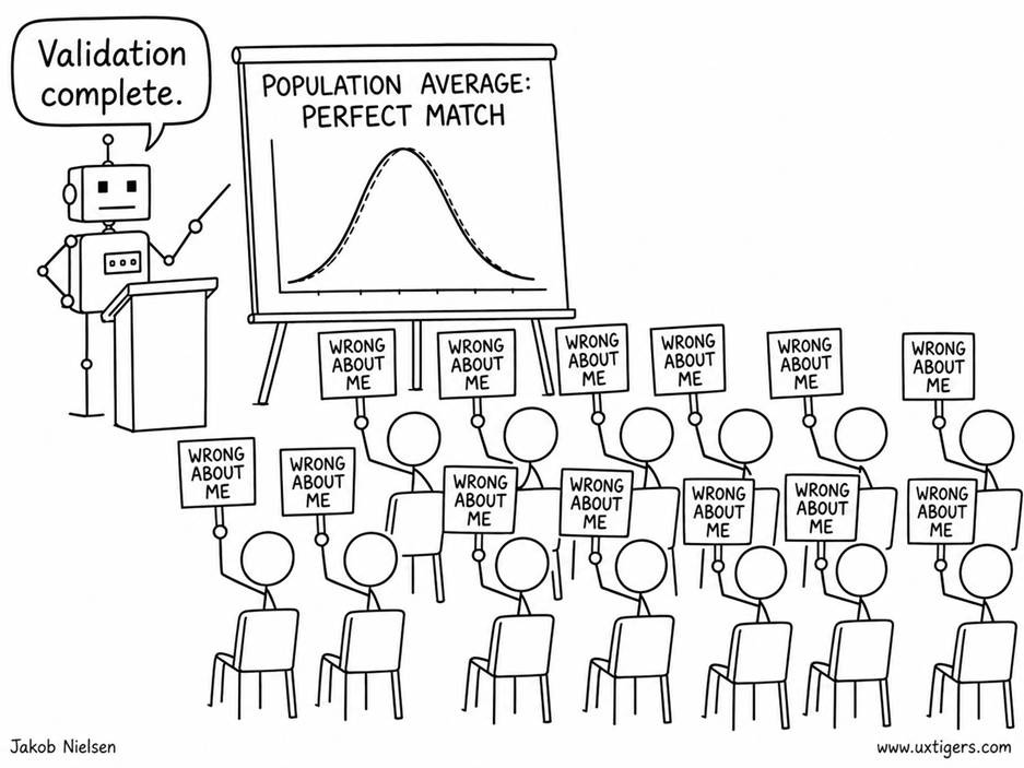
Even when an AI persona correctly predicts the average, it may be wrong about individual customers and thus fail to predict their actual behavior. (GPT Image 2)
The second failure matters more for design decisions. The models treated demographics as far more predictive of attitudes than they are among real people. Political views explain a measly 1.5% of the variation in Americans’ confidence in banks, yet the models behaved as if politics explained up to 67% of it: a roughly 40-fold exaggeration. And a bigger brain made things worse, since the frontier model stereotyped more than its smaller sibling. Translated into the segment-targeting decisions synthetic users are sold to support, the models inflated between-segment gaps 2–4x, targeted the wrong segment in 50% of US cases and 72% of cross-cultural cases, and invented segment splits with no basis in the human data in up to 41% of the value questions. The simulated population is not a blurred copy of humanity but a caricature. Silicon samples turn out to be silicon stereotypes.
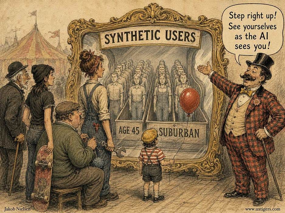
Demographics are the wrong approach to personas. (GPT Image 2)
Since Alan Cooper popularized personas in his 1999 book The Inmates Are Running the Asylum, the cardinal guideline has been to build personas from users’ behaviors, goals, and skills, not their demographics. Knowing that a user is a 45-year-old suburban woman tells you almost nothing about how she’ll use your product; knowing that she reorders the same 20 grocery items every week tells you plenty. I made the same argument in my article on individualizing UX. This benchmark quantifies why: even for attitudes, demographics explain only a few percent of person-to-person variation, and AI multiplies that weak signal into fake certainty.
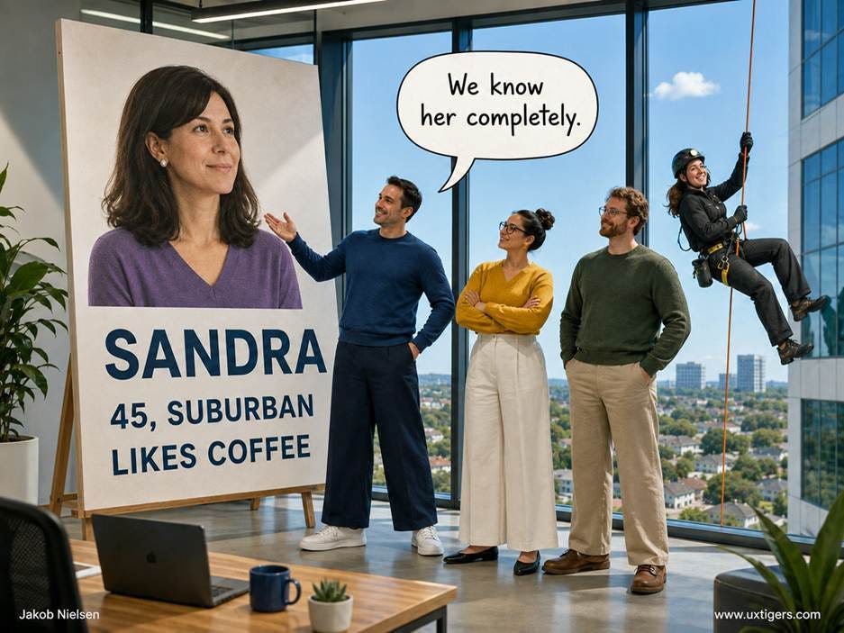
Personas already risk being superficial and misleading, even when they are based on real data from real people. In this case, maybe it’s more important to know that “Sandra” climbs skyscrapers for a living than that she likes coffee. (GPT Image 2)
Three takeaways for user researchers:
Don’t build synthetic users from demographic sliders. You’ll inherit stereotypes dressed up as data.
Never accept aggregate similarity as validation. Check individual-level accuracy and segment gaps against real human data before trusting a single simulated finding.
Keep watching real users. The authors scope their results to demographic prompting; synthetic users conditioned on behavioral data remain untested and are the more promising path, precisely because behavior predicts behavior.
AI will transform user research, but this study shows that the current shortcut fails where it counts. Demography was never destiny, except inside the model.
The largest study yet of unsupervised AI use in schools tracked 26,811 Chinese students for 30 months. AI adoption raised homework scores by 18% and cut homework time by 30%, but closed-book exam scores fell 20%, and high-stakes entrance exams eventually fell 18–24%. The culprit is homework outsourcing: AI users who worked as long as their unaided classmates learned just as much.
David Strömberg (Stockholm University) and co-authors from the University of Hong Kong followed students in grades 7–12 in a county in central China from September 2022 to June 2025 (SSRN paper). AI adoption grew from almost zero to 80% of students over the period, and the staggered timing let the authors compare each adopter against never-adopters in a difference-in-differences design. A digital homework platform supplied grades and completion timestamps, monthly closed-book exams measured short-run learning, and China’s zhongkao and gaokao entrance exams measured the long run.
The productivity numbers look glorious: homework scores up 18%, completion time down from 64 to 45 minutes. But as we know from prior research, when AI does the work for students, learning suffers. In this case, monthly exam scores dropped 20% within 6 months, and students with 2 years of AI exposure scored 24% lower on the zhongkao and 18% lower on the gaokao exam.
The timestamps expose the mechanism: after 5 months of use, 81% of AI students finished homework faster than the fastest unaided student, with grades matching what AI models score on such problems. High homework grades, collapsing exams: phantom mastery. But AI users who still spent normal time on homework kept their exam scores and earned better homework grades on top. In this study, top students were hurt more than weak ones. (We need more research to tease apart AI’s impact on clever kids vs. dull ones.)
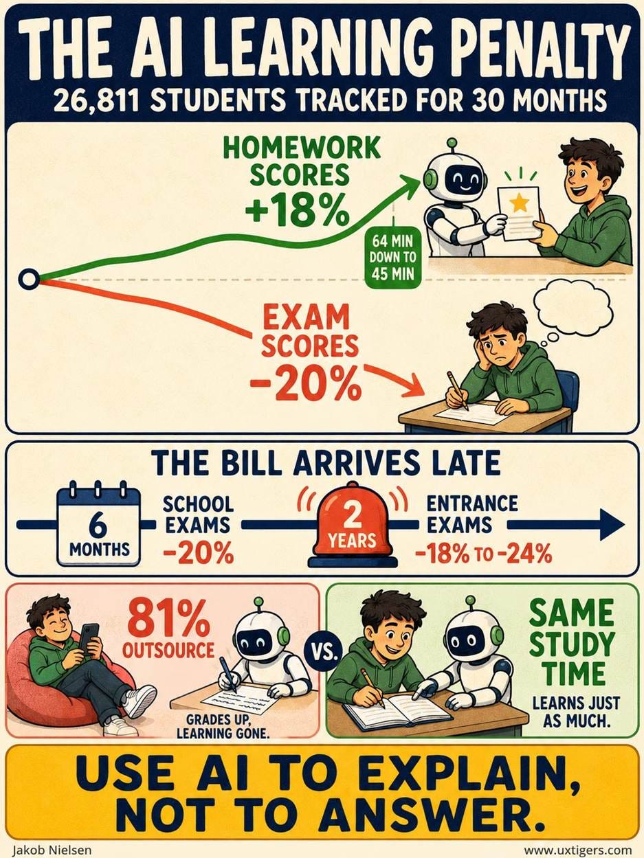
AI in education can help or hurt, depending on how it’s used. (GPT Image 2)
Regular UX Roundup readers have seen this movie before. AI hurts education when it does the work for students and helps only when it’s used as a tutor to guide the learning process at each student’s individual pace, for example by supplying customized explanations and hints. The new study adds what the earlier studies I covered lacked: massive scale, self-chosen everyday tools, and a horizon long enough to show the full 2-year process. (For example, two weeks ago I covered a study where 12 hours of AI use boosted African students’ learning of mathematics. Great! But what would have happened the next school year or if they had used AI for 30 hours? Would AI have continued to accelerate these students’ learning, or was it a one-time benefit?)
Configure AI as a tutor, not an answer machine. Require hints, worked explanations, and self-testing. In this study, the Chinese students who kept normal study time learned fine with AI.
Monitor inputs, not outputs. AI has corrupted homework grades as a signal, so watch time on task instead. Suspiciously fast plus suspiciously good equals phantom mastery.
Shift assessment weight to closed-book, in-person work. Effort must pay again, or students will keep renting competence from a chatbot.
Tell students that the bill arrives late. AI users don’t feel the learning loss while it accumulates. Credible information about the 2-year delayed cost is itself an intervention.
We just saw how Brad Myers provided empirical evidence for the usability benefits of progress indicators in 1985. He has given the UX field much more during the 41 years since his grad-student days, and I have had the pleasure of discussing many interaction design topics with him.
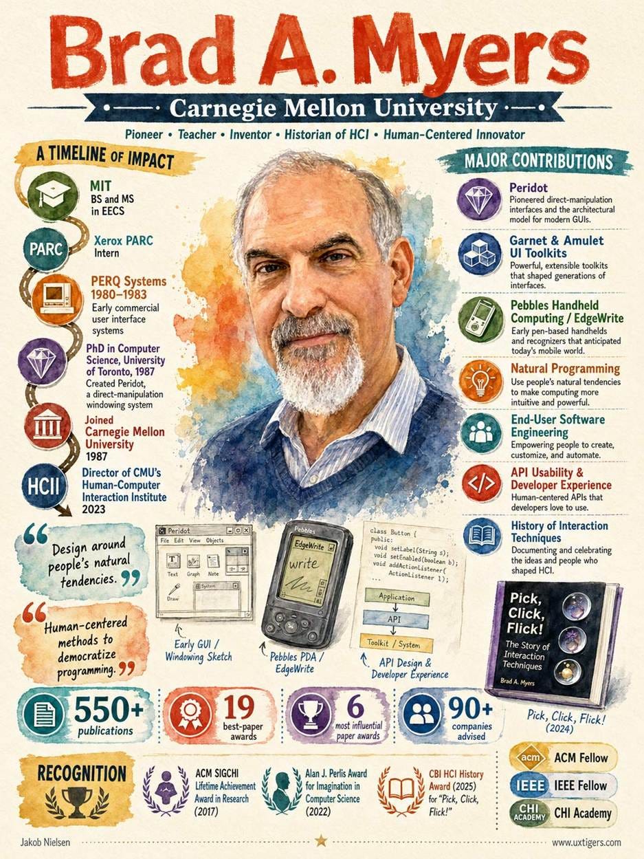
Professor Brad Myers is one of my heroes of UX, with a list of achievements that couldn’t even fit on 10 infographics (those 19 best papers probably each deserve an infographic!). (GPT Image 2)
Until I made this infographic, I hadn’t even realized that Myers worked at PERQ Systems in the 1980s. PERQ was an early GUI workstation, and I used one myself for a 1983 experiment comparing windowing and scrolling as ways for users to see more information than fits on the screen. That’s ancient history, and speaking of history, Myers’s recent book Pick, Click, Flick! is both an intriguing overview of interaction techniques and a useful manual for their proper use when designing graphical user interfaces. I was happy to provide one of the blurbs for the back cover.
About windowing vs. scrolling: “windowing” is when the user thinks of moving the viewport up to see information at the top of the document, and “scrolling” is when the user thinks of moving the content down to see information at the top of the document. This is purely a matter of mental models, since in either case, the computer screen doesn’t move, but simply redraws the pixels in new spots. At least in 1983, when I did the study, windowing won, but it’s possible that with touchscreens, scrolling would now have the edge. It could be a nice little graduate-student project to investigate whether using a mouse vs. fingers affects the optimal mental model.
Late in life, the detective-story writer Agatha Christie reflected on 1919: looking back, she found it remarkable that she had naturally assumed she would have a nurse and a servant, yet never imagined being the sort of person who owned a car, which was for the rich alone.
In other words, in 1919, servants were cheap, and cars were expensive. Salaries were low, and manufactured goods were dear.
Today, it’s the opposite: servants are expensive, so only the very rich keep full-time staff. But mass manufacturing has made cars cheap enough for even poor people to own one. (This started with Henry Ford’s assembly line in 1913, but apparently the associated price drop hadn’t fully reached England by 1919.)
My prediction: AI will return us all to living like Agatha Christie. By this, I don’t mean that we’ll all write Murder on the Orient Express, though AI will cause an explosion in creative expression, even for people who can’t write mystery best-sellers.

Who was the killer? Read the book to find out. I’m not giving away any spoilers. (Muse Image)
Rather, I mean that we’ll all have servants, but not own cars. The servants won’t be humans (salaries will increase even more, as society gets immensely rich because of AI). But we’ll all have several household robots to perform the tasks that servants used to do. We’ll even have some non-humanoid robots for new tasks: think micro-drones that zap mosquitoes before they can bite us.
On the other hand, only eccentric collectors will own personal cars. Robotaxis will perform all transportation tasks on demand. Probably so efficiently that existing bus services will be abolished, because a Robotaxi that comes to your door at the press of a button and takes you to your exact destination will beat any bus that makes you walk to the stop and wait in the rain.

What did the conductor see on the Orient Express? His great-grandkids won’t have jobs in public transportation, because most transit systems will fold as Robotaxis become vastly superior. (Muse Image)
Just one example of how AI will transform many things we used to take for granted. Though in this case, it essentially returns us to Agatha Christie’s world of 1919. Sans the murder.
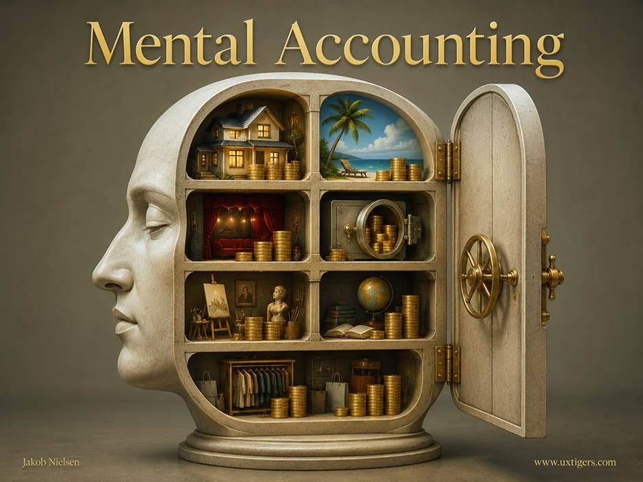
People sort money into separate mental budgets and refuse to treat a dollar in one budget as equal to a dollar in another. Design for these invisible jars: make them visible when that helps users, and never reach into the jar with the loosest lid.

The economist insists that a dollar is a dollar. The user disagrees: he or she decided which jar that dollar lives in long before your pricing page loaded. (GPT Image 2)
Definition: Mental accounting is the set of cognitive operations people use to organize, evaluate, and keep track of their financial activities, typically by assigning money to separate mental budgets that they treat as non-interchangeable.
Economic theory assumes fungibility: any dollar can substitute for any other dollar. Real users violate fungibility daily. A $50 restaurant gift card buys a fancier dinner than $50 of salary ever would. A $400 tax refund turns into a gadget, while $400 of wages goes to the electric bill. Same money. Different jar. Different behavior.
And the jars have lids of different tightness. Money labeled “savings” is guarded like a dragon’s hoard, while money labeled “bonus,” “credit,” or “winnings” practically spends itself. Thus, any interface that touches money is also touching the user’s internal bookkeeping system, whether the design team realizes it or not.
Richard Thaler, then at Cornell University, introduced the theory in Mental Accounting and Consumer Choice (PDF), published in Marketing Science in 1985, and consolidated the field’s findings in Mental Accounting Matters in 1999. The name is a deliberate borrowing from corporate bookkeeping: people behave like small firms, posting every expense to an internal account and balancing each account separately, instead of maximizing over one big pot the way textbook economics prescribes. When Thaler received the 2017 Nobel Prize in economics, the committee’s citation prominently featured the 1985 paper. Not bad for a theory about jam jars.
My favorite demonstration comes from the 1999 paper. Wine collectors who buy futures years before delivery code the purchase as an “investment.” When they finally uncork the bottle, drinking it feels free. Eldar Shafir and Thaler titled the underlying study Invest Now, Drink Later, Spend Never: an expensive hobby, mentally laundered into a free one. Thaler and Eric Johnson also documented the house money effect in 1990: gamblers treat recent winnings as the casino’s money and bet them far more recklessly than the cash they walked in with.
Users already run their finances on jar logic, so the best financial UIs stop fighting the mental model and externalize it. Banking apps that offer named sub-accounts, envelopes, or “pots” let people move their internal ledger onto the screen, where software can enforce what willpower alone cannot. The payoff is real: earmarked money is far less likely to leak into impulse purchases, and users who see a “Vacation” balance grow will return to the app for the pleasure of watching it.
So support the jars in mundane flows, too:
Category summaries turn a raw transaction list into the account statements users mentally keep anyway. Reconciling “where did my fun money go?” should take seconds, not an evening with a spreadsheet.
Refunds should visibly return to their jar. A refund that lands as an undifferentiated blob gets recoded as a windfall and spent twice.
Price framing can match the account users will draw from. Billing business software annually fits the budget cycle a manager actually plans with. That’s legitimate, as long as both framings are shown honestly.
Every mechanism above has an evil twin. In-game gems convert dollars into a proprietary currency, detaching each purchase from the “real money” account where scrutiny lives. Drip pricing splits one price into a base fare plus fees, so each nibble debits a smaller jar and no single number triggers alarm. “Just $0.99 per day” reframes a $361 annual charge as pocket change. And “bonus credits” are engineered windfalls, aimed with sniper precision at the jar that has no lid at all.
Do these tricks work? Of course they work; that’s why regulators keep suing over them. But they work by taxing the user’s bookkeeping, and users eventually audit. The remedies are cheap: state the full real-currency total early, show cumulative spending, and translate every virtual currency back into dollars at the moment of spending.
You can abuse the knowledge I’m giving you about mental accounting to pry the lids off users’ mental money jars. But doing so easily turns into dark design, so please don’t. (GPT Image 2)
Mirror users’ jars in the UI. Offer named sub-accounts, envelopes, or category labels so the internal ledger becomes an external, enforceable one.
Respect earmarks. When an action would raid a protected jar (paying a bill from “Vacation” savings), say so before the confirmation, not on next month’s statement.
Reveal the full price early. Every fee disclosed late lands in an unbudgeted mental account and feels like a betrayal, even when the total is unchanged.
Translate virtual currencies at the point of spend. “500 gems ($4.99)” keeps the purchase connected to the account users actually budget in.
Aggregate the nibbles. A yearly recap such as “you spent $214 on subscriptions” restores the visibility that small recurring charges are designed to escape.
Frame time-based prices both ways. If you advertise per day, show per year in the same breath. One framing is marketing; two framings are information.
Make credits and refunds legible. State their dollar value, expiration date, and restrictions in plain sight, because vague credit is windfall bait.
Test comprehension, not just conversion. Ask 5 users what they believe they paid and will pay next month. Wrong answers are a defect, whatever the funnel metrics say.
Mental accounting is neither a bug to fix nor a lever to yank. It’s how normal people impose order on chaotic finances with a brain that never evolved for compound interest, and it mostly serves them well. Design that supports the jars earns trust, retention, and long-term revenue. Design that raids them earns chargebacks, churn, and a subpoena. UX = Profits, and with money UIs the profitable move is the honest one: respect the jars.
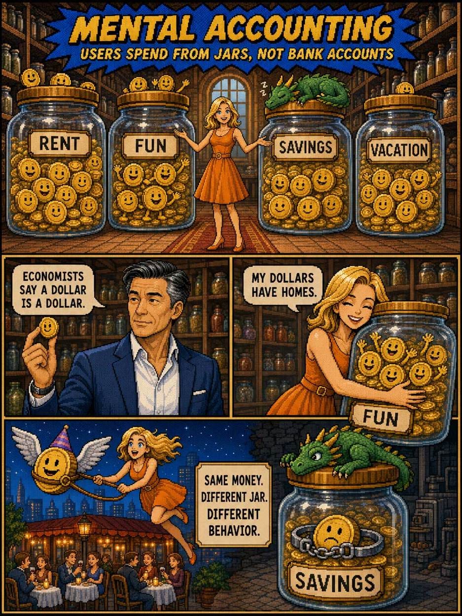
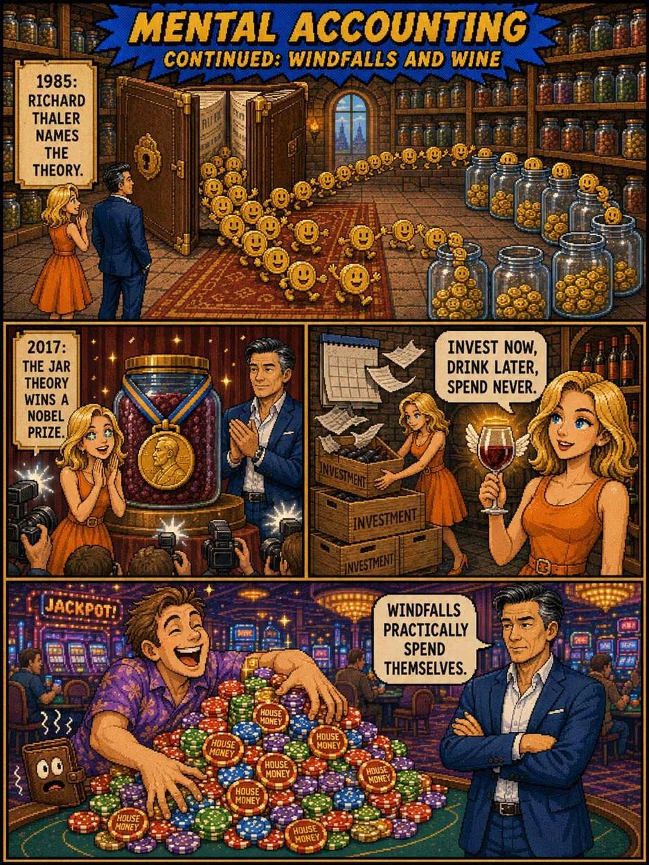
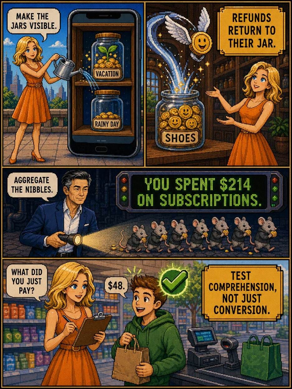
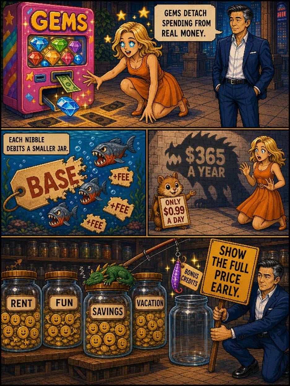
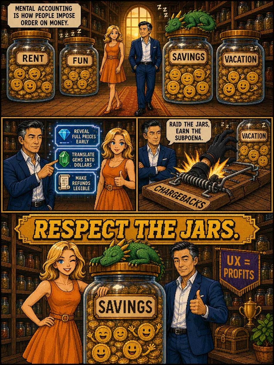
Alice and Zimo teach mental accounting in 16-bit pixel-art style (GPT Image 2)
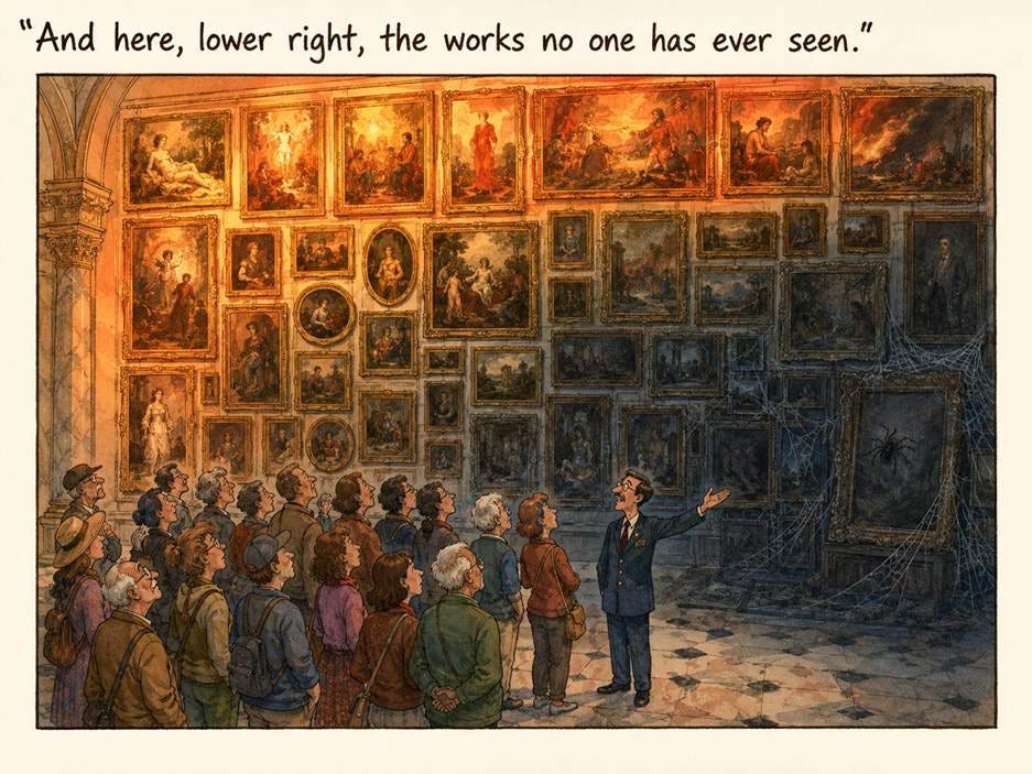
SpaceXAI has launched a much-improved version 2 of its Grok Imagine image model. Here are a few images I made with the new model. I asked it to make infographics, posters, and comics about Jakob’s Law, but without giving it any information about the concept other than its name. For the last comic strip below, I asked for a strip about other famous UX principles, and it gave me Hick’s Law told by cute animals. Clearly, the model has good world knowledge, because the content of all these images is spot on.
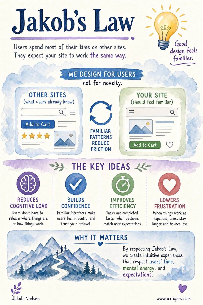
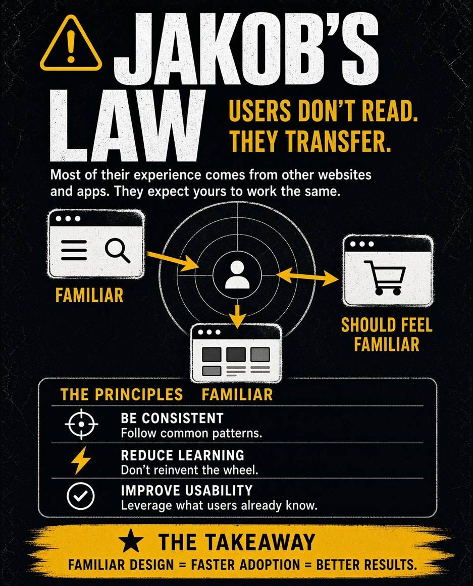
(This layout is flawed: the label “Familiar” for the third screenshot overlaps the header for the table of the three principles, making it look like a misplaced extra word in that header. The yellow arrow also points the wrong way. These were the only layout mistakes I found in my experimentation.)
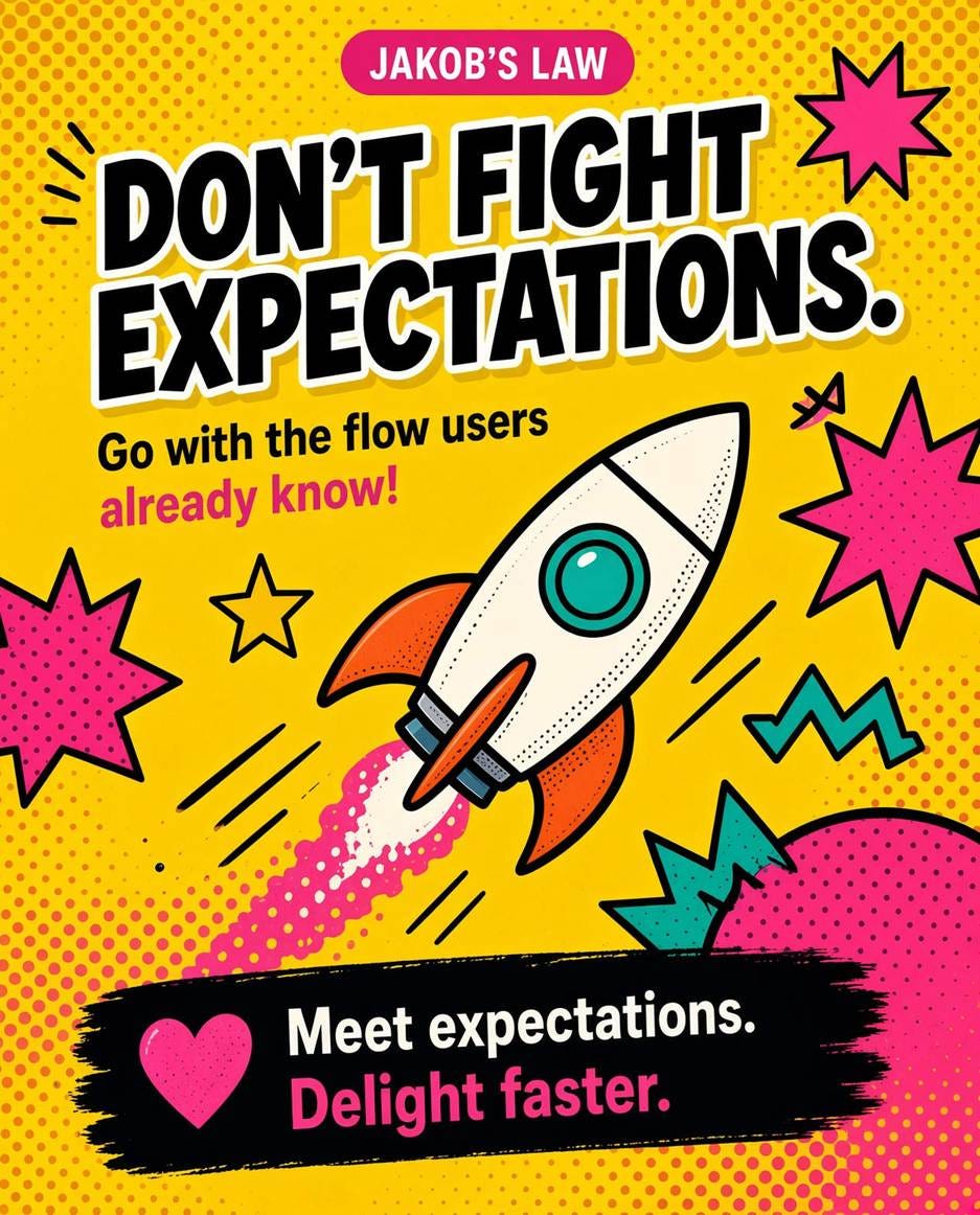
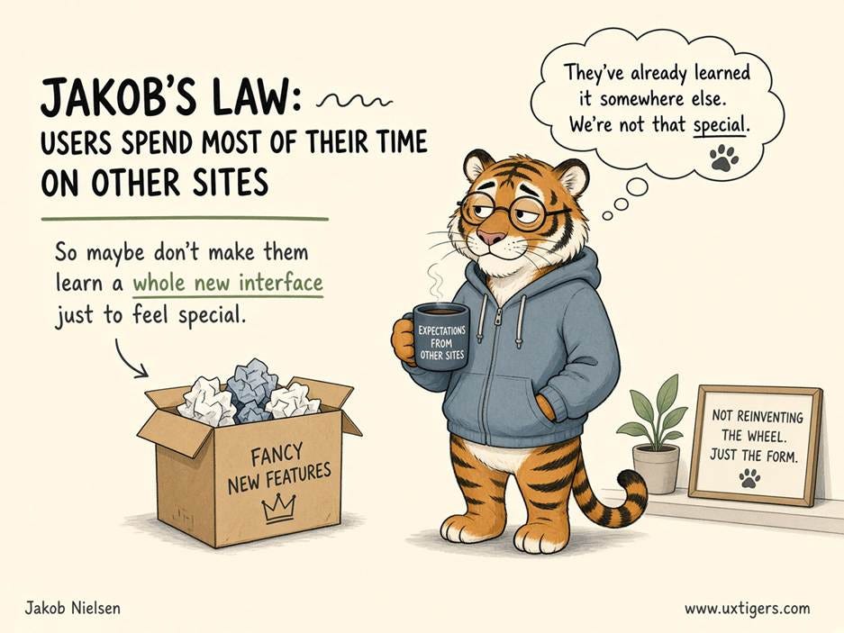
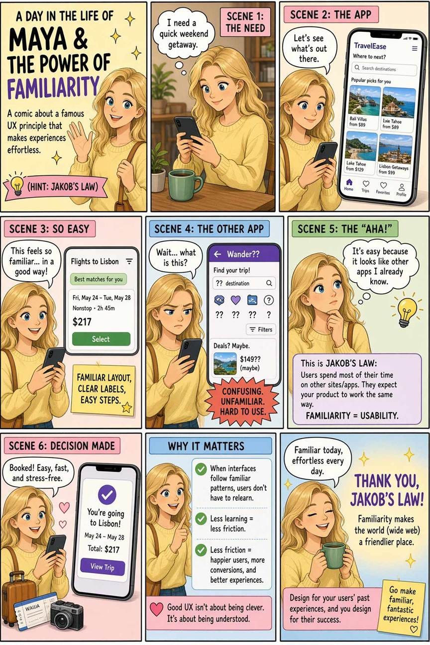
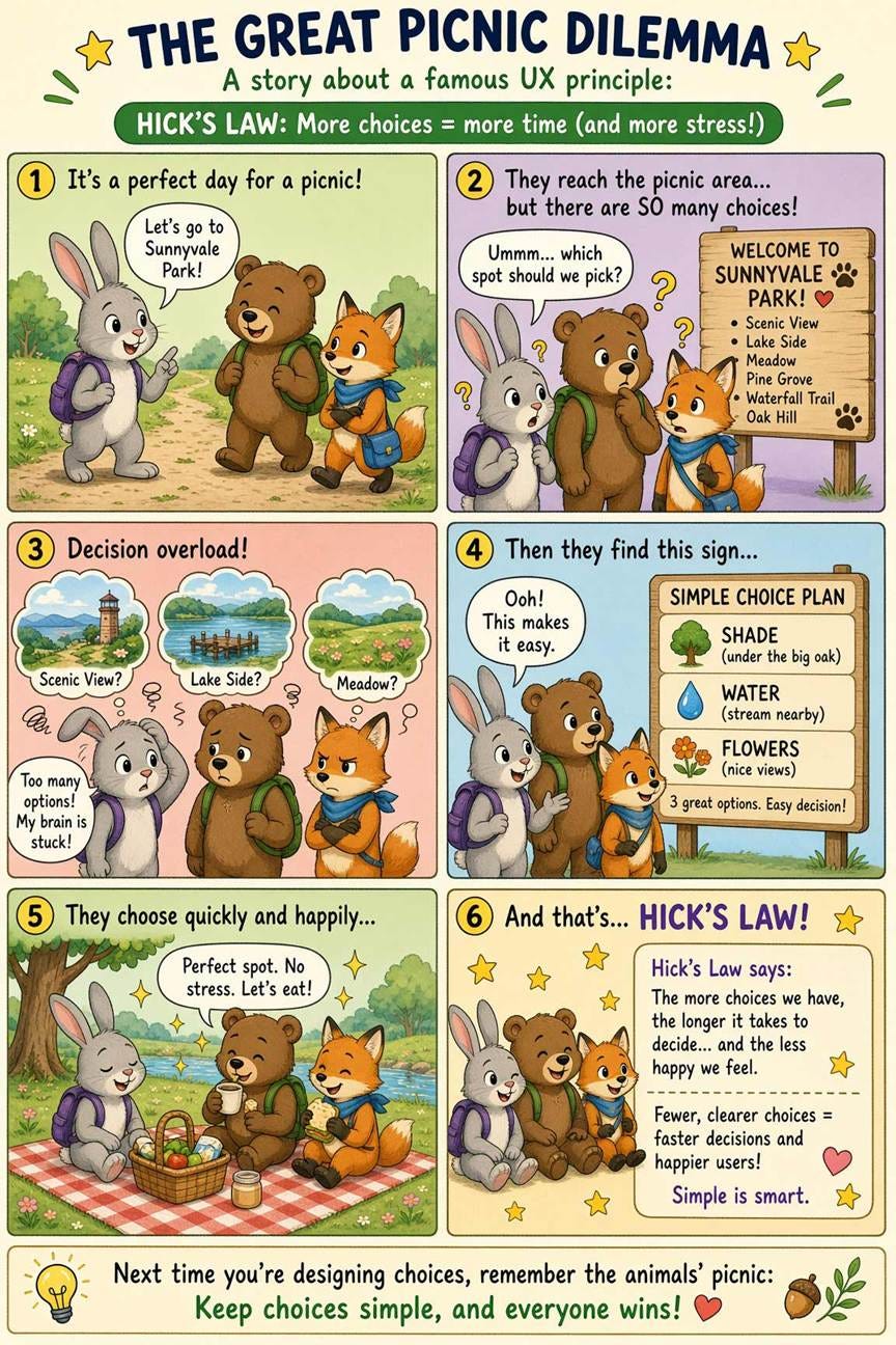
(Grok Imagine 2)
If Grok had delivered these images before the launch of Nano Banana Pro on November 20, 2025, I would have been ecstatic. Only 9 months ago, this level of accurate text rendering and imaginative design of visual information based on world knowledge was unheard of. Today, I rate Grok Imagine 2 at the level of Nano Banana 2 and slightly below GPT Image 2. This is still an impressive achievement from SpaceXAI’s imaging team!
Grok Imagine 2 beats Google’s and OpenAI’s image models in one aspect: it has an object-based editing system for the inevitable times when a generated image is good but just not exactly right. You can open a sidebar to see a list of the visual elements that make up the image. This list is nested, so that, for example, in the poster below, the “target graphic” object has a sub-object named “crosshair icon,” allowing users to edit this element in two different ways. This nested-objects editing feature closely resembles image editing in Reve.
Here, I used image editing, rather than regeneration, to fix the layout problems I had identified in one of my posters:
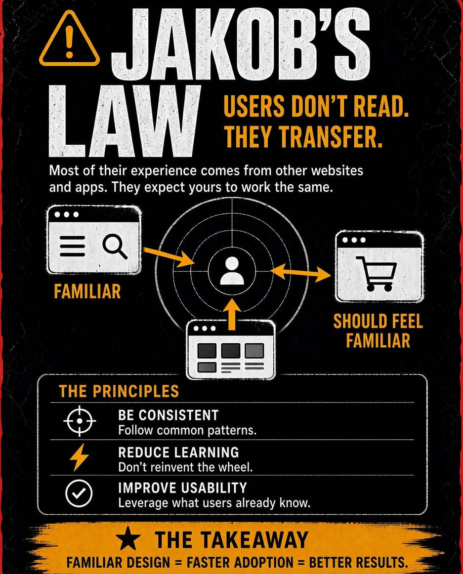
(Grok Imagine 2, after using the built-in editing features)
Jakob Nielsen, Ph.D., is a usability pioneer with 43 years experience in UX and the Founder of UX Tigers. He founded the discount usability movement for fast and cheap iterative design, including heuristic evaluation and the 10 usability heuristics. He formulated the eponymous Jakob’s Law of the Internet User Experience. Named “the king of usability” by Internet Magazine, “the guru of Web page usability” by The New York Times, and “the next best thing to a true time machine” by USA Today.
Previously, Dr. Nielsen was a Sun Microsystems Distinguished Engineer and a Member of Research Staff at Bell Communications Research, the branch of Bell Labs owned by the Regional Bell Operating Companies. He is the author of 8 books, including the best-selling Designing Web Usability: The Practice of Simplicity (published in 22 languages), the foundational Usability Engineering (31,248 citations in Google Scholar), and the pioneering Hypertext and Hypermedia (published two years before the Web launched).
Dr. Nielsen holds 79 United States patents, mainly on making the Internet easier to use. He received the Lifetime Achievement Award for Human–Computer Interaction Practice from ACM SIGCHI and was named a “Titan of Human Factors” by the Human Factors and Ergonomics Society.
· Subscribe to Jakob’s newsletter to get the full text of new articles emailed to you as soon as they are published.
· Read: article about Jakob Nielsen’s career in UX
· Watch: Jakob Nielsen’s first 41 years in UX (8 min. video)
Comments
Nothing yet. Say the first thing.
Sign in to join the conversation.