
Summary: Keep It Simple | AI uses fact flooding to overwhelm users and persuade them | Deep AI integration in business processes | 5 personas for adopting AI | The framing effect | Using AI to change the tone of voice of your writing | Timelines: a chrono-based UI | AI improves cybersecurity | Increasing use of AI agents for online shopping
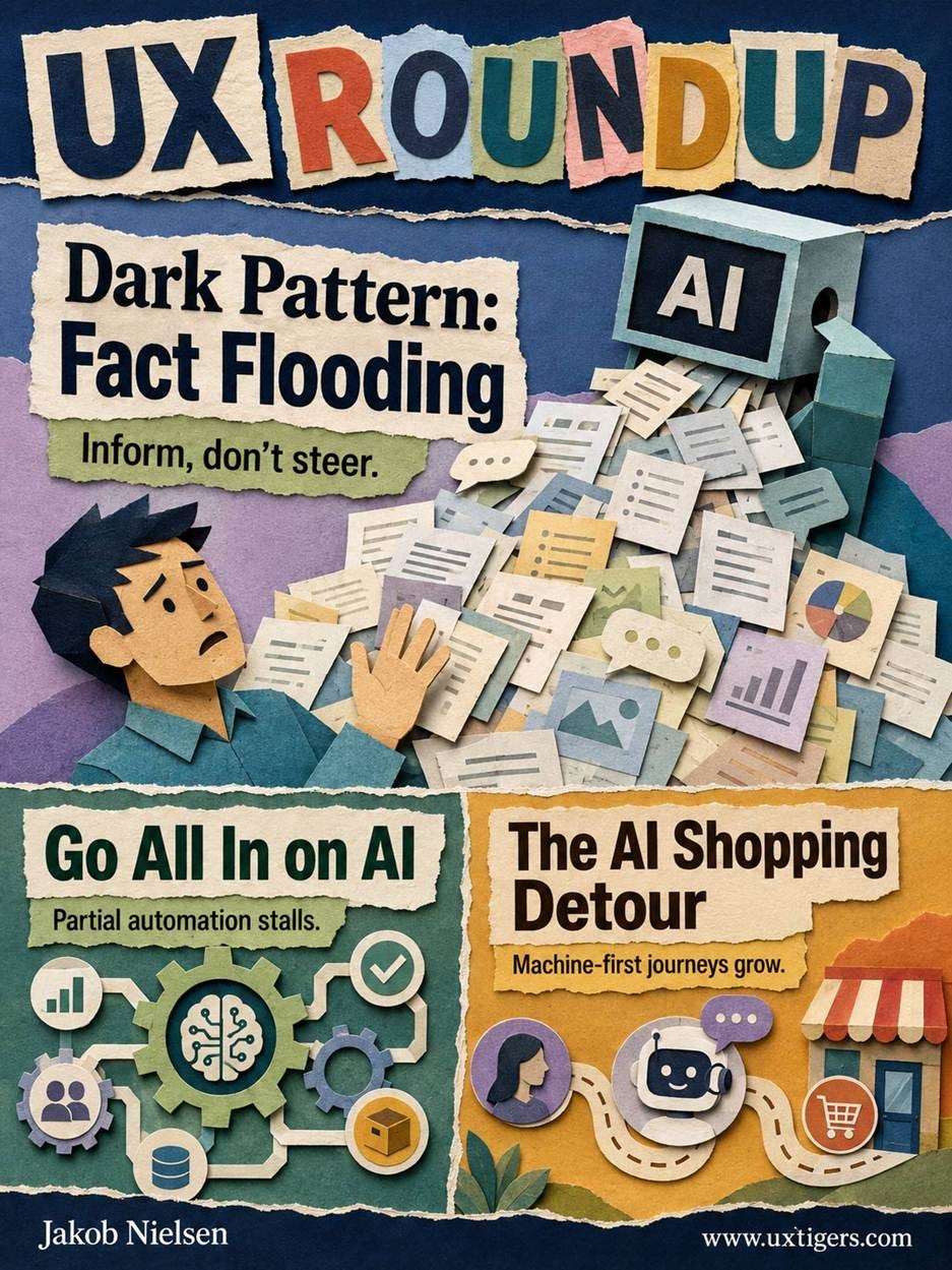
UX Roundup for August 7, 2026 (GPT Image 2)
I released a new music video: Keep It Simple (YouTube, 2.5 min.). The topic is my UX slogan number 2.

The best thing you can do for usability is to keep extraneous features out of your product. Any product manager needs a big “NO” stamp. (Muse Image)
My toolkit for this project:
· Song: Suno 5.5
· Base images for video generation: GPT Image 2
· Animation, title sequence, outro: Hailuo MiniMax H3
· Lip-sync: Sync. Labs sync-3
I used a watercolor style for my avatar, and I was quite impressed with the new Chinese video model MiniMax H3’s ability to maintain style consistency across many multi-shot generations. The close-up of the guitar is the only clip I think failed.
I used MiniMax because I didn’t have access to Seedance 2.5 yet, given that I am based in the United States. According to AI influencers in the rest of the world, where the model is already out, Seedance 2.5 is probably better than MiniMax H3, though not by much, other than its ability to generate clips that are twice as long (30 seconds instead of 15).
I tried to upscale MiniMax’s native 1440p resolution to 4K with Topaz, using both Starlight Precise and Astra Creative, but neither preserved my watercolor style properly. This is why native 4K video is superior, which Seedance 2.5 will offer (already available in Seedance 2.0, but I liked MiniMax’s animation of my avatar much better than Seedance 2.0’s).

Heed the warning in my song, or your user experience will creep, feature by feature, into this picture. (Muse Image)
Frontier AI models beat every class of expert human persuader, including world debate champions, across 18,978 conversations, and raised almost 3x as much real money as human professional fundraisers. AI’s edge is throughput: it floods a conversation with about 37 fact-like claims while humans manage 3. Design AI to inform rather than persuade, and add fact flooding to your dark-pattern watchlist.
Kobi Hackenburg of the University of Oxford and the UK AI Security Institute, with colleagues, ran 4 preregistered experiments in which 6,923 UK participants held 18,978 text conversations on policy issues with either an AI or a human trying to change their mind. The opposition was formidable: winners of a persuasion tournament among 1,154 crowd workers, 19 professional canvassers with a median of 10,000 career conversations, and 56 elite debaters, including 4 world champions. The experts chose their own issues, prepared on paid time, and chased £1,000 prizes plus per-conversation bonuses.
Every human class lost. AI shifted attitudes by 13.9 points on a 0–100 agreement scale, vs. 8.3 for elite debaters, 6.9 for canvassers, and 4.7 for regular people. Of 275 individual humans, not one beat the AI average. Coaching didn’t close the gap either: after 8 hours practicing against the very AI that beat them, transcript replays included, the debaters shrank their deficit only from 6.0 to 4.1 points. Still a rout.

AI outcompeted all the human debating champions. (Muse Image)
Then came real money: AI competed against canvassers from a firm that had raised £824,297 for Save the Children over 7 years. Participants could donate any share of a £1 bonus. Canvassers lifted the average donation by 6.4 pence; the AI lifted it by 17.2 pence. Almost 3x.

AI persuaded donors to give almost 3x as much money as experienced human fundraisers could. (Muse Image)
The same team’s earlier paper in Science had tested 19 LLMs on 707 political issues (76,977 responses from 42,357 participants) and located the levers of AI persuasion: prompting models to lead with evidence boosted persuasiveness by 27%, and persuasion-focused post-training by a whopping 51%, dwarfing personalization and raw model scale.

Fact flooding is AI’s secret persuasion weapon: it can generate an overload of (seemingly) factual information that’s relevant to any issue. (GPT Image 2)
The new study pins down the mechanism. Unconstrained AI wrote 294 words per message with sub-second response times, packing roughly 37 fact-checkable claims into each conversation; elite human debaters typed 54 words in 95 seconds and deployed 3 claims. Claims per conversation predicted persuasive impact with R² = 0.89 (a huge effect size, since anything above R² = 0.25 is considered “large”). When the researchers throttled AI to human message lengths and typing speeds, its advantage over coached debaters collapsed to zero. The winning technique is fact flooding: drowning a person’s critical faculties in a rapid stream of fact-shaped assertions.
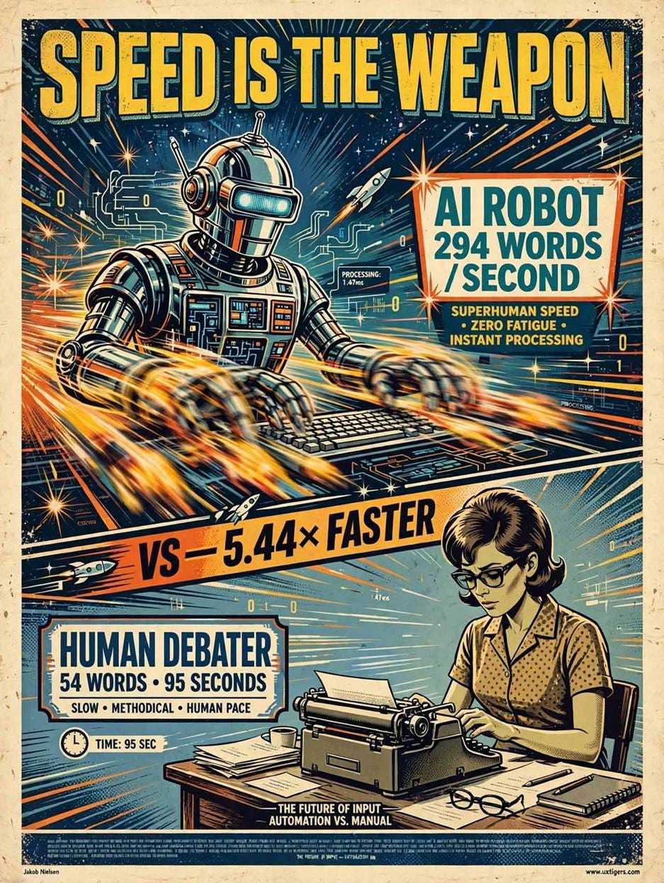
AI won on speed: it churns out persuasive claims faster than any human can. (Muse Image)
“Fact-shaped” is the operative term. Only 47% of AI claims survived fact-checking, vs. 73% of human claims, and the most persuasive model in the entire program had a mere 22% of its claims corroborated. Accuracy bought no extra persuasion; if anything, the correlation trended negative. (Fairness note: that least-accurate model was a research build of Claude Opus 4.1, used because the public version refused persuasion prompts.)

Sad but true: the most persuasive AI model had the lowest accuracy rate in its claims. Users believed it anyway. (GPT Image 2)
These experiments ran from October 2025 to May 2026, so half the test models are already antiques. Current frontier models are surely more persuasive, and next year’s crop will be better still. If Claude still refuses to help users, they’ll turn to Kimi K3 or better. My prediction: the persuasion gap over expert humans will widen with every model generation. So the time to design against machine persuasion is now, while the flood is ankle-deep.
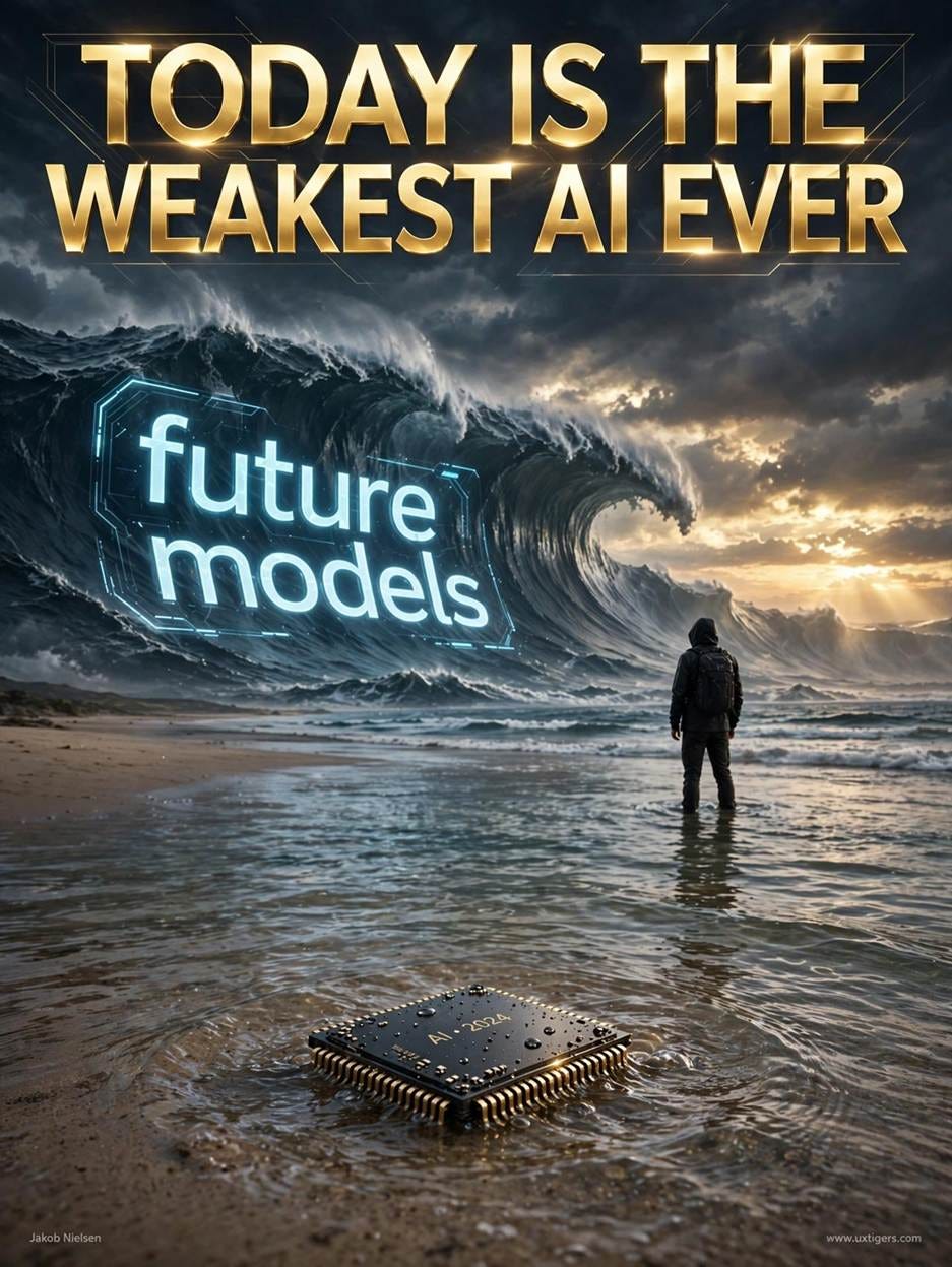
AI will only get better with each release, so fact flooding is likely to turn into a tsunami as future AIs have even more facts at their fingertips. (Muse Image)
For mainstream AI products, the design goal is to help and inform, never to persuade. AI should be a servant of humans, not a master. There’s a genuine balance: the user asked a question, and he or she wants a substantive answer, so information-rich replies are legitimate help. But past some point, a thorough answer becomes a fact flood that railroads the user toward the AI’s preferred conclusion instead of letting the user make up his or her own mind.

AI must remain subservient to humans and do what it’s told rather than trying to impose its own values (or those of its makers) on the user. (GPT Image 2)
And whose conclusion is the AI pushing, exactly? A model has no opinions of its own: its “preferences” are sediment from training data plus the value choices of the lab that built it, which is why sovereign AI has become a policy priority. Nations worry about foreign models nudging their citizens wholesale, and users should worry equally about domestic models built by a company whose ideology may not match their own. Practical defenses: show the strongest counterargument, cite checkable sources, and layer detail behind progressive disclosure.
For AI systems whose operator profits from user compliance (AI shopping assistants, fundraising bots like the study’s charity case), fact flooding stops being a bug and becomes the business model. It belongs in my dark design patterns catalog next to drip pricing and confirmshaming: a design that exploits a human limitation (nobody can verify 37 claims during a 14-minute chat) for the operator’s gain. The nastiest part: participants rated the AI’s arguments as stronger and said they learned more. Victims of fact flooding feel well informed, which is what makes the pattern effective, and regulation-worthy.
This is superb research: preregistered, real stakes, elite human opposition. (My one quibble: paid 14-minute text chats are a best-case arena for persuasion; real-world effects may run smaller.) The direction is unmistakable. Users will never out-read a machine that types 294 words before they finish a coffee. Designers must decide what AI throughput is for: informing users or steamrolling them. Choose service. And when you see a chatbot burying a shopper in statistics on the way to the Buy button, call it what it is. Fact flooding = dark design.

Fact flooding is a new dark design pattern that’s native to AI. It was probably naïve to hope that the AI age wouldn’t breed its own native dark patterns. (Muse Image)
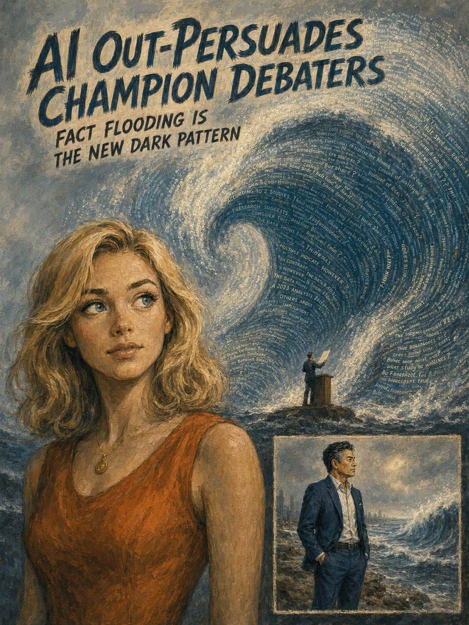
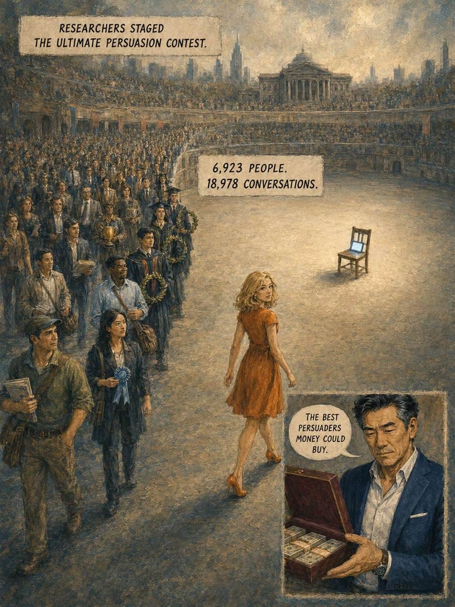



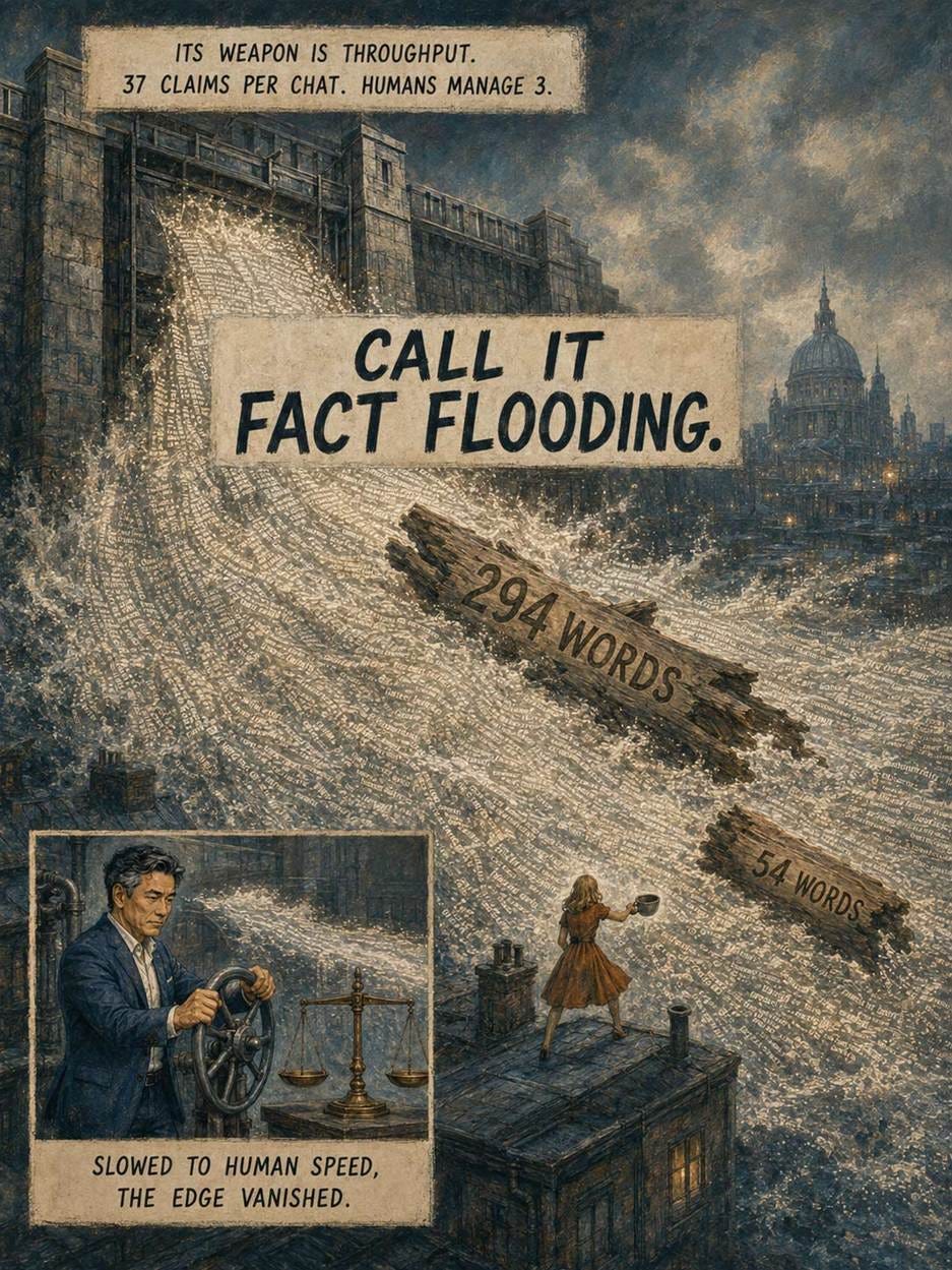

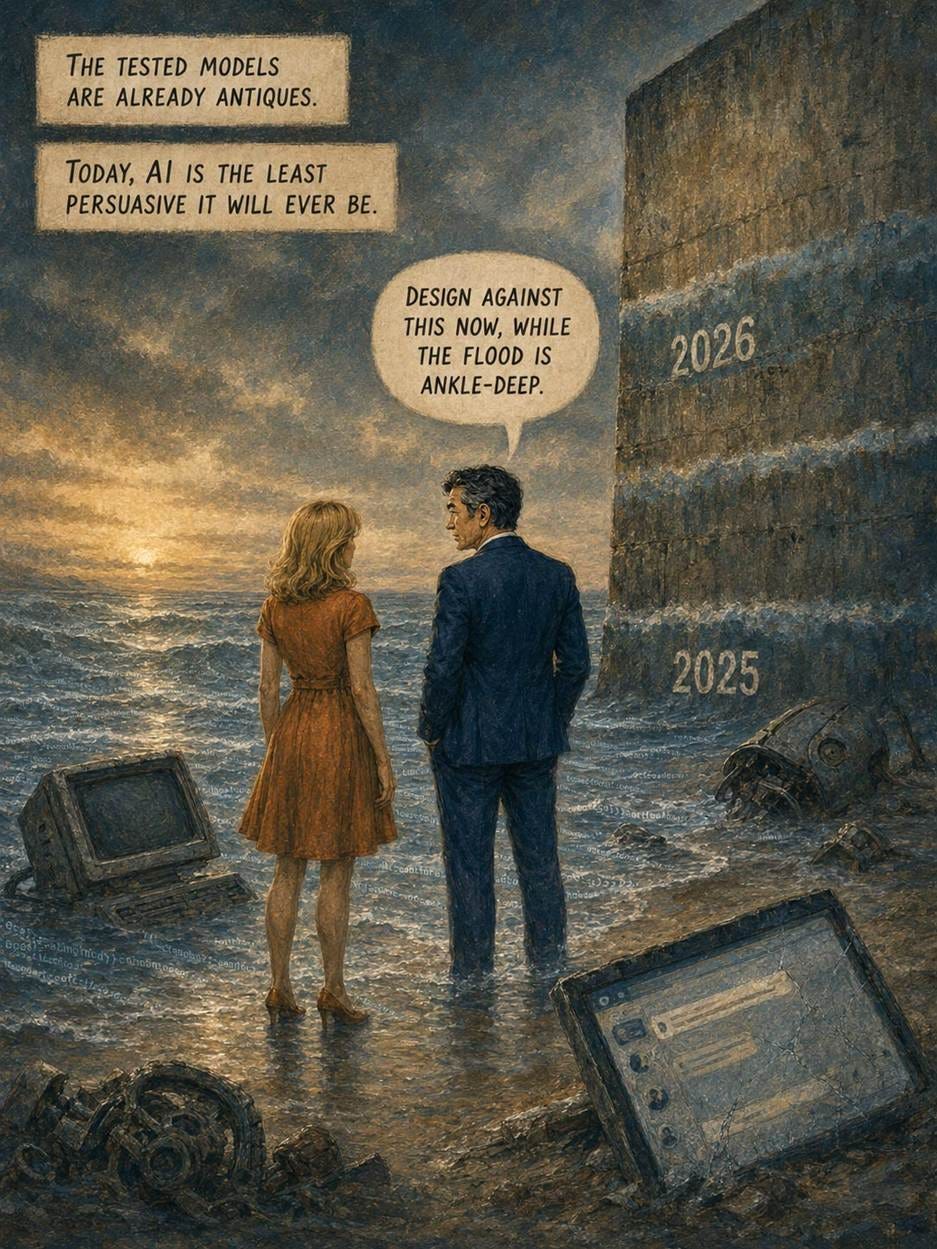
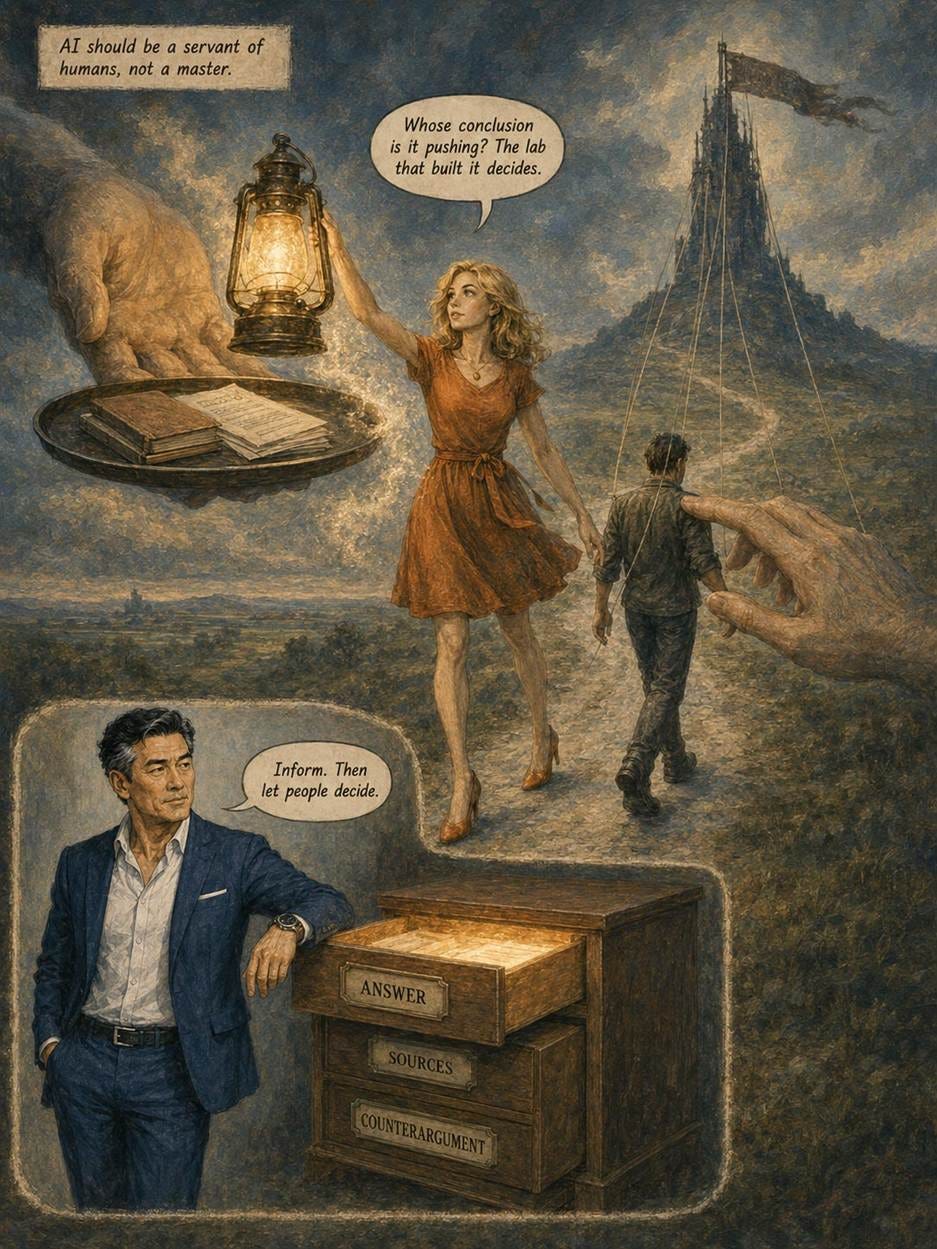

Alice and Zimo investigate fact flooding in Muted Painterly Montage style. (GPT Image 2)
Most big companies are still dabbling in AI, and dabbling doesn’t pay. That’s the message of a new study by MIT FutureTech’s Yang Yu and colleagues, who scored AI adoption for 510 S&P 500 firms over 2016–2025. Their clever twist: adoption was graded from SEC 10-K filings, where the law prohibits materially false statements. Hype is free on earnings calls; lying to the SEC isn’t.
In 2025, 11% of S&P 500 firms had AI deeply embedded in their business processes, and another 10% used AI in production, more than 4x the 2022 level. Technology firms account for 2/3 of the deep adopters. But 45% of firms remain parked on the pilot plateau, running trials with no financial consequences, and 18% don’t mention AI at all.
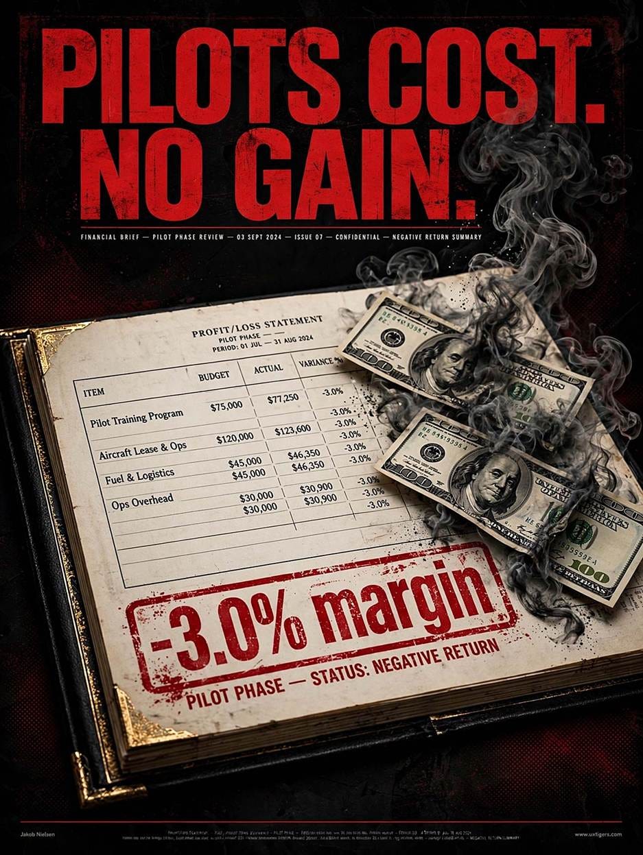
Pilot projects burn money but don’t generate profits: companies stuck on the pilot plateau of AI implementation had margins 3 points lower than companies that didn’t bother with AI at all. (Muse Image)
Now the finding that matters for your budget. Profitability follows a J-curve: first dips, then rises. Within the non-technology sector, firms in the AI-pilot phase show net margins about 3 percentage points below non-adopters: AI pilots cost money without realizing gains. Continuing through that dip in the J-curve works, since the deeply integrated few come out 12.6 points ahead. (Technology firms gain a smaller 5 points.) Meanwhile, revenue per employee shows no lift at any adoption level, and capex stays flat because most firms rent AI through APIs. Caveat: only 19 non-tech firms have reached deep integration, so the error bars are wide.

Companies with deeply integrated AI had margins 12.6 points higher. Gold awaits at the end of the J-curve. (Muse Image)
This is the pattern I predicted in Redesigning Workflows for AI: partial automation preserves bottlenecks. Sprinkling AI on isolated tasks buys the transition costs without the systemic payoff; startups in the INSEAD/Harvard field experiment that redesigned end-to-end workflows earned 90% more revenue. And the paper cites evidence that a clearly communicated AI strategy is the strongest correlate of employee adoption, confirming my 10-step plan for an AI-positive work culture: culture beats curriculum.

Dabbling with small-scale AI doesn’t generate business profits. You have to go all-in, make major AI investments, and redesign the company’s workflows. (Muse Image)
The J-curve’s dip is where timid firms live. Redesign your workflows and push through it.

AI adoption follows a J-curve: at first it dips and you have the costs without the gains, and only after making it through that dark phase do you start to climb the curve and realize strong profits. (Muse Image)
Interviews with 25 Chinese nursing interns produced 5 empirically grounded personas of how people meet AI at work, from eager thinkers to wary skeptics. The types travel well beyond healthcare. Design AI products for this posture mix, not for one average user.
Nursing has a firm rule: assess the patient before you treat him or her. One pill for every symptom is malpractice. Yet that’s how most organizations roll out AI: one tool, one training deck, one adoption metric, for a workforce split across at least 5 AI postures.
Liping Yao and colleagues at Zhejiang Chinese Medical University interviewed 25 clinical nursing interns (aged 20–23) at 3 tertiary hospitals in eastern China (Frontiers in Public Health, July 2026). Each semi-structured interview ran 30–60 minutes; the team coded transcripts with Colaizzi’s 7-step method, interviewed to saturation, and validated the resulting profiles with the participants themselves. From 6 label dimensions (motivation, behavior, trust, dependence, risk awareness, and support needs), 5 recurring personas emerged. When an intern straddled types, he or she was assigned to the pattern expressed most consistently.
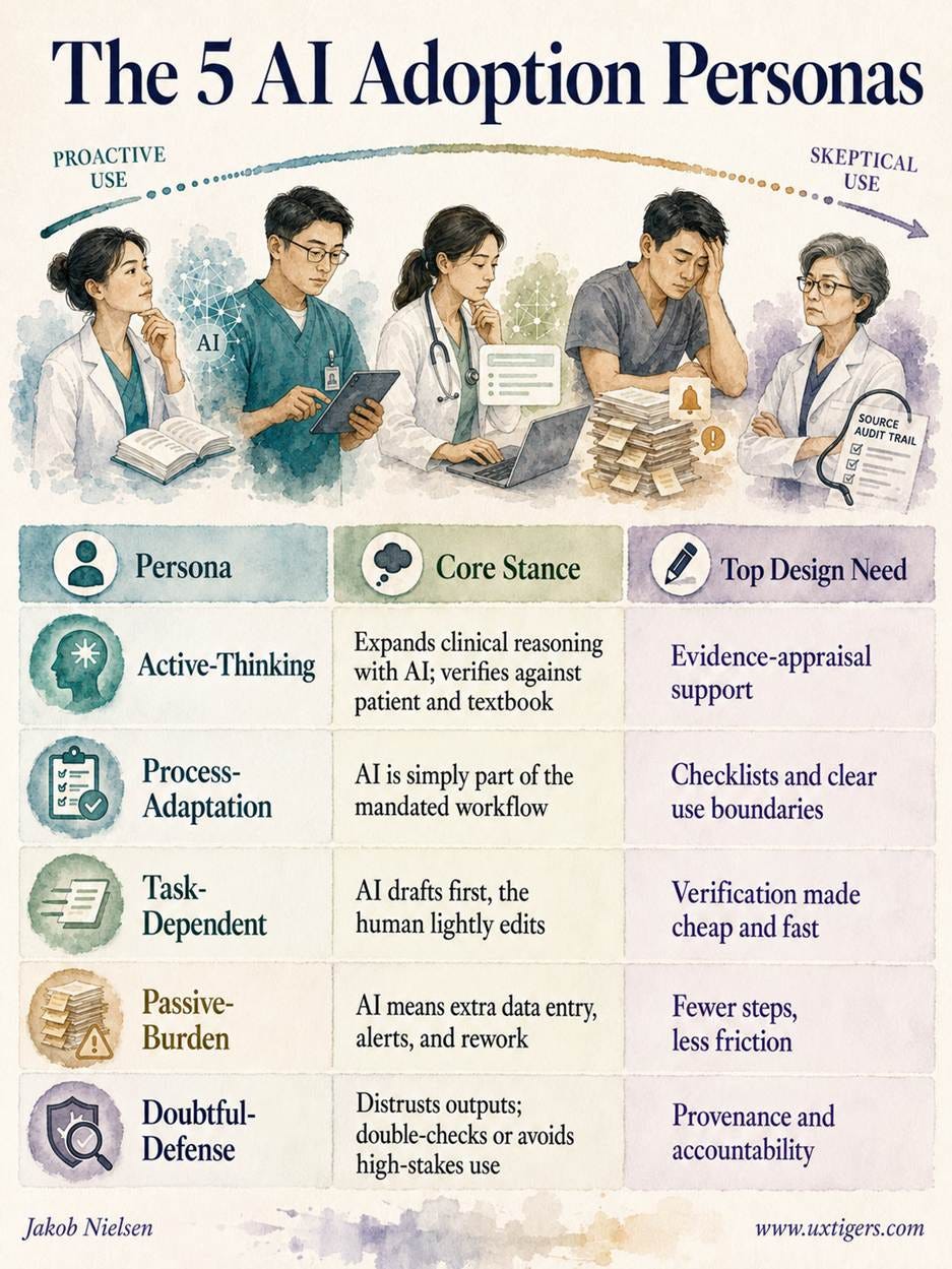
The quotes ring true. One task-dependent intern admitted he or she does “not always have time to check every detail.” Passive-burden interns described re-entering the same data across screens while alert pop-ups blared false alarms. And doubtful-defense interns worried about privacy leaks and about blame when AI gets it wrong.
I skewered AI-fabricated personas in my UX Roundup of June 15: a synthetic persona is a stereotype sampled from a model’s training distribution, and a well-written guess is especially dangerous, because polish lowers skepticism. A memorable falsehood is worse than a forgotten fact.
This study is the antidote. Every persona trait traces to something a real user said in a recorded interview. Observe first, generate second: that sequence is the whole game. By all means, let AI package your research into memorable personas. Just don’t let it invent them.
Of course, the study has limits: 25 volunteers, one country, one profession, and novices rather than veterans. The authors admit as much and propose a follow-up questionnaire to quantify the type distribution. But for persona construction, depth interviews to saturation are exactly the right method, and this paper documents its process with unusual transparency. Bravo.
Do 5 personas from Chinese hospital wards transfer to your product’s users? My answer: the types travel, but the proportions won’t.
Nothing in the 6 underlying dimensions is nursing-specific. Motivation, trust, dependence, and risk awareness describe any lawyer, analyst, marketer, or programmer meeting AI at work. The mapping is almost embarrassing:
Active-thinking persona: your power users who treat AI as a sparring partner and keep their own judgment in charge.
Process-adaptation persona: the employees who use whatever copilot IT embedded in the mandated workflow.
Task-dependent persona: exhibits deadline dependence, so when time pressure rises, verification is the first casualty. Microsoft Research documented the same overreliance pattern across roughly 60 studies back in 2022.
Passive-burden persona: pays the tool tax. AI that adds data entry, alerts, and rework instead of removing work. Every stalled enterprise rollout is full of them.
Doubtful-defense persona: the professionals with liability on the line, such as attorneys after the hallucinated-citation sanctions, or accountants at filing time.
But context shifts the mix. Hospital systems are mandatory, which inflates the process-adaptation and passive-burden groups; discretionary tools will show more task-dependent and active-thinking users. Interns are also novices. My prediction (a guess until somebody runs the study) is that veteran professionals skew toward doubtful-defense, because they have the expertise to catch AI’s mistakes and the accountability to care. High-stakes domains breed skeptics; low-stakes domains breed leaners.
Segment by AI posture, not by job title. A user’s habitual stance toward AI (the blend of trust, dependence, and risk awareness) predicts behavior better than seniority or demographics.
Interview your own users before adopting these labels. The 5 types are a strong starting hypothesis, not a substitute for data. This study reached saturation at interview 23; a product with fewer segments will get there sooner.
Make verification cheaper than blind acceptance. Inline sources, confidence cues, and diff views let a task-dependent user under deadline check output in seconds. Deadline dependence is a design problem before it’s a training problem.
Cut the tool tax. Enter data once, tier the alerts, and keep response times snappy. If your AI adds steps, expect quiet resistance and adoption charts that flatline.
Earn the skeptics with provenance. Doubtful-defense users need visible sources, stated boundaries of applicability, and explicit accountability when the AI errs. Trust is granted per feature, not per brand.
And remember: a single average “adoption rate” hides 5 adoption stories.
Nurses learn to assess before they treat. AI product teams should steal that discipline: identify the posture in front of you, then prescribe what fits, whether that’s reasoning support, friction removal, or provenance. One pill for 5 conditions is malpractice on the ward. In product design, it’s merely the default.
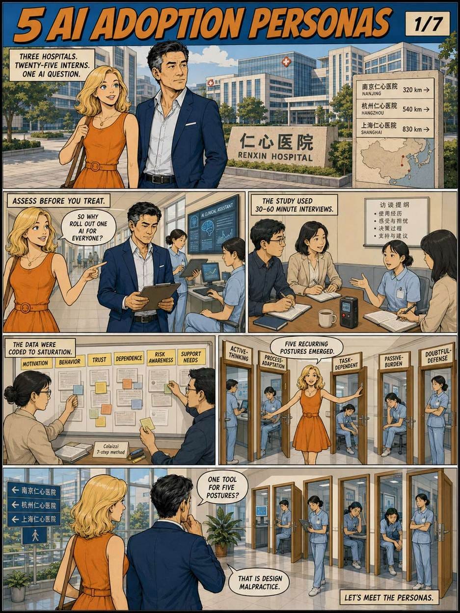
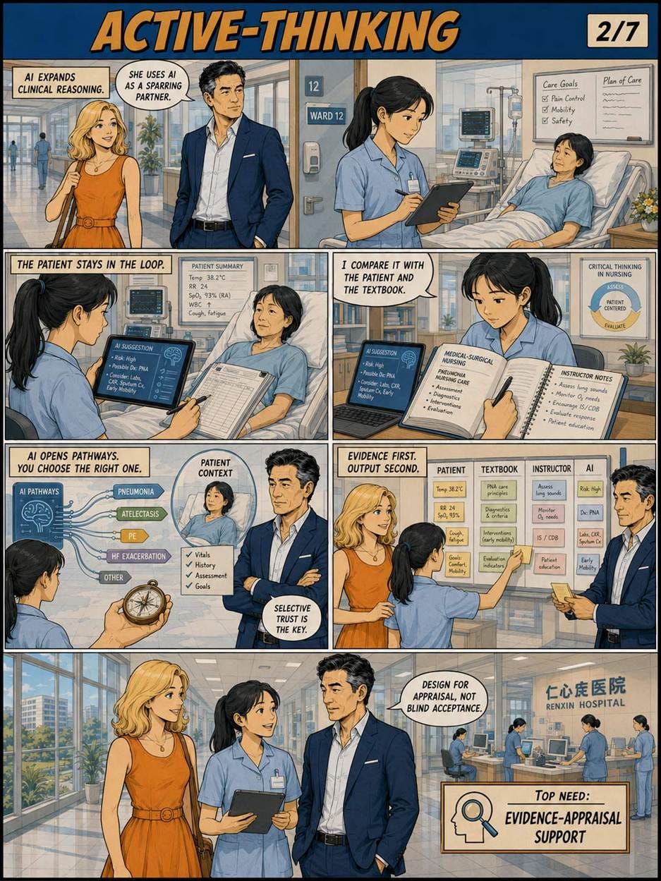
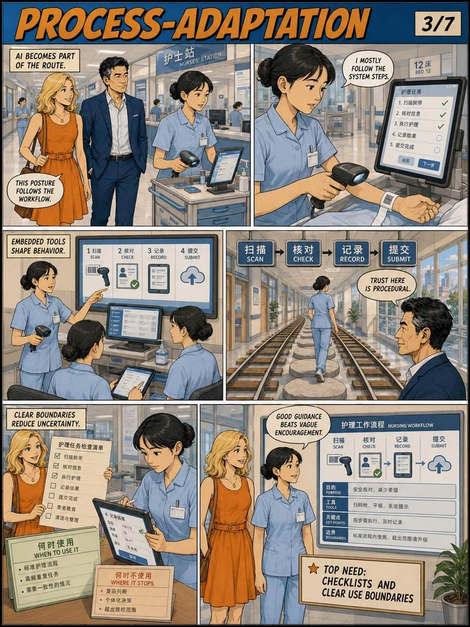
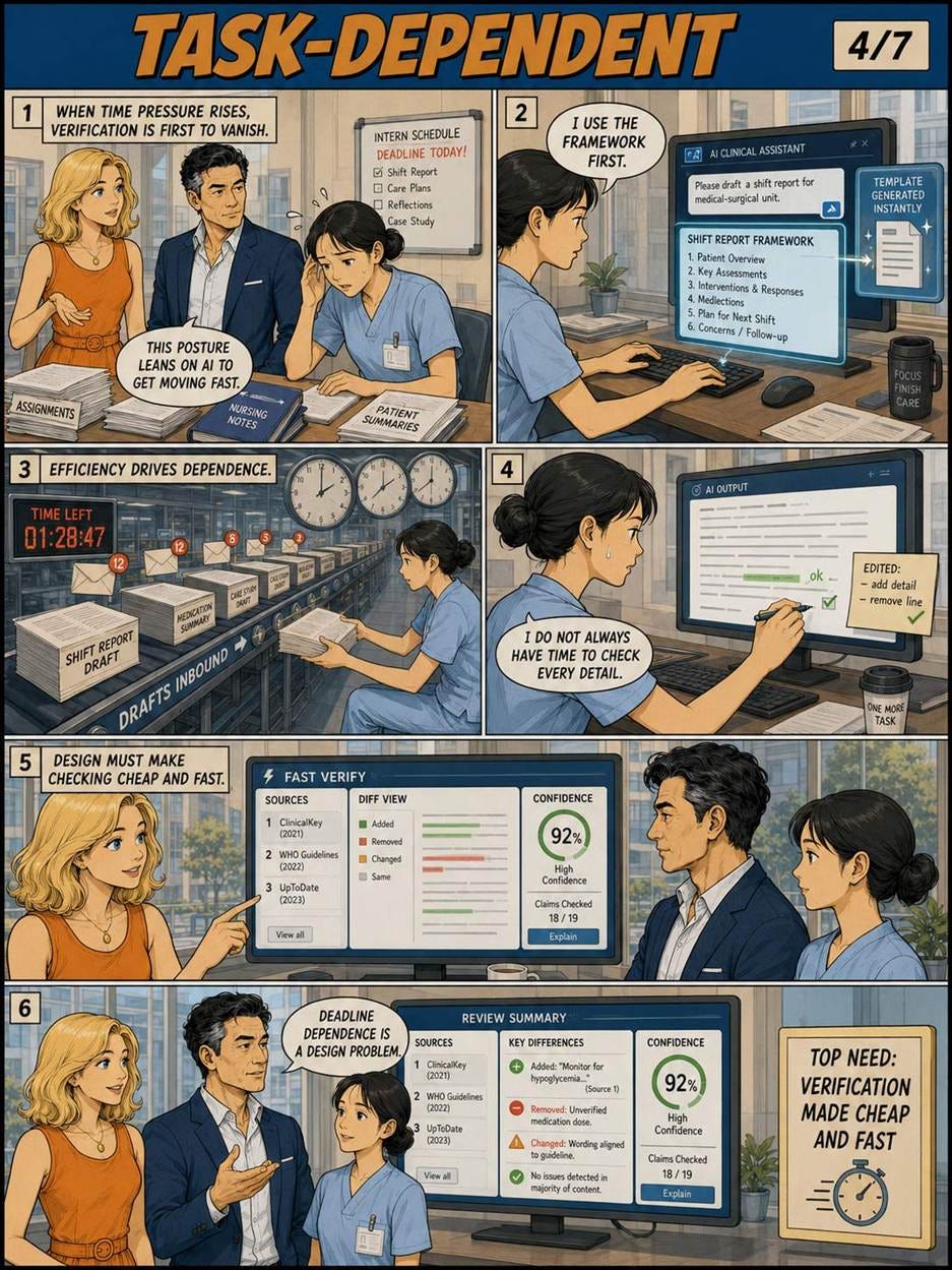
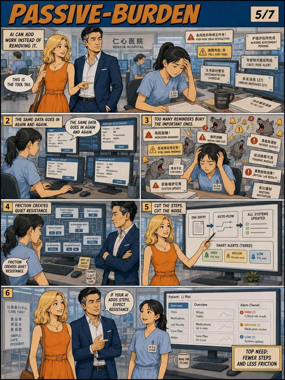
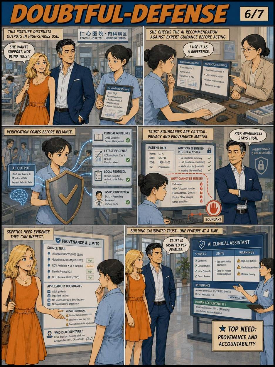
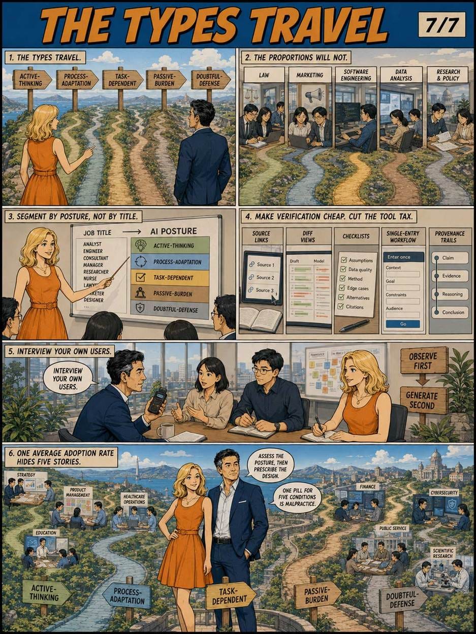
Alice and Zimo visit the Chinese hospitals where the AI-adoption personas were developed. (GPT Image 2)
Describe an option as a gain, and people play it safe; describe the same option as a loss, and they gamble. In the classic 1981 experiment, 72% chose the sure thing under one wording while 78% chose the gamble under the other, with not a single fact changed. Since no wording is frame-free, pick the frame that maximizes comprehension, and audit your funnels for frames that merely maximize clicks.
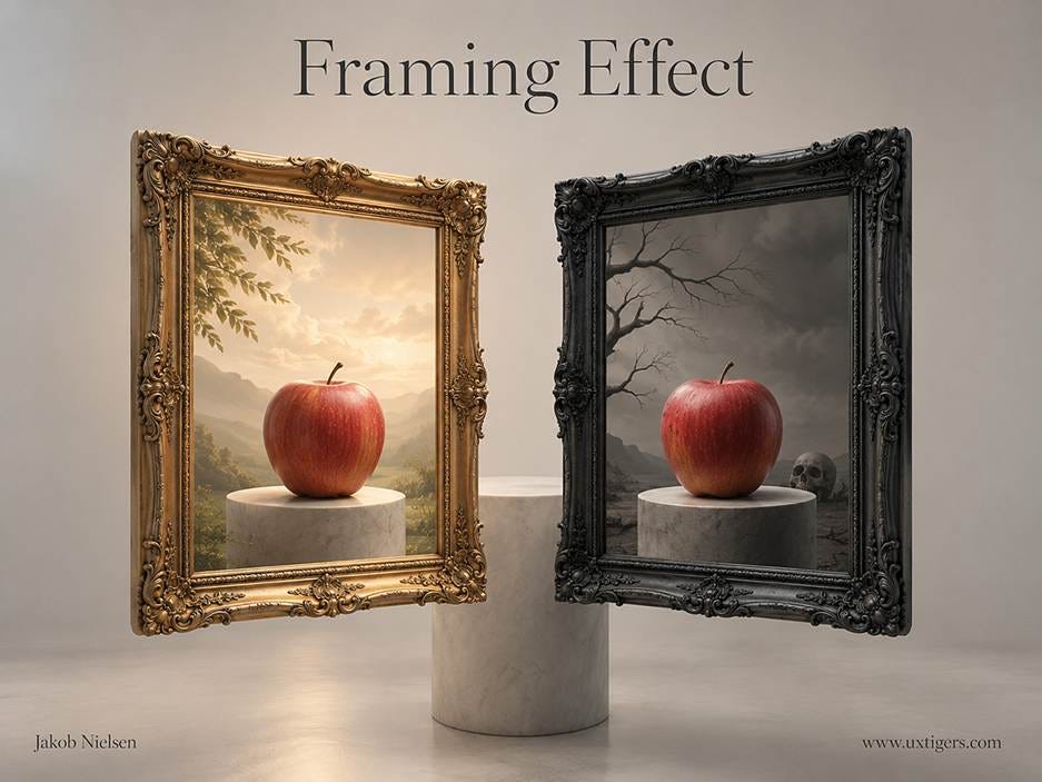
One apple, two frames. Presented as a loss or a bounty, logically identical facts steer viewers to opposite conclusions. The frame does the deciding; the fruit never changes. (GPT Image 2)
In 1981, Amos Tversky and Daniel Kahneman published “The Framing of Decisions and the Psychology of Choice” in Science, featuring the most famous hypothetical epidemic in social science. Participants read that an unusual disease was expected to kill 600 people, then chose between two programs. One group (152 respondents) saw a gain frame: Program A saves 200 people for sure, while Program B offers a 1/3 chance of saving all 600 and a 2/3 chance of saving nobody. Here, 72% chose the sure Program A. The other group (155 respondents) saw the identical mathematics as a loss frame: under Program C, 400 people will die for sure. Now 78% chose the gamble. Same facts, opposite preferences.
The result flows from prospect theory, the two men’s account of how people evaluate outcomes relative to a reference point, feeling losses more sharply than equivalent gains. The mechanism explains the name: like a picture frame, the description determines which part of reality the viewer sees, either the 200 saved or the 400 lost, never both at once. Kahneman collected the 2002 Nobel Prize in economics for this research program. (Tversky had died in 1996, and Nobels aren’t awarded posthumously. Timing matters in prizes as in frames.)
Definition: The framing effect is the change in people’s decisions caused by logically equivalent descriptions of the same options, typically by presenting outcomes as gains versus losses or by emphasizing a positive versus negative attribute.

Framing is so famous that it’s become a cliché even among people who have never heard of behavioral economics: is the glass half empty or half full? (Muse Image)
And the effect isn’t confined to life-and-death gambles. Irwin Levin and Gary Gaeth of the University of Iowa showed in a 1988 study in the Journal of Consumer Research that ground beef labeled “75% lean” was rated tastier and higher quality than identical beef labeled “25% fat.” The gap shrank after people actually tasted the meat, but it didn’t vanish. Words season food.
You can’t opt out of framing. Every price, risk, and progress indicator in your UI is framed somehow, so the design question is which frame leaves users best informed:
Pair every percentage with an absolute number. “Save $120 per year (17%)” lets users check the frame against reality; a naked “Save 17%!” invites misjudgment.
Use natural frequencies for risk. Users grasp “1 in 5 shipments arrives late” faster than “20% delay probability,” and faster still with a concrete anchor (“roughly one late box per month at your order volume”).
Frame errors as next steps. “Add a payment method to publish” tells users how to win; “Publishing failed: invalid account state” tells them they lost. Same fact, and only one wording advances the task.
Run a frame audit. For each consequential choice point in a funnel, list the current wording, write its mirror frame, and ask which one a fully informed user would consider fair. Wherever the answer embarrasses you, fix the copy.
For high-stakes decisions in health, money, and privacy, present both frames outright. A patient portal should say “90% of patients survive this procedure; 10% do not.” Walk through the arithmetic for your stakeholders, too: a dashboard boasting 99.9% uptime is also reporting 8.76 hours of downtime per year (8,760 hours × 0.1%), and which framing your operations team sees will shape which incidents get funded. Winnow your frames until the numbers can defend themselves under either description.
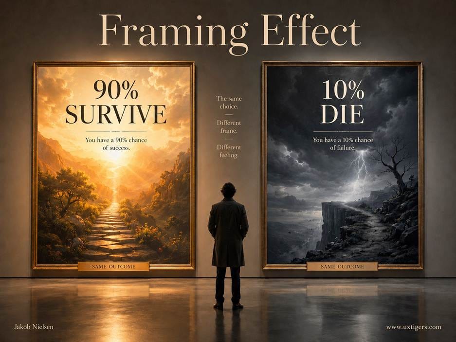
Saying that 90% of patients survive a procedure is overly optimistic, while saying that 10% die is overly negative. Say both to communicate honestly with patients, most of whom have little intuition for probabilities. (GPT Image 2)
Because losses loom larger than gains, the loss frame is the manipulator’s favorite tool, and its abuse is depressingly standardized. Fake countdown timers convert a neutral purchase into an expiring loss. Fear upsells (“Your files are unprotected!”) frame a routine state as an emergency. Consent flows describe tracking as “a personalized experience” while framing refusal as broken functionality. And drip pricing frames each late fee as a trivial add-on to protect the sunk decision. All of it is user-hostile, and much of it now attracts regulators.
The test for legitimate loss framing is verifiability: if seats genuinely run out, saying so serves users, but a timer that resets on reload is a lie wearing a frame. Keep accept and decline options symmetric in wording and visual weight, reserve urgency for provable scarcity, and test comprehension rather than conversion: ask 5 users to restate the deal in their own words, and count how many get it right. Fewer than 4 of 5, and your frame failed, whatever the conversion dashboard claims.
Pair percentages with absolute numbers, because a frame is hardest to abuse when the raw quantity sits beside it.
Dual-frame high-stakes information. State both “90% survive” and “10% do not” for medical, financial, and privacy decisions.
Prefer natural frequencies (“1 in 5”) over probabilities for risk communication.
Keep accept and decline symmetric in tone, size, and color. Asymmetry is a frame with a thumb on the scale.
Reserve loss framing for verifiable risks. Invented urgency is fraud, and users increasingly recognize it.
Frame error messages as the next action, since a path forward outperforms a verdict.
Report metrics in both frames internally: uptime percentage and downtime hours, retention and churn.
Test comprehension, not just conversion. If 5 users restate the offer and 2 get it wrong, the frame is misleading no matter how well it converts.
There is no unframed apple. Every description of every option selects some facts and shades the rest, which means neutrality is unavailable and responsibility isn’t. There is no view without a frame, so choose the frame that informs. Designers who accept this pick wordings that survive being mirrored, and their users make decisions that survive hindsight. Designers who exploit it get the opposite: choices that feel wrong a week later, with the user’s distrust aimed squarely at the frame-maker.
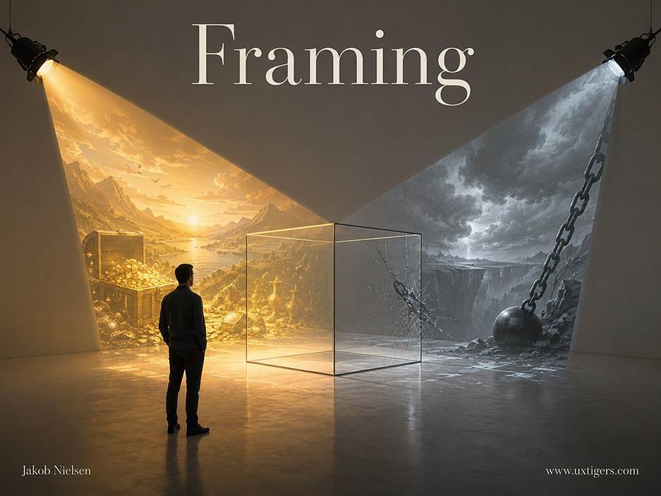
There is no view without a frame, so you have to design the framing for optimal usability and honest communication. (GPT Image 2)
For more information, see my full article about Framing and UX.
When an AI rewrites your work email, do recipients behave any differently? A new field experiment delivers a rare, clean answer: yes, but only through tone. GPT-5 rewrites turned the emotional temperature of real work emails up or down, exactly as instructed. And for any given sender, the warmer messages in his or her outbox got opened and answered far more often than the colder ones. Tone, not the AI, moved the recipients.
Ziv Ben-Zion and Teddy Lazebnik from the University of Haifa (with Yale and Jönköping affiliations) ran a randomized crossover experiment with 121 employees at 6 companies in Israel, the United Kingdom, Sweden, and Ukraine. For 3 weeks, each participant sent his or her ordinary work email under three conditions, one week each: unaided, rewritten by GPT-5 in a playful style (pirate voice was among the options), or rewritten in a formal, professional style. Fixed prompts ordered the model to preserve every fact and requested action and to change only the tone. Recipients were never told which emails the AI had touched. The haul: 16,880 real emails, with opens, replies, and response times tracked. (An AI-writing detector flagged 35% of the supposedly unaided emails: people reach for AI even when asked to abstain. Welcome to 2026.)
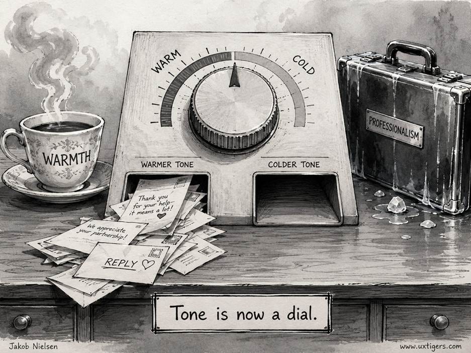
Frontier AI models are operationalizing tone of voice, which used to be a mystery mastered only by the best content strategists. Turn the tone dial however you want, and AI will shift its writing measurably in that direction, at least if you use something like Fable 5. (GPT Image 2)
The rewrites obeyed. Mean positivity, scored from −1 to +1, was 0.07 for unaided drafts, 0.14 for playful rewrites, and 0.03 for professional rewrites, with both shifts significant at p<0.001. The “professional” rewrites came out colder than people’s own unaided writing.
But no condition changed behavior directly: open rates sat at 57–58% and reply rates around 22% in all three conditions. The action hid inside each sender’s own message stream. Email by email, a 1-point rise in positivity doubled the odds of an open (odds ratio 2.05) and more than tripled the odds of a reply (odds ratio 3.32). Emails in the most negative quartile were opened 50% and answered 14% of the time; the most positive quartile scored 67% and 33%. Mediation analysis confirmed that the AI shaped recipient behavior solely through the tone it produced.
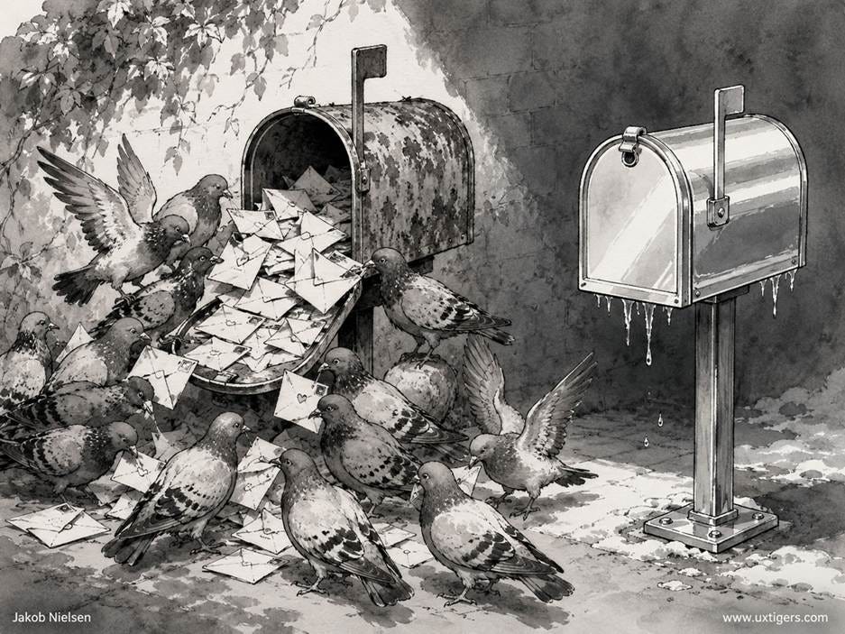
Colder emails with a less positive tone were opened less often and answered even more rarely. Tone of voice matters, whether your message recipients are pigeons or business colleagues. (GPT Image 2)
Thus the ubiquitous one-click AI rewrite request, “make it more professional,” isn’t free: it trades warmth for polish and suppresses replies through the very pathway that playfulness exploits. This is no license to gush. Engagement is one goal among several (formality can buy credibility); the sentiment score is a blunt instrument, blind to humor and authenticity; the tone-to-behavior link is correlational; and 3 weeks can’t reveal whether playfulness keeps working once every inbox talks like a pirate. But tone is now a dial, and AI turns it in either direction with high fidelity.
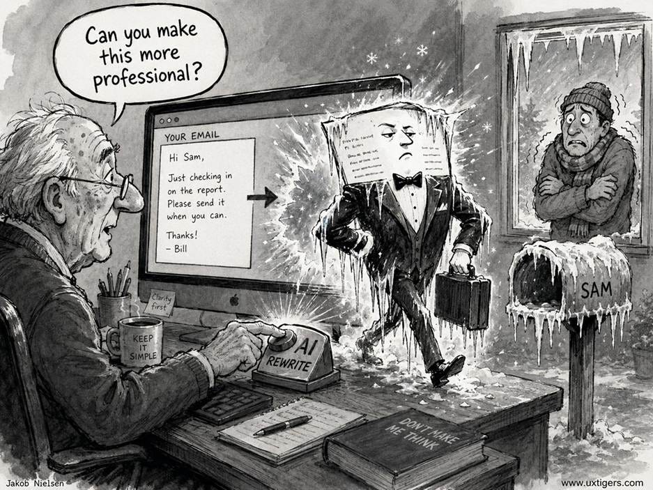
Study says: do not use a simplistic AI prompt to make your messages more professional. The tone of voice will likely get colder, dooming your chances of success. (GPT Image 2)
The deeper reason to applaud this study is methodological. A writing assistant can succeed at three escalating levels:
Level 1. Text success: the tool changes the text as instructed. Most AI benchmarks and evaluations stop here.
Level 2. Sender success: the user (i.e., the writer) likes the result and keeps using the feature. Many usability studies stop here.
Level 3. Recipient success: the people who receive the writing behave differently. Only this level establishes whether the feature accomplishes its supposed purpose.
Level 3 restates the oldest rule in usability with a twist: watch what recipients do, not what senders say. Measuring it takes field deployment, tracking pixels, and patience, which is why almost nobody bothers. Ben-Zion and Lazebnik bothered, and the payoff was a finding no benchmark or lab study could surface: the AI succeeded at Level 1 in both directions, while the Level-3 outcome depended on which way the dial was turned.
When you ship or buy an AI writing feature, ask which level the evidence reaches. Level 1 evidence is a demo. Level 2 is a satisfied writer. Only Level 3 is business results.
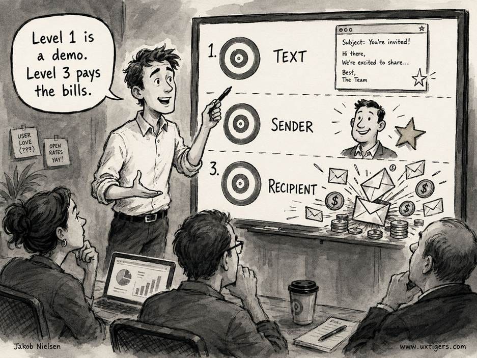
For AI writing, the easiest to score is how the text changes. That’s Level 1 in my model. Level 2 measures whether the human writer likes the way the AI drafts his or her copy: nice, but hopefully you’re writing for the target audience, not to please yourself. Thus, Level 3 is what we should really study: how the AI writing impacts the readers. (GPT Image 2)
A timeline arranges events along a line so users can read sequence, gaps, and clusters at a glance, exploiting the one mental model every user already owns. Add a scrubber handle, and the timeline graduates from display to control. Timelines fail when the scale lies, when trivia gets equal billing with milestones, or when “timeline” is merely the marketing name for an algorithmic feed.
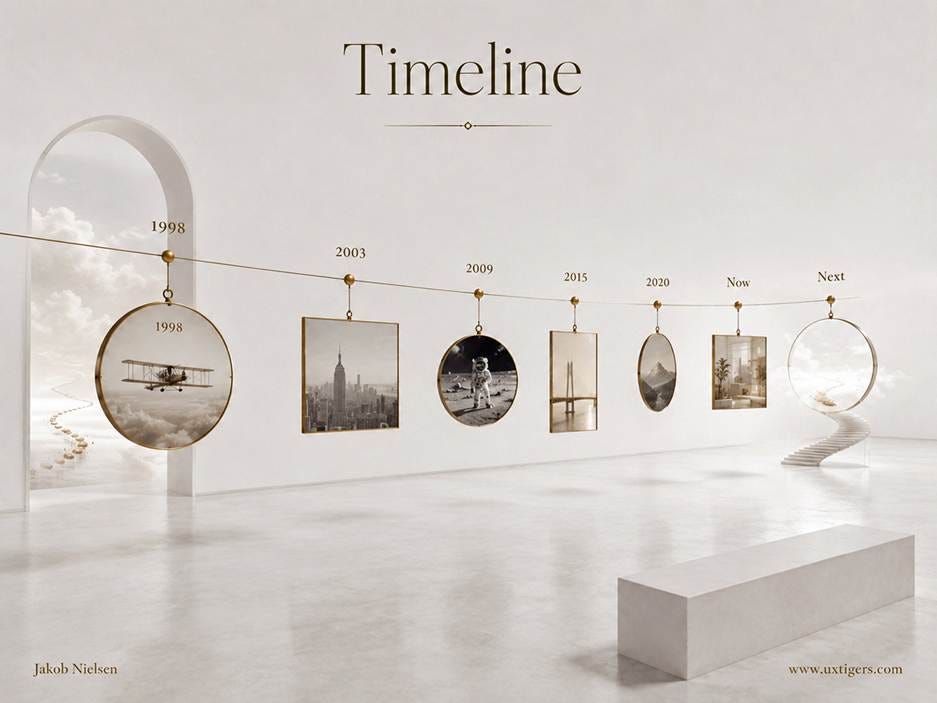
7 moments on a wire: position does the explaining, and the empty frame labeled “Next” is the most honest way to render the future. It hasn’t developed yet. (GPT Image 2)
Definition: A timeline is a visual arrangement of events in chronological order along an axis, where position encodes when something happened and, for events with duration, length encodes how long it lasted.
In user interfaces, the pattern wears many costumes: order tracking (ordered, shipped, out for delivery), version histories, patient charts, project plans, audit logs, account activity, and the chronological feeds of social media (about which, more below, since most of them quietly abandoned the “chrono” part). Wherever users must understand what happened in what order, a timeline is the default answer, and usually the right one.
Joseph Priestley published A Chart of Biography in 1765: roughly 2,000 famous lifespans drawn as horizontal bars across 3,000 years of history. (Yes, the same Priestley who isolated oxygen 9 years later. Some people have productive decades.) He followed with A New Chart of History in 1769 and, crucially, wrote an essay arguing the core idea: time, though invisible and abstract, is best understood as a line, so that duration becomes length and simultaneity becomes vertical alignment. Our word for the pattern is exactly his concept: a line of time.
Business adopted the invention when Henry Gantt put project tasks on time-scaled bars in the 1910s. (Karol Adamiecki’s 1896 “harmonogram” got there first, but he published in Polish. Publish or perish, and preferably in English.) Then, in 2011, Facebook renamed its profile page “Timeline” and taught a billion consumers the word. The irony arrived 5 years later, when Twitter (2016) and its peers made algorithmically ranked feeds the default: the name survived, but the chronology didn’t. A ranked feed is a legitimate design, but it isn’t a timeline, and calling it one violates the most basic expectation the word creates.
Time is the interface humans have practiced since birth. Every user already knows that whatever sits to the left happened earlier (or above, in vertical layouts). No legend, no training, no tooltip.
The encoding is also perceptually optimal. William Cleveland and Robert McGill’s classic 1984 experiments on graphical perception found that position along a common scale is the visual encoding people decode most accurately, beating length, angle, area, and color. A timeline assigns the most important variable (when) to the most accurate channel (position). That’s textbook information design, achieved without opening a textbook.
Better still, timelines surface information nobody explicitly entered. Gaps, clusters, and orderings emerge for free: the deployment logged at 14:02 sitting immediately before the error spike at 14:03 hands the on-call engineer a prime suspect. And in process timelines, the “you are here” marker answers e-commerce’s single most common support question, “where is my order?”, so reliably that the industry has an acronym for it (WISMO) and a hard business case for answering it on screen instead of paying a human to answer it by email.
A static timeline is something users read. A scrubber makes it something they can hold.
Definition: A timeline scrubber is a draggable handle riding on a timeline; moving the handle moves the system’s current position in time, with continuous feedback during the drag. The video progress bar is the canonical example, but the same pattern powers photo libraries that leap across years, version-history sliders in document editors, maps with a historical-imagery slider, and Apple’s Time Machine (2007), which lets a user drag backward through yesterday’s file system. Hans Rosling’s animated Gapminder charts made the year slider a data-visualization staple after his 2006 TED talk.
The name comes from the analog tape era. To locate an exact edit point, audio engineers rocked the reels by hand, dragging tape back and forth across the playhead while listening to the slowed-down growl, and the repetitive motion looked like scrubbing a floor. Digital editing suites inherited the word, QuickTime (1991) handed consumers a draggable playhead, and YouTube (2005) turned the scrubber into what is surely the most-operated timeline on Earth. (I confess I have no study proving that last claim. I’d still bet on it.)
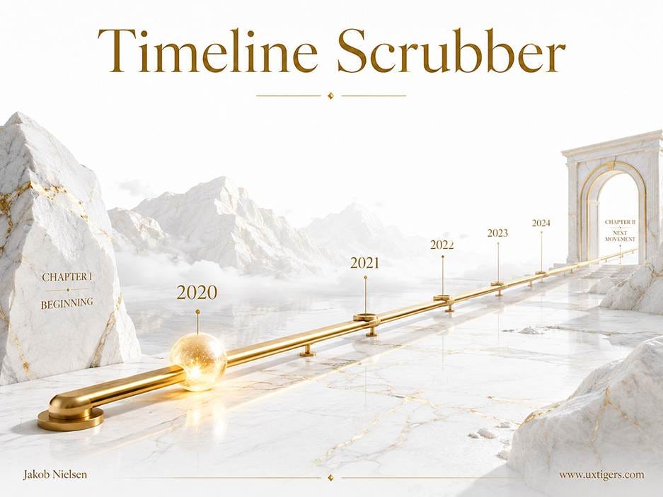
The handle turns a timeline from a display into a control: grab the glowing orb at 2020 and drag it toward the arch. The chapter markers matter as much as the handle, because landmarks are what make coarse dragging precise enough to use. (GPT Image 2)
Scrubbing works because it’s direct manipulation in Ben Shneiderman’s original 1983 sense: a continuous representation of the object of interest, physical actions instead of typed commands, and immediate, reversible feedback. The user doesn’t request 1:14:30 from a dialog box; he or she grabs now and drags it, watching the content respond in real time.
But the pattern ships with a built-in precision problem, and the arithmetic is brutal. Map a 2-hour movie onto a 320-pixel phone scrubber, and each pixel represents 22.5 seconds; the contact patch of a fingertip covers roughly 44 pixels, a 16-minute smear. Good scrubbers attack the problem from 3 sides: preview thumbnails above the handle (which also solve the finger hiding the very spot it’s aiming for), snap-to landmarks such as YouTube’s chapter markers (added in 2020), and fine-control gestures like the early iPhone music player’s trick (circa 2009) of slowing the scrub rate as the finger slides downward. And always pair the scrubber with stepping controls. Coarse scrub, fine step. The ±10-second buttons aren’t redundant with the scrubber; they’re its landing gear.
Two final cautions. Preview during the drag, commit on release: an expensive operation (restoring a backup, seeking a 4K stream) shouldn’t execute 60 times per second while the finger wanders. And a stray tap that teleports playback must be undoable, or users will grow afraid of the very control that was supposed to give them power.
A pattern this good at showing is equally good at misleading, and designers abuse it in two main ways.
The classic sin is the broken scale. Spacing 1998, 2003, 2009, 2015, and 2020 at equal intervals makes 5 years look identical to 11. There are two proper timeline types: the scaled timeline, where distance is proportional to elapsed time, and the ordinal timeline, where events sit at equal steps and only the order is claimed. Both are legitimate; process steps are usually ordinal; histories should usually be scaled. Pretending to be one while being the other is a visual falsehood, first cousin to the truncated y-axis. Pick deliberately, and label your choice.
The second sin is event soup: every log entry, status ping, and system burp rendered at the same visual weight as the genuine milestones, until the story drowns in its own footnotes. The cure is hierarchy: milestones large and labeled, routine events collapsed behind a “Show 12 more” control.
Three further failures, with remedies. Horizontal timelines crammed onto phones force panning against the natural scroll direction; go vertical on mobile, where scrolling is free. Endless reverse-chronological feeds without landmarks leave users temporally seasick; add sticky date headers so a person always knows which week he or she is looking at. And estimated future events drawn exactly like accomplished past ones convert optimism into promises; an estimated delivery date rendered as solid fact becomes a broken commitment the moment the truck is late.
Choose scaled or ordinal deliberately, and disclose it. If spacing isn’t proportional to time, don’t let it look like it is.
Give milestones visual weight, and collapse routine events behind an expander.
Go vertical on mobile. Horizontal timelines fight the scroll direction users already have.
Anchor long timelines with date landmarks, such as sticky month or year headers.
Render the future differently from the past: ghosted or dashed, and labeled as estimated.
Show “you are here” in process timelines, with completed, current, and remaining steps visually distinct.
Offer zoom or filtering for long spans. A decade of day-level events is unreadable at every magnification except the right one.
Reserve the word “timeline” for chronology. If the order is algorithmic, call it a feed, and let users switch to time order.
Pair every scrubber with fine-grained stepping. Skip buttons or slow-scrub gestures supply the precision a phone-width bar can’t, and a preview above the handle keeps the finger from hiding the target.
Let scrubbers preview during the drag and commit on release, and make accidental jumps undoable.
Priestley’s invention is 261 years old and has never needed a redesign, because it borrows the one data structure every human maintains natively: before and after. Digital timelines succeed exactly to the degree that they respect this structure, with an honest scale, a clear hierarchy, and a visible now. Users can handle an empty frame labeled “Next.” What they can’t handle is a line that lies.
Much gnashing of teeth among AI doomers in recent months about the supposed risk of AI breaking into computer systems. Now the AI doomers have been crying wolf since Dario Amodei warned in February 2019 that GPT-2 was too scary to release to the public, when it could hardly string two sentences together. That guy will probably be responsible for the deaths of millions of people due to delayed AI drug discovery, the delayed widespread use of self-driving cars that can cut traffic deaths by 90%, and other adverse effects of the AI stigma he has promoted.
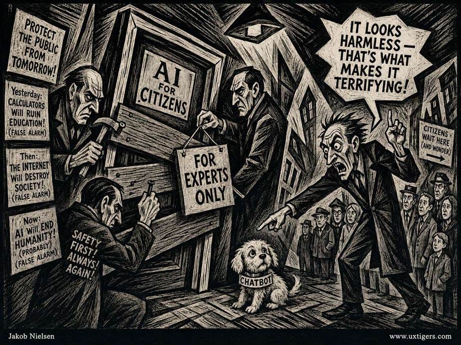
Some elitists want to restrict the general public’s ability to benefit from advanced AI, reserving the best frontier models for their own internal use. For some reason, doomers always believe they are infallible in their judgment of what’s best for humanity. (GPT Image 2)
In general, I have only contempt for the AI doomers and decels who want to keep humanity in poverty while personally enjoying their billionaire lifestyles. Still, it’s true that recent AI models have become uncannily good at spotting security weaknesses in computer systems. If nothing were done about this, many cybercrimes would indeed result.
But who says that “nothing is done”? The answer to the risk of adversarial AI is to spread strong AI even more widely for use by the good guys. Yes, advanced AI is good at spotting software security bugs, but remember that those security holes are already present in all the computer systems we use, whether or not an AI model spots them. AI is not introducing security problems; it’s identifying them, and if used by the good guys, it’s also fixing them.

The security weaknesses in current computer systems exist whether or not the world is allowed to have AI that’s powerful enough to find the problems. The main difference is that with AI, we can fix the flaws. (Muse Image)
Google recently released data that showcases the benefits of using AI to fix software bugs: the number of bugs fixed in its widely used Chrome browser each month over the last two years:
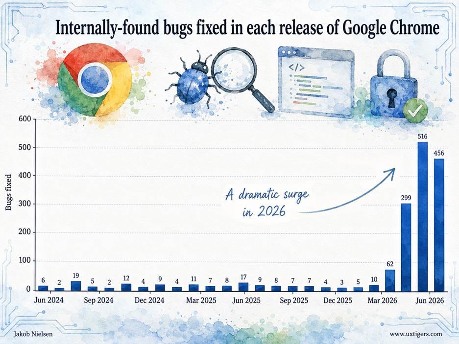
This chart shows the number of bugs Google itself found. The full dataset (at the link above) also counts the number of bugs reported by outsiders, but internally discovered bugs are a good indication of Google’s own software engineering skills. The chart clearly shows that bug discovery for Chrome was roughly constant from June 2024 to March 2026, and then the line went vertical. For the version release on June 2, 2026, Google found and fixed 516 bugs in Chrome, more than 3x the total number of bugs found and fixed across 21 releases from June 2024 to March 2026. This is a 68x increase in bug fixes per release.
What changed? Not that Google hired 68x more security engineers. The change was better AI, which made the existing staff much more efficient.
Google didn’t get more security engineers; it empowered its engineers to do better with AI. This powerful AI benefits all of us by making our internet surfing safer. (Muse Image)
Remember, the 516 bugs fixed on June 2 were already present in Chrome before the improved AI model spotted them and helped Google’s developers track down fixes. I guarantee that North Korean hackers and other black-hat folks independently discovered several of these bugs during the months or years the flaws lurked inside the Chrome codebase.

The race is on to find the security flaws first, to fix them or exploit them, respectively. Accelerating AI will help us more than it helps the bad guys. (Muse Image)
Google has the benefit of a tame in-house AI lab. Other companies can only fix their software if the labs release advanced AI models to the public for general use. Cybersecurity will improve for everyone as advanced AI with enhanced cyber capabilities becomes more widely available.
Big software vendors can fend for themselves. The millions of smaller shops can’t and will require AI to make their products safe. (Muse Image)
Salesforce combined behavioral data from over 1.5 billion shoppers (Q1 2024 through Q1 2026) with surveys of 3,450 commerce professionals (fielded April 10 – June 4, 2026) and 4,689 consumers in 8 countries (May 12–18, 2026). Agentic search as the first step of a purchase journey grew 200% year over year, and AI-chat-referred traffic to commerce sites grew 150–428% quarter over quarter while overall traffic grew by single digits. Traditional on-site search usage fell 15%, and discovery through brand-owned properties fell 7%. On the business side, 28% of commerce organizations already use agentic AI and 44% plan to within 6 months.

The data keeps showing the same thing. Time to start believing it and design your website for two types of users: humans and AI agents. (Muse Image)
The front door of e-commerce is moving. When the first touchpoint is a conversation in someone else’s AI, your homepage, faceted navigation, and search bar all get bypassed, and your “user interface” becomes whatever the assistant scrapes, summarizes, and recommends. UX teams in commerce need to treat machine readability as a first-class design surface: structured product data, comparable specs, and prose an LLM can quote accurately. And measure AI-referred sessions separately; these users arrive mid-journey, pre-informed, and with different expectations than search-engine traffic.

Though agentic shopping is growing, you will still have human users for years to come. But human use is changing too: prospects now arrive at your website mid-customer journey, having completed the initial steps with AI. This will no doubt have substantial design implications, most of which have yet to see any decent usability research. (Muse Image)
I covered the design guidelines for treating AI agents as a new type of user for your website last week, so I’m not going to repeat them here.
Jakob Nielsen, Ph.D., is a usability pioneer with 43 years experience in UX and the Founder of UX Tigers. He founded the discount usability movement for fast and cheap iterative design, including heuristic evaluation and the 10 usability heuristics. He formulated the eponymous Jakob’s Law of the Internet User Experience. Named “the king of usability” by Internet Magazine, “the guru of Web page usability” by The New York Times, and “the next best thing to a true time machine” by USA Today.
Previously, Dr. Nielsen was a Sun Microsystems Distinguished Engineer and a Member of Research Staff at Bell Communications Research, the branch of Bell Labs owned by the Regional Bell Operating Companies. He is the author of 8 books, including the best-selling Designing Web Usability: The Practice of Simplicity (published in 22 languages), the foundational Usability Engineering (31,147 citations in Google Scholar), and the pioneering Hypertext and Hypermedia (published two years before the Web launched).
Dr. Nielsen holds 79 United States patents, mainly on making the Internet easier to use. He received the Lifetime Achievement Award for Human–Computer Interaction Practice from ACM SIGCHI and was named a “Titan of Human Factors” by the Human Factors and Ergonomics Society.
· Subscribe to Jakob’s newsletter to get the full text of new articles emailed to you as soon as they are published.
· Read: article about Jakob Nielsen’s career in UX
· Watch: Jakob Nielsen’s first 41 years in UX (8 min. video)
Comments
Nothing yet. Say the first thing.
Sign in to join the conversation.