
Britain’s biggest premium health club has more than 800,000 members, who visited over 62 million times last year. That’s 62 million opportunities to make people feel healthier, calmer and happier.
So why do so many of the premium wellness spaces we happily pay a fortune for still feel like a leisure centre?
I’m a member of two very different places.
One is Soho House (eye rolls welcome). But for all the controversy, it is an incredibly considered, well-designed space. You walk in, and you feel something.
The other is one of the big premium leisure clubs most of you probably know. The sort of place you’ll find all over the Home Counties if you don’t have a Soho House on your doorstep. Pool, gym, fitness classes, tennis courts, somewhere to grab a coffee afterwards, a space to work for a couple of hours, and, if you’re lucky, a spa. You probably know the one. I won’t name names, so for the sake of this article, let’s call it Leisure Club Two. A top-tier membership costs around £210 a month. Call it £2,500 a year. And just for reference, there is only a £50 a month difference between the two.
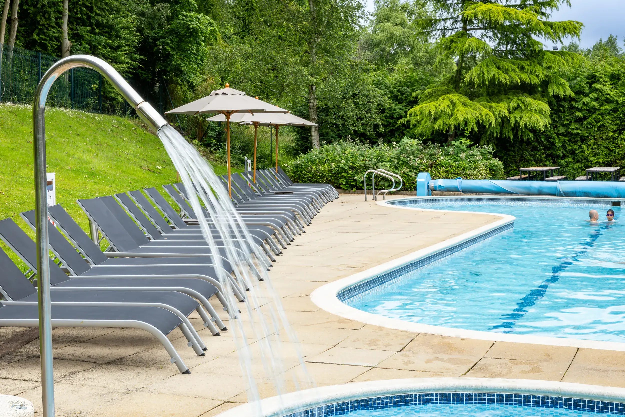
This whole thought landed on me while I was sitting by the pool at Leisure Club Two, on a gloriously sunny weekend we’ve been lucky enough to have lately.
The pool was packed. To be fair, Soho House pools are every bit as rammed, but at least they look good while you’re fighting someone for a lounger. Instead of relaxing, I did what every interior designer does: quietly picked apart every decision that had been made. Did anyone actually think about this? Was there a designer in the room at all?
Sitting by a pool is always a pleasure. But there are pools you wow at, and pools you just forget. This is a forgettable one.
We’re all bathing on cheap looking metal sun loungers, beside a pool clad in tiny grey mosaic tiles. There’s a polished chrome water feature that, I imagine, is meant to read as luxury. It reads as a handrail. And the tiles underfoot are grey 30x30 cement slabs, the exact ones you’d find outside your local high street.
The intention was there. Someone, somewhere, wanted this to be a nice place to be. But the outcome is just a little dull. And I’ll admit I’m a particularly harsh critic.
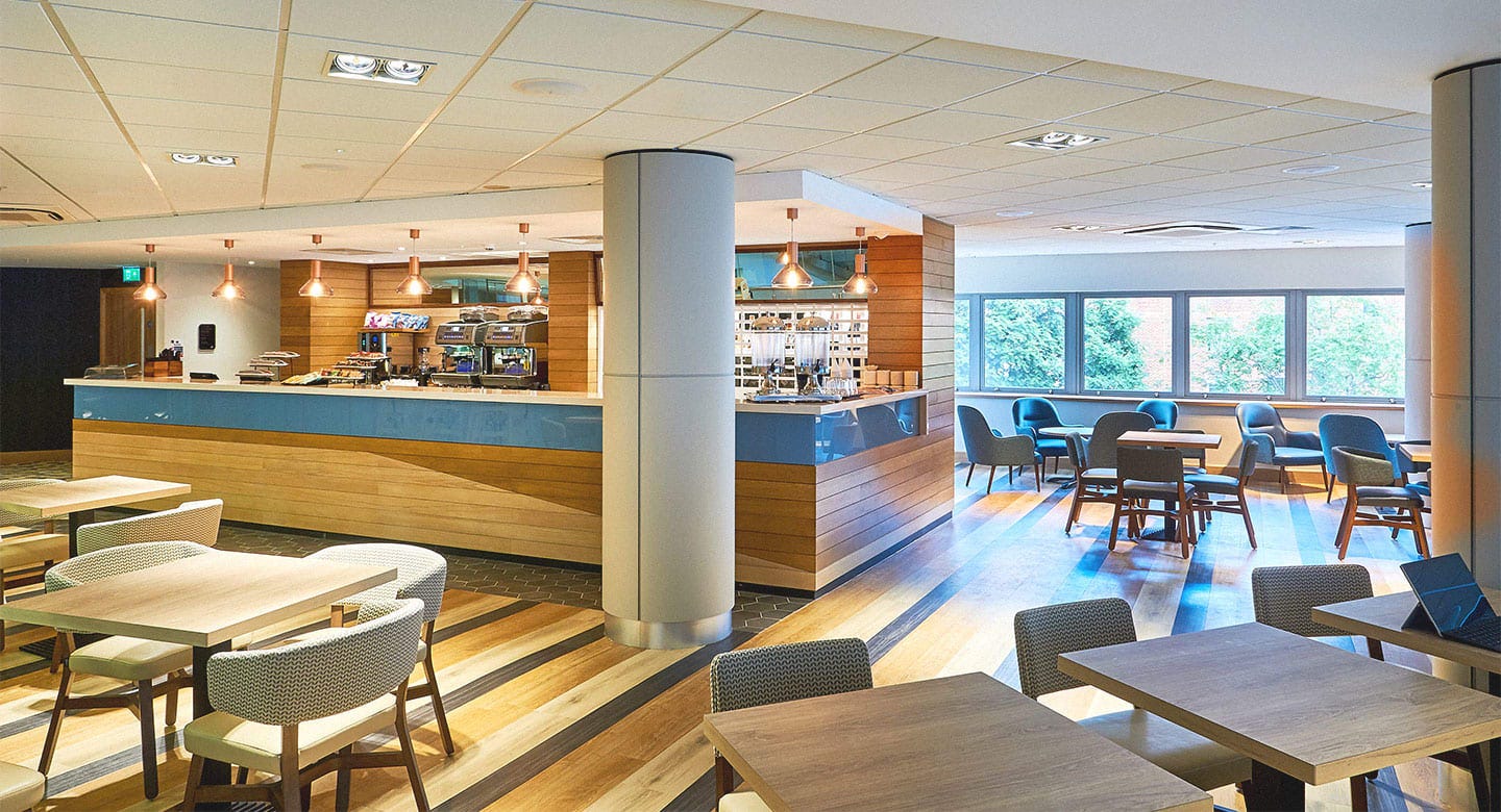
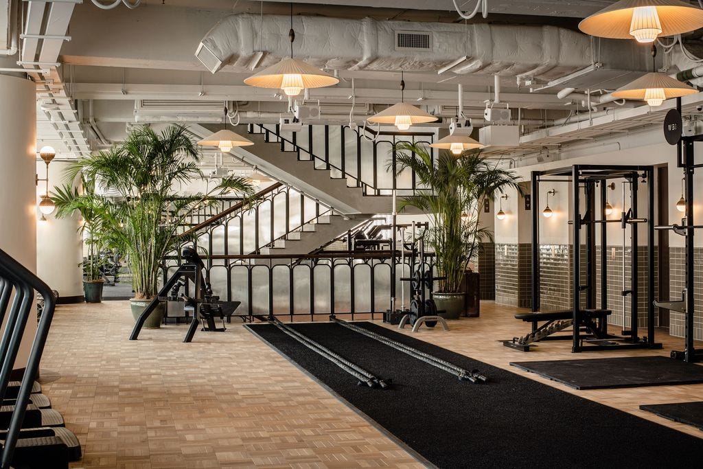
The gym itself has been renovated over the years and genuinely looks good. Great equipment, huge space. But then you reach the little pockets that clearly got no love. The changing rooms, flat and brown, more municipal leisure pool than premium wellness club. And the café/coworking space, where I spend a couple of afternoons a month working away, and which everyone has to walk through to reach the gym or the spa. It’s all patterned tub chairs and booths in endless shades of brown, basic and uninspired, broken up with the odd nervous pop of colour.
Someone designed it, technically. It just doesn’t give you that feeling you came in for.
My club, here in Surrey, is meant to be one of the more premium ones. It’s big, well run, most of the bells and whistles, and a lovely spa that half the members would tell you is worth the fee on its own. I had a nose at the others online too, and the standard ones broadly read the same: same palette, same finishes, same flat, wipeable everything. There are a handful of “Luxe” flagship clubs, the shiny London ones, that sit on a higher tier my membership won’t get me through the door of, so I can’t tell you whether those have cracked it. Maybe they have.
I know exactly how fortunate I am to belong to both places. But that's also what makes the comparison so fascinating. Here are two clubs charging almost the same amount of money and offerings, broadly speaking. Yet one feels like a genuine escape and the other feels... fine. Perfectly pleasant, but instantly forgettable. As a designer, how can two places that are so similar on paper create such completely different experiences.

Because I keep asking that same question. You can see that they did, it’s just not landing everywhere.
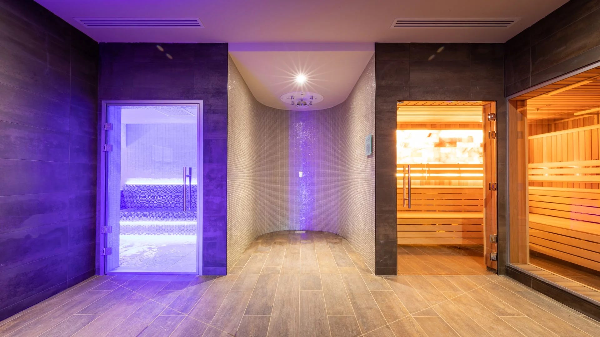
My club shows how close it is. Walk into the spa, and it’s dark, moody, dimly lit, a Himalayan salt sauna glowing in the corner, a steam room, a plunge of ice-cold water, a quiet little cave of treatment rooms. And it works.
A fair bit of that “luxury” is really the lighting doing the heavy lifting, helped along by a premium offering (a Himalayan salt sauna makes anyone’s brain leap straight to “fancy”). But it works, because someone gave it a mood.
And that is the thing I can’t get past. For the money everyone is handing over, how do you get one area that feels like an escape, and another a few steps away that feels like the local leisure pool?
We’re paying for third spaces. The place between home and work. We don’t just exercise there now, we have coffee, meet friends, answer emails, read, swim, escape for an hour. When I signed up, I wasn’t buying a treadmill. I was buying somewhere to spend my time, which means the interior matters far more than it did fifteen years ago.
And you’d assume the reason it falls short comes down to money. It doesn’t, the big chains are doing nicely. The money is absolutely there. Soho House, by contrast, has barely turned an annual profit in nearly thirty years, because it spends every penny on the feeling, and on opening the next house.
I’m not saying a gym should run at a loss chasing marble. Quite the opposite. The profitable one can clearly afford to care how it feels a little more than it currently does. I get it, everyone wants a bit more in their pockets. But theirs are pretty full.
This isn’t some humble gym that never promised anything. These clubs have spent years rebranding themselves as the opposite of a gym, a “premium wellbeing destination”, lifestyle clubs, somewhere to “elevate” the everyday rather than just somewhere you work out. They raised the prices to match, and we paid.
You know the opposite feeling too. A boutique hotel. A 5* spa. A gorgeous restaurant. That moment you walk in and something just... settles.
Take Soho House (Service aside), it’s the moody, layered lighting, the well-designed furniture, the texture and pattern everywhere you look. It also smells great, because they design their own fragrances! It’s the feeling of walking into a five-star hotel, and you’ll forgive almost anything for it.
Soho House isn’t selling fitness. It isn’t really selling the food, or the pool, or the gym. It’s selling atmosphere and lifestyle. That’s the entire product. Their in-house design team has thought about the lighting. The music. The smell. The furniture. The materials. The little corners where you can disappear with a picante. It’s about intention. It’s a design team who cares about how you feel from the second you walk through the door.
The big leisure clubs think they’re selling a wellbeing destination. Soho House knows it’s selling a feeling. For me, that’s the whole thing.
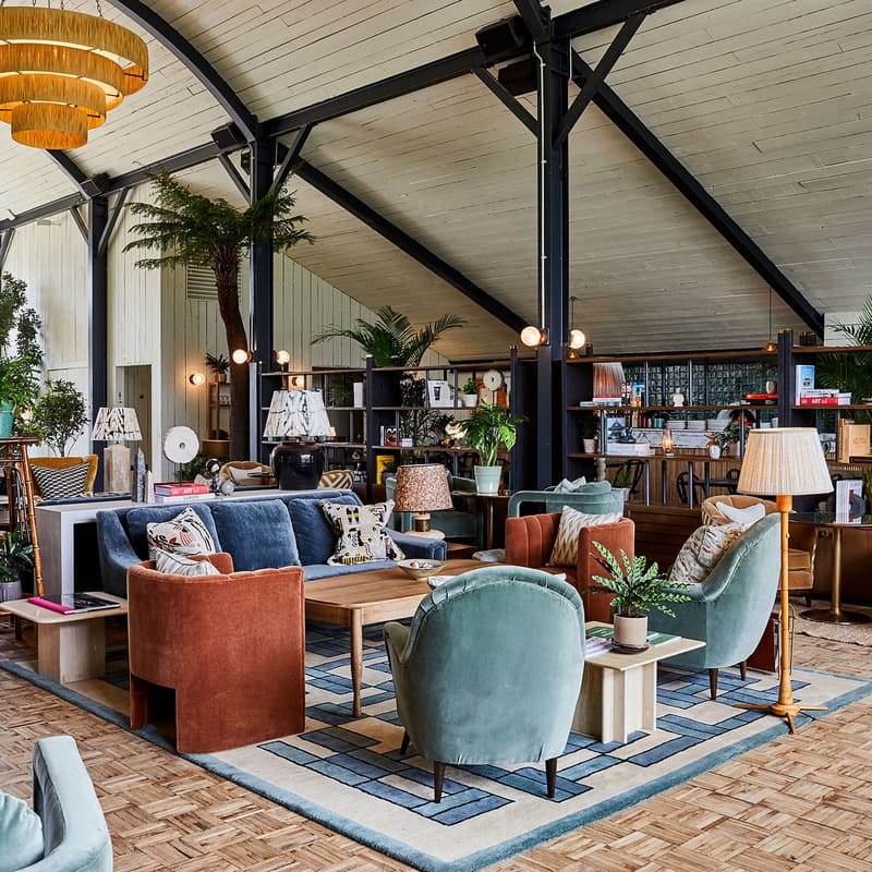
None of it is some dark art. There’s a recipe, and it isn’t a secret.
Start with light, because it does the most work for the least money. The good places layer it: four or five sources in a single room, all warm. Soho House won’t hang a bulb cooler than 2700K. Warm light forgives everything. Cold light forgives nothing.
Then you mix. A bit of vintage in with the new, so nothing feels flat-packed or ordered in a single catalogue go. Texture against texture, a velvet beside an aged brass. Seating you want to fall into rather than perch on. A piece of real art instead of a set of three prints. And a scent, so you go “Mmmmmm” the moment the doors open.
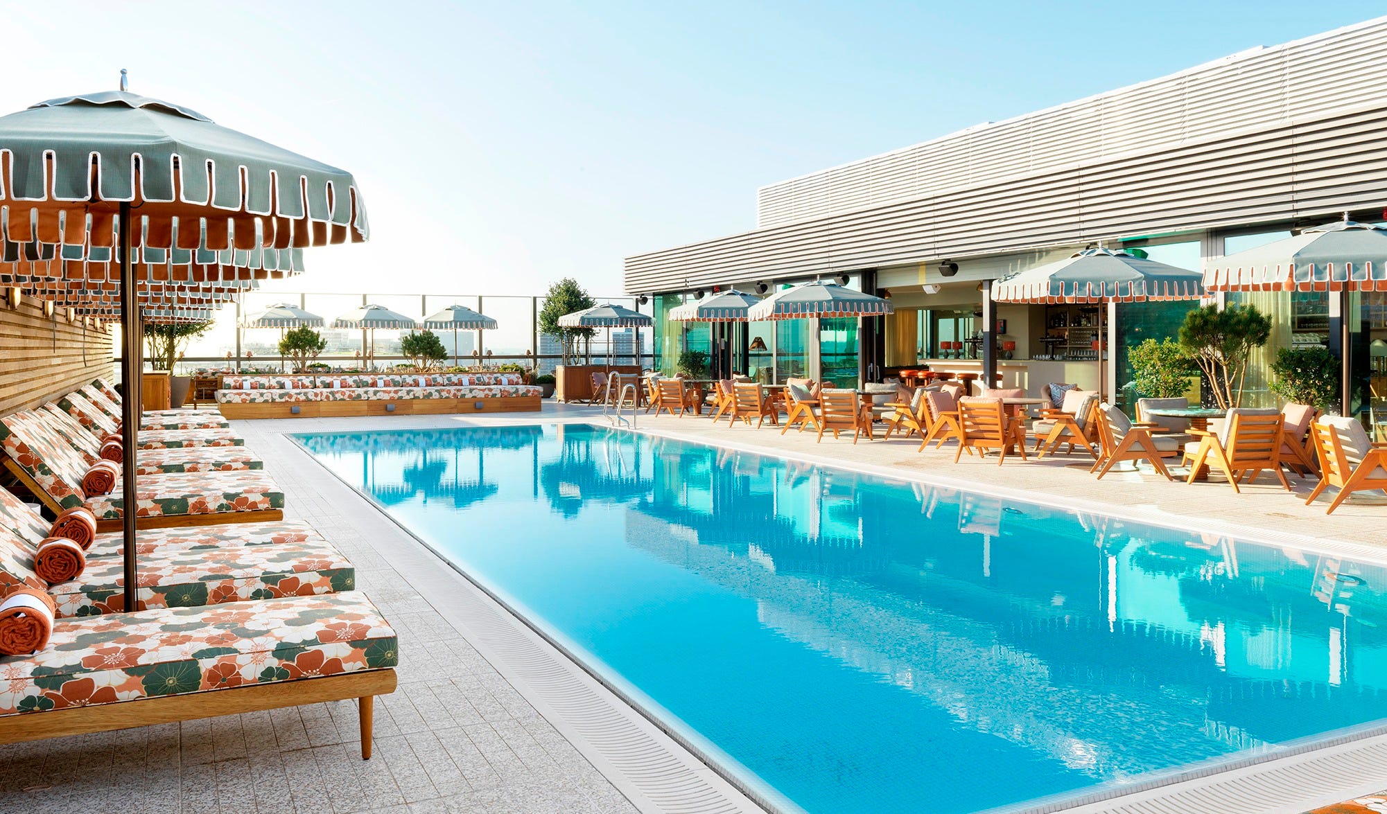
That’s the biggest myth going: that beautiful spaces need bottomless budgets. They don’t. They’re the result of better decisions. Knowing where to spend, knowing where not to, and above all, caring how someone feels when they walk in.
These spaces have to be practical. The materials have to be wipeable, easy to clean, hard-wearing, and able to survive a decade of soggy swimmers and sweaty arses. But practical and flat are not the same thing. You can have texture that still wipes clean. You can have a considered palette that still mops down.
If someone handed me the keys tomorrow, I wouldn’t rip it all out. I’d put every penny into the spaces where people actually sit and linger. The café and the communal areas, especially the ones everybody walks through to get anywhere, because those set the tone for the entire club.
Start with the lighting, always the lighting, and warm the whole thing up so it stops feeling like an office at 4pm in November. A few pendants, a wall light and table light here and there. I’d swap the patterned carpets, bring in natural materials, choose patterns that don’t scream 2010 Premier Inn, mix up the shapes of the tables and chairs, take the edge off the endless walnut. And, for the love of all things good, some proper art.
The zoning is fine; there are booths, little pockets of low seating. It’s the pieces themselves that let it down: cheap, uncomfortable, clearly chosen to survive a decade rather than to actually be sat in. Give me sofas you sink into, and armchairs that look as good as they feel, and you’re halfway there. None of it is radical. It’s just considered.
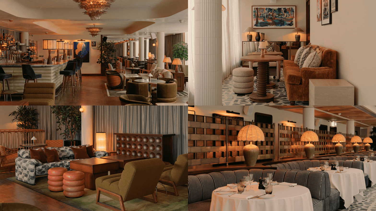
The appetite is already there. The members are there. What’s missing is the atmosphere.
I’m not expecting marble everywhere or handcrafted furniture. I’m expecting someone to have asked a much simpler question:
How do we want people to feel when they walk through the door?
It’s the same reason you’ll happily pay hundreds of pounds a night for a hotel that makes you instantly relax. Or why you’ll linger in one coffee shop for two hours but leave another after ten minutes.
They’re all selling the same thing. A feeling. Maybe that’s why I find all of this so interesting, it’s never really about the furniture or the lighting or even the gym. It’s about the invisible decisions that quietly shape how we experience a place.
And once you start noticing them...eeek!
Anyway. Rant over, lounger reclaimed.
Lydia x

No posts
Comments
Nothing yet. Say the first thing.
Sign in to join the conversation.