
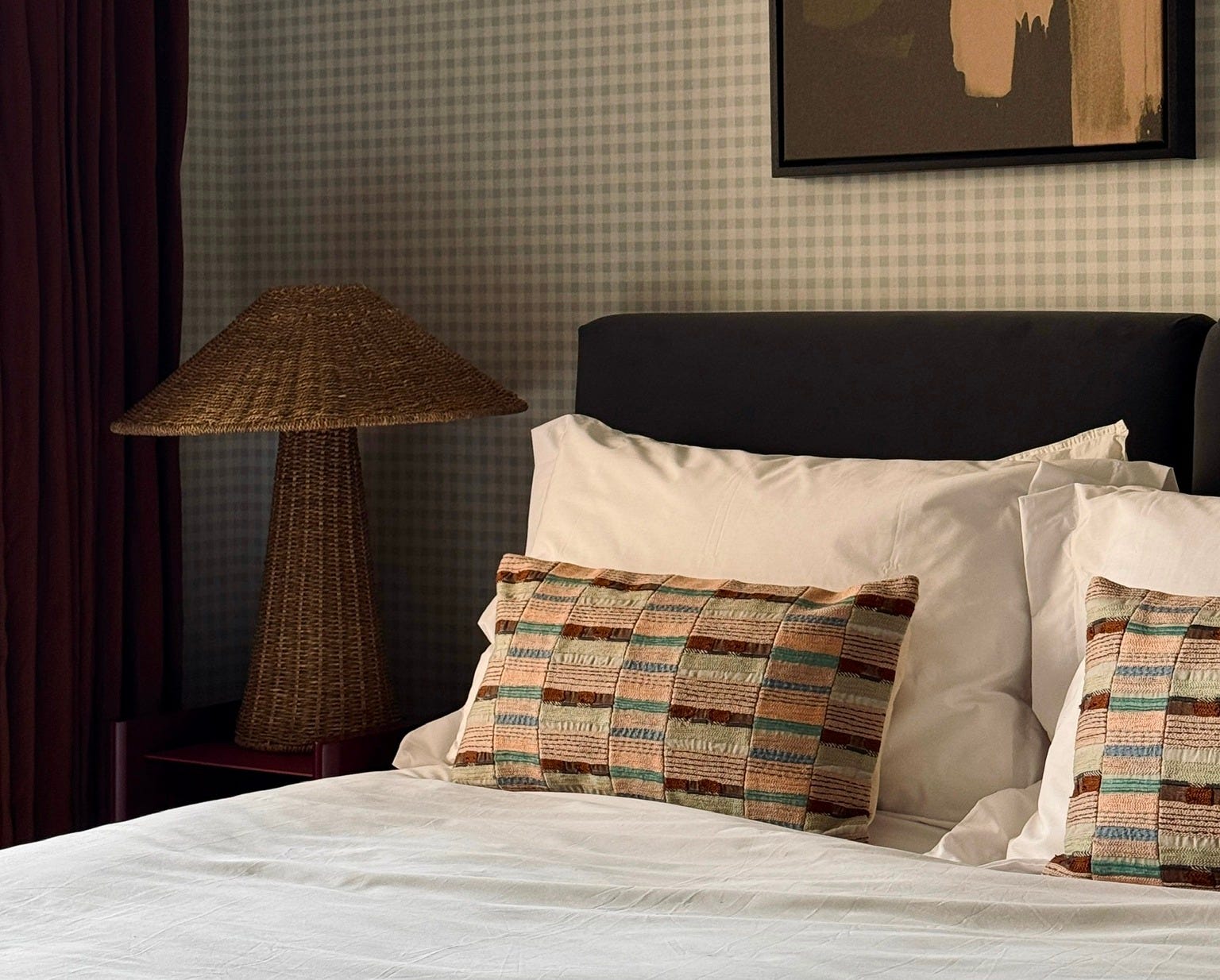
Every year, roughly nine thousand people publish their interior trend predictions. Most of them have never carried a sofa up four flights of stairs or waited three months for a tap that turned up in the wrong finish. I have. So here are mine. And because I believe in accountability, I’ll revisit every one in December and tell you where I was right and where I made a fool of myself.
I want to do this gently, because there are a few things here I love.
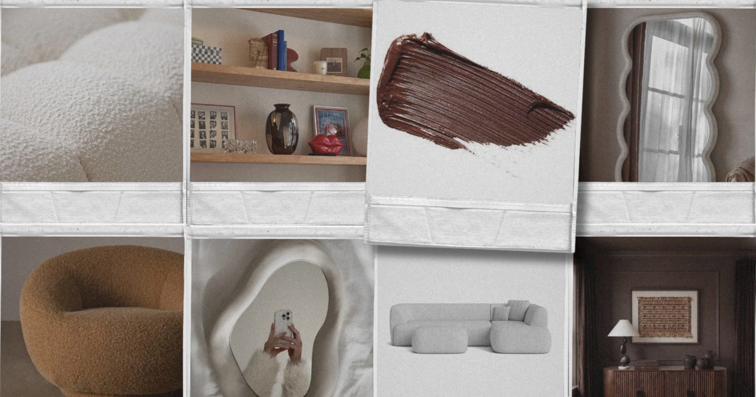
Bouclé — or rather, synthetic bouclé. I’ve been specifying good bouclé for the best part of ten years. That looped, curly yarn has been curling away since the 1940s, when Eero Saarinen wrapped his Womb Chair in Knoll’s bouclé and Coco Chanel cut it into her now-iconic jacket in 1954. It is a mid-century classic. The trouble came in the last five years or so, when the high street caught up and suddenly every single shop had a bouclé something. And when a considered thing goes everywhere in its cheapest possible form, that’s usually the sign it’s peaked. So I’m not calling bouclé dead. I’m calling the sad, synthetic stuff that pills and goes flat after you’ve sat on it four times dead. Long live the good bouclé.
The marshmallow shape — all those puffy, bubbly, entirely round sofas, beds and armchairs. I do love a curve, but I think we’ve reached peak squish. My call is that angles are quietly coming back. Not instead of curves, alongside them. A rounded sofa with a proper structured armchair beside it. A soft edge against a sharp one. The best rooms have always been a conversation between the two.
Brown. And now the one that might get me in trouble. Chocolate, coffee, caramel, every warm shade of it. Everyone is obsessed right now, and I understand why: it’s cosy, and it was a blessed relief after all that grey. But I think it starts to dry up. Not vanish, brown will always somewhere, but its main-character moment is nearly done. Screenshot that one especially. It’s the call I’m least sure about.
And a couple of quick ones. The squiggle mirror, you know the one, it launched a thousand identical selfies. And open shelving styled to within an inch of its life, groaning with objects nobody uses and no one ever dusts. Shelves are allowed to hold books again or that little bowl you picked up at a market in Portugal. Give it centre stage. And, Fast Furniture.
Now the fun part.
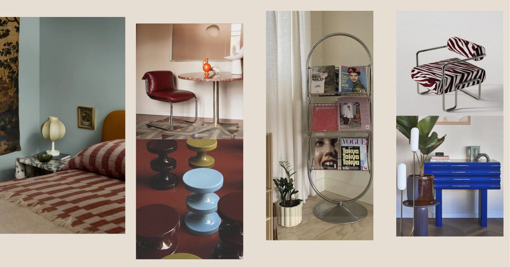
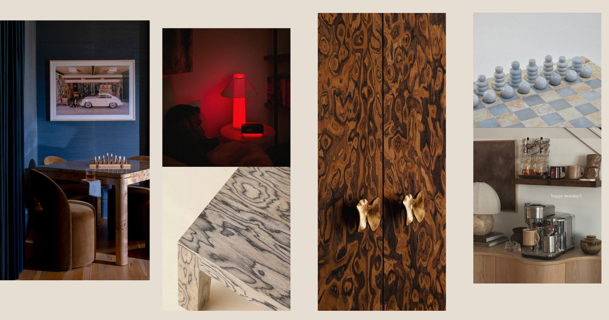
I’ll admit this one’s a bit of a cheat, because it’s already been making its way to the top for a while now. While we’ve all watched the richer tones, oxblood, olive, all that lovely depth dominate the last couple of years, I’m noticing powder blue quietly holding its own. It’s becoming less of a nursery pastel and more of a sophisticated neutral, particularly paired with walnut, aged brass and warm natural materials. That’s the whole trick: powder blue alone can read a bit sweet, but sat next to a warm timber and a bit of tarnished brass, it grows up in an instant.
We’ve watched it storm through fashion. Gen Z has been raiding the early 2000s for a couple of years now. Whimsical celestial prints, pod-like seating, glossy finishes, and a general refusal to be beige. The proper name for the mood is “dopamine decor,” which is a fancy way of saying rooms designed around joy. I’m not suggesting you fill the lounge with lava lamps. But a flash of nostalgic, slightly-too-fun energy? I think we’ll all be quietly borrowing from it.
If I had to bet on one colour for 2027, it’s cherry red. Not burgundy, not oxblood, those have had their moment and are settling comfortably into “classic.” I mean a proper, glossy, unapologetic cherry. It does something clever: a single cherry-red object in an otherwise calm, natural room lifts the whole lot. A lamp, a stool, a lacquered tray. And cherry red next to a soft ice or powder blue is unbelievably good.
Here is powder blues louder cousin. I’ve started noticing electric, almost sapphire blues popping on runways. I’m not suggesting you paint the lounge the colour of a raspberry slush. But a hit of electric blue, a lacquered console, one bold chair, a glazed lamp, the painted inside of a cupboard as a little surprise, is going to feel very now. So blue is really the story of 2027, top to bottom: powder for the everyday, electric for the show-off.
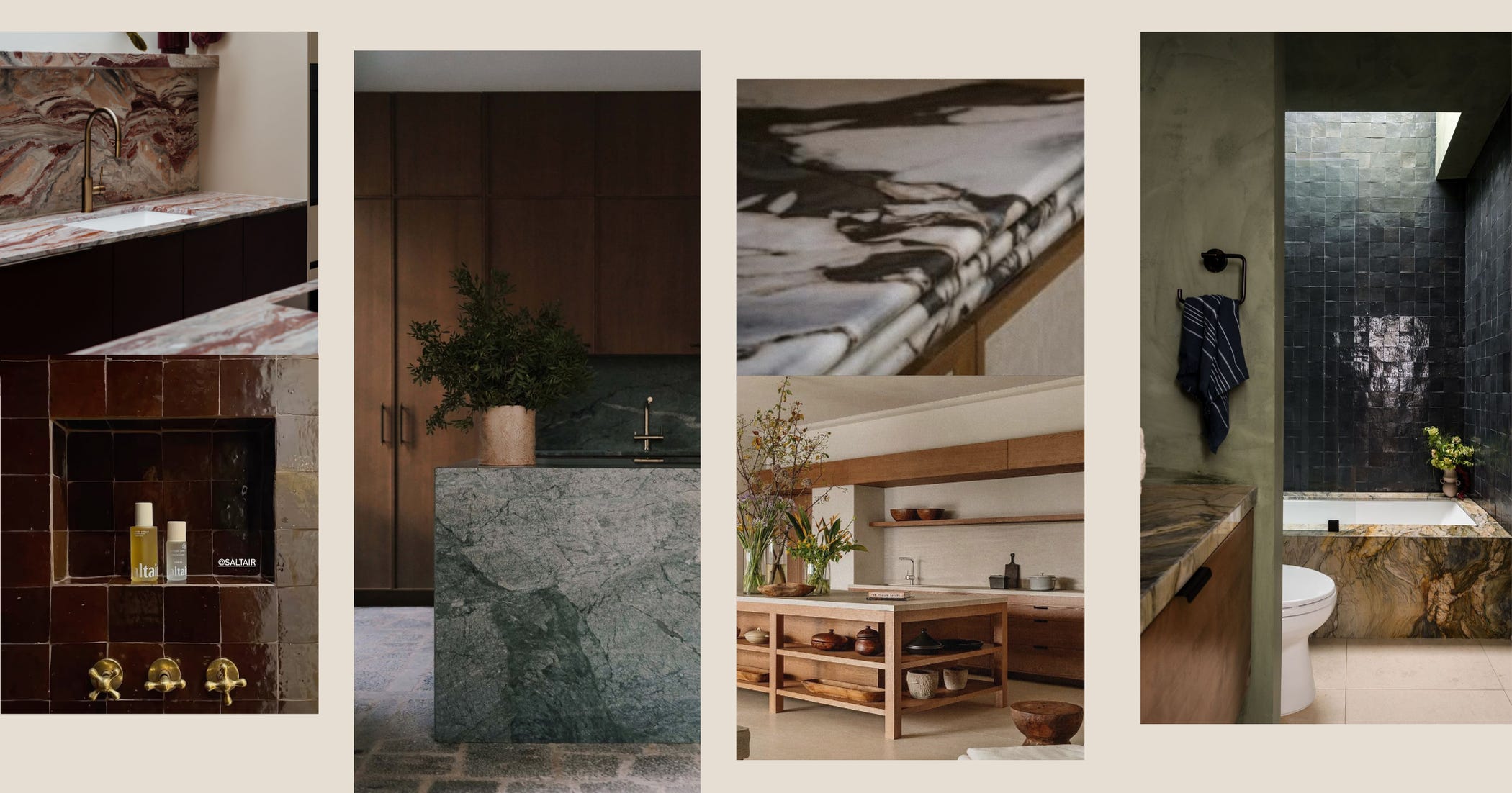
Two things here. First, the kitchen is becoming less “fitted units” and more furniture islands that read as a standalone piece, freestanding dressers, cabinetry with legs and personality rather than a wall of identical doors. The best kitchens have always looked collected, not delivered.
Second, the bit I want most, so take this one with the caveat that it might just be me manifesting. I am so ready for a bold worktop. Look, I love both, so often we see these beautifully neutral kitchens with a gorgeous Calacatta stone, and I understand why: a lot of them are show homes or built with resale in mind, there for a good time, not a long time, so they have to stay sellable. But in a home you actually live in? Go big. I want green worktops. I want blue worktops, with an extra-thick profile or a triple bullnose. I want the maddest, most characterful piece of stone you can lay your hands on. My prediction, and my plea: the surface becomes the statement, that’s not just Calacatta Viola.
The stark-white clinical box or a shower feature wall is being swapped for something with a pulse. The direction I love is the boutique-hotel bathroom: bright, energising, mixing materials, finishes, sizes, shapes and textures. But here’s my bolder statement: I think we’ll see people going the other way entirely and doing darker, moodier bathrooms. The small windowless one everyone apologises for? Stop fighting it. Lean in, drench it in something deep, light it properly, and suddenly the least promising room in the house is the most seductive.
A quieter one, but I think an important one. For years, we’ve designed our homes for other people. The imagined dinner party, the drop-in guest, the resale value. As everyone tries to claw back a bit of time offline, I think that shifts. We’ll build rooms around what we actually enjoy: a games table you’ll genuinely use, a proper coffee station for the morning ritual, a record corner, a reading chair placed for the light rather than the telly. Little rituals, given a bit of real estate. Not every room has to point at a sofa and a screen.
As designers, we’ve been specifying decorative veneers for years. Burl was the one that finally broke through and hit the high street recently. My call for 2027 is that the more interesting patterned veneers start landing on our shelves too, the graphic, the book-matched, the frankly show-off grains that used to live only in proper cabinetmakers’ workshops.
We’ve spent a few years bringing wellbeing into the home, and it’s not slowing down, it’s just getting built in. Sound wired through the house, infrared panels, saunas creeping out of the spa and into the utility room. There’s a whole corner of the internet, the biohacking, optimise-every-cell corner that I subscribe to and quietly enjoy. And while some of it is far too extreme, the entertainment value is undeniable.
So, alongside all the beautiful lighting I bang on about, don’t be surprised to see a few people quietly swapping the odd living-room bulb for a red one. Red-light therapy, apparently. I love a good light, I just didn’t expect one of them to be therapeutic.
I can already hear some of you: “hang on, what about…?” So before you write in, here’s what I think isn’t a trend at all. These are the classics, the things that were never really in, so they can never really be out. They just quietly keep being good.
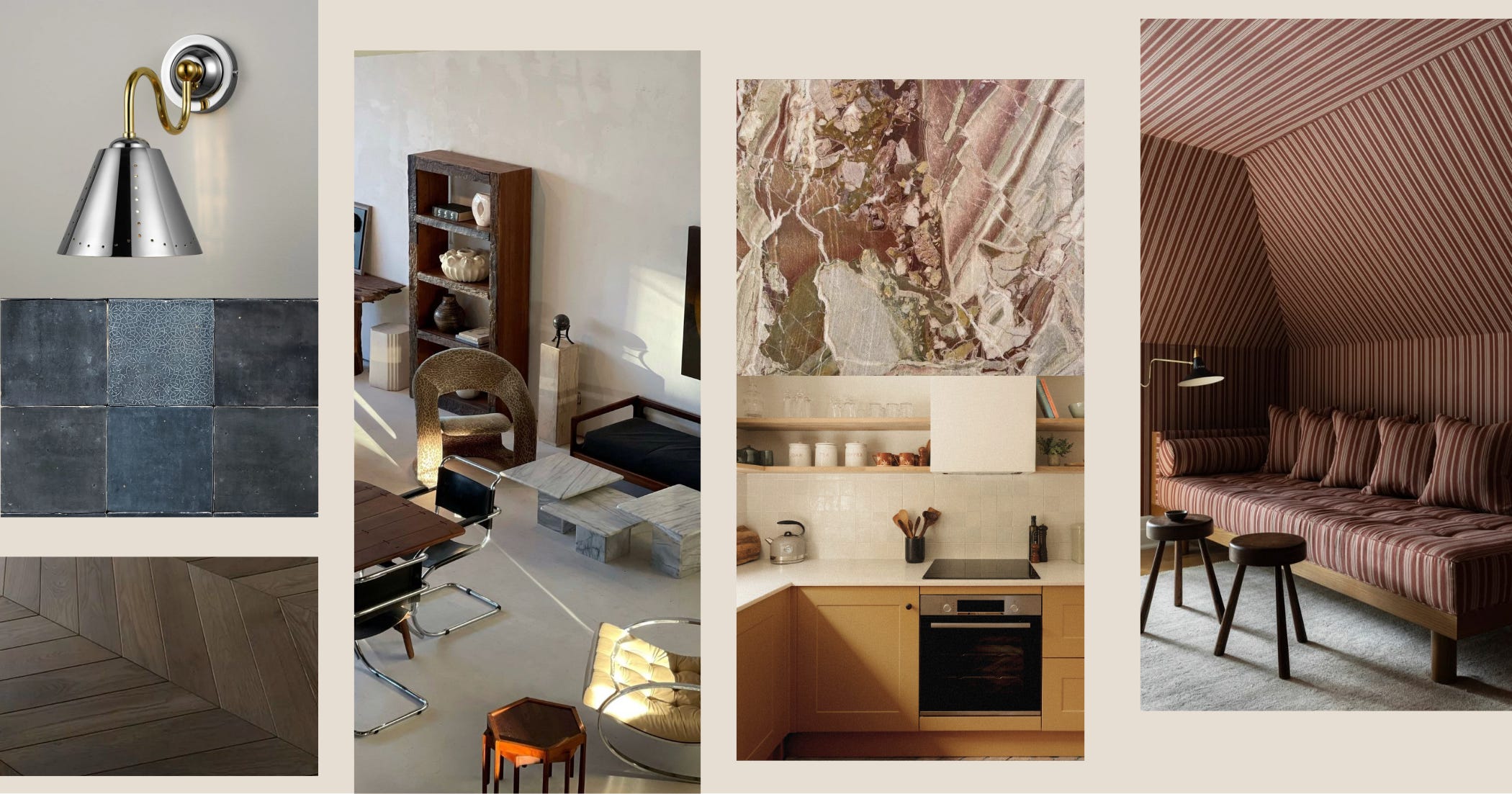
Pattern, in all its forms — florals, stripes, modern, animal print, a small-scale repeat. Pattern is permanent. It only ever looks dated when it’s done timidly.
Square tiles and zellige. The humble square tile has become a hero again, and zellige, all that lovely uneven, hand-made variation is texture and pattern in one. Not a trend. A staple.
Colour and pattern drenching. Wrapping a whole room in one shade or one print isn’t brave any more, it’s simply a good tool. And good tools don’t go out of fashion.
Polished metals. I’ll admit a proper love-hate here. I was militantly anti-polished-chrome for years, and now I adore it. Which is exactly the point: the classics come round again, and chrome, brass and nickel will keep doing that forever.
Natural materials. Stone, timber, linen, wool, plaster. The eternal answer. If you’re ever unsure, reach for something that grew or came out of the ground.
Butter yellow. Yes, it’s having a moment. But yellow in this soft, buttery form never really leaves. Warmer than mustard, gentler than lemon, quietly nostalgic. It’s sunshine you can actually live with.
Vintage and retro finds. The single most reliable way to make a room feel like yours and nobody else’s. Never a trend. Always right.
None of this is gospel. Trends are just a lot of people slowly agreeing on something at the same time. So, save this, screenshot it, pin it to the fridge if you’re that way inclined. In December, I’ll pour a large glass of something and mark my own homework in public. If I’m right, we celebrate. If I’m wrong, well, at least you’ll have had a good time watching.
See you next time.
Lydia x
No posts
Comments
Nothing yet. Say the first thing.
Sign in to join the conversation.