
Hello and welcome to Inspired, a weekly email for my paid subscribers. In this series I want to explore topics which I hope might spark some inspiration for your own photography. I will talk about my thought process for creating images, both in the field and in post processing. The posts will be linked in some way to the monthly challenges, hopefully giving you all lots of food for thought.
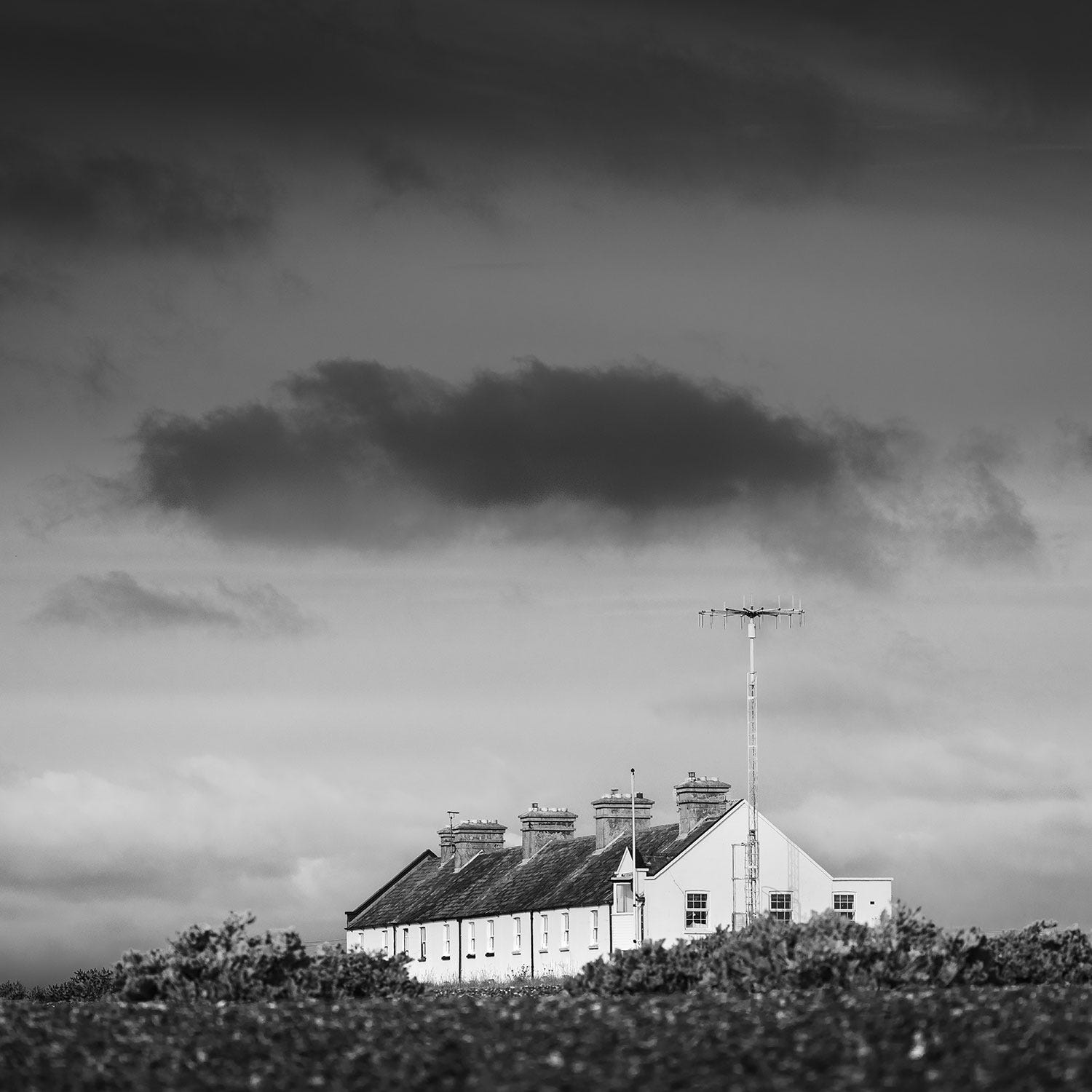
This week is the last week of the June black and white challenge and I wanted to discuss my thought process when it comes to removing the colour from my landscape images.
Most of my images are processed in colour. I love the soft subtle palette that summer brings and I find it hard to see the landscape without its technicolour glory. However I also really appreciate black and white images and I enjoy the range of options open to me when I am processing this way.
For me black and white has a versatility that colour doesn’t. A single shot can be two very different things in black and white each with their own mood and atmosphere and this is what I wanted to discuss in this post.
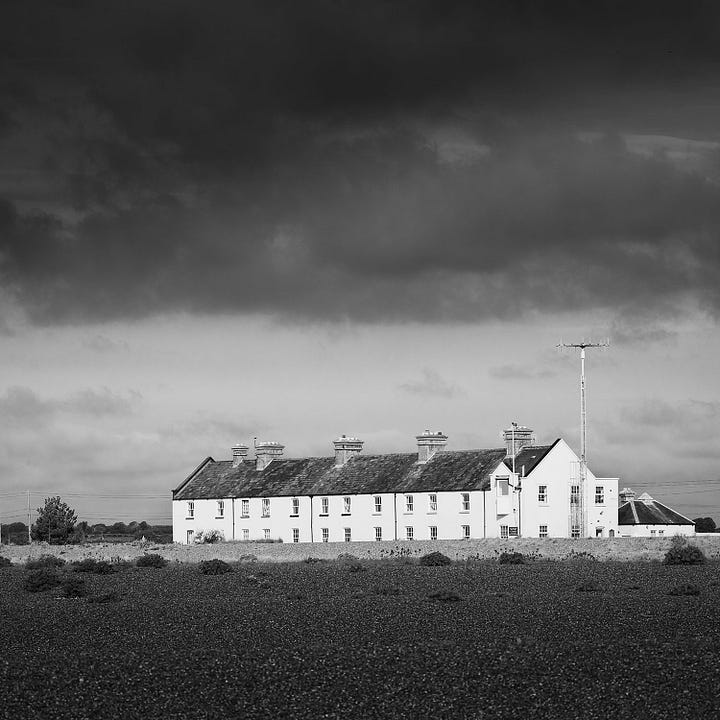
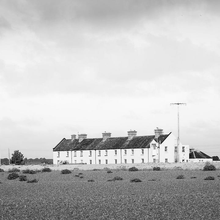
The images below show two very different versions of the same scene. One feels more dramatic and one more serene. There is no correct way to process this image it comes down to the mood that I chose to convey.
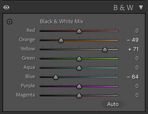
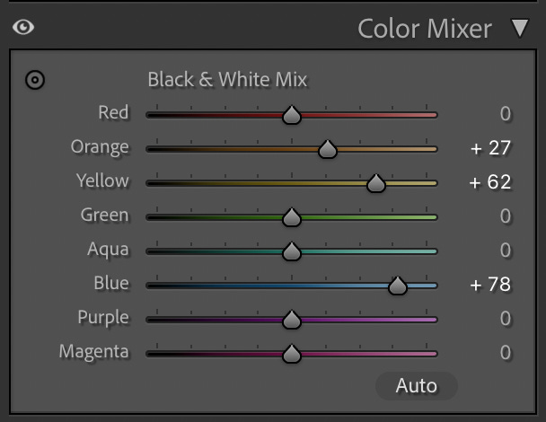
Beneath the images you will see the choices I made with the colour mixer in Lightroom. This dictates how the colours are rendered in monochrome. You will see that in the left image I darkened the oranges (the shingle) and the blues (the sky) and lightened the yellow which corresponds with the area of sunlight in front of the coastguard cottages. In the right hand image which is much lighter I have lightened the oranges and yellows and the blues so that the whole image has a brighter, lighter feel.
When we take a photograph all the relevant information about that scene is recorded in a RAW file. This is akin to a digital negative and it is up to us as photographers how we interpret that information. We choose:
the overall mood
the level of contrast
the tonal distribution
and where the viewer should look.
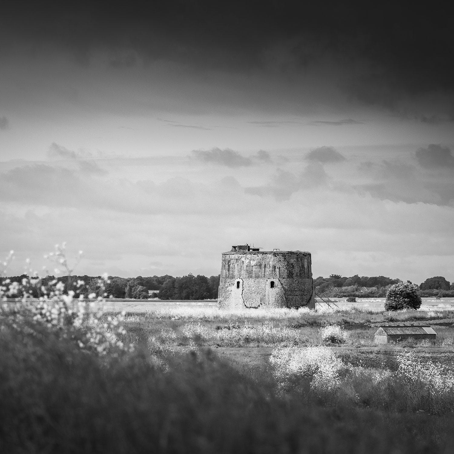
In this image I have chosen to darken my greens, blues and oranges, but I have lightened the yellows. This has resulted in the middle section of the image standing out because this is where all the yellow flowers are. The dark sky and the dark grass add to the moodiness of the scene and act as defining edges to the frame, while the brighter areas tell the viewer where to look.
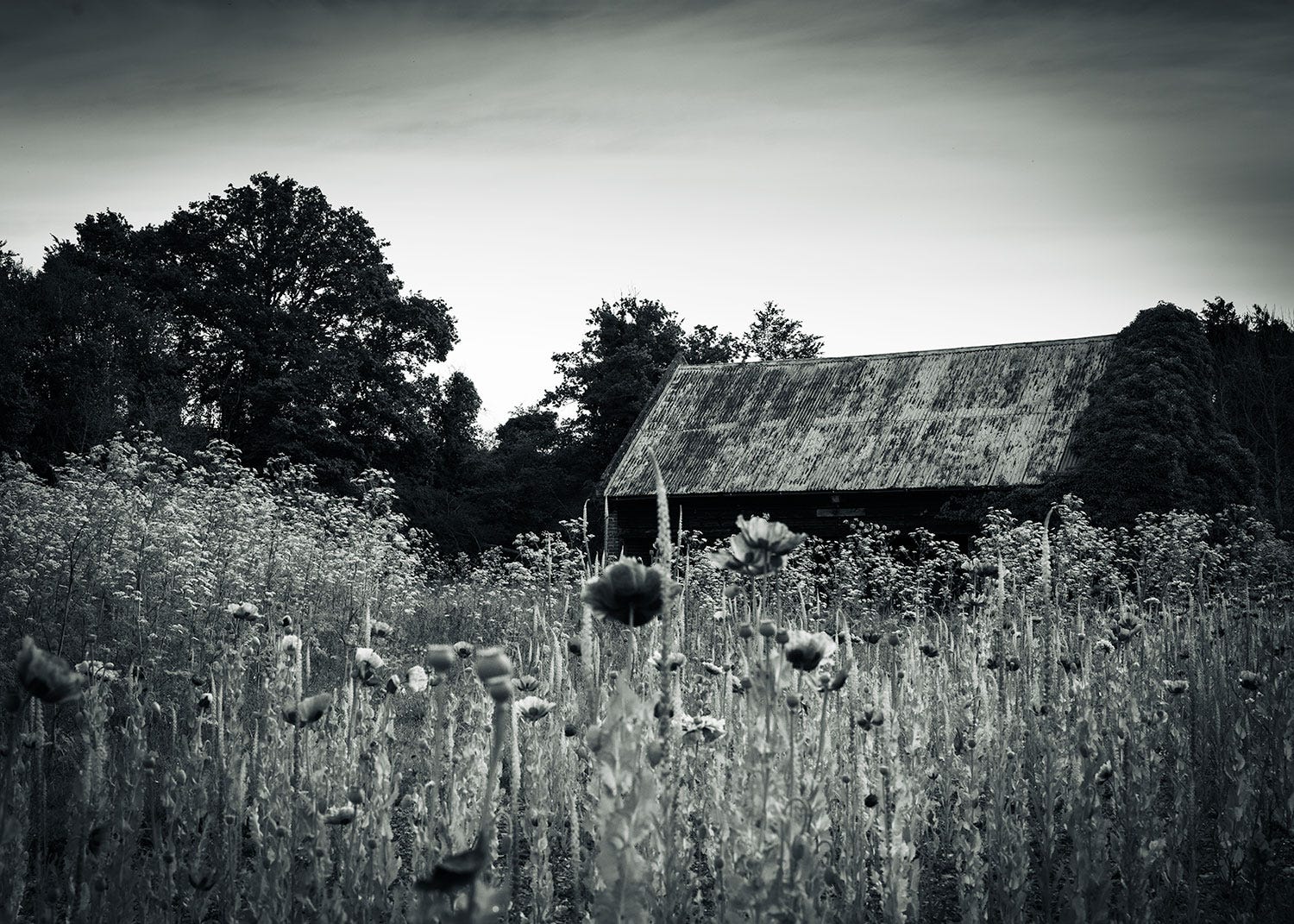
Dark and moody images generally have deeper blacks, the shadow detail is preserved selectively and some parts of the image are allowed to fall into darkness.
The image below is an example of this where I have tried to create a more cinematic feel with an air of mystery.
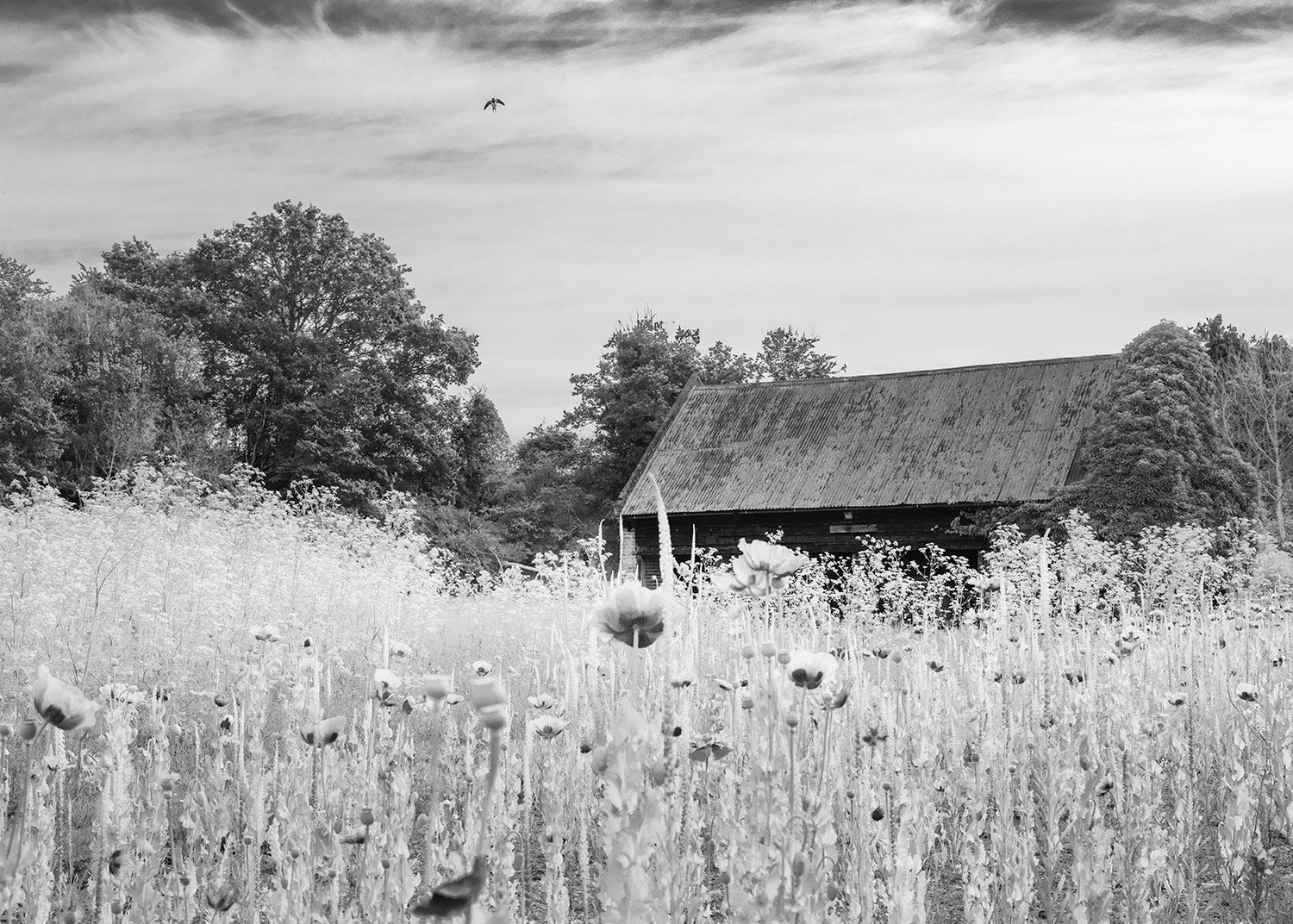
I have also tried to process the same image in a more summery way, working to create something that feels lighter and brighter and more reminiscent of a summer mood. To do this I have lightened the foliage considerably and matched the tones with the main area of sky. The barn stands out now as the main focal point and the air of mystery contained within the first image has vanished.
The next image also has a summery feel to it. For this file I have lightened the blue in the sky and all the greens and yellows in the foreground. The houses still act as a focal point because of the darker tones on the roof.
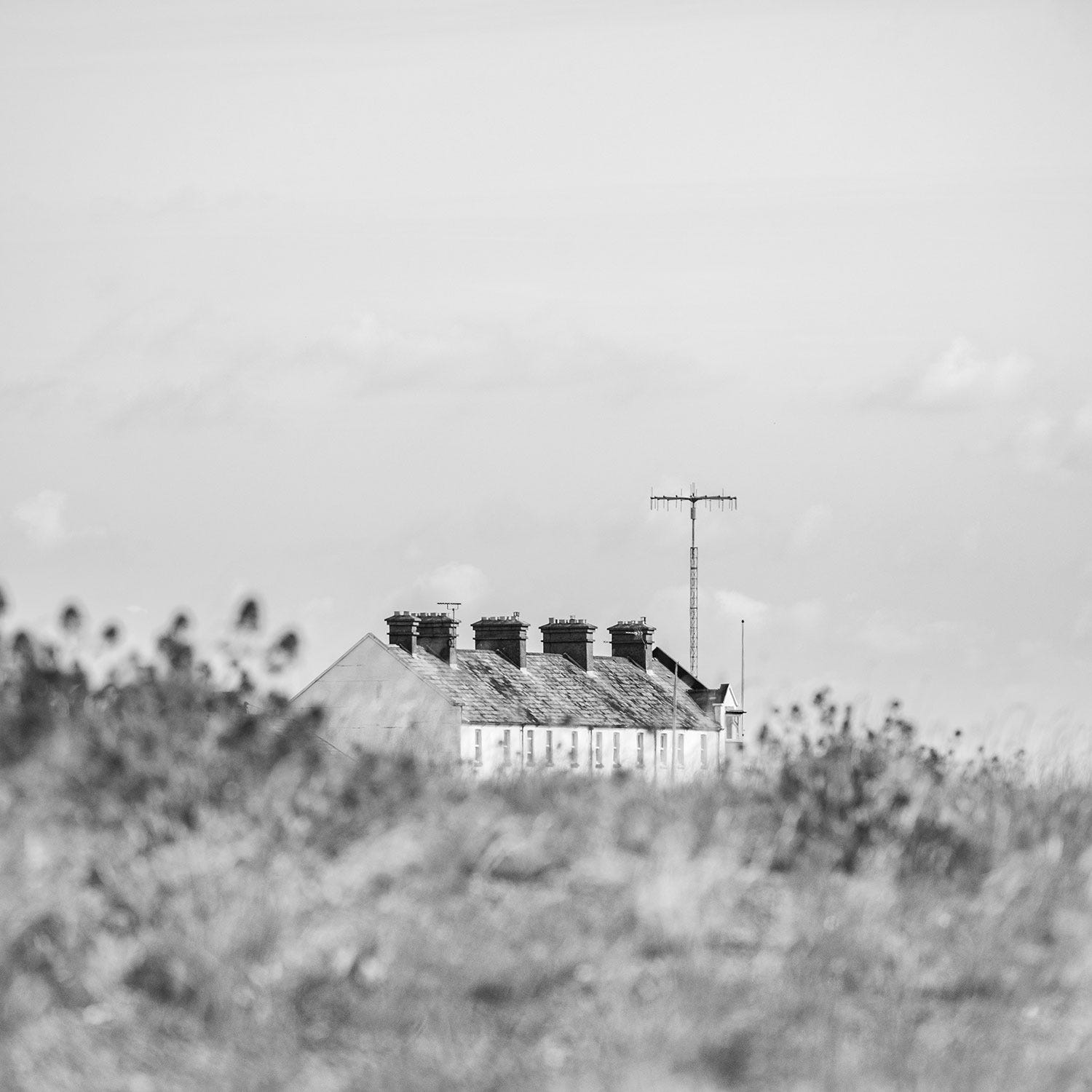
With lighter conversions I generally lift the shadow areas, tone down the contrast and reduce the blacks in the scene. There are more mid tones in the image above and fewer extreme blacks. The idea behind this is to create a scene that hints at calm and serenity.
A landscape in black and white can be dramatic, moody, joyful or dreamlike all in the same file. It is up to us what we choose to say. Our processing choices will dictate the mood and atmosphere often in a more obvious way than if we were working with colour.
The difference between a dark and moody black-and-white photograph and a light and airy one is not the scene itself, but the photographer's vision. By using post processing we can create something that reflects our vision rather than depicting the literal scene itself.
If you would like to find out more about black and white photography I am running a ‘summer in black and white’ workshop on Friday 24th July where we will be spending half the day making images and the other half processing and printing them.
I hope this has given you some inspiration for creating your own black and white summer photography. If you would like to experiment with post processing then please share your images in the chat.
Thank you again for taking out a paid subscription and please chat or comment to get the most out of it.
Gill
No posts
Comments
Nothing yet. Say the first thing.
Sign in to join the conversation.