
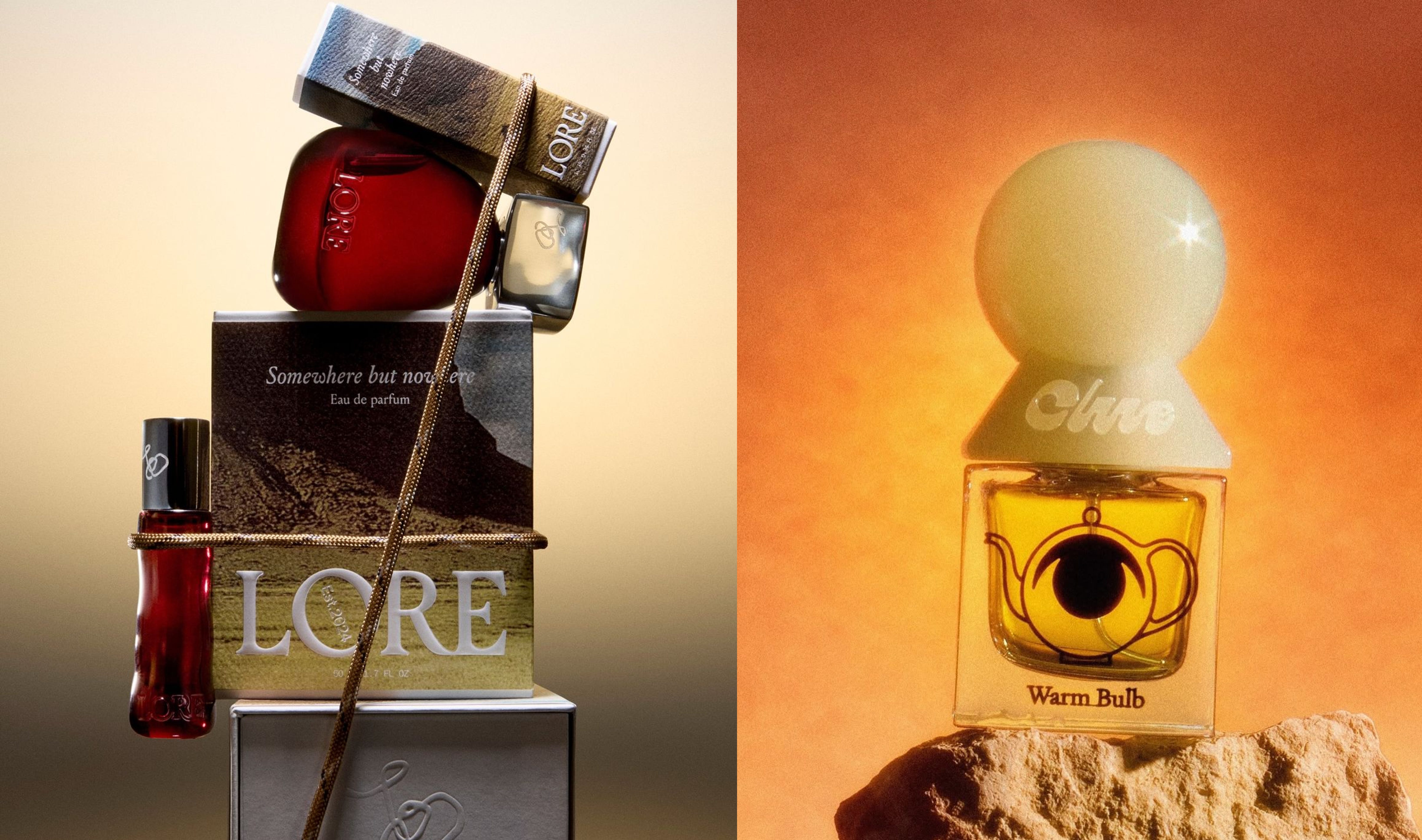
Pick up a product. Any product from a category where what is inside the container is invisible: a serum, a perfume, a face oil, a protein bar. Before you read the label, before you register the brand name, before you have processed a single claim, the packaging has already told you whether this product belongs to a belief you hold, whether the aesthetic is one you live inside, whether the ritual it is proposing is familiar to you or foreign. The packaging speaks before language does, and what it says either lands or it does not.
This is not instinct. Research in haptic perception, the study of how touch communicates meaning before thought, describes what is happening in that moment with some precision. When a consumer’s fingers close around a product, a pre-cognitive assessment begins. Weight, texture, temperature, material rigidity: these properties are processed before the eyes have finished reading, and they produce judgments about quality, authenticity, and trust that are disproportionately difficult to overturn with subsequent information. A study by Krishna and Morrin found that water tasted better from a firm cup than a flimsy one. The container was not decorating the product. It was changing what the product was.
For fragrance, where the product cannot be experienced before purchase, the packaging appearance determines whether a consumer picks the product up in the first place. The formula is invisible. The packaging is the entire pitch.
What the packaging pitches is not only aesthetic. It pitches function, style, coherence. When the physical properties of the object align with what the brand claims to be, when the feel of the thing confirms the promise of the label, the consumer receives this as credibility. When they do not align, the consumer feels the gap before they can name it. Haptic research calls this congruence. When it is absent, it registers as doubt. And doubt, at a shelf, is enough.
The question this raises is where that coherence comes from. There are two ways to build a visual identity for a product brand. The first: you decide what the brand looks like, then you bring those decisions to the packaging and ask the object to carry them. The second: you start at the object, and you draw the identity outward from what you find there. Call the first application, the identity imposed from document to object, from outside in. Call the second extraction, the identity drawn from object to document, from inside out. Most brands apply. The coherence that consumers register in those first seconds is best produced by extraction.
The traditional branding sequence, positioning then identity then packaging, is built entirely around application. The logo is designed. The color palette is named. The typography is selected. The brand guidelines are written. The packaging brief arrives last: apply what has been built to the product. For categories where the brand surfaces through means other than the physical object, a tech product whose primary surface is a screen, a service brand, a garment whose fabric is the experience, this sequence can hold. The product can receive an applied identity because it can represent itself through other channels.
But in skincare, fragrance, haircare, and food, the product cannot represent itself. It is invisible at the point of decision. The serum is inside the bottle. The perfume is behind the cap. The face oil will communicate its quality only through the experience of using it, which comes after the purchase, not before. The majority of buying decisions in these categories are made at the shelf, in the moment of physical contact, and increasingly on a screen, in the half-second a product has to hold attention in a feed before the scroll continues. The packaging is carrying the brand at both of these moments. It is the brand’s only available voice: the object that gets held in a store and photographed in a campaign and rendered on a product page and scrolled past on Instagram. Every surface the brand will ever occupy begins with what the packaging looks like and how it behaves in light. And when the packaging has been designed last, after the identity was built in the abstract, in a document, in a room with no product in it, it is being asked to carry a language that has not met the production realities.
The application model produces something I have seen in briefs and felt in my own hands. The color palette decided without ever asking what material it would live on reads differently on frosted glass than it does on a screen. The logo built for a white artboard loses its authority on a curved label that must also carry an ingredients list, a batch number, a regulatory line that cannot be made smaller. The hierarchy that held in a presentation buckles under real copy. These are not execution problems. They are the structural consequence of designing for a canvas that does not exist.
And then there is the layer that design briefs almost never reach: manufacturing. The moment a design file moves into a factory conversation, a set of constraints enters the room that the brand book never anticipated. The manufacturer stocks three materials, not the one the designer specified. The dye cannot be achieved at the minimum order quantity available to a brand launching its first product. The formula requires UV protection, which makes amber glass not a preference but a physical requirement, regardless of what the color palette says. The label dimensions are set by the bottle, and the bottle by what is available at the production volume the brand can afford. These are not problems that appear after the design is approved. They were always present, always determinative, and they were never invited into the room.
I understood this the first time I moved from a design file to a factory. Everything I had built in the abstract met something that had its own logic, its own constraints, its own reality, and the design had to negotiate with all of it. What survived that negotiation was not the design I had made. It was a compromise between the design and the world the design had never accounted for. The brand guideline was still beautiful. The packaging was what the manufacturing reality allowed.
This is where the application model breaks down completely. Not in the visual inconsistency, not in the logo that does not sit right, but in the moment the factory shows you what was always true: the object has its own logic, manufacturing has its own realities, and any identity built without understanding that logic will be revised by it. The only question is whether that revision happens during the design process, where you still have choices, or after, where you do not.
Extraction does not mean beginning with nothing. The brand strategy exists, the positioning is clear, the story is there. A stylescape, a visual world assembled loosely around the feeling you are building toward, is enough to establish the aesthetic register before a single design decision is made. Not every element precisely resolved, not a color palette locked or a typeface chosen, but a sense of the world the packaging will inhabit. That is the brief. From there, you go directly to the packaging.
Extraction begins by understanding what the product is physically, because the product’s physical reality is the first brief the packaging receives. What color is the formula? A rosehip oil is already red. A charcoal product is already dark. A turmeric serum carries a color story before a designer has touched anything. What texture does the formula have? What does using it ask of the person using it: poured, pressed, spritzed, scooped? These are not the visual language. They are the inputs that make the packaging honest. The ritual of use suggests the form of the container. The form of the container, chosen for what it genuinely communicates rather than what looks good in a mockup, is where the design work begins.
Alongside these questions, extraction asks the manufacturing questions at the same moment, not as a separate production phase but as a design constraint that shapes every decision. What does the manufacturer stock? What does the formula’s stability require? What is achievable at launch volume, and what will hold as the range scales? A color that cannot be produced at the minimum order quantity is not the brand’s color. A material that cannot be sourced consistently is not the brand’s material. These are not practical considerations that limit the design. They are the truth of the design. A visual identity built without asking them is a document that has not yet met the packaging it claims to govern.
From this foundation, the visual language is found through designing the packaging, not before it. Type is worked on the actual surface, at the scale the label permits, with the real copy it will always carry: the brand name, the product name, the claims, the regulatory line. The hierarchy reveals itself only when real information occupies the space. Designing around placeholder text is designing around a fiction the packaging will eventually correct. The wordmark is discovered in conversation with the label, not decided in advance and imposed onto it.
By the time the packaging feels true, the visual language has been found. The color palette is known because the packaging surface confirmed it. The type system is known because the label demanded it. The logo was found because this specific bottle, this specific material, this specific label required a particular kind of mark. The brand book, written now, is a record of those discoveries. It describes what the packaging taught, not what a presentation imagined. That is what makes it a design system rather than a mood.
The last test, before anything is locked, is whether the underlying logic holds as the range grows. What if the serum becomes a line of five? What if the protein bar becomes a powder, a drink, a snack? The packaging will change form. What must not change is the logic: the way the brand name relates to the ingredient story on the label, the color system that creates variation across SKUs without fracturing coherence, the structural approach to information hierarchy that makes every product in the range instantly recognizable as the same brand without looking identical. This logic, tested against a hypothetical second and third product before the first is launched, is the brand’s visual language. Not the logo. Not a color chosen for one surface. The principle that makes both of those things make sense, whatever surface they land on.
Dieter Rams wrote that good design is honest: that it does not make a product appear more valuable than it really is, does not make promises that cannot be kept. A brand book written before the packaging has been designed cannot be honest, because it is describing a visual language that has never been tested on the surface it is supposed to govern. The color palette has not been proven on material. The logo has not been found on a real label. The hierarchy has never negotiated with an actual ingredients list. The brand book built through application is a set of decisions made in the absence of the primary evidence.
The packaging is that evidence. When the logo is found on the bottle rather than designed for an artboard, it belongs there. When the color palette is extracted from what the packaging surface confirmed rather than what a presentation approved, it holds on every material it subsequently lands on. When the type hierarchy is built around real copy at real scale on a real label, it does not buckle when the range grows. The visual language that emerges from designing the packaging first is coherent not because it was carefully managed, but because it was found in the right place.
The brand book is the last document you write. It records what the packaging taught you: what colors held, what type weight the surface wanted, what the logo needed to be when it finally met the label it had to live on.
That is what makes it true.
👋 Hi, I am Fatema. I work with consumer brands on design and creative direction, helping them build identity from the product out. In my weekly newsletter Layer by Layer, I peel back the layers of brand, design, and culture. If this essay made you think differently about how brand systems get built, subscribe, and I will see you next week.
No posts
Comments
Nothing yet. Say the first thing.
Sign in to join the conversation.