

Creative Intelligence is a free monthly-ish newsletter about the art and business of color — from trend to strategy to design. Thanks for reading!
Happy Spring, friends. Hopefully with the change of seasons comes a change of habits that feels welcoming and expansive to you. For me, I’ve been getting out on my bike for long rides and have gotten a handful of early season bikepacking trips in. It’s felt so nice to spend hours in the quiet in the woods—swooping through trees, smelling new growth, watching bugs, getting up close to tiny blooming things.
Moving through nature has always been my best source of inspiration. Especially when I stay out long enough to watch the sunlight rise and fall, to feel the temperature change with it, to sleep on the dirt. I am always better for it—more creative, relaxed, intuitive, reminded of what truly matters. It’s from this place that I do my best humaning and honestly, my best work.
All of that to say, I’m making a commitment to nurture this by doing at least one overnighter a month for the next year. Several years ago, my family did something similar, and it was a life highlight. Want to join me? Doesn’t have to be bikepacking; it can be whatever it is that lights you up. Commit to making space for your greatest source of inspiration once a month for a year.
Are you in? I’d love to know and hear what it is that you’re dedicating time for. I’ll be rooting for you.
Let’s see how this year changes us.
Speaking of inspiration, this issue is dedicated to it.
Over the next few issues, I will walk you through the steps of designing a color palette—from defining the need to choosing the colors to evolving it in the future. Inspiration gathering is the very first step in the process.
Inspiration matters because it fuels creativity and a sense of wonder. It opens us to solutions and possibilities we may not have previously considered. It sharpens our awareness of innovations, trends, and shifting preferences—our own and others’. Most importantly, it helps us move beyond default answers to create options that truly amaze and delight. Feeling inspired is innately connected to feeling alive.
It can be tempting to dive straight into selecting colors the moment you know you need a palette. Don’t. Invest the energy into research and inspiration first. You’ll do a better job and spare yourself the headaches and disappointment that come from a lack of vision and an incomplete understanding of what’s at the heart of the project.
My first bit of advice is general: cultivate a regular practice of being inspired and collecting inspiration. Spend dedicated time being open and curious—gathering, wondering, noticing, learning. What this looks like will be unique to you. Find the activities, places, or sources that best and consistently ignite your creativity. Establish a system for saving and organizing what you discover.
The goal is to exercise and strengthen your creative muscle. Keep it healthy. When it’s strong and active, it will respond confidently and effectively when you need it most.
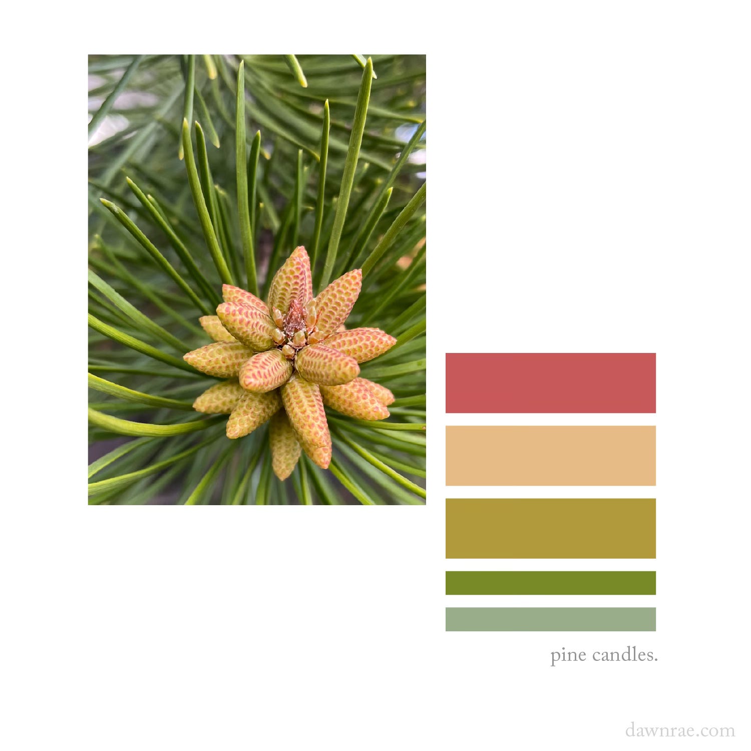
Spending time outdoors—like I mentioned—is a key source of inspiration for me. Another is my practice of creating mini palettes from daily life. In this, I take a photo of something I see in my everyday that wows me with its color, and I create a small palette from it. Simple enough, but this practice has made me more attuned to the colors and details in everything. It has also—even after years of designing color—deepened my understanding of how to balance color, colors to promote vs those to ignore in a particular project, and what truly makes a palette sing.
Find something similar for yourself and nurture it.
Now for the project-specific advice. Once you kick off a palette design project, tailor your inspiration collecting to it.
Gather inspiration from any sources that resonate with the project’s intended audience. If this is a professional project, the intended audience would be the client or brand and their customers. If it is a personal one, the audience is you and anyone else that will interact with the finished product.
Color trend forecasts are a great place to start. Some of the ones that I find the most insightful are WGSN (with Coloro), Future Snoops, Pantone, TrendBible, and pej trend. These are all subscription-based platforms, but most generously share some content for free. They are great resources for understanding major color shifts and their key trend drivers, as well as discovering interesting new color combinations or usage.
Collect inspiration from project-related resources, but also parallel and vastly different areas. If you’re designing color for a footwear company in the outdoor industry, absolutely look at what is trending and inspiring within both the outdoor and footwear industries. But also check out what’s happening in fashion, automotive, interiors, technology, beauty, and consumer goods. Look at directional shifts in entertainment, sport, art, food, music, and popular culture. Reference history and nature. Let your curiosity and the interests of the intended audience guide you.
For example, if you were planning on repainting your home, a good place to start is paint companies’ and interior design websites, publications, and social feeds. But also allow yourself to be inspired by a show you’re watching, the table linens at the restaurant you ate at last week, the color of your friend’s sweater, the flowering shrub in your backyard, your favorite nail polish, or the car that just whizzed down your street.
Inspiration can come from anywhere. Funneling it through the lens of the project will make it relevant and applicable.
Once you feel that you have enough inspiration, organize it. Figure out a system that works best for you. It could be digital or physical.
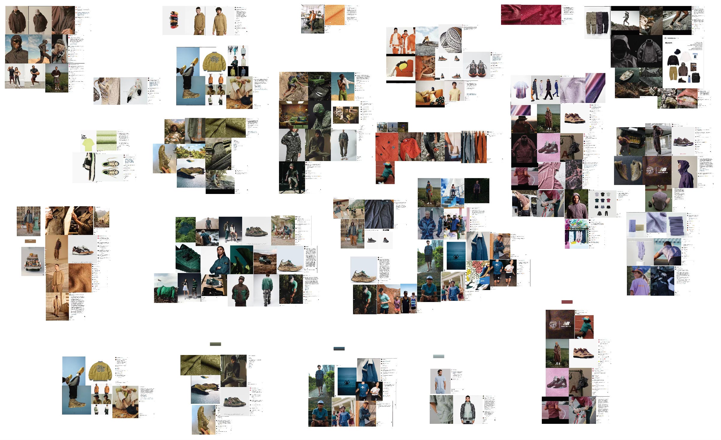
For me, I tend to organize my inspiration digitally. When I am working on a project for a client, I usually make one master Illustrator file to house all of my inspiration for that particular project. Then, within this one large workspace, I group the inspiration by color family, category, gender, or color story, depending on what makes sense for the project. If I am evolving a palette from a previous season, I will bring the current palette into this file, so I can evaluate the inspiration for new color additions next to it.
Keeping the inspiration in one file helps me make sure that as I narrow in on particular colors, they all harmonize together. This method also begins to shape the images and examples that I use in the moodboards in the project presentations. And later, when I start pulling actual physical color swatches as contenders for the palette, I reference this inspiration file continuously.
As I organize the images within the Illustrator file, I also organize the raw images into folders on my computer with easy to understand names like “w’s oranges_client x” or “m’s sand & stone_fw26”. I hang on to these for at least a couple seasons as they are usually valuable for other projects as well. Another reason I keep them is that I often get into a creative flow when I’m gathering inspiration which leads me down wild, hard-to-replicate threads of curiosity. It’s helpful to reference the images I found down those rabbit holes when I want to check out the original sources again.
If this same system works for you, use it. Or create your own. The goal is to develop a method that helps focus your vision for the palette and begins to reveal what colors will work best.
In parallel with gathering inspiration for a project, you will also be defining the goals of the color palette. (We’ll go into that in the next issue.) You’ve gathered enough inspiration when patterns begin to emerge and you can start to visualize how to meet the project’s goals.
Another clue is you will likely feel excited and confident to begin. You will feel ready to start translating the inspiration into assets for the project and to see whether the possibilities you’ve gathered can become solutions.
For me, I spend a good chunk of time gathering inspiration. Then, when I begin to feel that excitement and see patterns emerge, I start pulling color swatches for the areas of inspiration that are resonating the strongest. As I get a sense of where these first colors may land, I can better gauge where there may be some holes in my inspiration for the remaining colors. Then I go back to collecting more inspiration—this time focused on the weaker areas—before continuing. There can often be quite a bit of this back and forth until the full vision settles.
Honestly (and thankfully), there is always more inspiration to find. Sometimes you will just have to give yourself a time limit so that you can proceed with the project. The best practice is to constantly be accumulating inspiration. That way, you always have a library of ideas that are interesting or relevant to the work you do.
The inspiration stage is the time to be wildly curious and open. Brainstorm. Explore. Consider every possibility. And throughout it all, stay connected to the heart of who you are designing for. Because if you dig down to the very root of it, that is the most important thing to win over and delight.
Take care,
Dawn Rae
Thanks for reading Creative Intelligence! If you enjoyed this, please share it with a friend.
Book update: It’s been awesome and intense! In case you missed it: I am writing a book. Colorscapes comes out early 2027 and will be packed with color inspiration and knowledge. It will teach you how to use color confidently and create palettes that work.
I handed off the manuscript in early January, and have spent the last few months designing the color palettes (~165), creating the color combinations (~1880), and naming all the colors (~1000). Now, we’re reviewing initial layouts and making tweaks, adding a few more palettes, swapping out some images. In a couple weeks, it goes to proofreading, and I start making the index with RGB and CMYK values of all those 1000 colors (!!).
It is beautiful (biased), and I cannot wait to share it with you.
I help brands understand what their customers will love and value in the future, and I create the color design + trend strategy to get them there.
I design client-specific seasonal trend forecasts, color palettes, and color merchandising plans. Find a full outline of my services here.
If you are curious about working together, reach out: knoth@dawnrae.com.
website: dawnrae.com
socials: LinkedIn, Instagram, Substack
Creative Intelligence: all issues
Comments
Nothing yet. Say the first thing.
Sign in to join the conversation.